For this week, I have been working on the header of the website.
Screen Recording 2022-05-13 at 1.38.49 PM 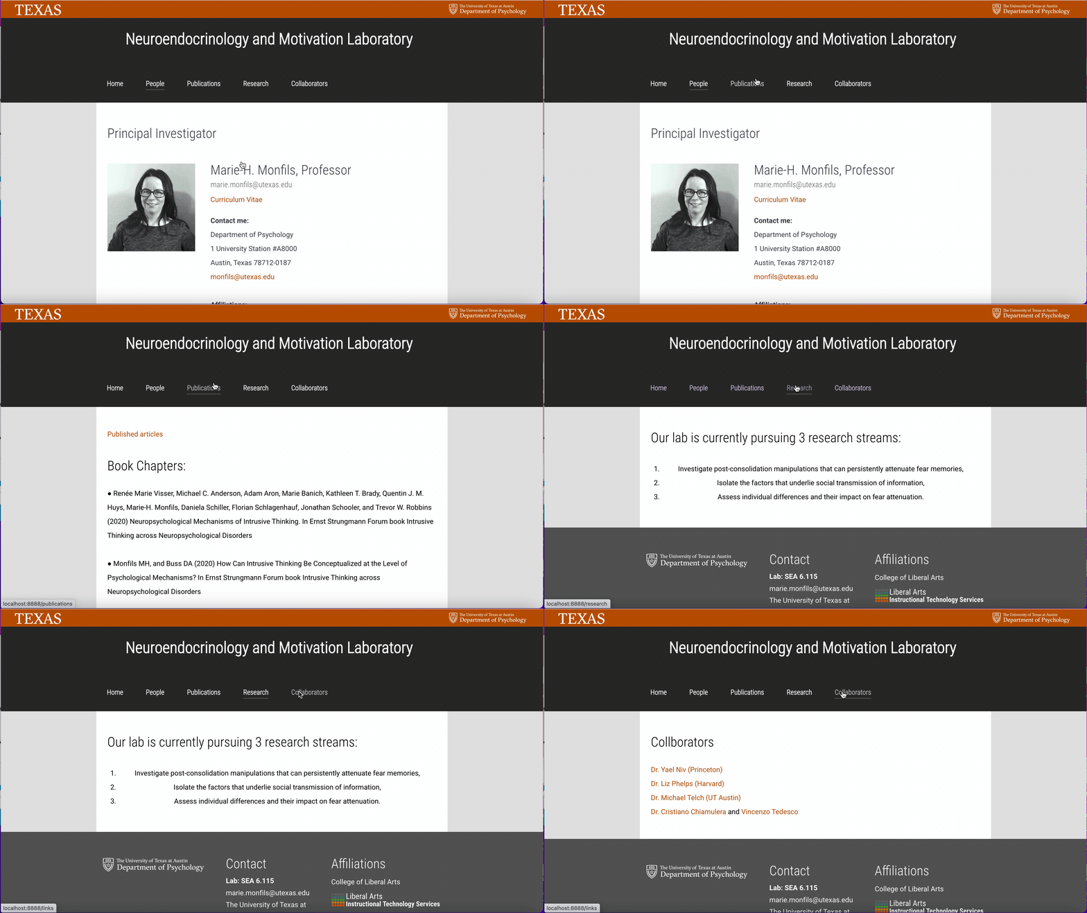
Also, I am creating the content for the client documentation. Hopefully, we will get it done soon.
For this week, I have been working on the header of the website.
Screen Recording 2022-05-13 at 1.38.49 PM
Also, I am creating the content for the client documentation. Hopefully, we will get it done soon.
Reflecting on my first two months as an STA this semester, I’ve had a great semester here. I’ve got to learn so much in my trainings, make friends with the coolest people, and be apart of a really positive working environment! I’ve made a lot of memories from starting with Hoa to having the funniest conversations with Valerie and Abriella. Estella has taught me a lot about the details and thinking that must go behind web development to make it accessible and visually pleasing. I never had prior experience with design, but I have gotten to work on design trainings and learn from my fellow STAs, Suloni, Valerie, etc.
I just finished completing an infographic on optimal card design layouts as my final assignment for the semester.

This is another example of me learning more about incorporating knowledge of design elements into web development, as the way your final products look is just as significant as the backend.
This summer I’m planning on interning as a software developer in New York, so I’m excited to be out of my comfort zone for the next few months. But I’m also looking forward to returning to LAITS in the fall and start working on more projects with Estella for more clients. Even though there have been mishaps along the way, getting familiarized with the job, I think I’ve learned a ton and don’t feel too new and unfamiliar here after these two months!
Thank you for a great time, I look forward to seeing everybody who is returning in the fall!
This week I became familiarized with using Grav in my local directories and learning how to create/design a webpage using Gantry. Earlier this week, I had a few troubles with installing Gantry and then having certain features/files in my trainings not working. However, I think I finally got the hang of it today and understood how to work with Grav well.
This is the Grav website I have now (I’m hoping to finish it by the end of the day, so I’ll post my updated version.)

Although there are some troubles I have with formatting, I am able to play around to solve these problems. I also understand the web development aspect of Grav, where I know in the future, a lot of my web dev. understanding can be used.
Hey, this week was my second week working as an STA and I got to spend majority of my time this week working on my training assignments for web development. I’m really passionate and interested in developing a lot more in the future, so I really enjoyed getting to learn more about the more programming-based aspects of being an STA.
For the first two assignments, I used the inspect element tool on the LAITS website and got familiarized with using git/github to update my code.

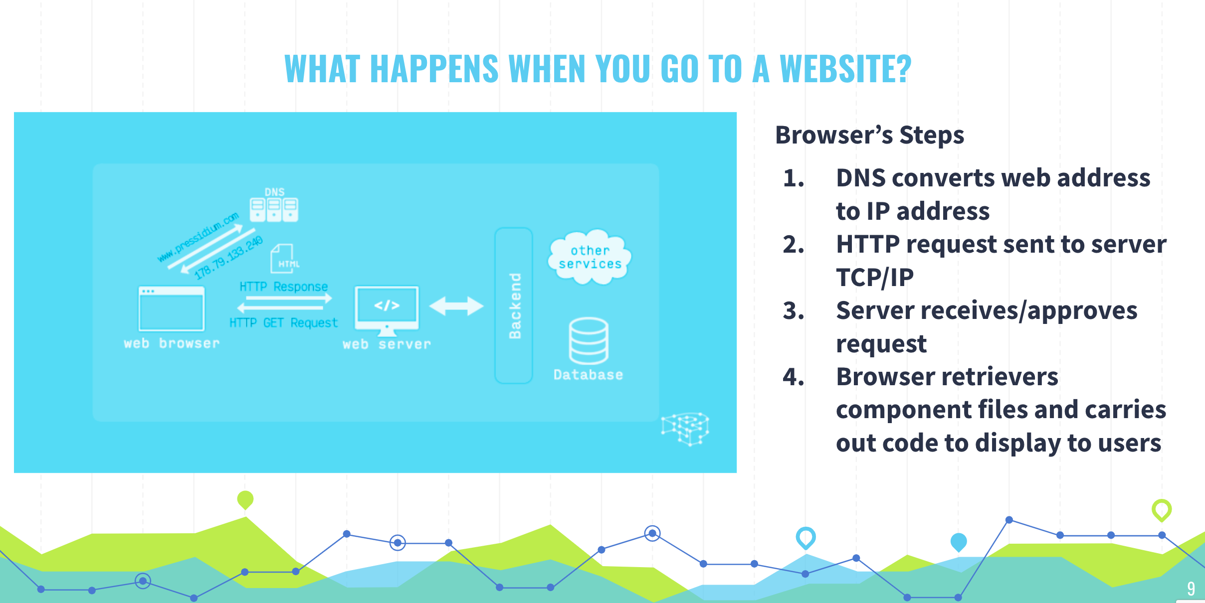
Finally, I created a Google Slides presentation to recap the basics of the network communication behind websites at this link: https://docs.google.com/presentation/d/17DDB9X6w8SLe34A-k0s3oAyGvhqJZU5f8600OadVzwc/edit?usp=sharing
One thing I learned about was that HTML, CSS, and Javascript files worked together to compose a component file. Once a server receives a request and approves it, it sends back the component files to the browser to display it to the user. I have worked with the three scripting languages I mentioned above to a limited extent, so I am excited to continue creating bigger things and expanding my knowledge in this field!
In addition, Suloni seemed to enjoy the design for my slides, so today she was kind enough to ask me to help her work on a flyer and screen ad for a COLA course. I’m excited to tap my toes into the design field, since I’ve never done too much of it before.

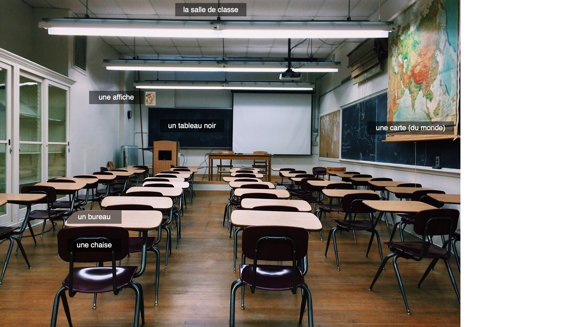
Yazz, one of our clients provided me with a list of classroom objects and digital classroom objects she needed images for to be translated into a PowerPoint and projected onto a green screen. We tried to get as many images in a single photo as possible. Commercial use attribution-free images were harder to find for the digital version so some only have 3 or less on a slide. I had about 4 days to make two different powerpoints.

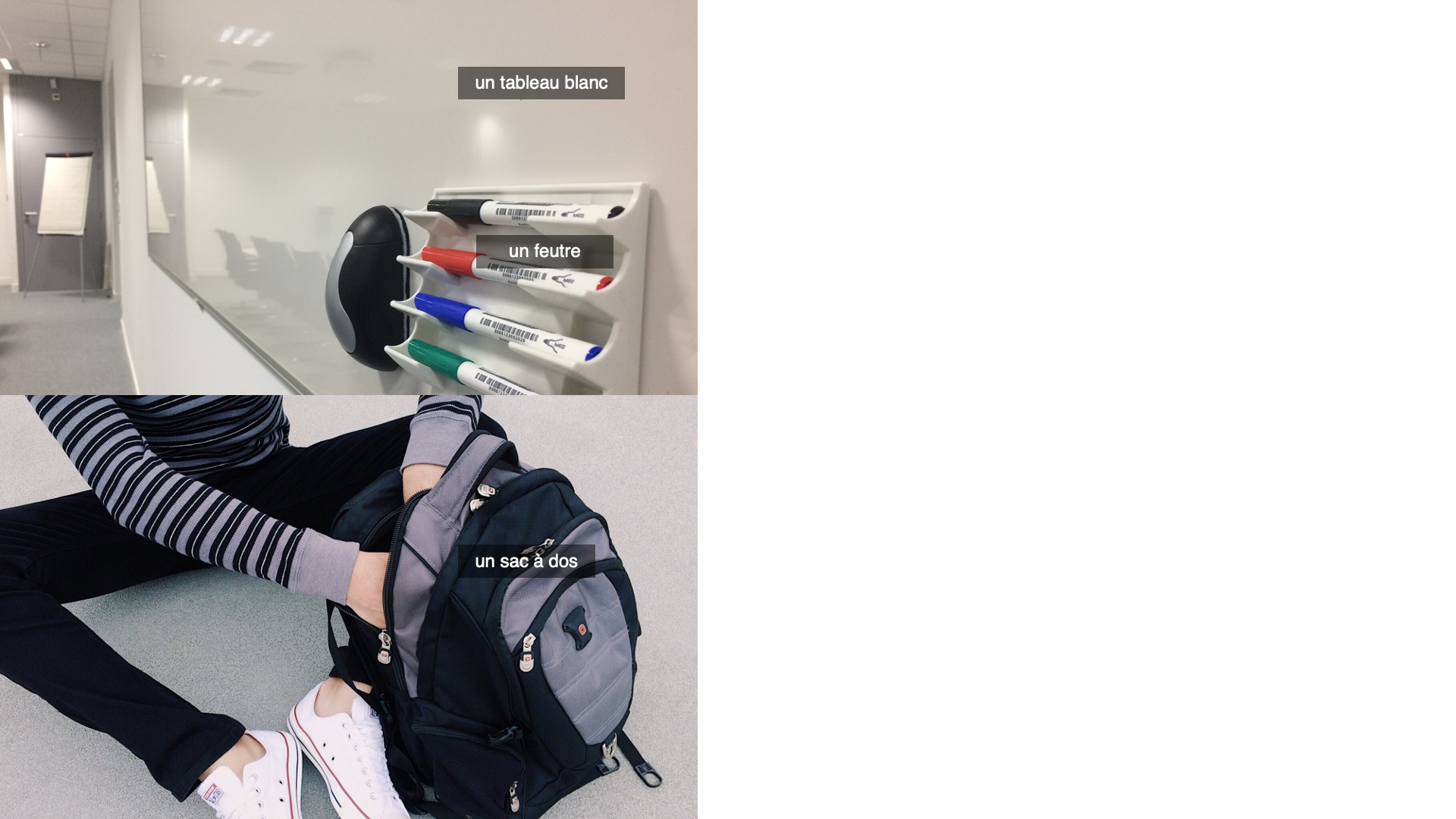
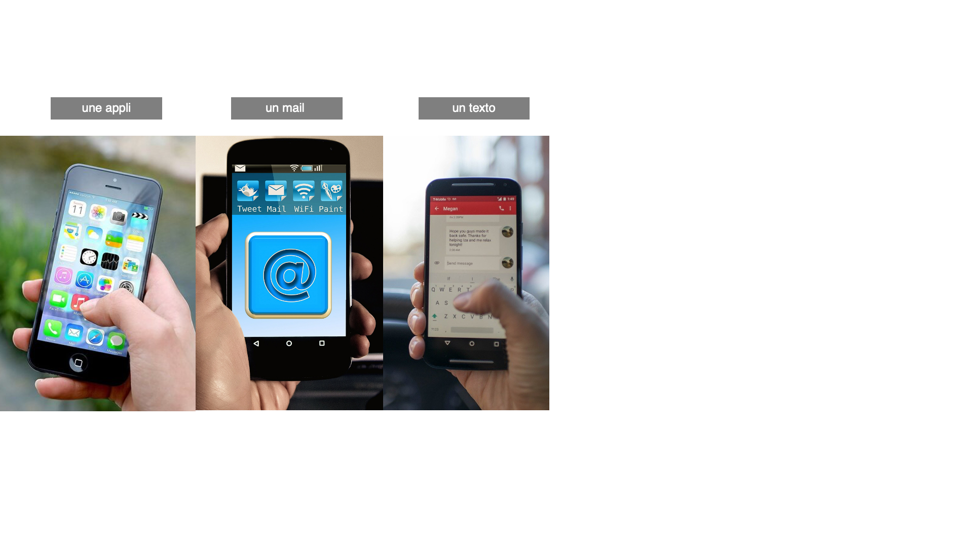
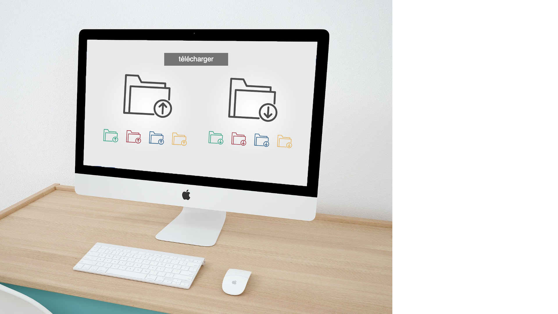
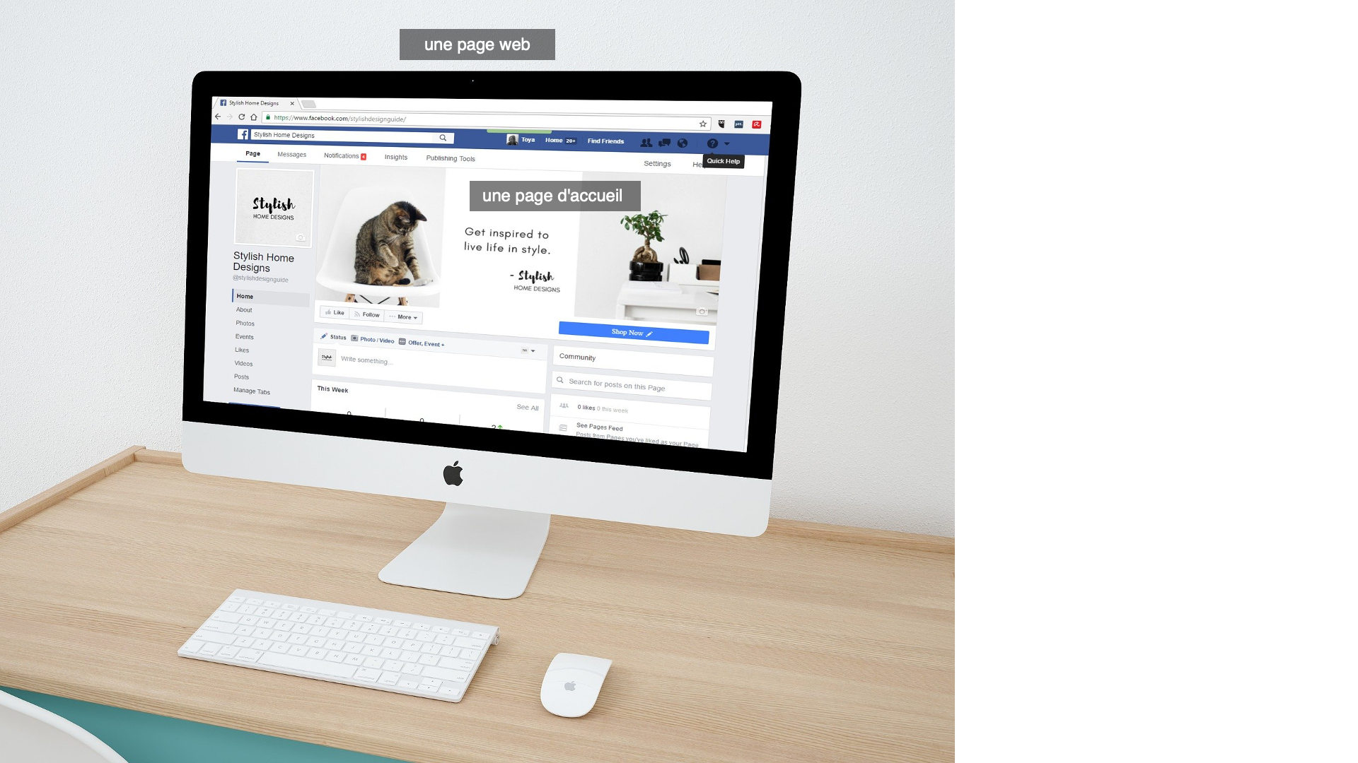
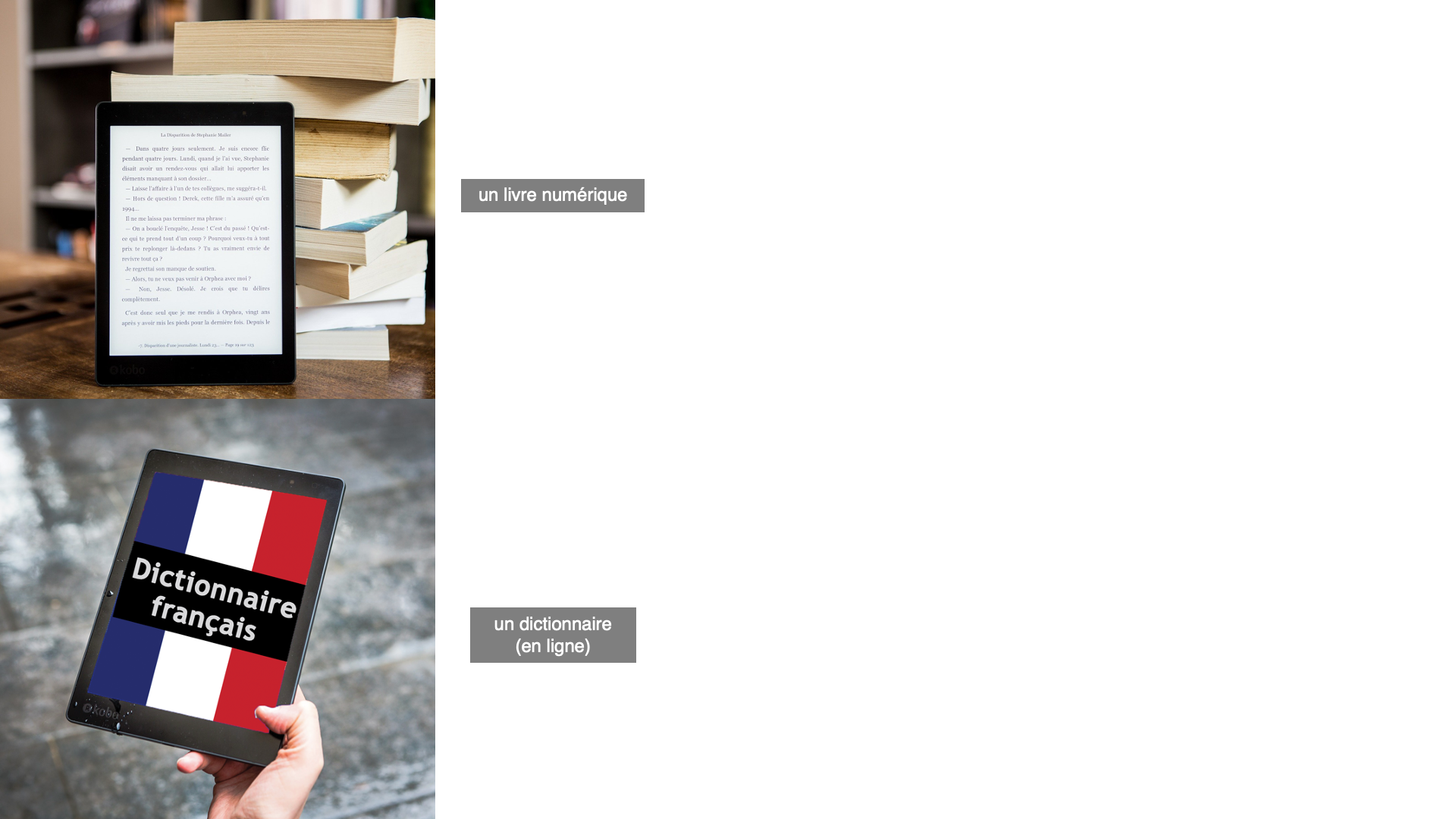

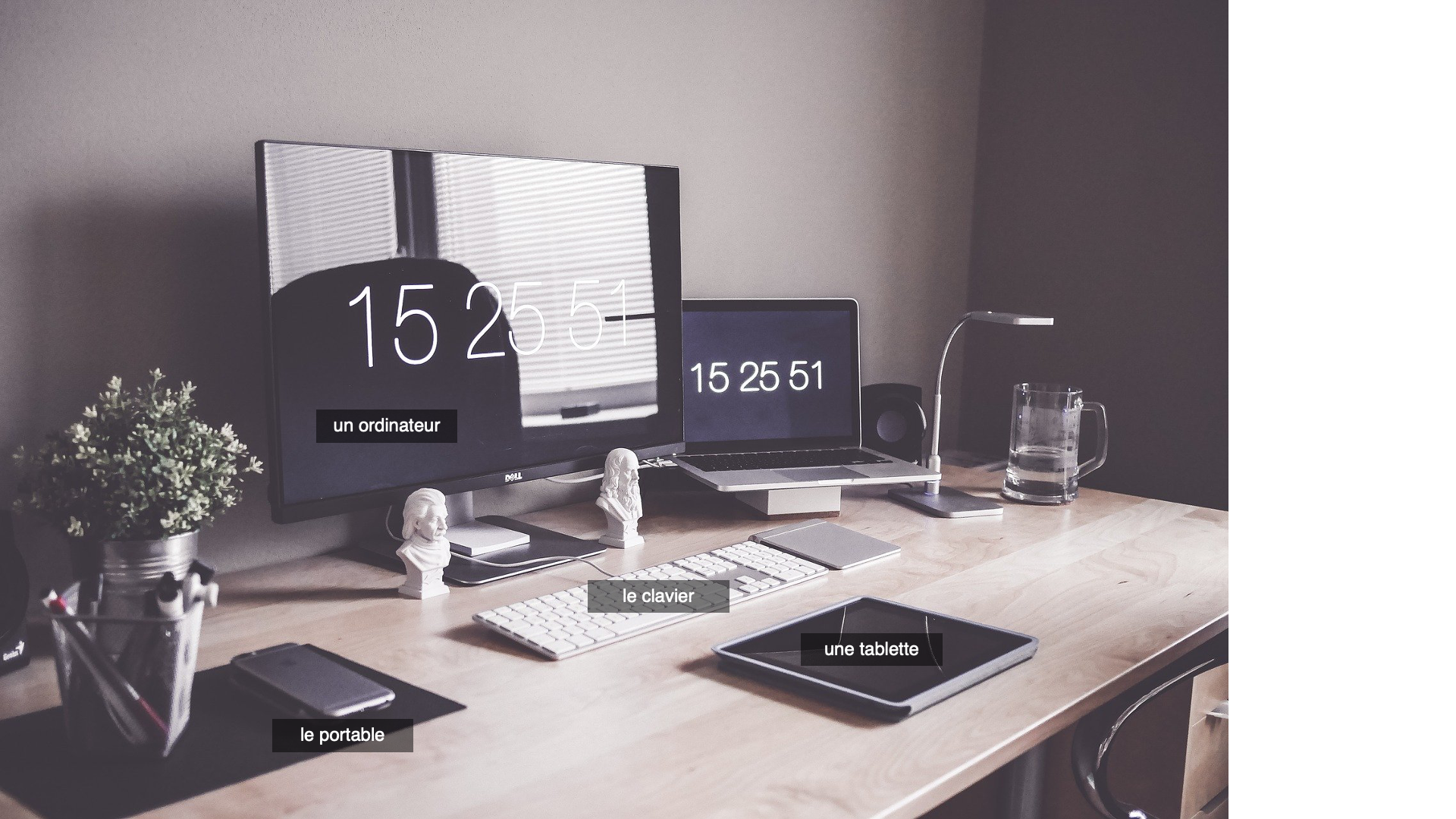
Another list was provided with the numbers 1-20. They wanted to use dice to represent this and luckily Valerie had a 20 sided die? dice? and took photos for me to place inside the PowerPoint. Yazz came back with a request to fill in the numbers to be black so I added in that. I also added a throwing the dice animation for each slide so they are more interactive.
https://utexas.box.com/s/0iquk47fjowthqv5bjn9k7rsbxplzqev
1. drafted a kb for updating the new tbh site explorer
TBH-SITE-EXPOLRER-HTML-UPDATING-STEPS-2022 – Google Docs
2. then I drafted an email to Dr. Black
3. finished research for hosting solutions for Mello Scholar – finding hosting solutions was much easier than finding affordable wordpress plugins that had the necessary features. plugins were much more expensive than hosting
4. drafted email to Madison, client from Mello Scholar