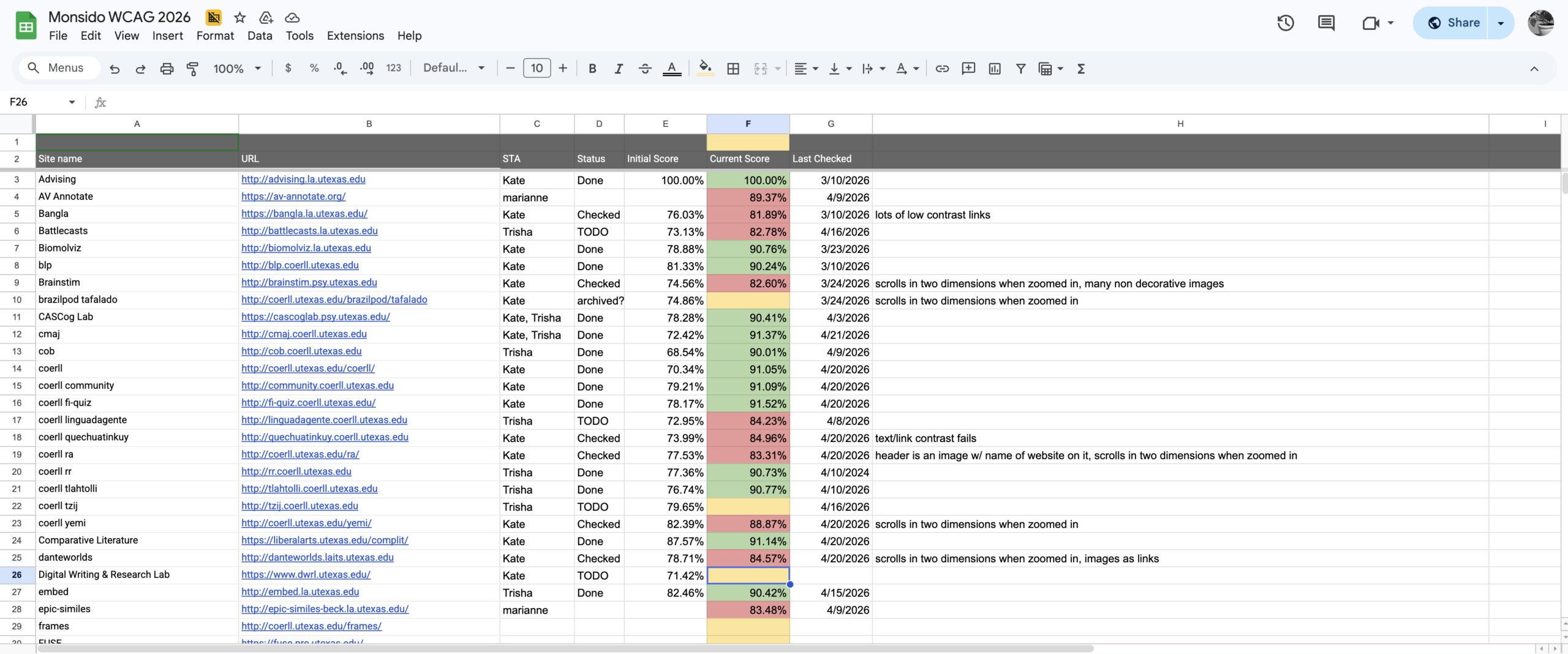
WCAG
Task: Make sure all utexas websites are Web Content Accessibility Guidelines (WCAG) compliant
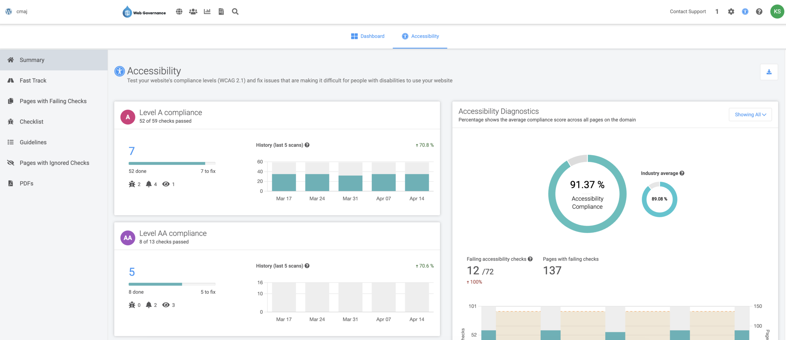
Status: In Progress
1. Run an Accessibility Scan
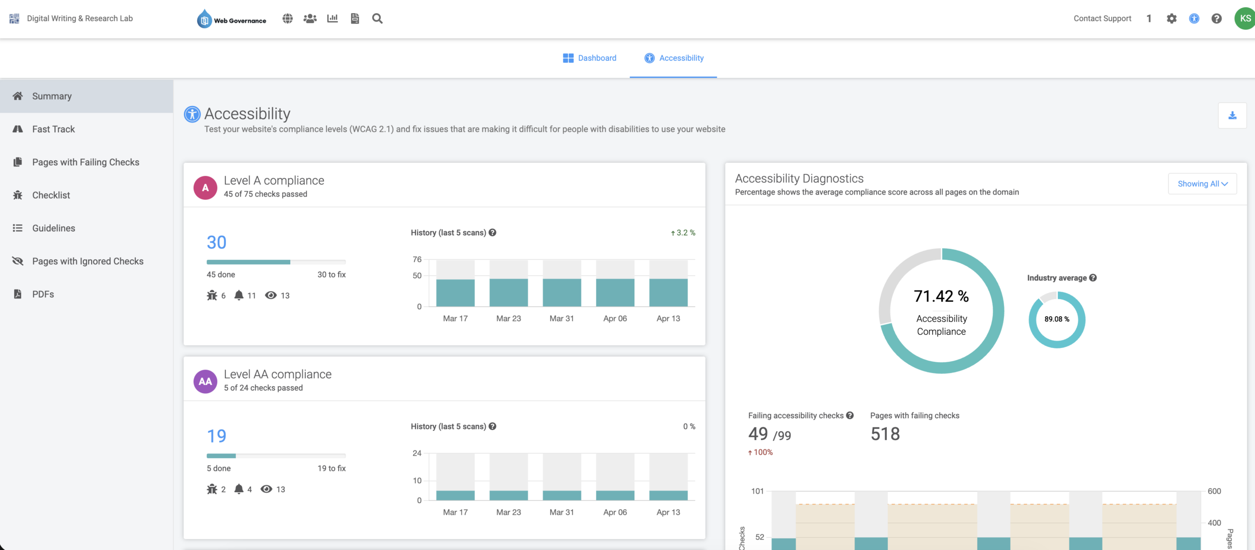
2. Review Issues
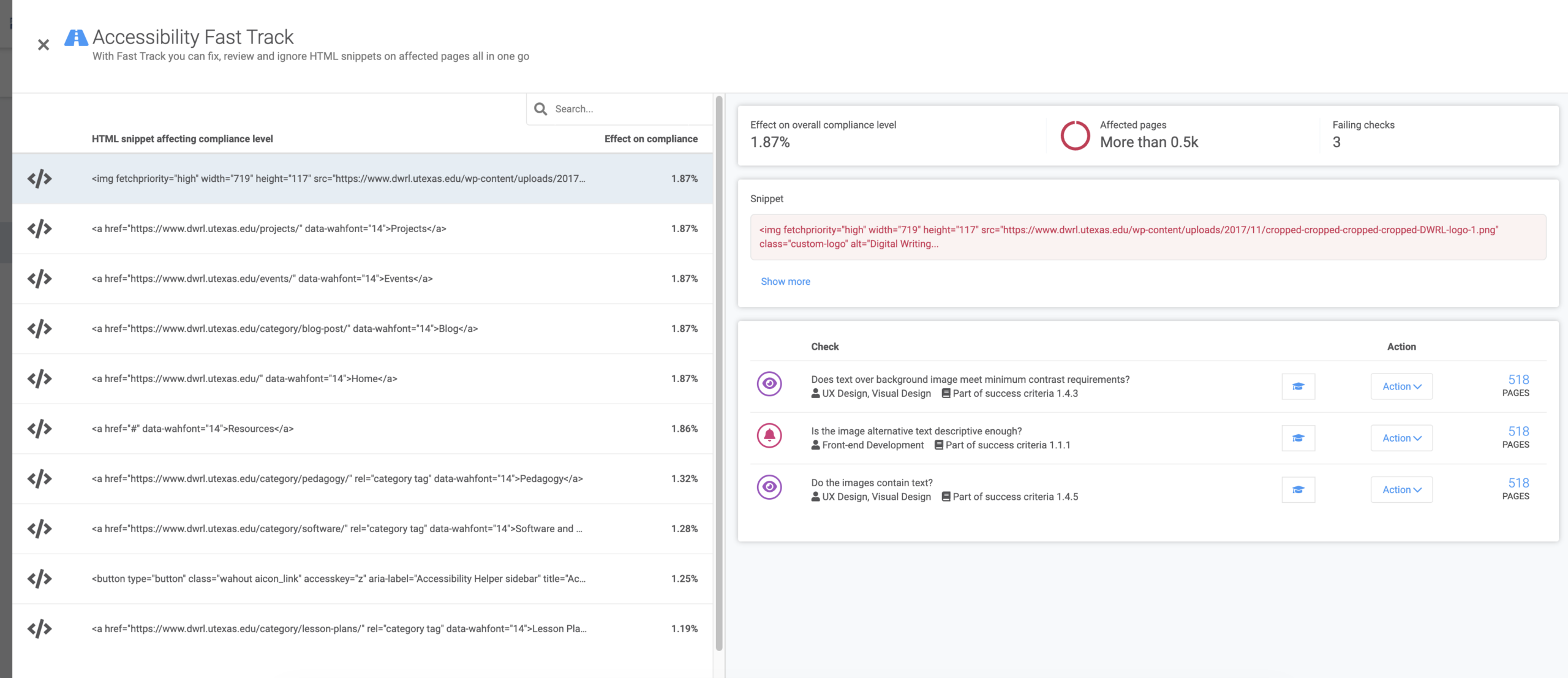
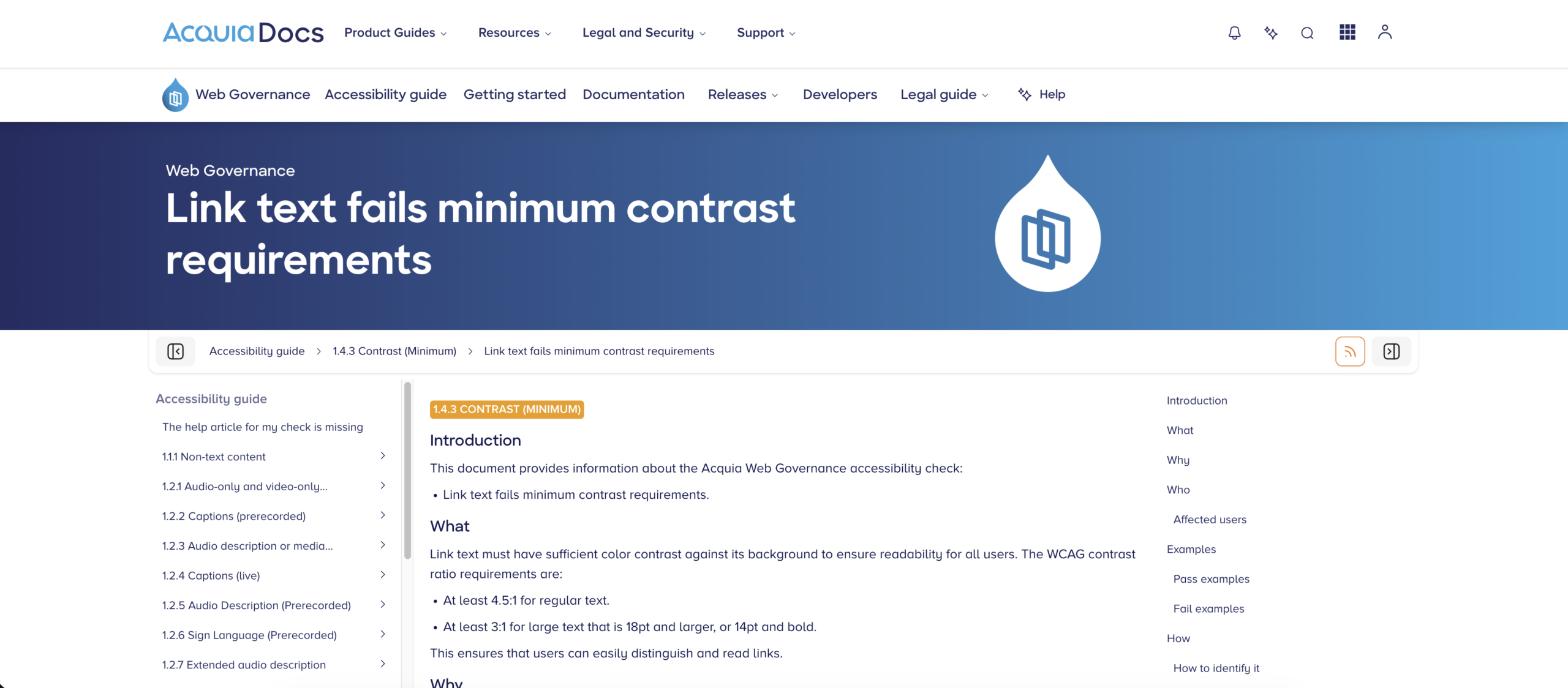
3. Understand Issues
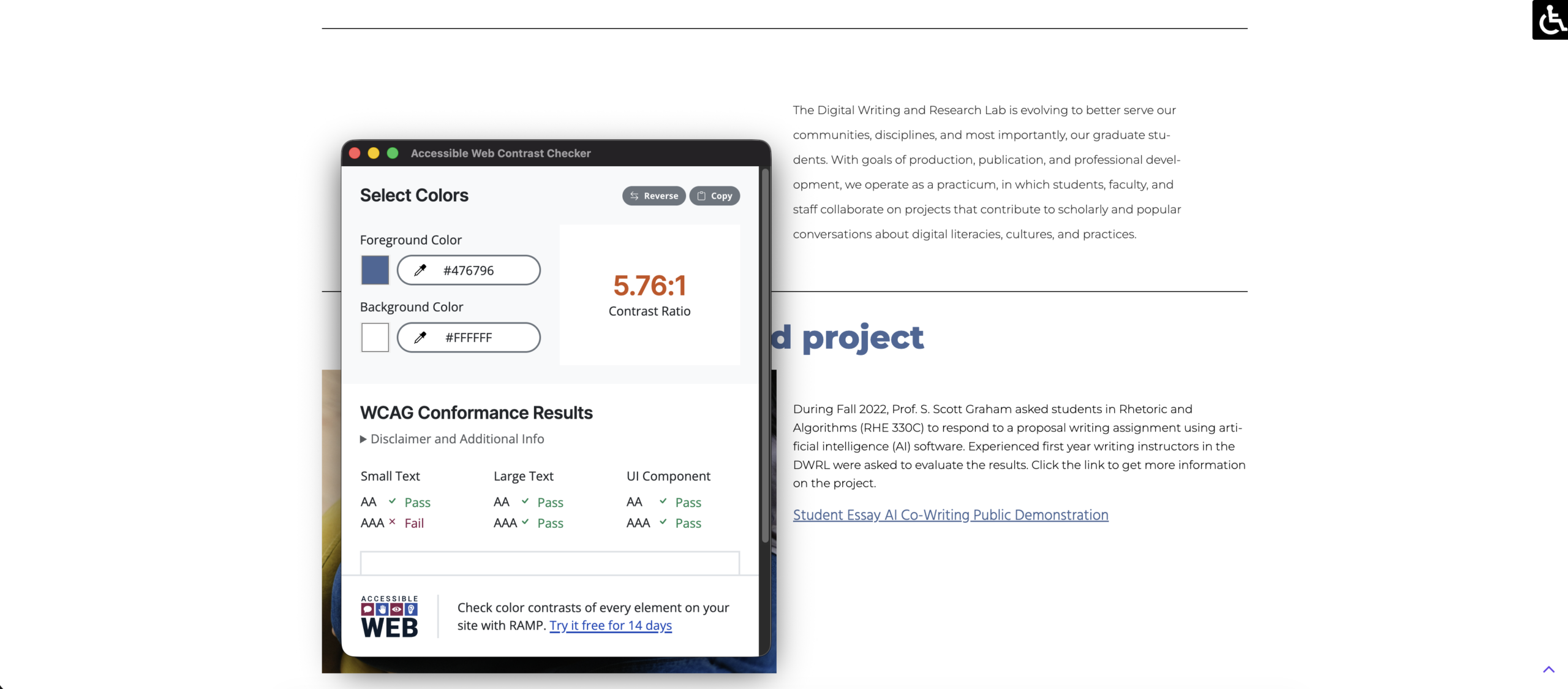
4. Find False Positives
5. Get Compliance to 90%+
6. Update Spreadsheet