🍓 Week 8 🍓
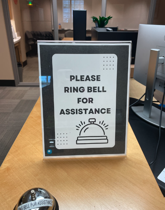
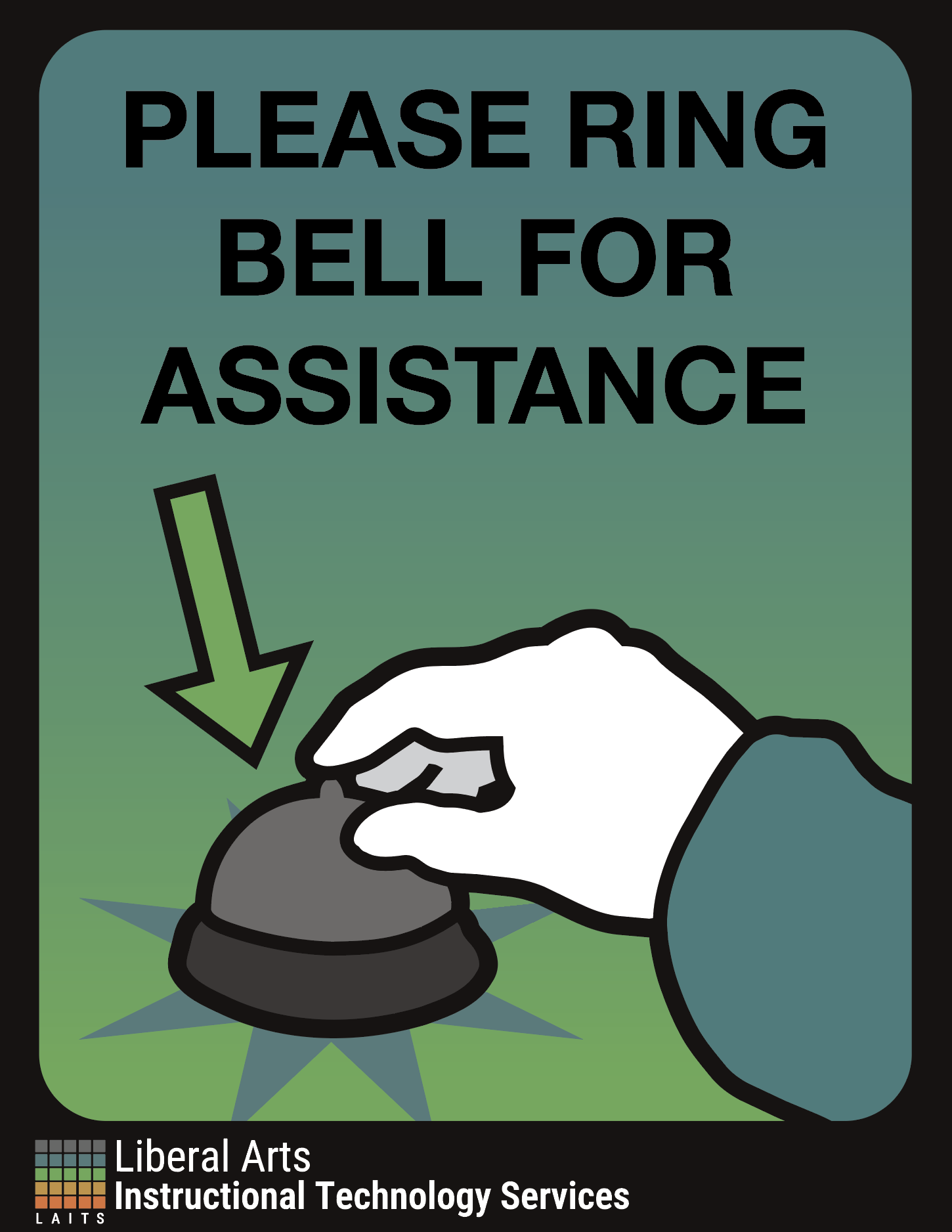
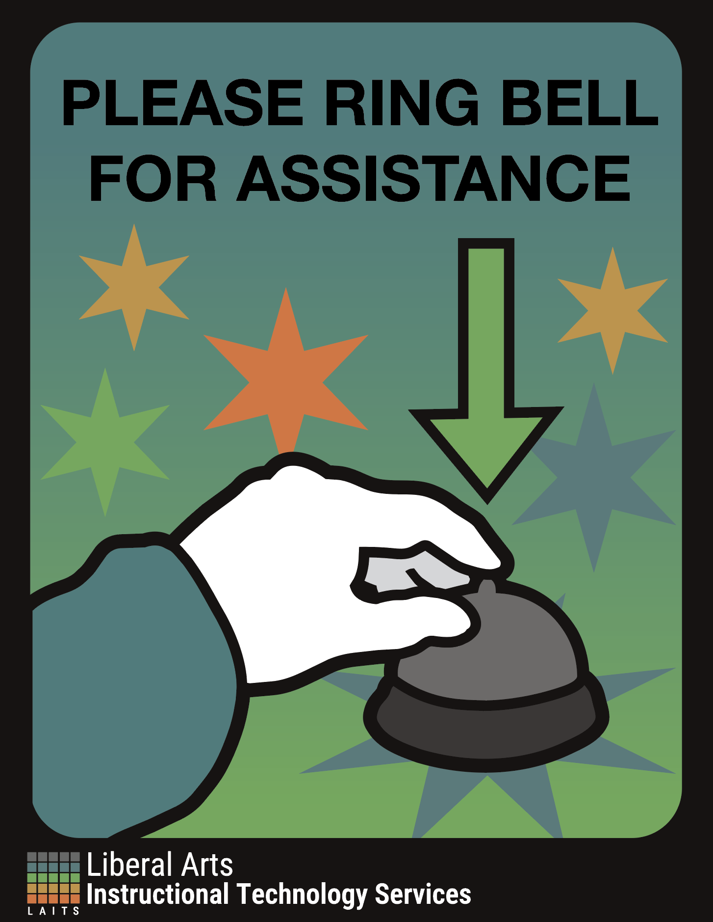
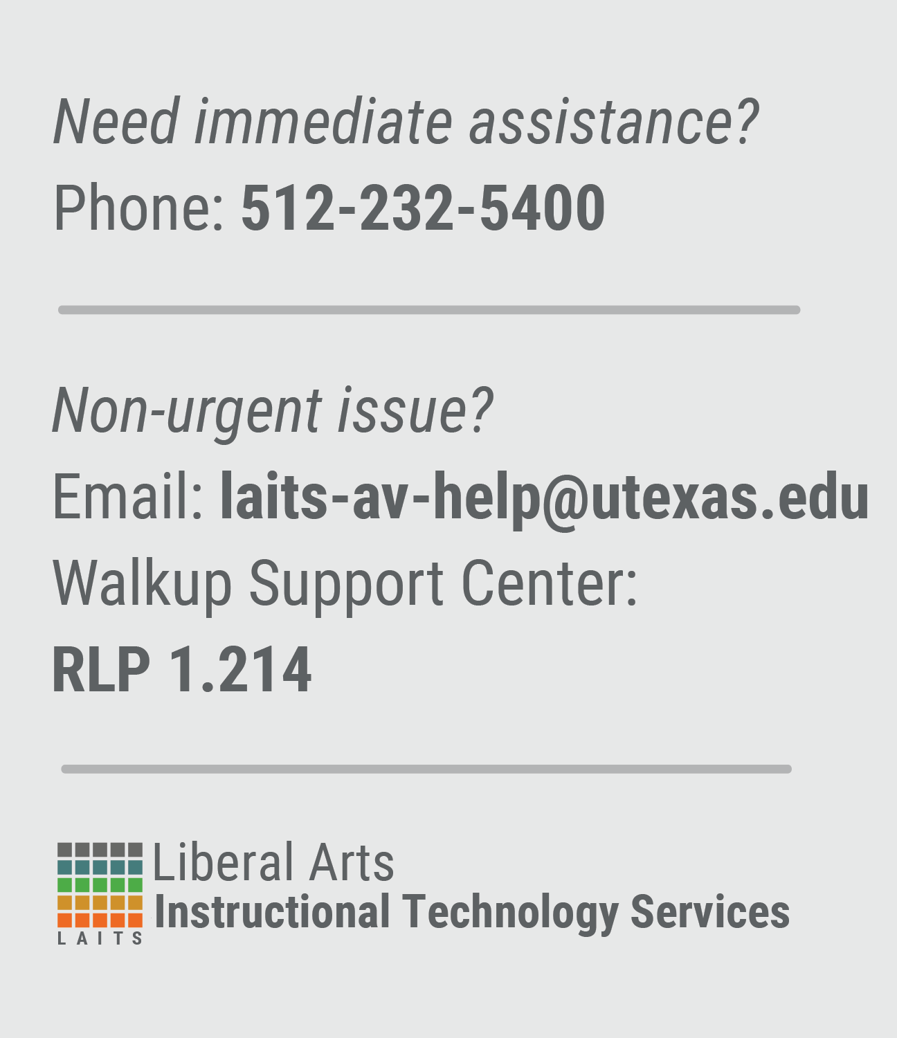
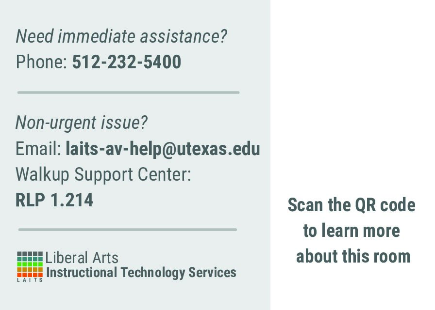
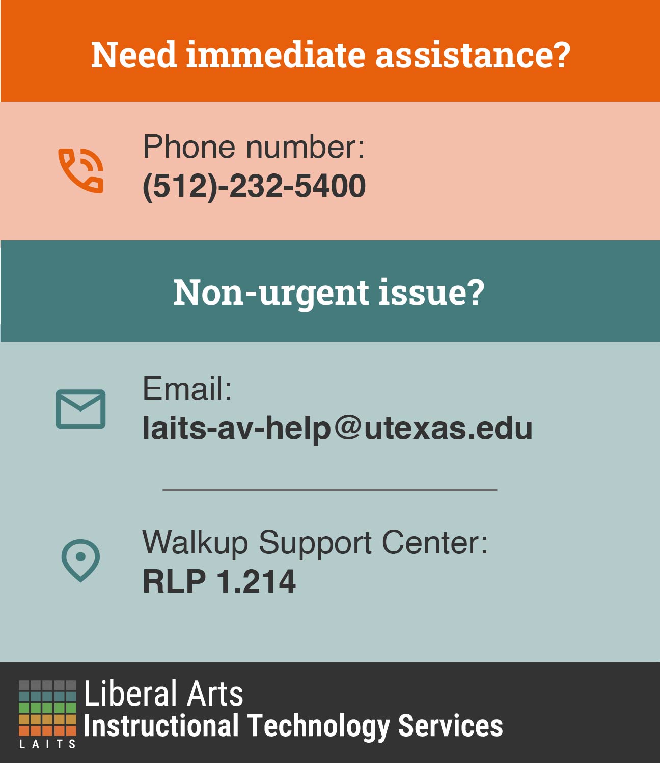
✧⋆ Ring Bell for Assistance Flyer ⋆✧
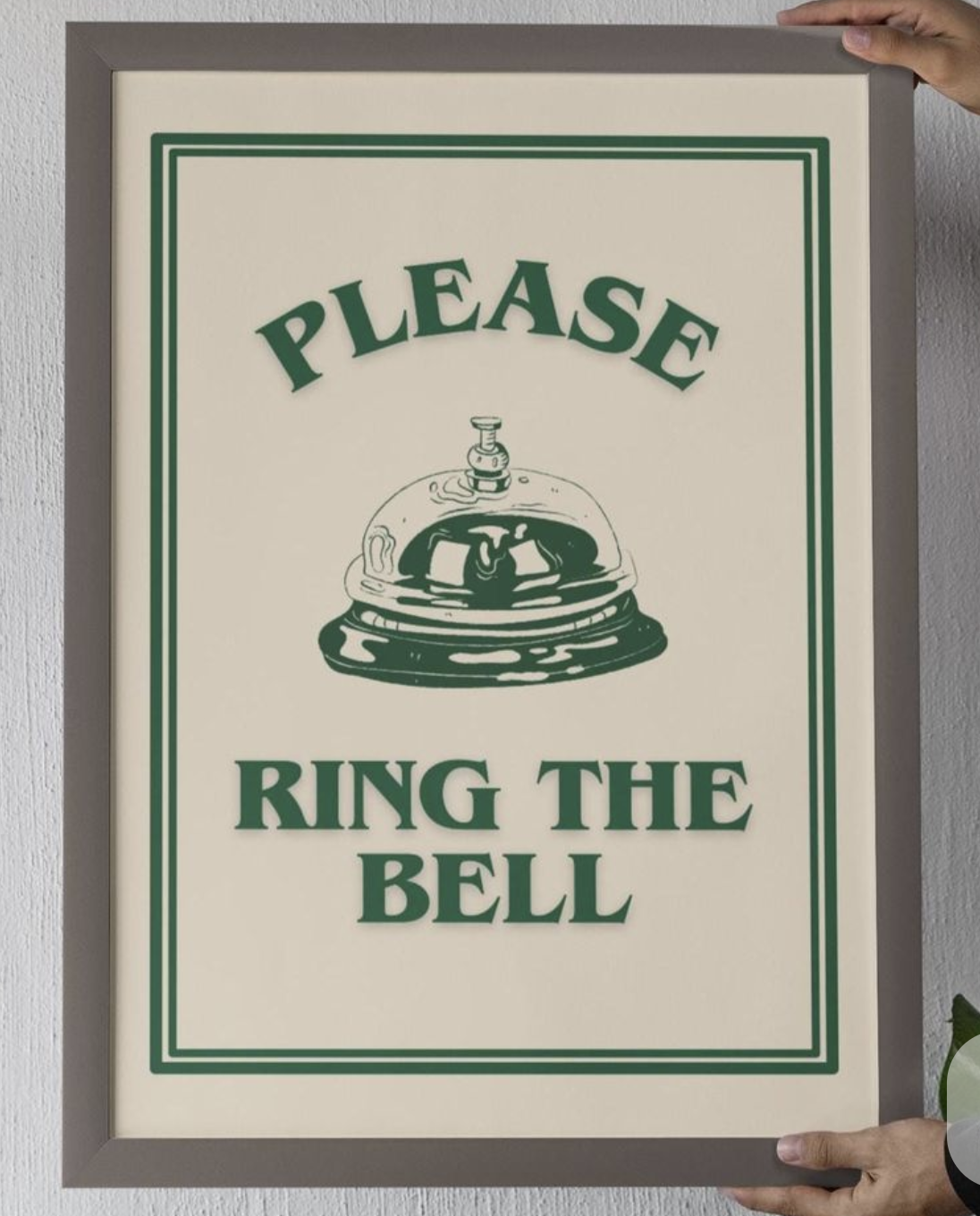
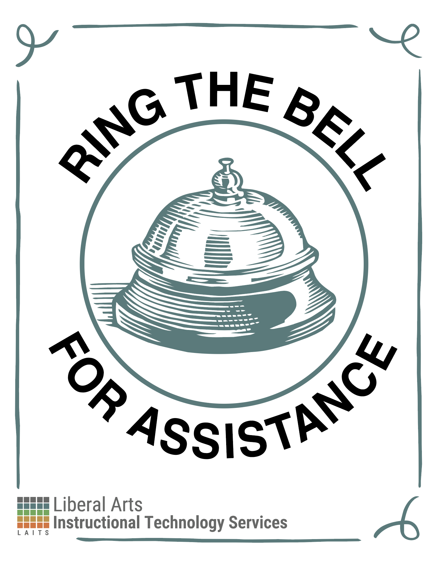
My previous version of this was a little too busy, so I got the following feedback:
- Maybe too much illustration
- Needs more professionalism
- Shift to a more minimalist design
- Tone down color palette to 2 colors or 3 colors
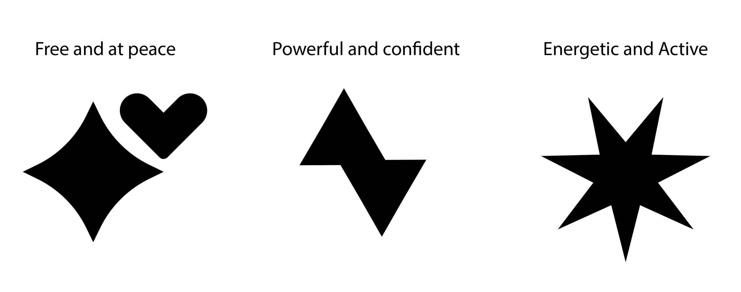
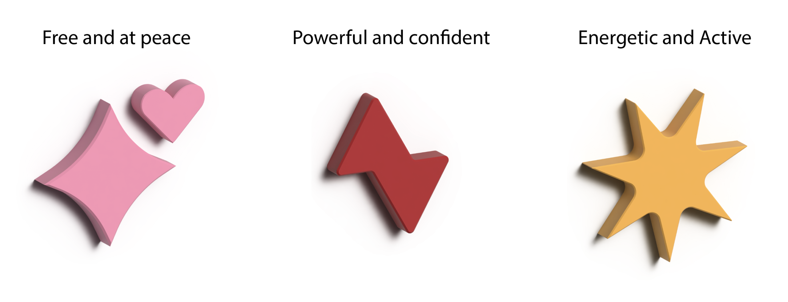
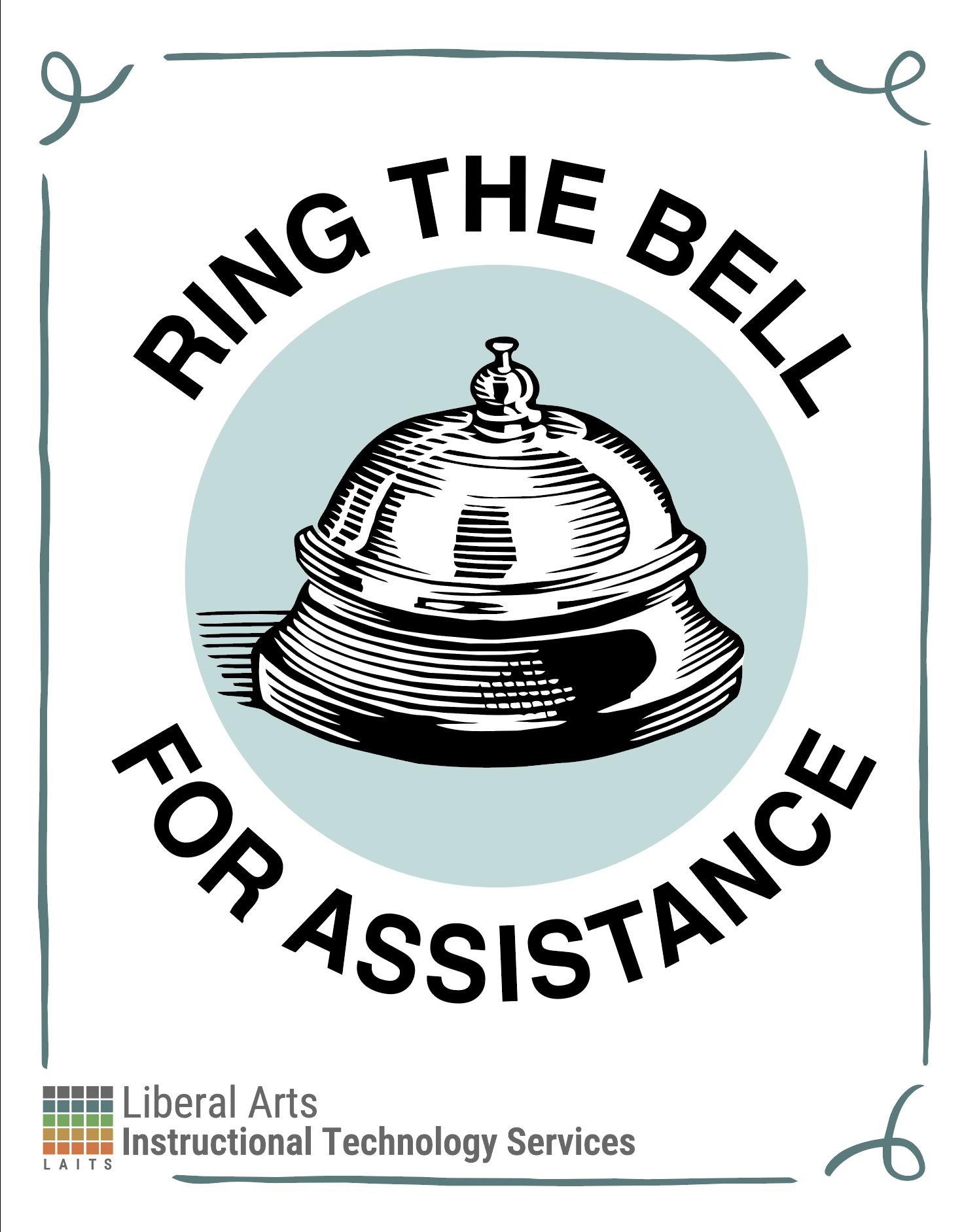
I was given this poster as an inspo (left), so I set off in this new direction (right):
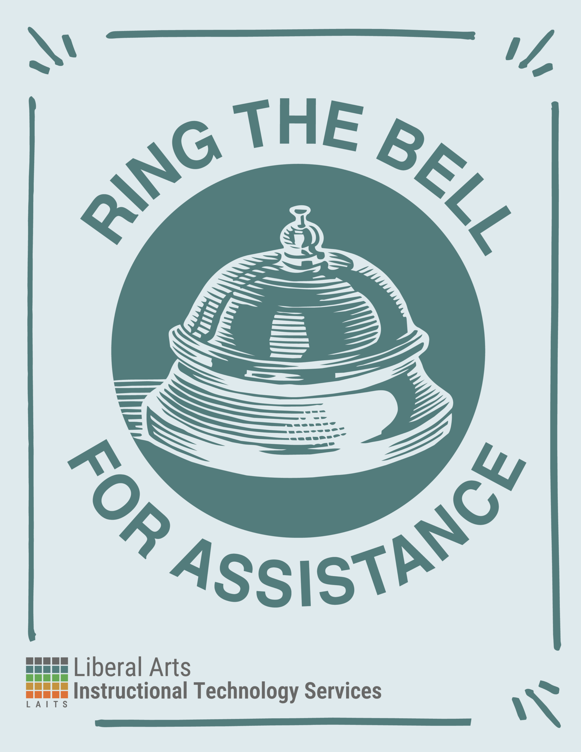
I have also been working on another poster which I will get into, and I needed to make these seem like they were part of the same brand, so I did these two variations:
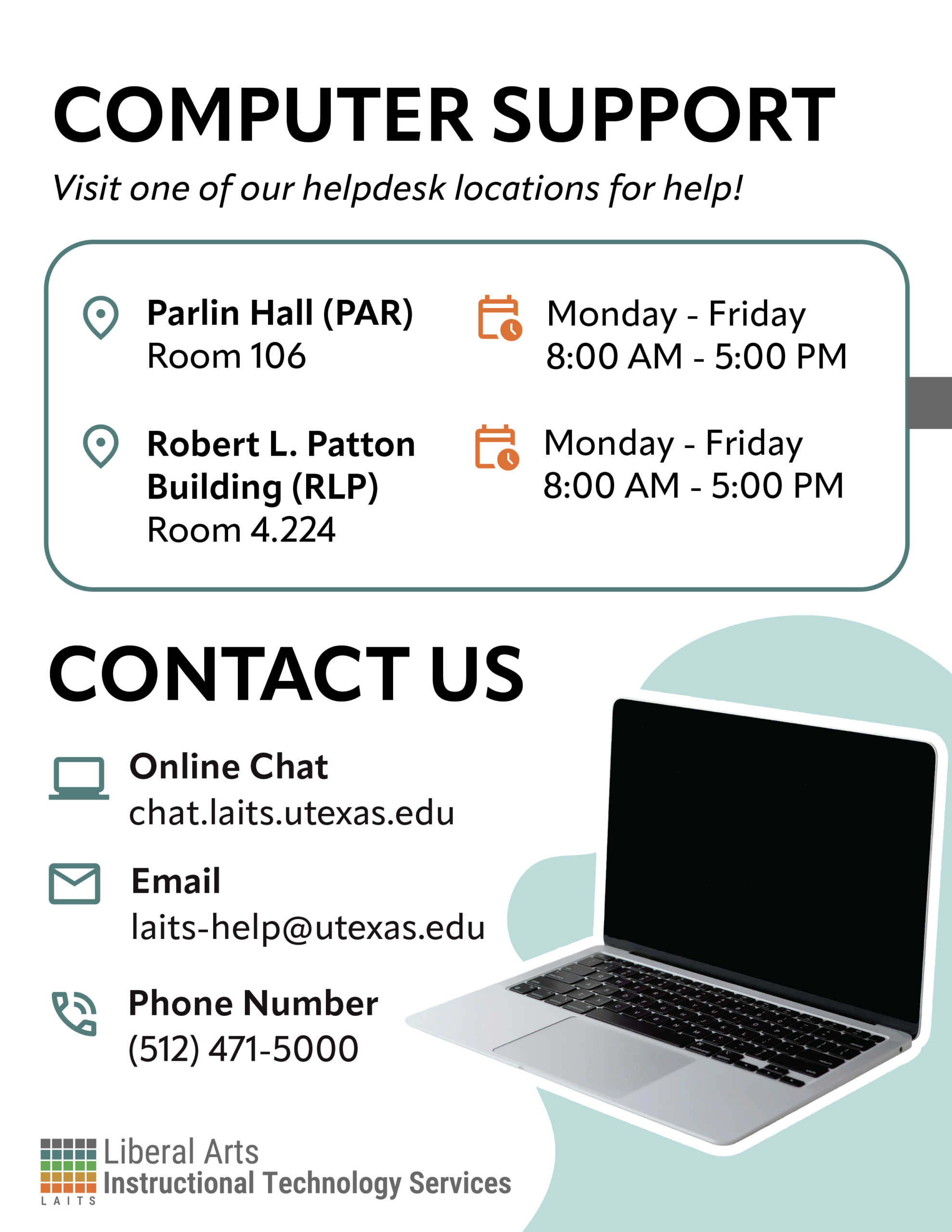
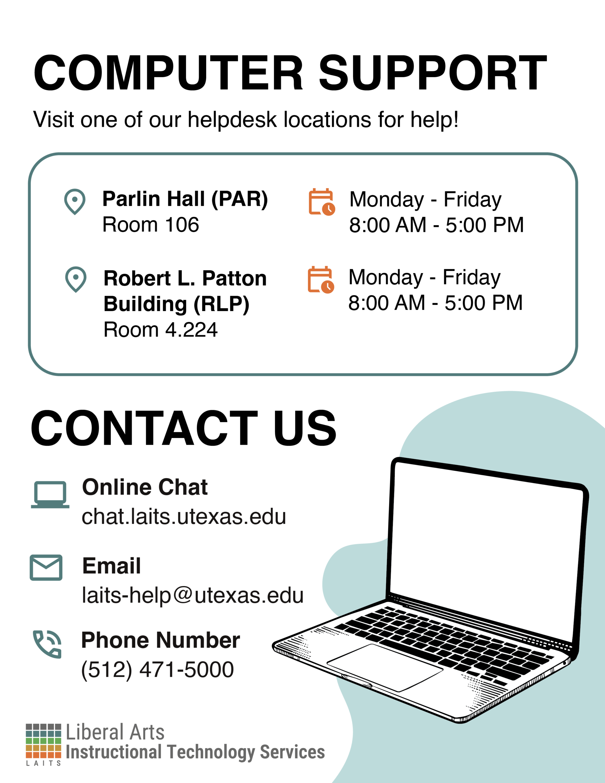
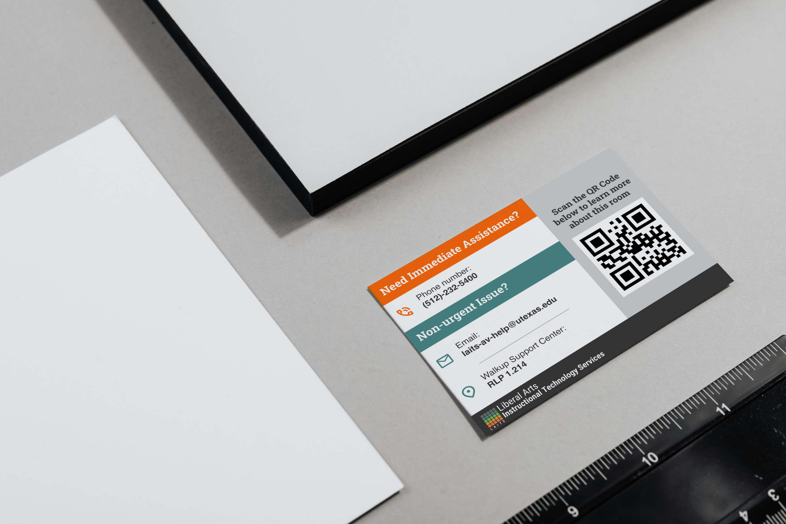
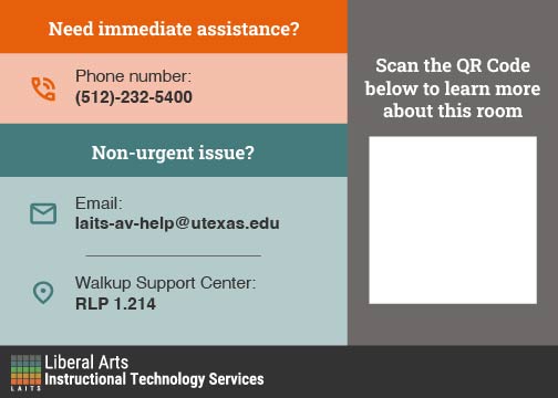
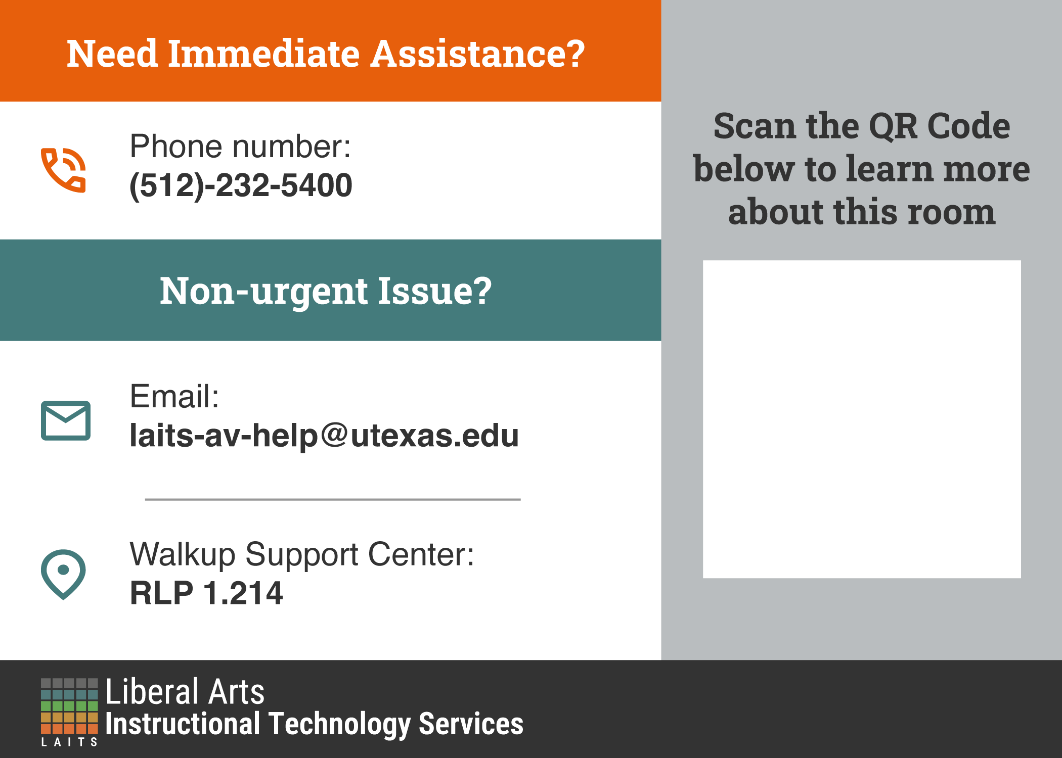
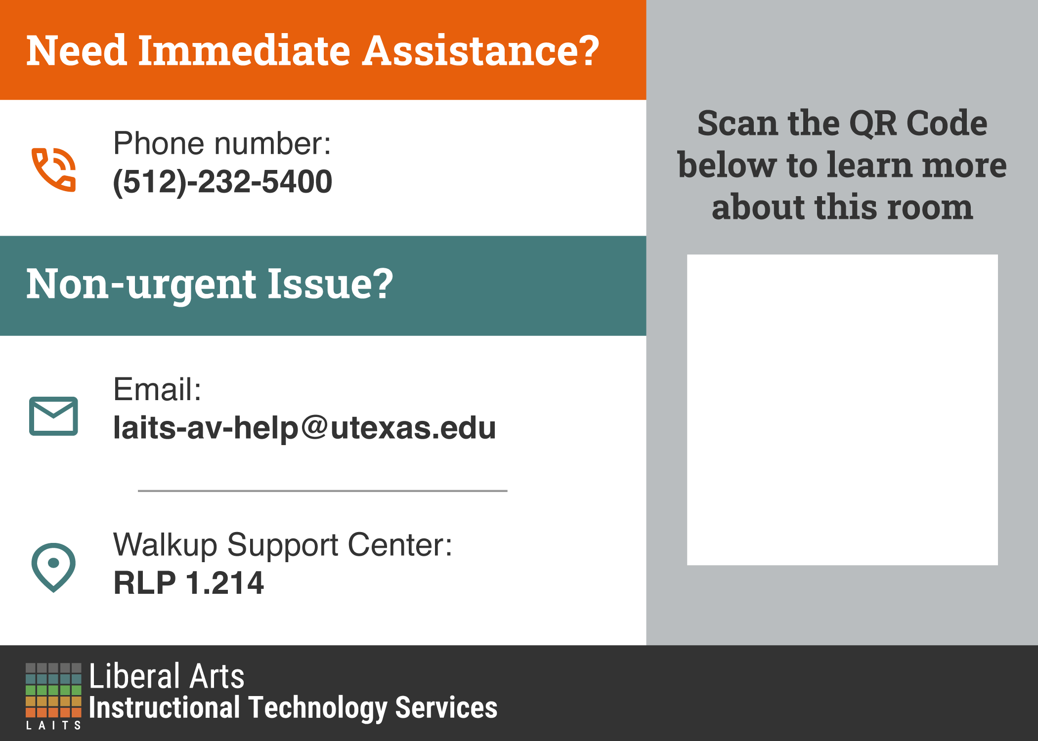
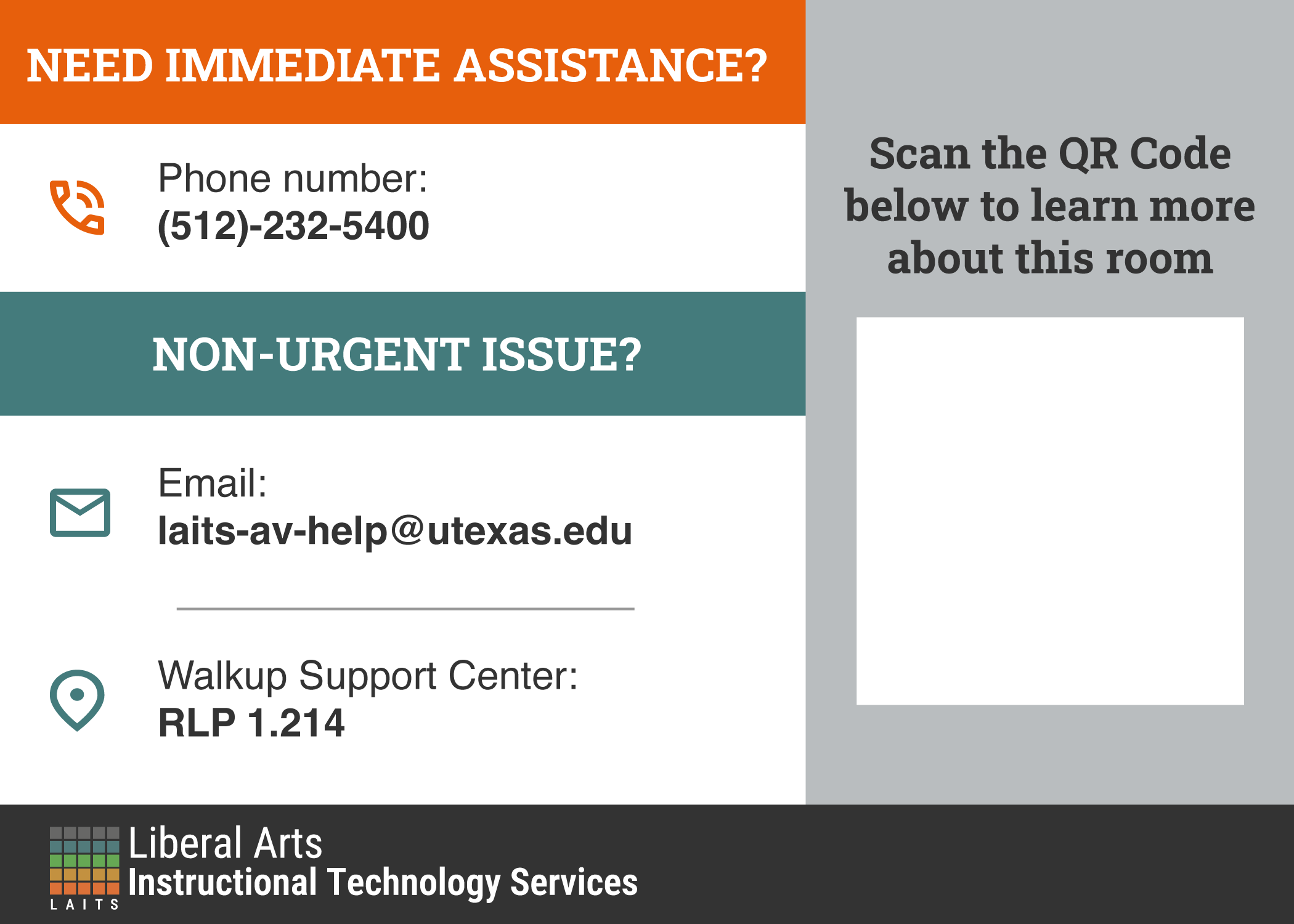
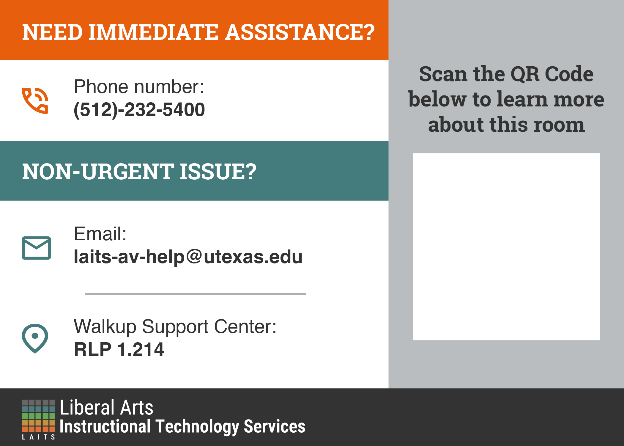
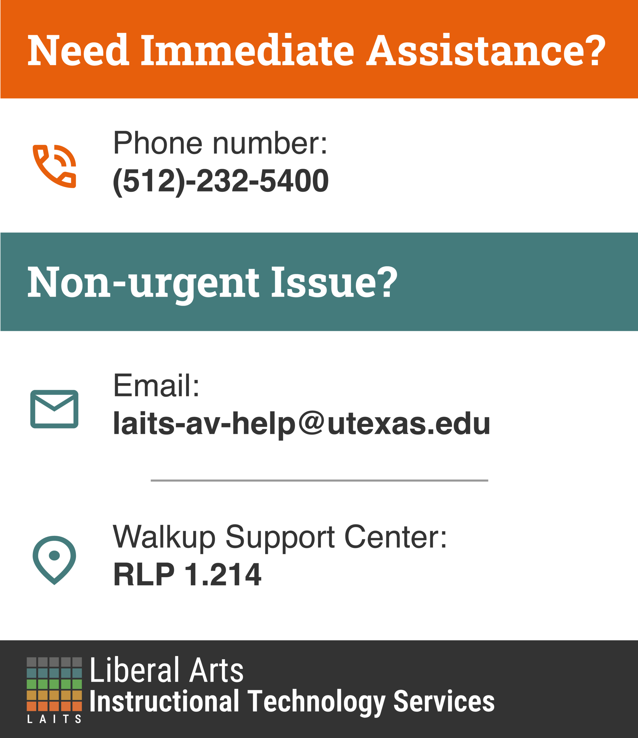
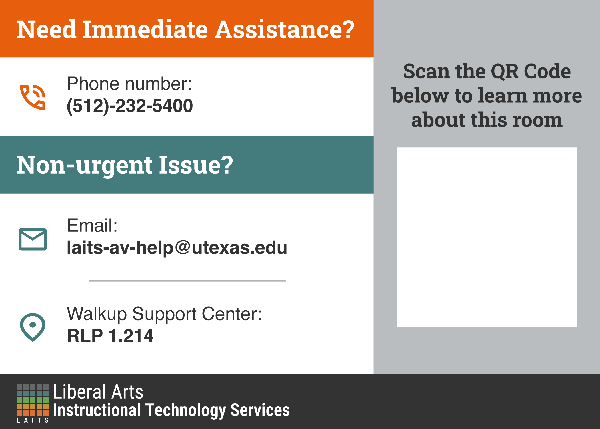
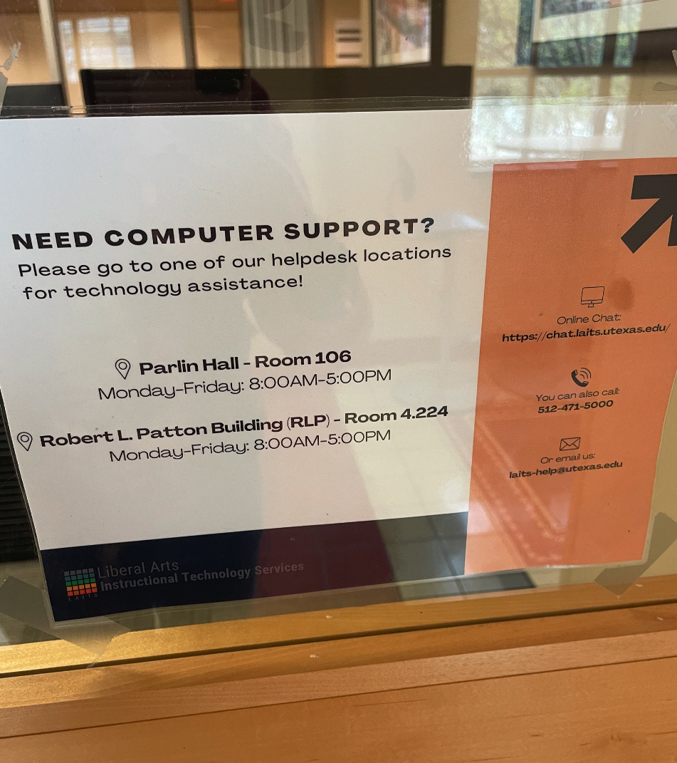
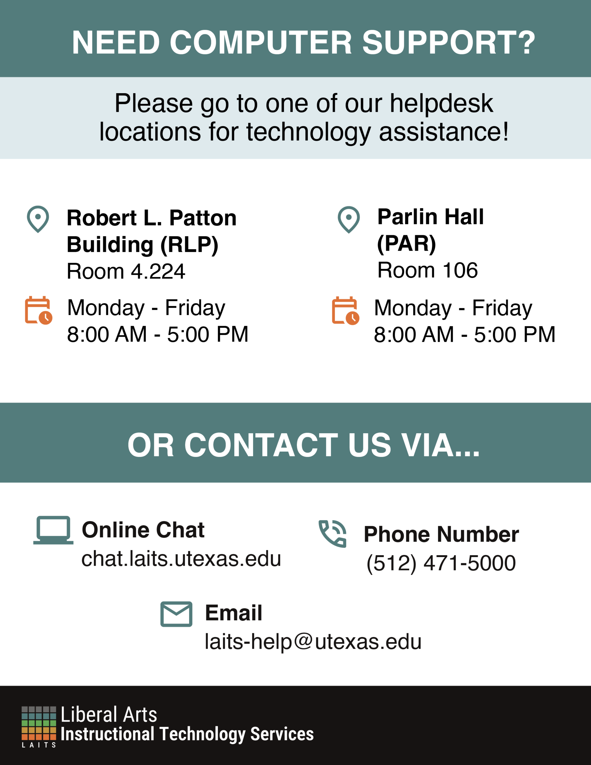
✧⋆ Admin Office Computer Support Flyer ⋆✧
I was tasked with revamping this poster, making sure it's:
- Easily digestible
- A representation of the LAITS brand
- Clear in it's visual hierarchy
- Keeps all information present in the flyer

Original flyer:
To start with, I kept the horizontal format:
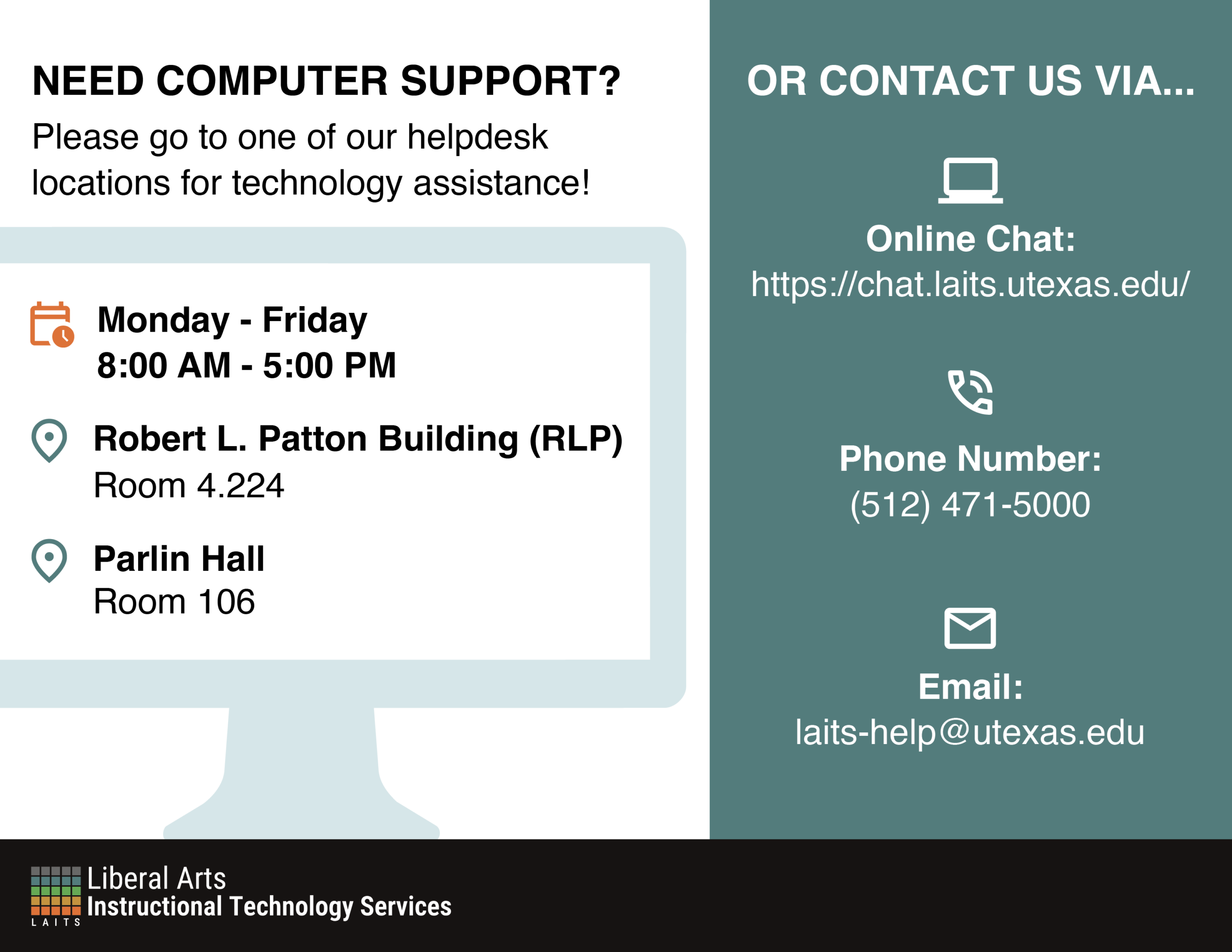
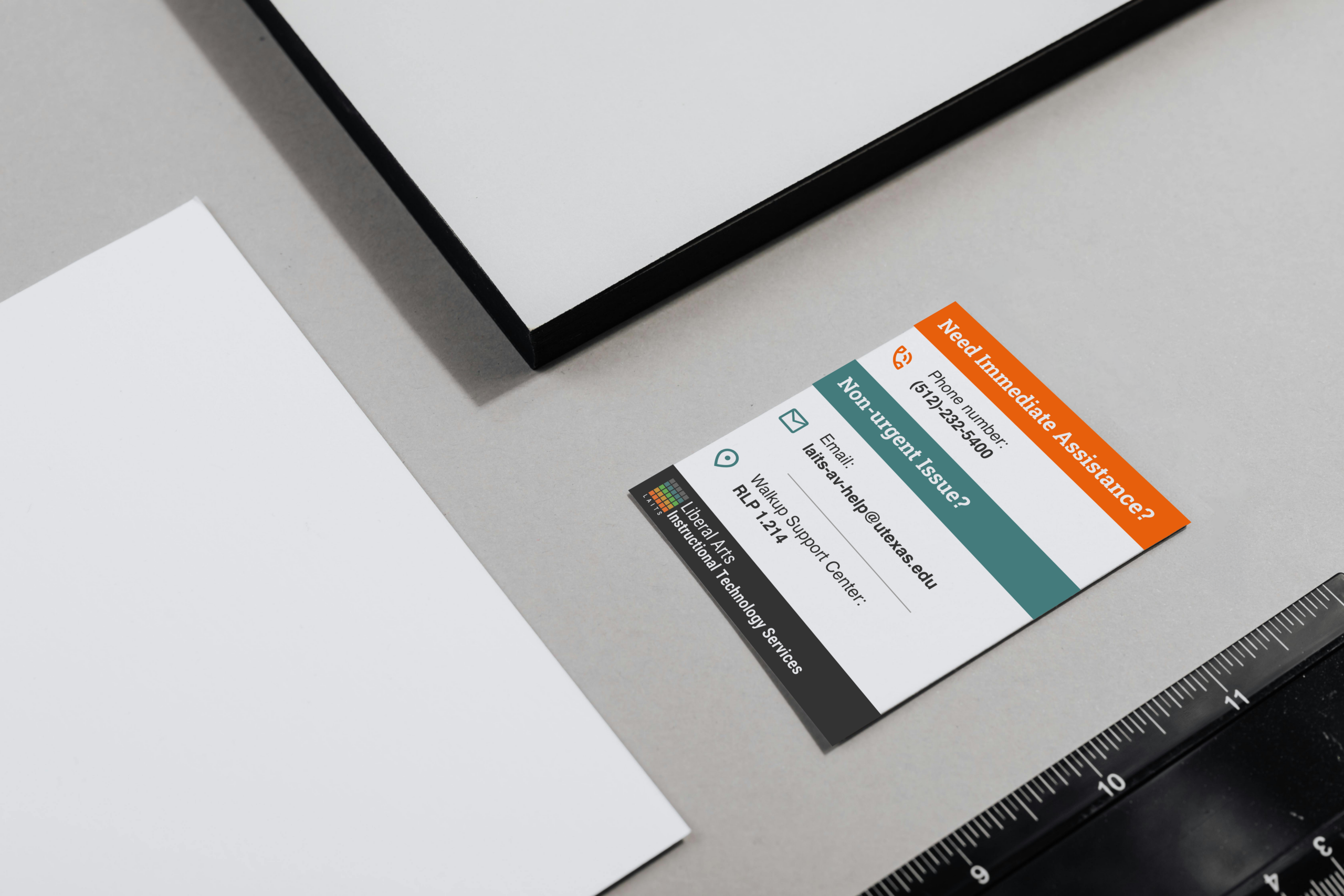
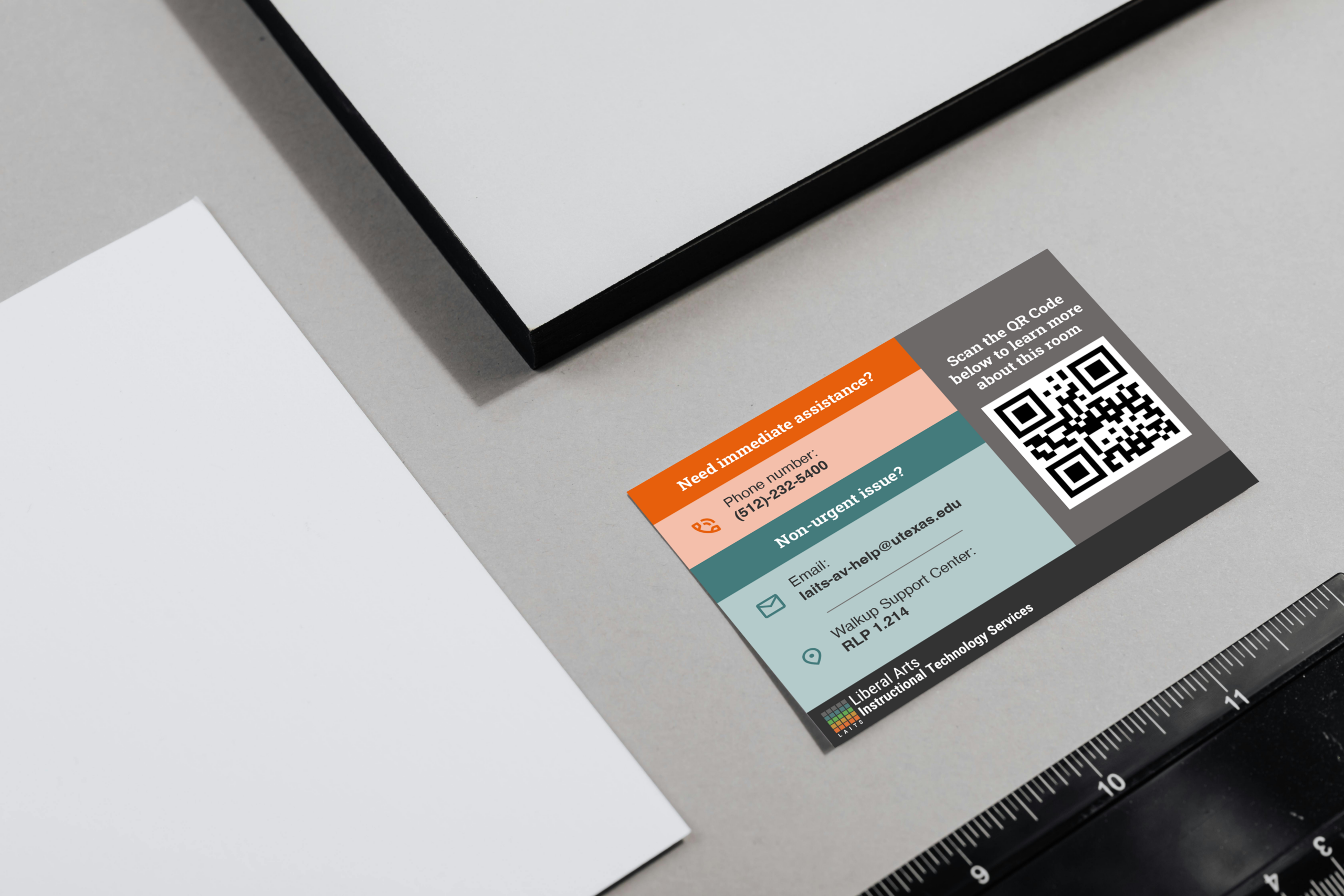
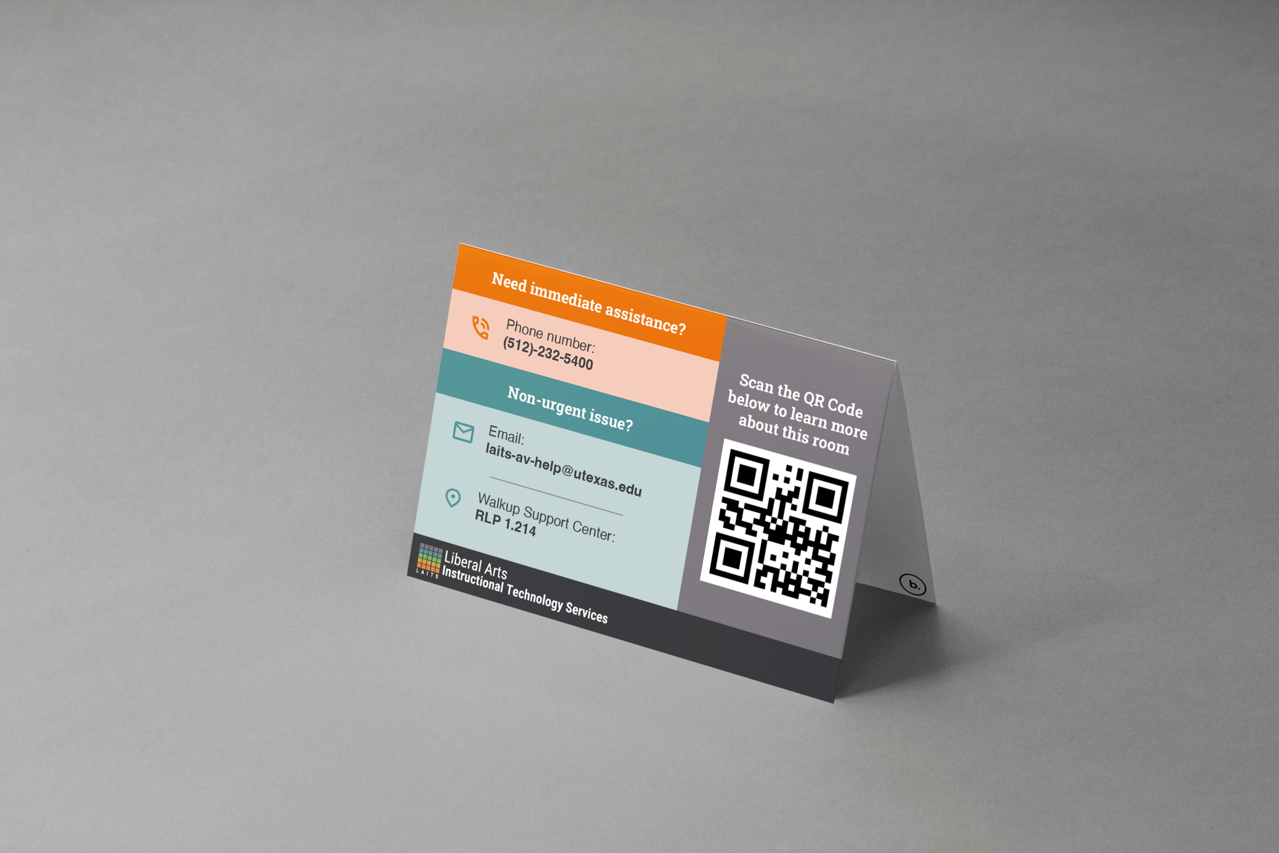
I then got feedback to make it vertical and fous more on the visual hierarchy. So I got to these versions:
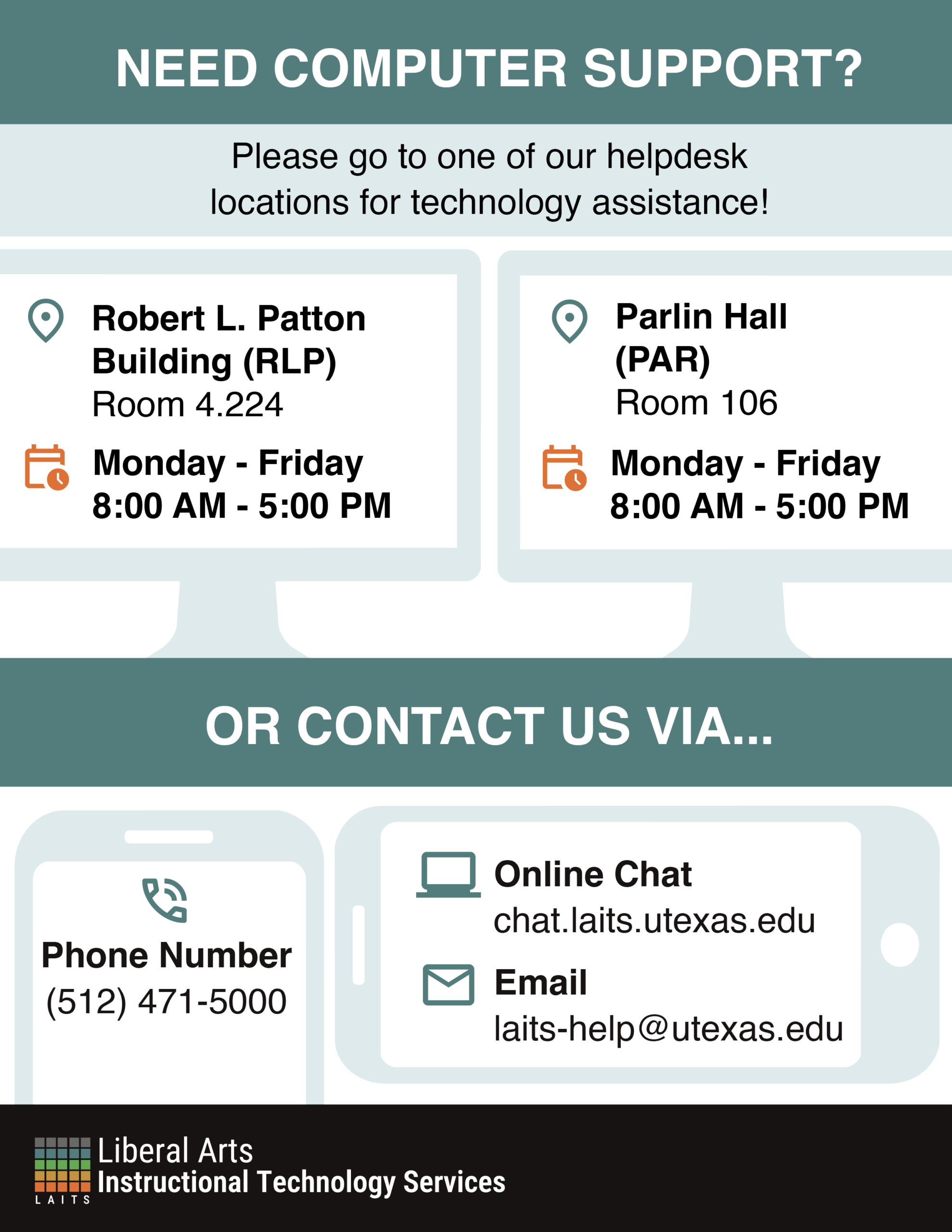
I then came up with more versions, trying to better match the previous poster rather than treating them as separate. One of them is an image whereas the other I drew the laptop in the same sort of style the bell flyer had: