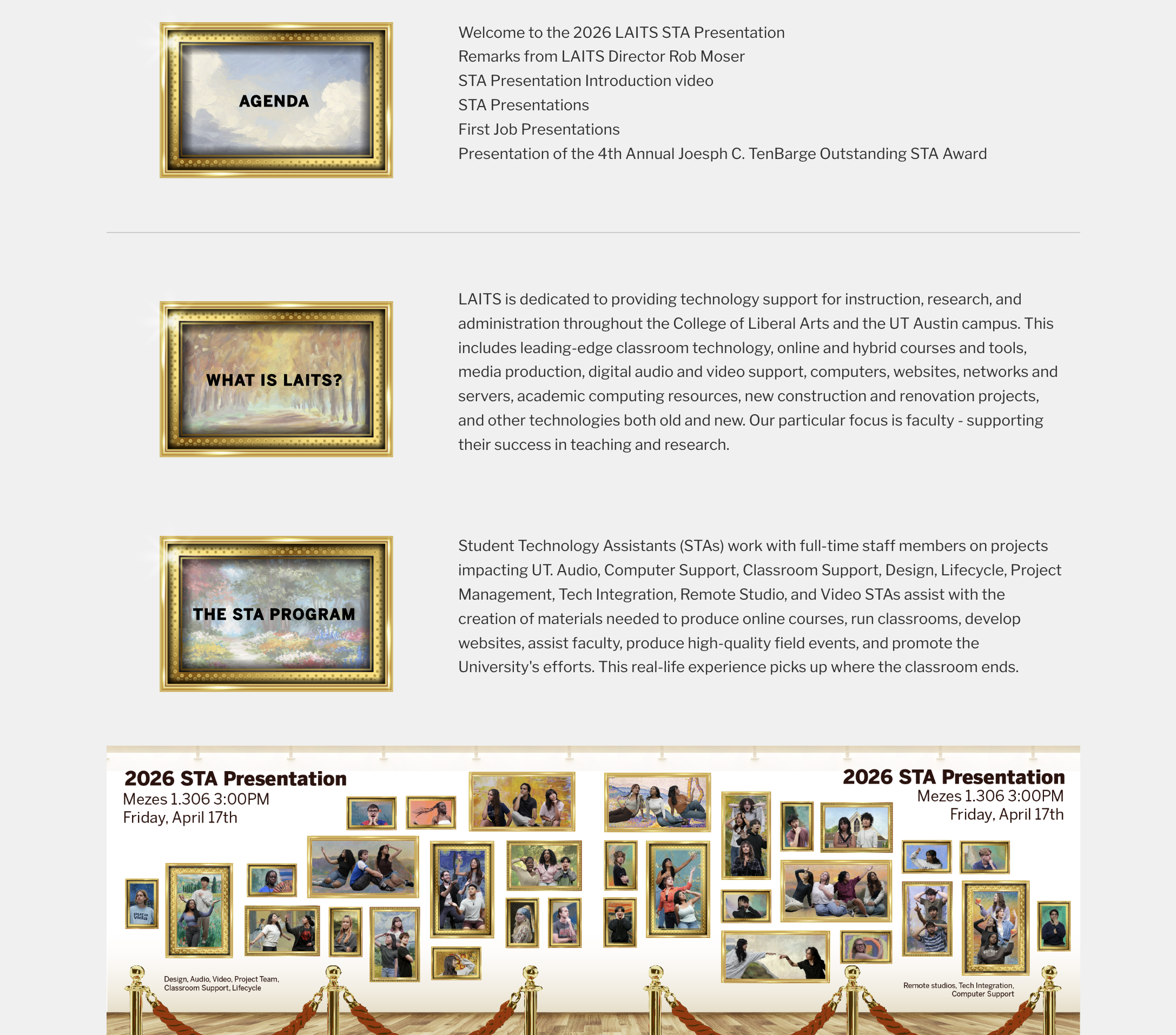
Swedish Studies Promotional Sticker
────────────────────⊹ ࣪ ˖♡˖ ࣪ ⊹ ────────────────────
.
.
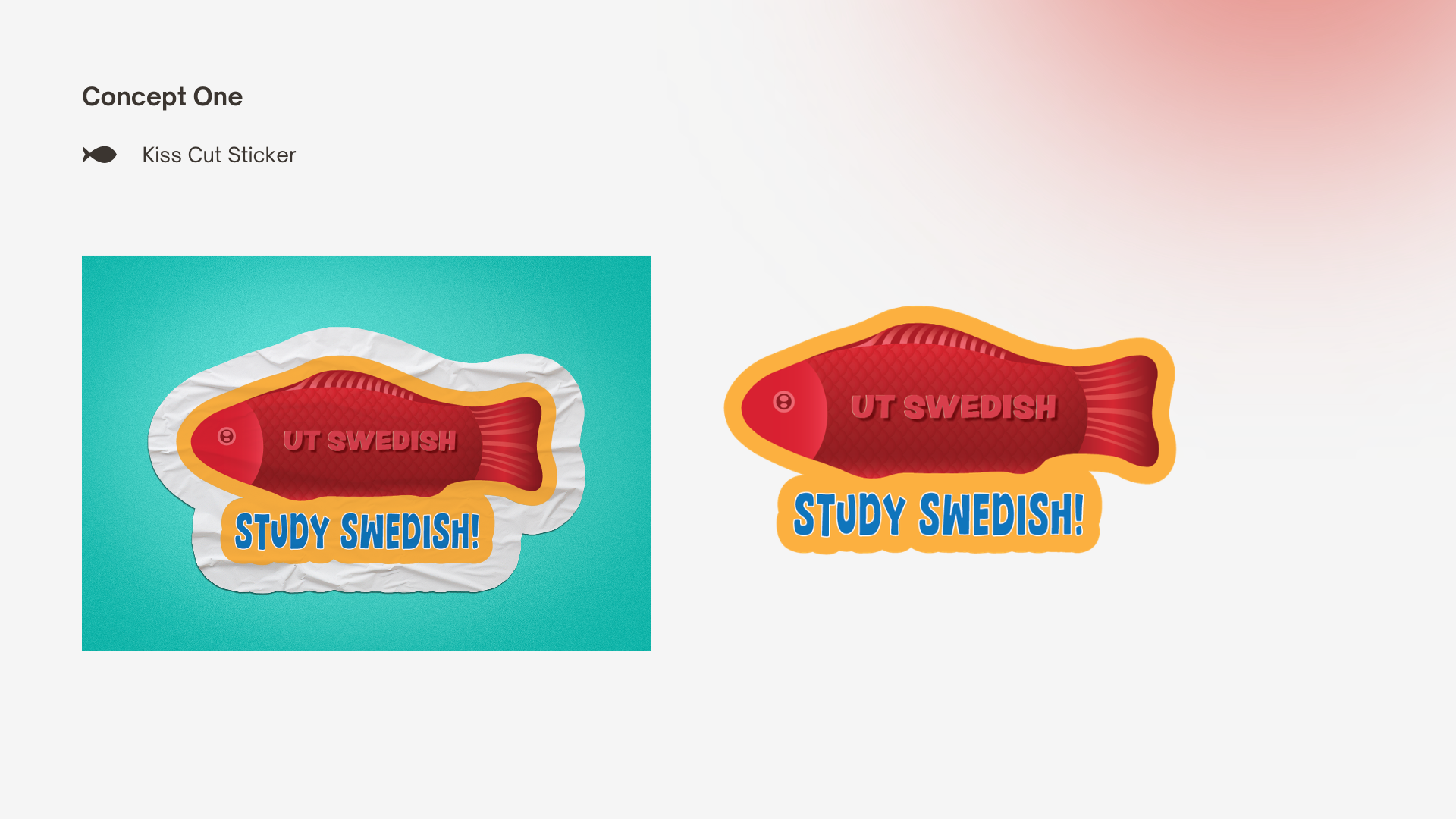
The Swedish Studies program was searching for a sticker design and I was given the opportunity to make the vision come to life! The client had some requirements being:
- Swedish Fish Candy Representation
- Generic Name: “UT Swedish”, “Swedish Studies”
- Tagline: “Study Swedish”, “Take Swedish”
.
.
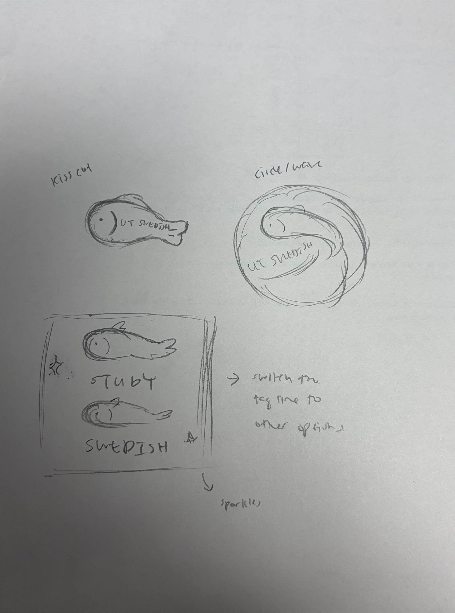
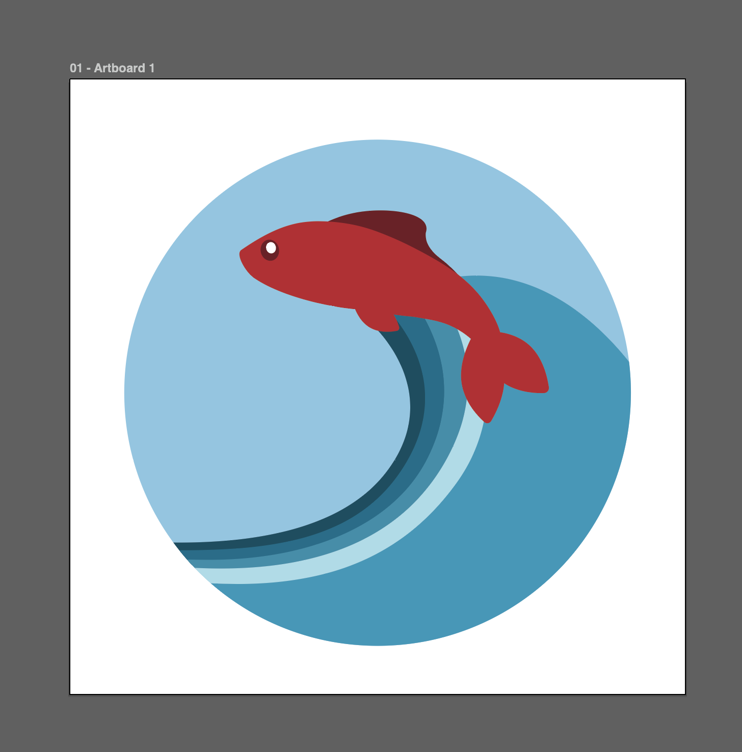
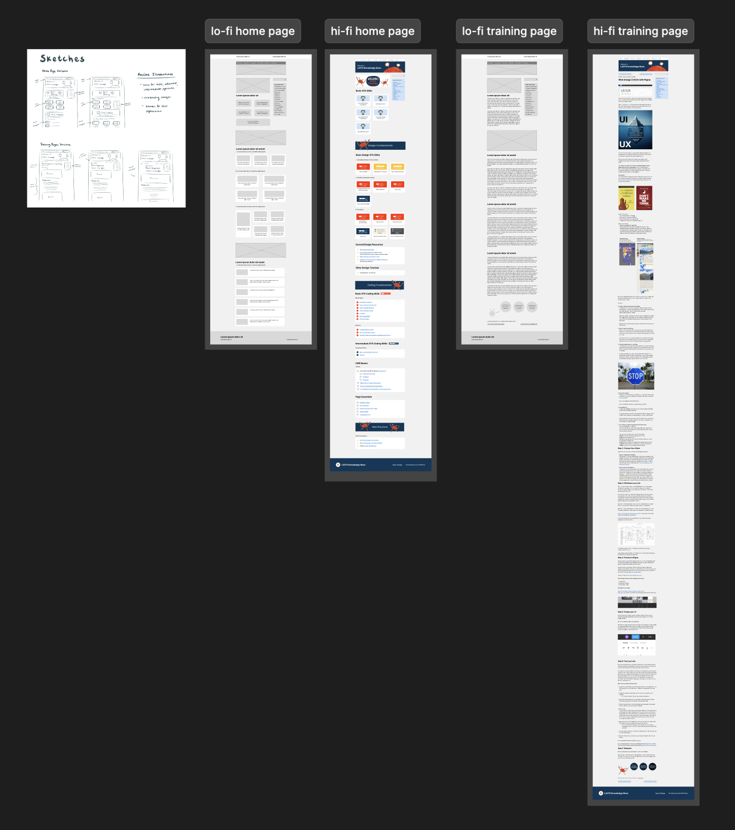
I first started by sketching some potential designs focusing on a kiss cut, circle, and square shape. I wanted to see how much I can explore when it came to the layout of the sticker since the fish will be the main focal point.
.
.
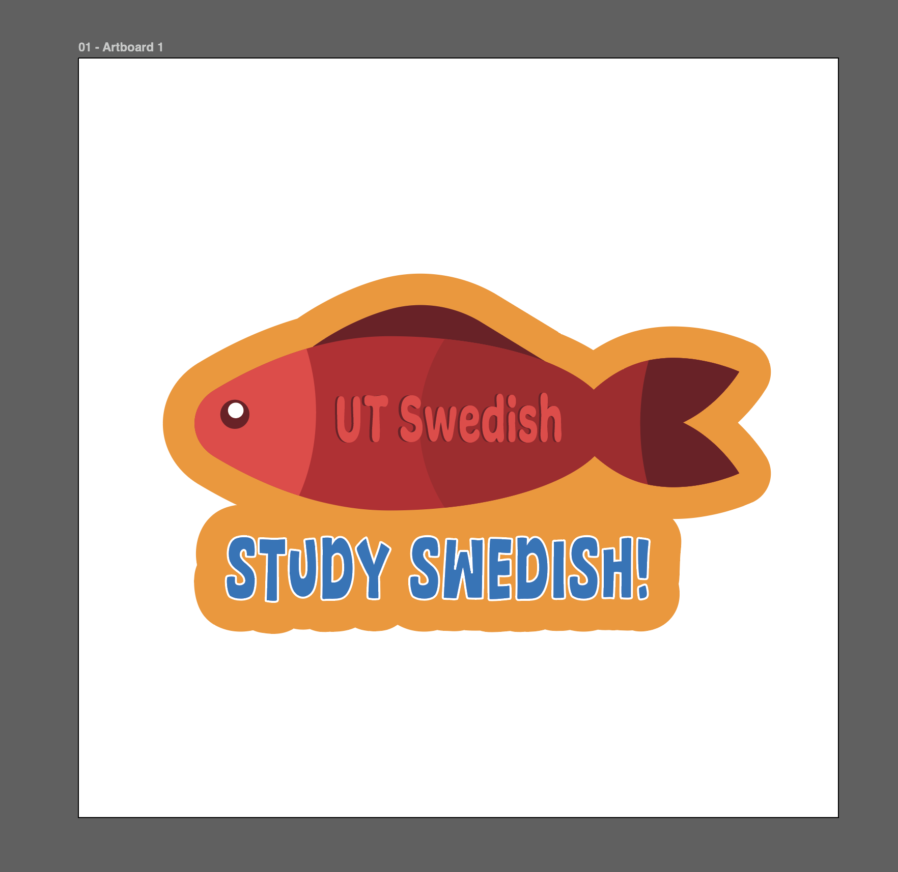
Transforming my sketches to vector images was quite fun! It’s always great to get some more experience in Illustrator and learn more about the platform. Plus I think the initial fish design turned out really cute.
.
.
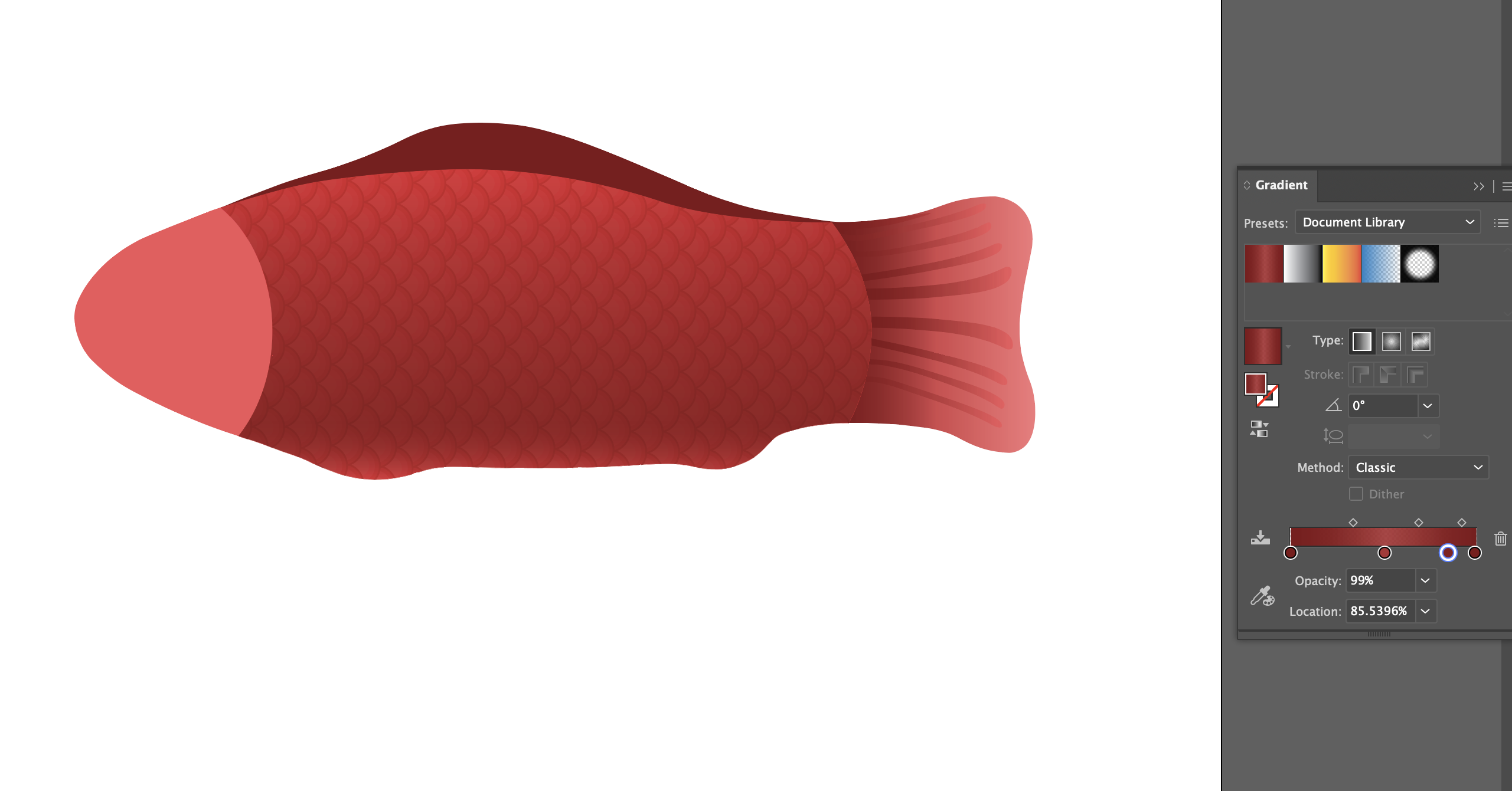
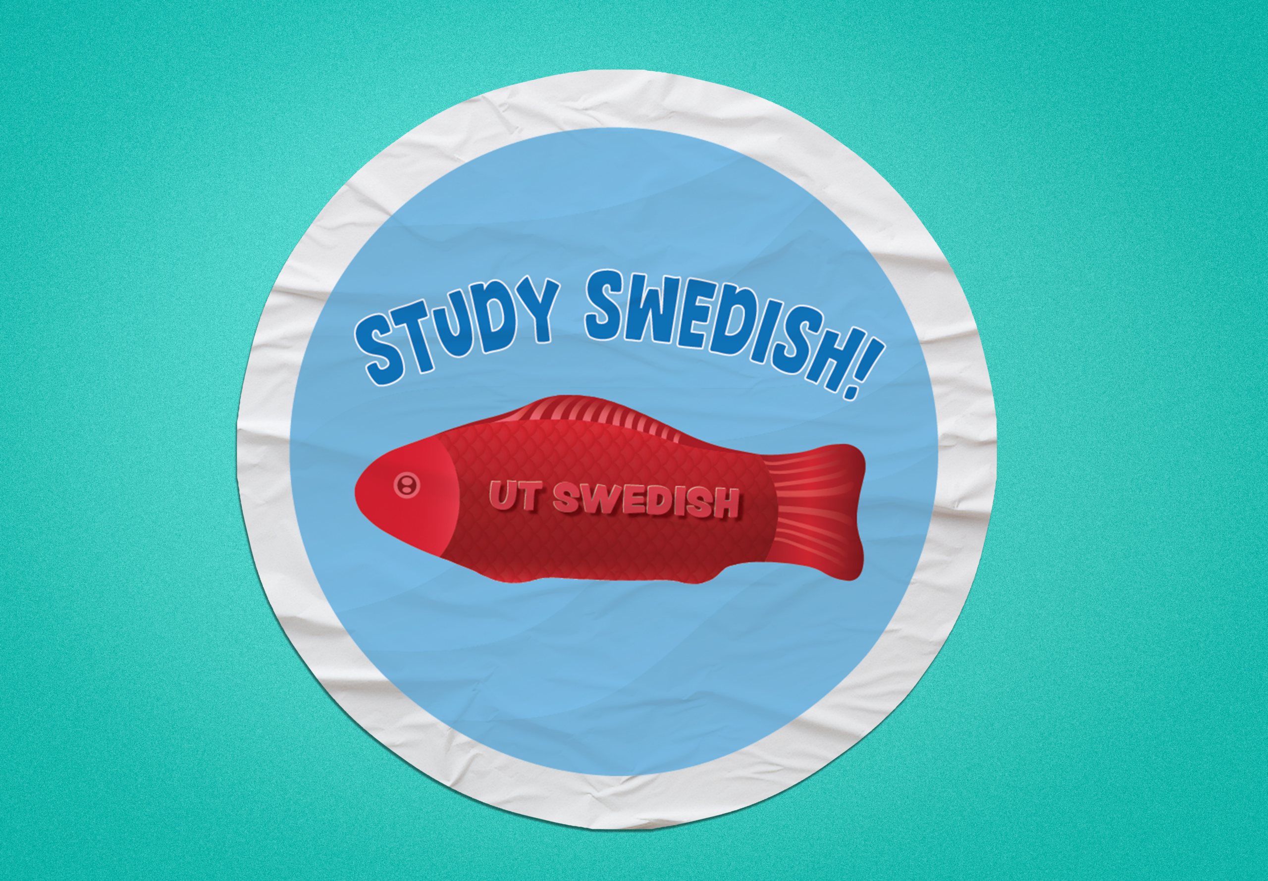
After I created the initial designs I got feedback from De’sha to try to hone in on realism rather than an illustrative design to be sure the fish is recognizable as the candy. From there, I replicated the shape of the candy and delved more into detail for the fish’s fins and scales!
.
.
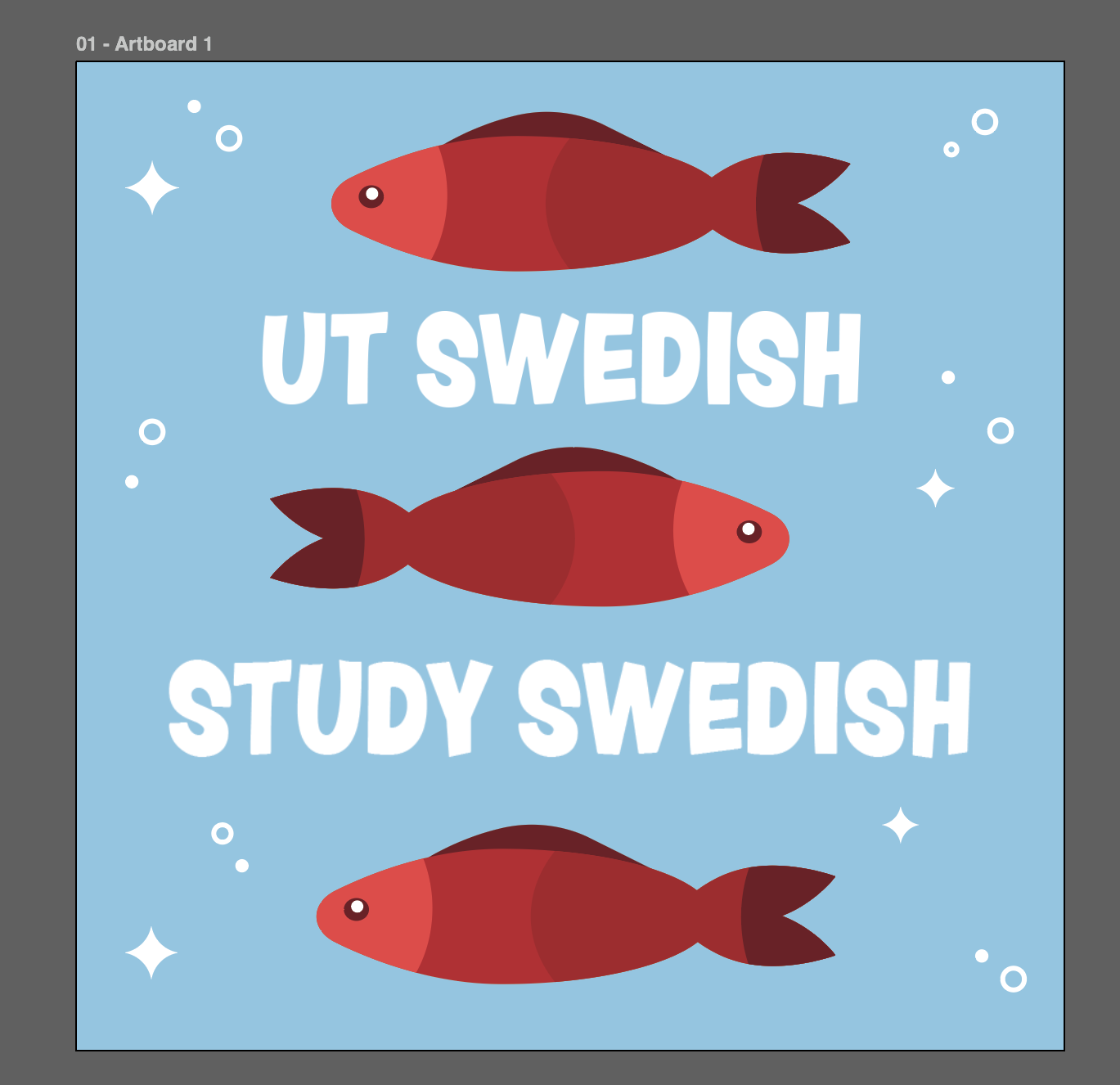
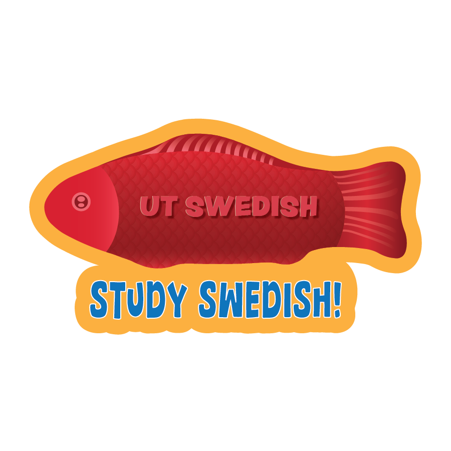
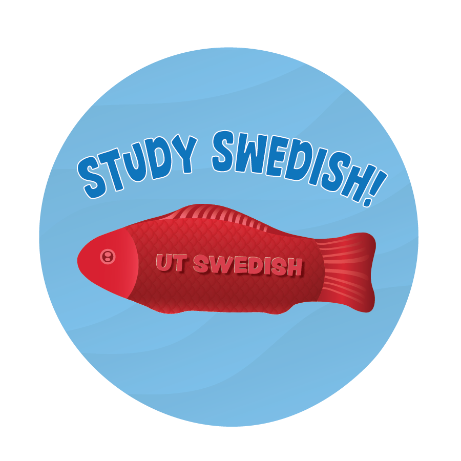
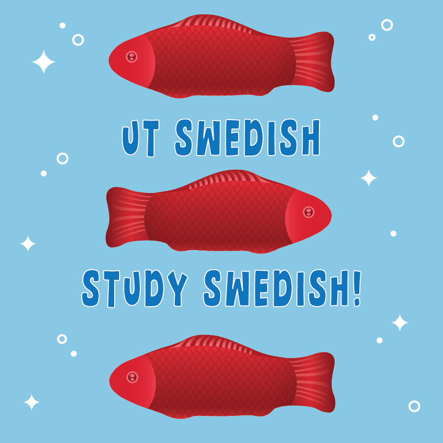
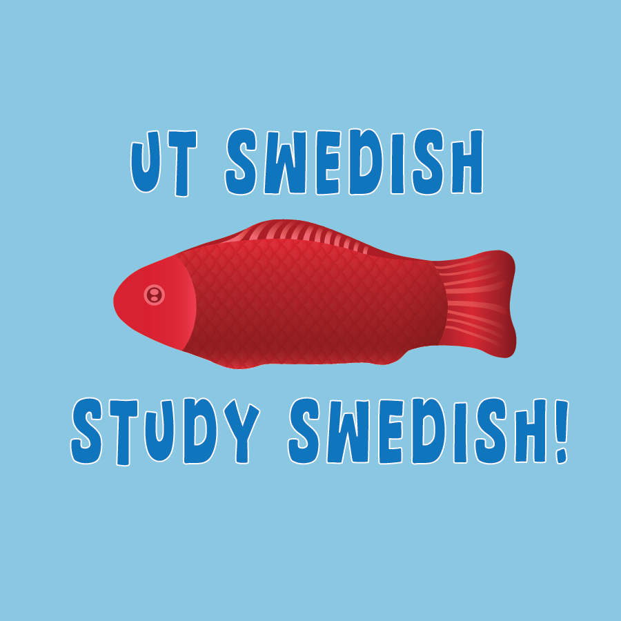
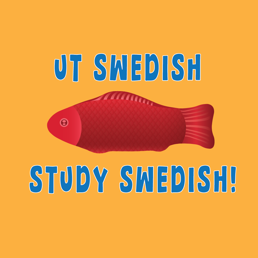
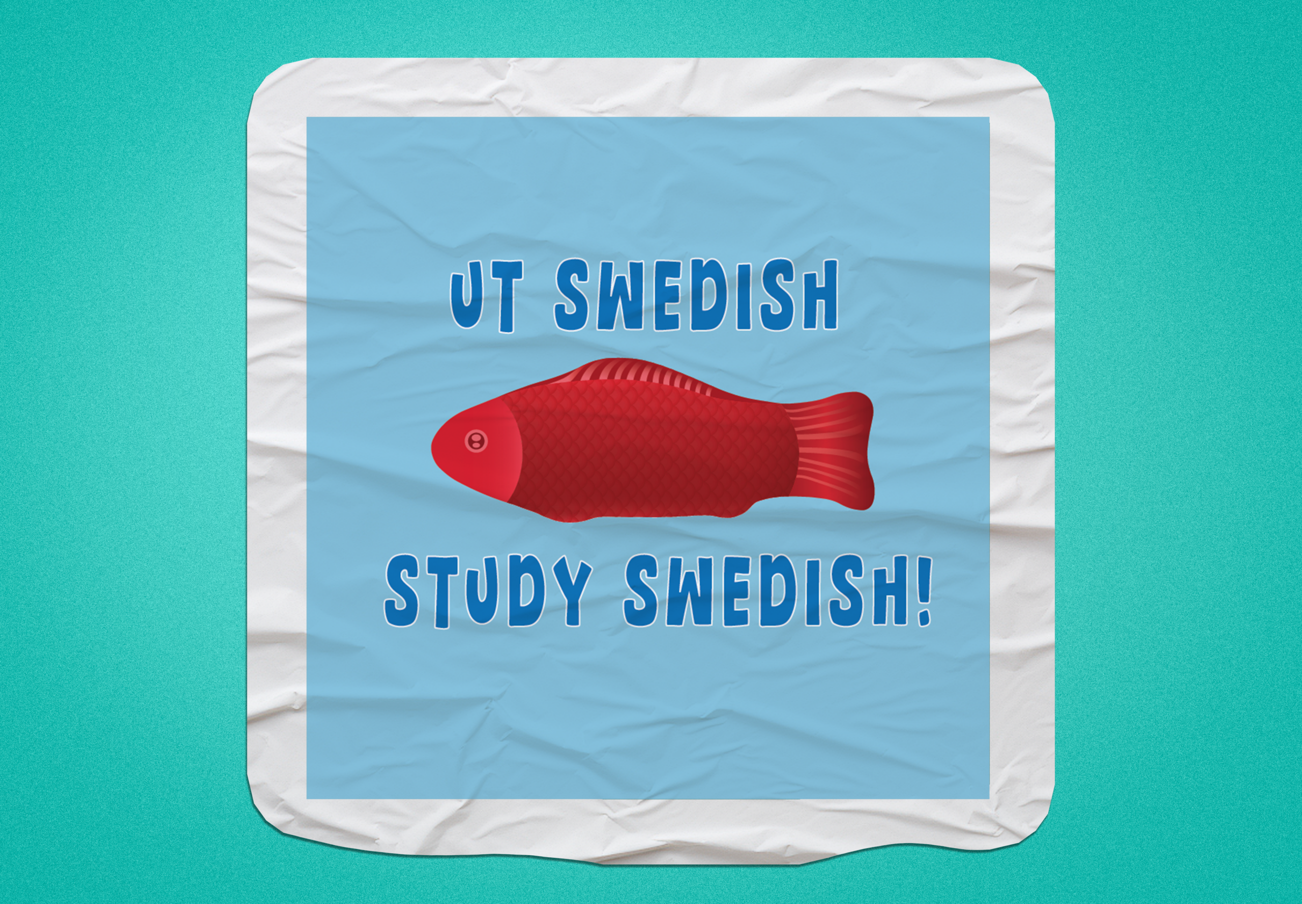
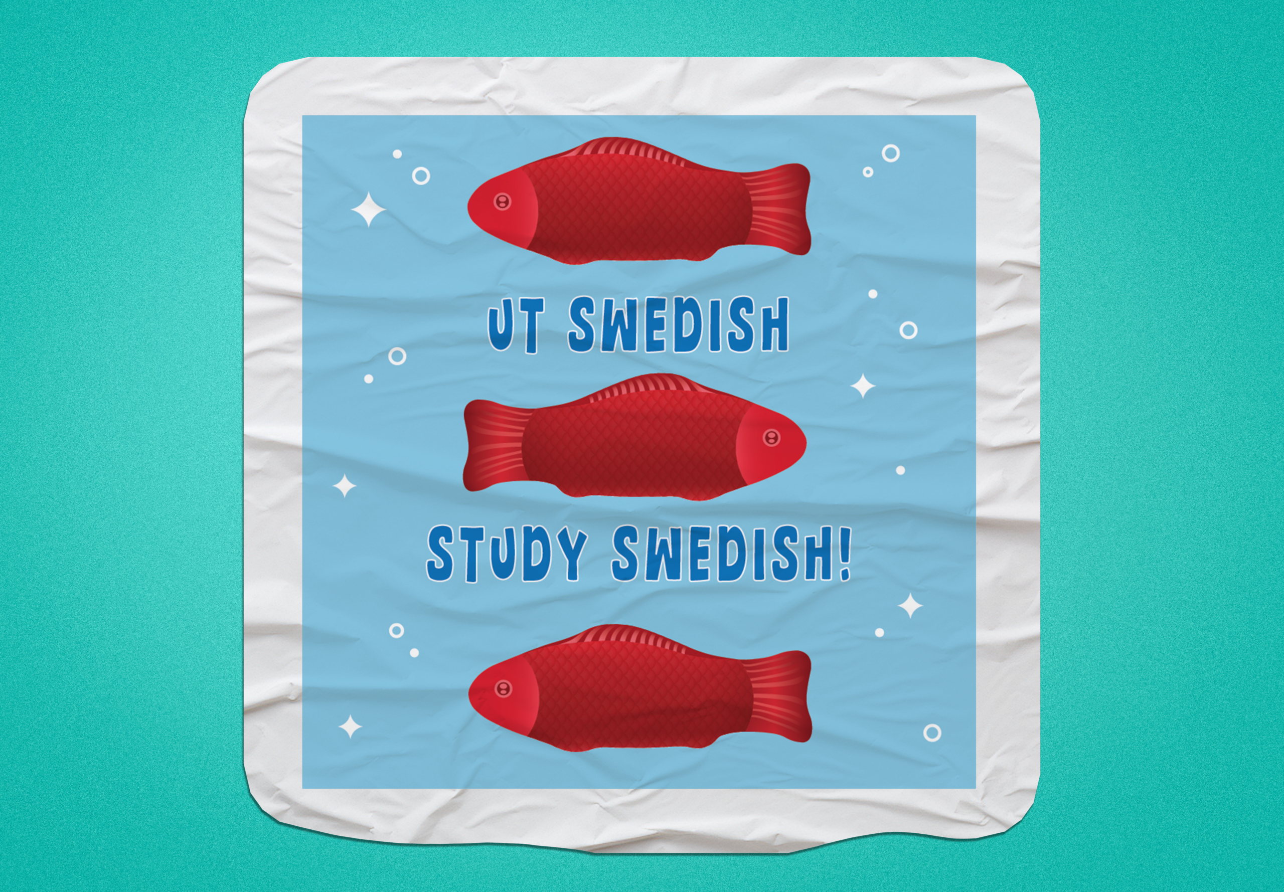
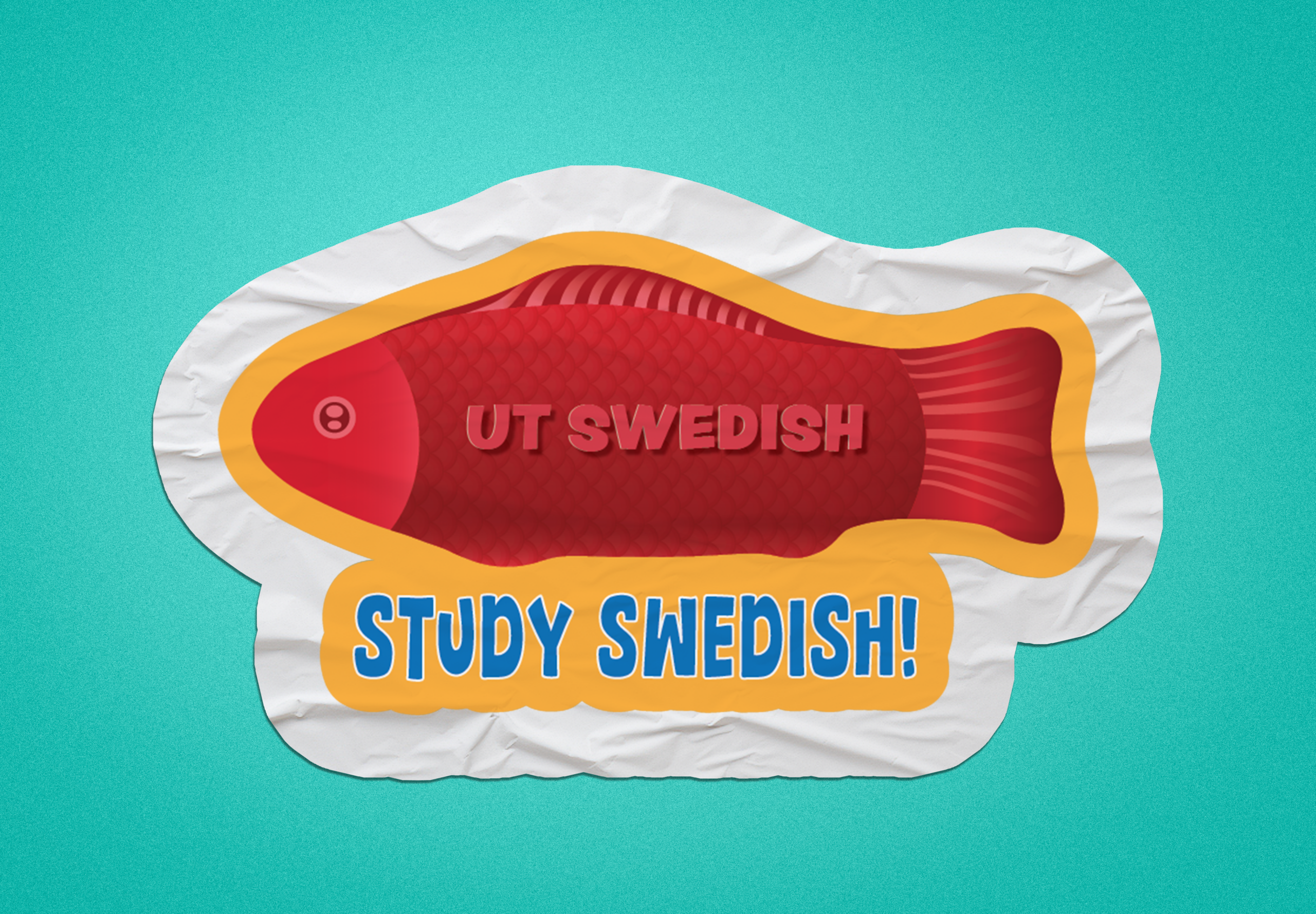
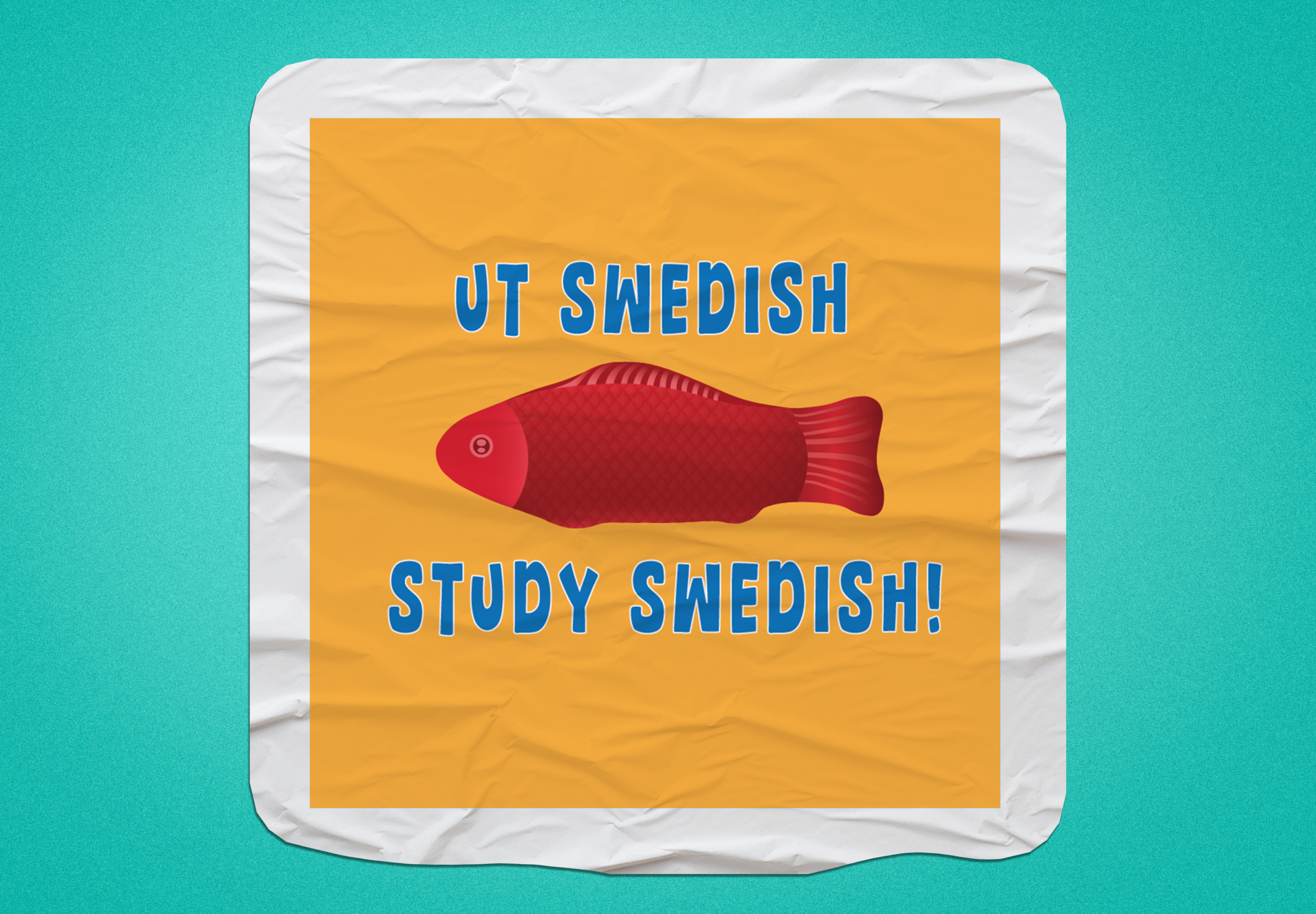
After finalizing the candy fish, I created five designs that explored different sticker shapes and colors! Seeing the difference between the first iteration and the final iteration was so cool to see! I think the realistic approach was the route to go!
.
.
Next, I created some design mockups of the stickers and it was time to create the design proposal to send off to the client!
.
.
Now it was off to send to the client and await for her feedback! I’m so happy I was able to join this project and get more experience in logo design! It’s so fun to work with vectors and see the finished product!
.
KB Website Update
────────────────────⊹ ࣪ ˖♡˖ ࣪ ⊹ ────────────────────
.
.
I revisited the KB website wireframes I did and iterated on them to produce the hi-fi frames! What was challenging was figuring how to build consistency amongst the training pages since different authors made different trainings. On the other hand, creating the icons and layouts was fun and brings a lot of visual variety to the hi-fi home page!