2026 Summer Marketing | History of Football Course Poster
My first summer marketing assignment was to create a promotional poster for the History of Football course. I was instructed to make sure the poster is eye-catching with a strong cover image, so that students walking by will take notice.
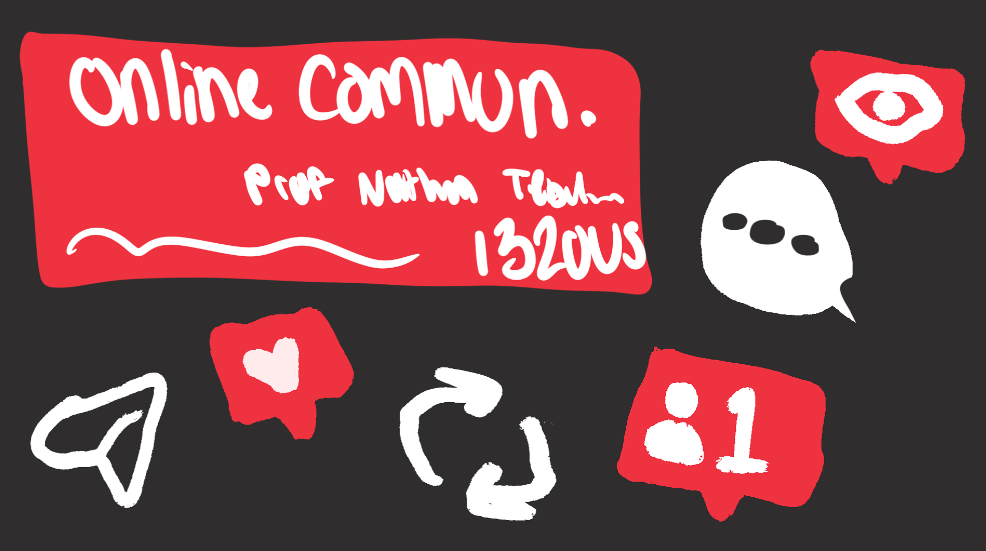
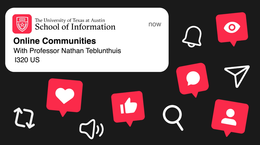
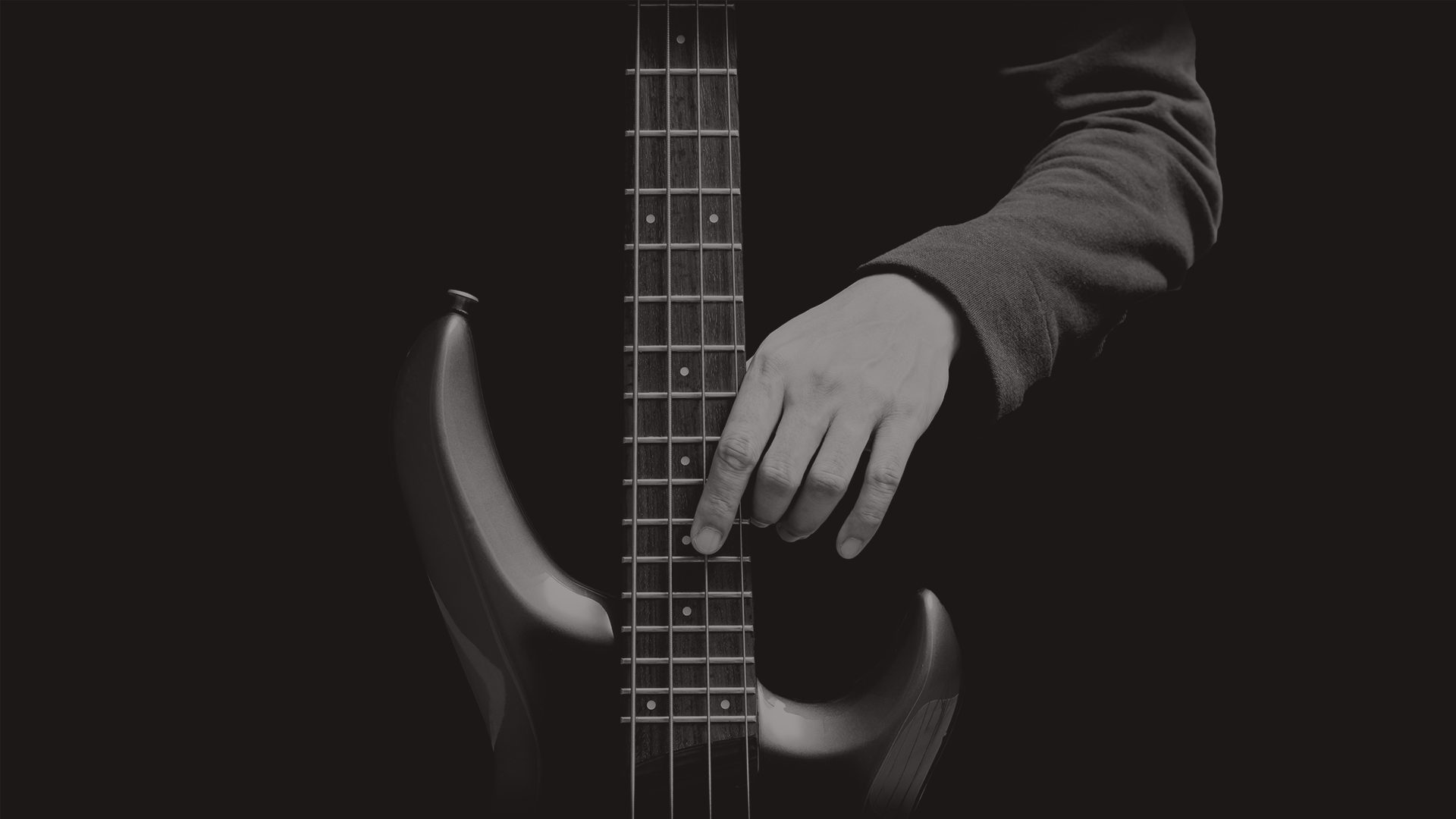
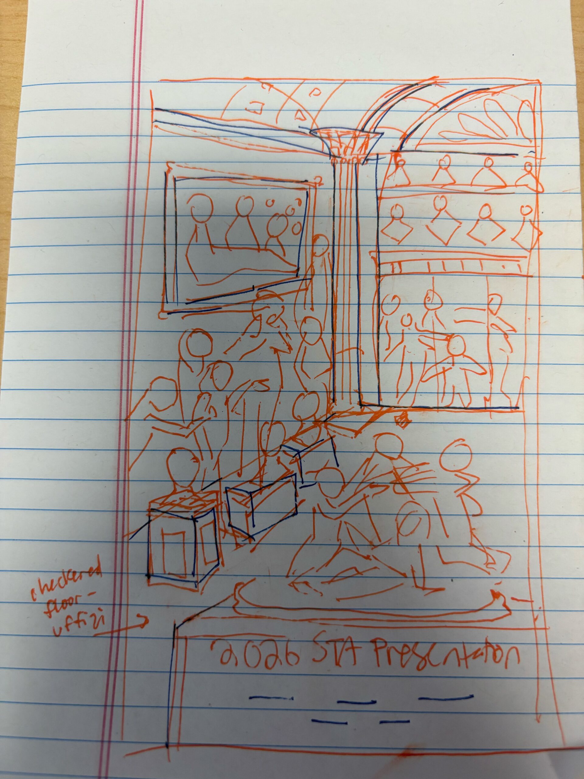
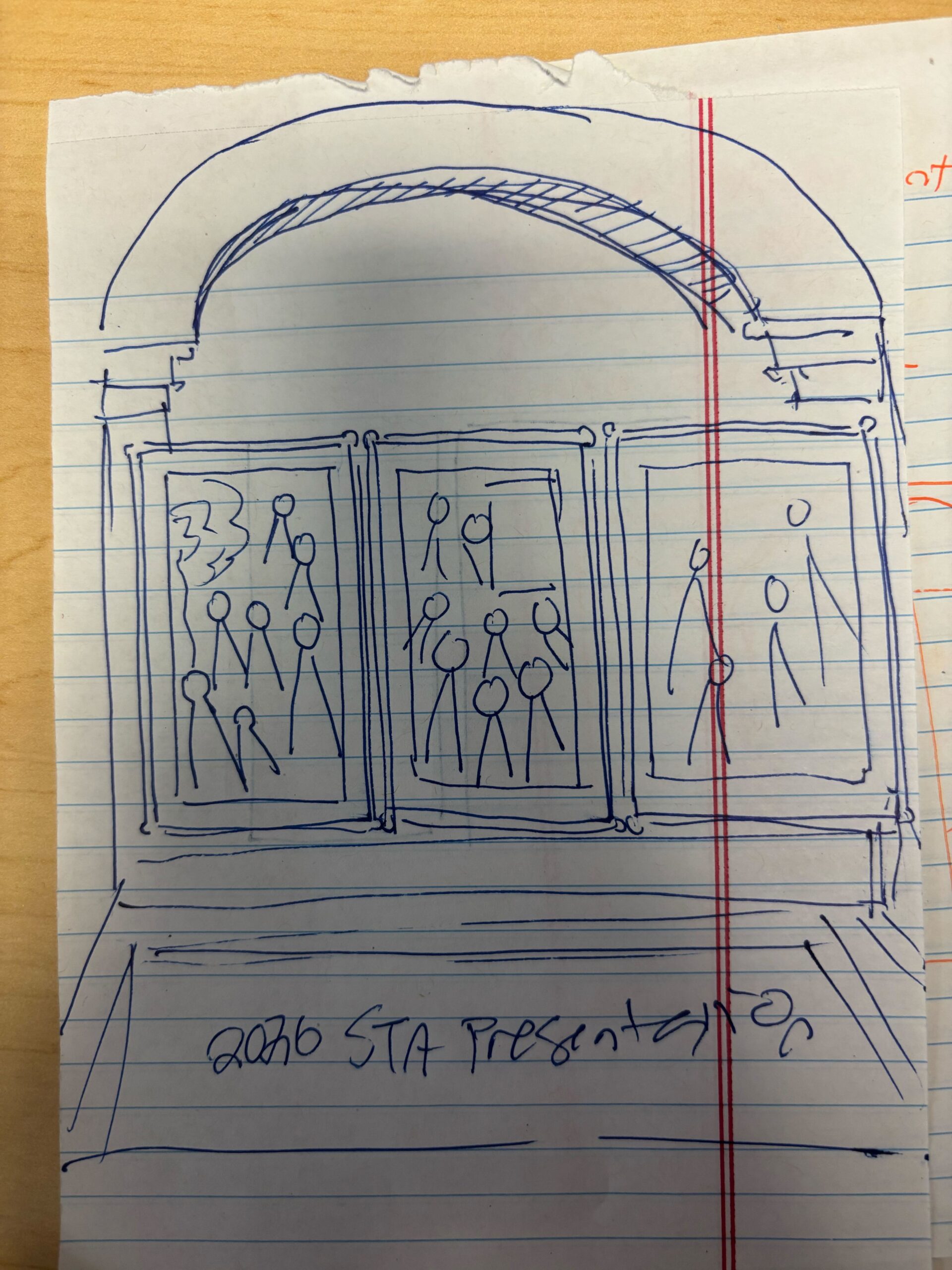
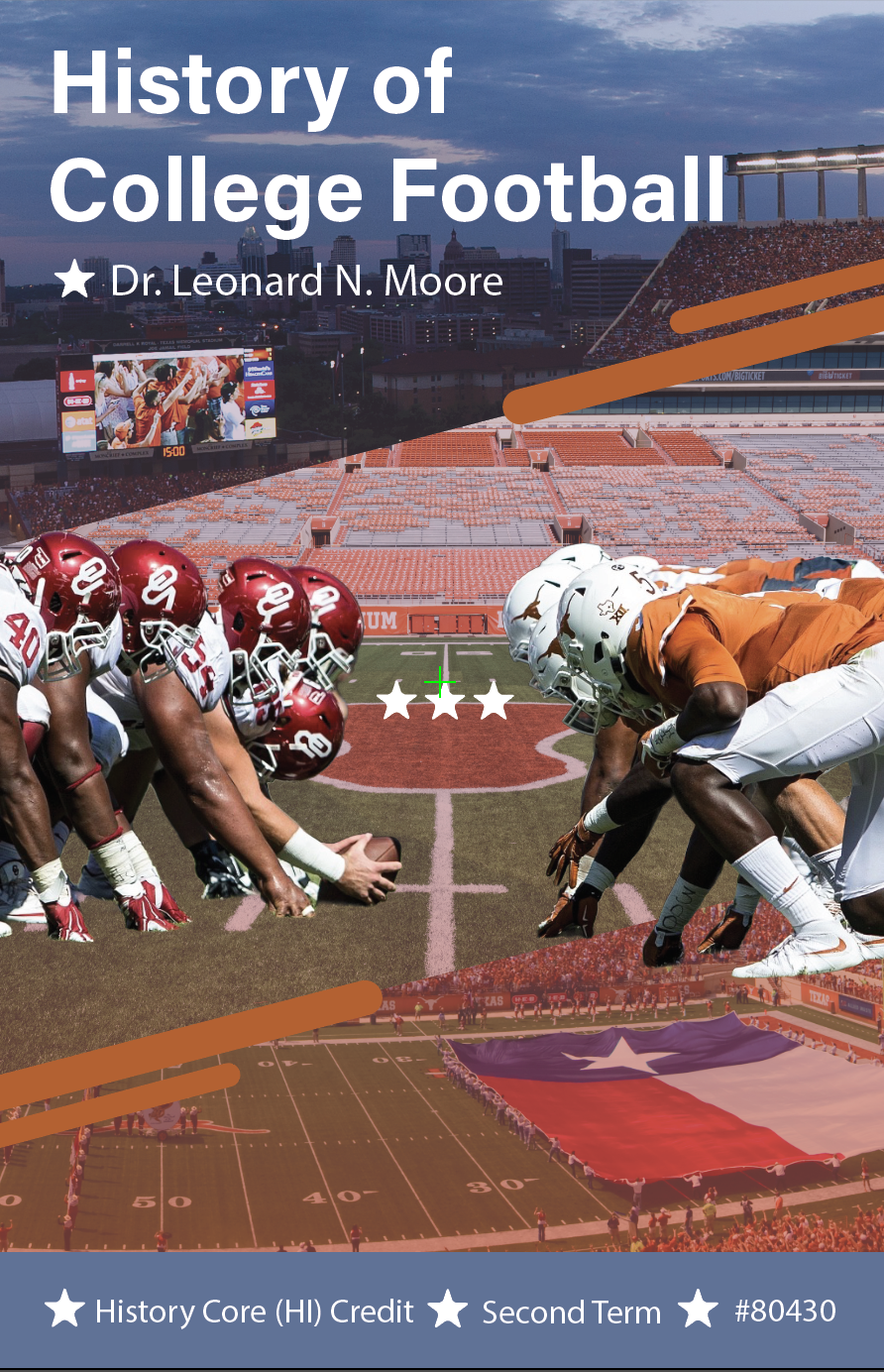
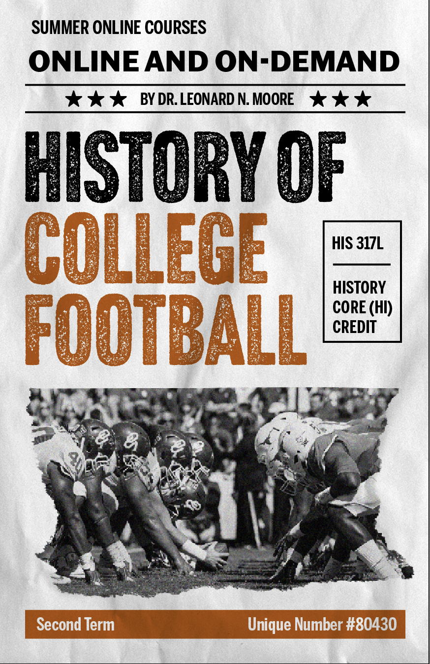
★ Design Iterations: Because the project was operating on such a short timeline (the poster needed to be distributed quickly, as it is marketing for the summer), I immediately started creating a polished draft for the poster.
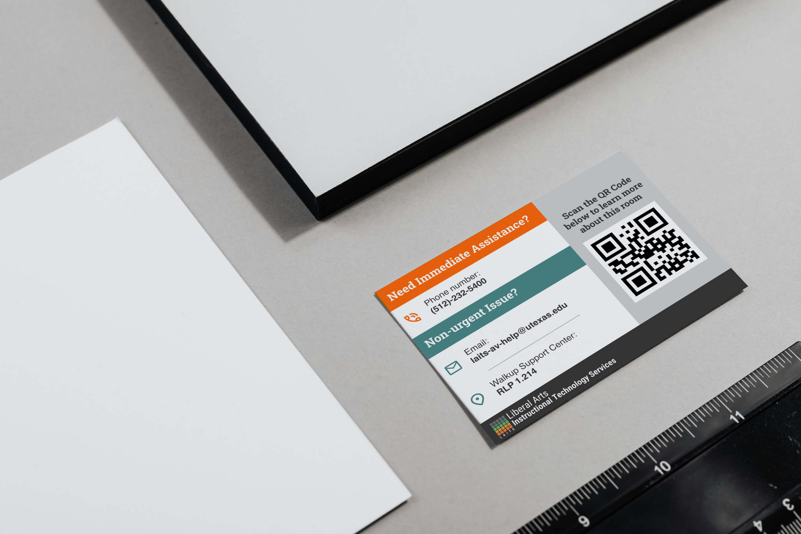
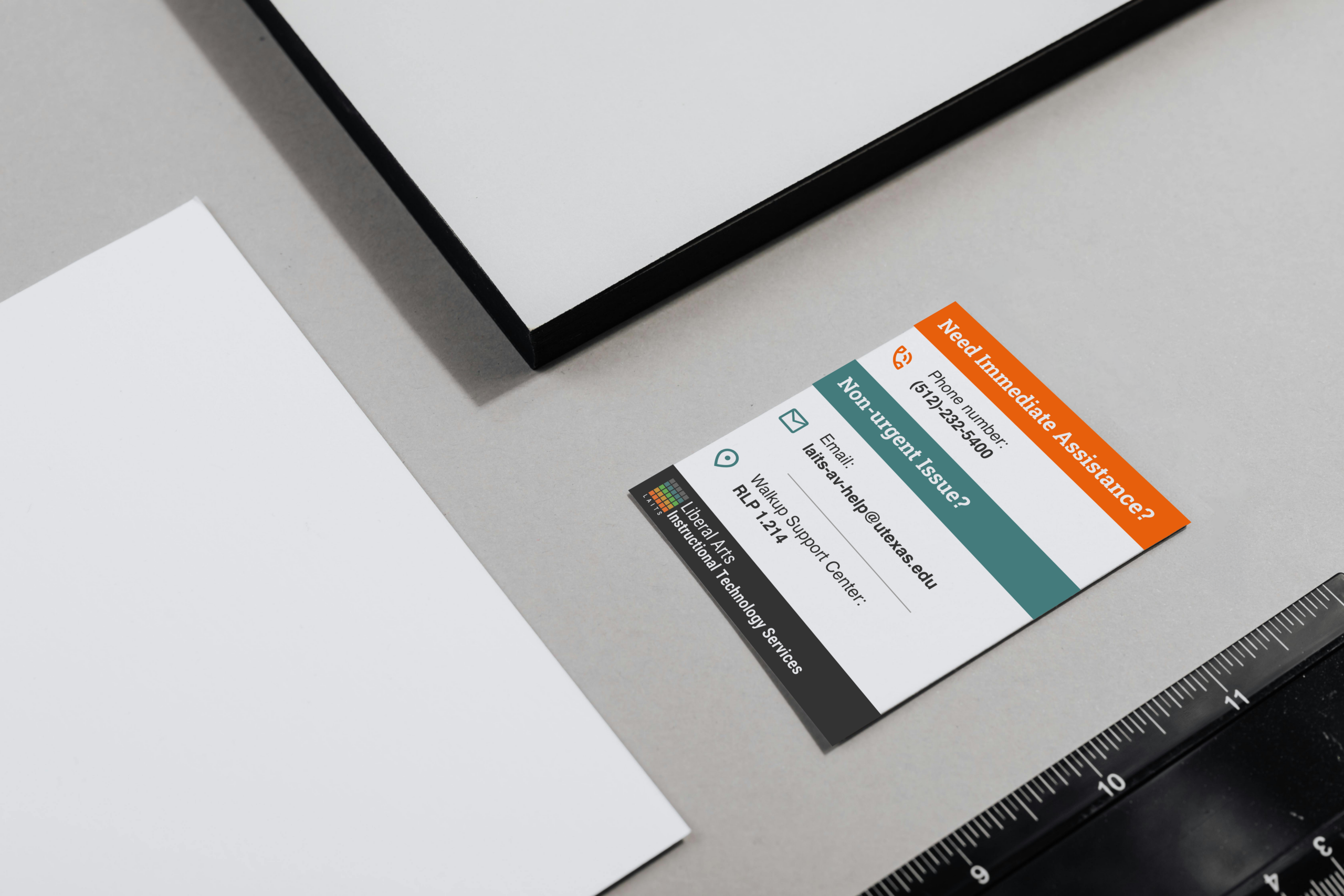
To follow existing visual design guidelines for the course, I used the color gradient and photo assets that were in the course box folder. I was also inspired by the online course promotions for this year and wanted to make the poster look consistent, so I added in some dynamic, rounded lines. I additionally included stars to break up the text and evoke imagery of Texas.
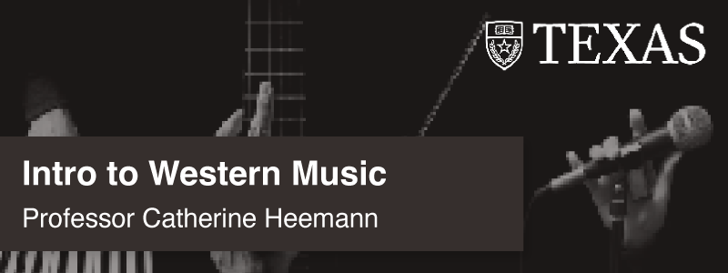
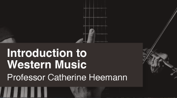
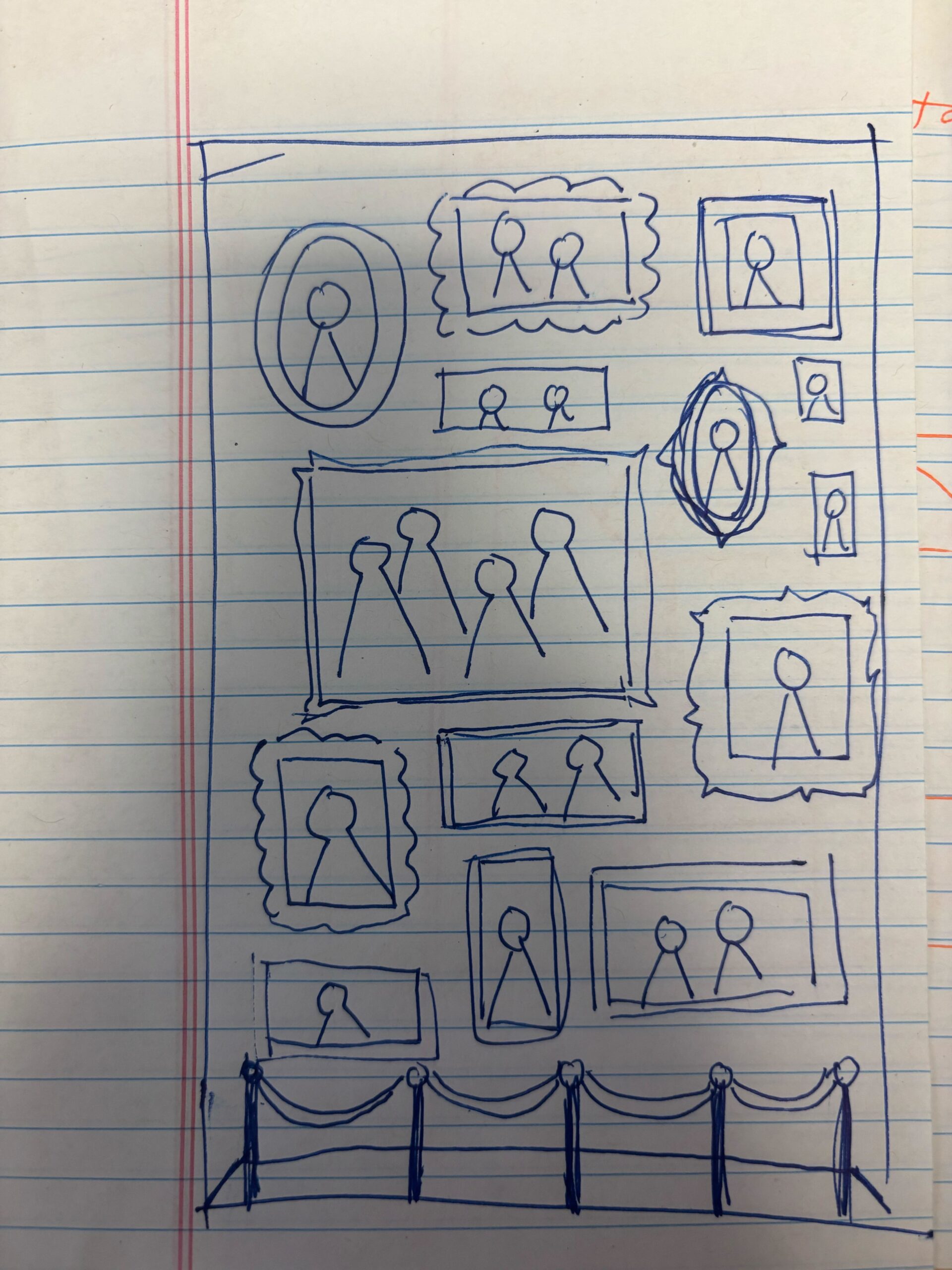
After creating this draft, I received feedback that the design needed to be a bit more punchy to fully capture the eye-catching effect needed to advertise the course and the bold spirit of football. I was advised to take a look at newspaper headlines for football. Taking these considerations into account, I refocused my design approach to align with a newspaper theme, and created the following designs:
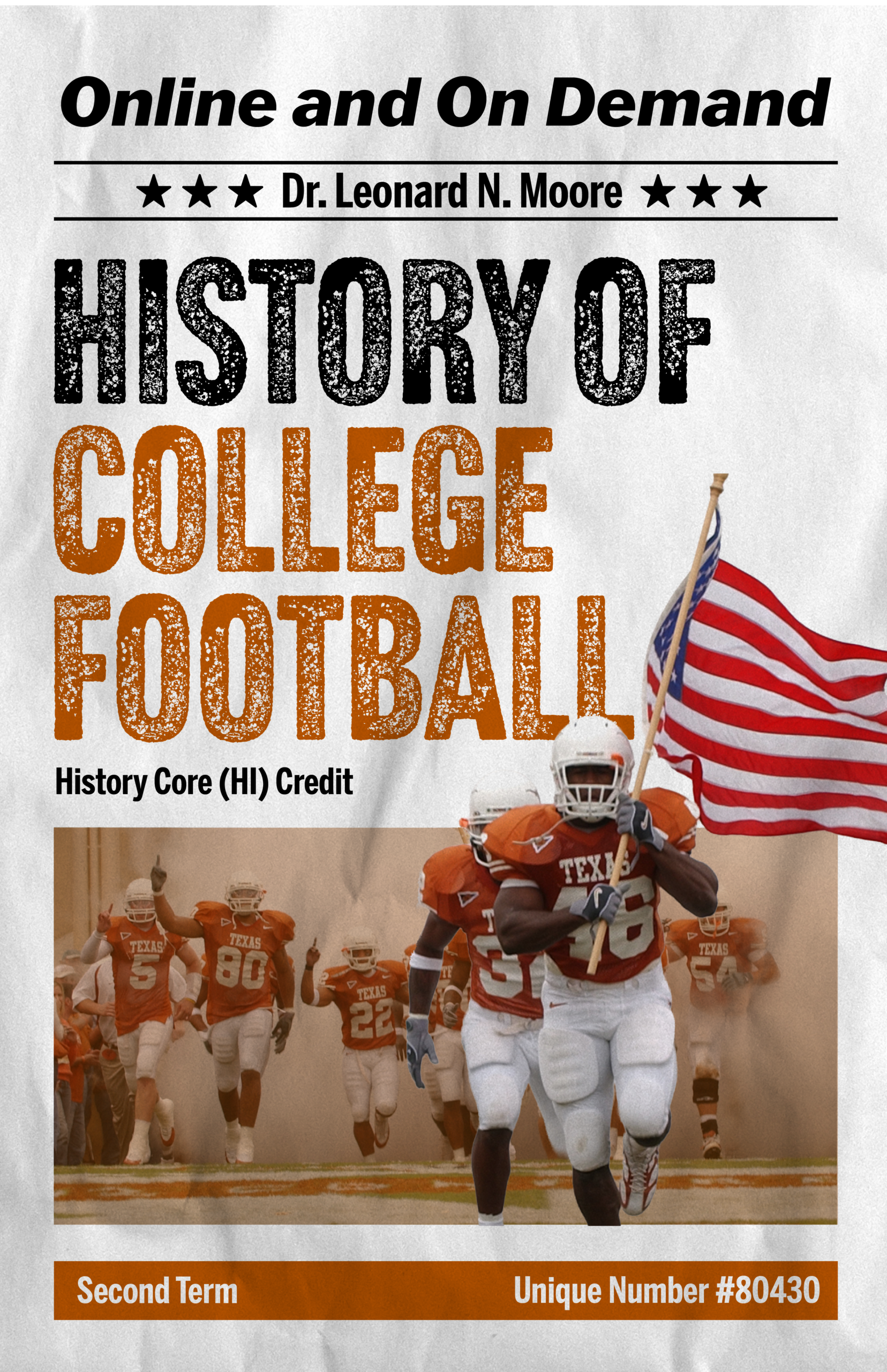
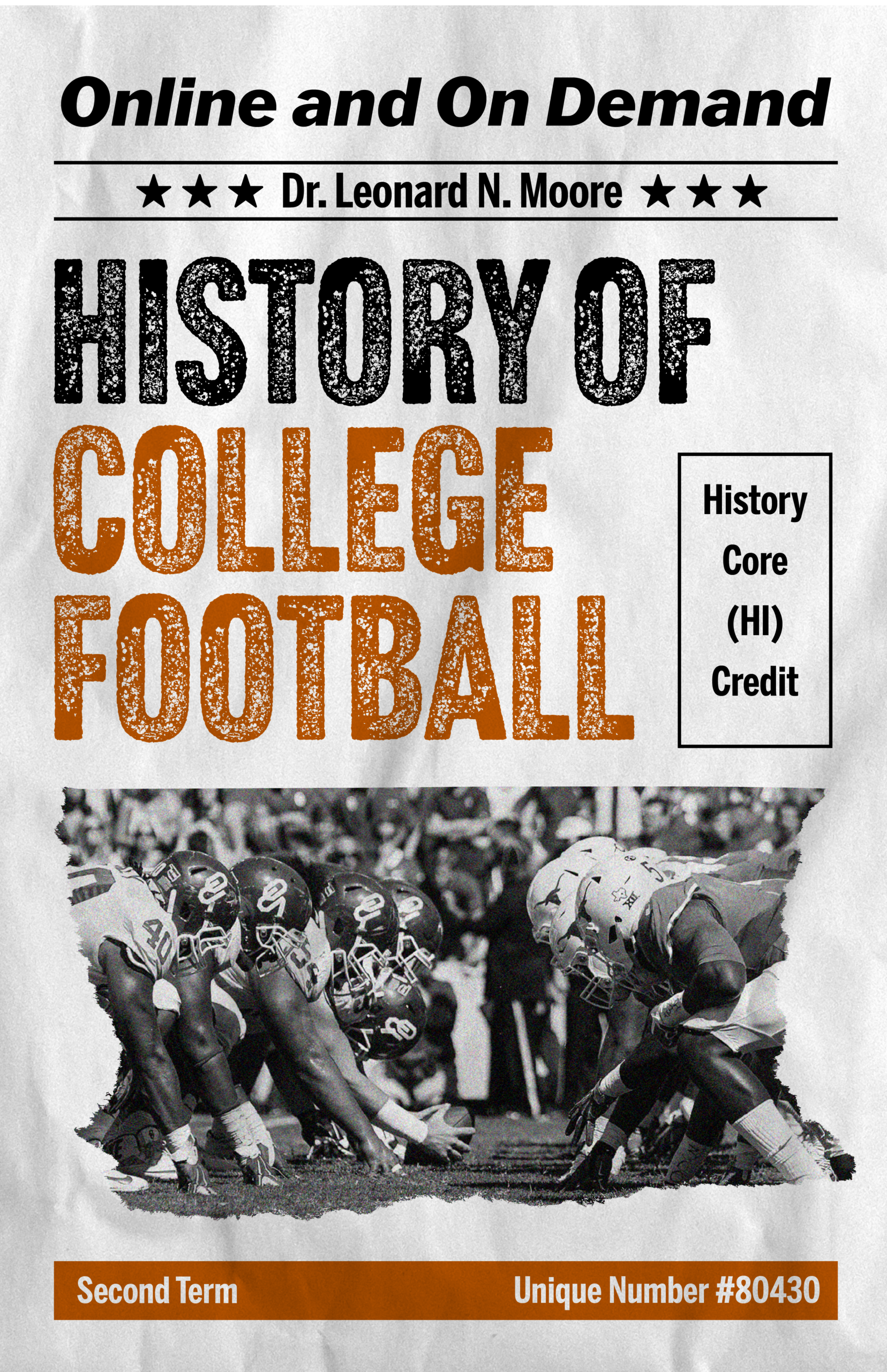
These designs were much more effective at capturing the energetic, bold spirit of football with the typeface and focus on a central image. The client decided to go with the right design, and the design was slightly edited to better emphasize that the “summer and online” aspect of the course.
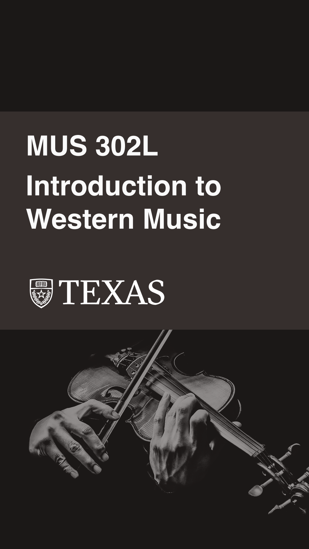
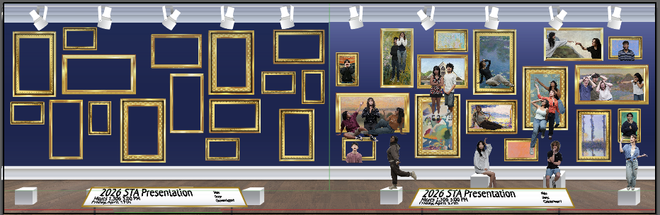
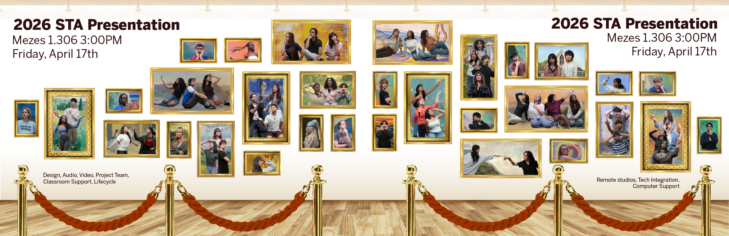
★ Final Design:
★ Project Status: Completed (04/02/26)
★ Project Reflection: This is the first project I have worked on with such a tight deadline. My first iterations were created on one shift, and the next shift I was asked to finalize the poster. I learned a lot about managing my time and prioritizing both good design and functionality of a product; with such a short working time, I made sure to prioritize including all necessary text and information on the poster, even if the design was not yet perfect. Additionally, I was able to alter the poster to better communicate the exciting, bold nature of the course, making it a more engaging and effective promotional material.