• We are STAs
    • Abdurrahmaan Baghdadi
    • Asha Rountree
    • Cindy Truong
    • Haley Ma
    • Isabella Melendez Gonzalez
    • Julie Brandt
    • Kate Shih
    • Kodi Khiraoui
    • Kyra Lee
    • Nicholas Peasley
    • Sasha Kenney
    • Shanda Horm
    • Shriya Atreya
    • Tomas Marulanda-Mesa
    • Trisha Darure
  • We were STAs
  • STA Presentation
    • STA Presentation 2017
    • STA Presentation 2016
  • Testimonials
  • Resources
  • Home

STA Blog

Julie Brandt

Julie Brandt

UX Training

October 23, 2026 By Julie Brandt

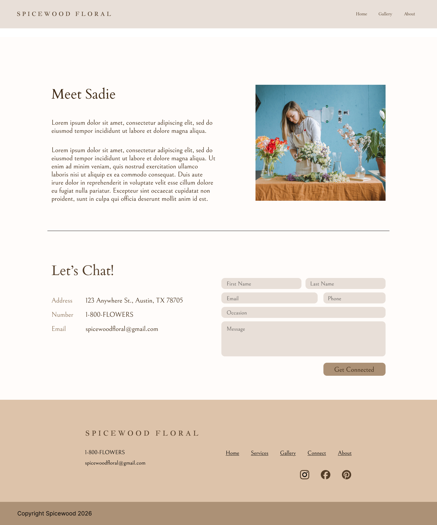
Spicewood Floral

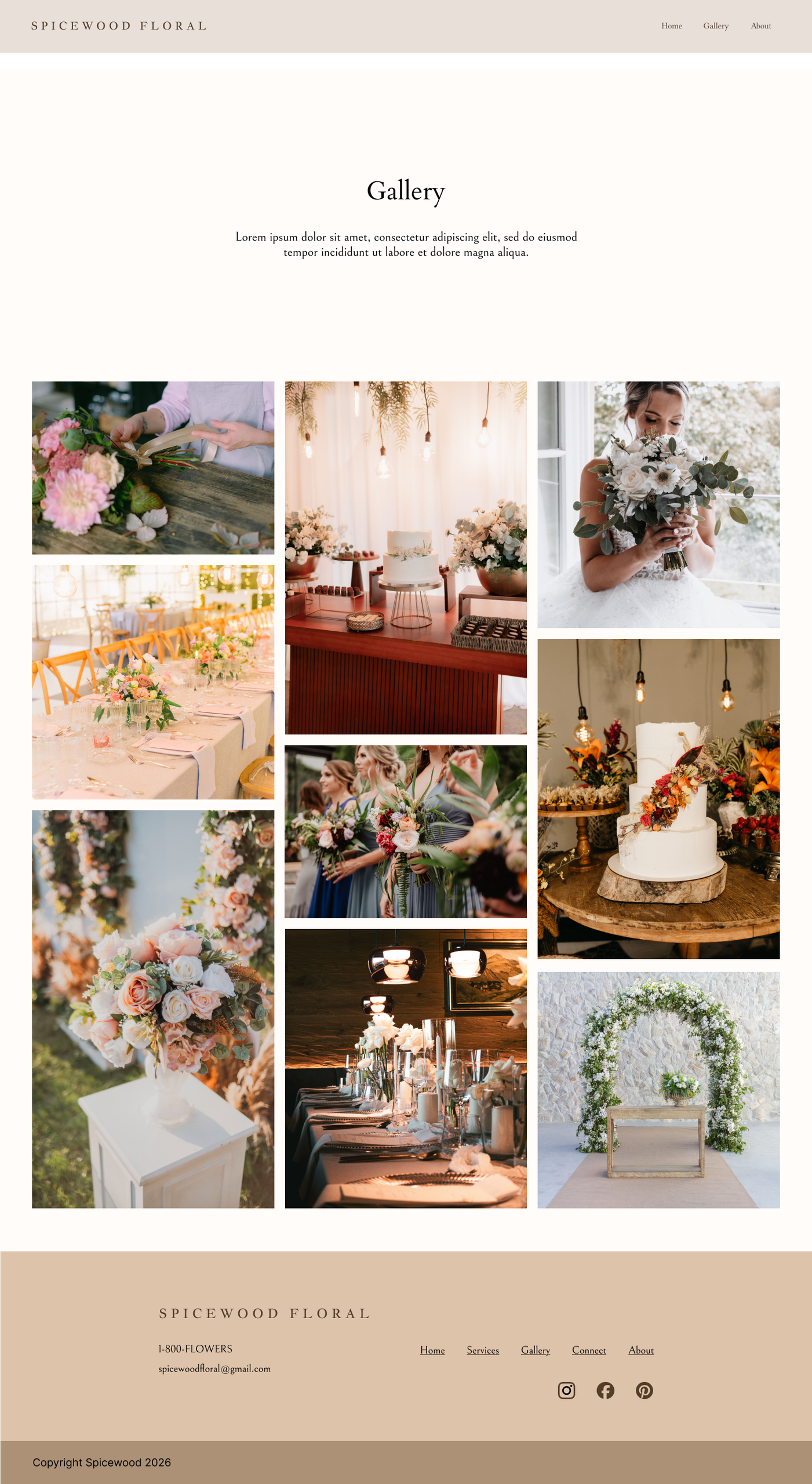
Task: Create a website for Spicewood Floral while maintaining accessible web standards

Status: Complete


Accessibility Research

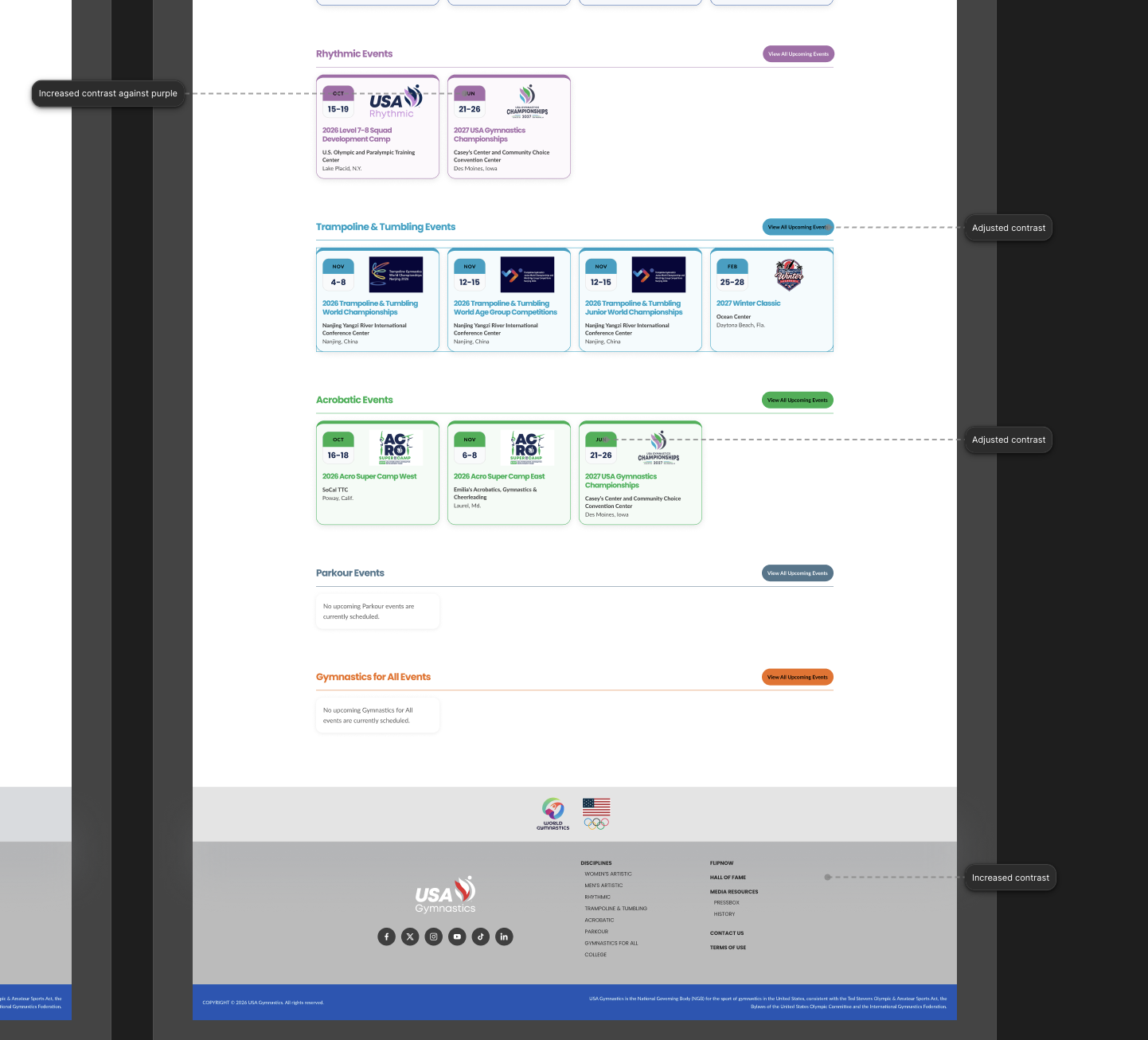
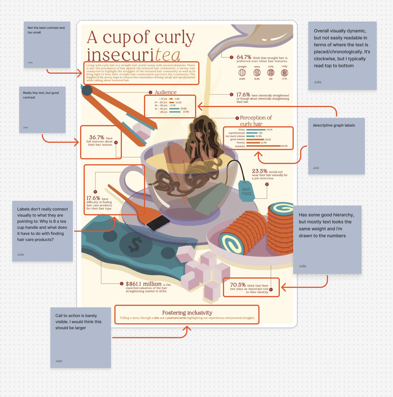
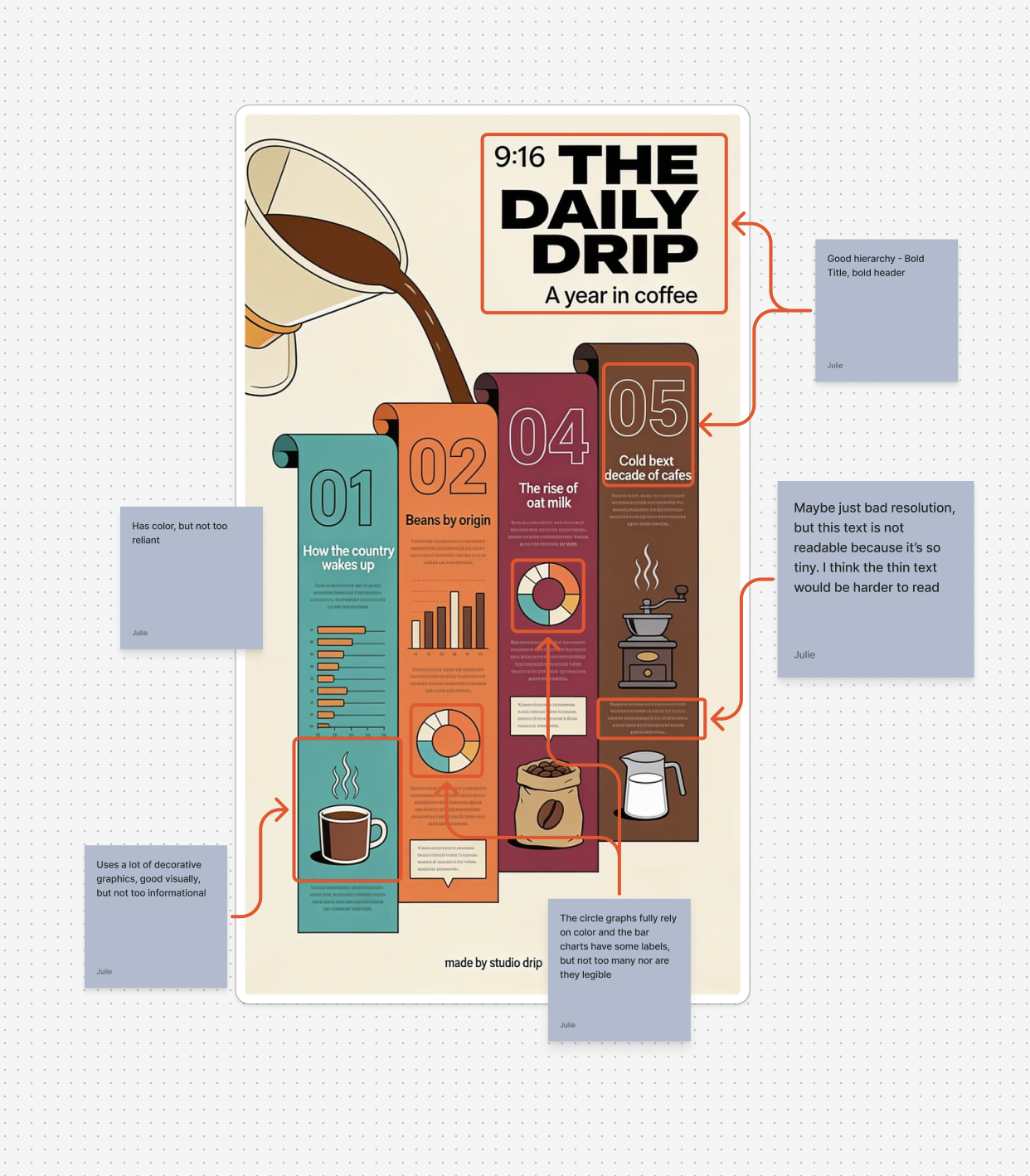
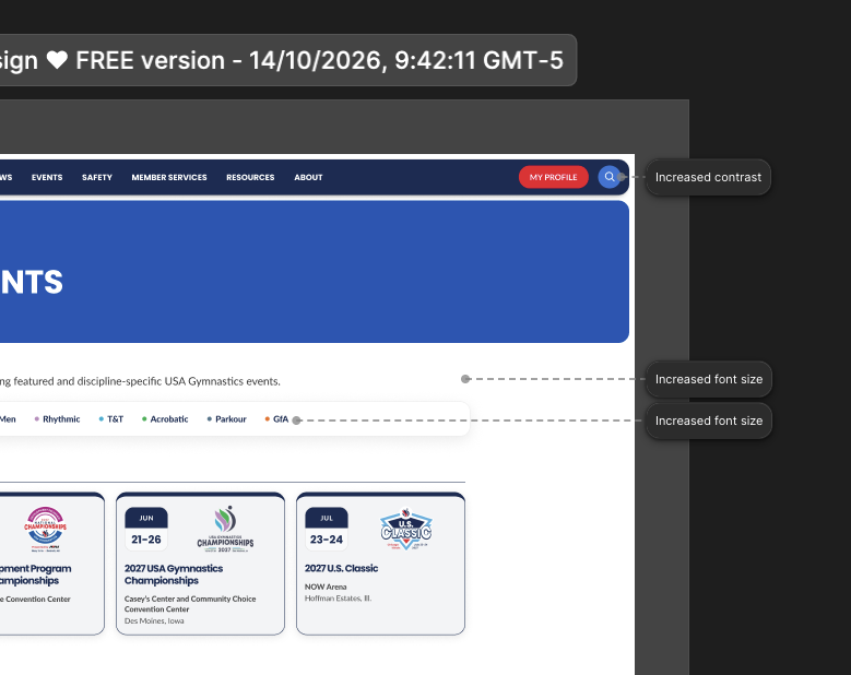
In order to make my website accessible, I started by completing the KB WCAG Training. For that training, I did an analysis on two posters then imported a website into Figma and made adjustments so it complied with WCAG. The website I found was the USA Gymnastic site and it wasn’t too out of compliance. There were a few areas that needed contrast improvements and alt text, but other than that it was pretty good in terms of accessibility.
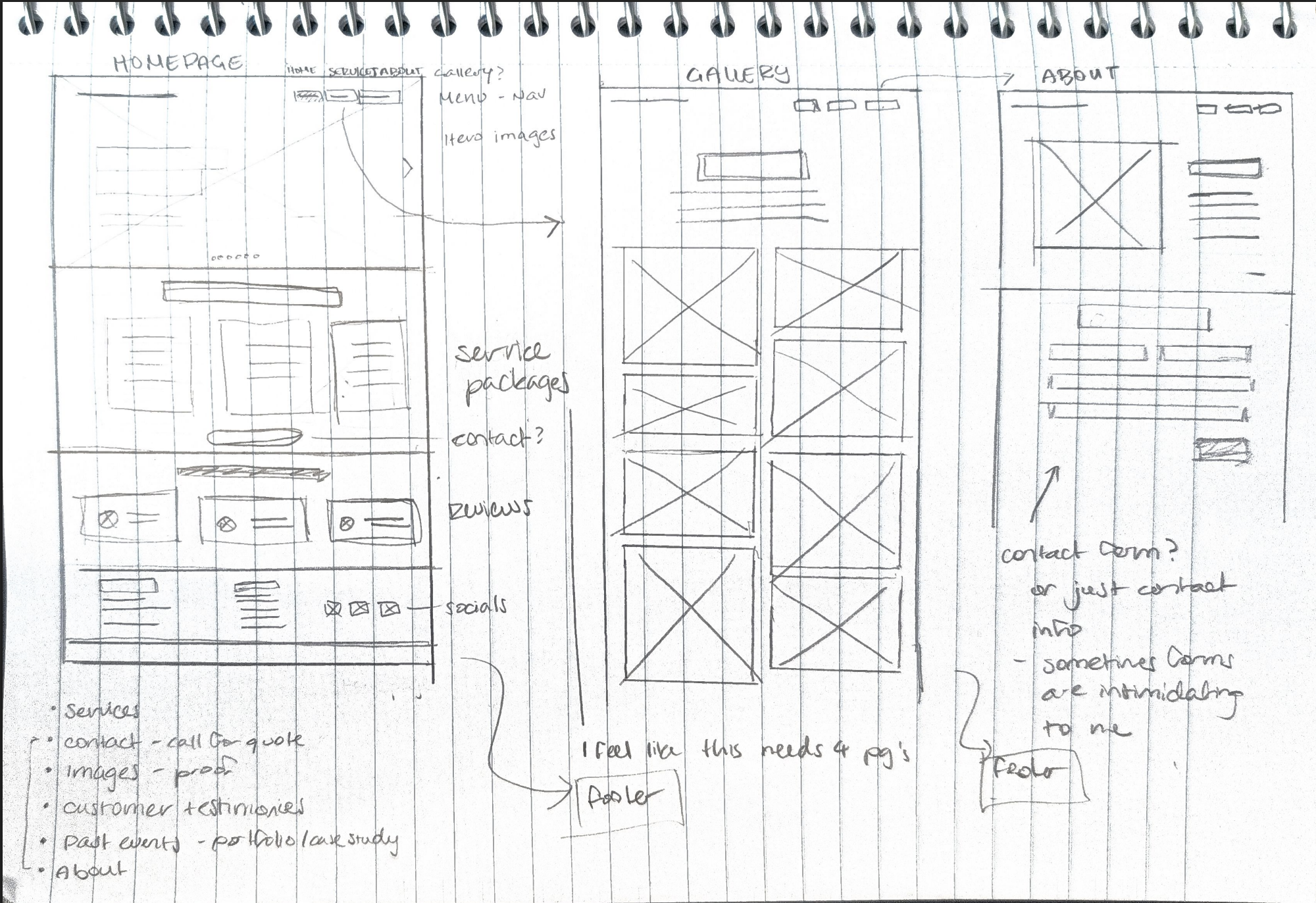
Sketches

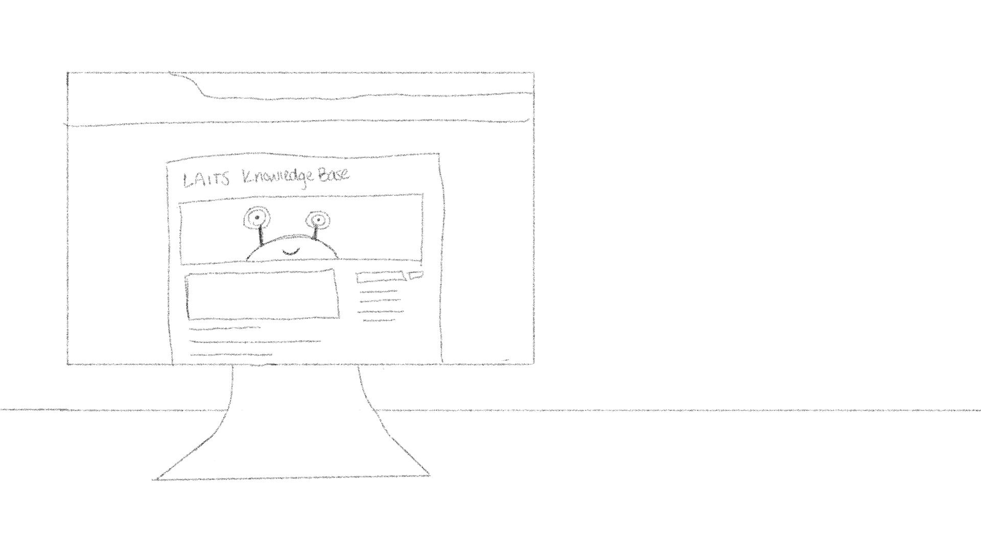
Before jumping into Figma, I created some wireframed of the floral website. I tried to keep the “client’s” desire to connect with potential buyers when designing the website’s flow.

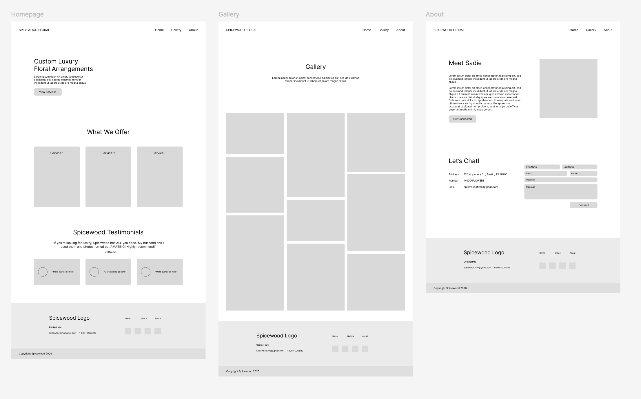
Lo-fi on Figma

Once me sketches were approved, I created the basic layout structure on Figma.

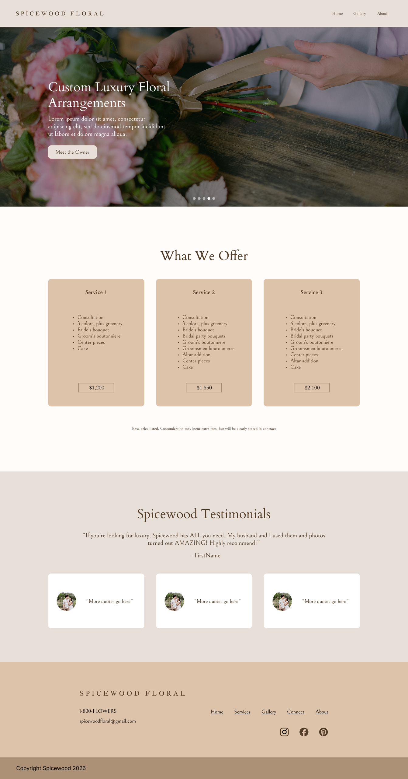
Polishing the Site

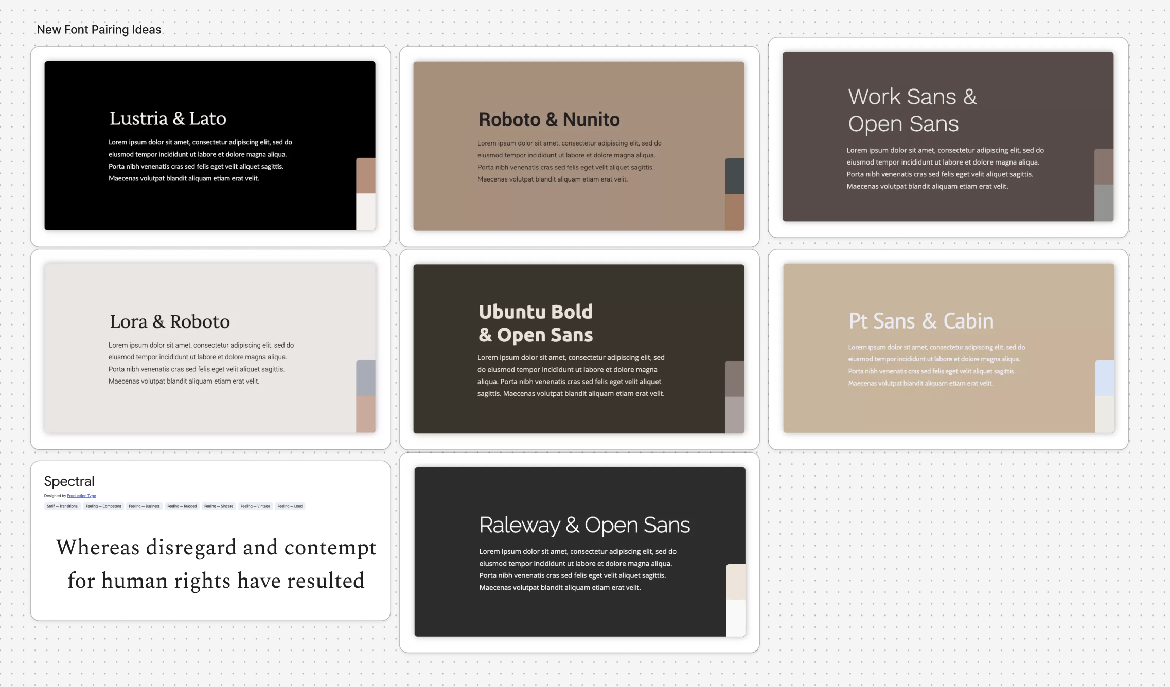
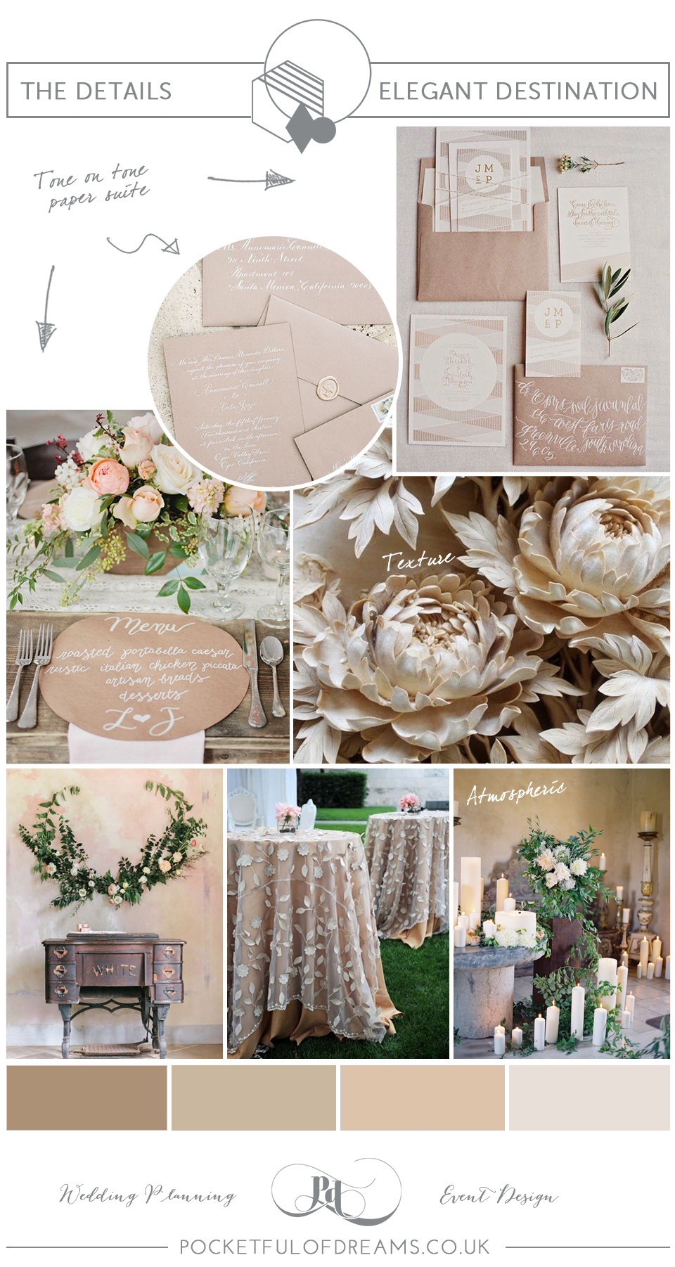
Using the brand guide that Lila provided, I began adding colors and fonts to make this website realistic.
Reflection

This training was fun and reminded me that I enjoy working in Figma sometimes. I had to really think about the user’s flow and expectations when designing each page. Since I have done some floral shopping, I tried to put myself in their shoes and provide the information they might seek clearly and upfront.
Filed Under: Fall 2026 – Spring 2027, We are STAs

Collab Lab Display

October 2, 2026 By Julie Brandt

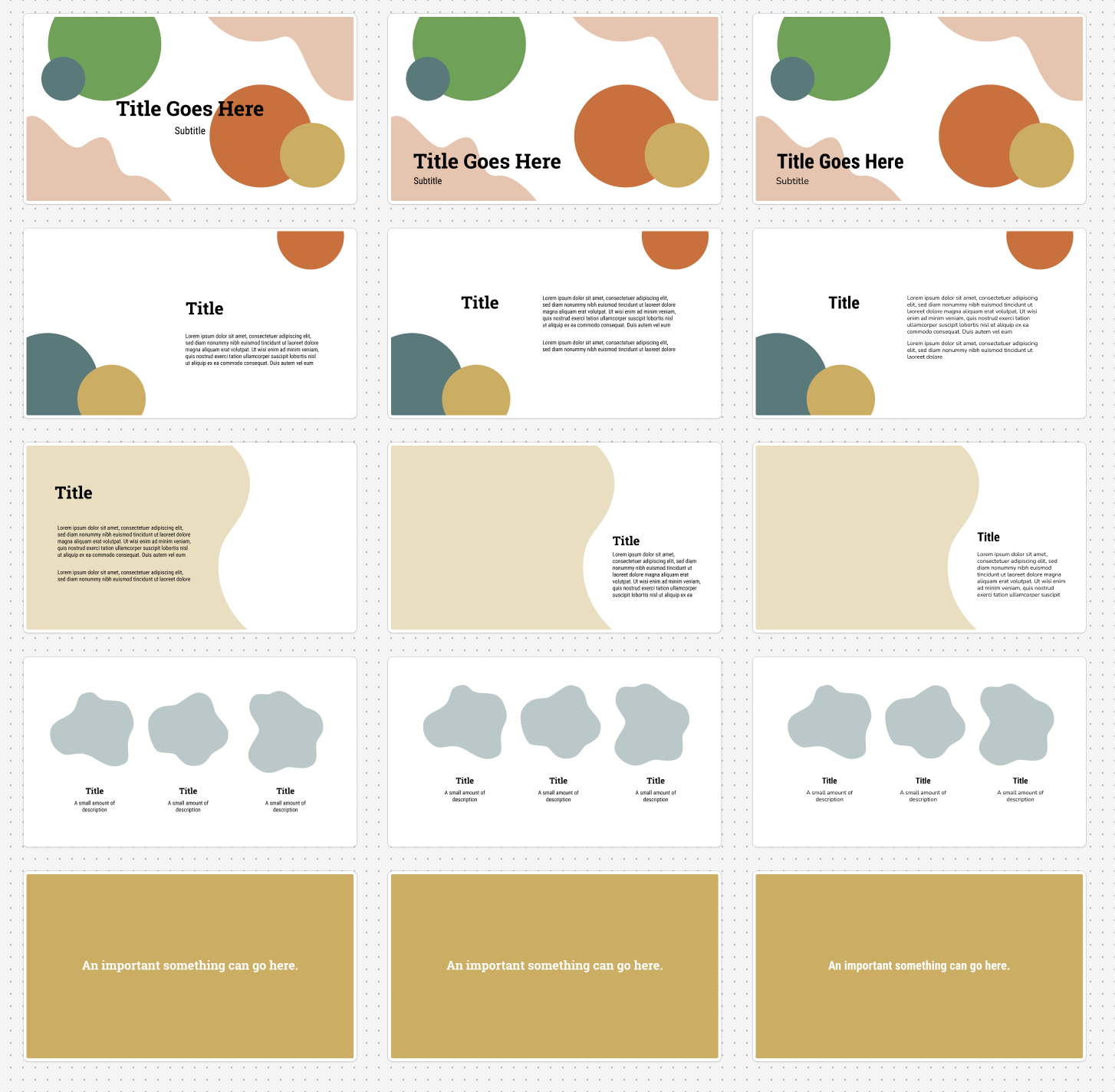
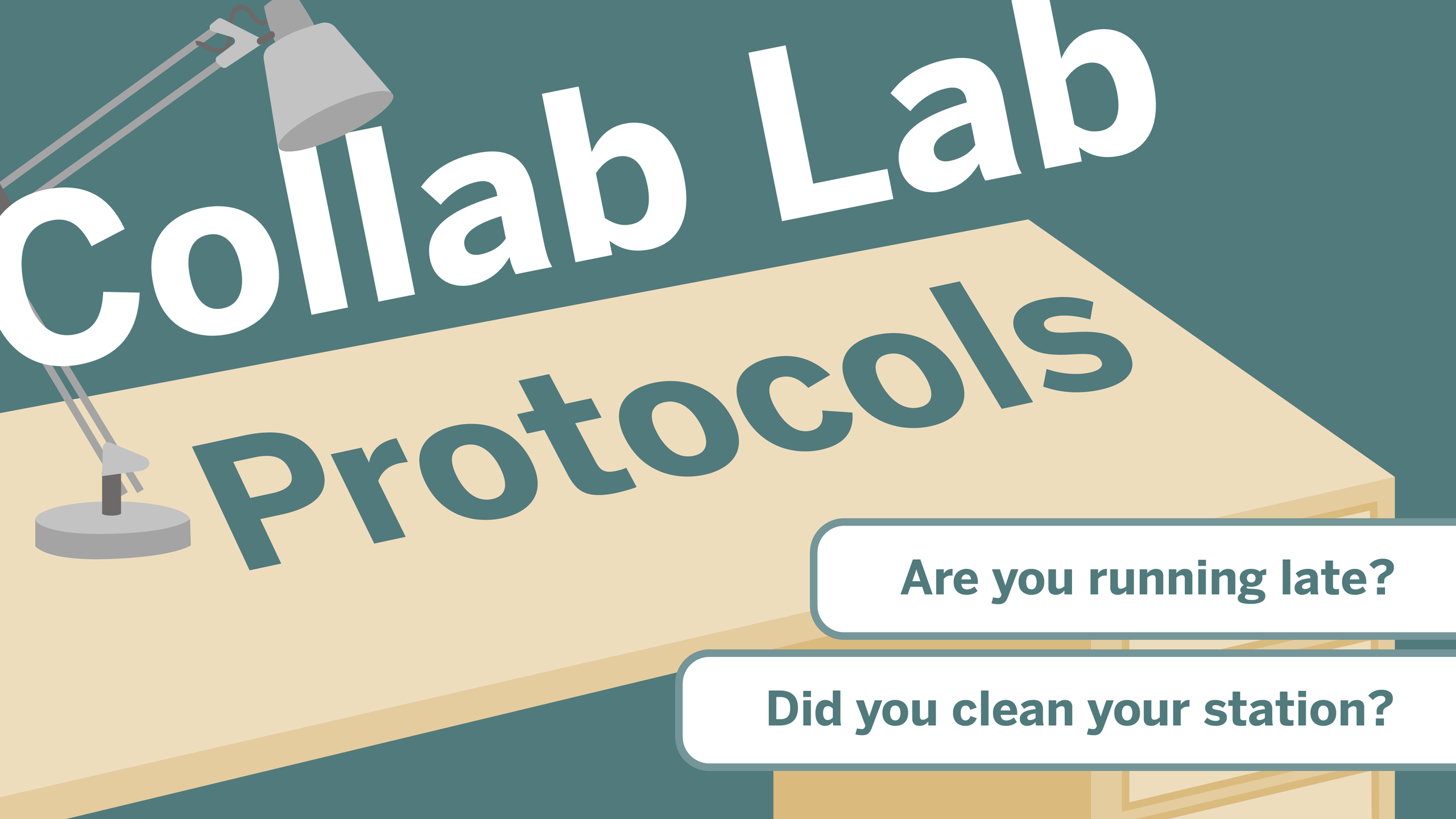
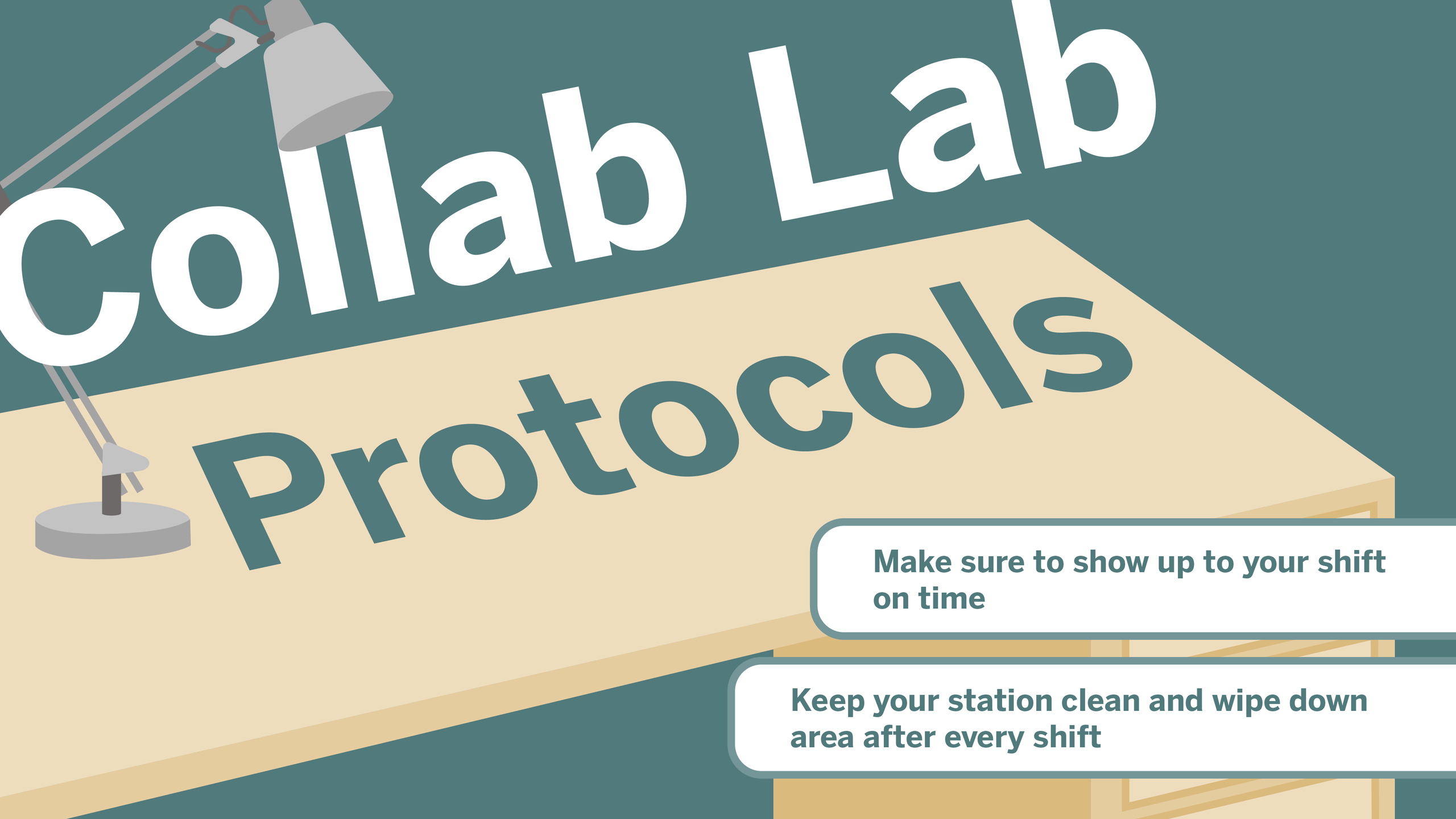
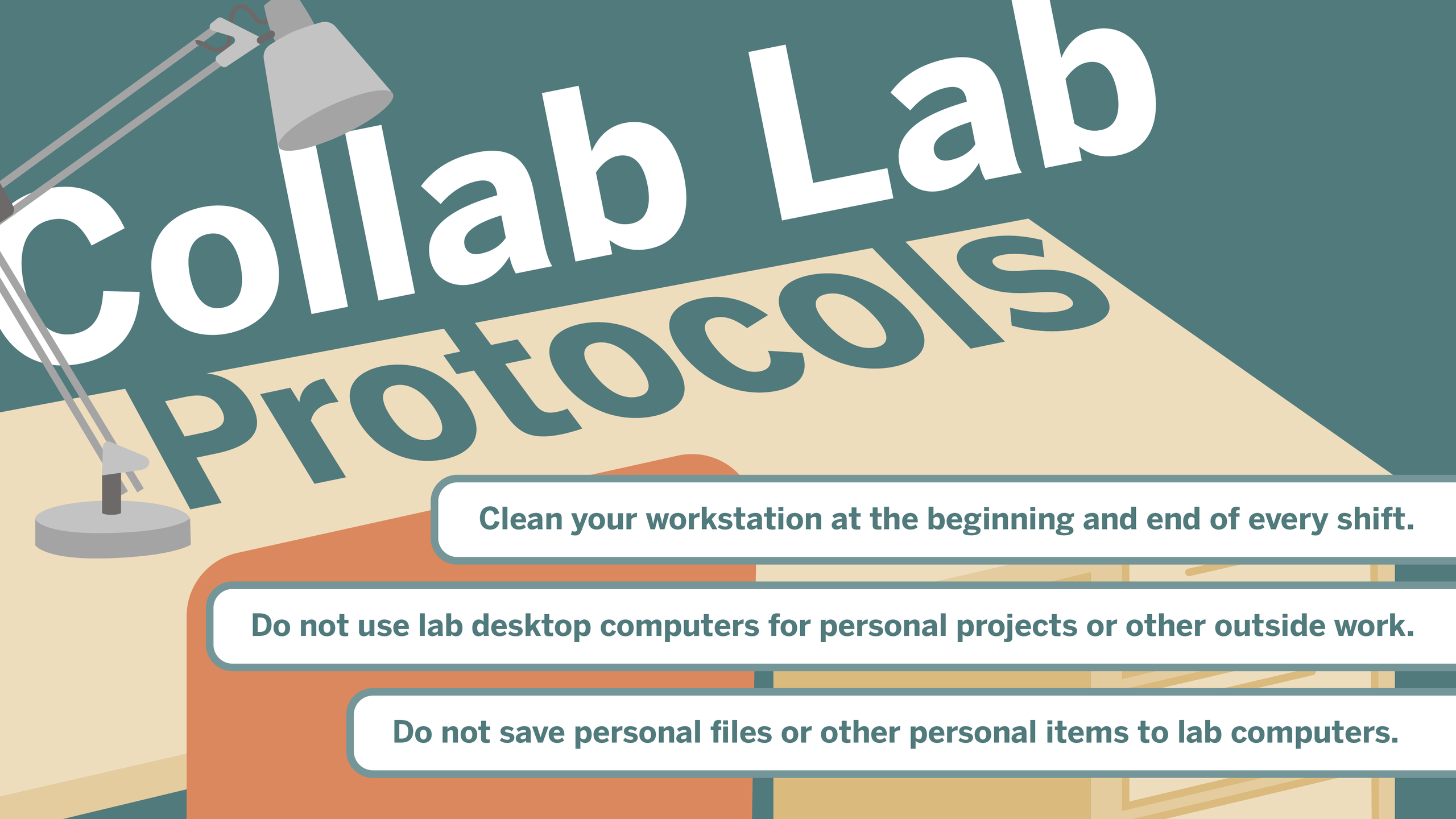
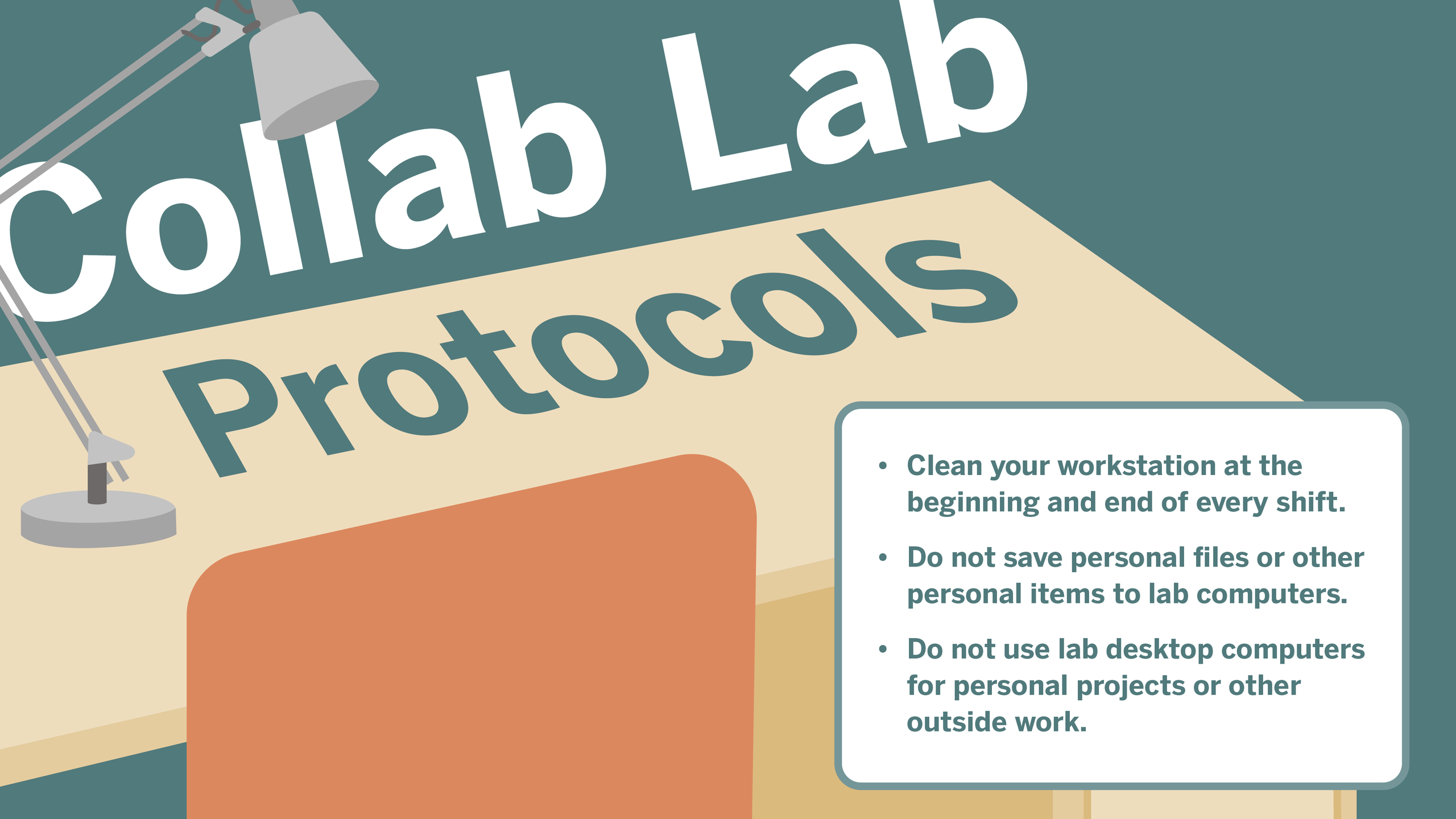
Collab Lab TV Display

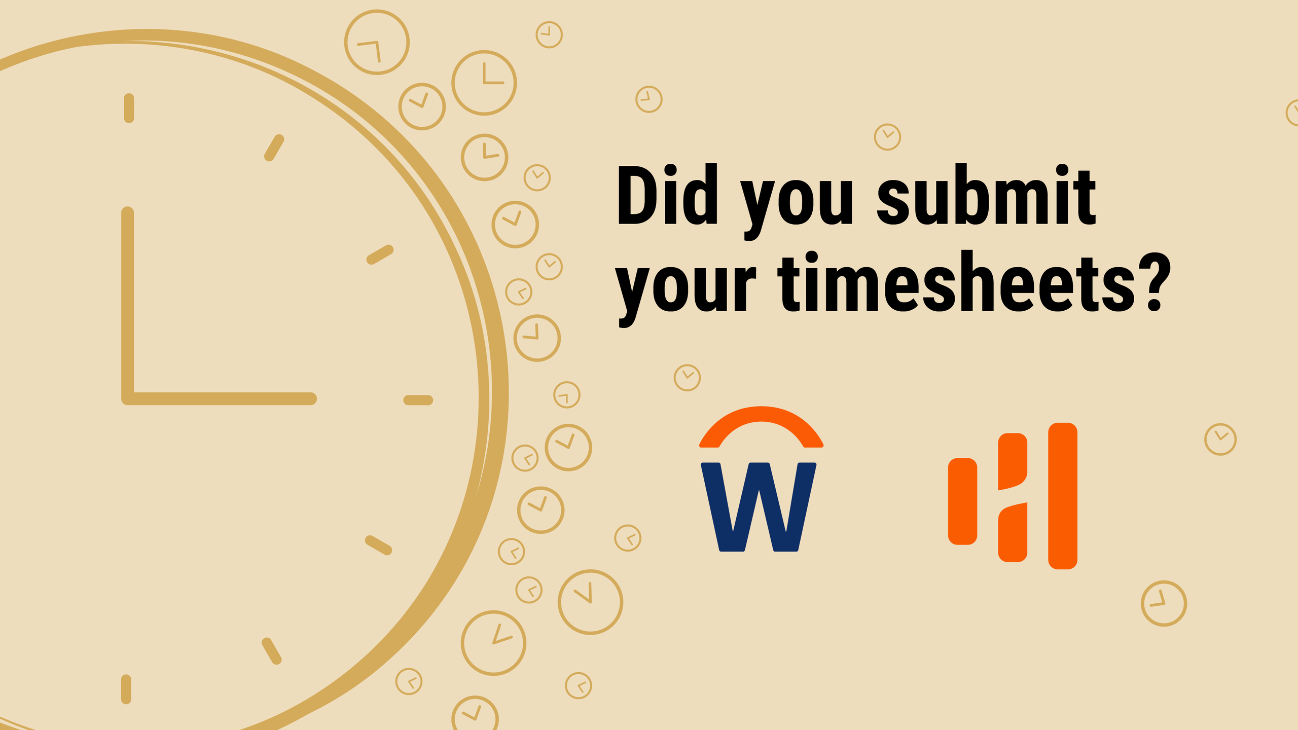
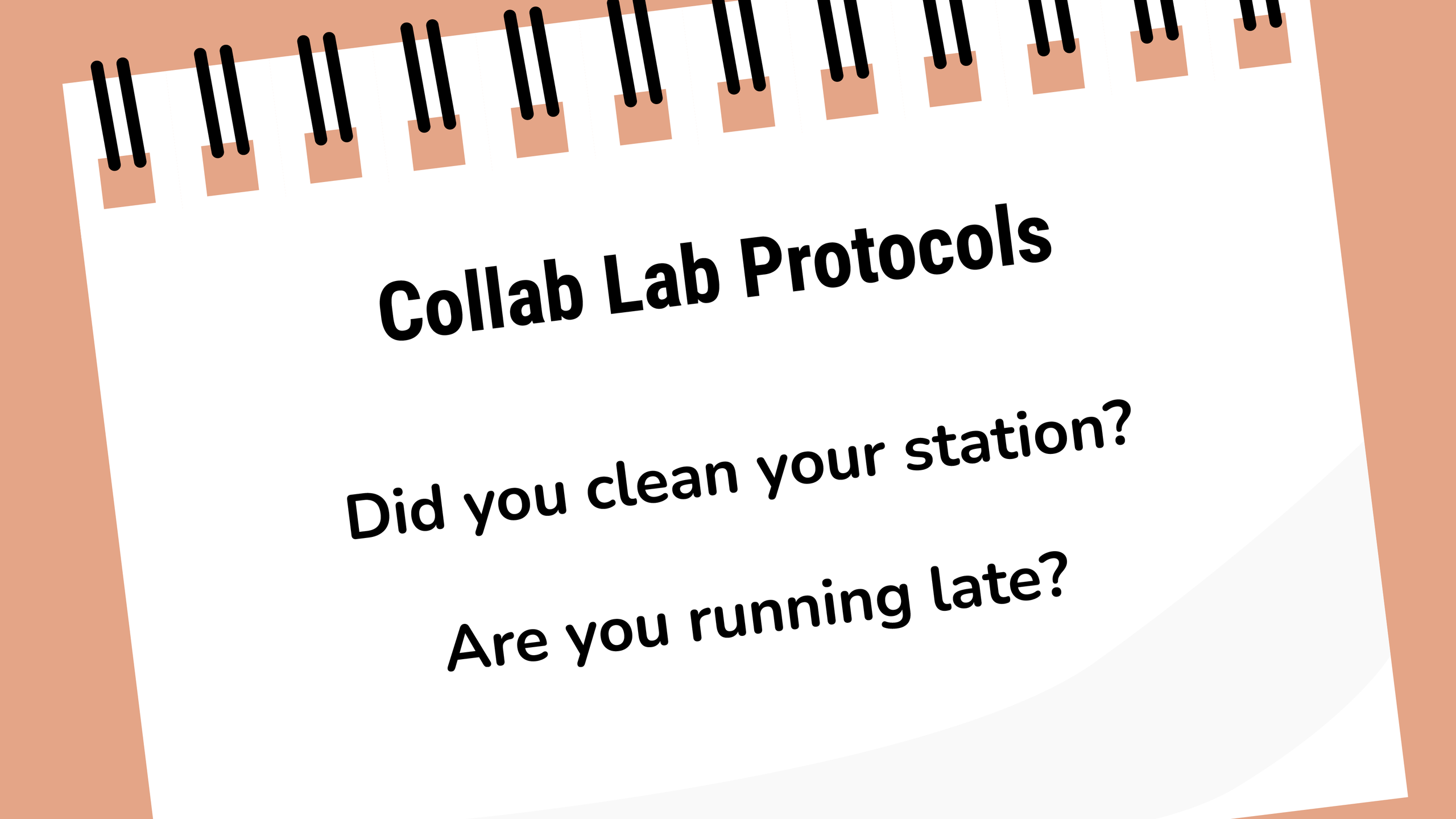
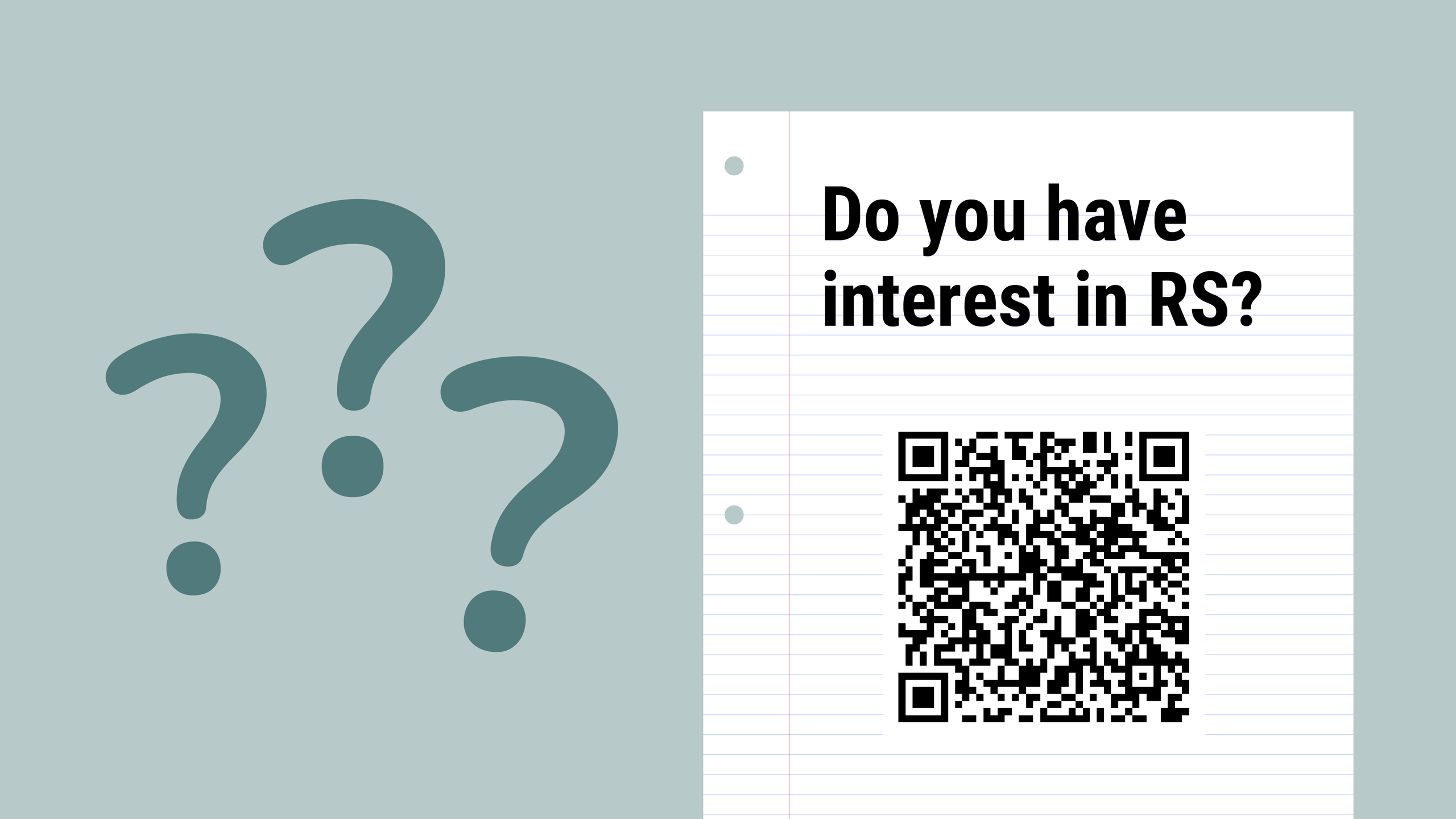
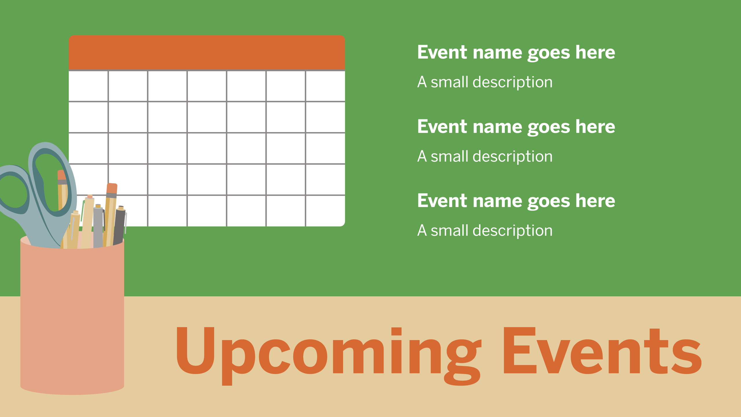
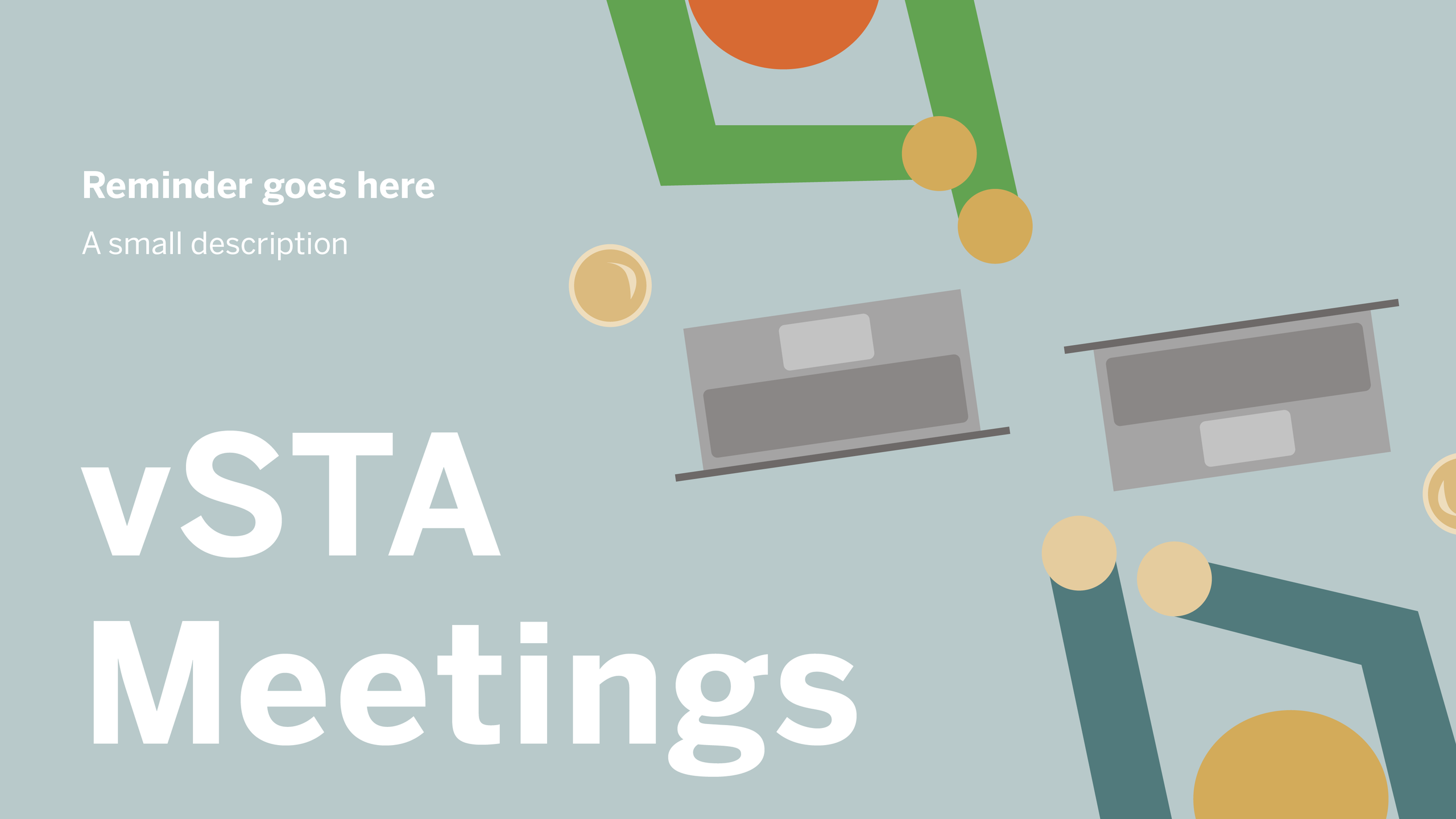
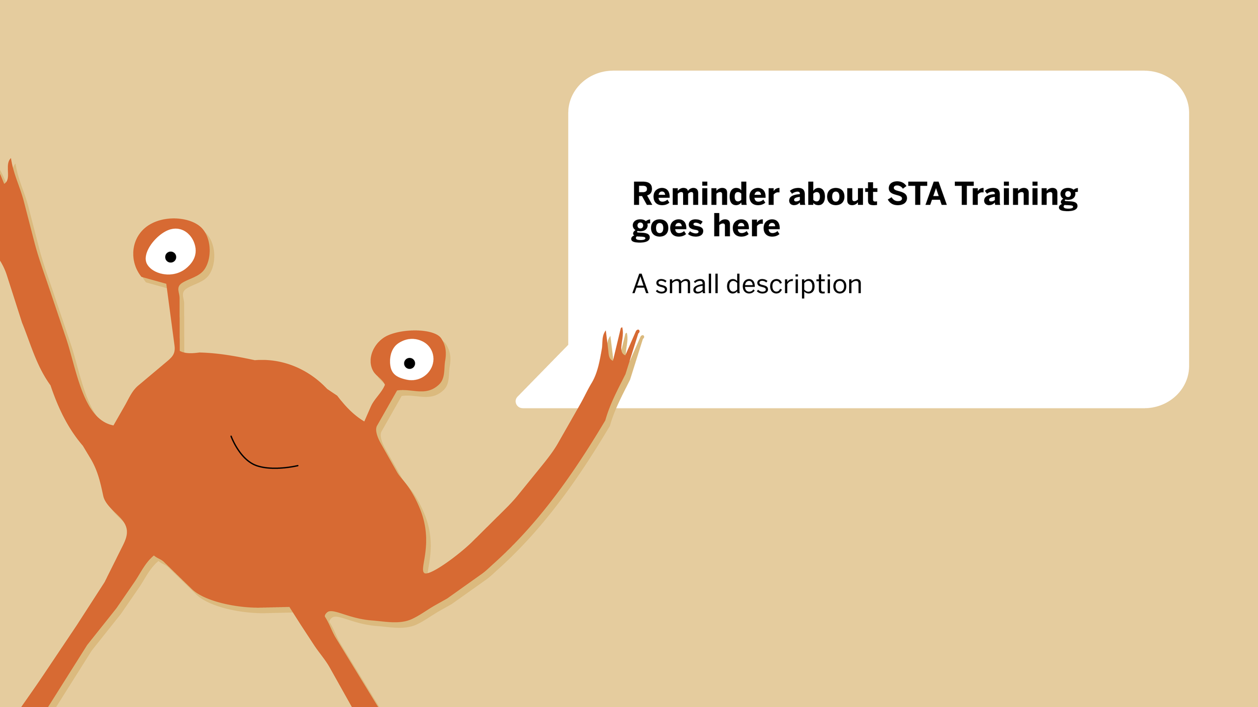
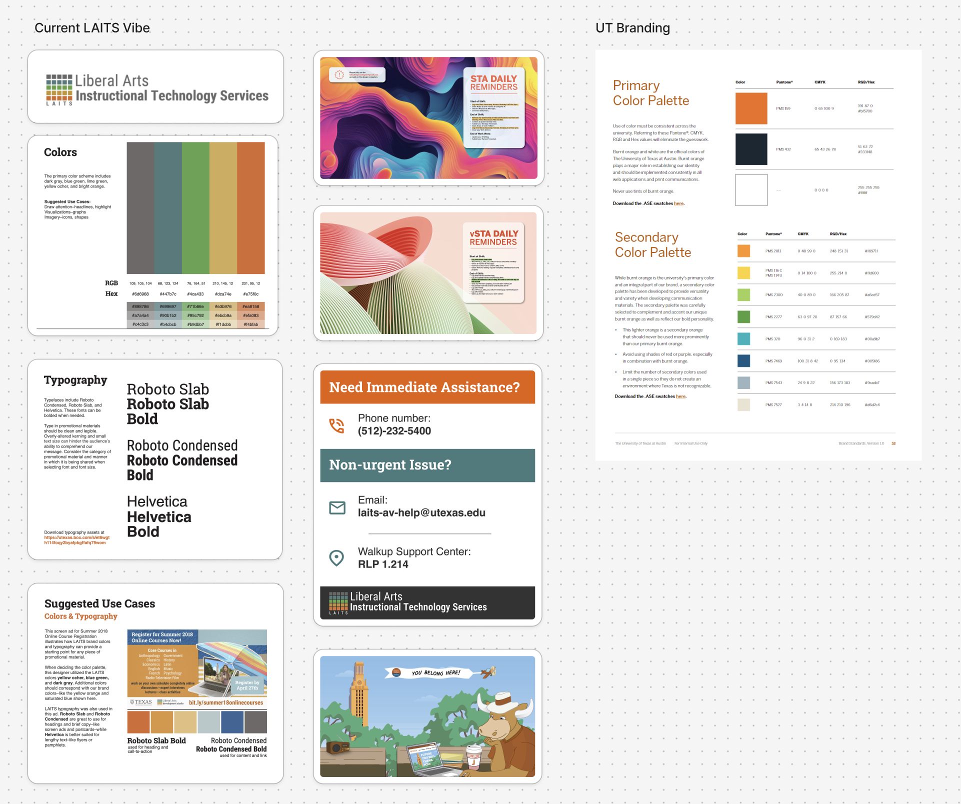
Task: Design a series of slides for the Collab Lab TV for STA announcements and protocols. Each slide should have a distinct style, but as a whole deck, remain cohesive and consistent.
Status: In Progress


Visual Guidance

In order to begin this project, I started a Figjam board with Kate to establish existing brand systems and styles before designing the slide deck.


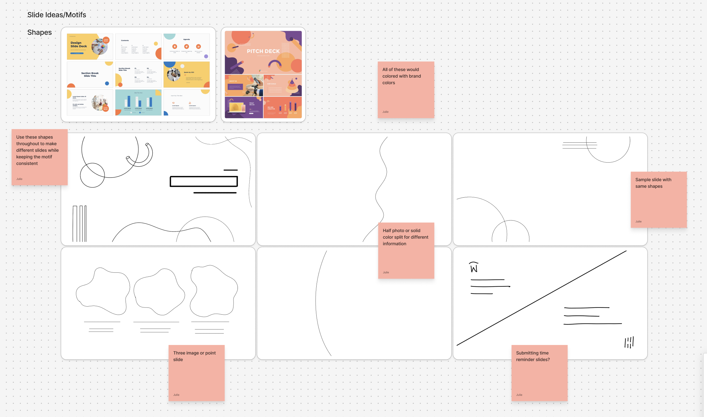
Moodboard, Sketches, First Drafts

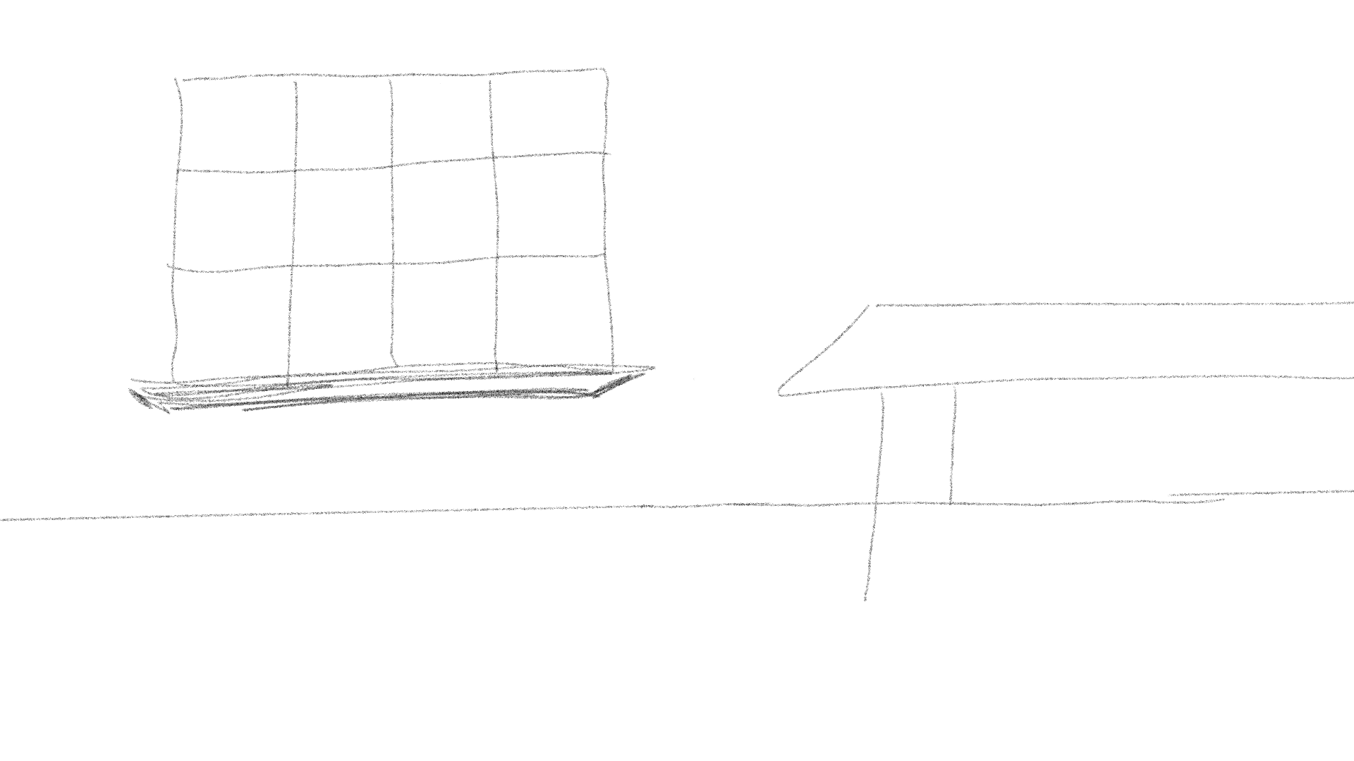
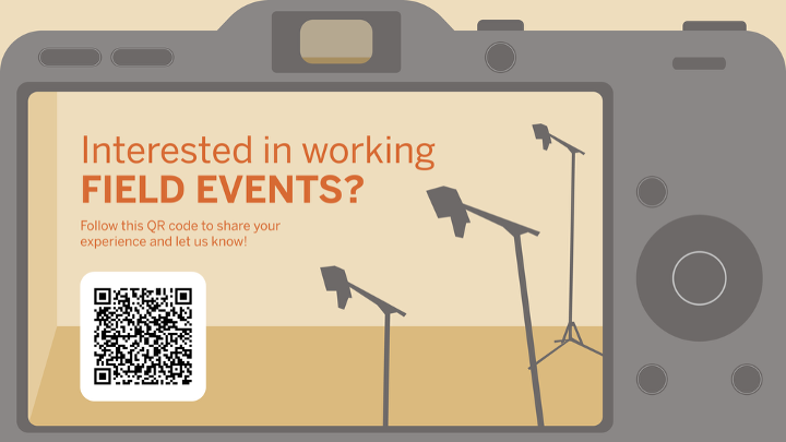
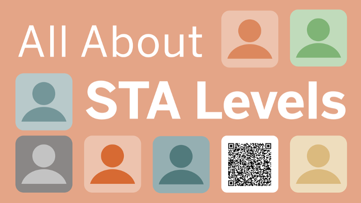
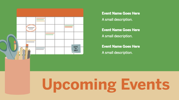
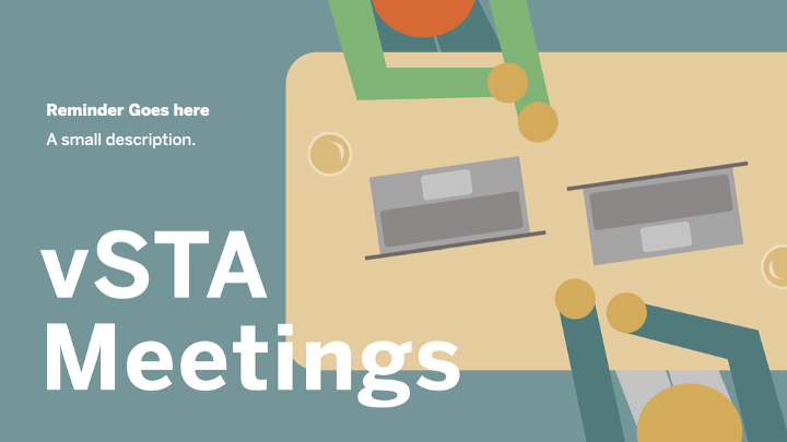
I began creating a moodboard with ideas for different layouts, colors, and motifs we could use. Then, I sketched out a few ideas and created them on Illustrator. However, there was a bit of confusion in what the assignment was, so these were not used in future designs. Instead of creating a slide deck template, I needed to design a series of engaging announcement style graphics in slide format to be displayed on the Collab Lab TV.


New Direction

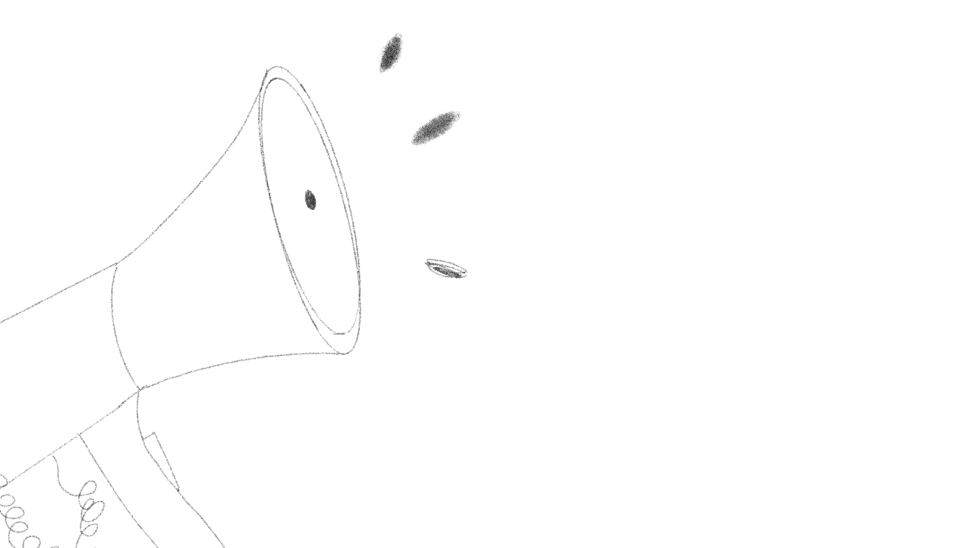
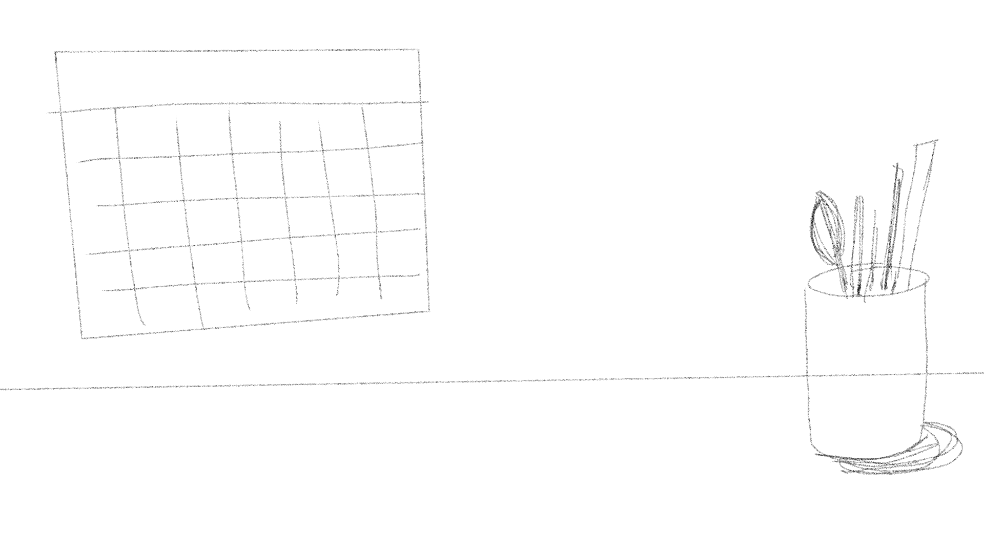
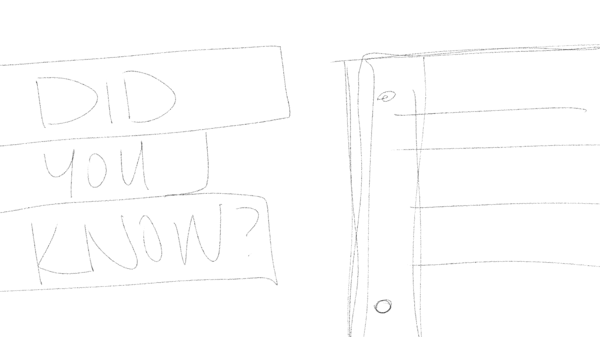
With this is mind, I created a few new sketches for the slides and created them on Illustrator. Although this was heading in the right directions, they were still too simplistic.


Evolution and Iterations

I evolved my designs after getting feedback from Kate and De’sha making them more illustrative and dynamic. With this new direction, I was able to inform the designs of the other slides.

Improved Designs and Client Requests

The designs below were changed based on feedback from De’sha. Specifically on consistency, correcting verbiage, and alignment.
These are changes I made based on the clients requests

Continuing Slide Drafts

Using the style of the first five designs, I began sketching and designing ideas for the rest of the display slides.

Final Designs

These slides were approved and placed into an editable PowerPoint presentation for the Visual Team


Reflection

Making this slide deck was a really fun process and I was able to put my illustration skills to the test. When I first began looking at color and branding inspiration, I didn’t think that the LAITS palette had enough fun colors. However, I quickly realized that there was more than enough and they still made visually appealing designs. It was a good challenge to keep everything within the LAITS brand. In the future, I look forward to working with other brand identities and making engaging designs despite the feeling of being limited.

Filed Under: Fall 2026 – Spring 2027, We are STAs

Roster Poster Continuation

October 2, 2026 By Julie Brandt

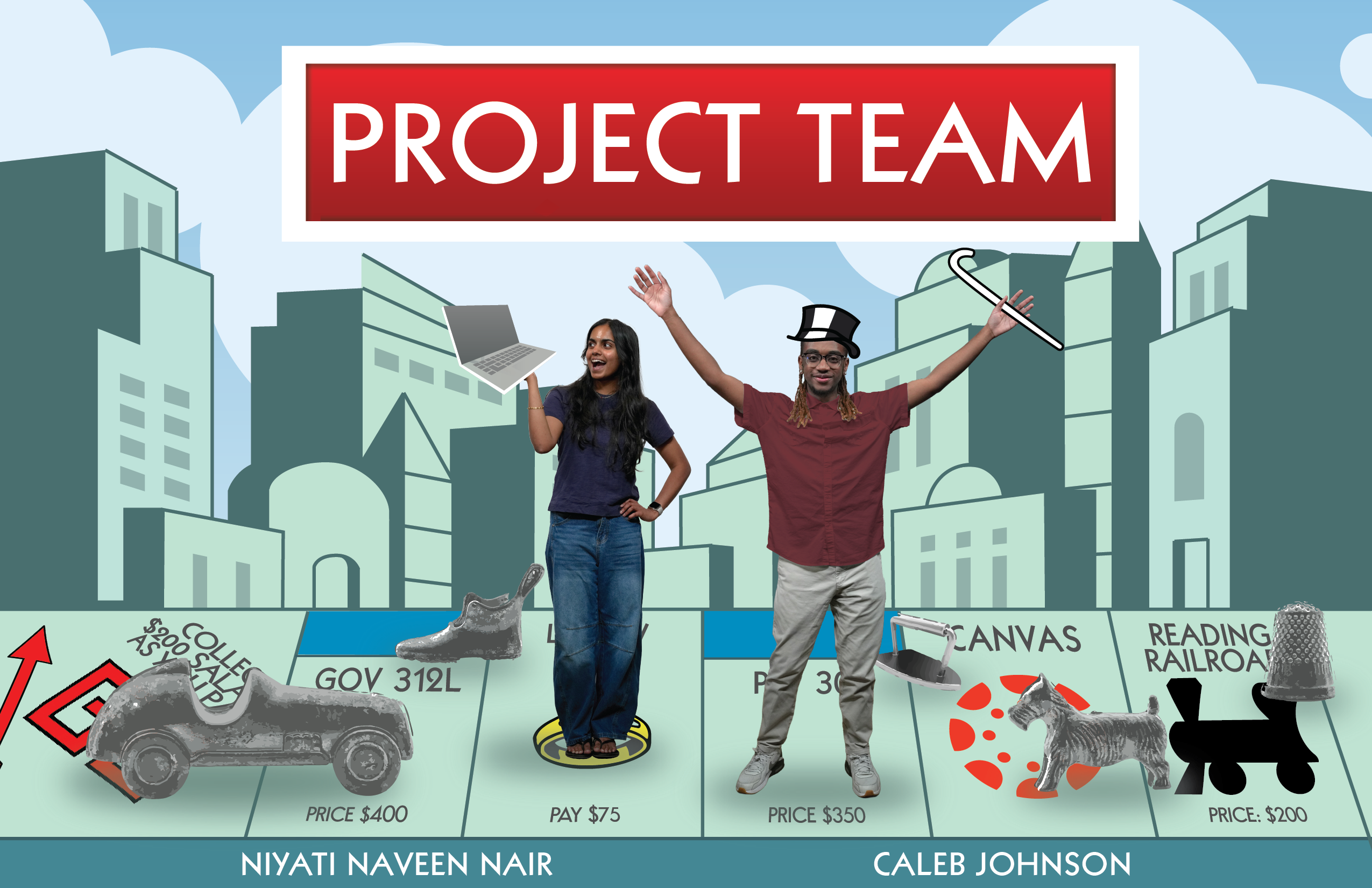
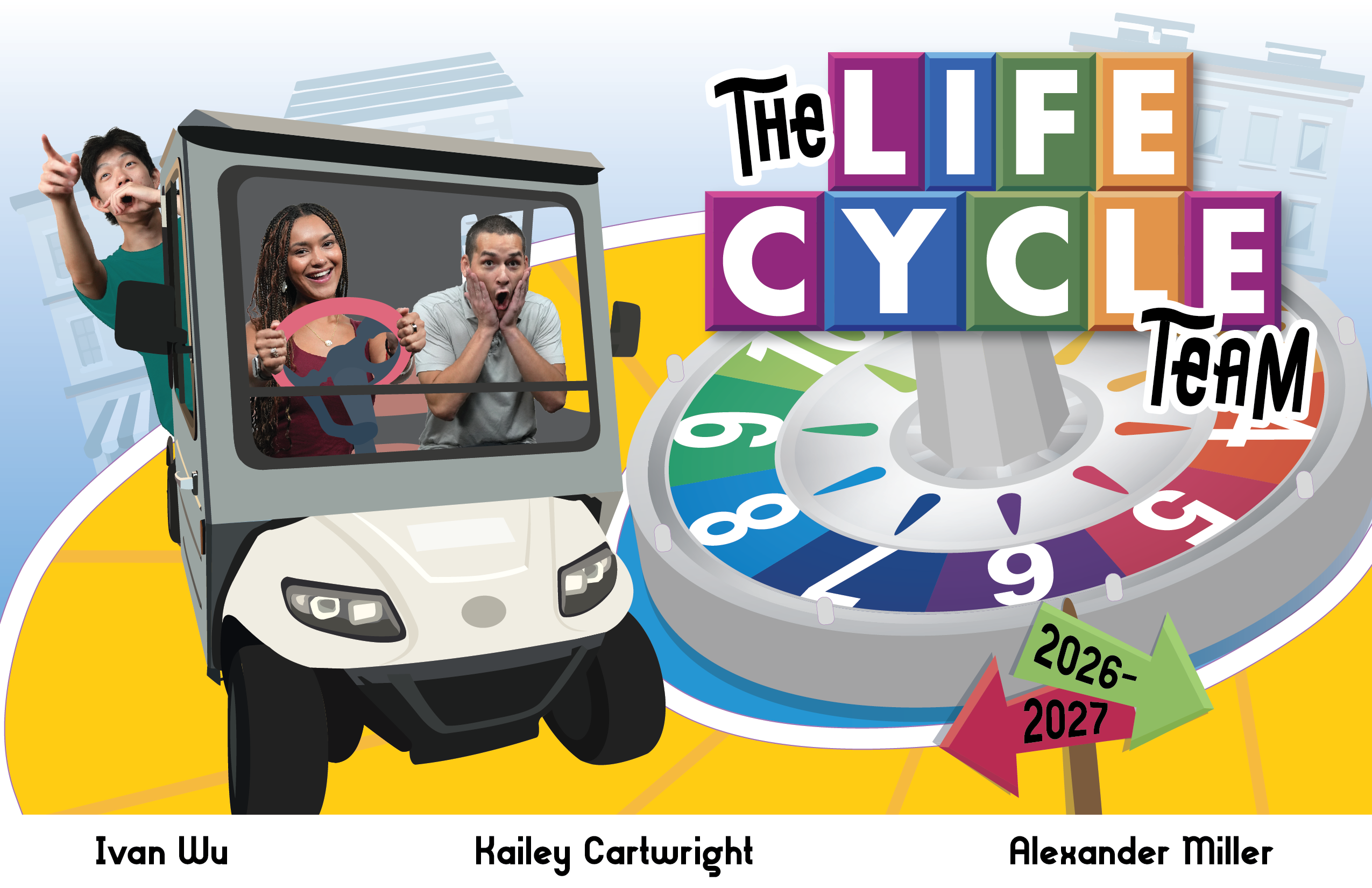
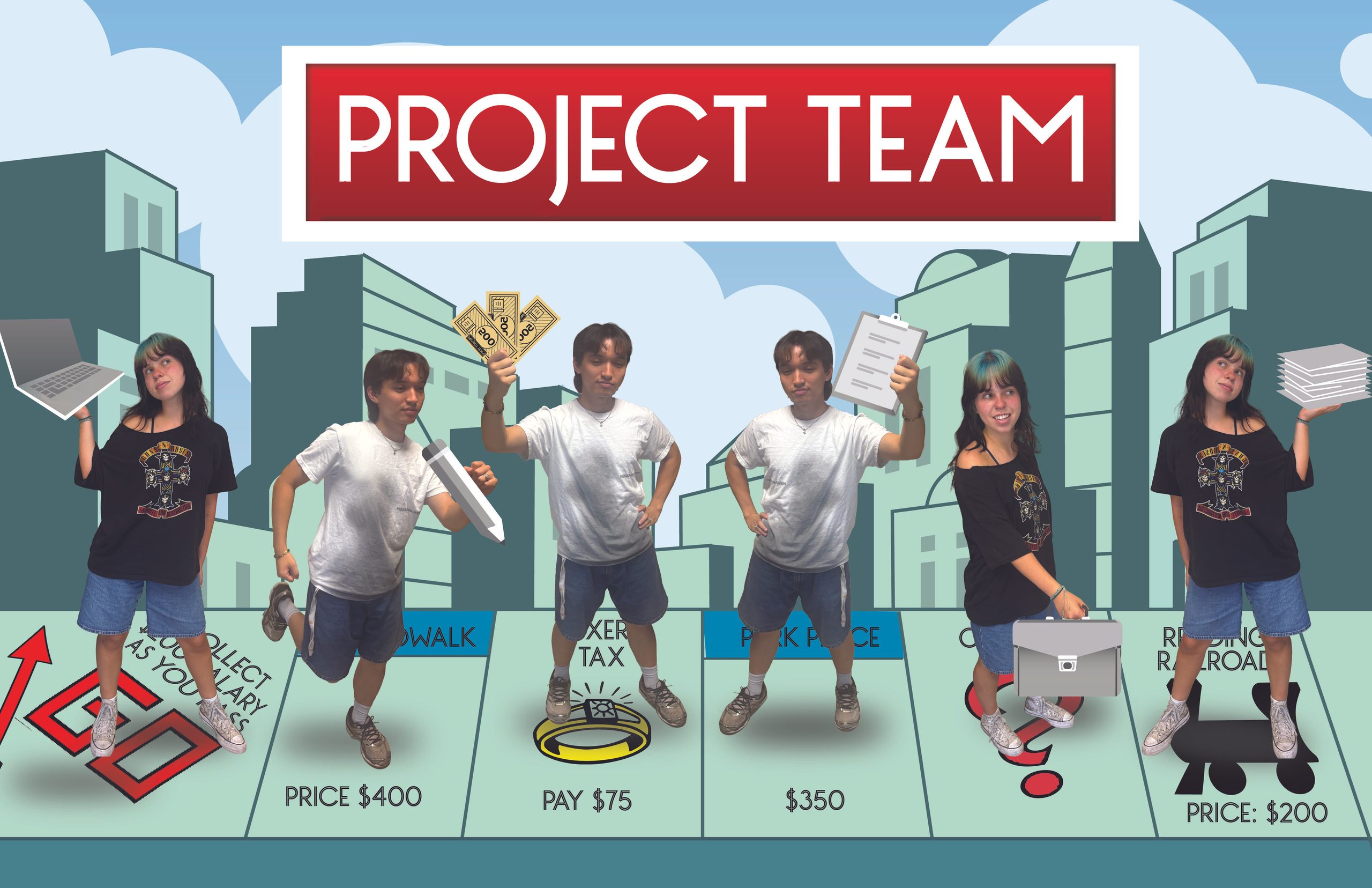
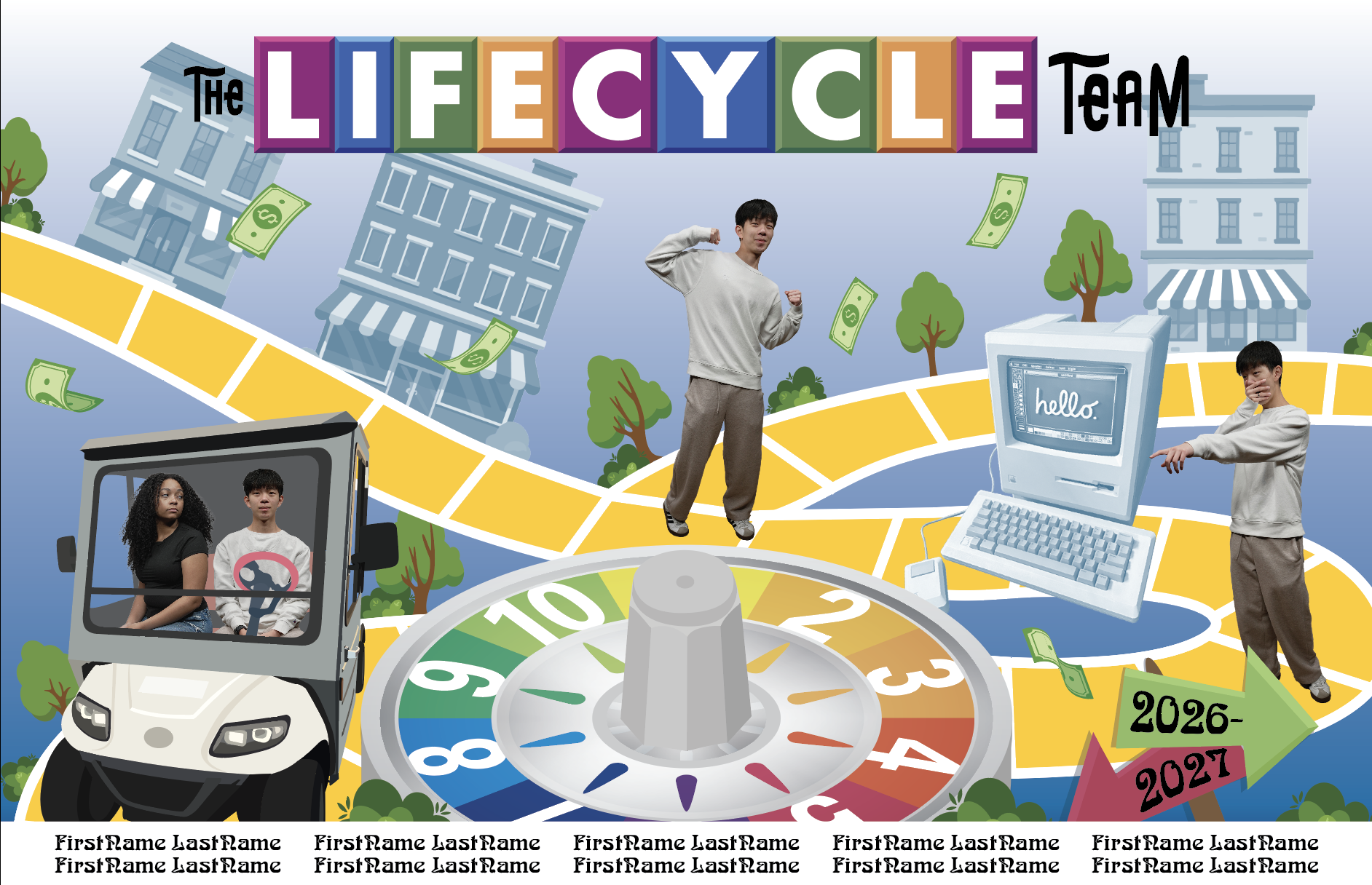
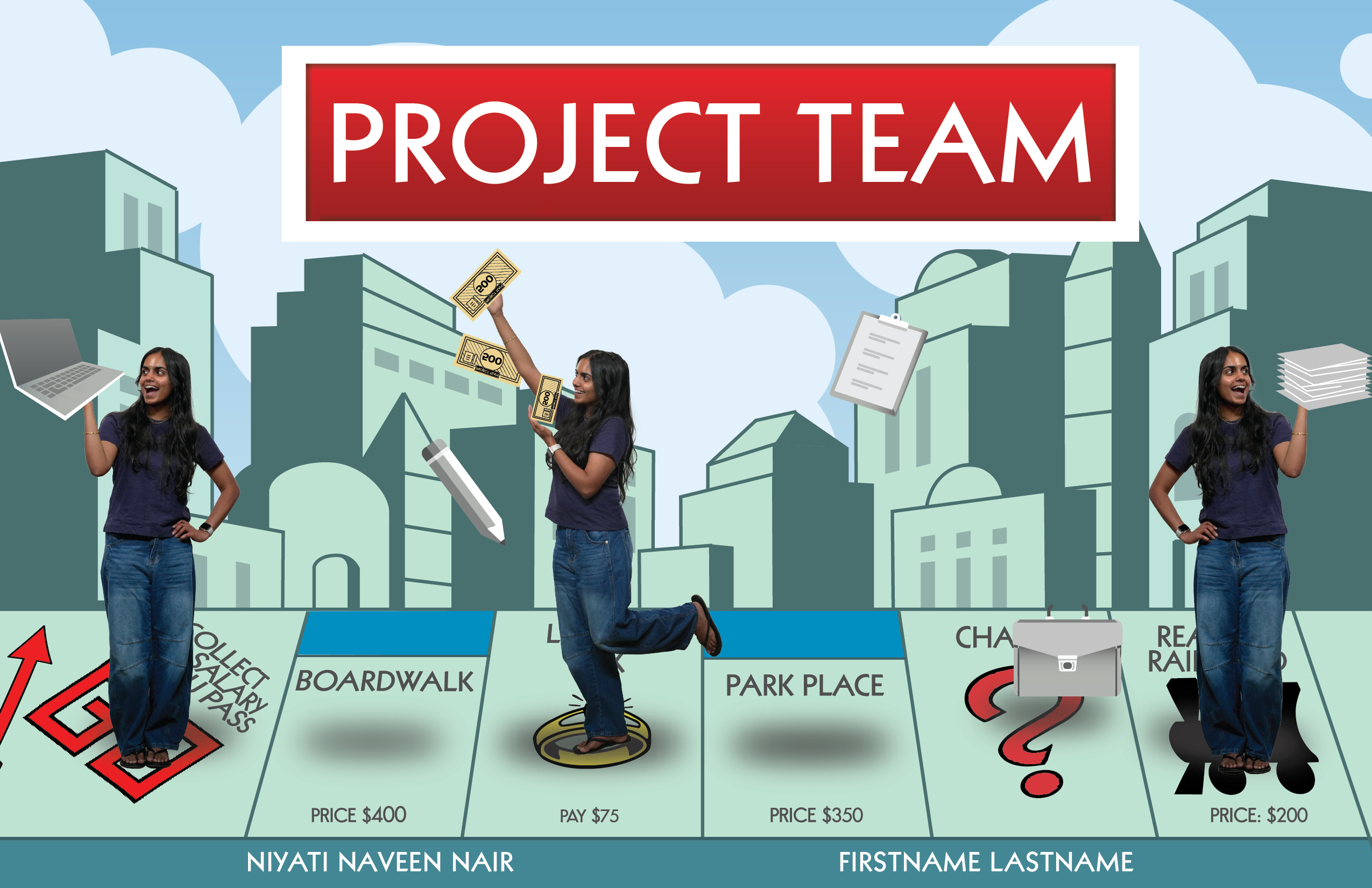
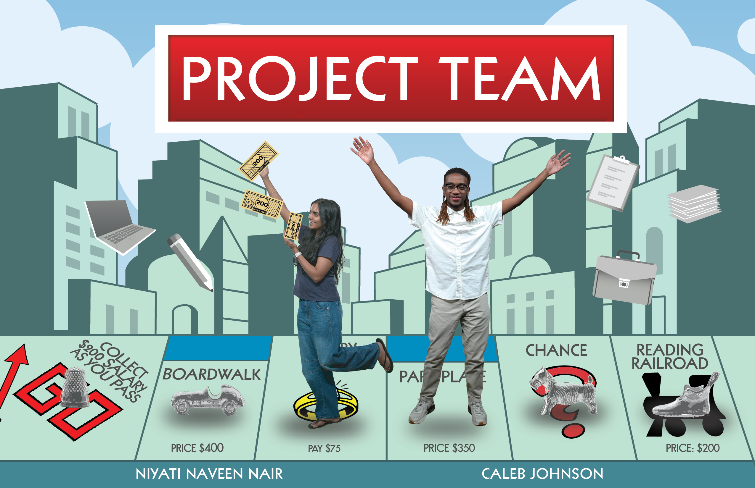
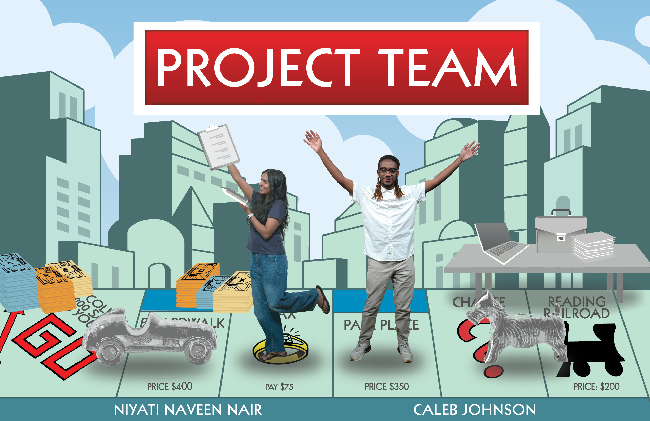
Project Team and Lifecycle Team

Task: Complete the roster posters designs

Original Designers: Asha R. for Project Team and Sasha K. for Lifecycle

Status: Complete


Final Posters


Reference

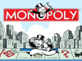
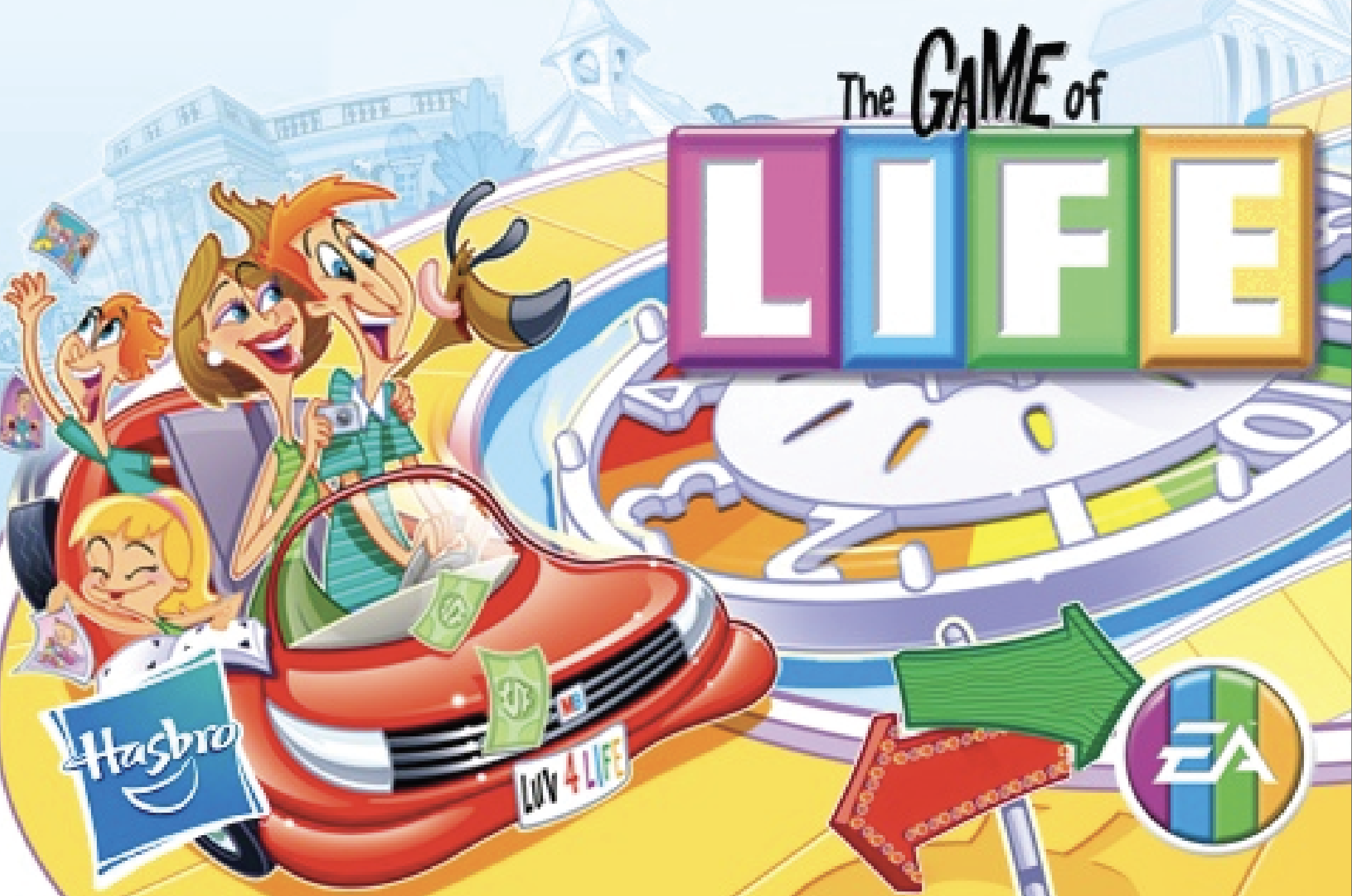
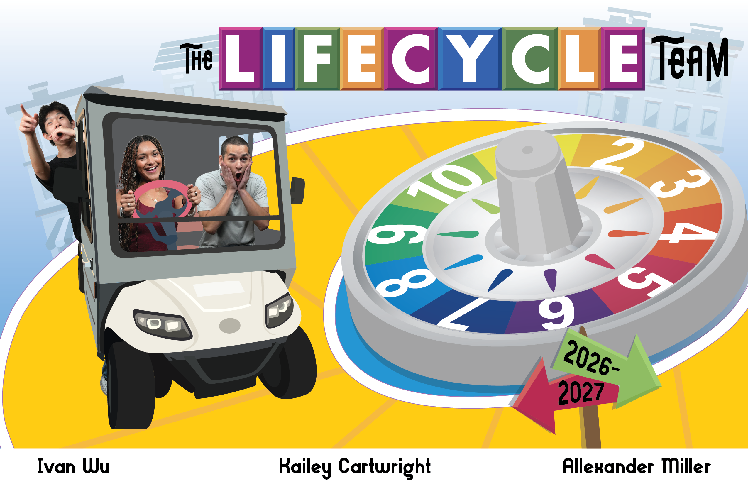
The goal was to create a poster that visually resembled the board game box. When I received the posters, the main references I used were these two images.


Pre-existing Designs

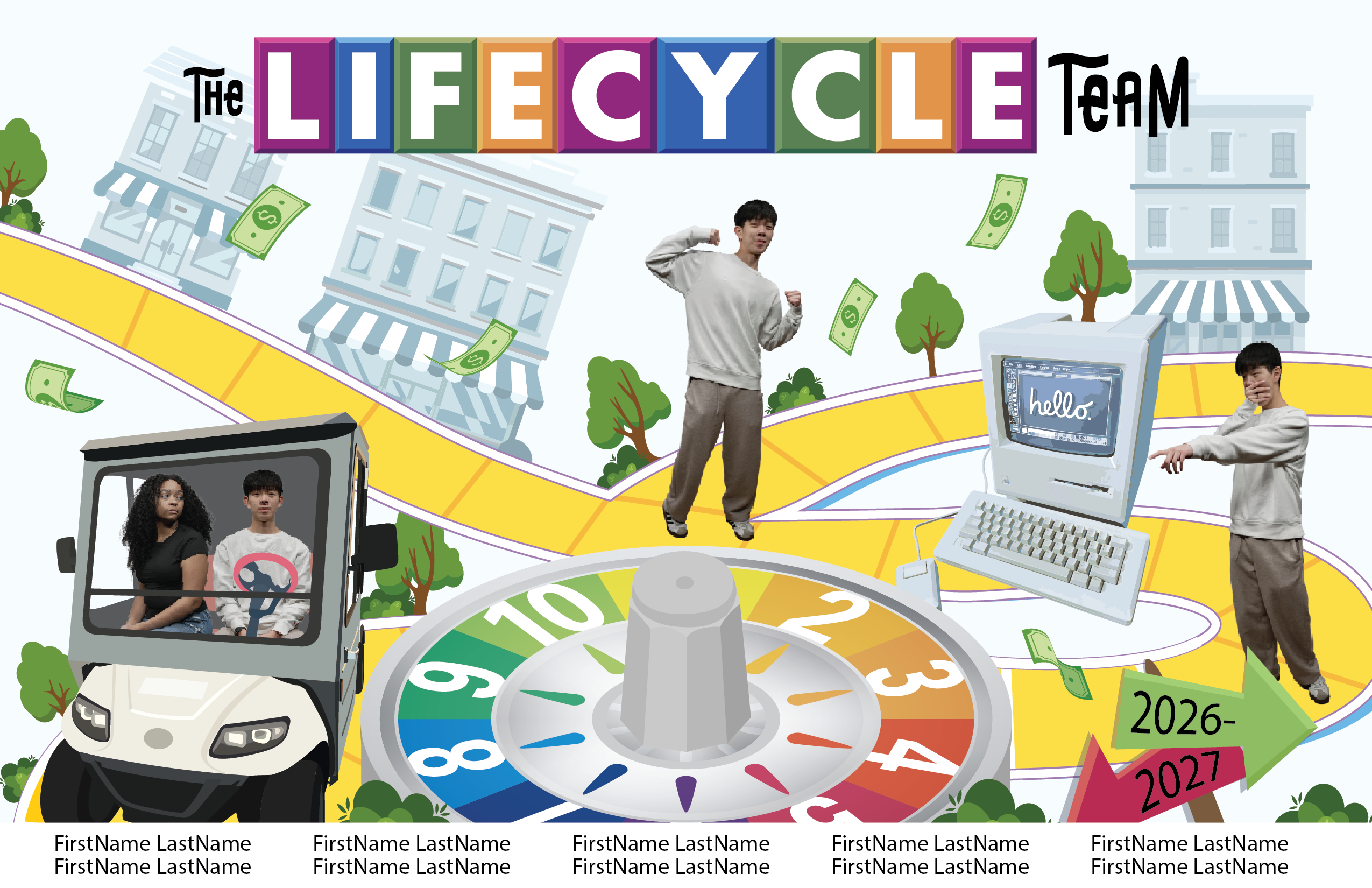
Below are the designs that Asha and Sasha originally created. I worked with their files and eventually made changes based on feedback from Lila and De’sha.

Asha R.
Sasha K.

Project Team Iterations

We changed layout directions a few times due to the small number of people on the Project Team. For example, we decided not to have multiples of the STA’s. To accomodate for the new layout, we rearranged the elements on the page and I created new graphics to fit in the poster. We leaned into the original board game’s token pieces and the Project Team’s most used items.

Added “tokens” and other STA’s
Created more graphics to ground the poster

Lifecycle Team Iterations

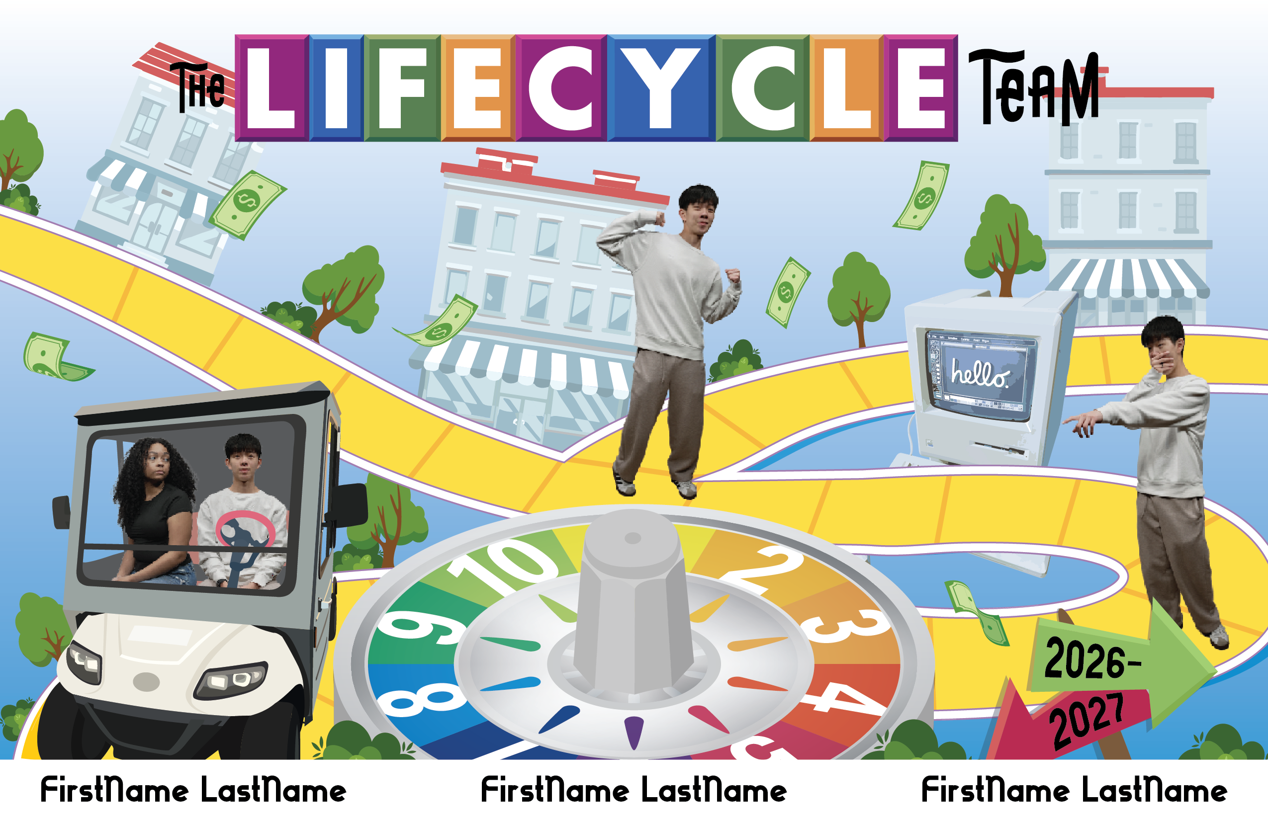
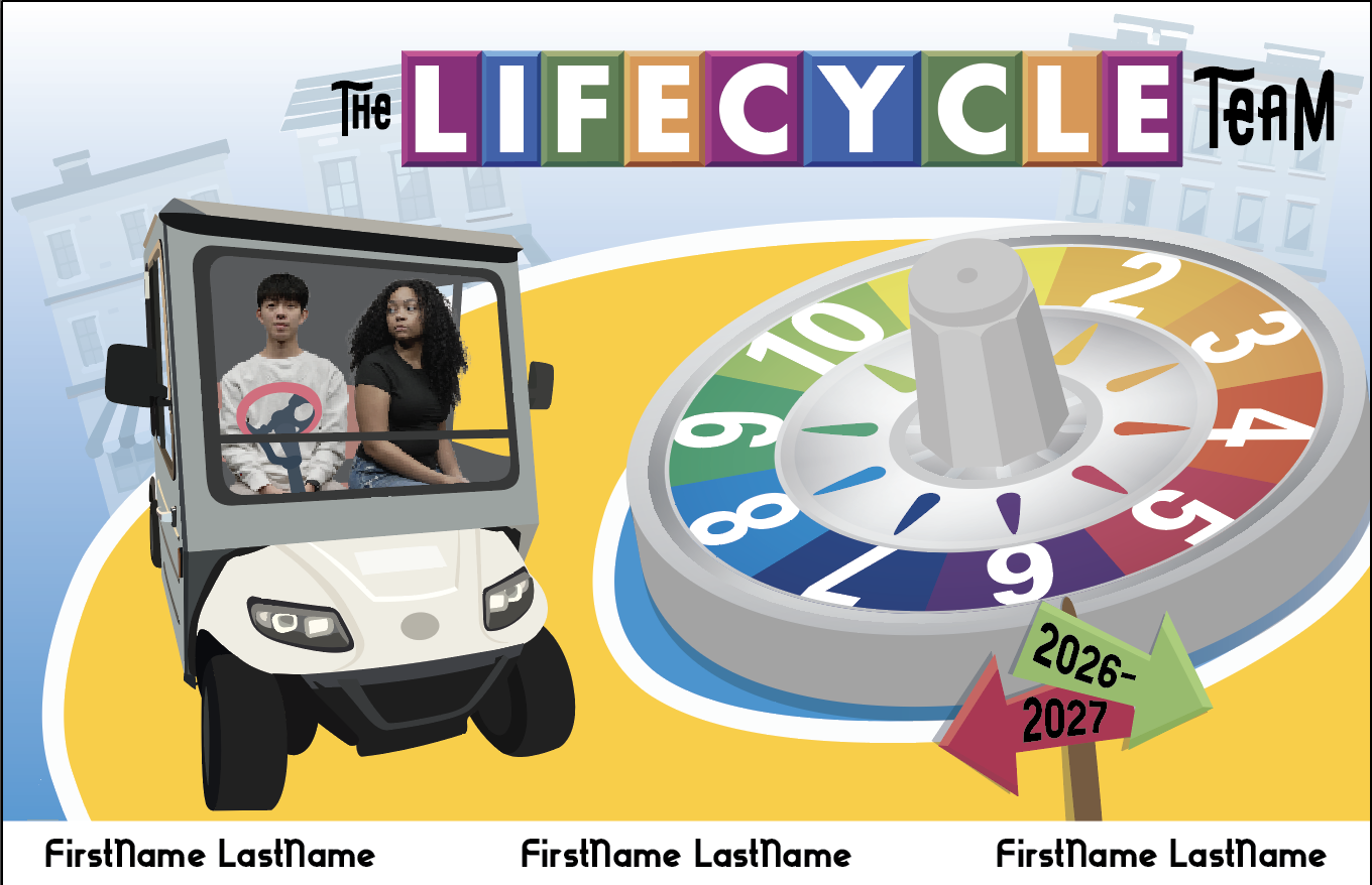
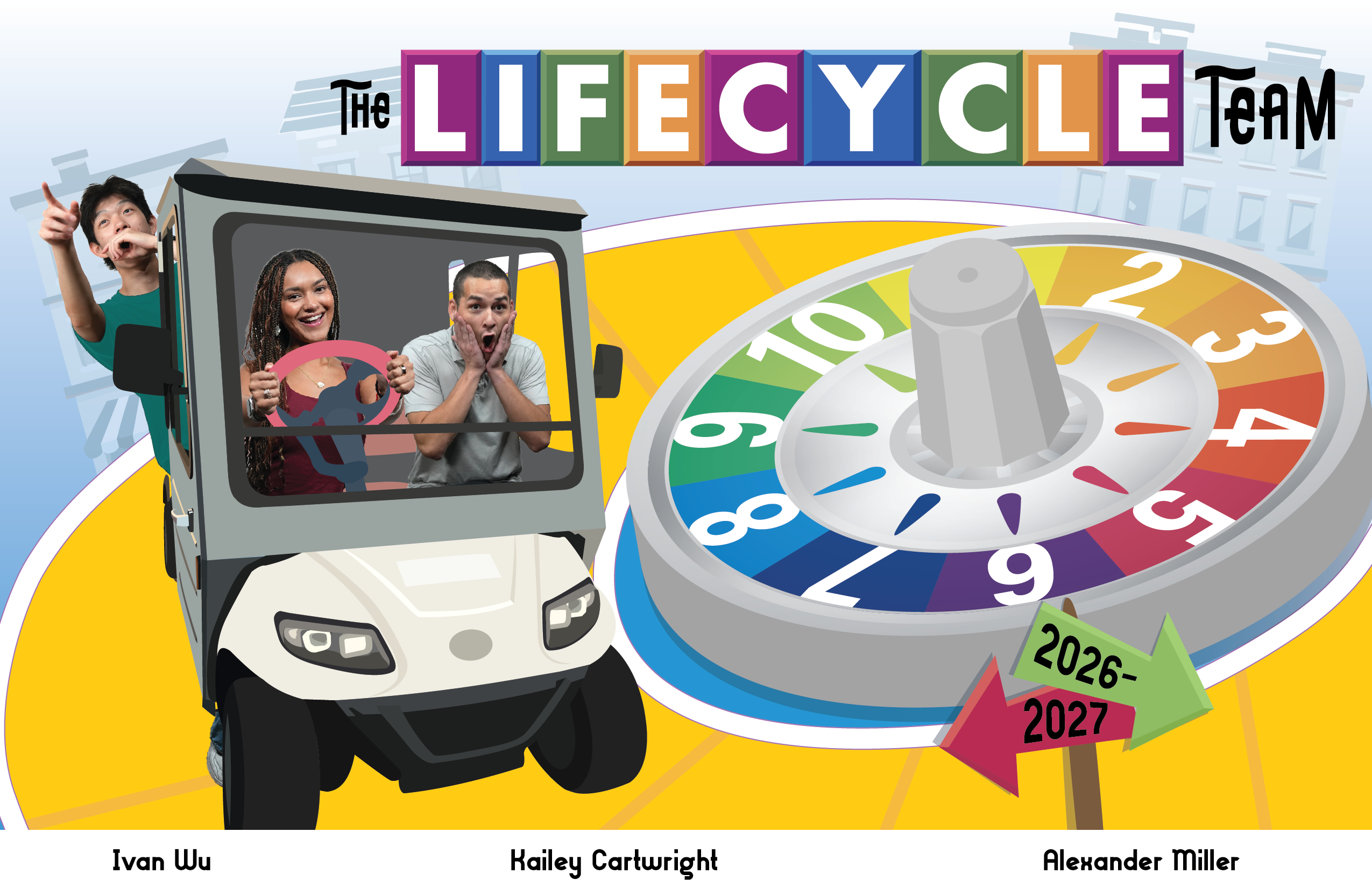
This poster had a similar issue in that there were only three STA’s, but the poster was a bit busy. After messing with the original layout a few times, De’sha created a new file that was much simpler. I made adjustments to make it resemble the reference image more closely.

New layout shared with me by De’sha
Adjusted pathway and STA’s
Fixing STA positioning and changing shirt color

Final Designs

For the Project Team, we decided to simplify the design and add more tokens onto the board. This made the board more consistent and focused on the STA’s. Additionally, we added a few details such as GOV 312L, PSY 301, and the Canvas logo to connect the poster back to UT.

For the Life Cycle poster, we adjusted the placement of “The Life Cycle Team” and added an offset path to increase legibility. Insead of having the text across the board, this version balanced the weight of the car and the title.


Reflection

Coming onto this project midway through the process was a new experience for me, but will likely be how design jobs will be in the future. I think this was good practice for me to work with another person’s design, keep core elements, and continue improving it. At first it was a bit challenging to know what to change and what to keep, but with guidance from Lila and De’sha, I think these turned out well in the end. Overall, jumping into these posters was a fun and challenging experience and taught me how to push designs forward that weren’t mine to begin with.

Filed Under: Fall 2026 – Spring 2027, We are STAs

Week 2

September 4, 2026 By Julie Brandt

Painting, Pixel Art, and Logo Animation

This week I worked on three different trainings. One was brush painting in Photoshop another was creating pixel art in Illustrator and the last was animating a logo in After Effects. I learned a lot of new things in all trainings and am looking forward to using these skills in the future!


Photoshop Painting

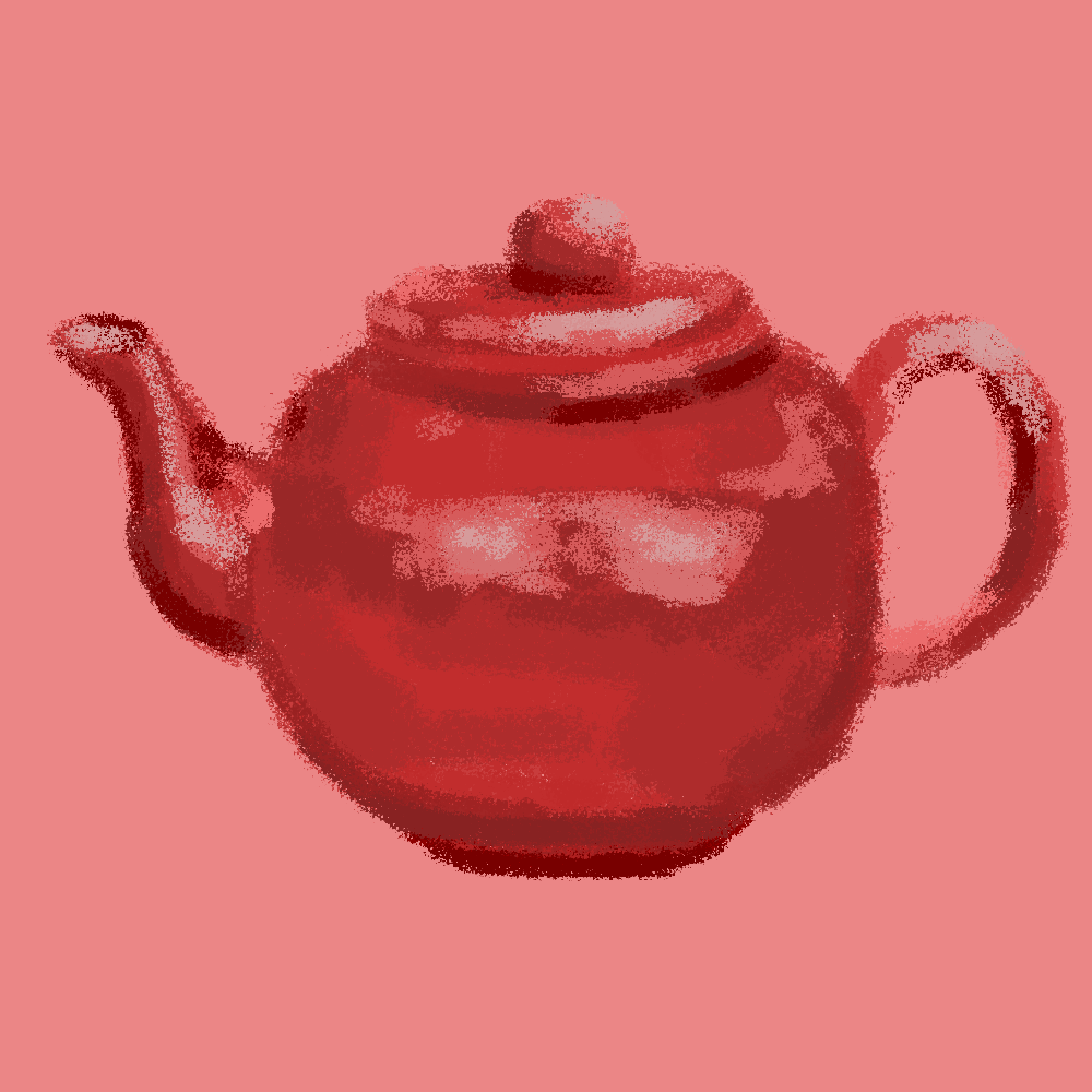
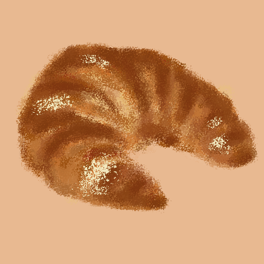
My task was to replicate a teapot design, then use a photo of my choice to create a new painting. I then animated it within the program to add a cuteness factor 🙂


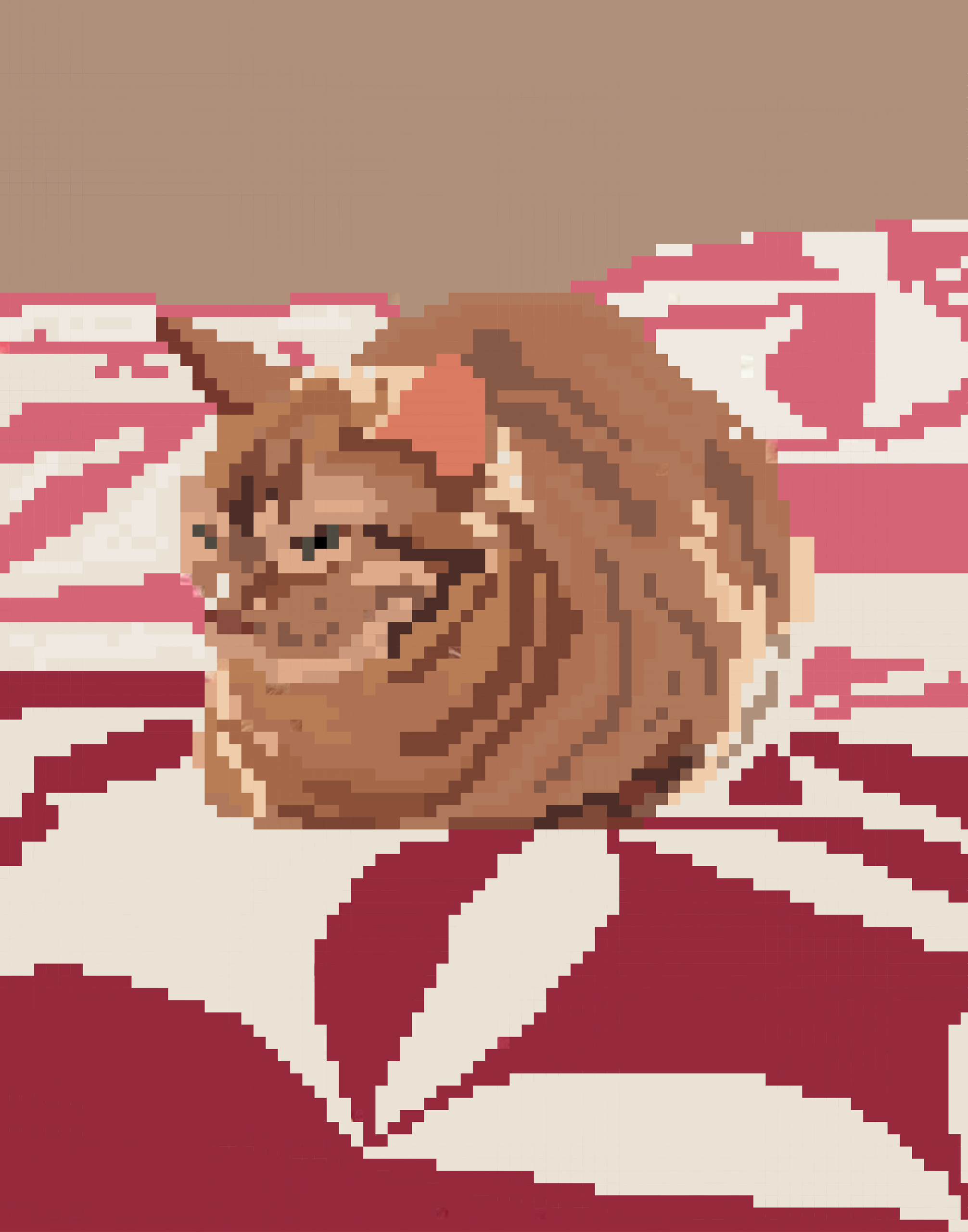
Pixel Art

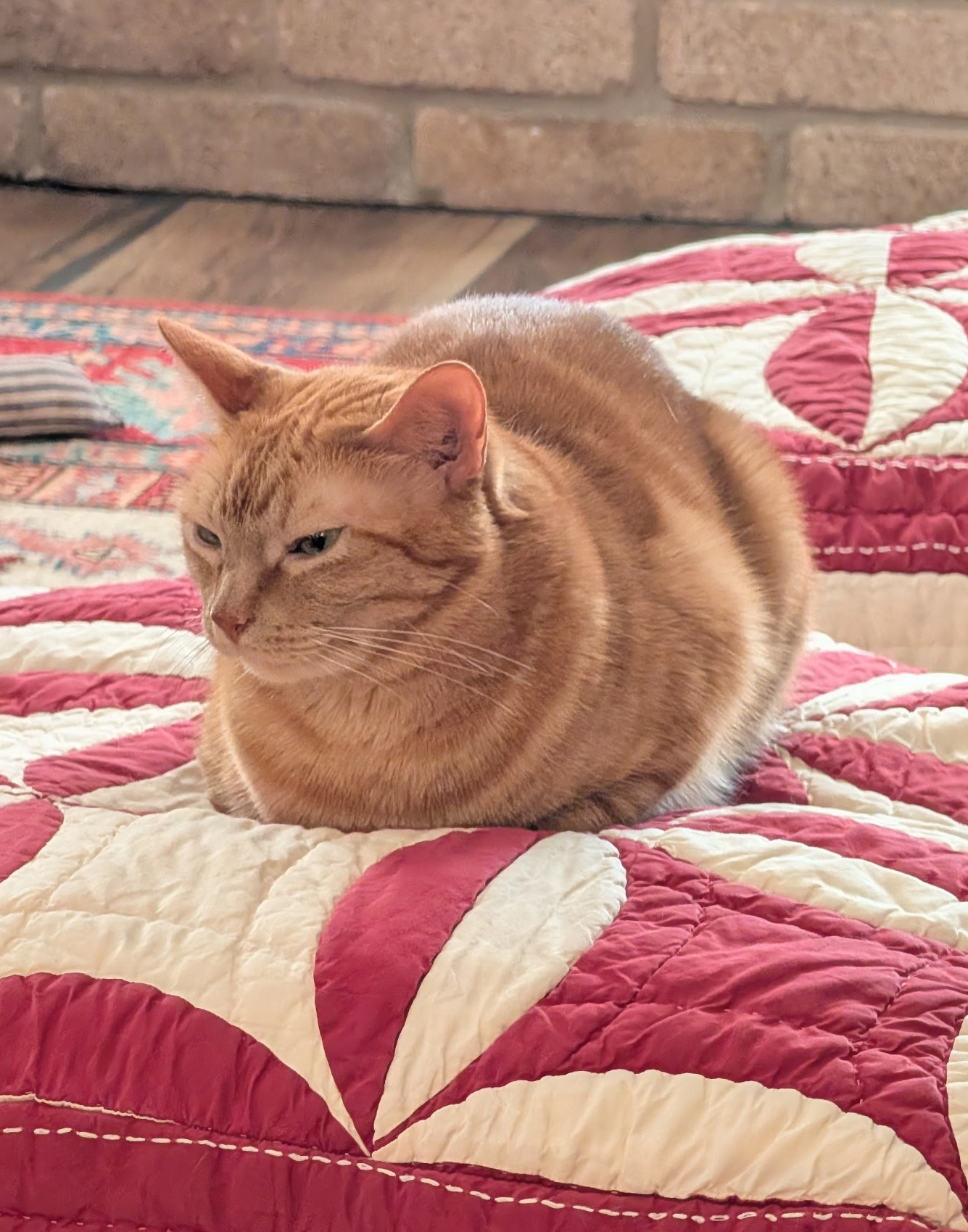
For this, I followed the pixel art tutorial on the KB. I chose a picture of my cat because I thought it would be challenging, but rewarding – and it was 😀


Logo Animation

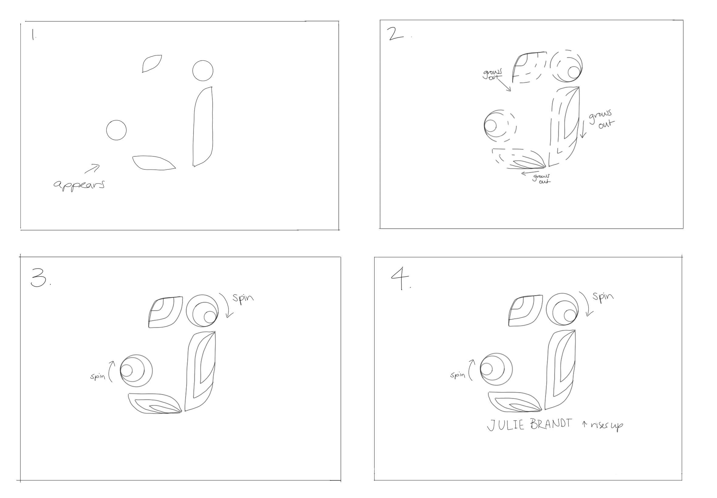
For this task, it involved more planning and iterating. I started with a story board which I ended up altering after hearing from Lila. Then, I had to separate my layers in Illustrator from my original logo. After watching a ton of videos of techniques and styles, I began working in After Effects.

Attempt 1 – I was struggling finding transitions other than opacity changes
Final – After watching more tutorials, I was able to ad more effects and create the growing motif I was aiming for in the beginning

Reflection

Overall, I had a fun productive week learning new skills in PS, AI, and AE. Hopefully there will be opportunities for me to uses these skills in other areas of my work.

Filed Under: Fall 2026 – Spring 2027, We are STAs

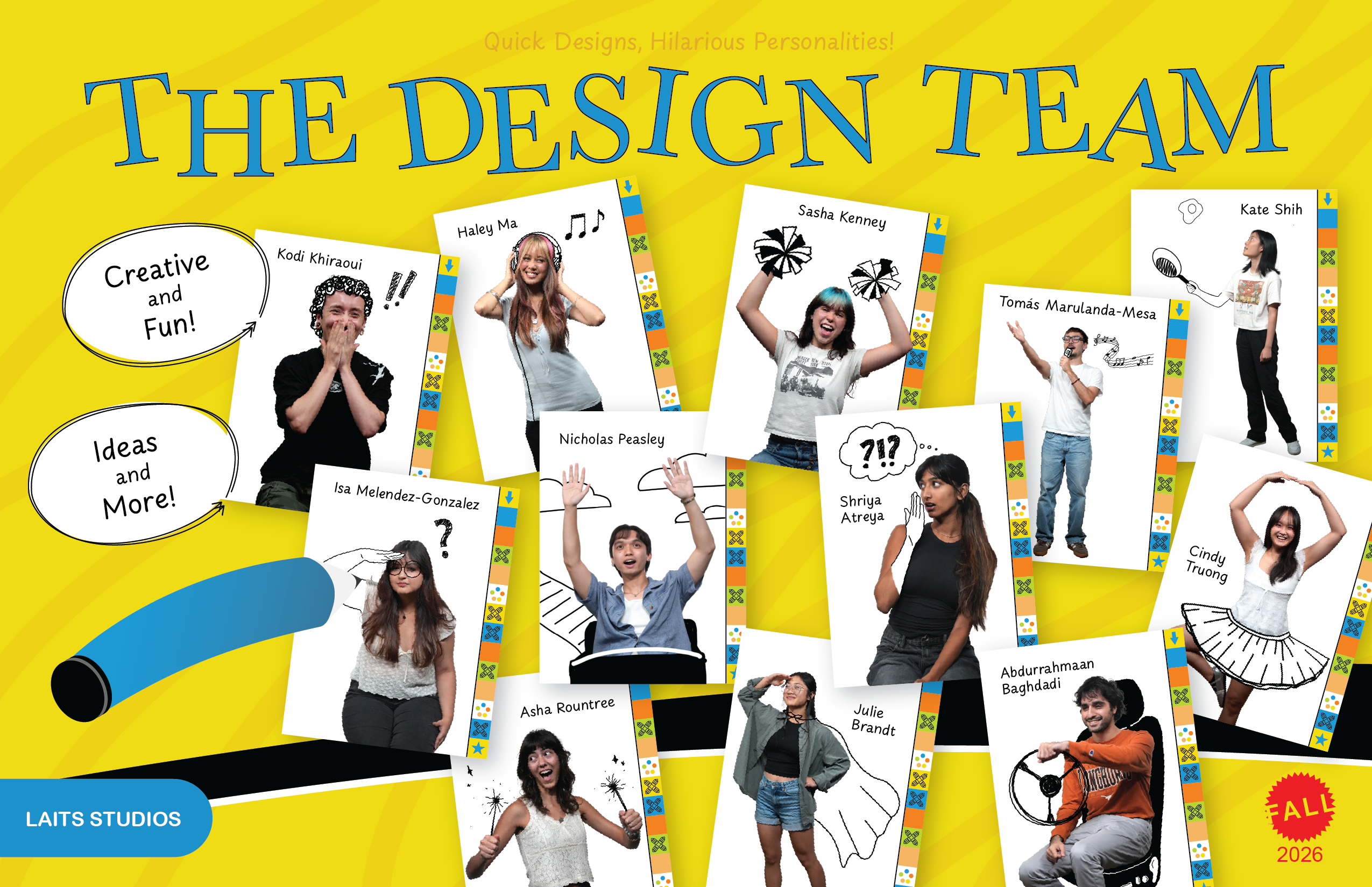
Design Roster Poster

September 1, 2026 By Julie Brandt

Roster Poster Design

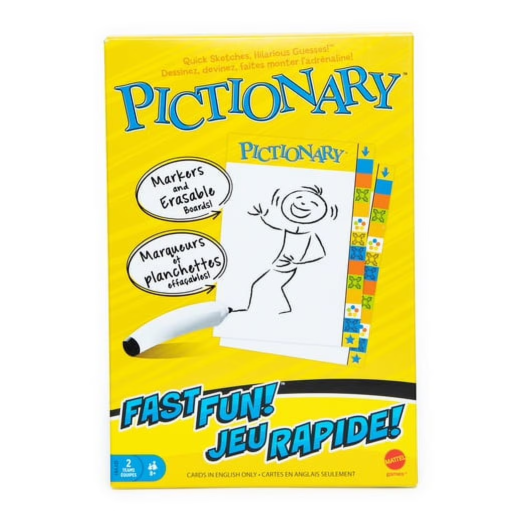
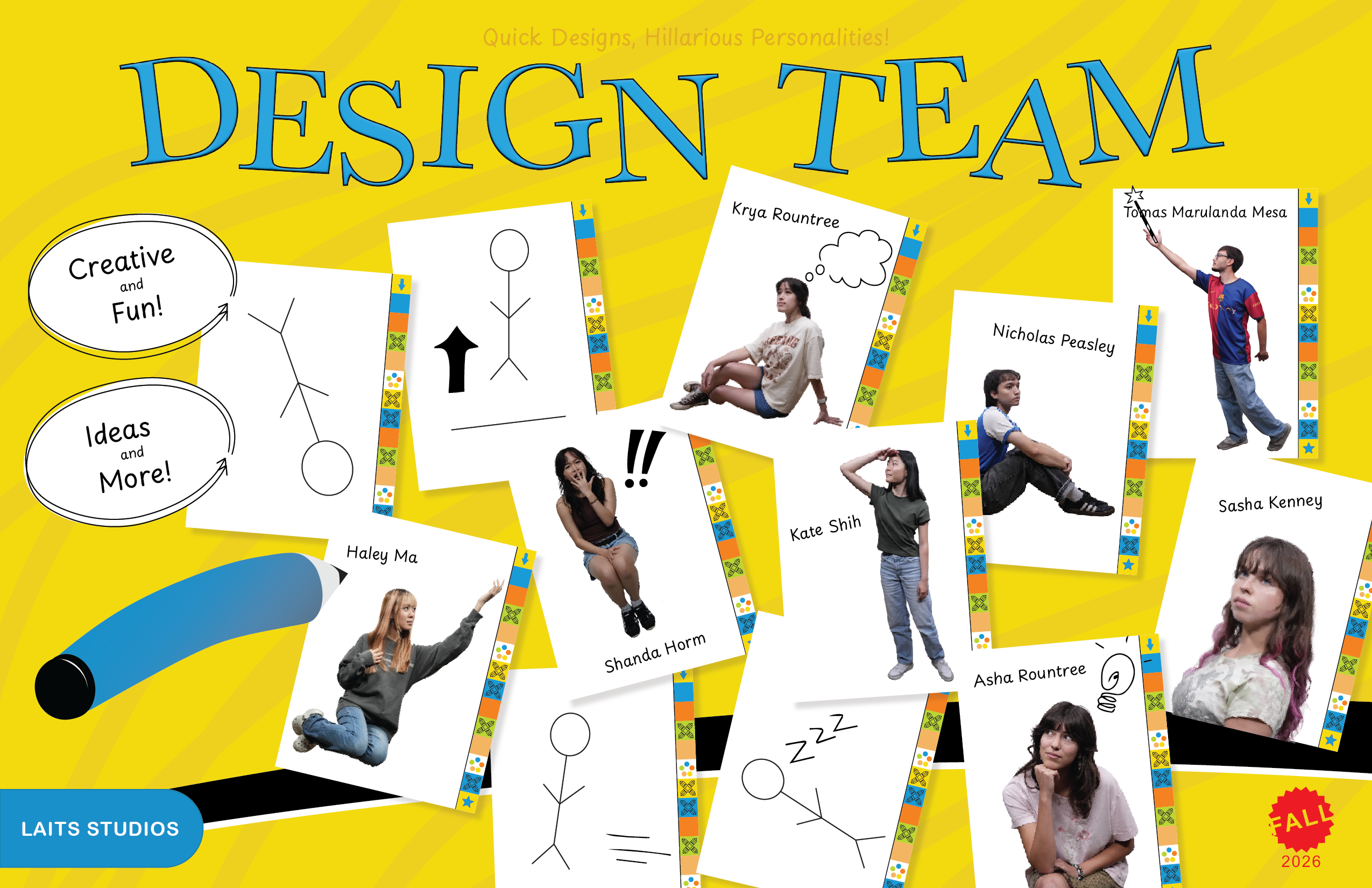
Task: Create a team poster for the design department at LAITS referencing the board game Pictionary

Status: Complete


Reference

The goal was to create a poster that visually resembled the board game box


Sketches

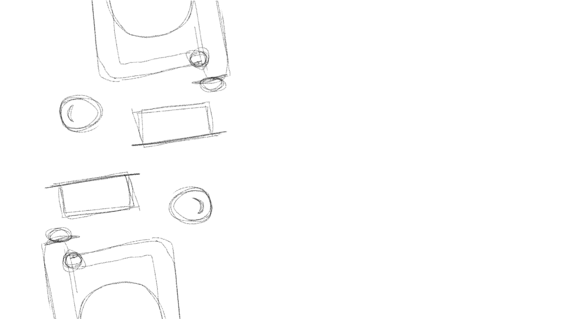
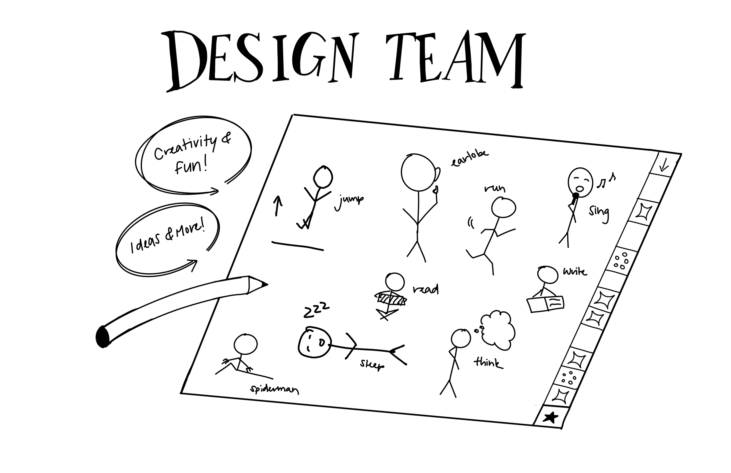
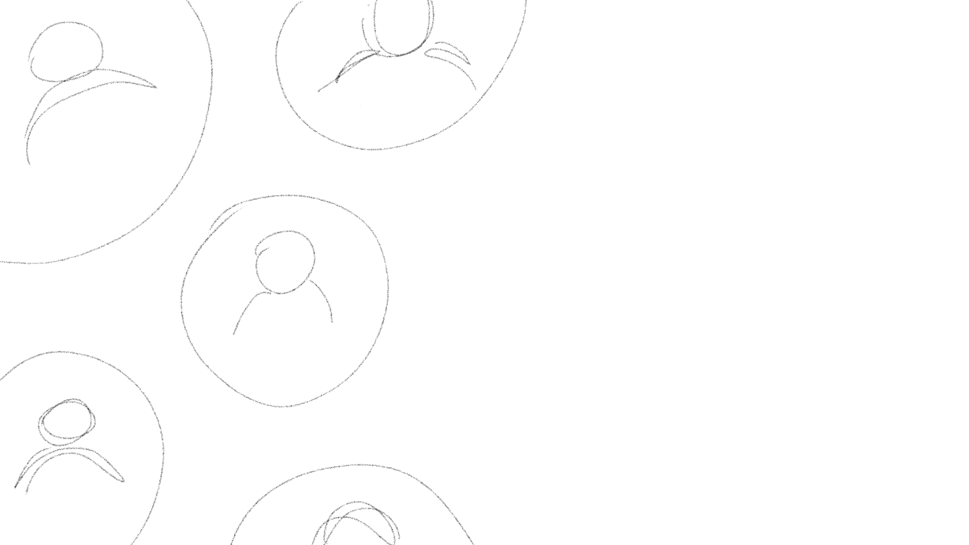
First, I started by sketching ideas out. I had a huge board of all the STA’s in different Pictionary-based poses


Feedback + Digitizing

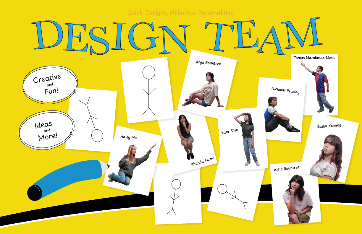
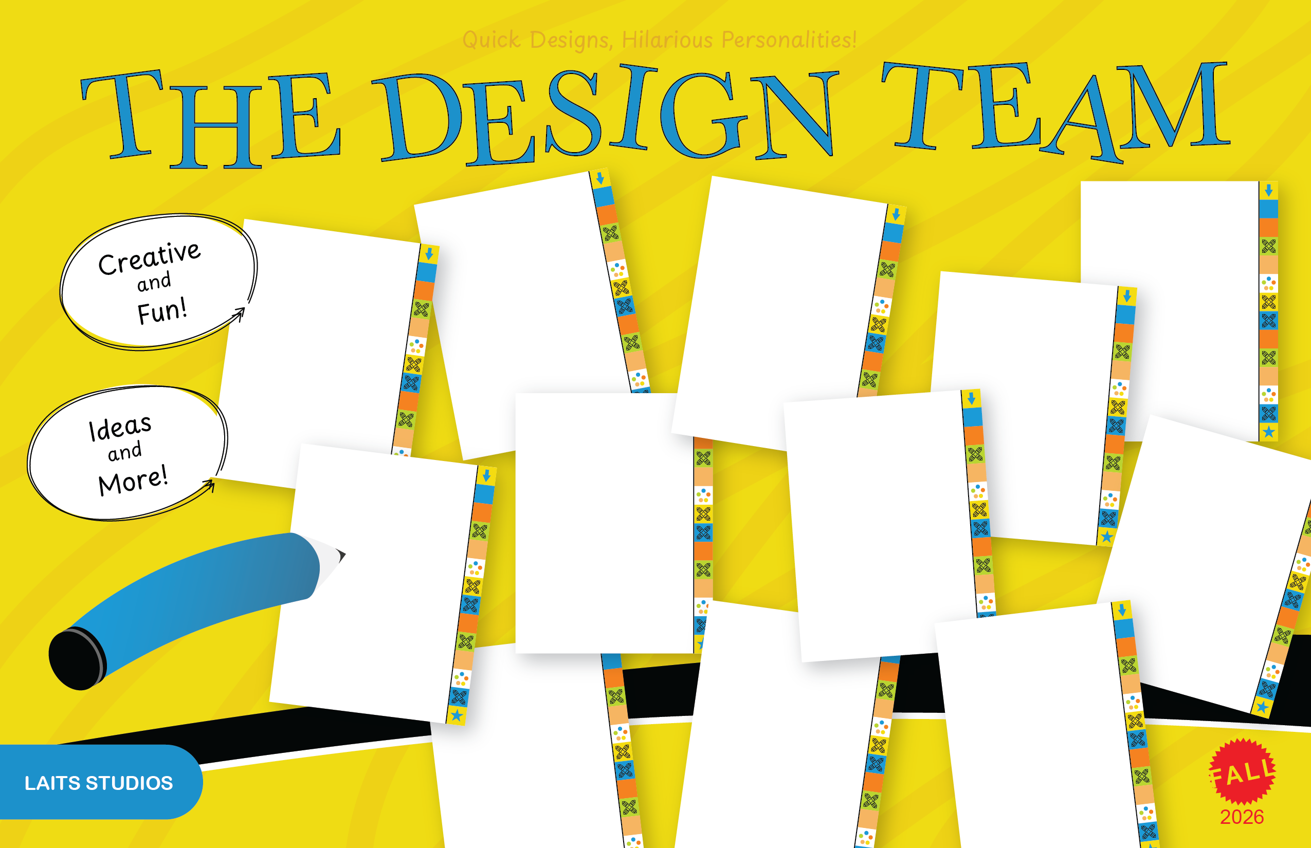
Before creating the design in Illustrator, I got suggestions to create individual boards for each of the STA’s and have a place for their names. So, when I started illustrating, I explored this route and ended up keeping this suggestion


Further iterations

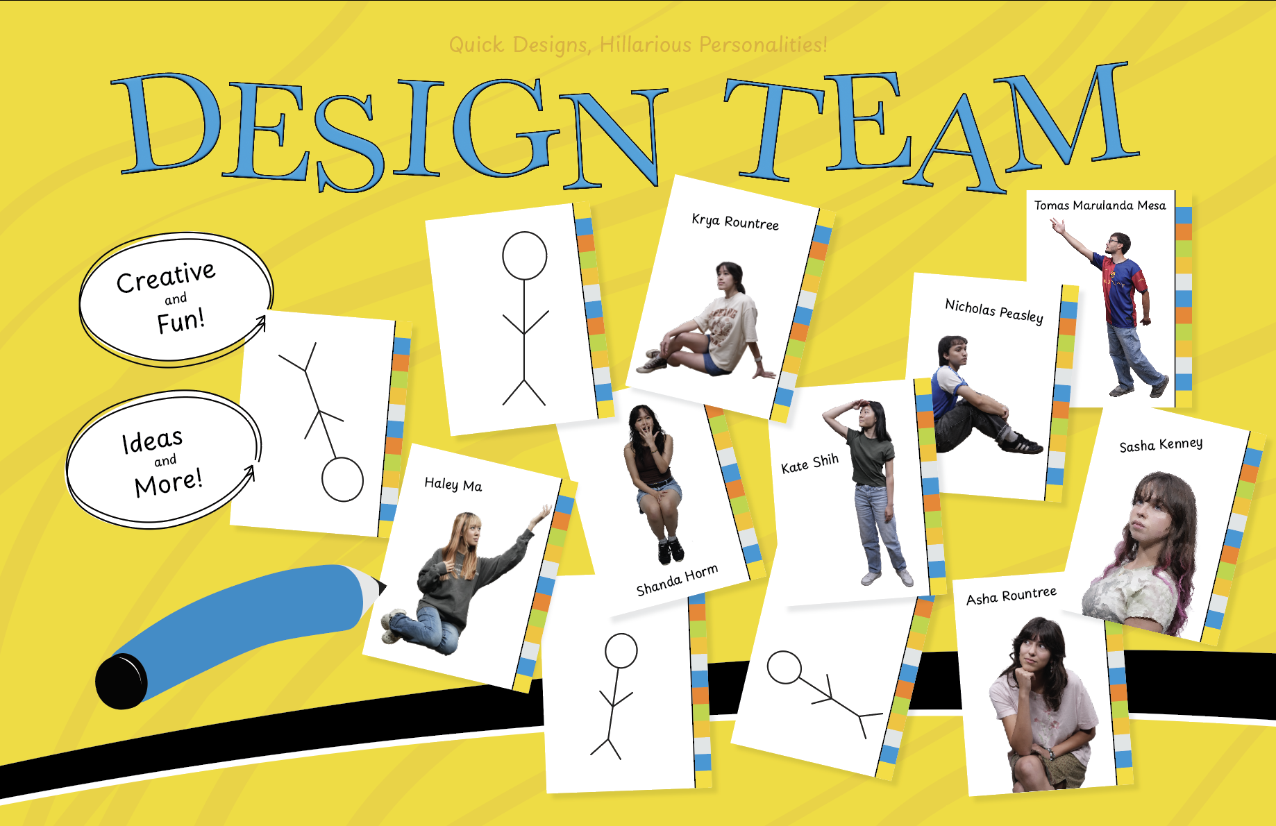
I still wanted to add smaller details to push the design forward and get the design as close to the reference as possible. I added small doodles, coloring to the each board, and other information in place of the players and company.


Rebuilding & New Ideas

I made a mistake and had to rebuild the Illustrator file. Luckily, I had lots of reference images to design quickly. Elements like the erasable cards, pen, and side notes where complex to make initially, but when rebuilding I was more efficient. Additionally, I made a few slight adjustments to the title, pen, and circles.
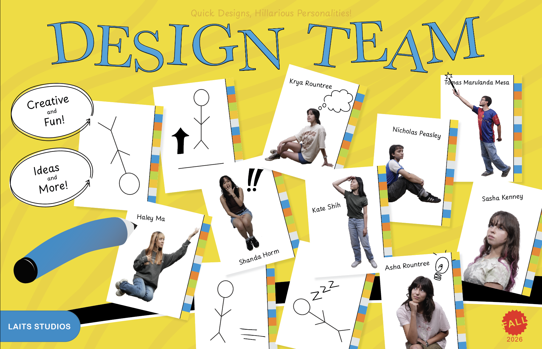
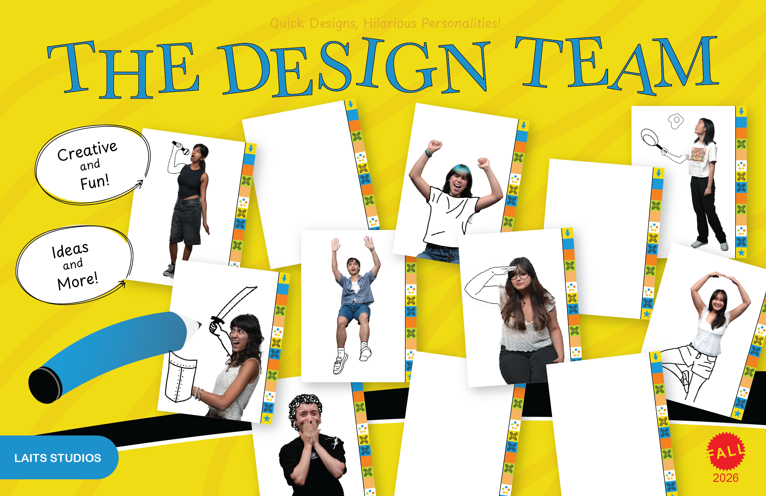
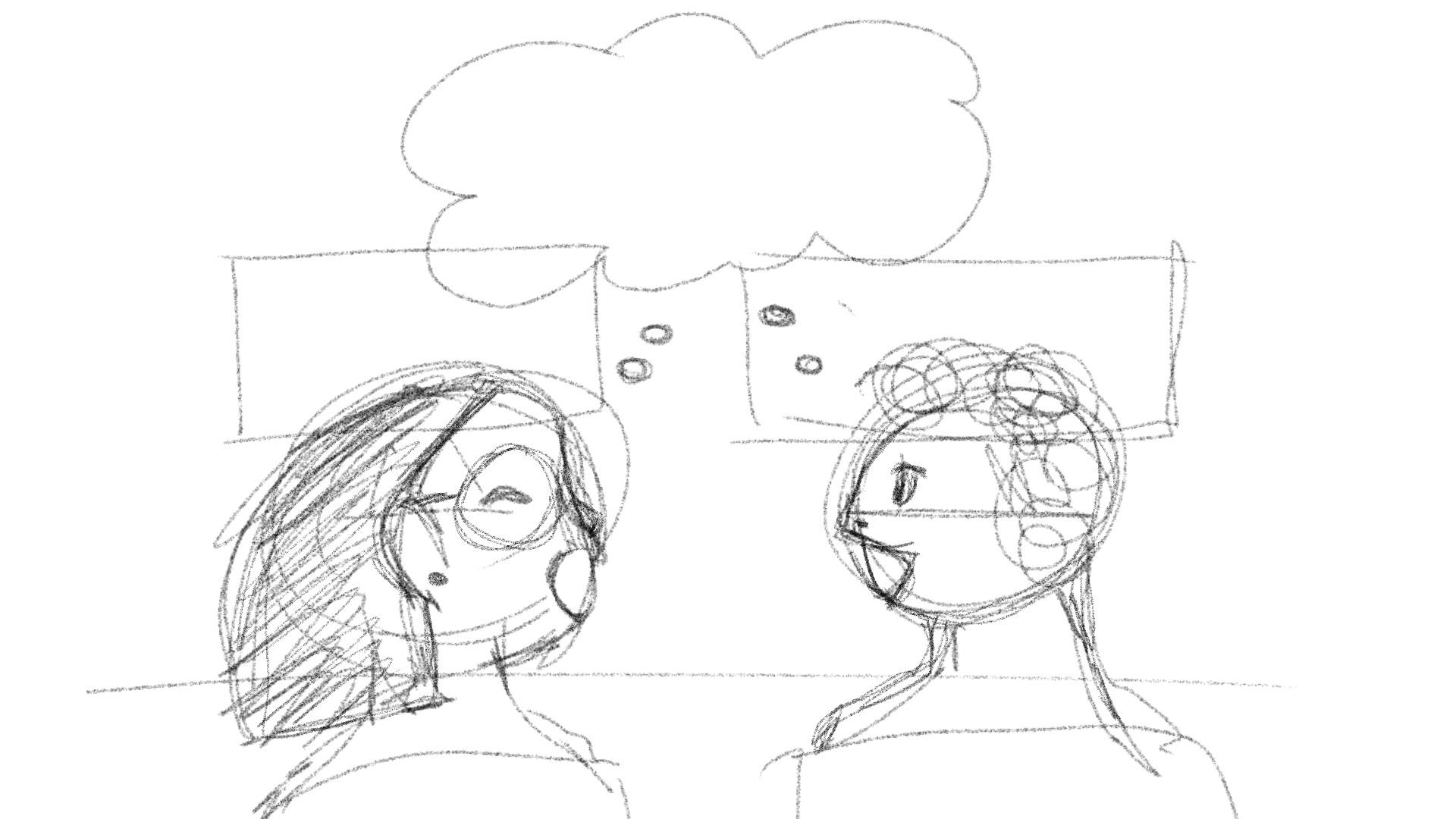
Lila made the suggestion that the STAs were half sketched to enhance the poster. Using procreate, I added doodles to each person according to their poses. I made two versions: ones with more elaborate, additive doodles, and ones that had a small portion of each STA doodled.


Final Design

After several iterations on individual doodles and placements, this is the final poster.


Reflection

Creating this poster was a lot of fun and taught me to double check before moving something into the trash. I was able to work closely with Lila and improve my designs based on her feedback and suggestions which helped me to be flexible with my designs. Overall, I am very happy with how this turned out and look forward to doing more illustration and graphic design.

Filed Under: Fall 2026 – Spring 2027, We are STAs

Summer 2026

September 1, 2026 By Julie Brandt

My Break

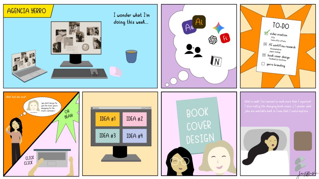
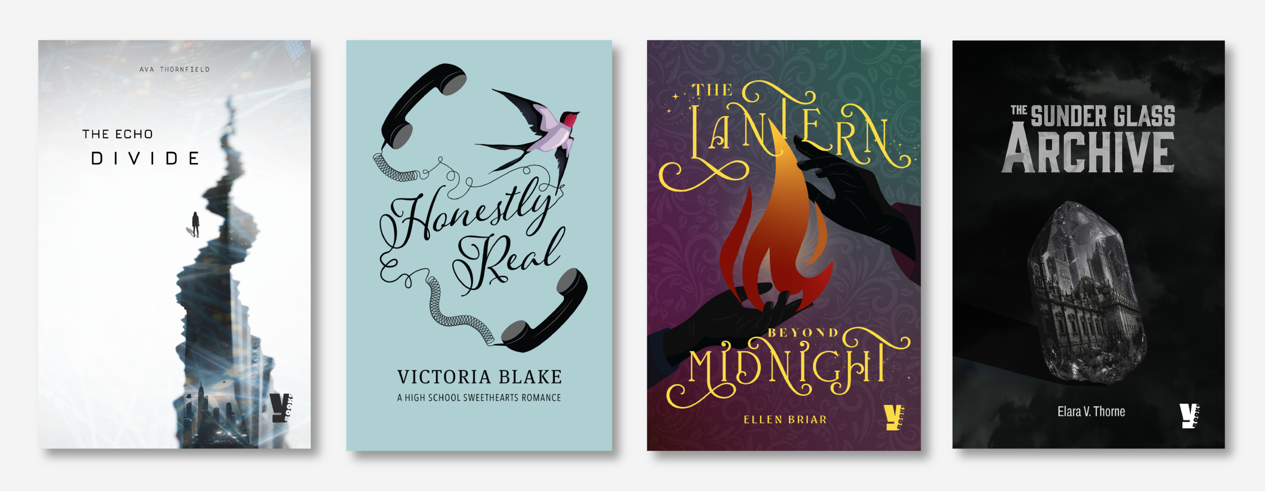
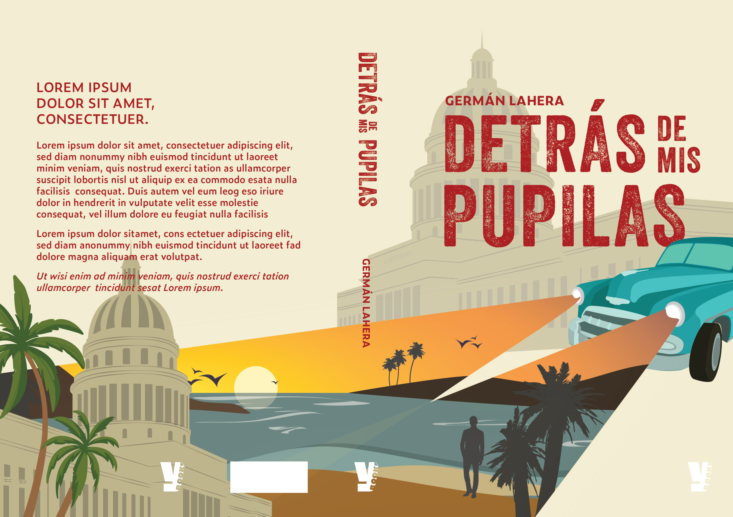
This summer I was able to go to Spain through a program called Absolute Internships. For 6 weeks, I studied at an self publishing editorial firm called Yerro Books. I worked on a few different projects including filming and editing a portfolio showcase, designing a book cover for a client, and researching methods to ethically work with AI in book cover designs. Communicating with my supervisor at times was challenging because of the language barrier, but through translator apps and visuals, we were able to stay on the same page. Something I learned outside of my workplace was how prominent design conventions and methods are used across the world. I thought there would be a greater difference in visual communication due to differences in culture, societal norms, politics, etc., but I noticed that graphic design in spain followed conventions used in the US.


Projects + Images

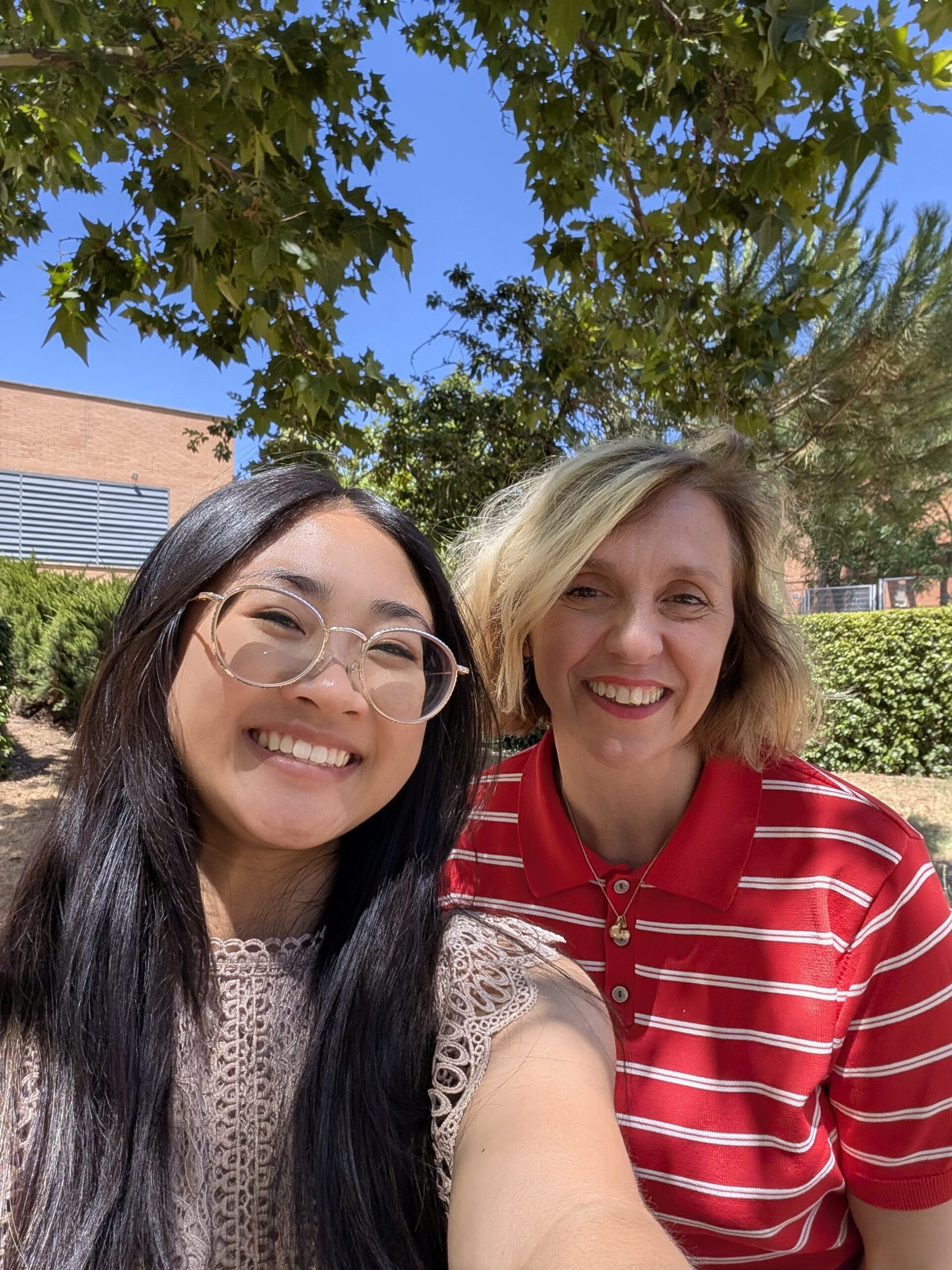
My supervisor Ester Carrasco
Thought Piece created for DES 260I
Book cover created for a client
Working with AI to generate book cover ideas

Filed Under: Fall 2026 – Spring 2027, We are STAs

  • 1
  • 2
  • 3
  • Next Page »

Copyright © 2026 · Cola Theme On Genesis Framework · WordPress · Log in