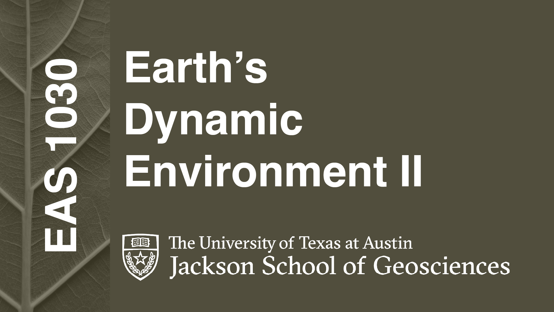
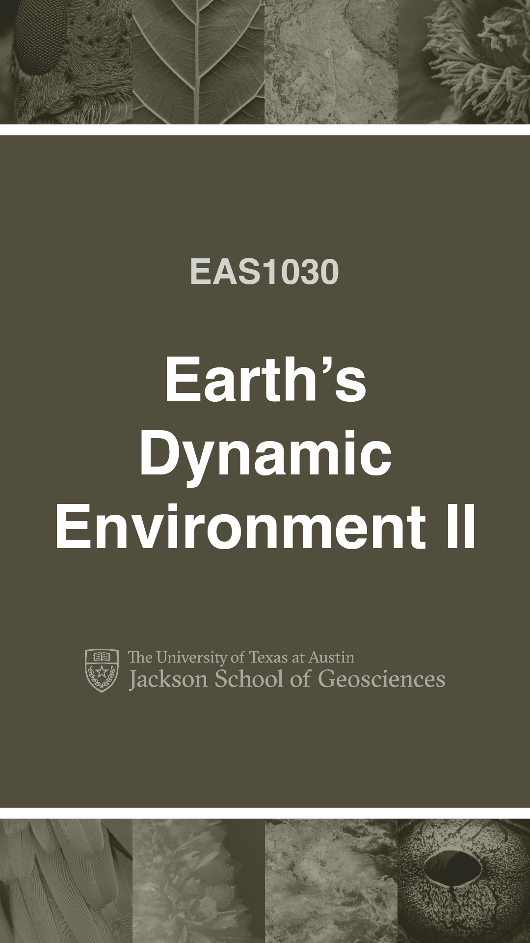
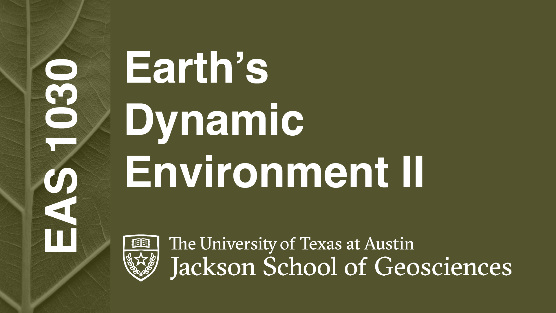
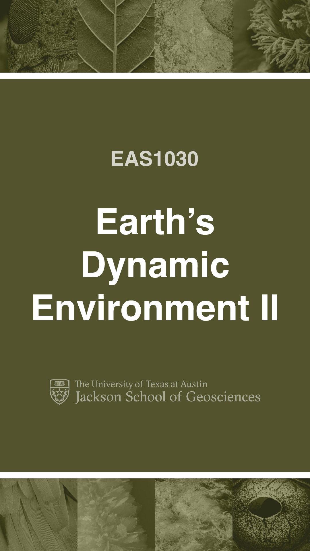
I continued working on my training assignments today and was able to do most of our Tier 2 Course Graphics training. I mostly used Illustrator since it’s what I’m most comfortable with, however I did dabble a little bit into Photoshop and After Effects. I was required to make custom graphics for a class that can be used in studio, class and Canvas. This includes backgrounds for video recordings, powerpoint slides, and interactive Canvas assets. Images used in this project were found on Pexels, a website where people can share their images royalty free.
I started off with brainstorming ideas of what and how I wanted my assets to look. Because I chose the class “Earth’s Dynamic Environment II”, I wanted to portray Earth in some way. I wanted to focus on using images of Earth material and animals while adding Earthy overlays to bring them all together. I only spent about 5 minutes on each mood board to avoid over working them.
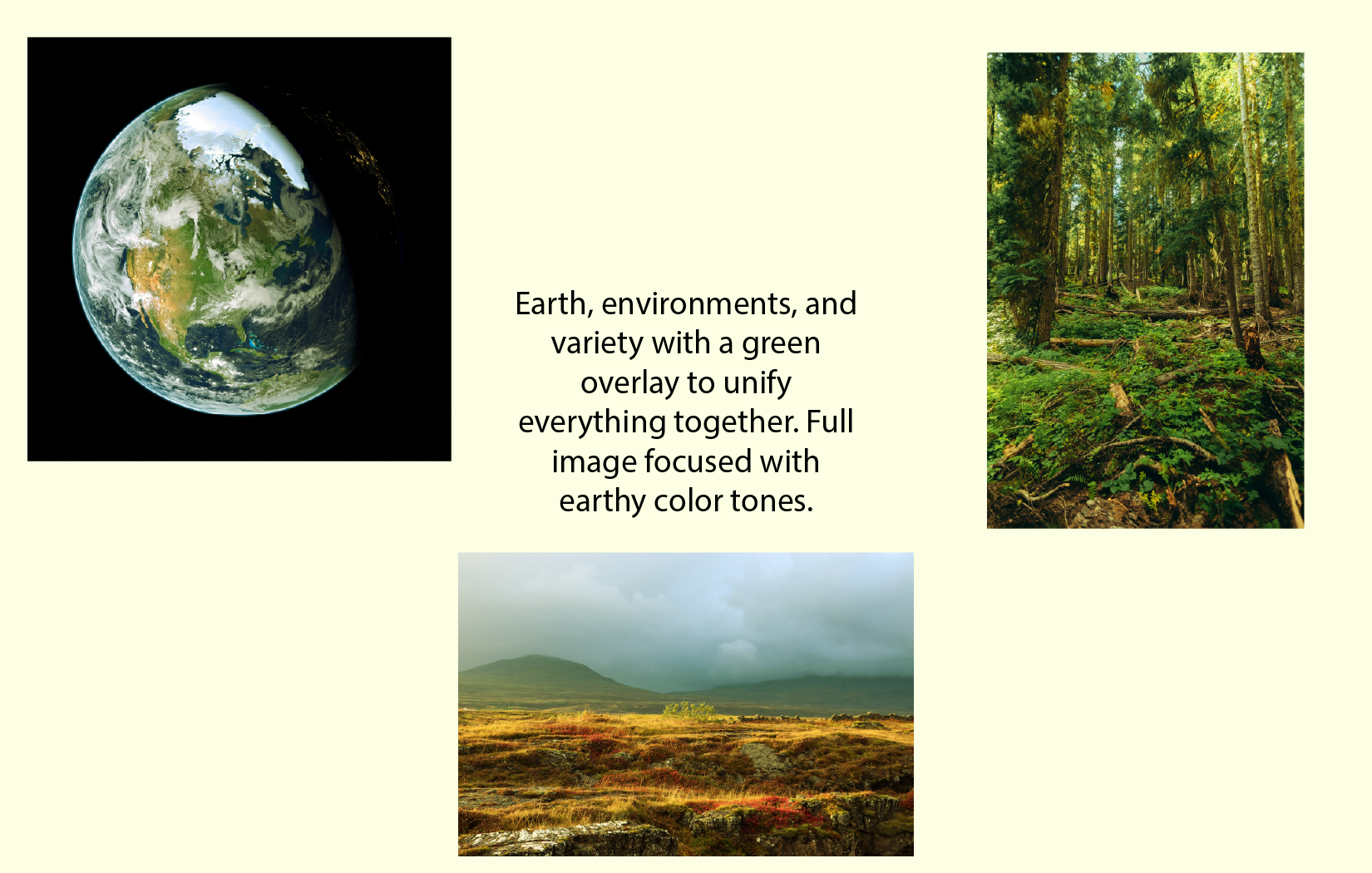
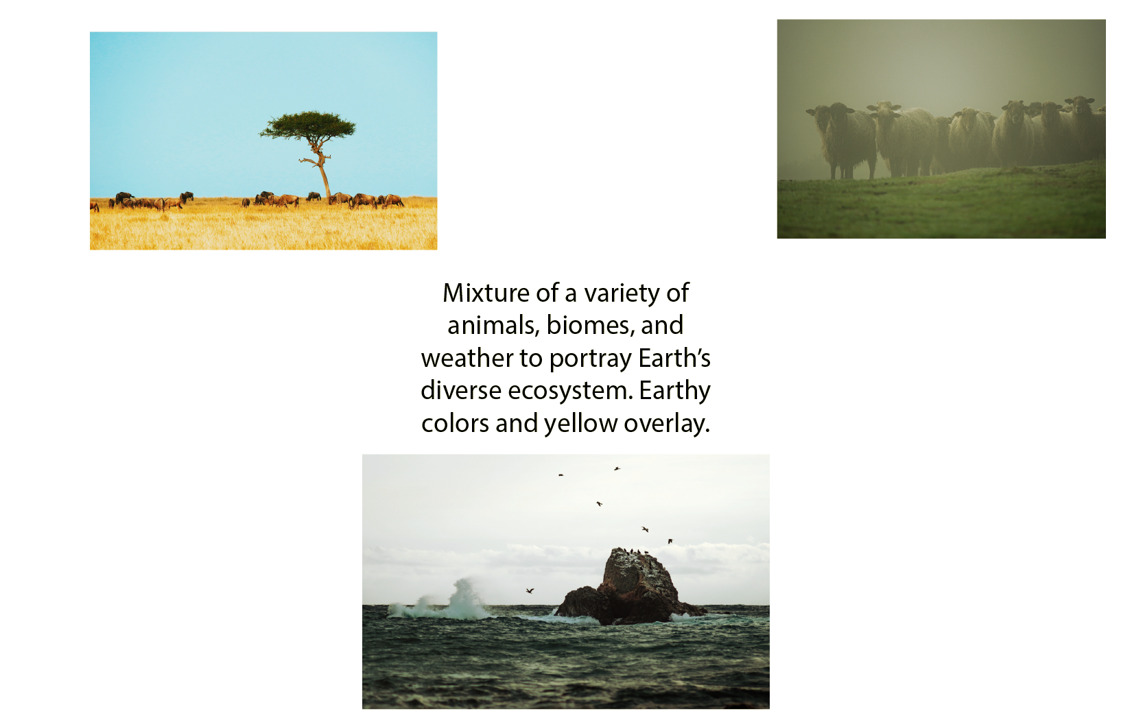
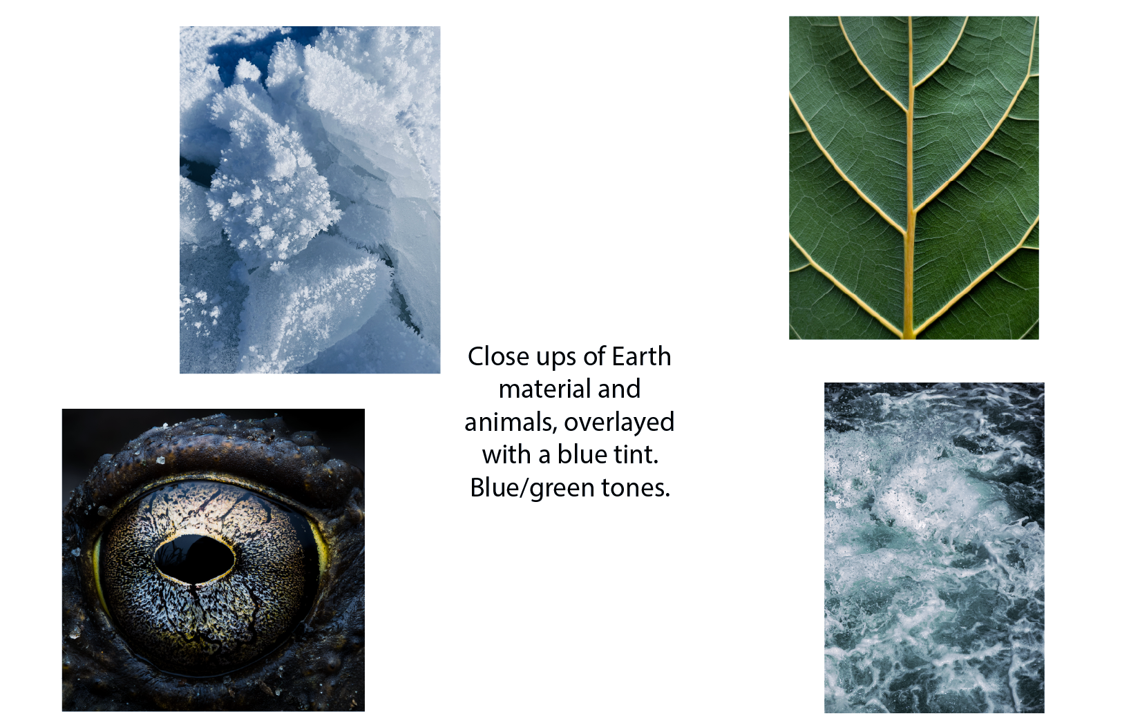
After sending the mood boards for approval, I decided on using close up images for a minimalist/artistic style and adding a green overlay to unify everything together. At first, I wanted to go with a very muted green to give the assets a serious feel, however after receiving feedback from my trainer I increased the saturation, which I ended up being very happy with. This increase in saturation would also help the color look more rich on video.
Overall, I’m happy with the progress I made. There were a few times where I misunderstood the instructions and had to redo a few assets, however I’m glad to continue to learn new skills and techniques.