• We are STAs
    • Abdurrahmaan Baghdadi
    • Asha Rountree
    • Cindy Truong
    • Haley Ma
    • Isabella Melendez Gonzalez
    • Julie Brandt
    • Kate Shih
    • Kodi Khiraoui
    • Kyra Lee
    • Nicholas Peasley
    • Sasha Kenney
    • Shanda Horm
    • Shriya Atreya
    • Tomas Marulanda-Mesa
    • Trisha Darure
  • We were STAs
  • STA Presentation
    • STA Presentation 2017
    • STA Presentation 2016
  • Testimonials
  • Resources
  • Home

STA Blog

Current Sta

Fall 2026 STA Posters

November 3, 2026 By Cindy Truong

Tech Integration poster

I was tasked with making the STA Poster for the Tech Integration team! I’ve never edited people for a poster before, so this was a great chance for me to practice using InDesign or Photoshop.

I ended up choosing to use InDesign to work on this poster, which I later realized photoshop would’ve been more efficient. However, even solely using InDesign I was able to make a really cool poster that I still can’t believe I actually made.

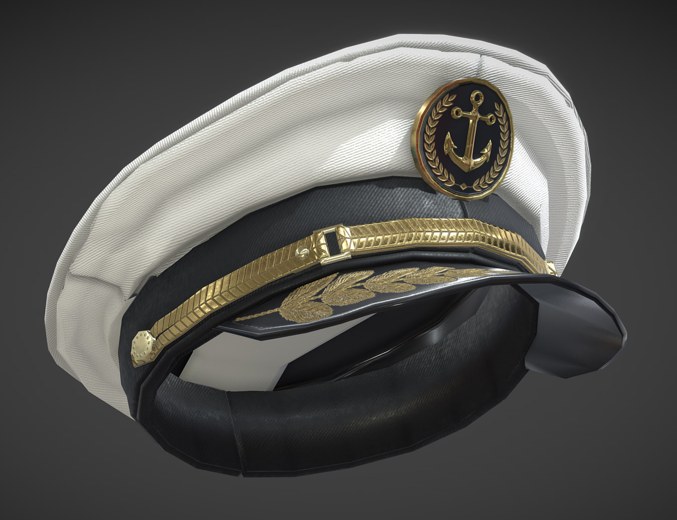
I was provided with these images as references.

Before getting the new Fall 2026 STA cut-outs, I began by using the older STA cutouts to understand the size and angle I needed to work with. I also searched for the font Battleship uses and mimmic the text effects, outlines, and colors of the text to make sure it’s as similar to the reference as I could make it.


Once we got the new STA cut-outs, I placed the STAs in the right sizing and position, added their uniforms, hats, and extra effects as I saw fit stylistically! In order to make sure the hats look as natural as possible I had to use sketchfab.com to use the 3D feature to position the hat at the right angle to match what the STA’s heads are facing and downloading the image.

Overall this was a great opportunity for me to practice the tools of InDesign! Though next time, if I had to do this again, I’d want to next use photoshop for a different experience and to understand through experience which one is better for these kinds of projects.

────── ෆ˚⋆୨୧⋆˚ෆ ──────
Filed Under: Fall 2026 – Spring 2027, We are STAs

Basic Training: Logo Design

November 3, 2026 By Cindy Truong

Basic Training: Logo Design

My first STA training outside of my new STA training modules! I started on this training after finishing my ART301 Introduction and had a great time going through the whole ideation to finished mock up process.

Activity Description: Creating a Logo


Now that you are more familiar with the 101 of logo design, you will make a brandmark, which is an icon/symbol that represents your brand.

Then, you will work on a wordmark or a lettermark. A wordmark is the design of the brand name (like Google’s logo), whilst a lettermark is the design of the brand’s acronym.

1. Ideation

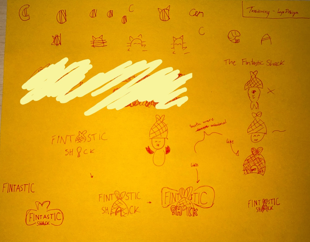
I started off with playing with the “fin” idea and just sketching random related doodles. I eventually followed a similar theme with each doodle I did and started to favor writing out “FINTASTICK SHACK” in my designs. I then realized both words have an odd number of letters and both middle letters of each word were an ‘A’. So I took that realization and ran with it for my final sketches I wanted to do for my logo and icons.

2. Sketch to Illustrator

I transferred my sketch ideas into Illustrator and refined the details I couldn’t on the paper. 

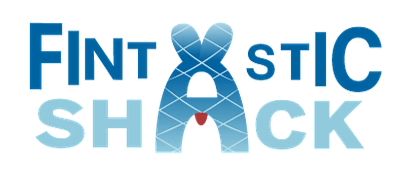
I played around with the negative spacing that is present with the font I chose for this. I really played with the ‘A’ to make it look like a fish’s body and with the negative space of the fish I thought it looked like a person so I added a face. Then for the “FINTASTIC” lettering I also wanted to make the sizing of the letters be different to have it look like a fish from a side view as well.

3. Iterate and Refine

Messing with the color palette for the icon, I chose to go for a more blue tone vibe to connect with the ocean since the restaurant is a seafood restaurant. I also made the lines on the fish thinner to not draw away from the actual fish shape, so the lines were just the scales. The red adds a small contrast to the overall icon and logo since I thought the negative space was a person, I opted away from choosing to add a face to the person and instead gave them a bib that seafood restaurants tend to give to their customers. 

4. Finished logo and the mock up

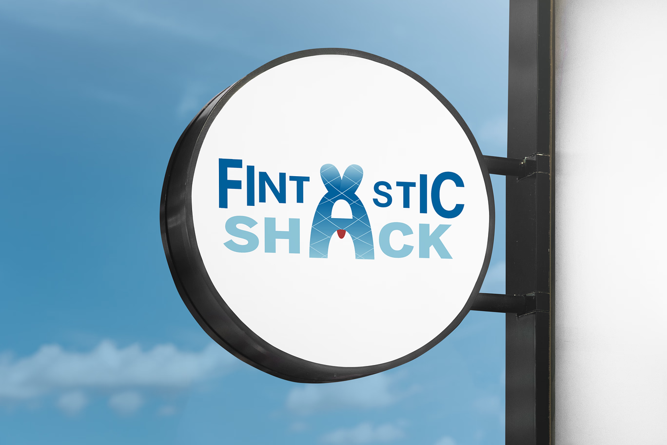
I finished this activity by using Photoshop to edit my logo and lettermark onto a mock up of a sign/marker of where the restaurant is! 😀

────── ෆ˚⋆୨୧⋆˚ෆ ──────
Filed Under: Fall 2026 – Spring 2027, We are STAs

Fall 2026 Projects

November 2, 2026 By Tomas Marulanda-Mesa

2027 Spring STA Roster Poster


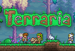
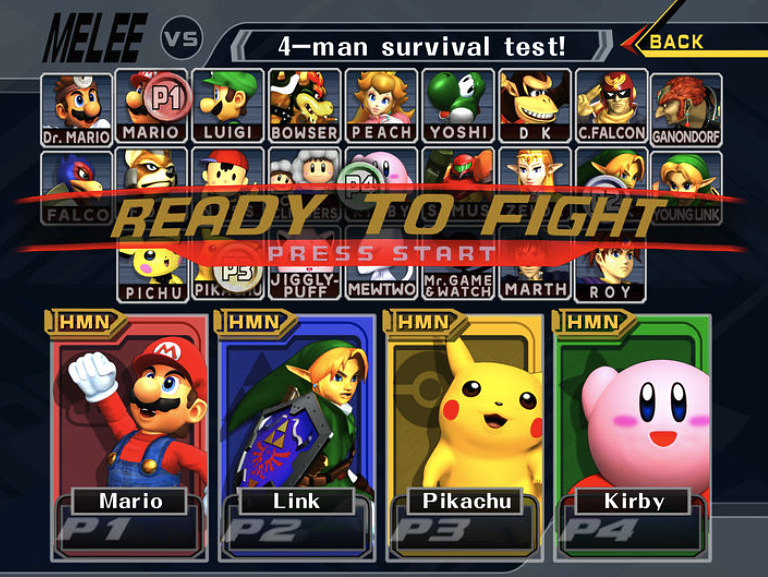
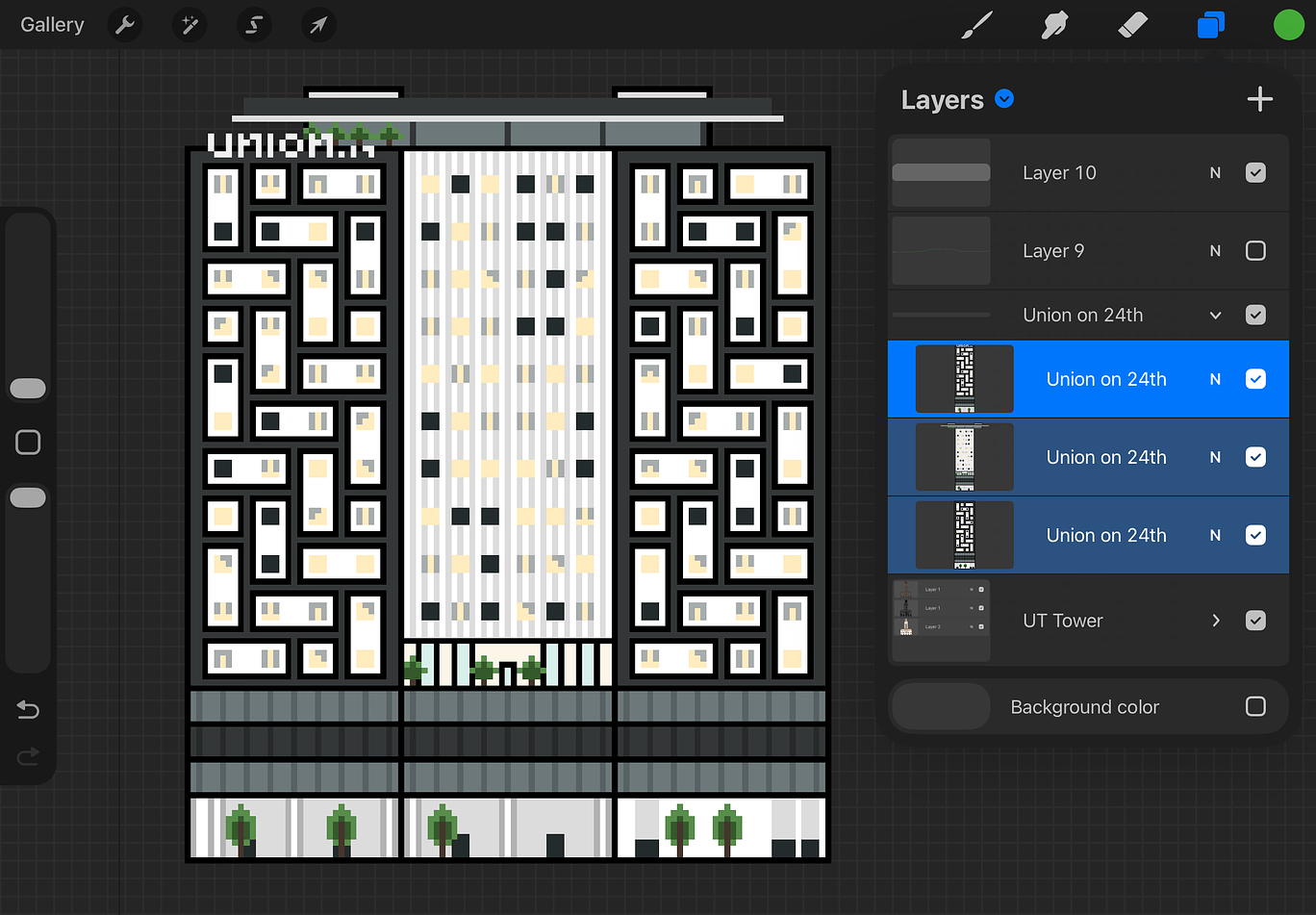
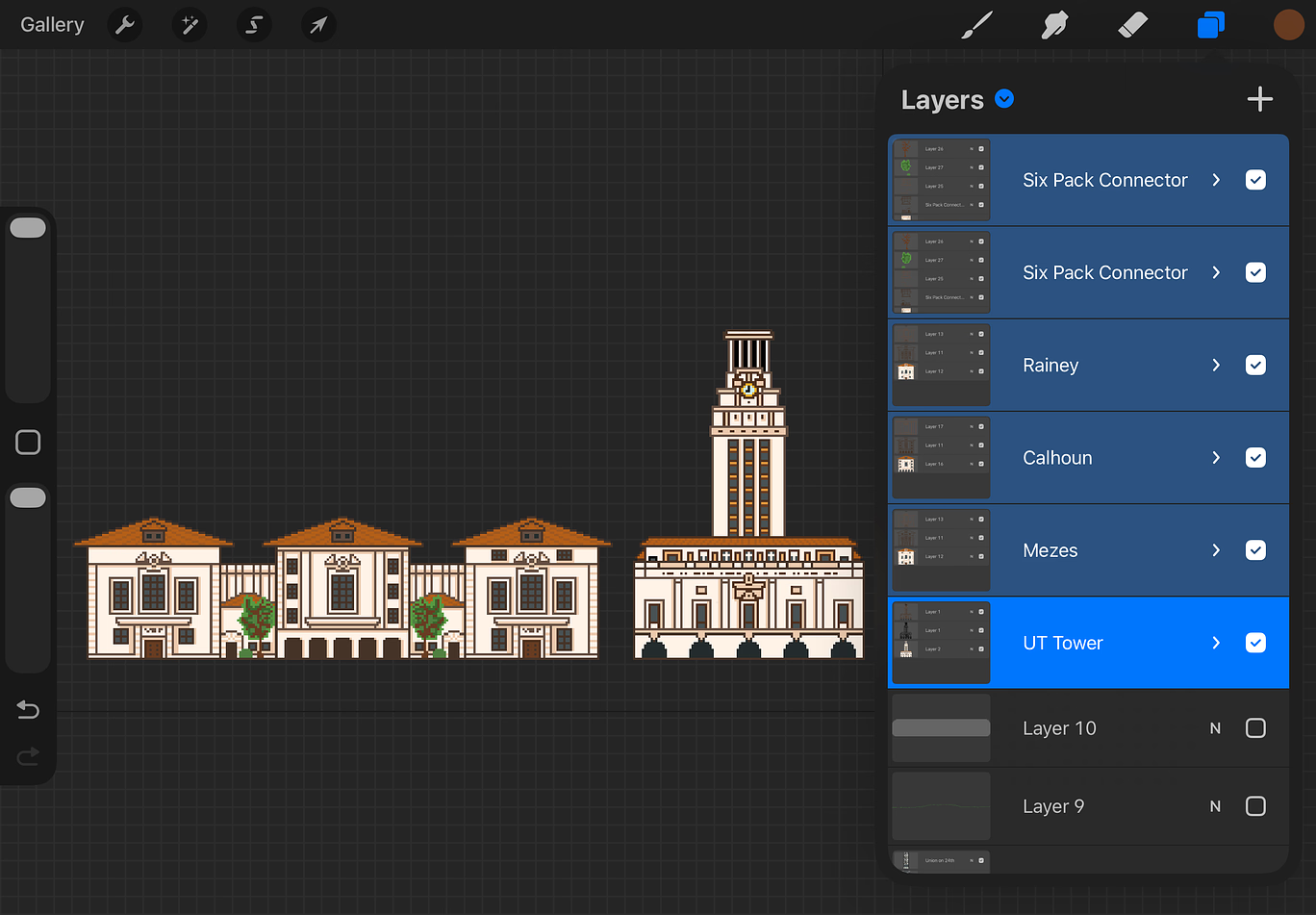
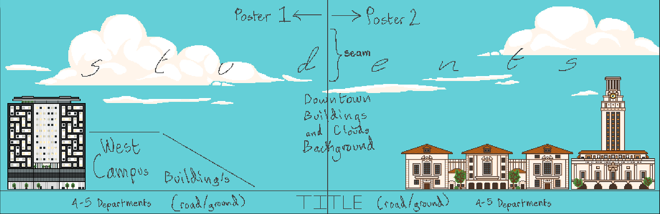
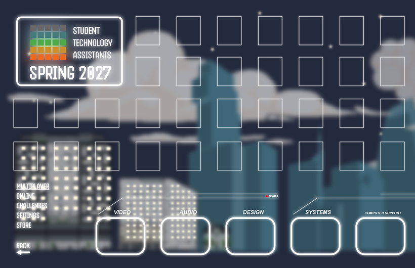
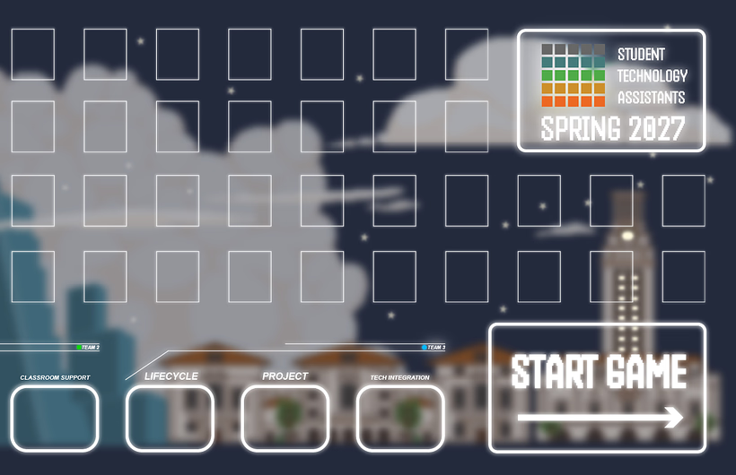
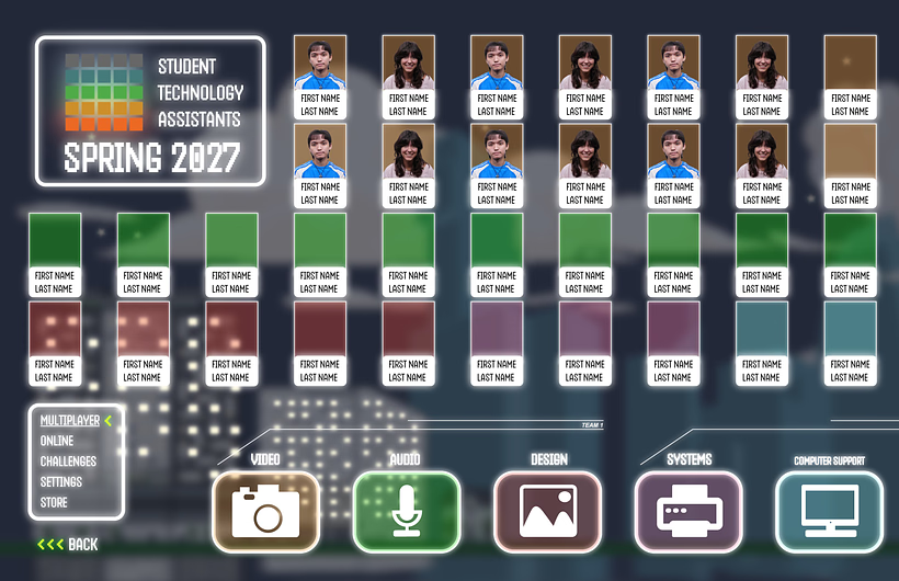
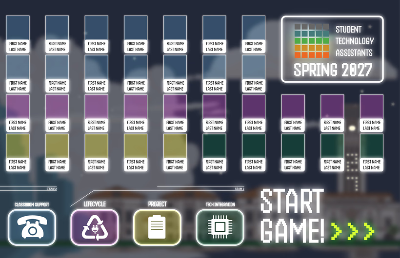
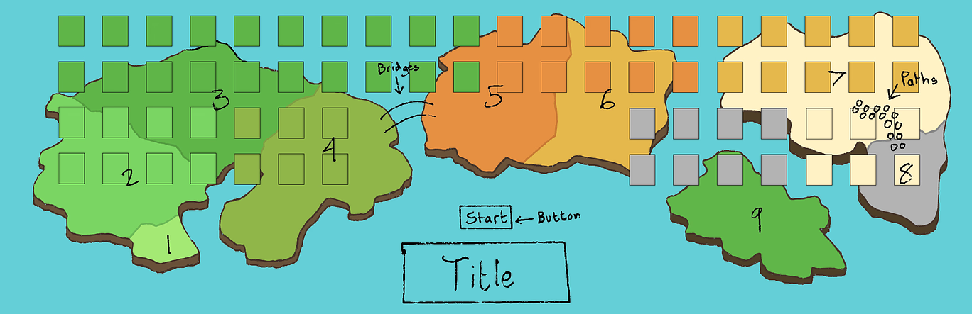
In August, I began working on the 2027 Spring STA Roster Poster. With the theme being a video game menu or character select screen, I started looking for references and inspiration in games like Terraria, Mario Kart, and Smash Bros.

Creating a Background in Procreate

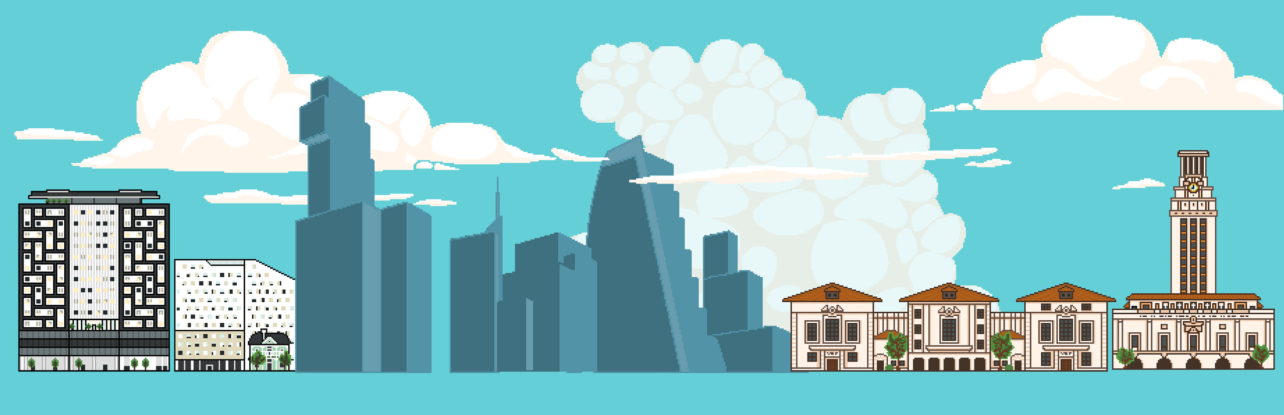
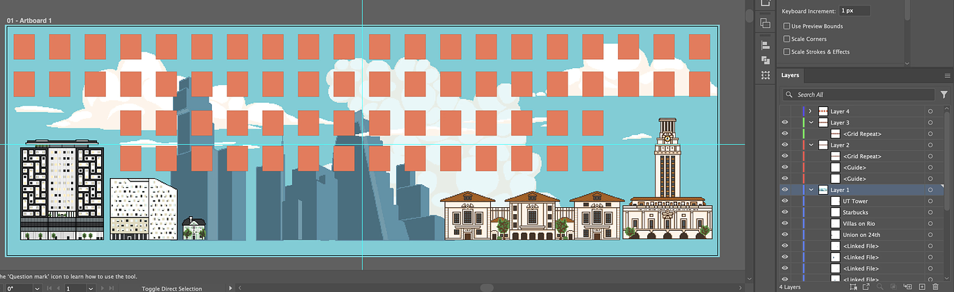
Going off of these inspirations, I went into Procreate and began sketching out my first concept background and assets, leaning more off of the Terraria pixel art style. I would continue with this art style for the majority of the project.

After completing these major assets, I began working out the rest of the background where the STAs and remaining design would take space. For this, I planned an updated layout and worked with the sections one by one, starting with the clouds in the far background, and the Austin downtown skyline in the middle ground.

Secondary Iteration & STA Frames

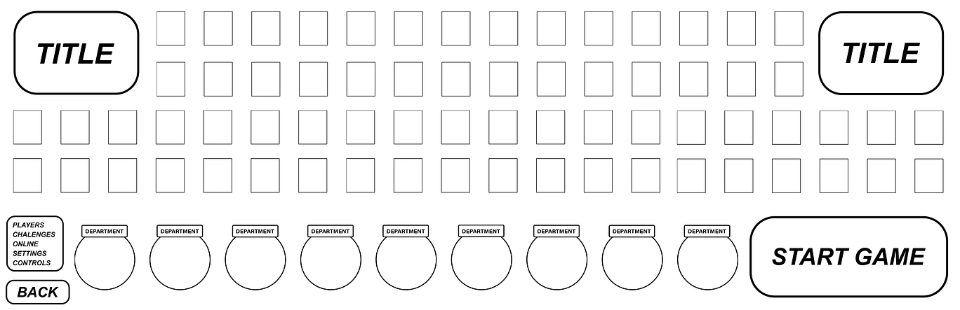
Now finalizing the background design, I imported all the assets into Illustrator and began working on the main layout design and STA frames. At the same time, I began working on a separate design with a different art style.

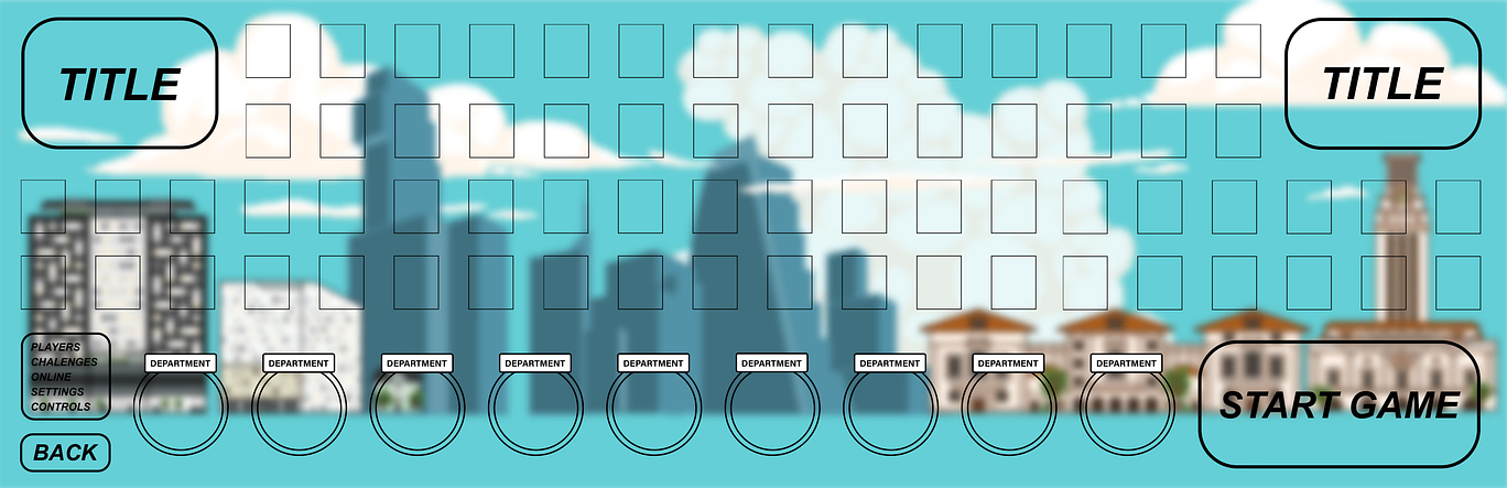
After working on these two designs, I created a separate layout of STA frames which I then applied onto my initial design.

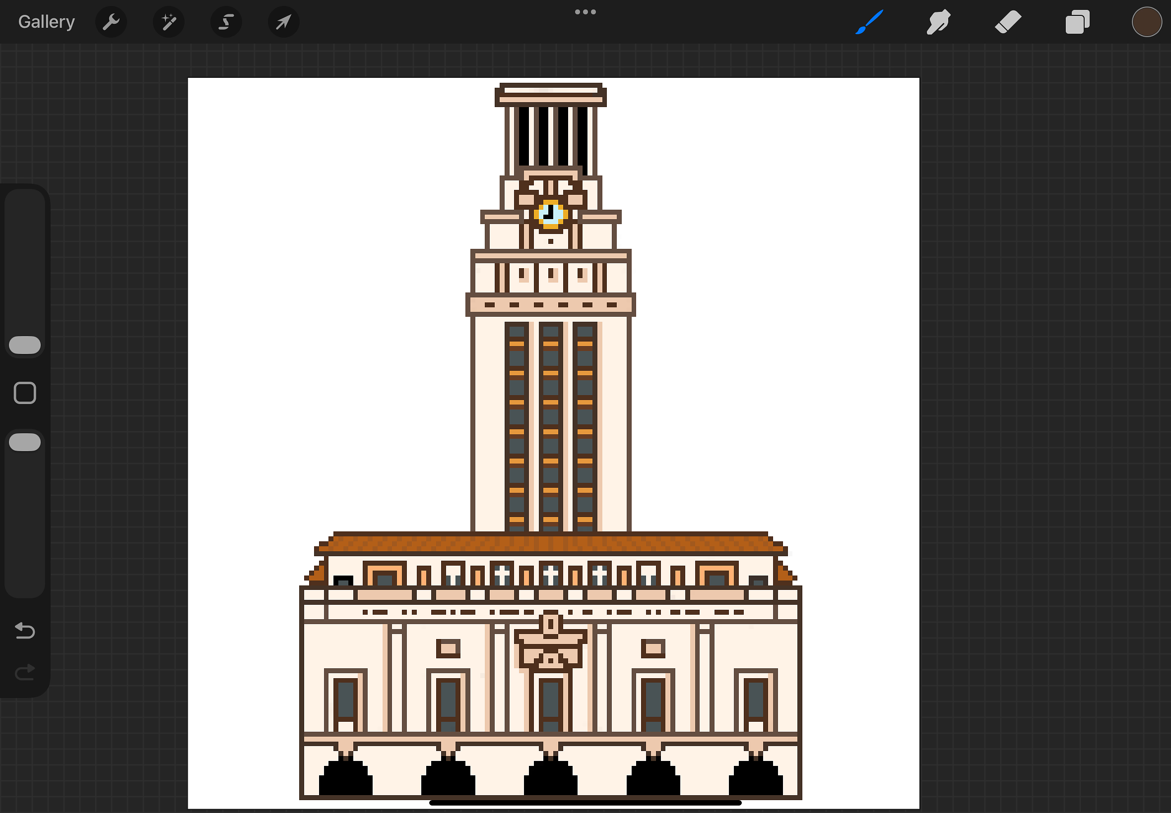
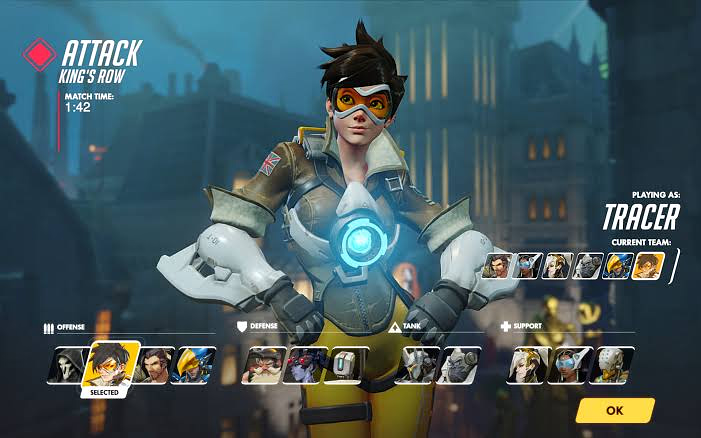
After combining the background with the STA frames, I took more inspiration from an Overwatch character selected screen for a darker, more contrasting look to the poster. I also added details to the background like stars, lights of the buildings, and a “27” on the lights of the UT Tower.

LAITS T-Shirt Design 2026-2027


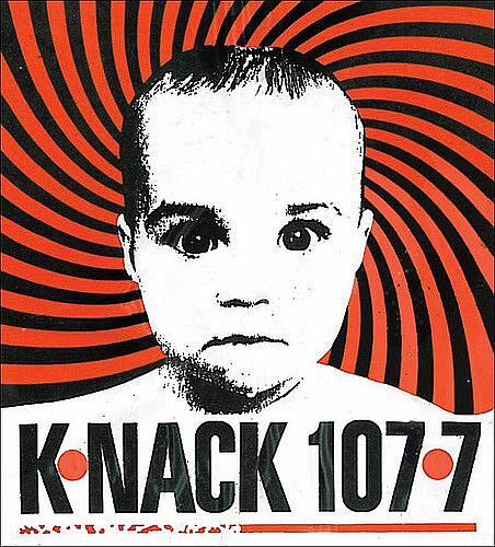
In late October, I began my work on the LAITS T-Shirt. The theme of this years shirt comes from the 1990s K-Nack 107.7 Radio Station bumper sticker design:

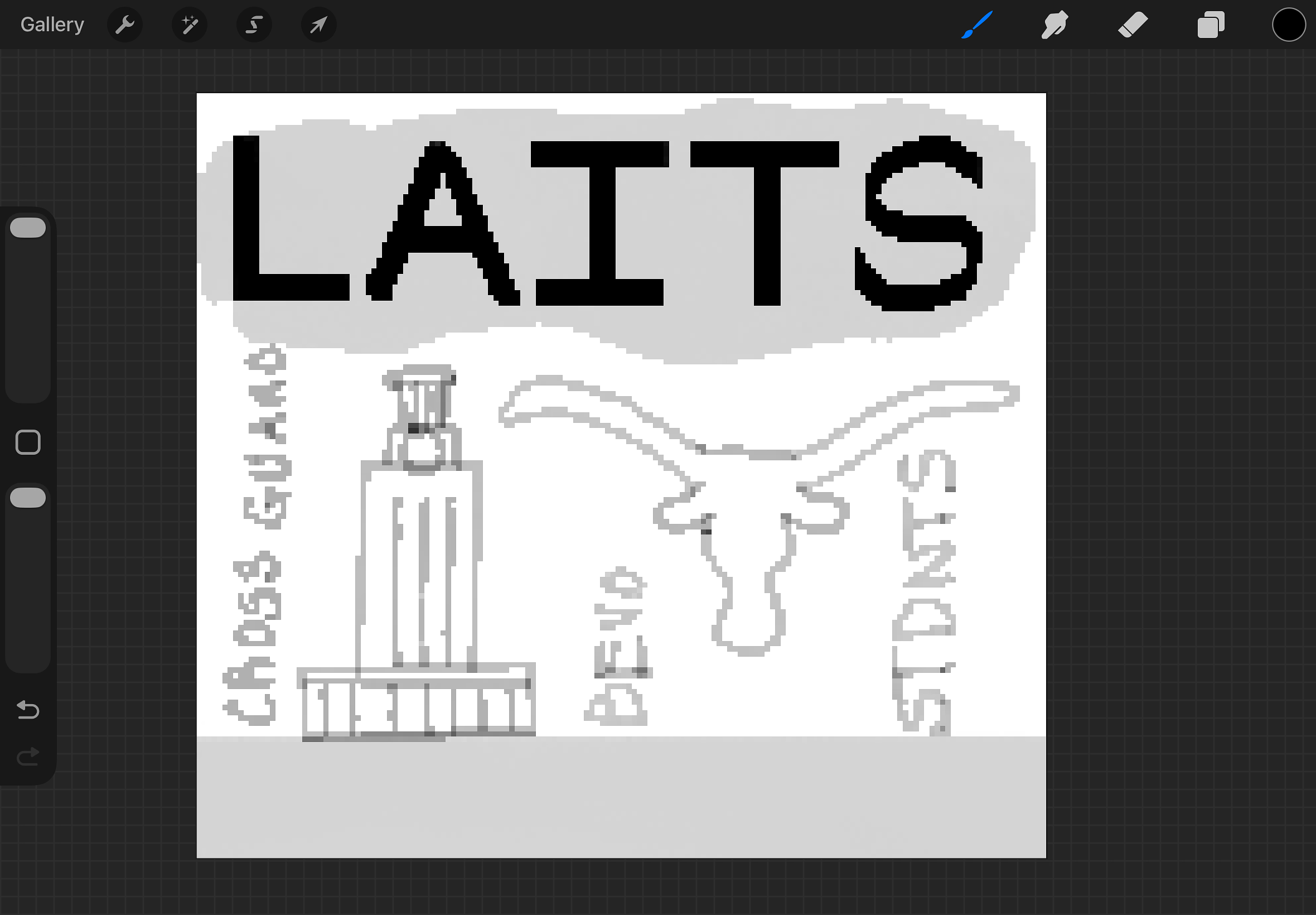
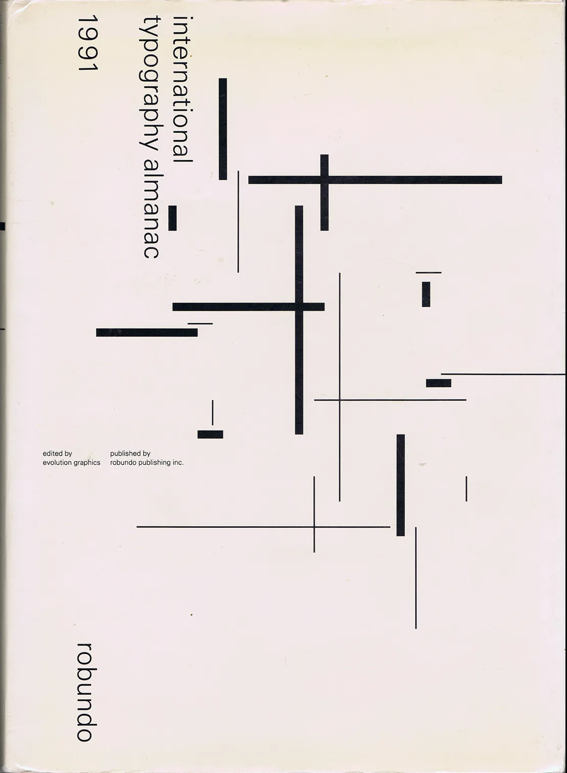
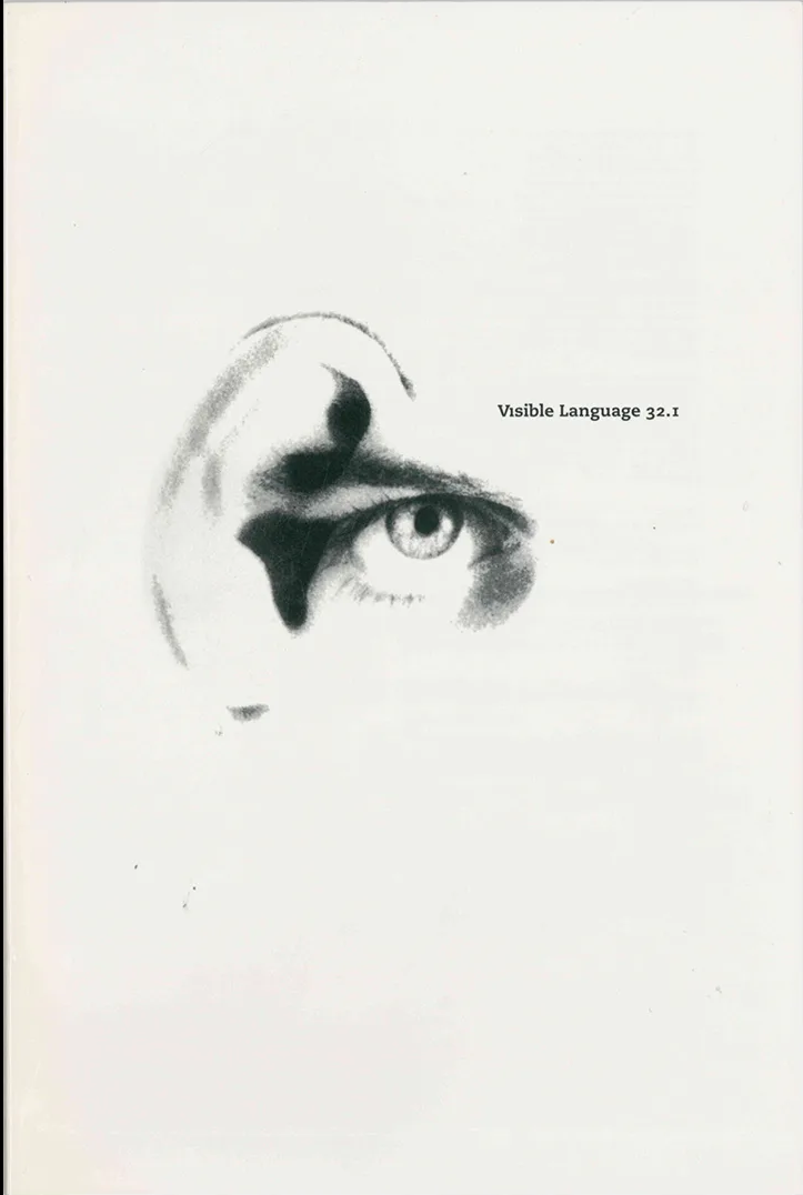
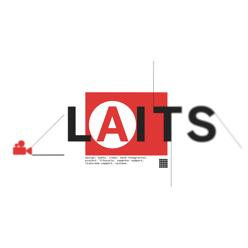
Since LAITS doesn’t have an official mascot or single visual theme which is unique to LAITS, I decided to make the main design surrounded by the word “LAITS” itself. Taking inspiration from the bumper sticker and various designs from the 1990s I found on Design Reviewed, I came up with the following first iteration.

Filed Under: Fall 2026 – Spring 2027, Uncategorized, We are STAs

End of October Projects: Week of Halloween

October 30, 2026 By Kodi Khiraoui

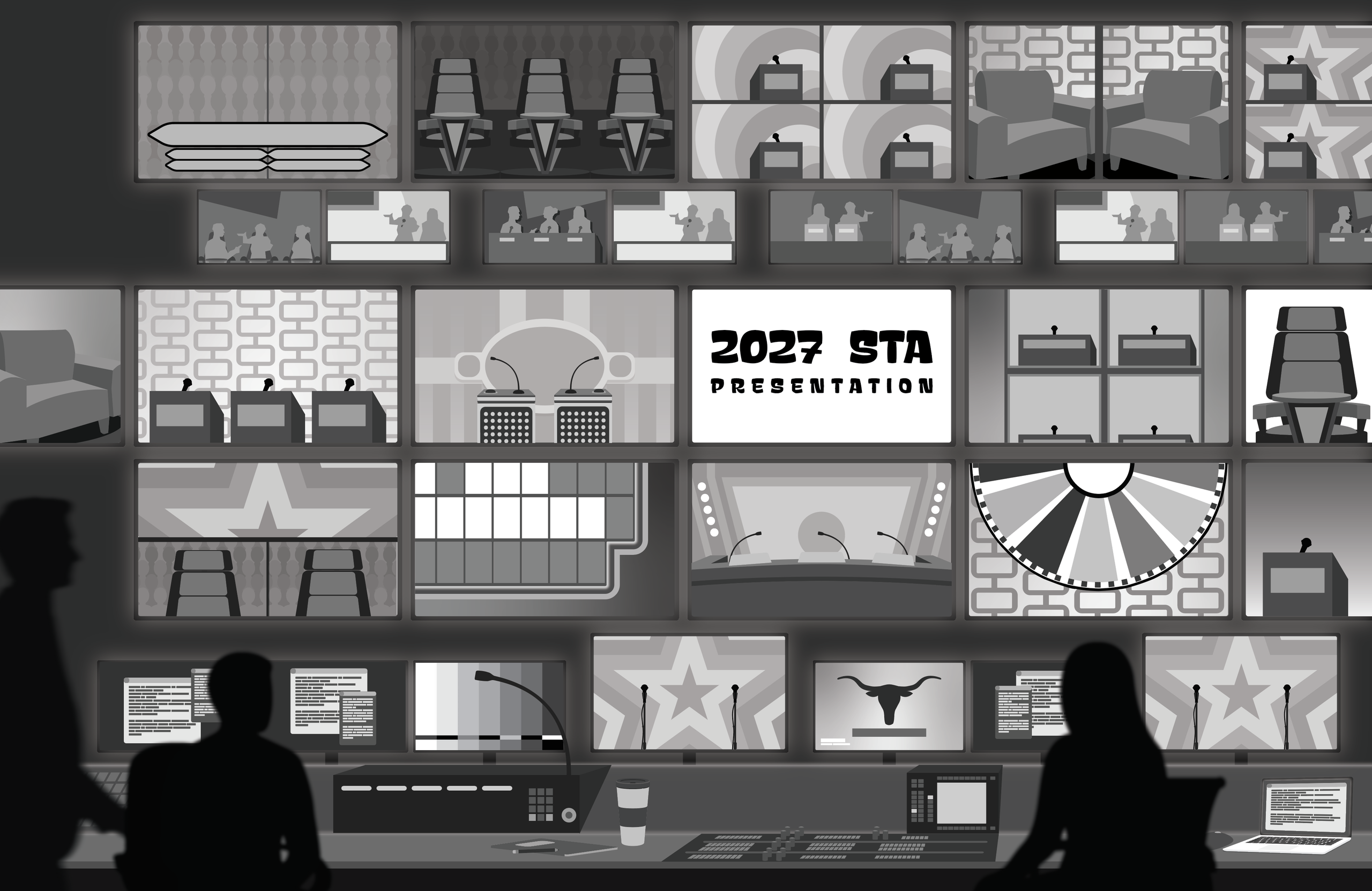
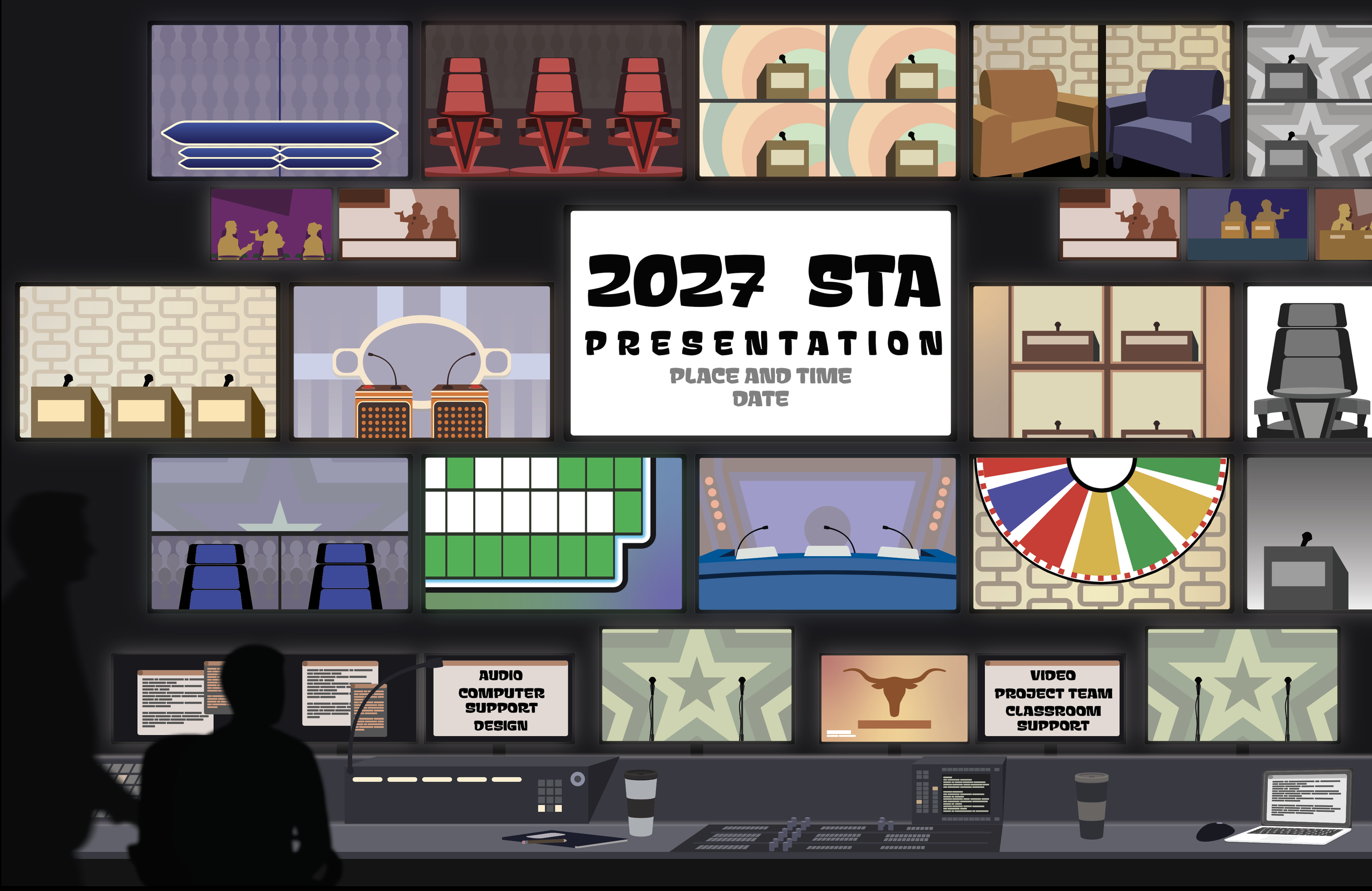
This week, I had a lot of time to work on the 2027 poster presentation as I waited for feedback on the course logo design. I’ve just about finished up designing the assets and begun adding in colors. Illustrator has a handy tool where I can quickly and easily recolor my artwork, so thankfully it has been a relatively quick process. The current colors are subject to change as I make adjustments to make the screens look more realistic and “screen-like”.


Initial design, before adding color and making minor edits

Added colors, minor edits


Next, I’ll be finishing up the colors and adding in some photos to see how the scaling looks to make sure the STAs aren’t too small.

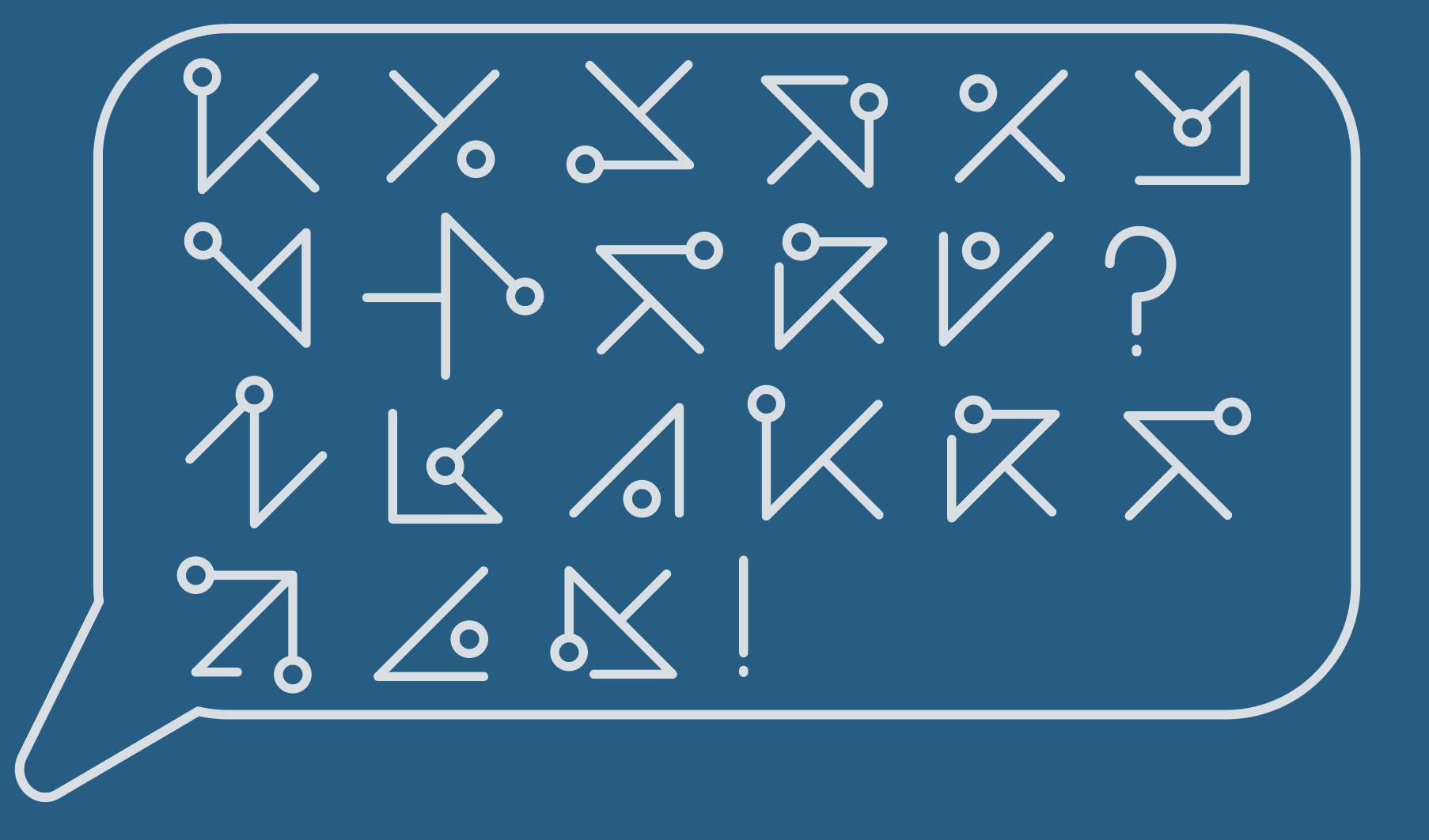
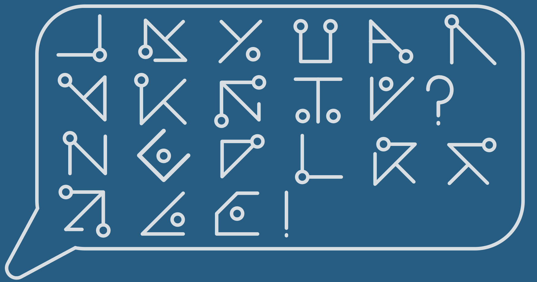
After a meeting discussing future plans, we’re coming up on the final designs for the course logo for the class Agentic Software Engineering. The designs below are the most recent designs I created after receiving feedback. We went back to one of my earlier logo concepts to focus on spacing out the symbols, adding punctuation and redesigning them to look more cohesive.


Both are relatively the same. The top image has symbols that I felt are very similar in design, while the bottom image includes simplified versions of the English alphabet.

That’s all I have for this week. Thank you for reading and I hope you have a spooky Halloween.

Filed Under: Fall 2026 – Spring 2027

First Class Day (Fall Term) | Post – [264017] 2027 Summer Marketing

October 30, 2026 By Asha Rountree

First Class Day (Fall Term) | Social Media Marketing


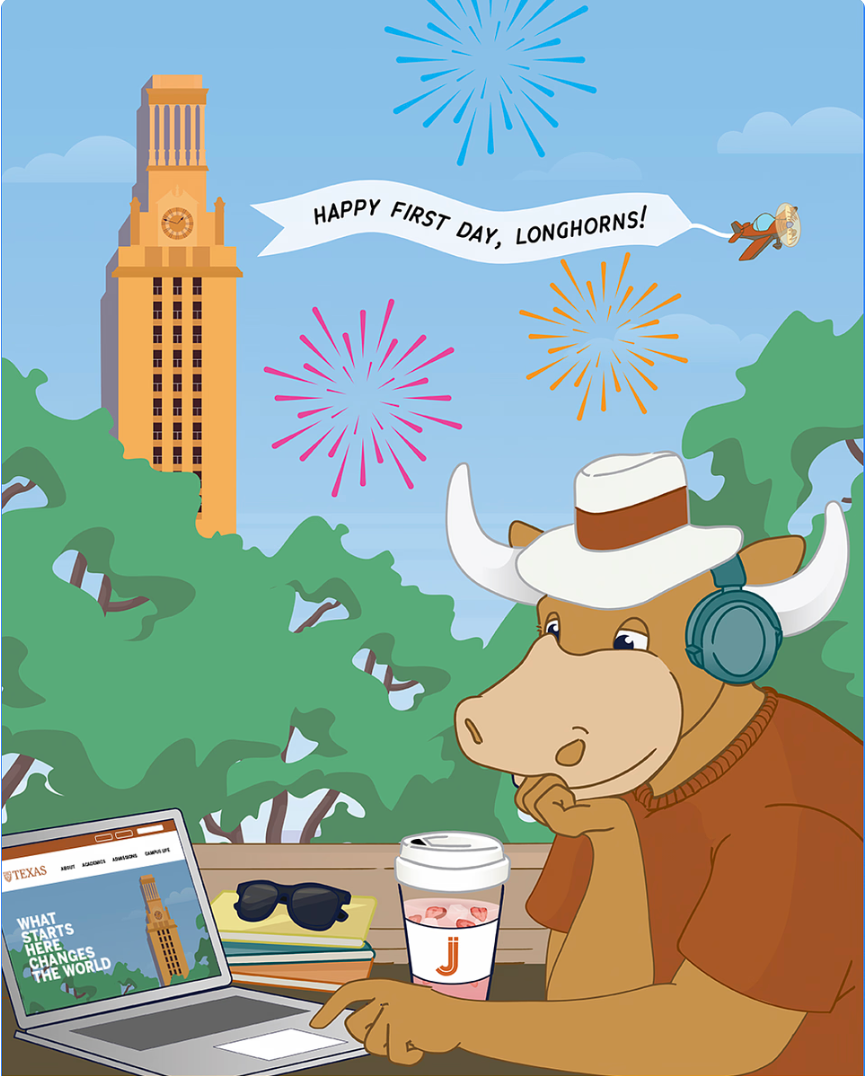
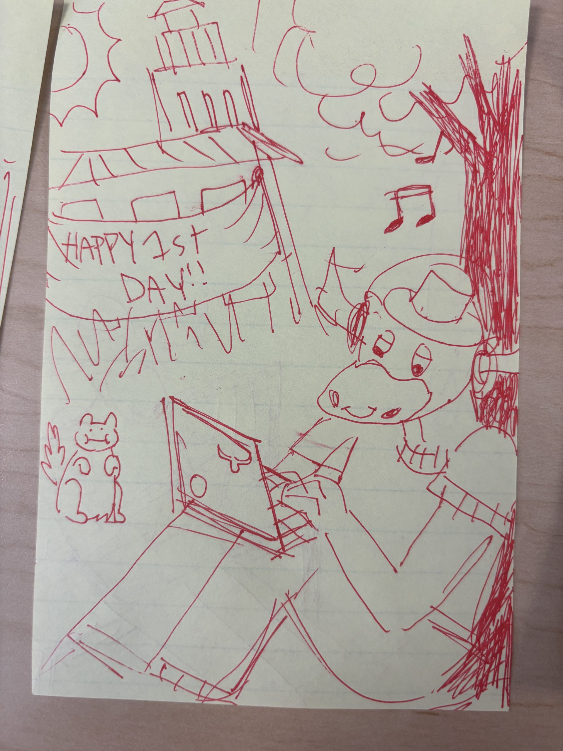
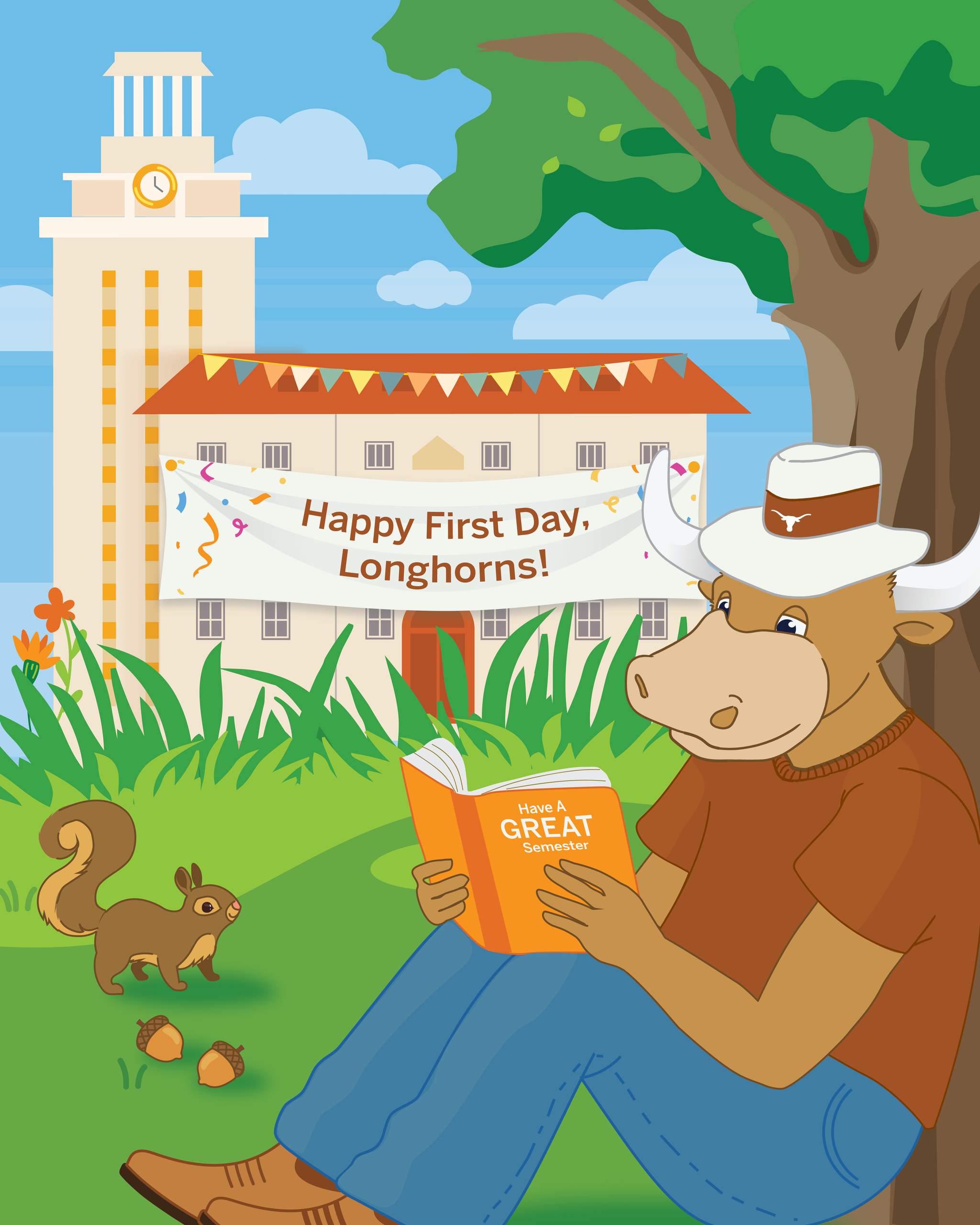
★ Overview: Following the Summer 2026 countdown, we wanted to create a new post to celebrate the first day of school for longhorns! We wanted to keep the same style of Bevo from the previous post, but change the background, activity, etc to create a unique post (as the previous graphic has already been used quite a few times). Previous post from 2025:

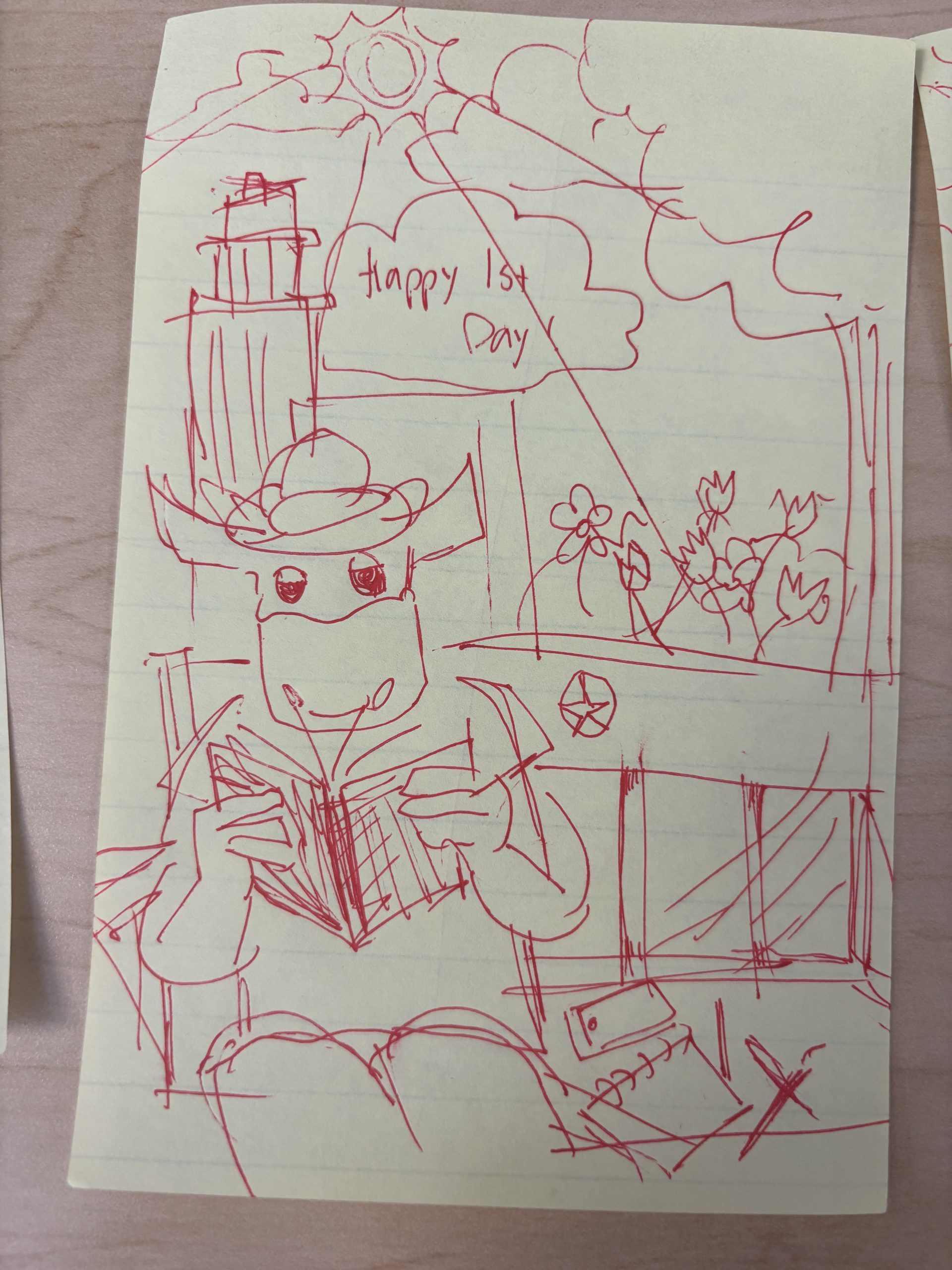
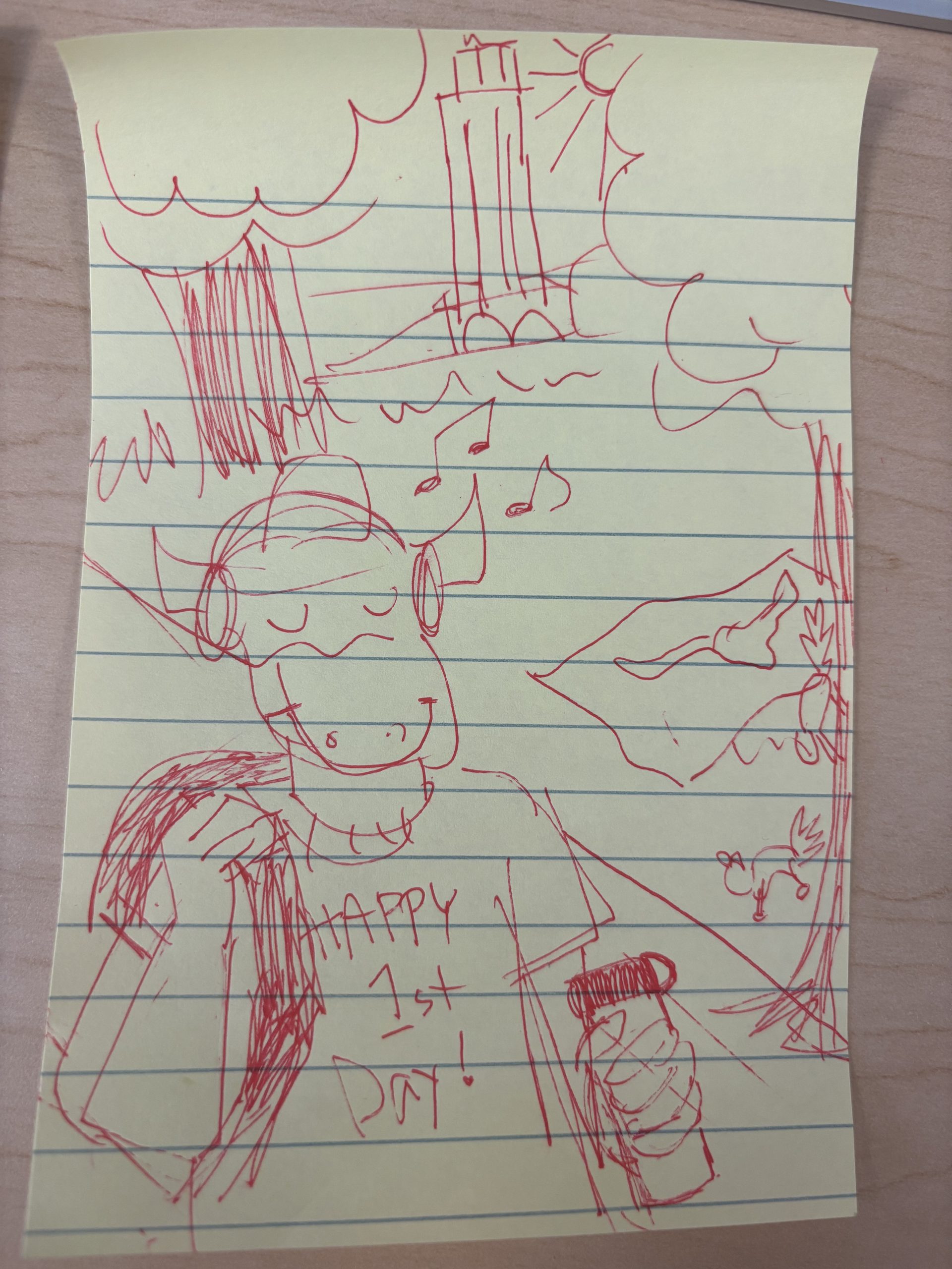
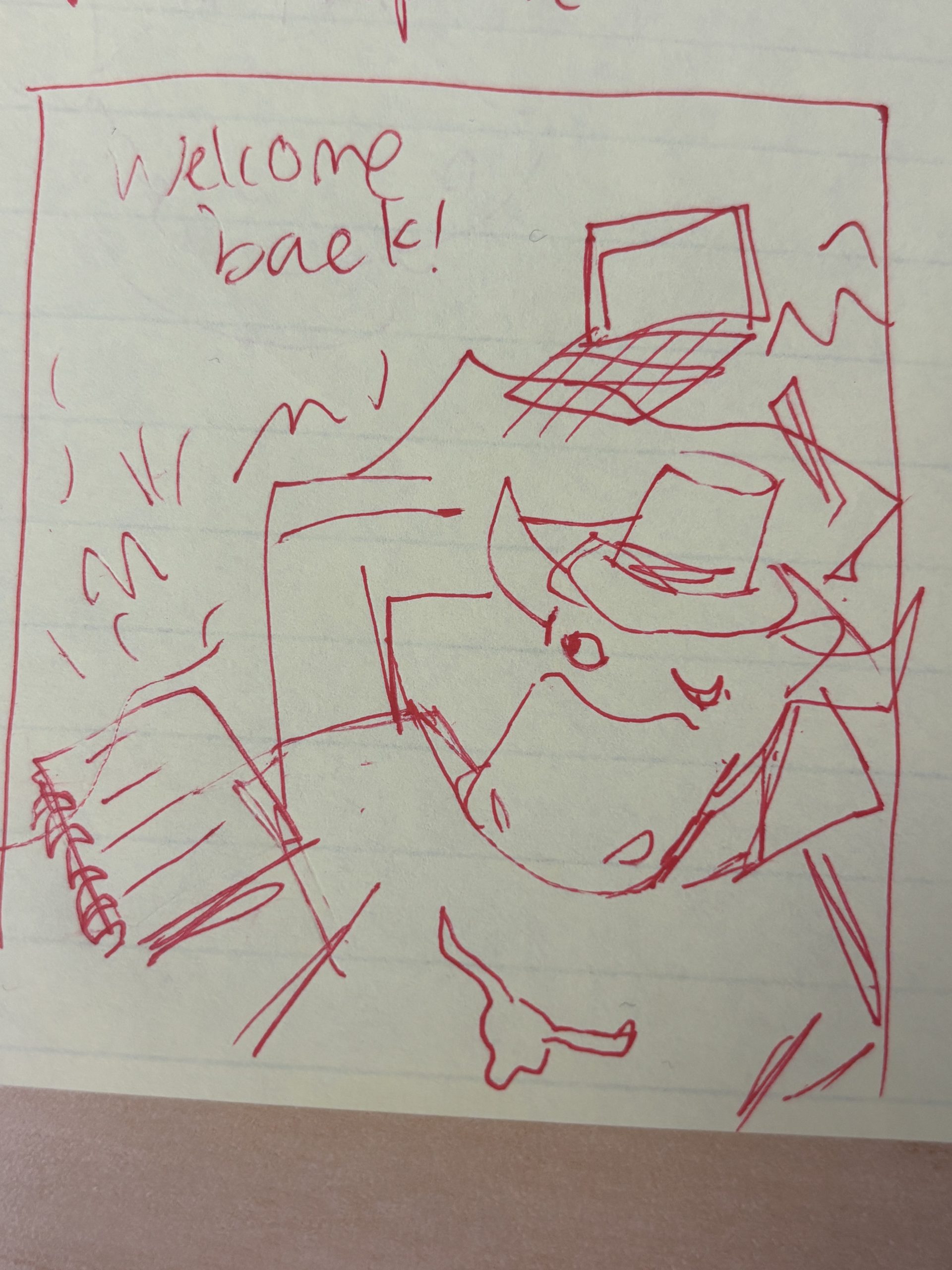
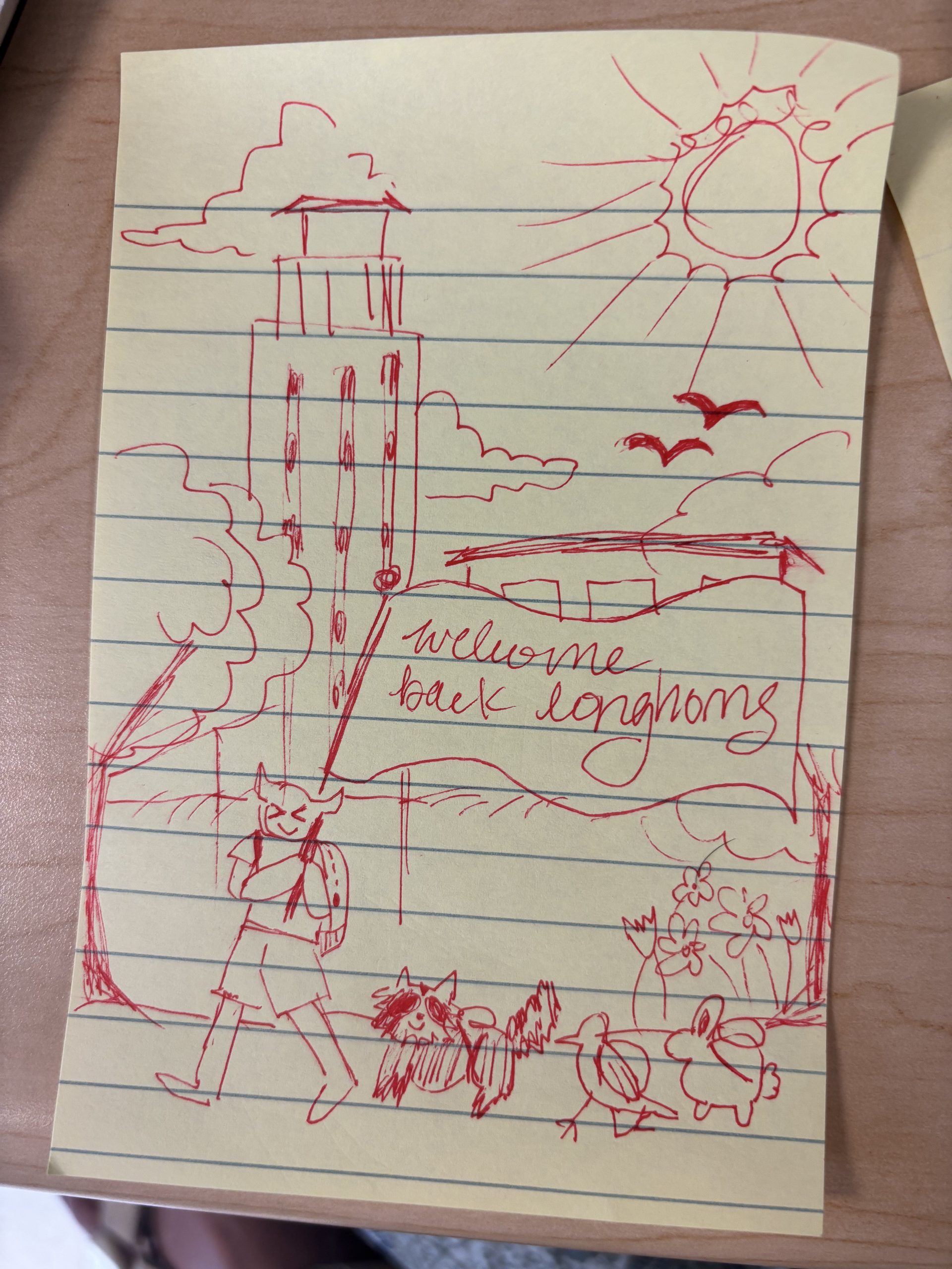
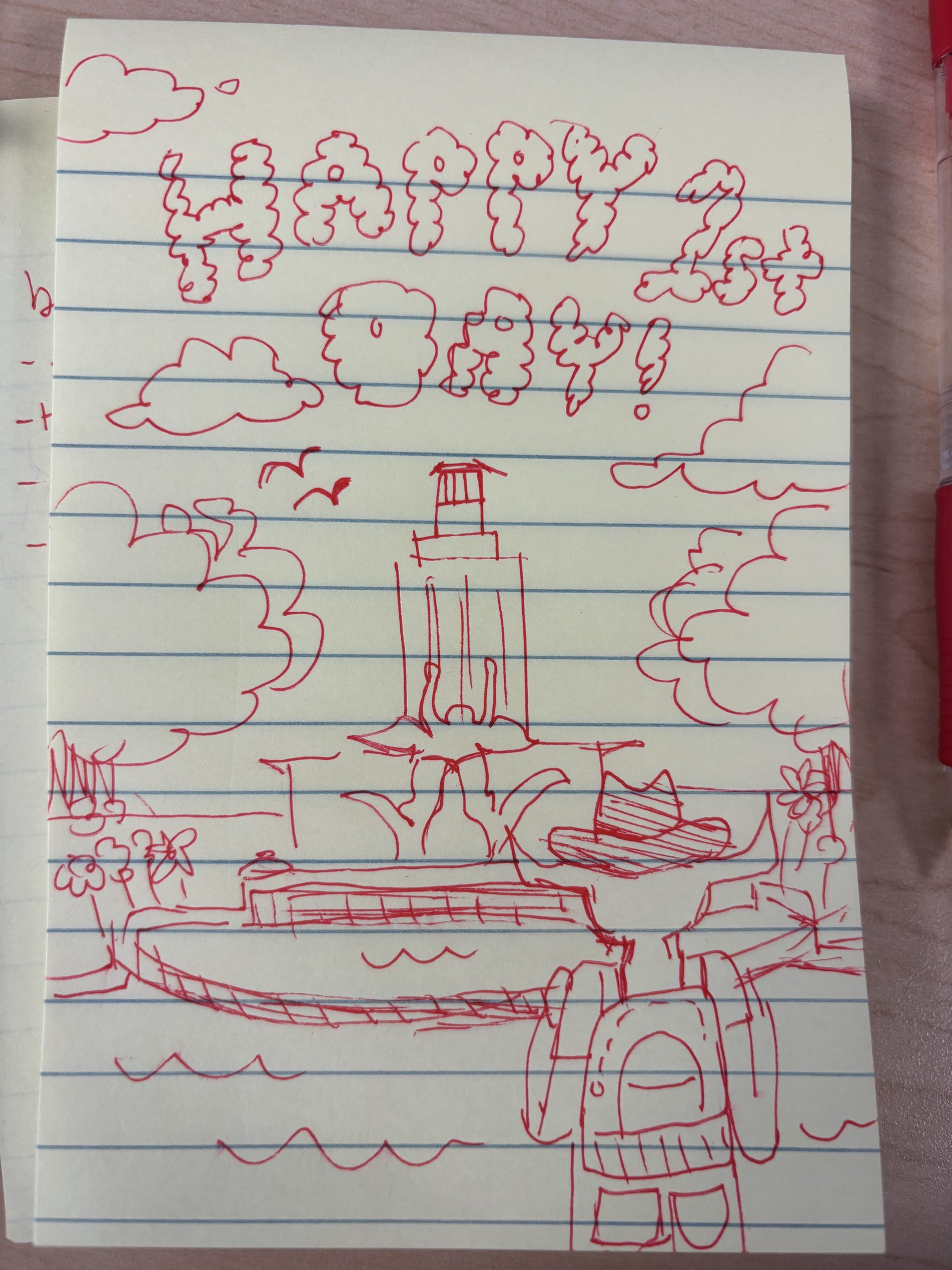
★ Brainstorming: I created quite a few different iterations of Bevo interacting with campus scenery to scope out options for the the new post:

After reviewing the iterations, we decided not to go with the bottom right, as it felt isolating towards Bevo, but the rest of my ideas were fair game. I decided to choose the top right (Bevo leaning against tree) because it felt friendly, relaxing, and welcoming, and still involved Bevo engaging in academics. I also like how visible the UT tower was in this iteration.

★ Iterations:

I decided to go with more saturated colors to create a bright, celebratory atmosphere. Some small edits I made between these two versions were lengthening Bevo’s neck and adding text to welcome our longhorns! I also re-interpreted the fireworks in the original 2025 post to be confetti in the current version

★ Final Design: drumroll please…

Filed Under: Fall 2026 – Spring 2027, We are STAs

Summer 2026 Countdown

October 28, 2026 By Asha Rountree

Fall 2026 Countdown Series | Social Media Marketing


★ Overview: My first assignment as the social media manager was to create a series of three countdown posts for the LAITS Instagram to get students excited about the upcoming fall semester

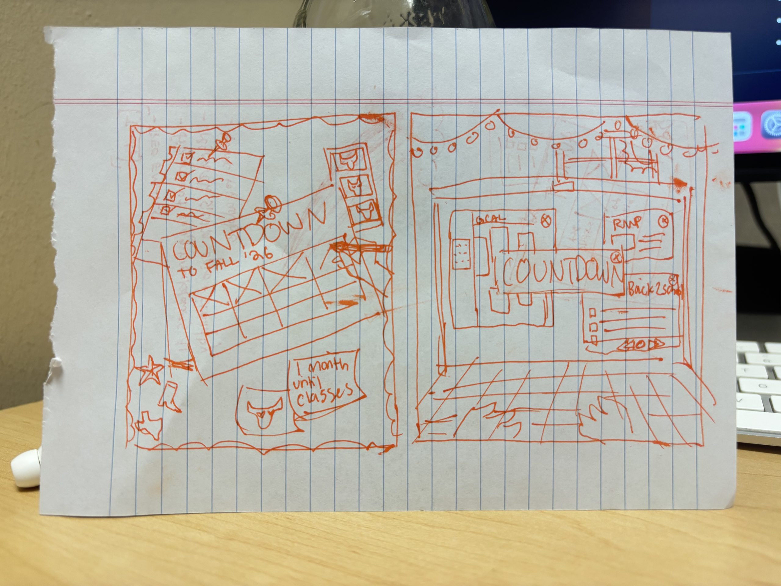
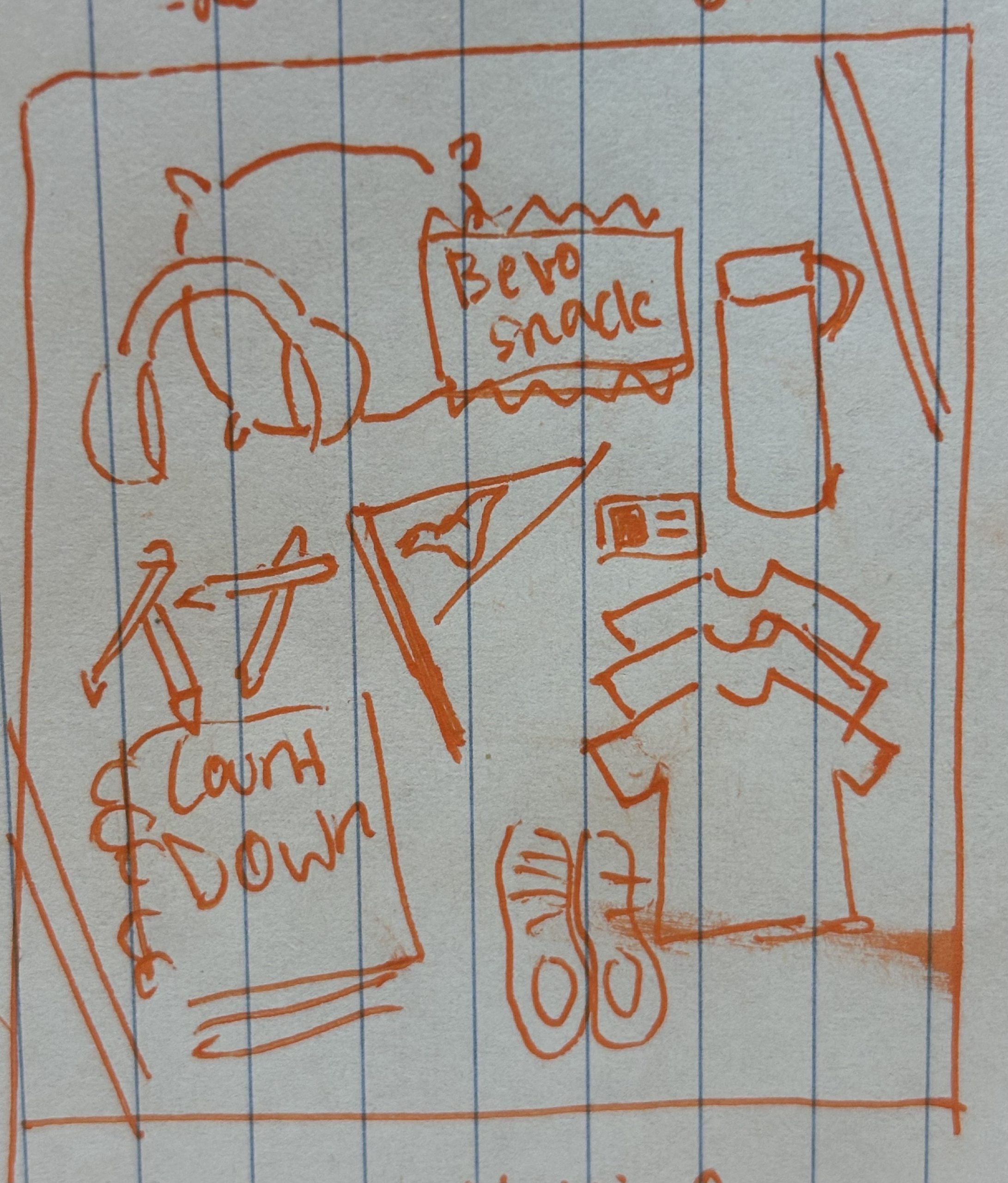
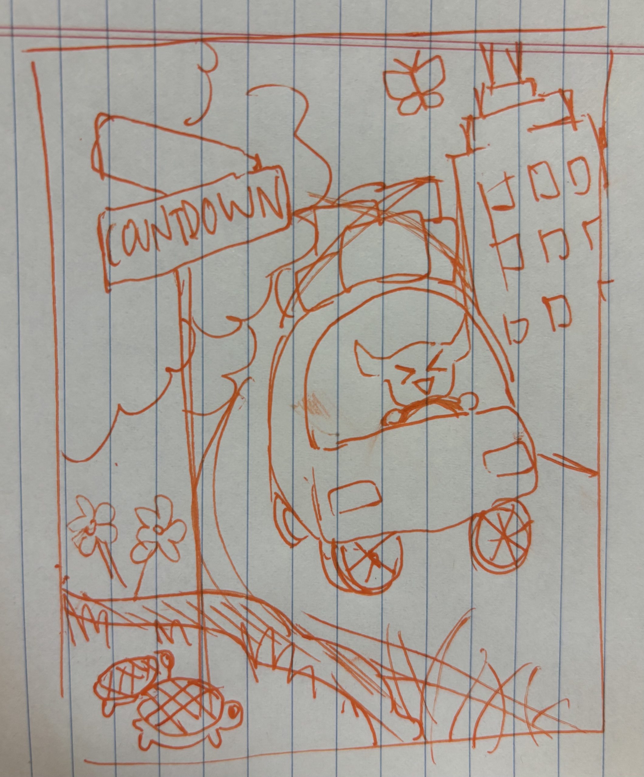
★ Brainstorming: I started out by sketching a few ideas for the post. I wanted the post to appeal to a modern UT student, and tried to lean into online trends (such as a flat layout of personal belongings), and included fun decor and imagery in the backgrounds of the post ideas to increase appeal and engagement to young adults.

I also wanted to keep the idea of Bevo getting ready for school as a common theme throughout the images (the same as last year’s fall countdown posts),

The first idea is a bulletin board set in Bevo’s room, including a calendar, checklist, sticky notes, photo strip, and pins.

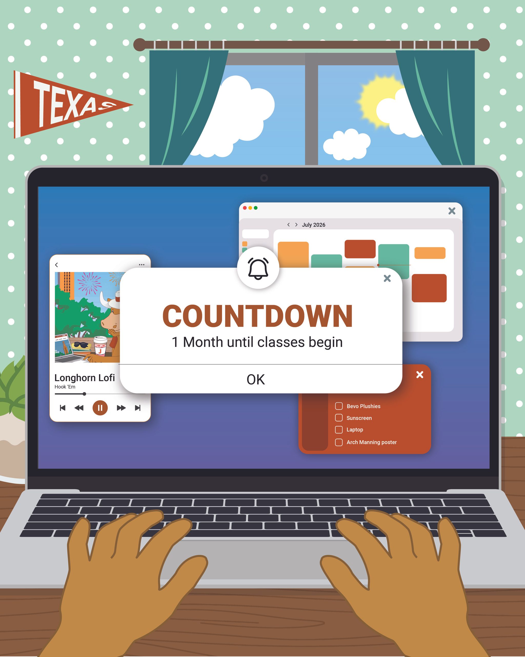
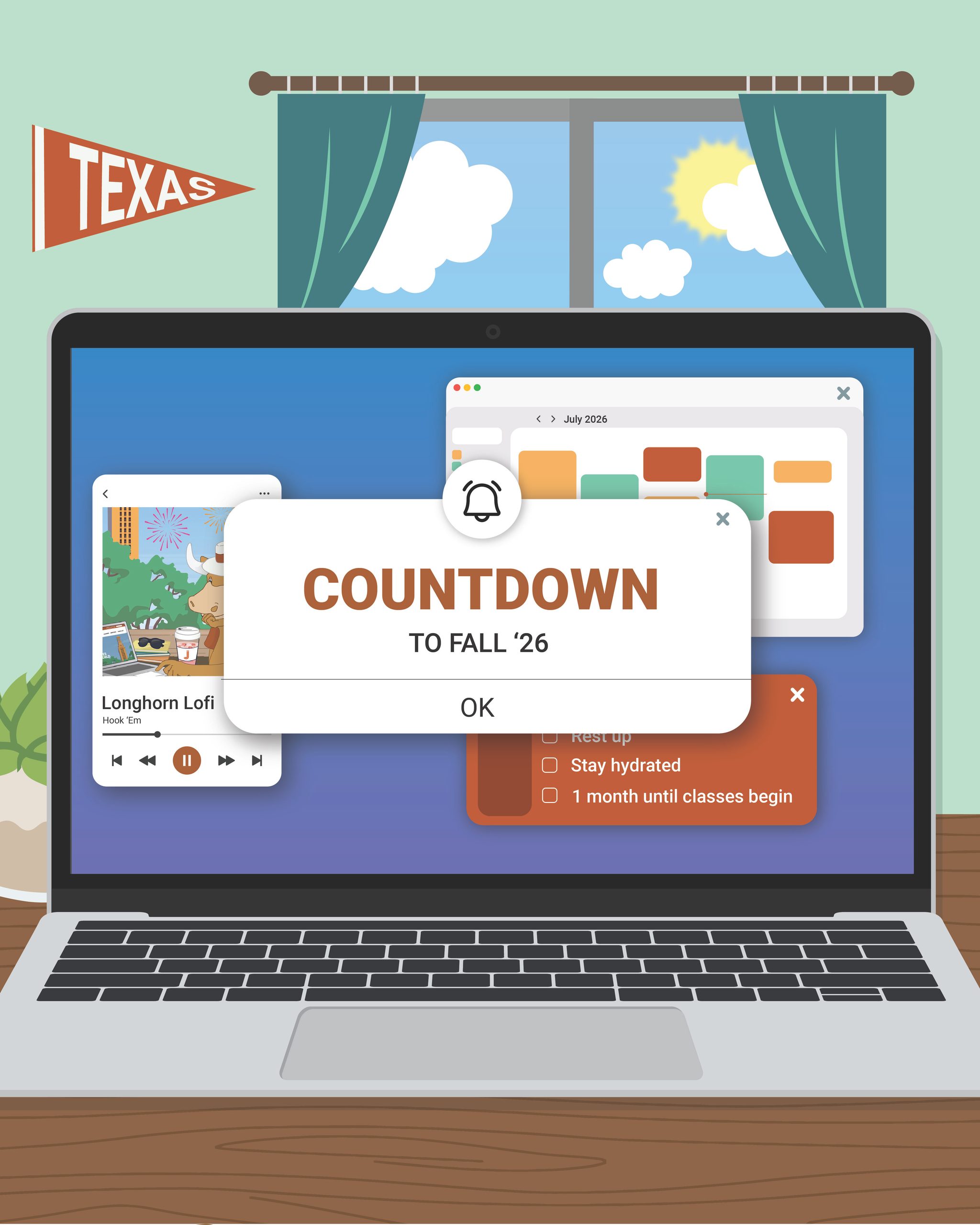
The second is a computer displaying pop up reminders, google calendar, and maybe a back to school playlist. This is a fun perspective because Bevo is behind the laptop.

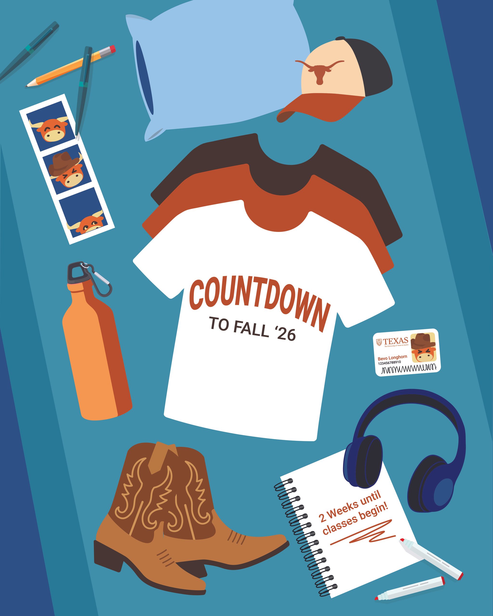
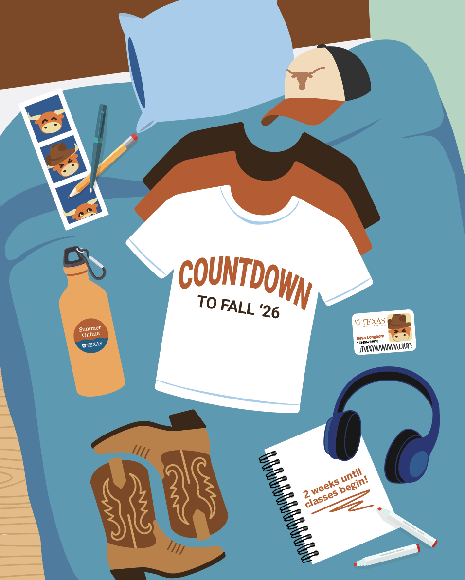
I had the idea to do a flat layout of back to school items for the next post as Bevo is packing up to return to UT. This is also a common method to display packing in an aesthetic way online.

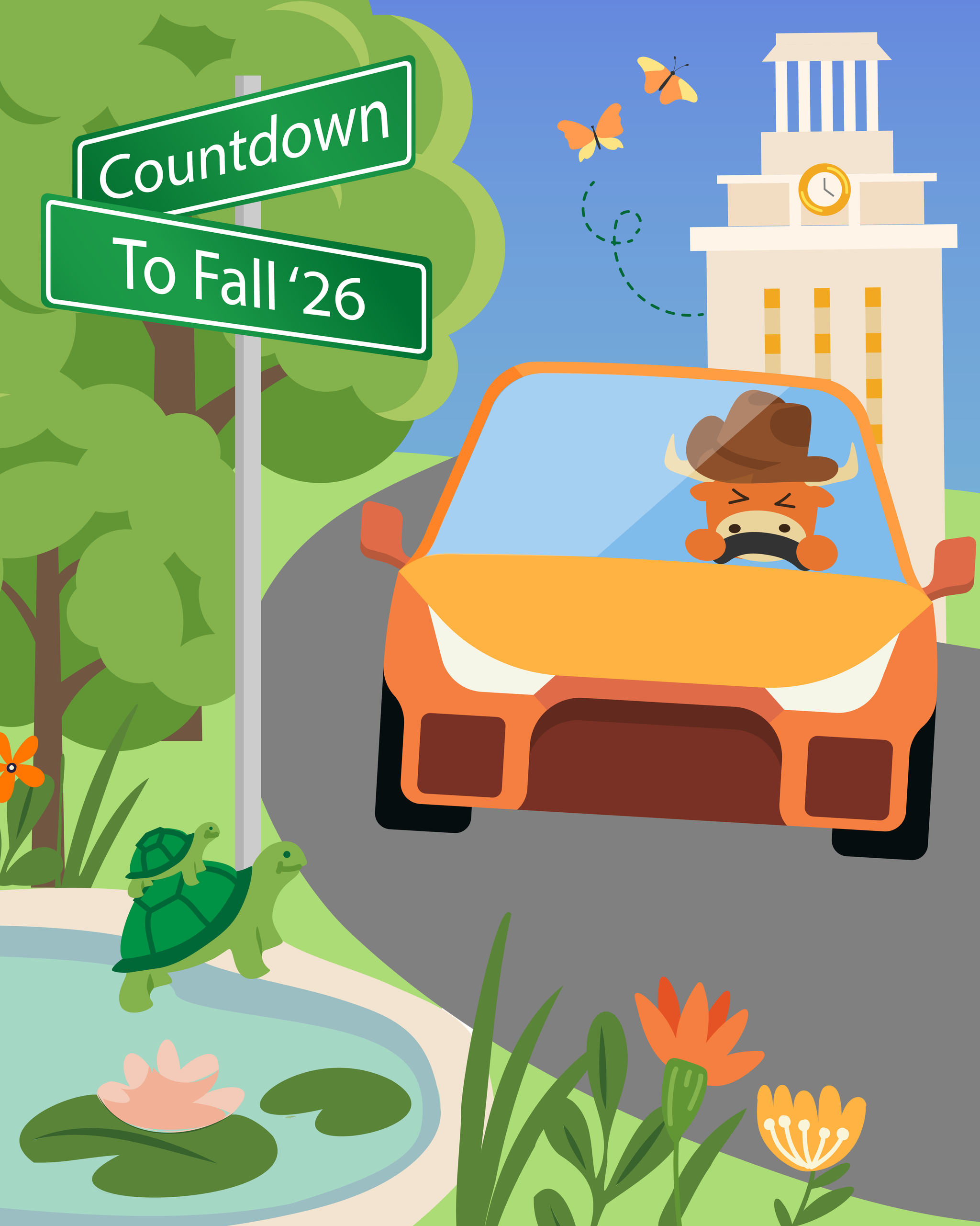
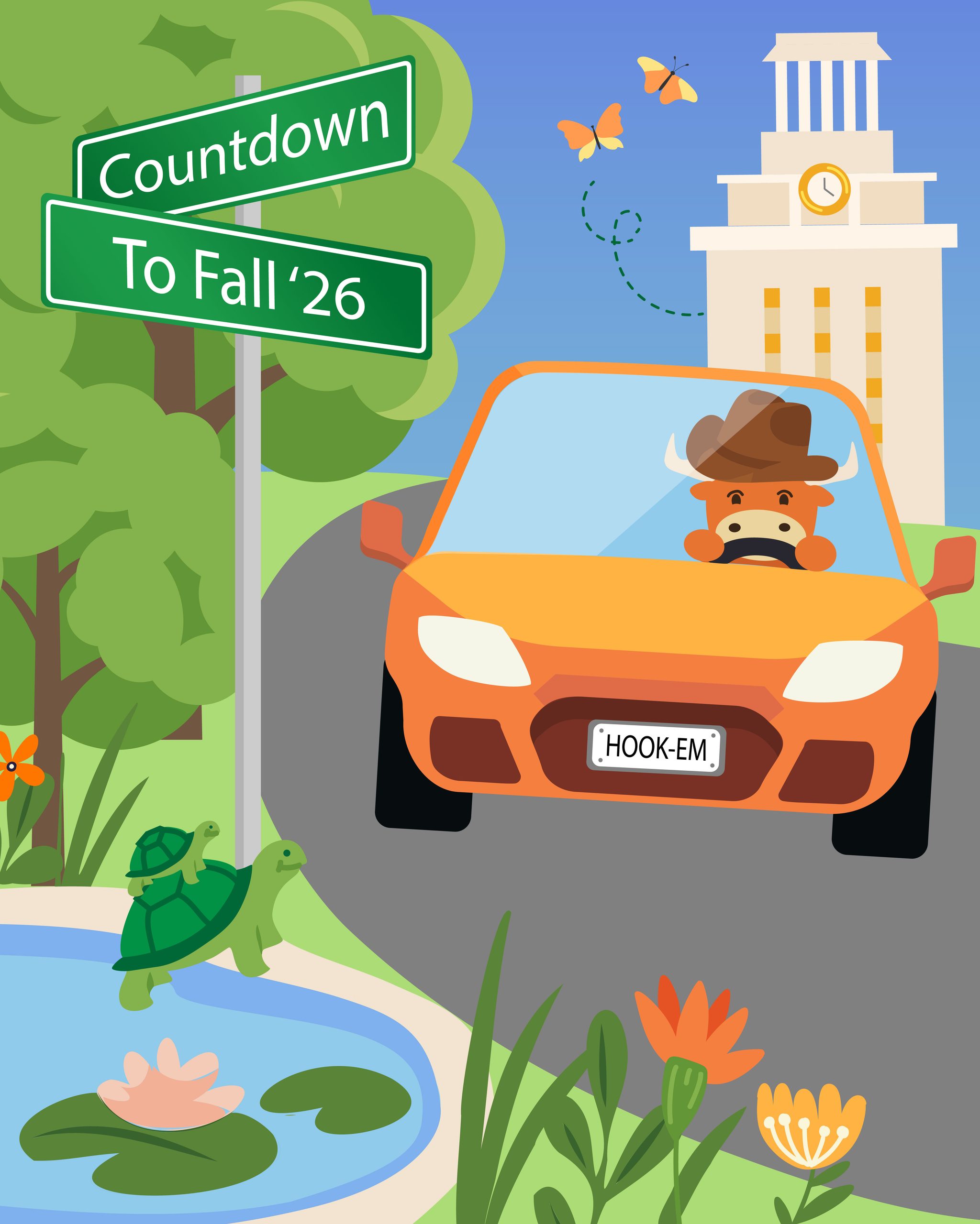
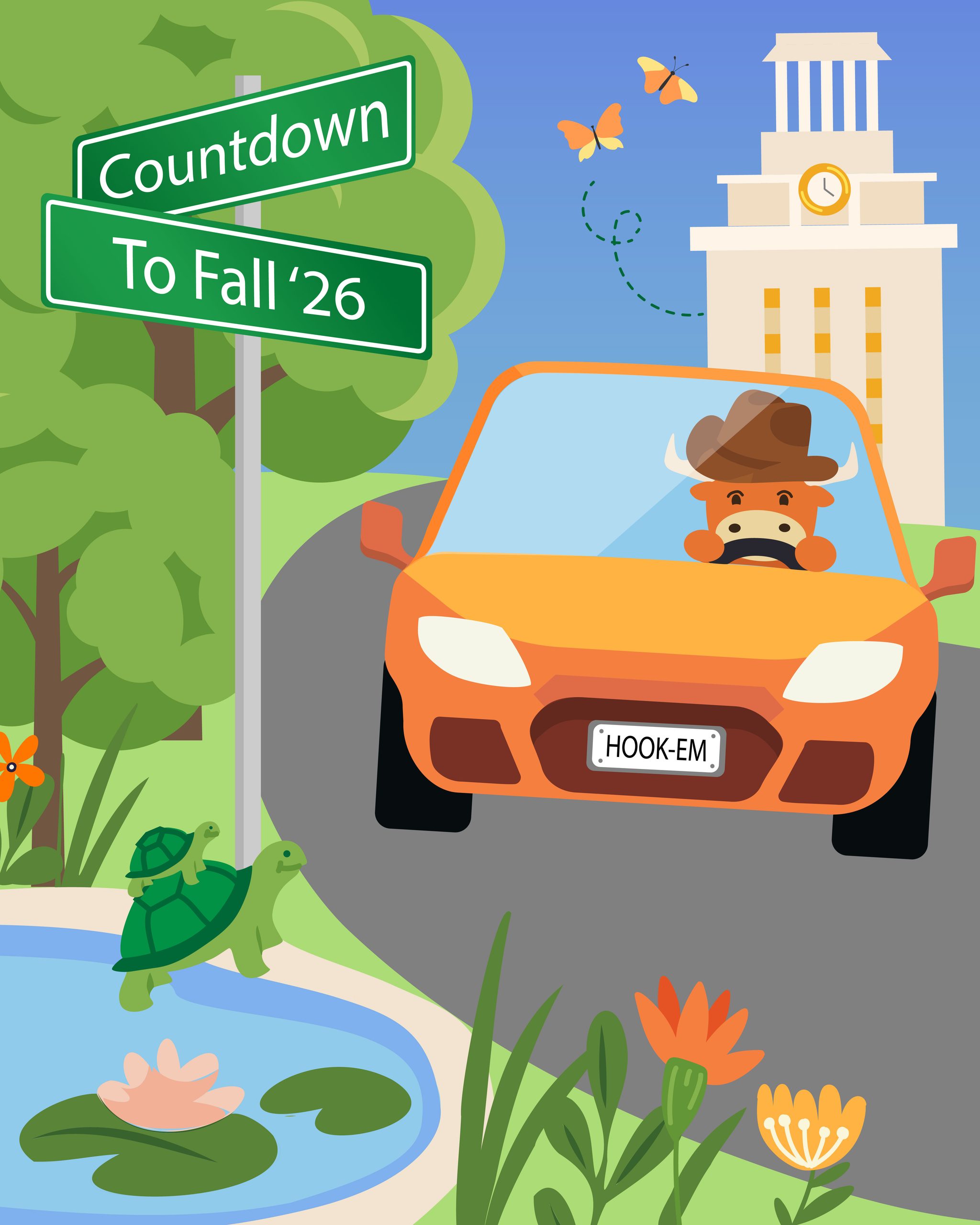
The last idea follows the original move-in theme, but from a different angle. I wanted to include the “countdown” title on a street sign, and incorporate campus nature (turtles, butterfly, trees, etc).

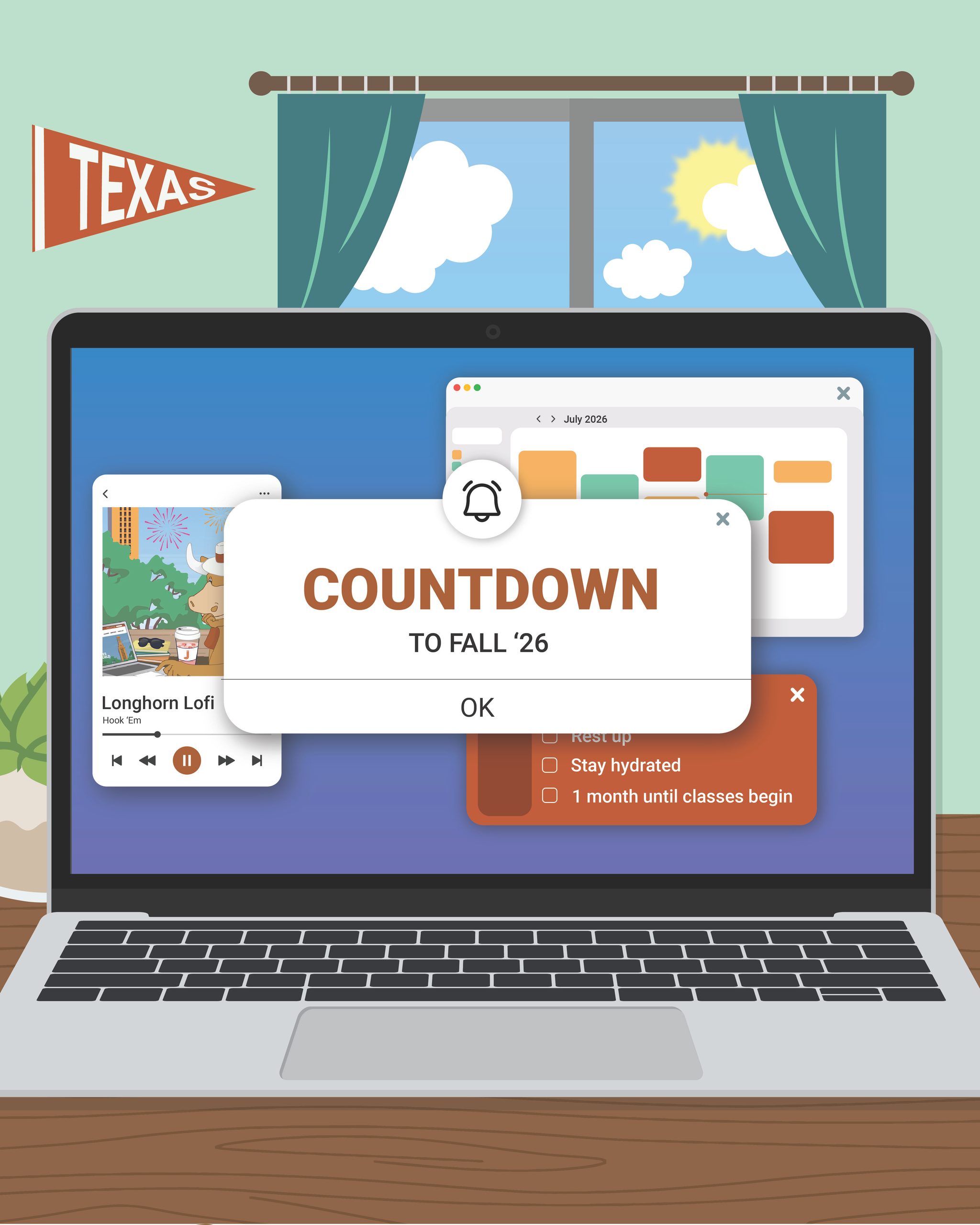
★ 1st Post: After my sketches were reviewed, I got the green light to begin working on the first social media post. Using my sketch as a reference, I created the first draft below. I also color dropped from the previous year’s posts to keep a consistent color scheme.

First Iteration
Final Post

Between these two posts, I got feedback to make a few changes to the background (making the background a solid color to reduce busyness and enhancing readability of the “Texas” flag). I also changed the main popup text to “Fall ’26″instead of “1 month until classes begin” to maintain text consistency throughout all posts

The main change I made after design review was removing Bevo’s hands. I realized after discussing with admin that it was not apparent that the human hands in the post would be Bevo’s. I originally designed human hands to emulate a humanized Bevo in a different post, but this interpretation became lost when I displayed just Bevo’s hand in the countdown post. I decided to just omit the hands entirely for clarity.

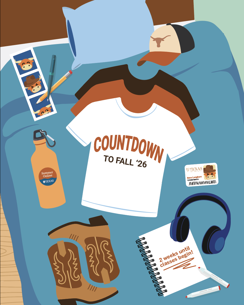
★ 2nd Post: Similarly to the first post, I referenced my original sketch to create the first draft of the next post. I wanted to include fun references to student life, like the Bevo student ID, photo strip, and cowboy boots:

First Iteration
Final Post

After the first iteration I received feedback to make the background more apparent as a bed, to add the Summer Marketing sticker to the water bottle, and to change the contrast of the water bottle. For the bed, I tried to make the blankets and bed frame more recognizable while still keeping the background of the post simplistic, allowing the items on the bed to pop.

★ 3rd Post: Finally, I created a post inspired by fun campus landmarks to welcome students on their journey returning to or discovering campus! Here was my first draft:

First Iteration
Final Post

The main feedback I received had to do with altering the car to be less “menacing” and UT themed. The main edits I made to address this were:

1) Rounding out the blocky shapes on the car

2) Adjusting the headlight shape to be less slanted, and a little more rounded. The headlights often read like eyes, so we wanted to make sure we were sending a positive message with this graphic.

3) Opening Bevo’s eyes (so he is not driving blindly)

4) Adding a license plate with a UT slogan!

★ Final Countdown Post Series:

★ Reflection: I loved working on this set of posts, and it was a great introduction to working on leading design ideation for the social media. A few takeaways were:

1) Narrative Structure: Choosing a consistent narrative for a set of graphics helps connect with the audience through storytelling. Throughout the process of making these posts, I was adding/removing things (such as Bevo’s strangely human hands), and including tidbits of Bevo’s student life (ID card, etc), to ensure the narrative of the posts aligned with the process of Bevo getting ready for school.

2) Non-human Emotional Impact: Non human items still invoke an emotional reaction. I learned this by realizing how much of an emotional message the car in the third post conveyed; even though the car is an inanimate object, I had to make sure its shape was still friendly towards the audience as it is a central focal point for the post.

Filed Under: Fall 2026 – Spring 2027, We are STAs

  • « Previous Page
  • 1
  • 2
  • 3
  • 4
  • 5
  • …
  • 137
  • Next Page »

Copyright © 2026 · Cola Theme On Genesis Framework · WordPress · Log in