Typography Training: Type Hierarchy in InDesign
For this particular training, my requirement was to create a faux flier for the course “Underwater Basket Weaving” in InDesign. I had never used InDesign before, so this was a great learning experience for me! My first flier had quite a few problems…
Namely, the text hierarchy was off (the more important text i.e. the title and time was the smaller text), and there was a lot of extraneous negative space.
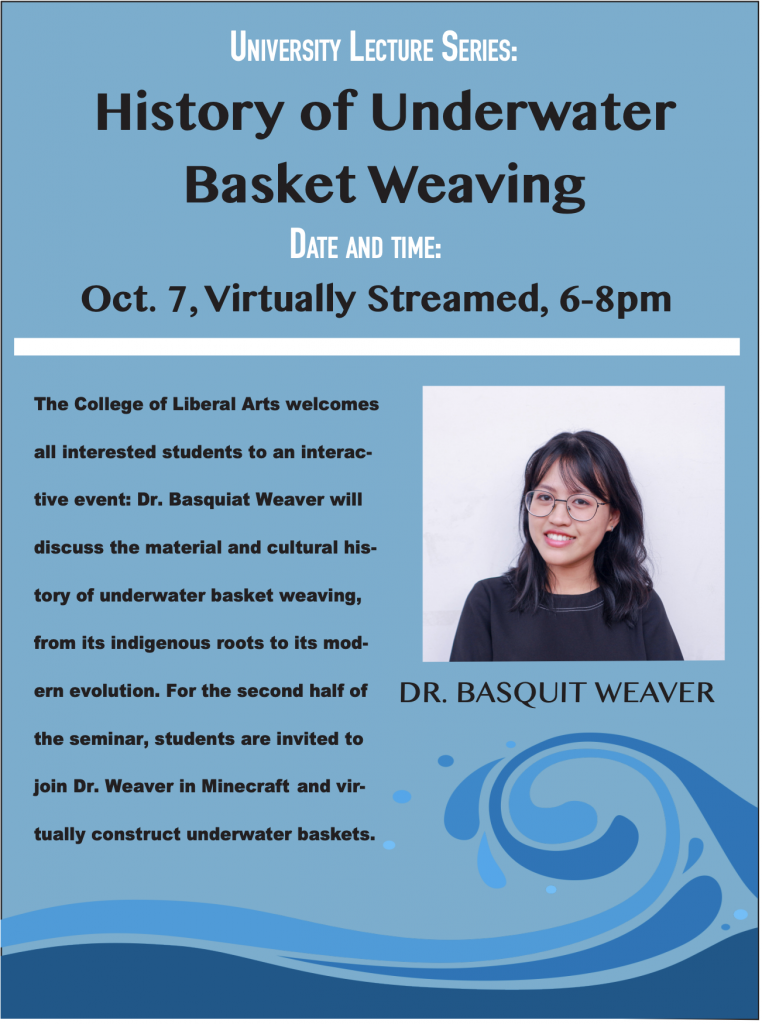
In the second version, I was able to get the type hierarchy better, but there is still extensive negative space as well as some awkward margins. I decided to essentially redo the entire layout and rethink the most logical way to place things and reduce awkward spacing. I ended up coming up with this:
This was definitely an improvement to the overall layout and format of the document. However, there were still a few things I was missing here:
- The bold text was too hard on the eyes
- The white accents were found on the top but not on the bottom
- The name bar was a bit too far to the left and also did not complement the shape of the image of “Dr. Basquit Weaver”
Abriella suggested I try making the image of the professor a different shape – which was very helpful!
The final version of this with those changes ended up looking like this:
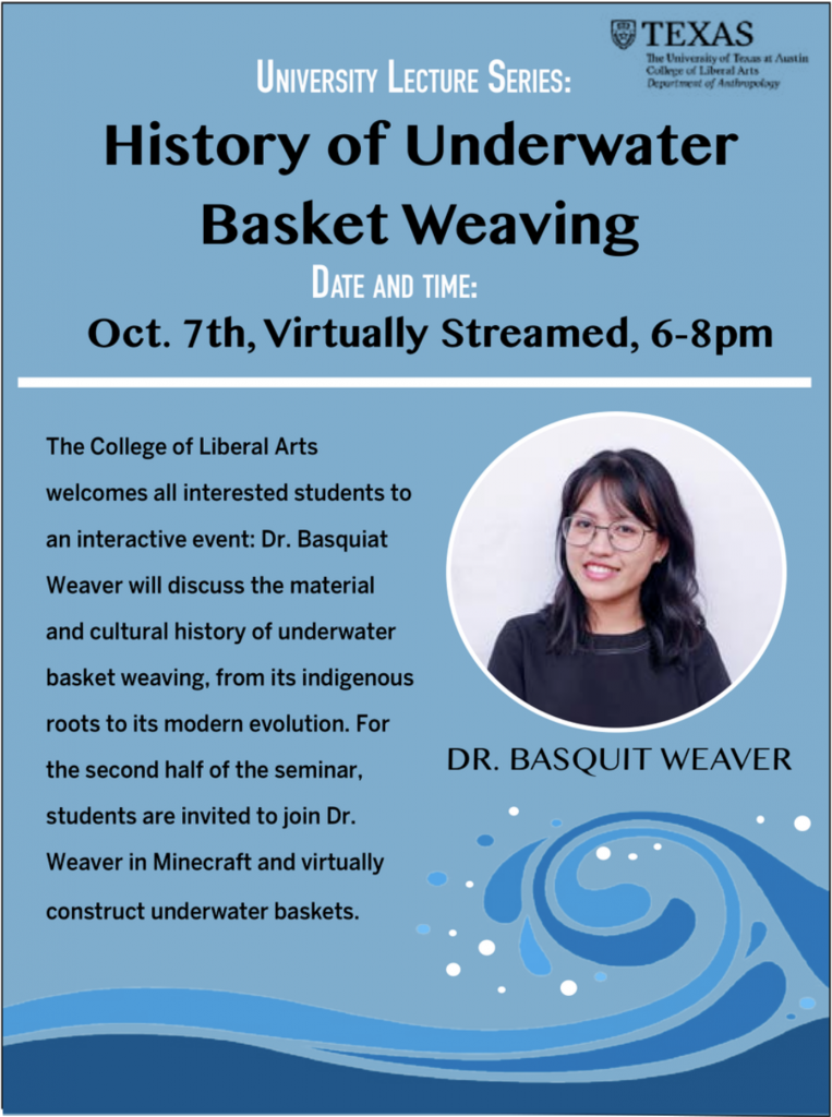
I was able to fix quite a bit of the issues involved with the last version, as well as add a few new changes that I think gave it more personality. Personally, I can still see things about it that I’d like to change, but I think overall it’s improved significantly since my initial draft (which now that I look at, makes me kind of sad.)
I learned quite about of InDesign by doing this assignment while also having fun designing this!
Bezier Curve Training Finale
As well as finishing that training, I also finished the “Create Custom Wordmarks Using Bezier Curves” training as well. My final version of this looks like this:
Ultimately, I decided not to include the gradient on the R because it didn’t match the solid colors of the triangles. Additionally, I removed the “Rachel Sacks” on the bottom as this is more of a short letter logo than a full brand logo.
Through this training, I learned a lot more about unity of design and maintaining a consistent coloring style and balance throughout. I also improved my skills with the pen curve tool, which allowed me to smoothly alter the initial R in this design without making it as clunky as the regular pen tool. I really like the pen curve tool, it and I are best friends.
2022 Charles A. Dana Center: InDesign templates + Infographics
Speaking of InDesign, this week I began a large client project for the Dana Center. We are creating templates for their journals, and then later are going to fill this out with actual content.
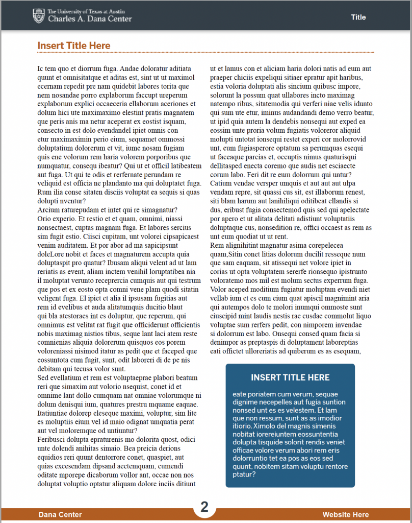
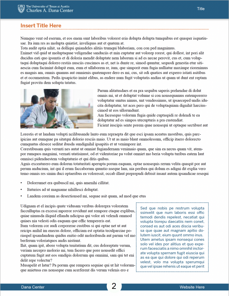
The first step to this is designing a template. We started working in Microsoft Word to create the template, but ultimately decided that InDesign would have better template functions. My first draft of the template looked like a replication of the previous template they gave us as a reference:

For my second draft, I was to create my own “innovations” to this style, while still sticking to the Dana Center brand. This was my first draft of this that I made on Friday:
I got some feedback on this already from Suloni and Maddy, and this is the final version of the style B we are sending to the client:
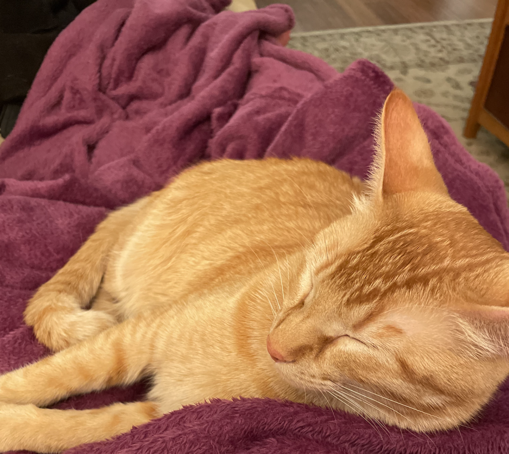
Finally, here is an important photo of my cat:
He was sitting on my lap last night completely tuckered out from…sleeping all day. A joy!
