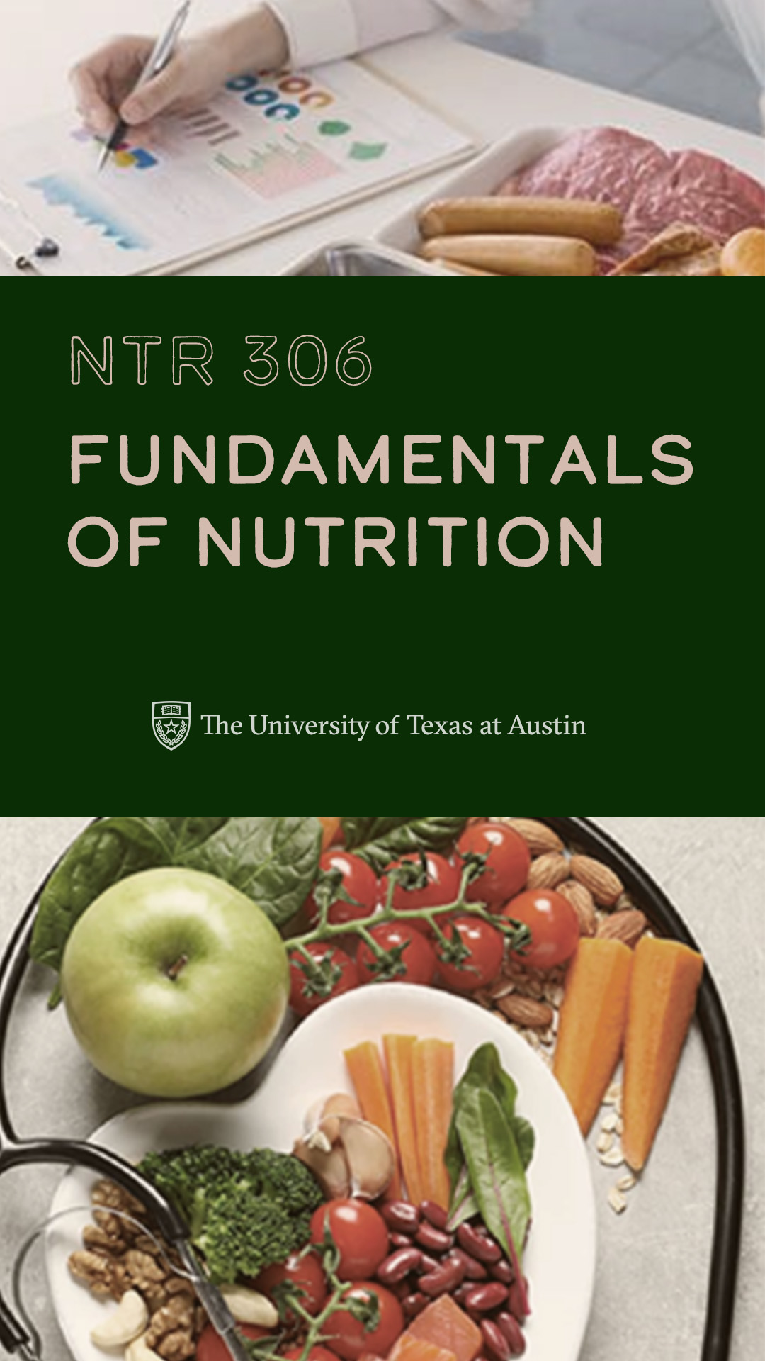
Even though this week was a bit slow for me, I was able to finish up the American Studies Banner, work on the UTFC project (like making backdrops & searching for stock images), and complete some extra training I had left. Here’s a final look at the AMS banner though! 
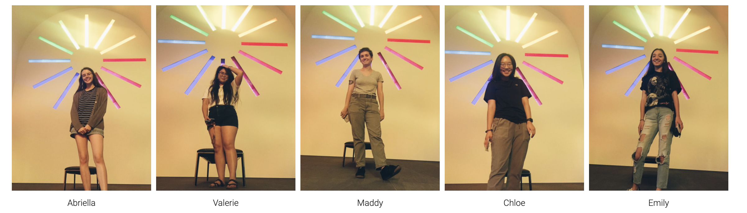
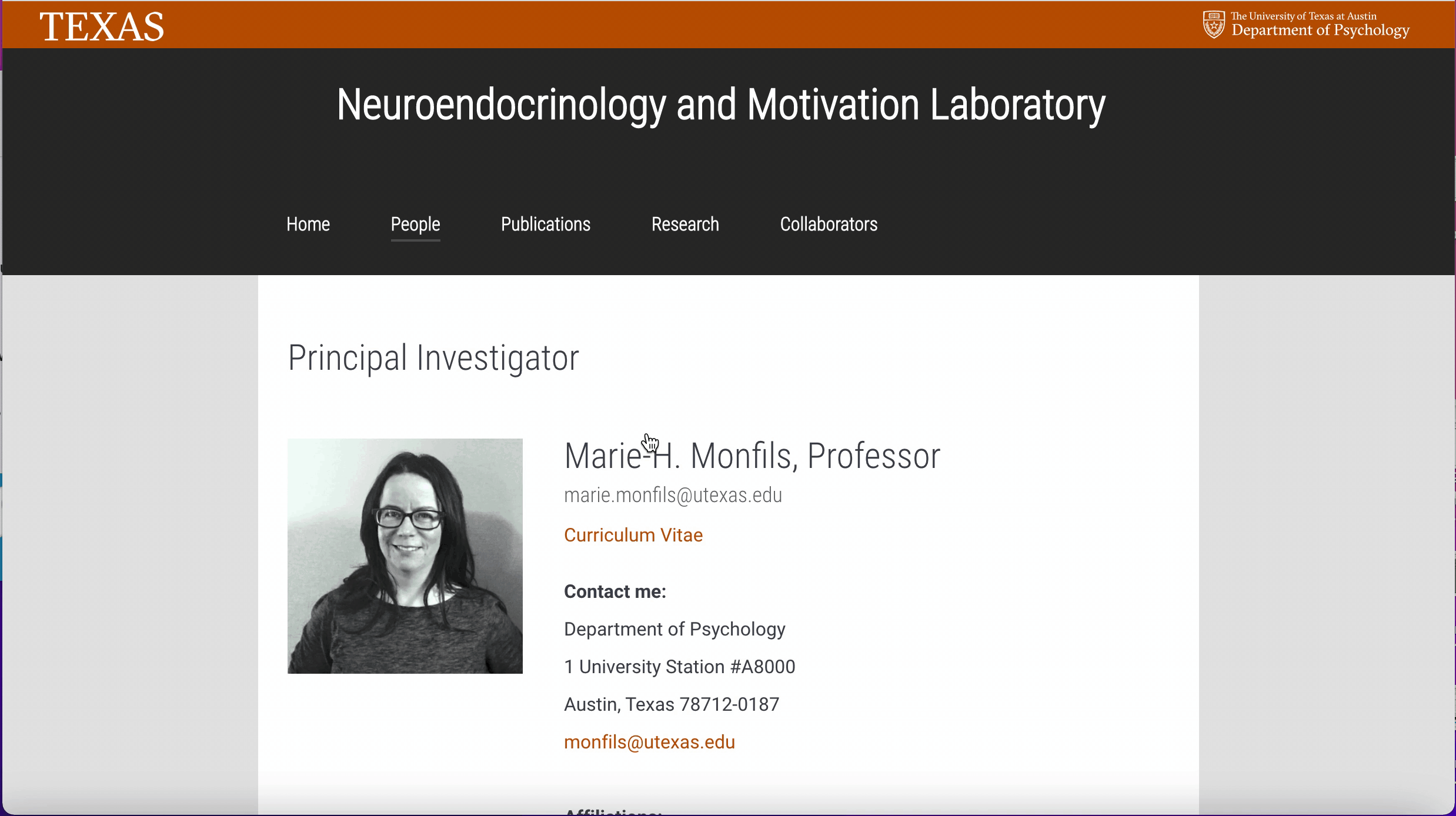
Some backdrops for the UTFC project:
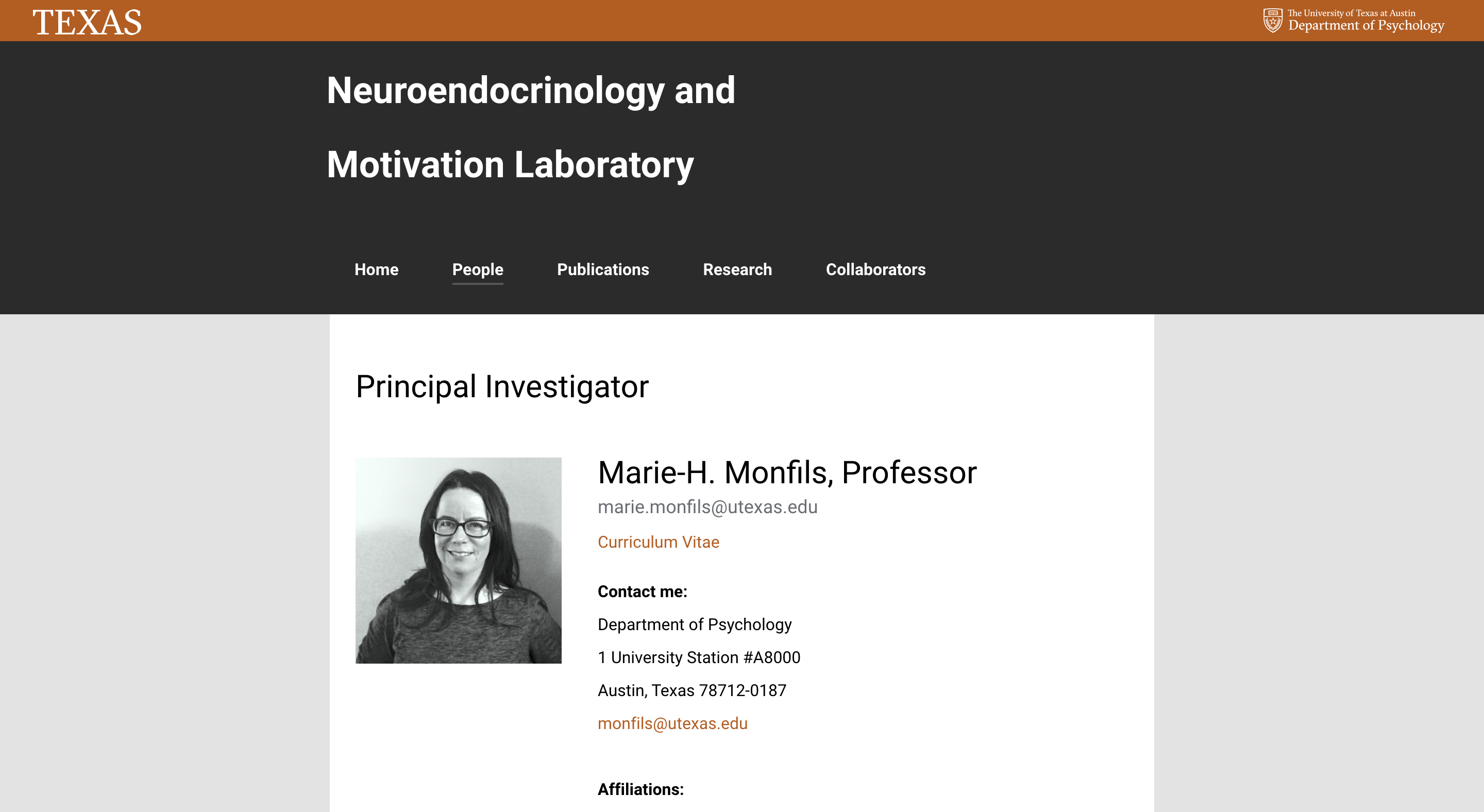
And the start of a new project for course graphics!