Project: Blanton Website Migration
Client /Prof: Blanton Museum
completion status: started work on August 23 and still continuing
staff guidance: Ruben Garza
STA team members: Marianne, Angie, Abriella, Rahul
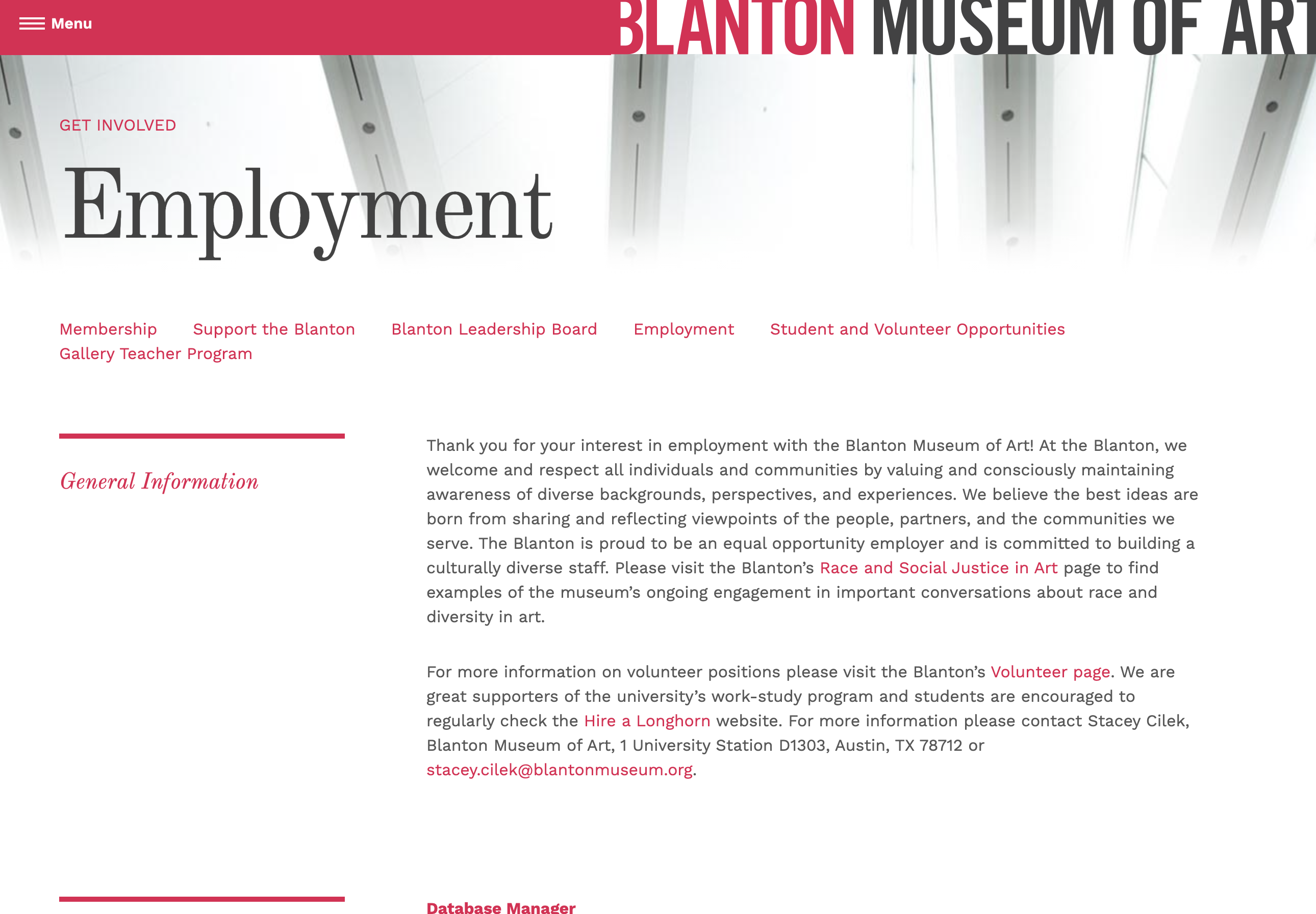
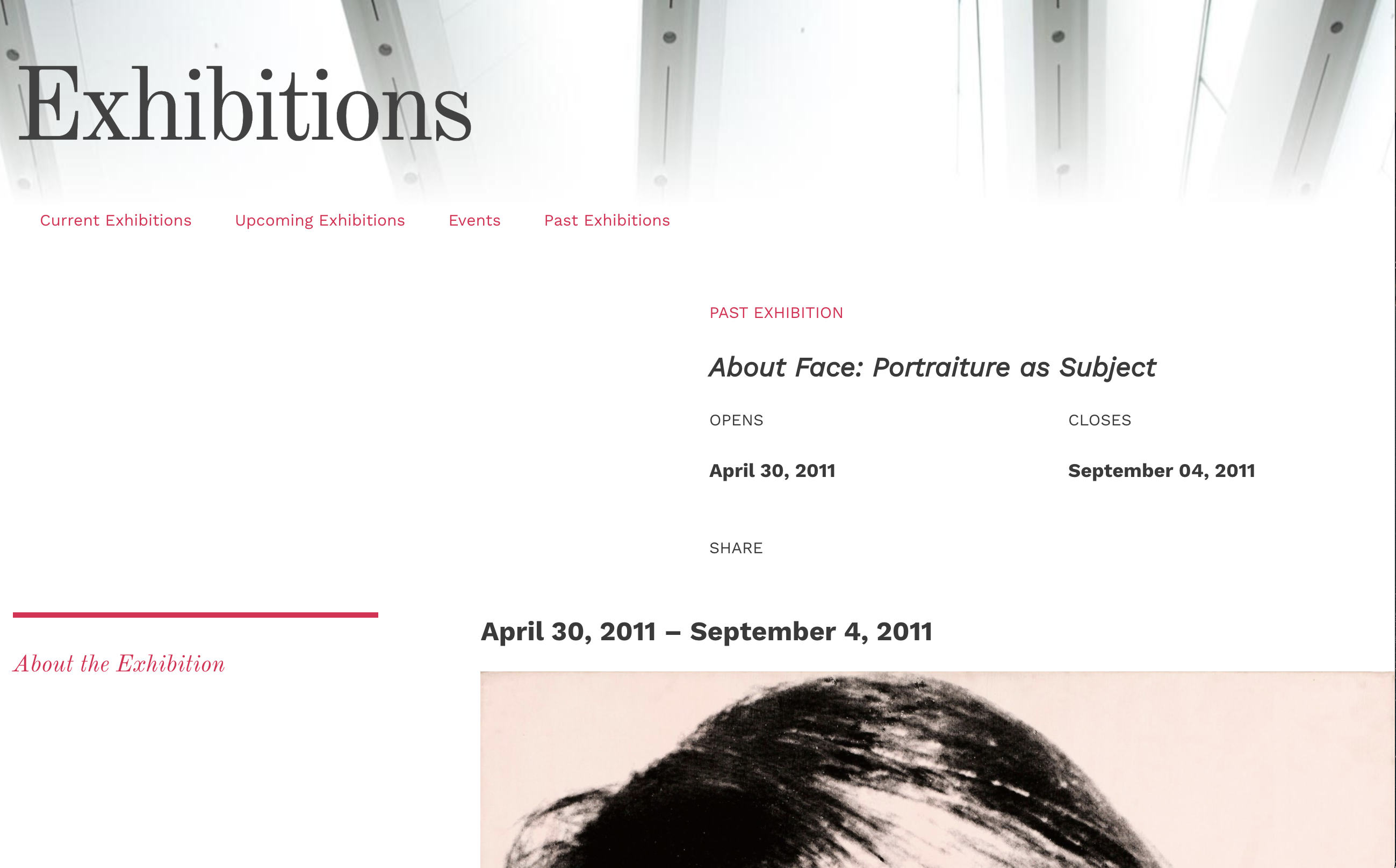
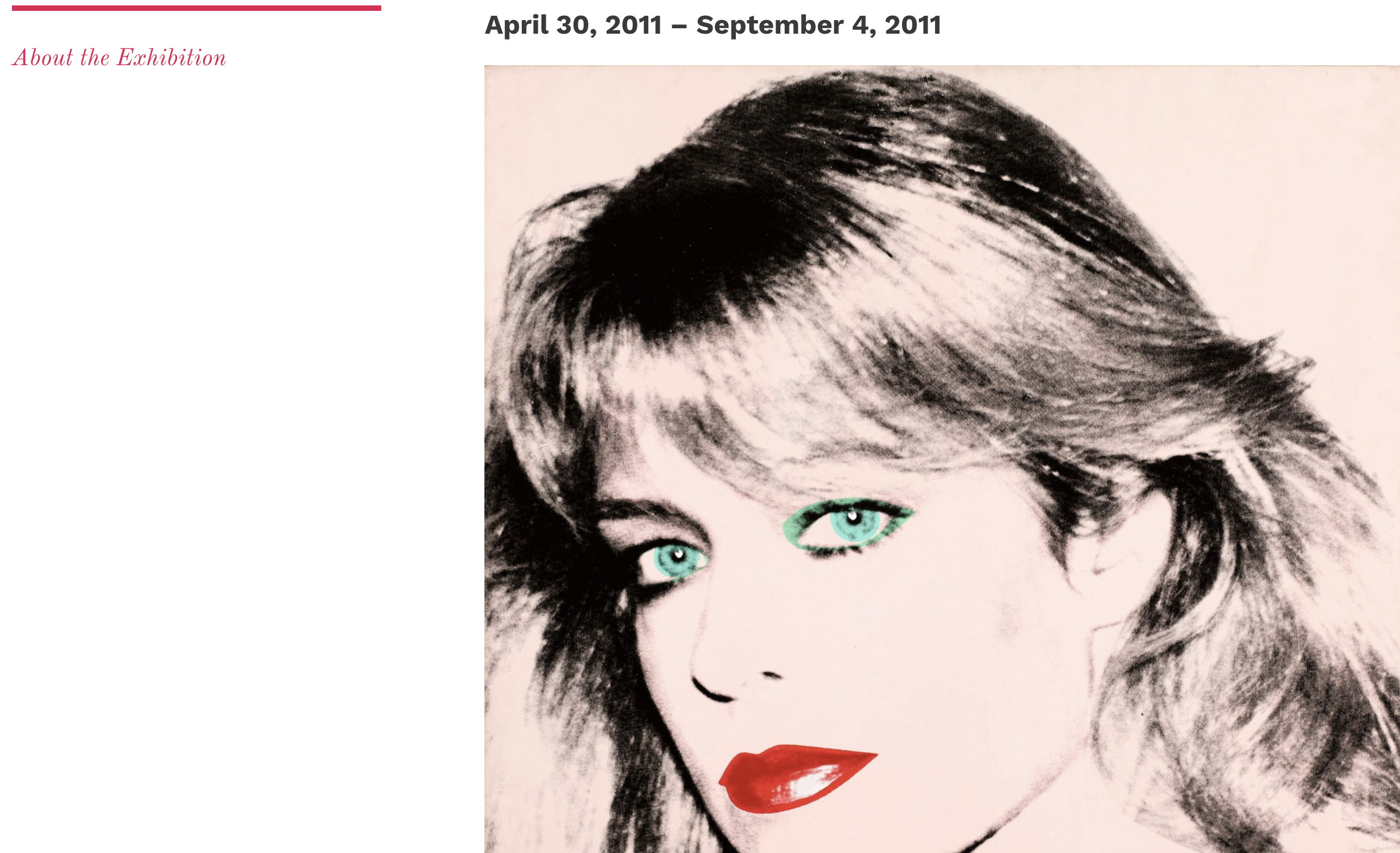
description/plans: Work on migrating the current Blanton museum website pages to the WordPress site
For Blanton I worked with Marianne to fix image links and the featured image for blog posts.
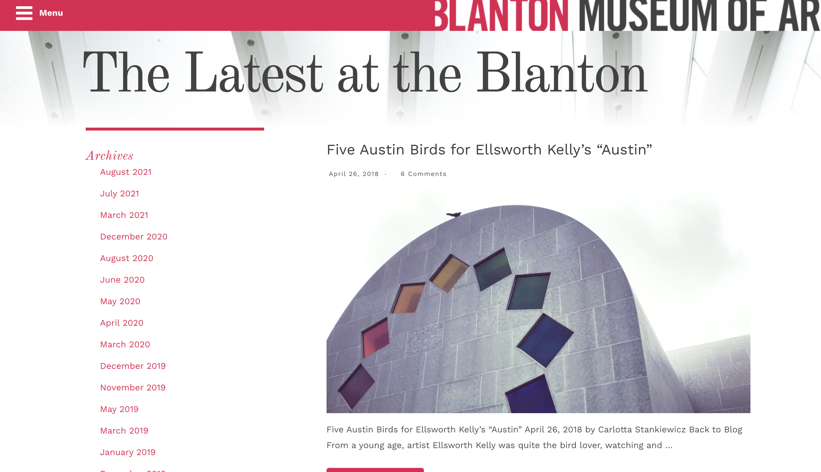
I also went back and fixed links from earlier pages that I made that went to the old Blanton site and changed them to navigate to the new WordPress site.
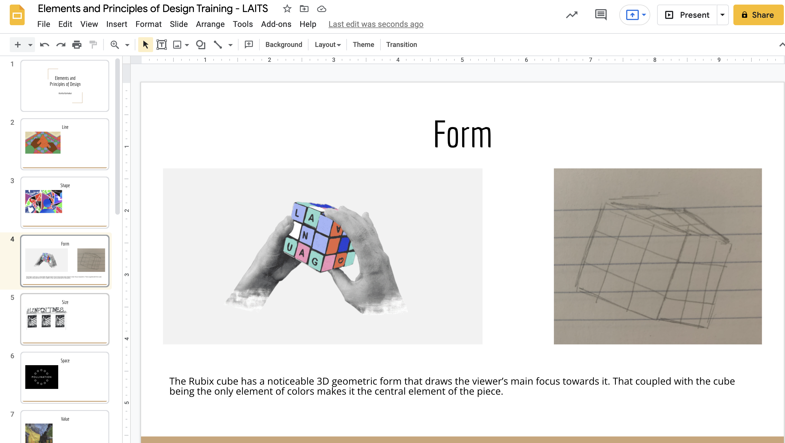
I started working on new trainings. The one I am currently working on is the Principles and Elements of Design Training.