Anxiety and Stress Site & OCIL & Other Things
The Anxiety and Stress Clinic mockups
This is a project I have been assigned to complete through this summer that I am very excited to be working on. We are working to develop a new website for Dr. Jasper Smits that seeks to combine two existing sites for the Anxiety and Stress Clinic and Research Lab into one cohesive site. I have met with Maddy a few times to discuss the team’s goals and needs, and these were the main goals I identified:
- automation – making processes like finding information on the clinic/clinicians, scheduling sessions, and booking appointments through the client portal more self-enabled
- combining two websites – the lab and the clinic access, similar to that of psychwire.com, making it very easy to navigate between the two different offerings through a common entry page
- theme – creating a theme/visual identity that suits the clinic’s prominent and growing reputation as a trustworthy research lab and clinic for anxiety and stress. Ensure that the aesthetic decisions are executable by web-developers through use of grids, alignment, and knowledge of WordPress functionality
- clarity and consistency – increased clarity on things like the mission statement, photography, service offerings, team bio
—
With these goals in mind, I spent some time browsing through wordpress themes available to us to see if any themes would work well with the clinic’s needs. The cool thing about this project is that it involves a coordinated effort with web developers such as Lauren and Ruben, and in the process I have learned quite a bit about what web development and design for web development. For example, things such as body content, appearance, fonts, and styles are likely more customizable with CSS, but elements such as navigation headers and footers are less. Understanding these concepts and keeping the team’s goals in mind helped streamline the search for themes and ultimately started mocking up a few pages based on the Essence and Slush themes.
—
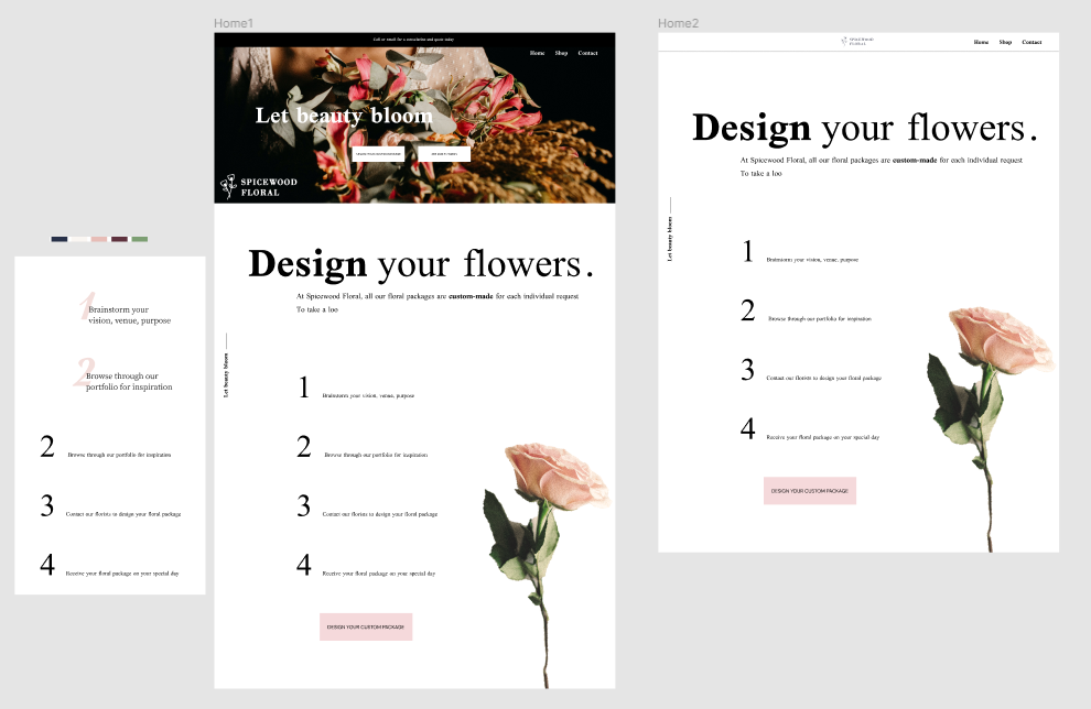
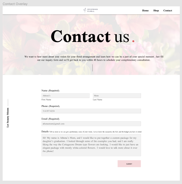
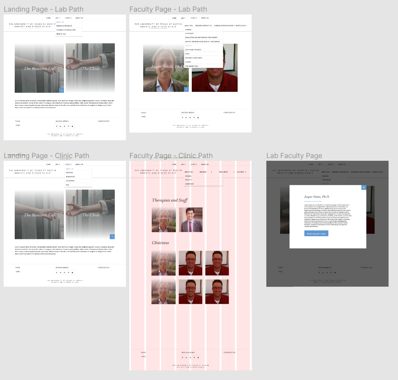
I then spent some time mocking up a few of the key pages in Figma. Figma is a digital prototyping tool that I’ve spent some time working on as an STA. So far, I have learned more about using grids and text styles to ease the process. I realized that the challenge for me here was that I did not have much experience with web development, so I did not quite understand what could and could not be changed from a WordPress theme; therefore, I was somewhat rigid with my application of the theme. Here are the initial mockups:
—
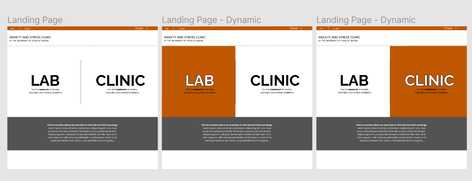
Here are the later mockups that I worked on after discussing with Maddy a technique for blocking out content on pages and planning web design. I had been developing the mockups using a technique that Maddy said Abriella told her about in which you initially design in grayscale to ensure high contrast design for accessibility. We also met with Lauren earlier to discuss Lauren developing a “sandbox” for us to try out using themes in wordpress, which was very cool. For now, we are taking a break on these mockups because Ruben and Lauren are discussing whether or not we will use WordPress or Grav/Gantry 5 to develop this new website. I will talk about Grav later.

—
The OCILL Project
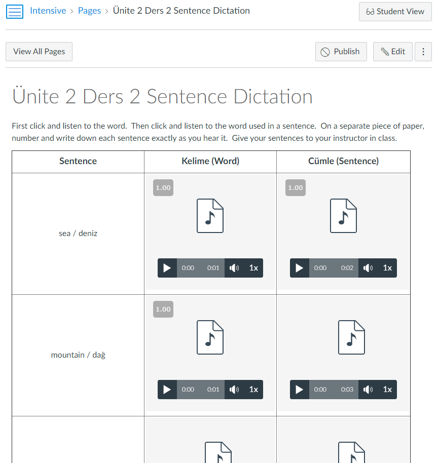
I am spending about half of my time also assisting with the OCILL project that I think Miguel is spearheading but almost everyone else is also helping with. We are transferring content from Dr. Okur’s original website for Turkish language courses. This page holds semester assignments and exercises, and the professor would like this content to be moved over to Canvas since the site will be going out of date. There is this spreadsheet of many many weeks of pages and exercises that are primarily two kinds of activities: audio grids and fill-in-the-blanks (FIBs). We self assign these pages, and we are aiming to finish before the summer ends. Audio grids involve downloading files and creating a grid for vocabulary purposes. Fill in the blanks require Quiz functionality in Canvas, and we are still working through some problems with understanding how to create lines for plain text information. This picture below is an example of an audio grid page:
—
There are a few main challenges so far. One challenge is that it is kind of a tedious process organizing and downloading the content that needs to be transferred. There are many audio files and html files to keep track of. Additionally, we often run into challenges with Canvas limitations, document titling confusion, and general functionality confusion that took a little bit of collaborative troubleshooting since Miguel and Dr. Okur were on vacation. Luckily, this has worked so far. Also, Miguel developed a great workflow document that made it easier for us to join in on the project quickly. Poonum and Angie have made comprehensive documentation of our challenges and questions, too.
Grav Documentation
As mentioned, we have been talking with Ruben and Lauren about the possibility of using Grav to develop websites. Grav is a simple CMS with no database. This is potentially applicable to the Stress and Anxiety Lab as well as the LatinX Pop Lab that Ingrid is working on, but it is also just an initiative that would be relevant to future STAs as the Gantry 5 element of Grav allows for simpler and more intuitive website creation for STAs with less coding experience. The Gantry 5 element allows for block editing that can be supplemented with custom CSS. De’Sha, Maddy, and I had a meeting with Ruben to set up Grav, which requires some connection to MAMP that the downloading of Git and Docker. To be honest, I am still confused about how everything works, but we are working through it. De’Sha and I will be working on documentation for this Grav setup and exploration process for future STAs. Also I am still running into some challenges that I will be working through that might involve Norton.
Fun Times Tuesday
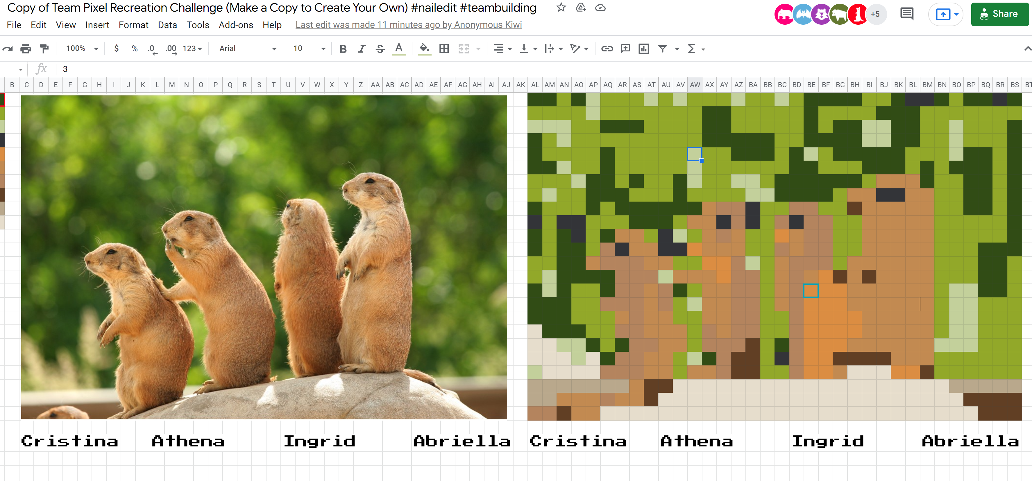
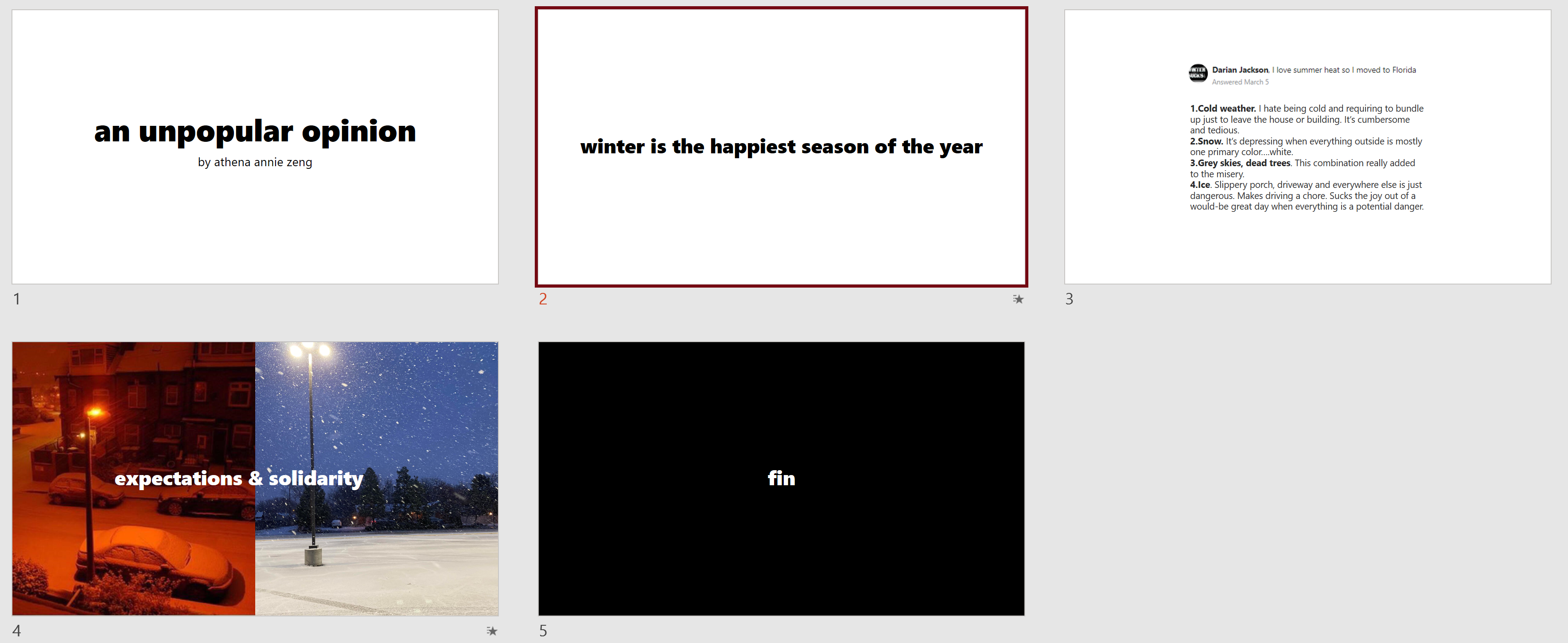
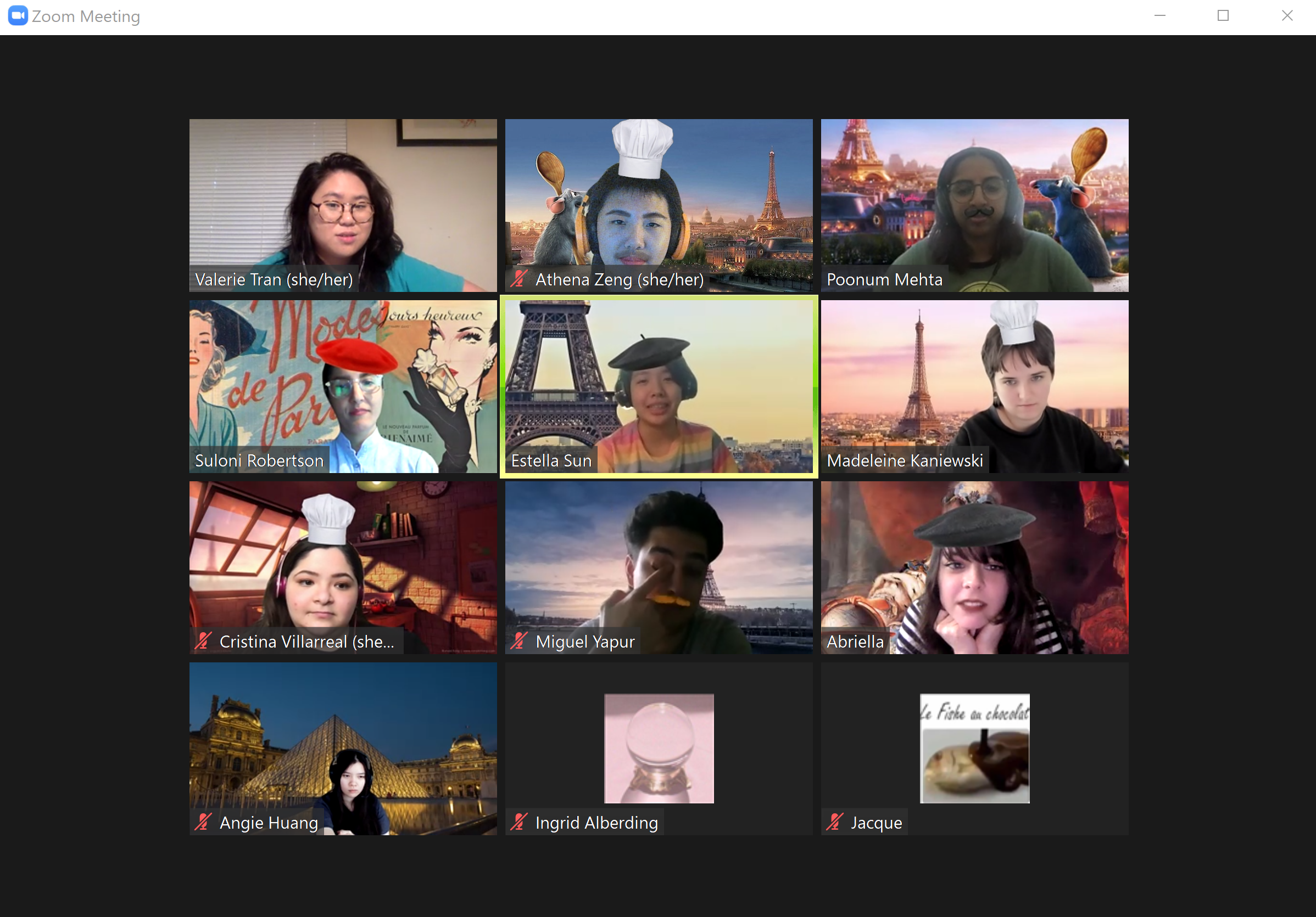
And as a fun tidbit, here is some info on Fun Times Tuesdays! Since all the STAs are online during our Tuesday meetings, we decided to use our meeting time this week for team bonding, which has been so fun in lieu of in-person interaction. Here are some screen caps from things we’ve done and also from the time we pranked Valerie after came back from her vacation to “Paris.” We have done team pixel art, played Club Penguin, presented on our unpopular opinions, and done a virtual website “pub crawl.” I feel closer to my fellow STAs and I truly love these days!
Super long blog post, I am sorry. I need to make more frequent posts!