• We are STAs
    • Asha Rountree
    • Haley Ma
    • Isabella Melendez Gonzalez
    • Julie Brandt
    • Kate Shih
    • Kyra Lee
    • Nicholas Peasley
    • Sasha Kenney
    • Shanda Horm
    • Shriya Atreya
    • Tomas Marulanda-Mesa
    • Trisha Darure
  • We were STAs
  • STA Presentation
    • STA Presentation 2017
    • STA Presentation 2016
  • Testimonials
  • Resources
  • Home

STA Blog

Current Sta

Update 05.07.2021

May 7, 2021 By Miguel Yapur

Data Exploration and Visualization Animation

As the CS course graphics design comes together, I created a quick 3-second animation for the Data Exploration and Visualization course using three assets that Aidan mentioned were his favorites. Here’s how the animation looks:

Backdrops

I also created five backdrops for different CSMS and MSDS courses, some of which I made course graphics for as well:

MSISP LinkedIn Icon

Once the client approved of Suloni’s quote, I made a first draft for the client, following the design request to make it look like the Moody icon:

Type Hierarchy

I went through Megan and Poonum’s KB tutorial and gave them some feedback on the content. The activity was really interesting, and I’m sure that new STA’s will find it really helpful when learning the basics of InDesign. Here’s the poster I made for this tutorial:

Video Manager Tests

This is an ongoing project in which Poonum asked Sheryl and me to test Ruben’s new tool for editing clips. As of now, this is how the user interface looks:

I must say it’s not the most aesthetically pleasing UI and there are still some sections where the user experience is not as intuitive as other video editing programs I’ve used (AfterEffects, iMovie) but I do think it’s headed in the right direction and just needs some tweaks. Below are some screenshots from BC in which I go into more detail on the feedback for it:


Filed Under: 2021 Spring - 2021 Summer, We are STAs

Update 04.30.2021

April 30, 2021 By Miguel Yapur

Data Exploration and Visualization

Below are some graphics I’ve been brainstorming to show Aidan on this CSMS course. The professor wants to stay away from conventional bar graphs and pie charts, and instead display information in key ways. I came up with radar charts, bubble charts, stacked graphs, and others seen below:

MSISP LinkedIn Profile Pic

I’m waiting for a client’s approval to start designing an icon similar to the one below, replacing “Moody” with “MSISP”:

New Curriculum Feedback

Throughout the week, we began giving feedback to each other on our new basic trainings.

Abriella has been working on the After Effects: Logo Animation Training, and she pointed out there was some specific instructions that weren’t correct for importing files into AE that would result in having all her layers show up at the center of the composition.

After some research on this issue, I corrected the instructions to specify that STA’s need to change the import mode to retain Layer Size:

Additionally, I went through the Color Theory KB, written by Cristina, and gave her some comments on what could be improved. I went through both activities listed in this post, creating color wheels and color palettes:

Photo ID’s

I worked on three of these on Tuesday and Thursday:

Filed Under: 2021 Spring - 2021 Summer, We are STAs

Gov banners and more

April 29, 2021 By Megan Fletcher

Gov banners and more

I finished up course graphics for both microeconomics and rhetoric! I got a new assignment last week to make retractable print banners (big ones) for the government department. They want two — one generic, with logos, and one for graduation (“congratulations, class of 2021”). I’ve made a ton of drafts (read: 15) and am waiting on feedback from the client.

In other news, I hear we’re starting a new training curriculum for web dev STAs, which is neat. I’ll be helping with it even though I’m not a web dev person: I’m writing up lessons on certain elements in CLIO — google forms and CSS flip cards, specifically, which loyal readers will recall I used in the D&I CLIO course we worked on over winter break.

Filed Under: 2021 Spring - 2021 Summer, We are STAs

Update 4/23/2021

April 23, 2021 By Miguel Yapur

Computer Science Course Graphics

This week, I mostly worked on tweaking and improving on the graphics with feedback from Maddy and Aidan. Here are some examples:

SIMPL:

Regression:

Design Principles and Causal Inference:

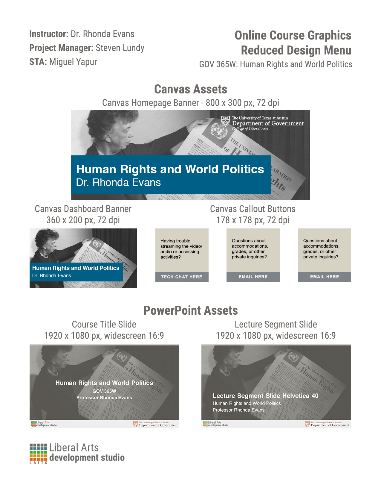
Reduced Course Graphics Design Menu

I also created a reduced menu template and used it for the GOV 365W graphics:
Filed Under: 2021 Spring - 2021 Summer, We are STAs

Course graphics

April 16, 2021 By Megan Fletcher

This week: course graphics

It’s that time of the semester again. Last week, I got two course graphics assignments, one for a microeconomics course and the other for a rhetoric course (but it’s on coding, so…)


Each are pretty straightforward, but they also have their quirks. Like I detailed in last week’s blog post, I created a hybrid image with Photoshop cutouts and image edits for the microeconomics course. We ultimately didn’t use it — instead, we’re using one of the stock images I suggested previously. And for rhetoric, the professor needed not one, not two, but six (yes, six) presentation templates in Keynote, the default Mac presentation software.


I hadn’t used Keynote, but it was fairly simple (I daresay more user-friendly that PowerPoint.) I created a template using master slides, then picked a color scheme (the professor wants his presentations color-coded) using coolors.com before making the remaining five presentations.  I created the remaining graphics for that course today, like the callout buttons and the Canvas banner.


In other news, my car got dented from a hailstorm (hang in there, Camry!) and I got new blue light blocker glasses, which I highly recommend even as we’re starting to come out of the pandemic.

Filed Under: 2021 Spring - 2021 Summer, We are STAs

Update 4/16

April 16, 2021 By Miguel Yapur

GOV 365W Course Graphics

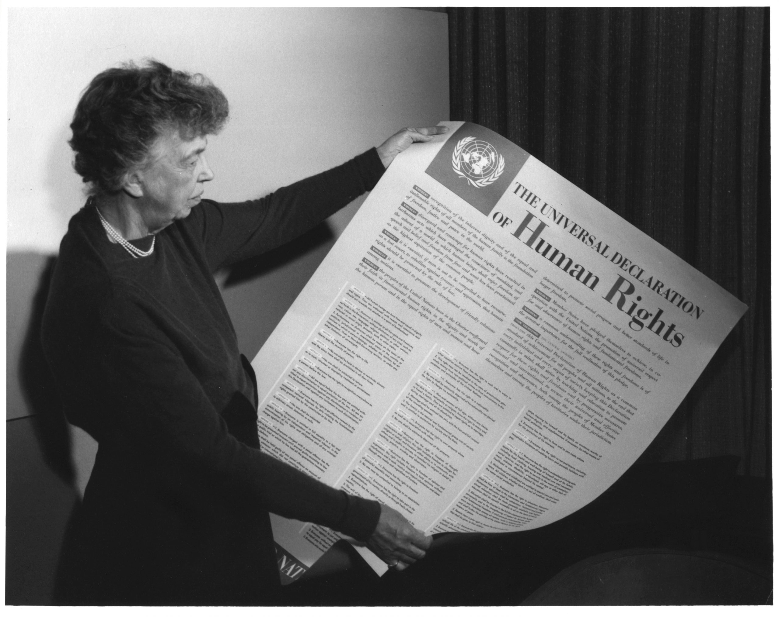
The professor for GOV 365W, Human Rights/World Politics, initially requested just two PPT mockups of using this image as the background:

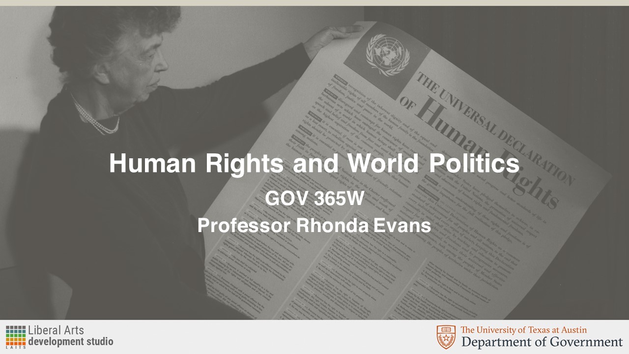
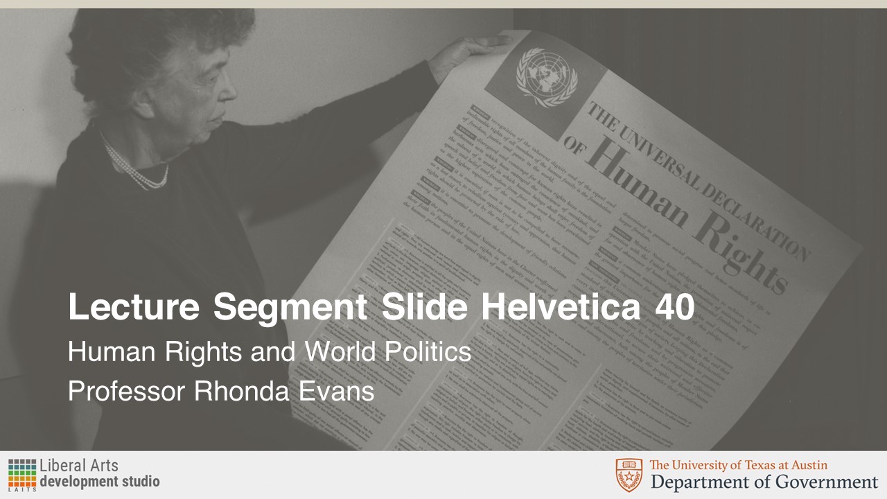
The request called for this image to be overlayed in UT’s Sandstone color. These were the resulting Course Title Slide and Lecture Segment Slide assets:
Later on, the professor requested the following Canvas assets in Sandstone color as well:
Once I got feedback from the client, I was asked to provide them with versions of the Canvas homepage banner and Dashboard graphics in a shade of blue. The reason for this was that the professor feared there wasn’t enough contrast and wanted to “see something brighter, like a turquoise or blue.” Consequently, I chose three different shades of blue on UT’s secondary palette, and these were the results:

As a way to increase contrast, Maddy asked for the background to be kept in black and white and have only the text box be colored in:

I think these look really good and give more contrast between the image on the background and emphasizes the text box for the course on the front. I like the “blue 1” and turquoise options more since they give more of a pop than the “blue 2” version. As for legibility, I think the “blue 1” version is the easiest to read out of the three colors.

CSMS/MSDS Graphics for Animation

This week, I was given the description of five CS courses. The design brief asked for graphics that could be turned into short animations and followed the style guide of previous graphics made for these courses:

ALR: Automated Logical Reasoning (CSMS) – Graphics

Course Description:

A lot of things in a lot of areas of computer science like Artificial Intelligence, programming language, and Databases, boil down to automated logical reasoning. How do you automate logical reasoning and applications about that especially about program correctness?

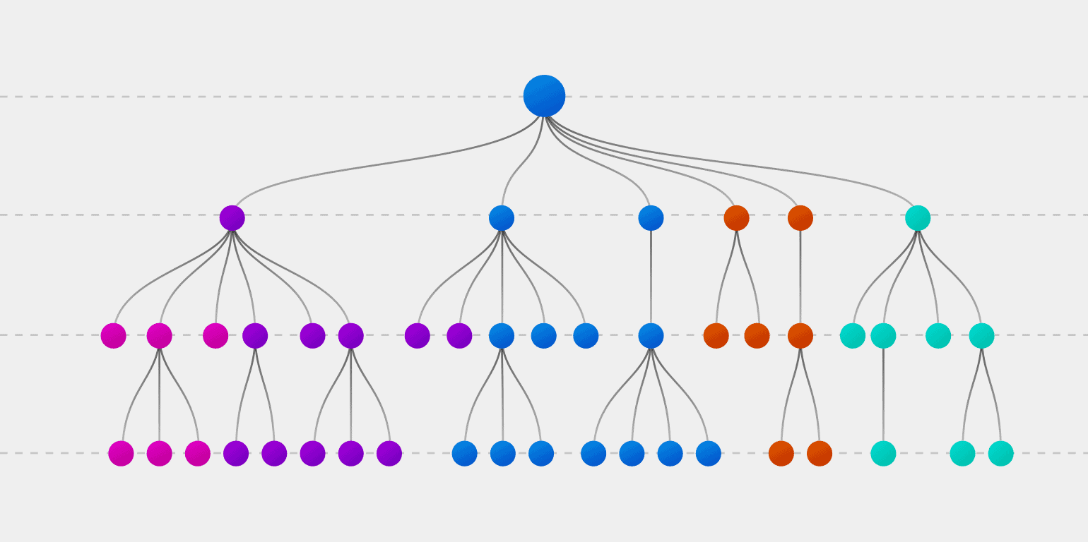
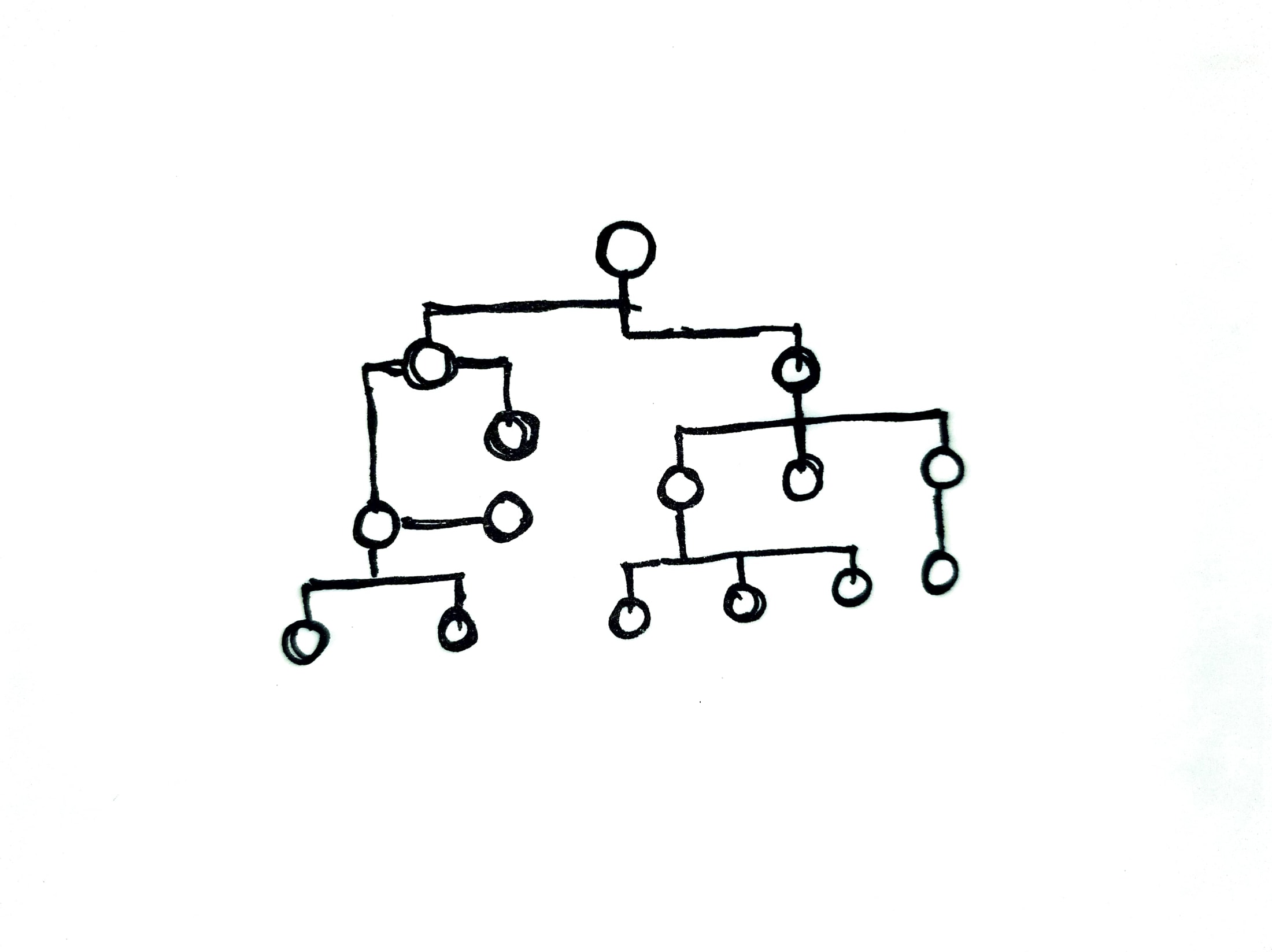
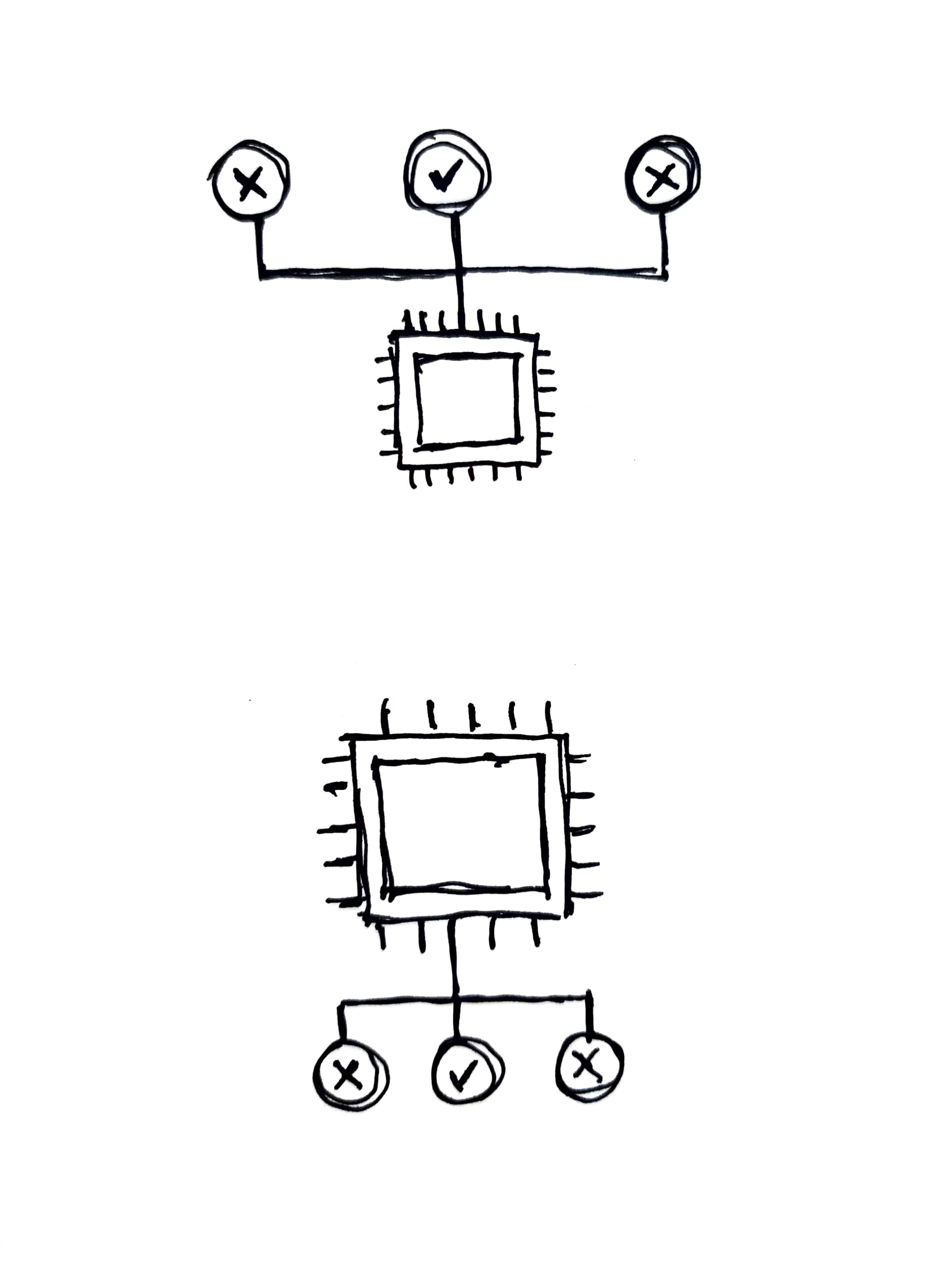
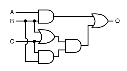
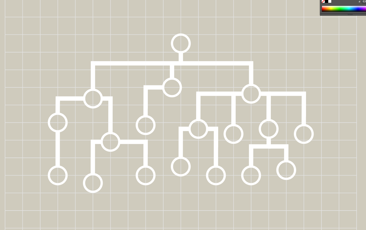
Maddy and Aidan initially liked the idea of a decision tree to reflect the logical reasoning behind computations. Initially, I came up with three different ideas:

1. Decision Tree

2. “Correct Decision”

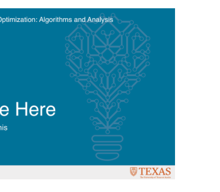
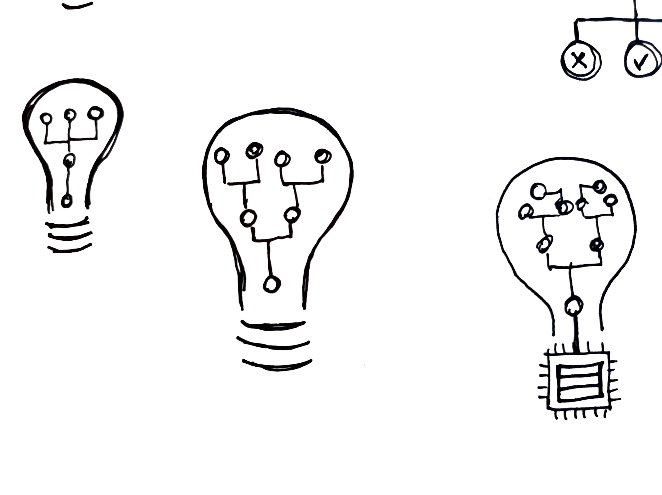
3. Lightbulb: kind of a combination between the previous two options and also reminiscent of the lightbulb design used for the “Online Learning and Optimization: Algorithms and Analysis” course.

Based on feedback for these, we decided to move forward with the Decision Tree version.

The first version used larger nodes and the lines had different stroke weights:

Maddy pointed out the question of keeping all line weights consistent or emphasizing the difference, like shown between these two images:

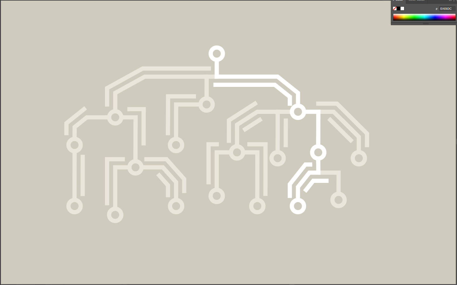
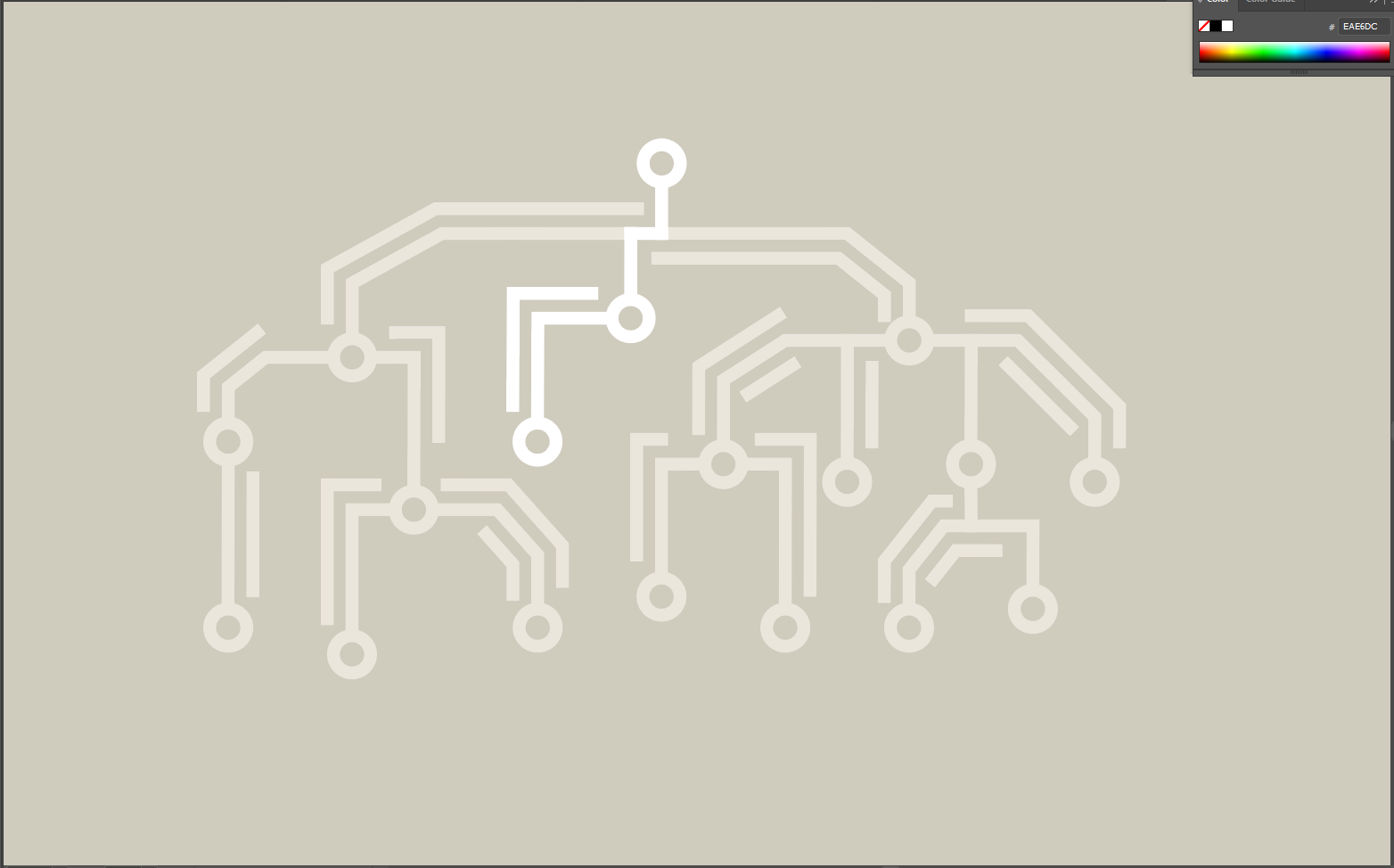
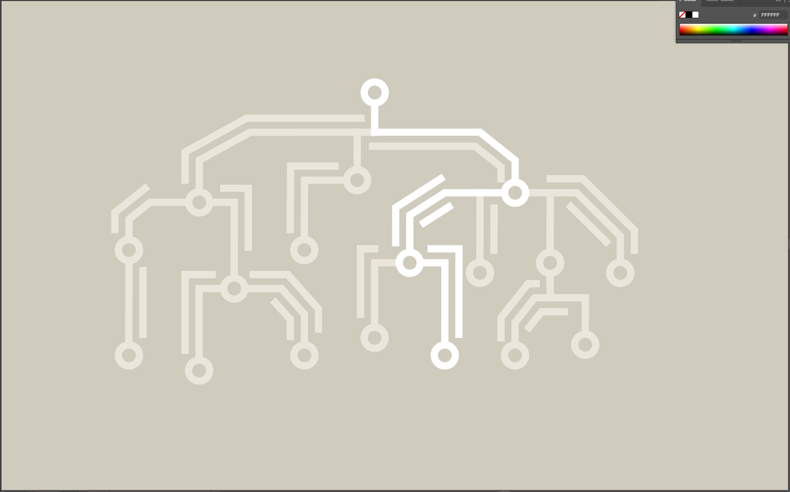
After some feedback from Aidan, we went ahead with consistent line weights and node sizes more proportional to a real-life PCB:

The resulting graphic started looking much better. Here are four images that depict “frames” of a possible way this graphic could be animated:

Later on, Maddy gave me some feedback and asked me to consider a grid layout and a more consistent path direction. This is what the graphic looks like at the moment:

SIMPL (CSMS) – Graphics

Course Description:

Bridging the gap between high-level programming language structure & low-level implementation details.

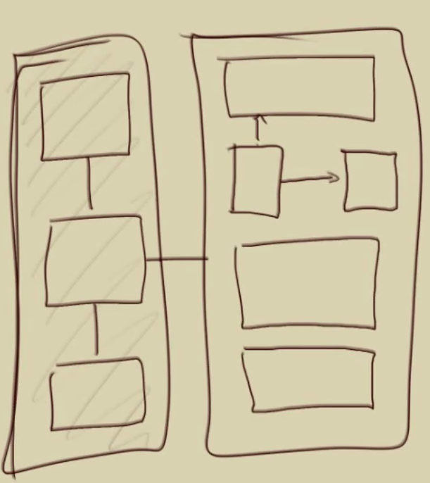
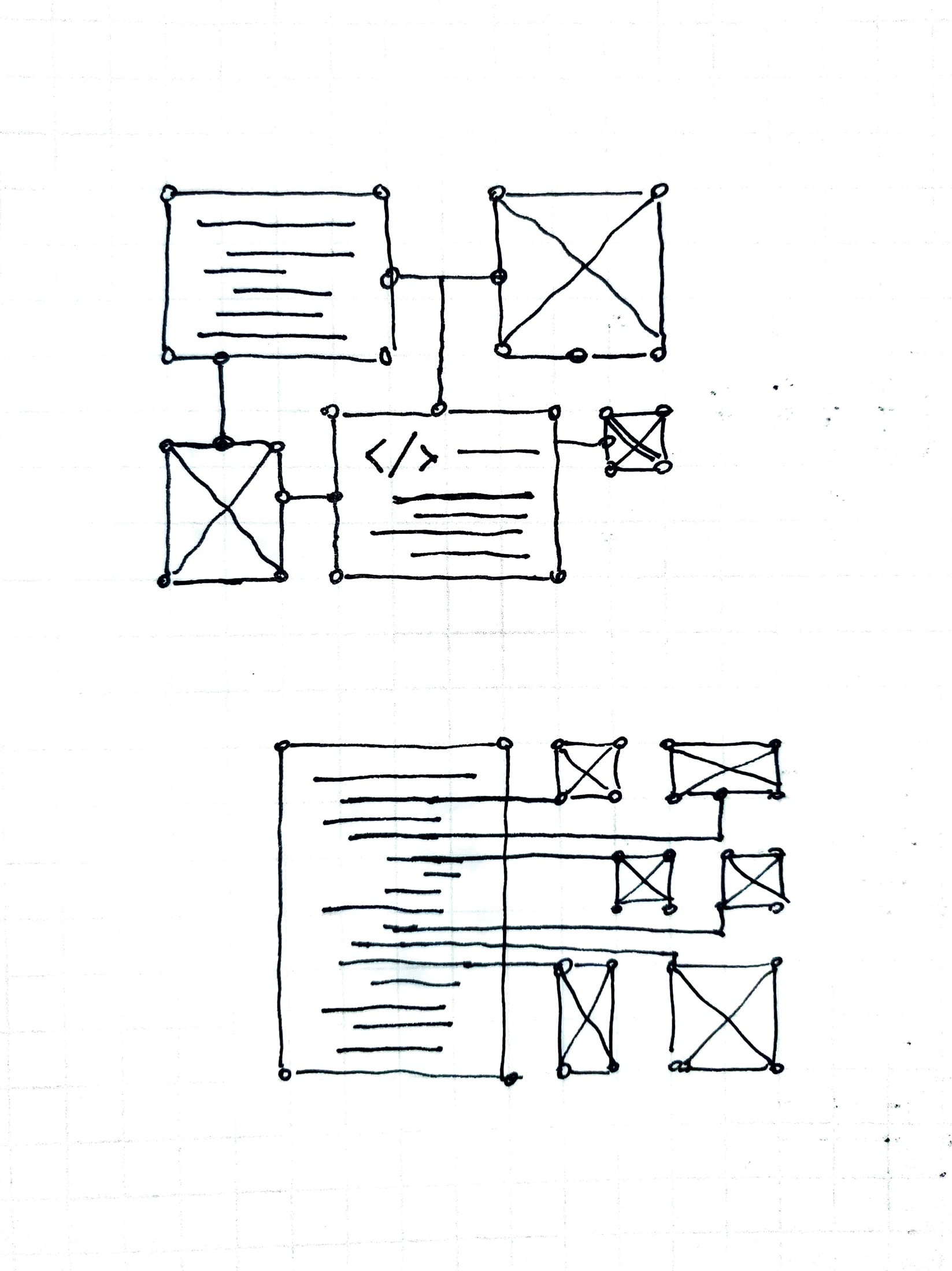
Aidan’s first sketched proposal:

Initially, I came up with three different ideas:

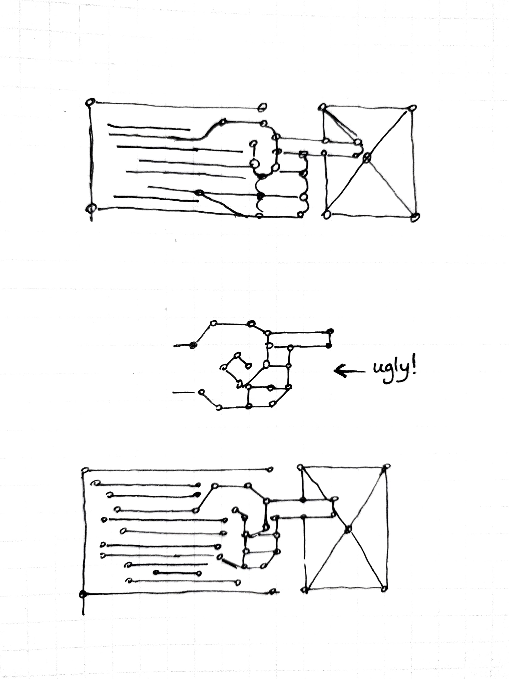
1. Vertical bridge, 2. Multiple boxes and connections, 3. Abstract hand

I wasn’t too convinced about these and asked Thuy for some input. She gave me some more details on the class description and gave me these graphics to work with:

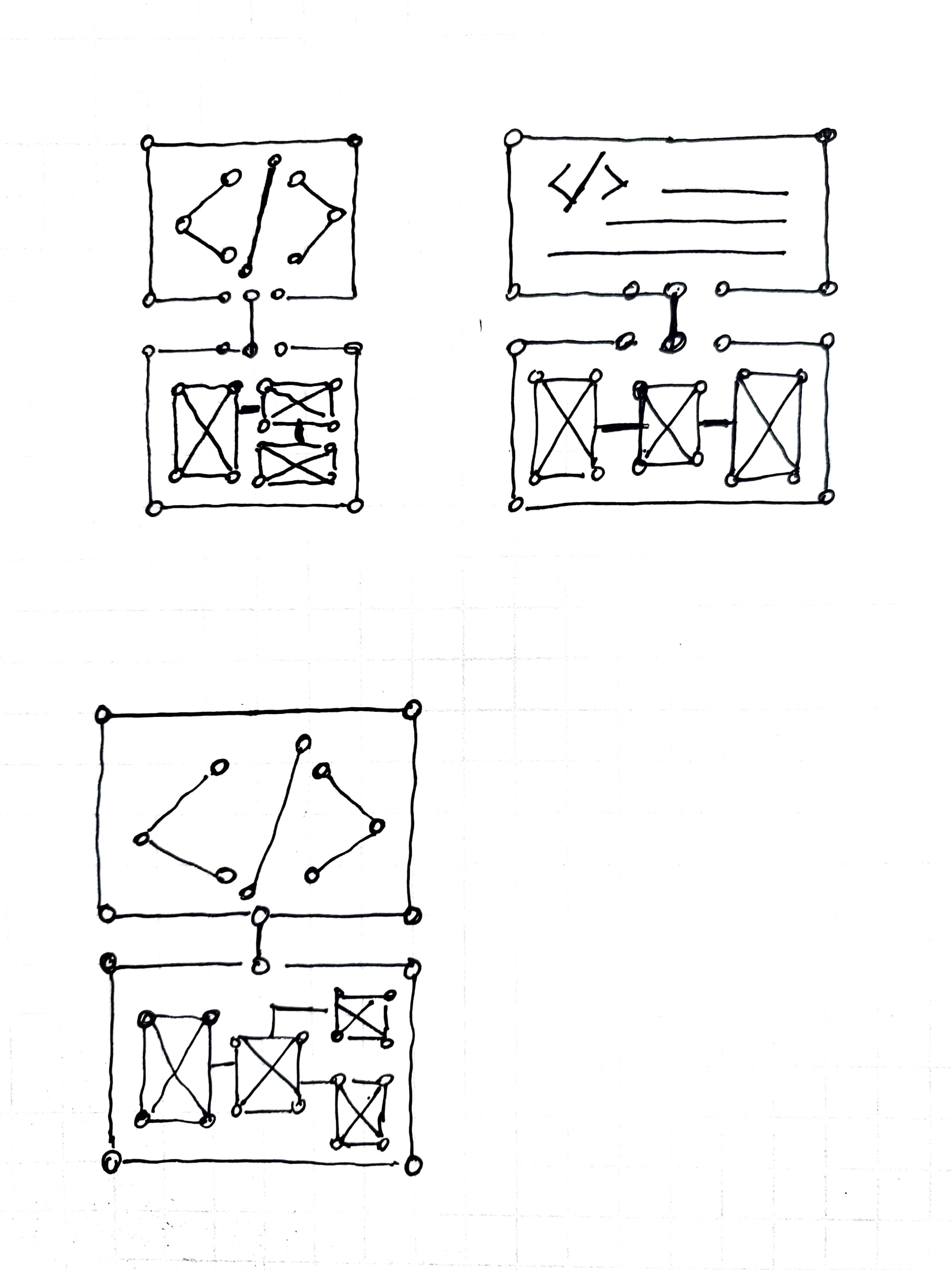
Based on these, I met with Maddy and decided to try these shapes using the same style guide for nodes and paths outlining important shapes:

As for now, I’m looking to see if it would make sense for these to go together. These are some “frames” of what these would look like animated:

And another version of the digital circuit layout that spells out SIMPL:


Filed Under: 2021 Spring - 2021 Summer, We are STAs

  • « Previous Page
  • 1
  • …
  • 92
  • 93
  • 94
  • 95
  • 96
  • …
  • 134
  • Next Page »

link to LAITS home page

Video STA Home

© 2026 Liberal Arts Instructional Technology Services | Production Credits