Color Correction Training
Brightness/Contrast
Color Balance
Curves
Exposure
Hue and Saturation
Isolated Color
Levels
Photo Filter
Shadows/Highlights
Vibrance
Current Sta
I finally finished the entire animation for the ECO304L course. It consist of 3 different types of currencies folding into different origami shapes. This project was difficult at times to figure out how to mimic how the shape folds, but I really enjoyed creating it. I was able to go beyond my own creativity and do something completely different.
After I completed the animation, I worked on the course graphics for this course. These assets are from the style B template. Since the theme of the animation was different currencies, I wanted to also use that in the course graphic. Therefore, I used an image of different currency bills rolled up. I also used the same blue color in the graphics like in the animation.
By Relena Lai
I got to present the HealthyHorns Sleep Assessment last week even though it’s still in the works. I’m always nervous when presenting, so I hope I got my points across 😅. It was also really inspiring to see all the other projects too, everyone’s looked amazing!
Here are the slides from my presentation (Bless Canva):
By Miguel Yapur
I’ve been putting together title cards for the CLIO Hub, a place where we’ll be compiling all of STA Clio websites and their respective Canvasser activities. Here’s how the cards are looking so far:

Another CS course graphic for Aidan’s animation team. I had to to some research to grasp a good idea of the concepts covered in this class in order to graphically translate them:

Here is what I have so far in regards to the actual graphics:

By Miguel Yapur
This week, I took over Angie’s project in creating two icons for a Skill Lab and a Debriefing section for COM 302 lecture slides. From what Abriella asked me, I researched some icons in the Noun Project to help me get started on something that could graphically represent these two concepts. Below are some icons I considered:
Once the client approved of the 1st and 4th icons, I created the assets for the lectures in the same style guide that Angie had been following:
During the beta testing of the Video Manager, Poonum and Ruben asked for the creation of new icons for the video manager. Here are the original ones:
The request called for new icons for the following actions:
In following a proportion similar to the one that Apple uses for their iOS icons, I created new icons that aim to be graphically intuitive and simple to understand. Here are how they look on their own and in a mockup screen:

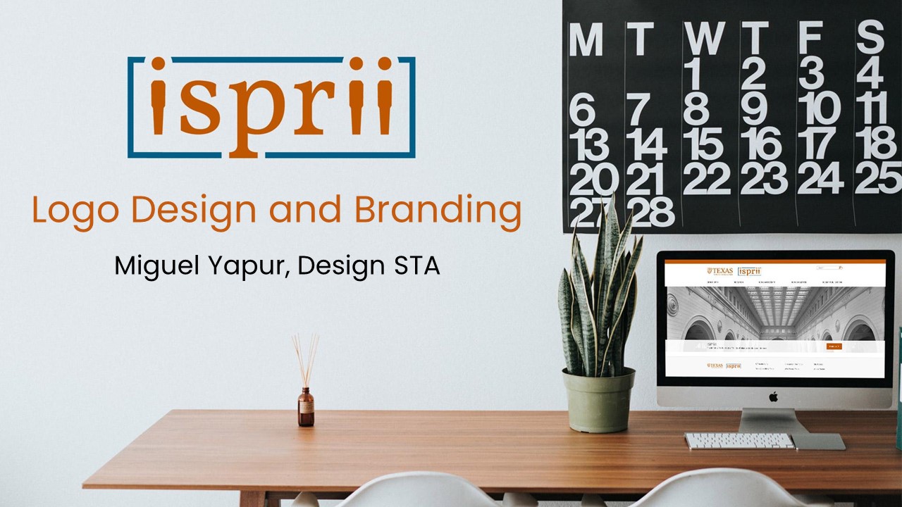
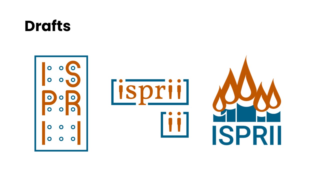
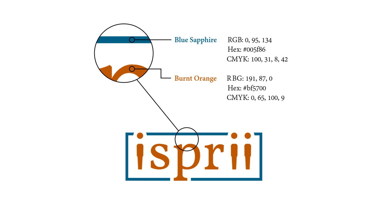
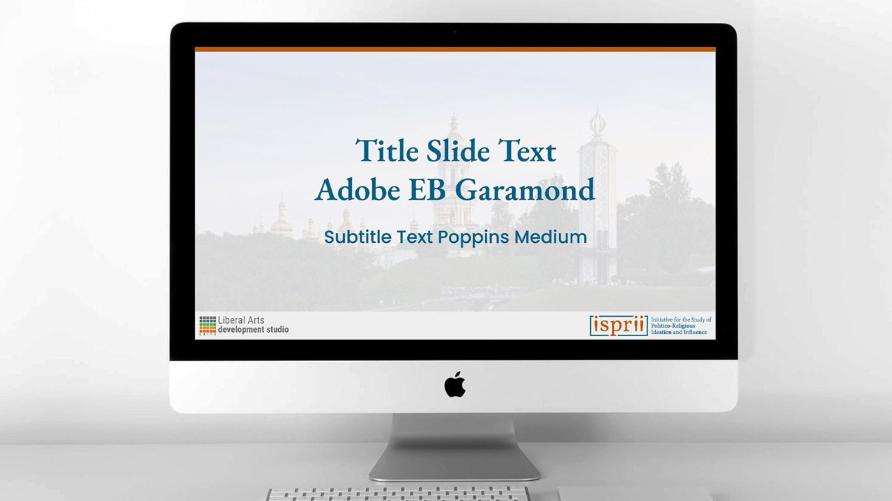
I had a really fun time watching others STAs present the projects they worked on throughout the last semester. Here are the slides that I presented for mine, which covered the design of the ISPRII Logo:
After multiple iterations and feedback from Aidan, it looks like we’re in the final stages of the graphics for Design Principles & Causal Inference and Data Exploration and Visualization. Here are two candidate animations for each course that I’m waiting for Aidan to approve:
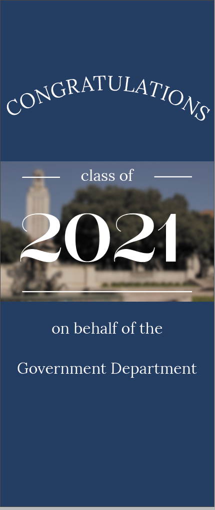
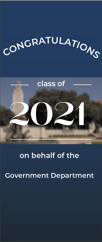
I finished up the government retractable banner project this past week, so be on the lookout for graduation banners in front of Batts Hall soon! I also presented my work on the Texas Politics Project’s social media graphics suite to (all of) LAITS on Monday. I’ll be signing off for the summer here in a few weeks, so dear reader, I will miss you!