STA Training: UIUX with Figma
Start: Oct 13th, 2023
To be Completed: N/A
Staff Guidance: De’sha
Project Description: Learn the fundamentals of user experience and use Figma to develop my NEW personal portfolio website and see how this process can make the website easier.
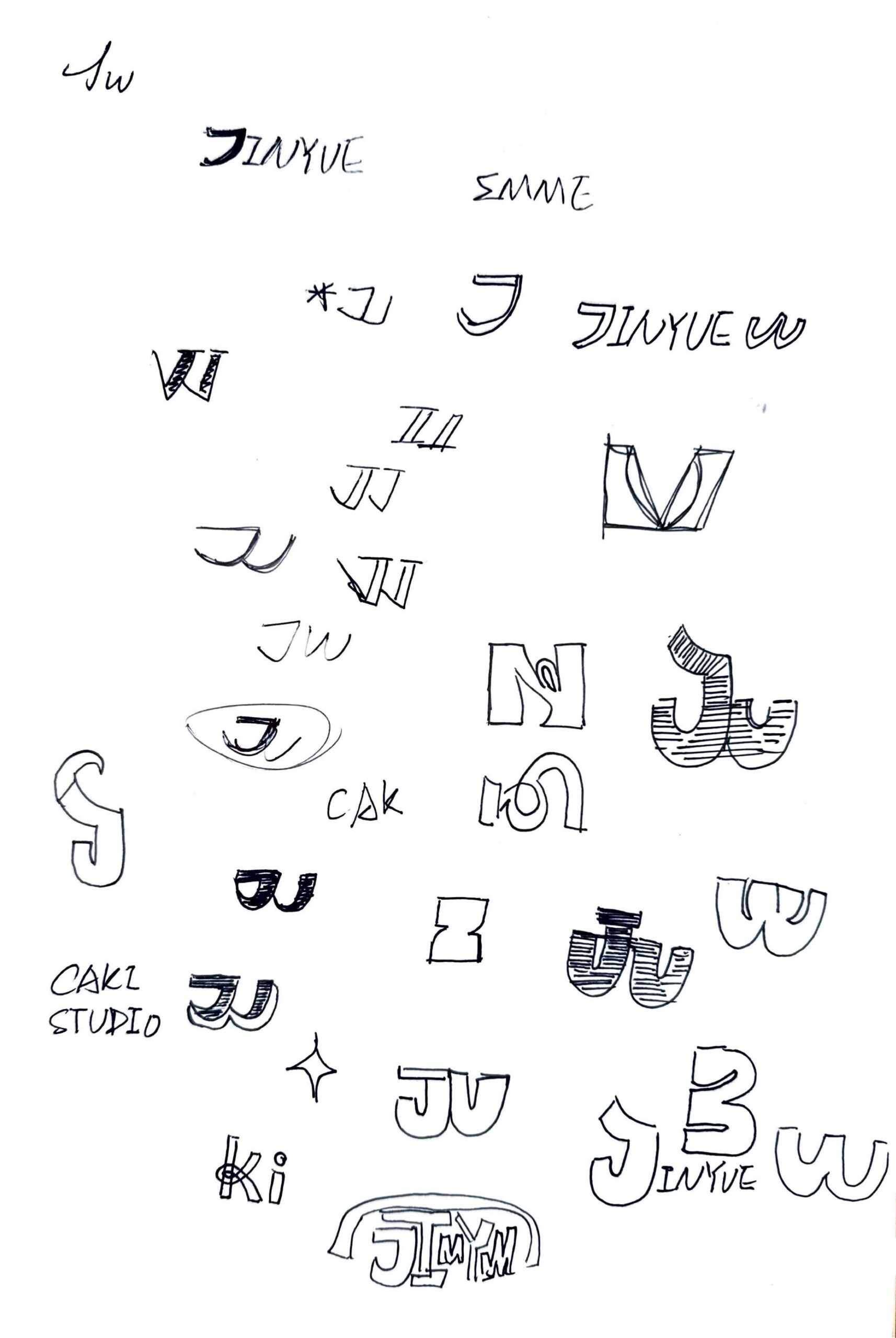
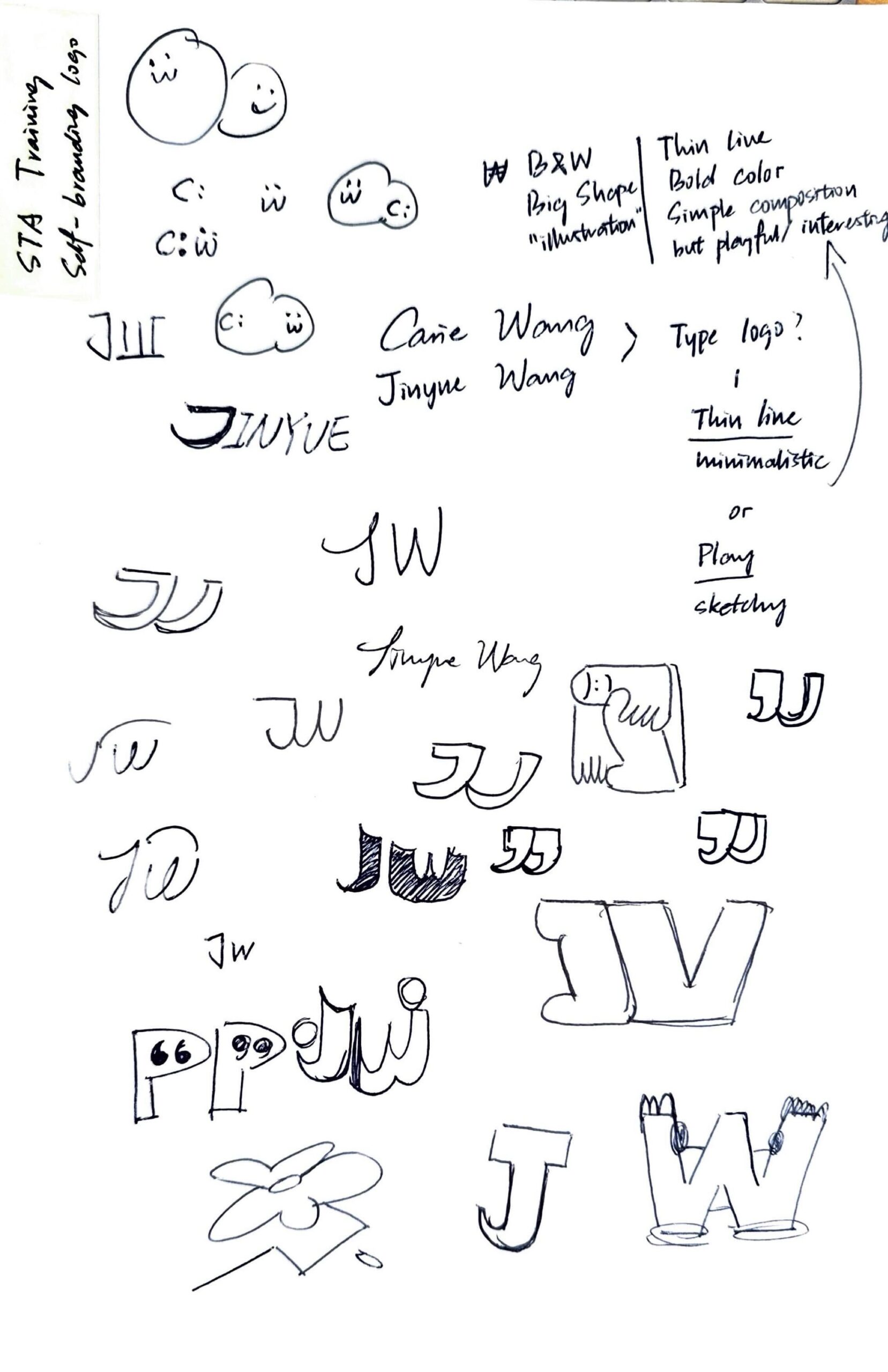
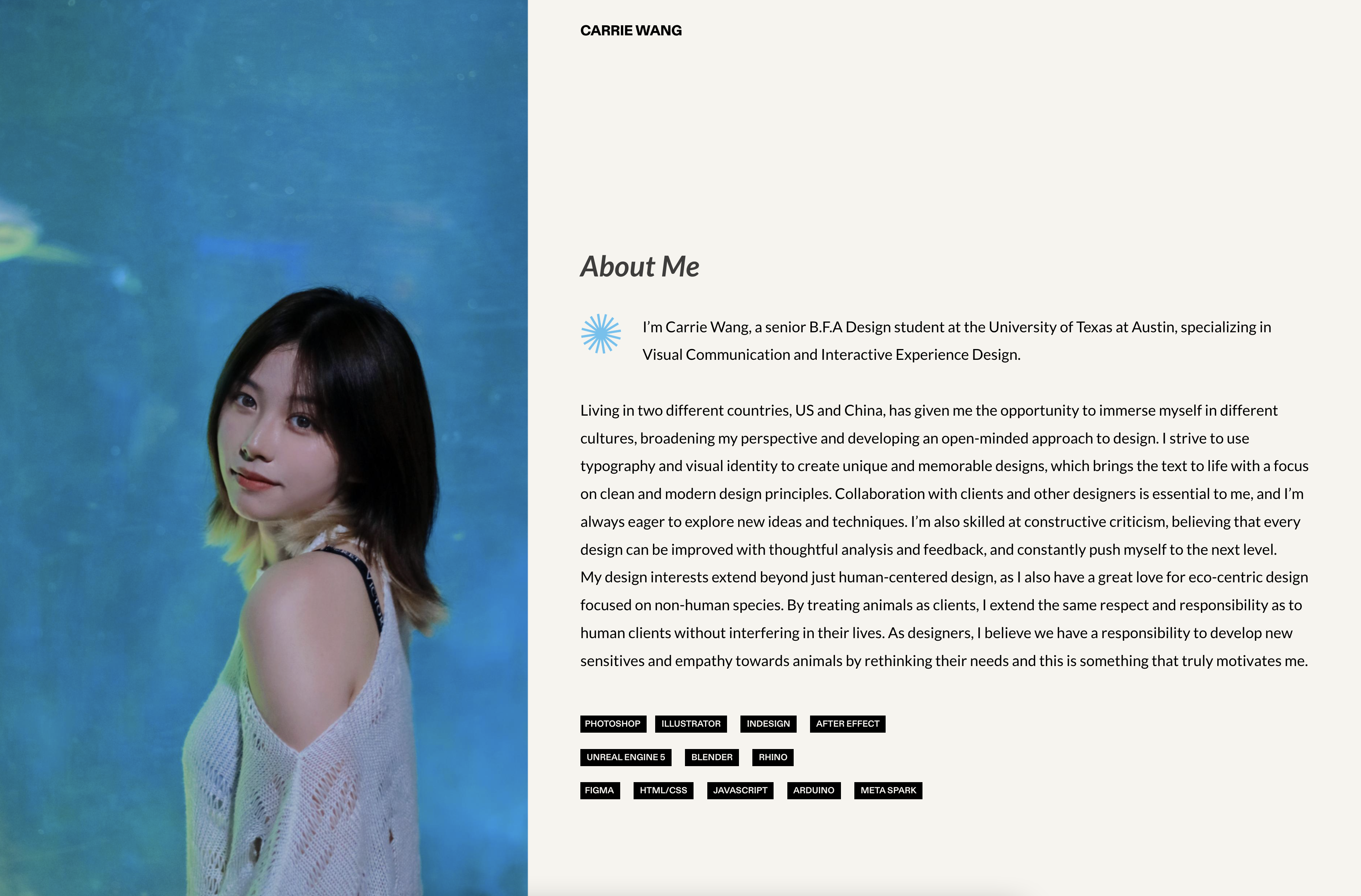
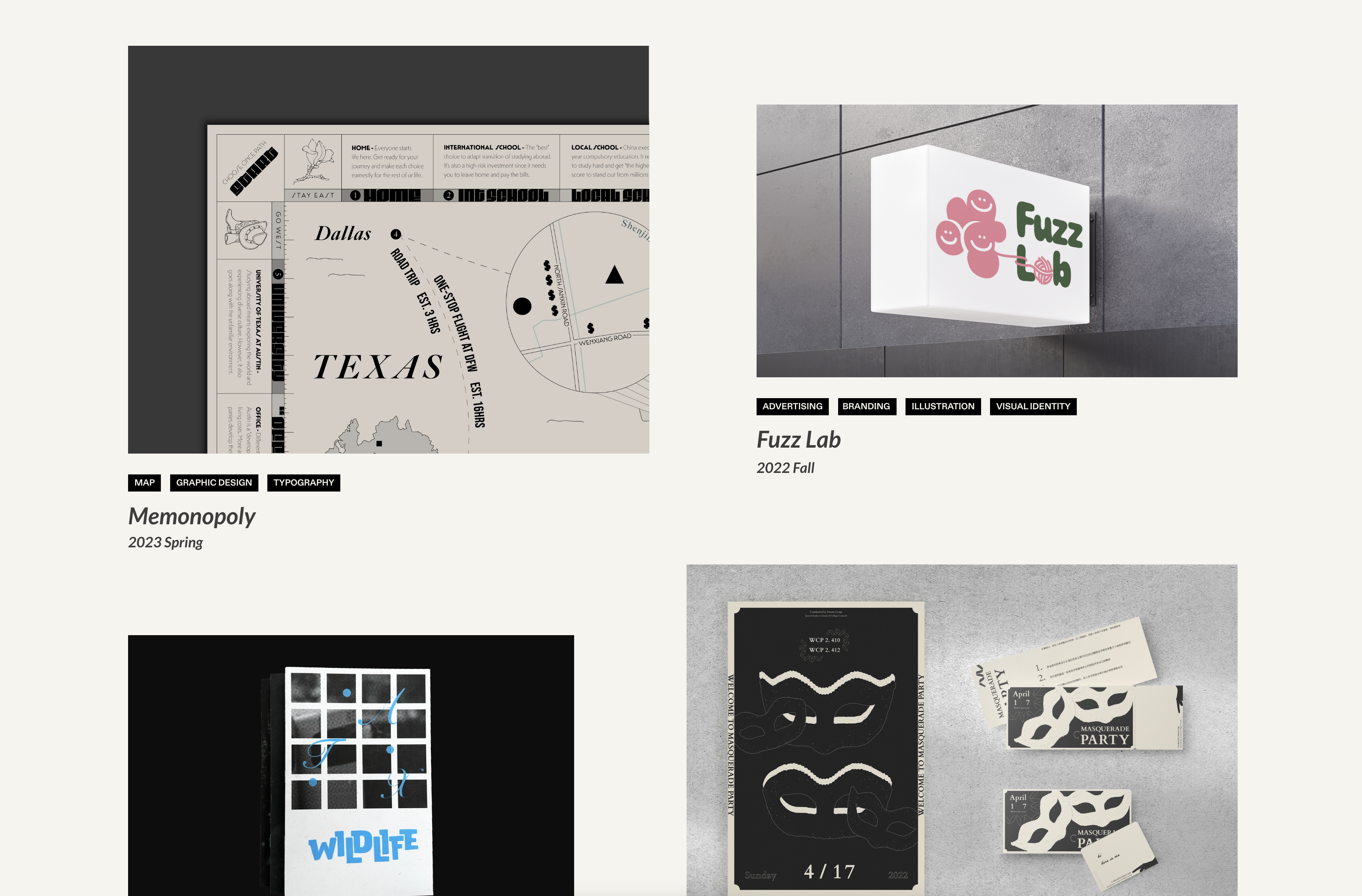
I started to work on this training for “client 2”. I read through the whole KB and found it cool to design a brand new personal portfolio website for myself with all the knowledge I learned. After ideations, I created these wireframe and user flow by listing out all the pages in its big “three-pages structure”. I found it’s cool to combine my personal logo as part of the website so I can create strong designer taste and personality.
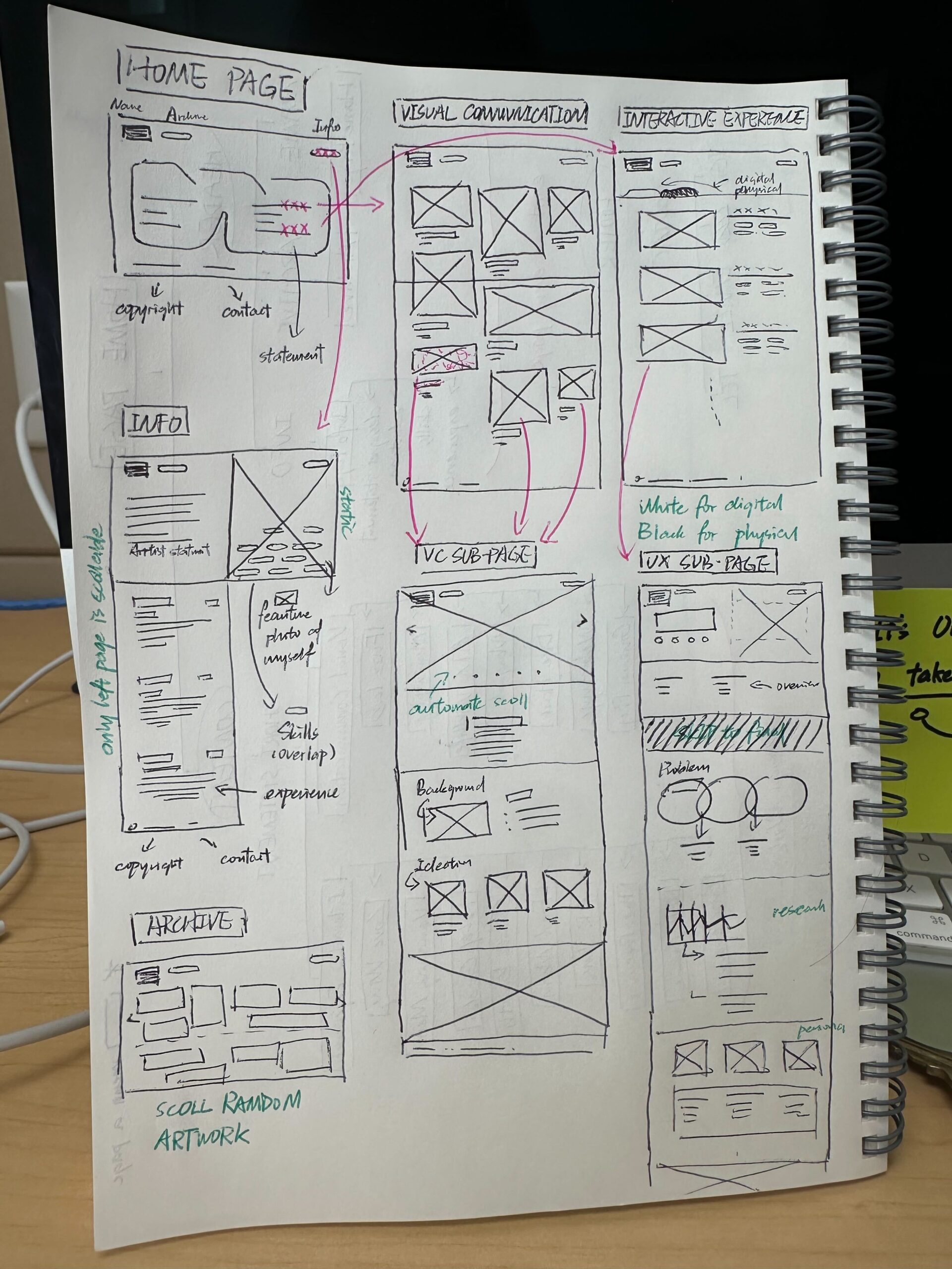
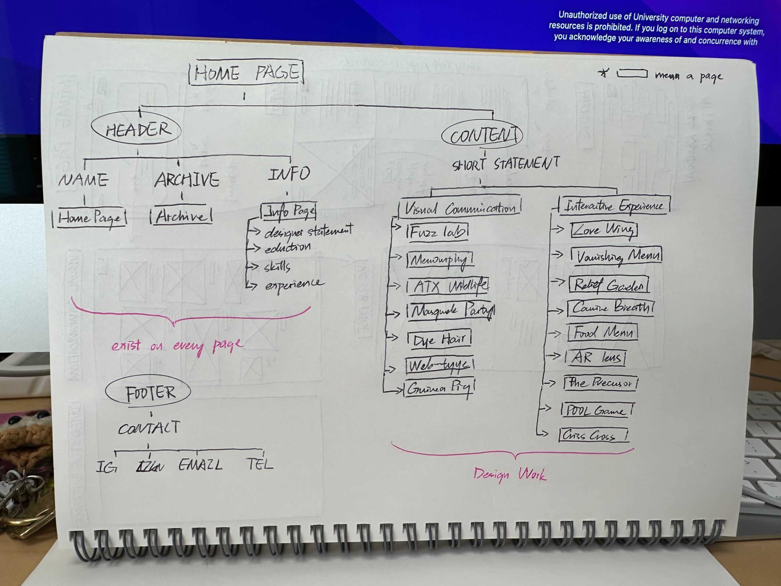
Here is my Figma file (digital website mockup) for myself to develop it in Figma.
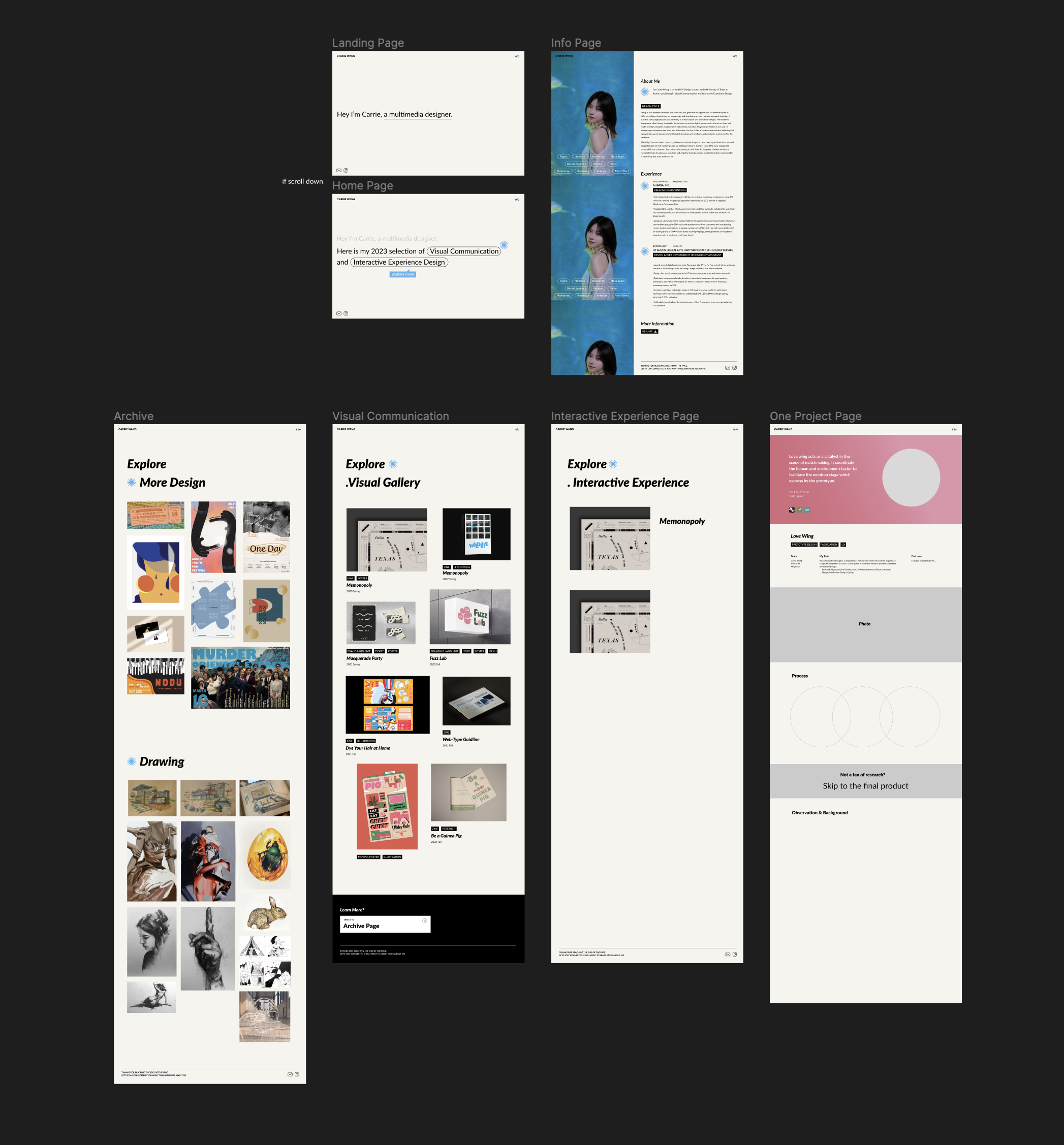
Here is how my website looks like now. I want to refine it by adding fancy animation and rolling effect on it. I might start a new design research on how to make website effect with custom coding and the design approach of it. 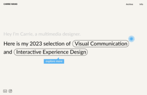
Specially, the first animation I want to create a frame-by-frame transition from a statement introducing who I am to the selected design works. I get the inspiration from Apple official website. I really love their aesthetic, color scheme, and web animation that works for their fantastic storytelling. If I’m able to make that tutorial, I might start with the case study of it. Moreover, I want to add in the basic transition/hover effect when people natural scroll the page. Such animation give people a smooth experience and emphasize the clickable section of the page when they want to explore around. I believe that it’s extremely crucial for web designer know how to guide people and imply information via details.