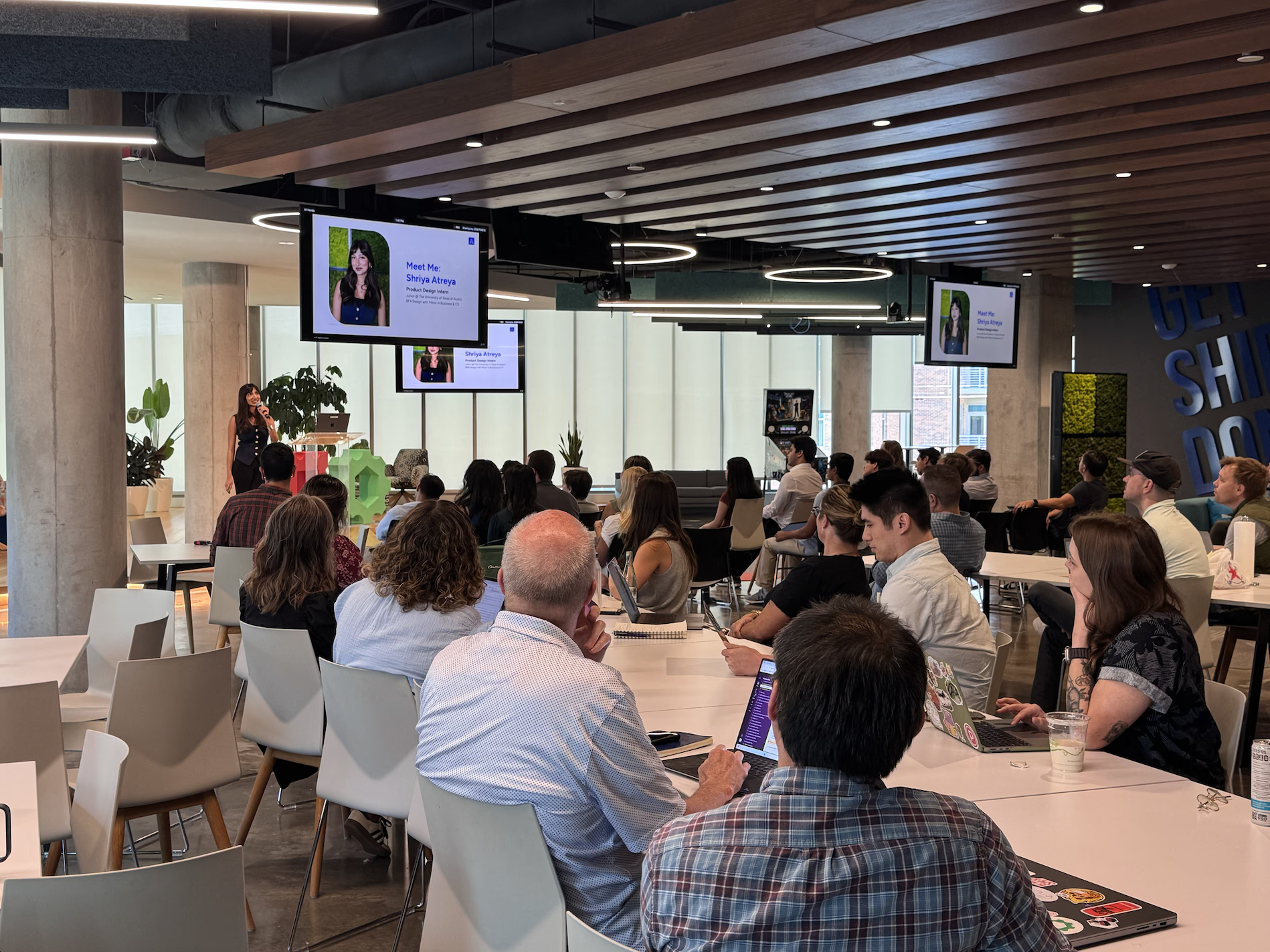
Summer Marketing: Countdown Posts
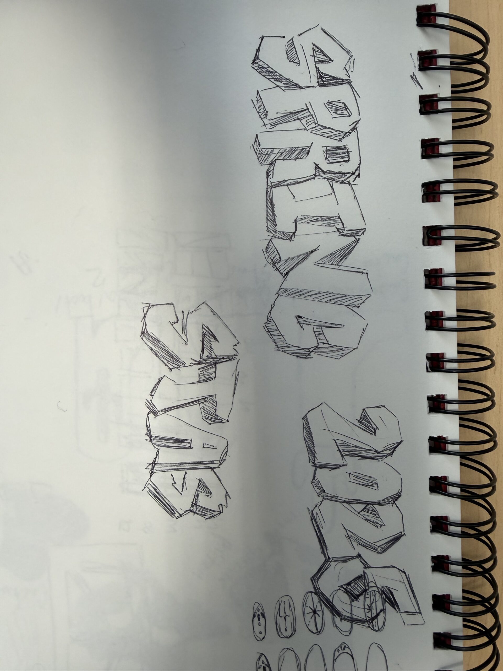
Worked in After Effects on this post, worked with Lila to figure out the mechanics of the flipping numbers. New versions of this with new numbers to come.
75 Days Countdown
New Versions!
- I continued to work with Lila on this project for the new versions. With her creation of a template, this project became a lot easier and more efficient.