Spring 2025 STA Roster Posters
Project Overview: Design 2 posters that display the STAs, their names, the main title, and that differentiate between the teams. The design will be based on “Movie Concession Stands”. The idea is to have the STAs represented as candy boxes/bags of candy.
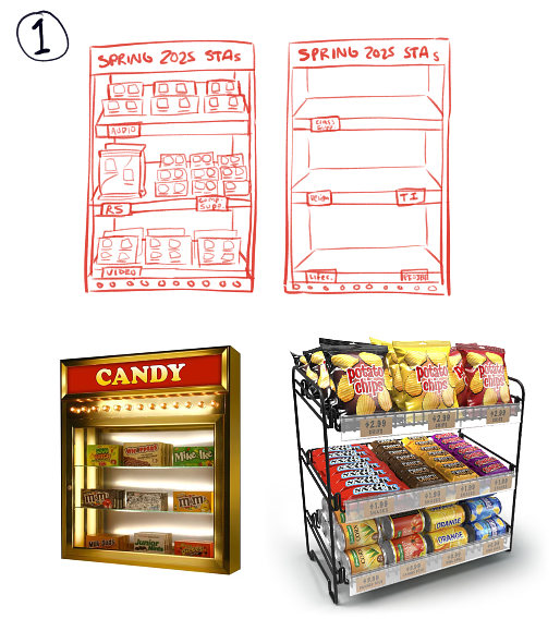
I started by sketching out some layouts and finding inspiration photos. My initial vision was to have the teams represented by different bars/bags/boxes of candy.

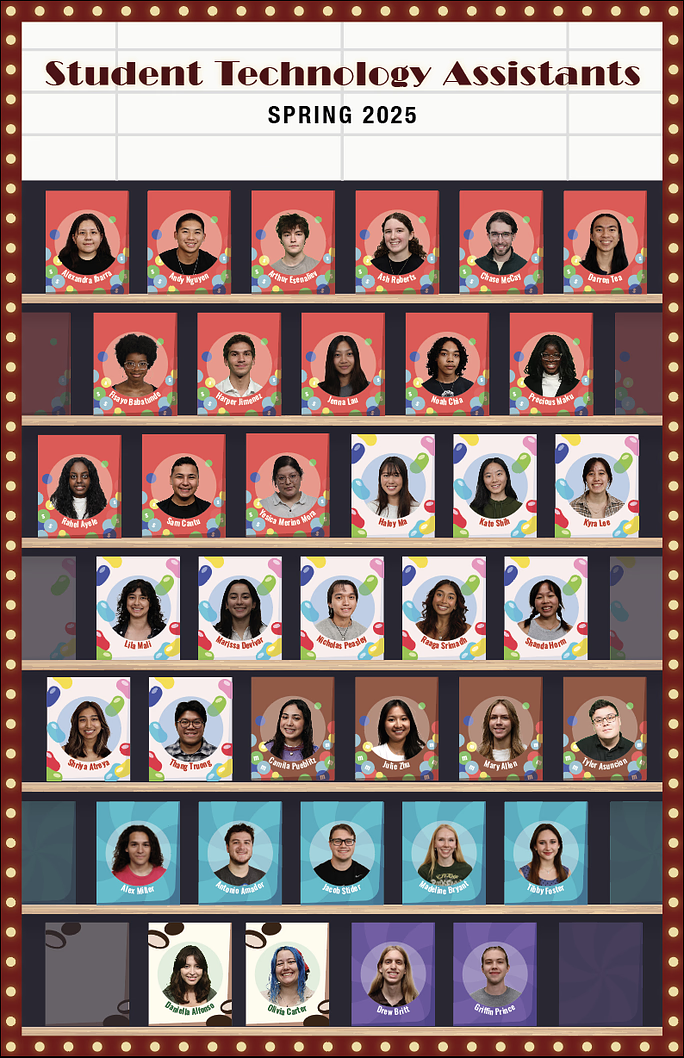
This is the first draft I created in Photoshop following the original design. It was at this point in the project that we decided to pivot on the design to something more illustrative to simplify the layout, fill the empty space, and save time.
I moved to Illustrator to try a new layout, created with the help of my manager De’sha. In this version, each STA would be on their own mini candy box. This way everyone is equally represented and can blend into the packaging more seamlessly.
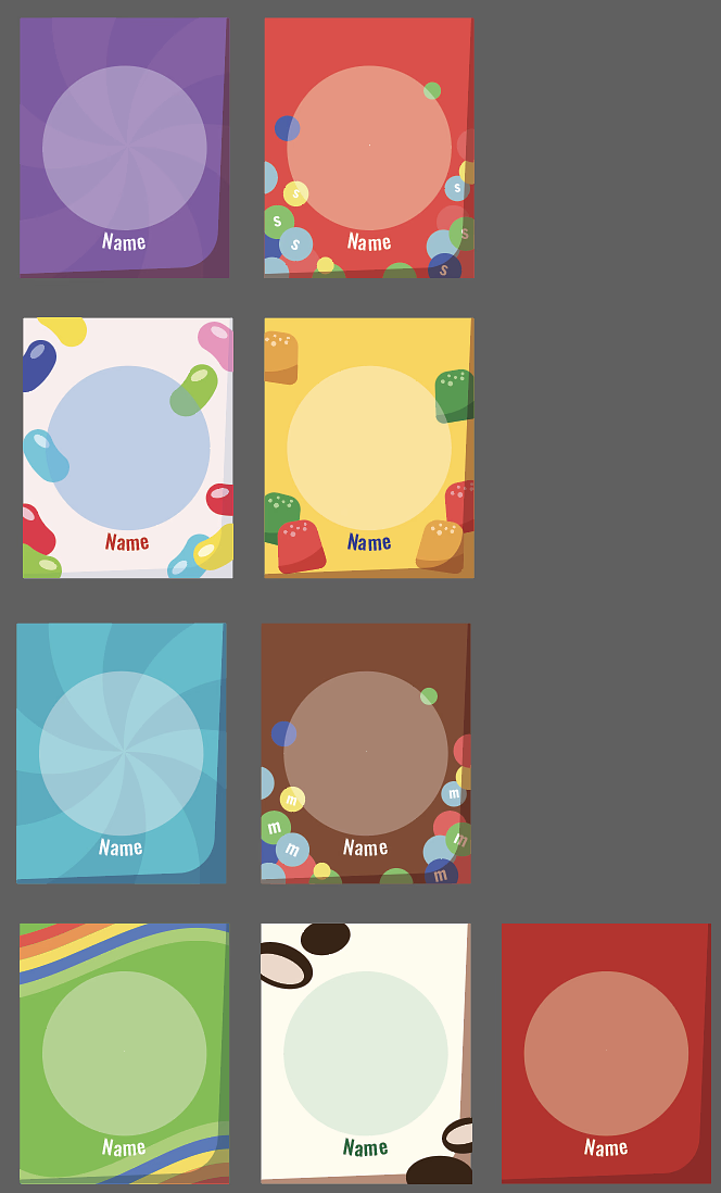
I designed some simple candy box designs with placeholders for the photos and names, then got to adding all 75 STAs to the document.
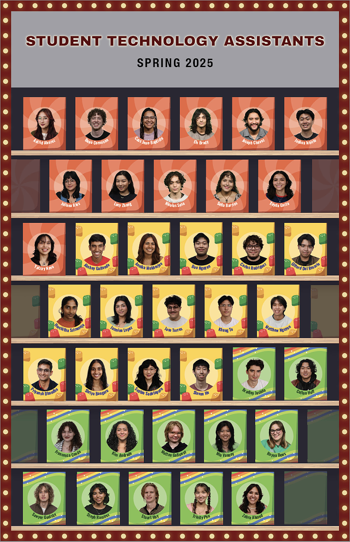
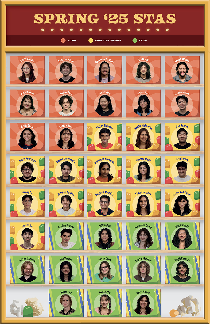
With all the STAs in their candy boxes, I could focus on the border and title design. I was directed to make it look more like the display case from my original inspiration pictures. I also added a key beneath the title identifying each of the teams.
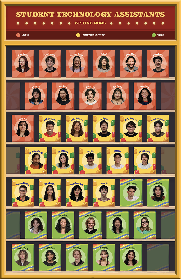
I received some more feedback to shorten the title, turn the boxes on their sides, lighten the background, and add some elements to fill the empty space on the bottom shelf.
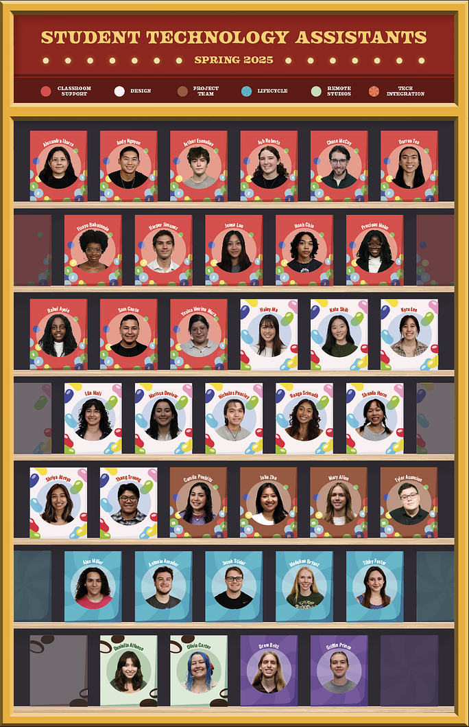
In another round of feedback I added some effects to the title, removed the border completely, darkened the color of the shelves, and simplified the popcorn to match the stylistic design of the rest of the poster.
In a final round of edits to make the design look more like a concession stand, I added a 3D perspective to the boxes, changed the title font and changed the key design.
My Thoughts: This project was a little bit of a rollercoaster, but I definitely learned a lot. In hindsight, I think I should have pivoted to Illustrator sooner as I spent a lot of time on a draft that ended up being scrapped in the end. Additionally, asking for more help and feedback in the early stages of the project would have saved time and energy fixing things later on.
Overall, I think the posters turned out fun, playful, and very colorful.
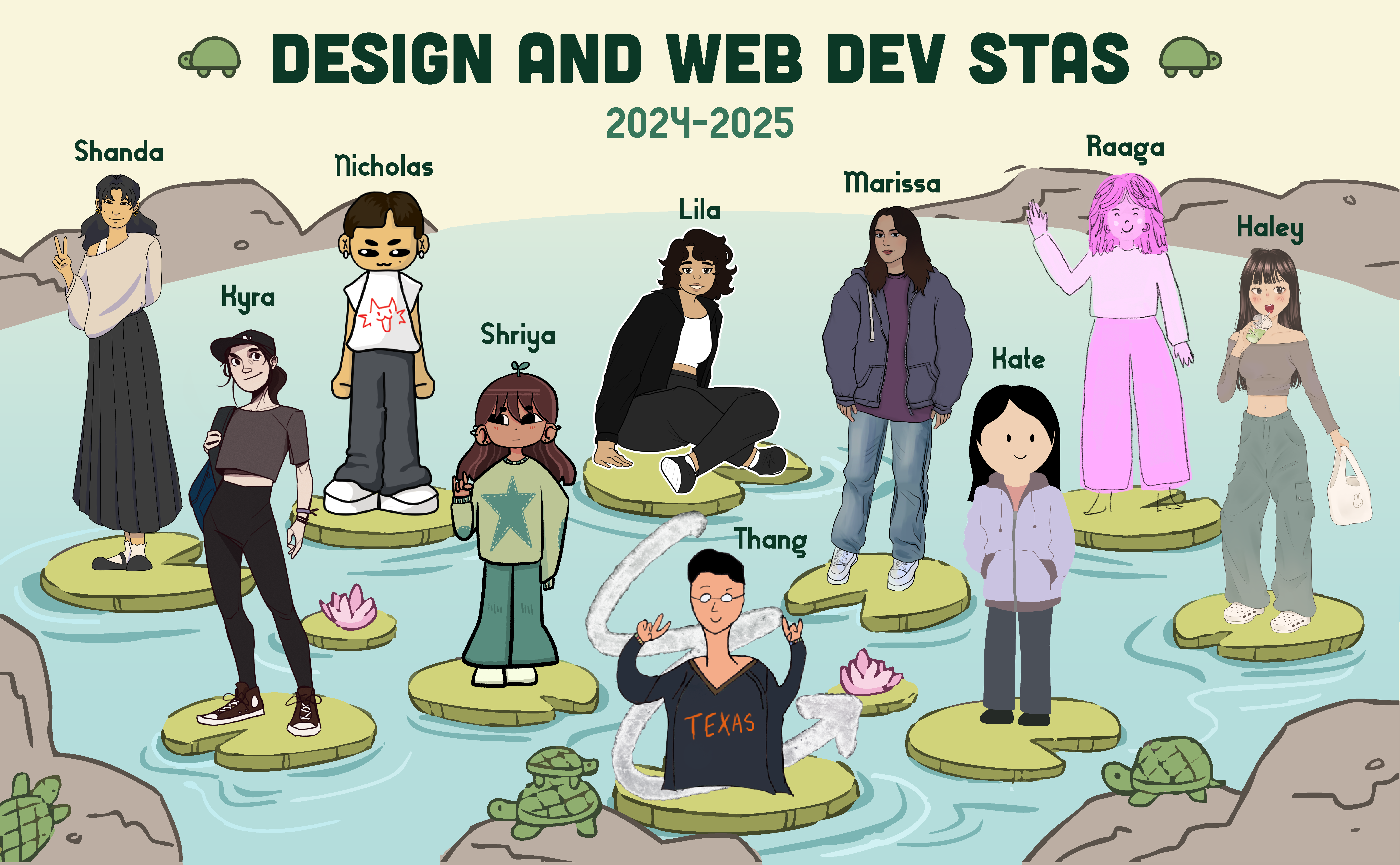
2024-25 STA Blog Banner Design
Project Overview: Design a banner that presents all of the STAs and their names to act as the Design/Coding STA Blog header.
This is the background design I created inspired by the UT turtle pond. I drew this in Krita, then transferred it to Illustrator, vectorized it using image trace, and added text.
By the time I went to add the STAs to the image, some new members had joined our team, so I did some rearranging and duplicating of lilypads to fit everyone. Here’s the final product!