Photo IDs
I was given two photo IDs to complete. One of them was a little tricky to locate the correct image and fix the lighting, but overall they came out well.
Original:

Edits:


Original:

Edits:


Current Sta
I was given two photo IDs to complete. One of them was a little tricky to locate the correct image and fix the lighting, but overall they came out well.
Original:
Edits:
Original:
Edits:
So macroeconomics was the hardest AP test I took — no joke, I redrew a graph (in pen!) four times. Oh well. When I got this assignment and noticed it was style B with no pre-chosen image, my brain suddenly grew cobwebs. I had no idea what kind of image to pick: is money too literal? is a city too macro? is a neural net of connections too meta? Who knows, so I suggested all of them.
Thankfully, the professors picked a photo. But it was way small, so Poonum suggested I recreate it. (original at bottom, mine at top)

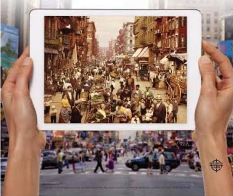
Here’s how I did it.
Here are the course graphic drafts I’ve made:




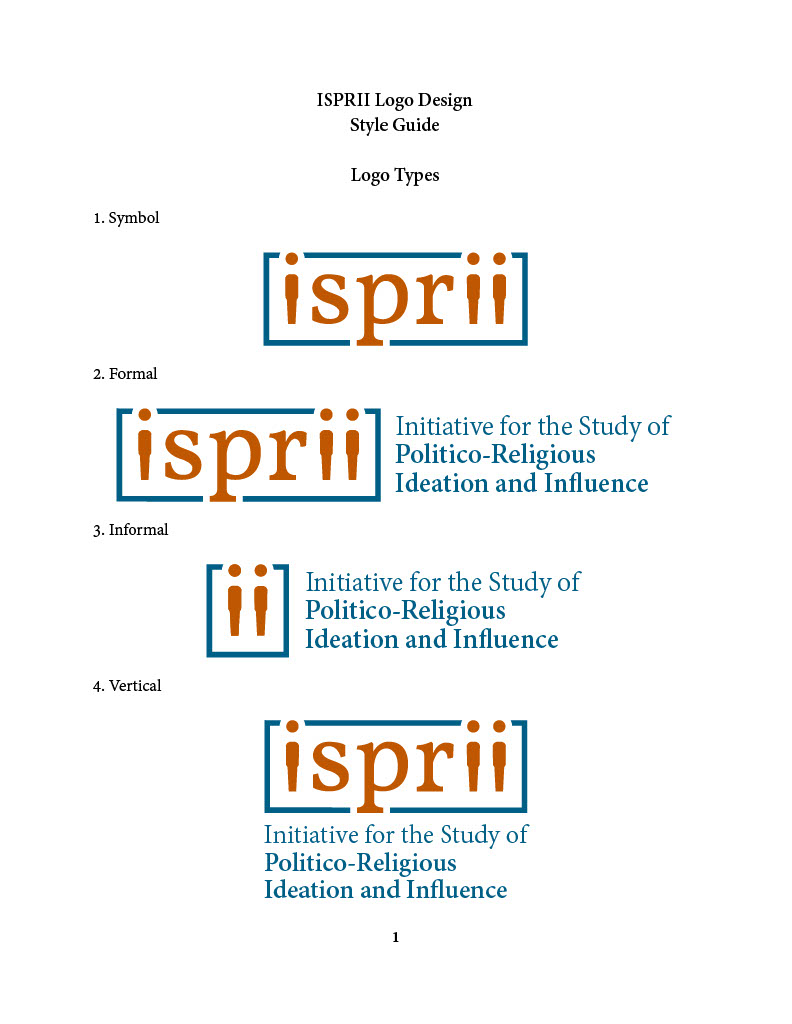
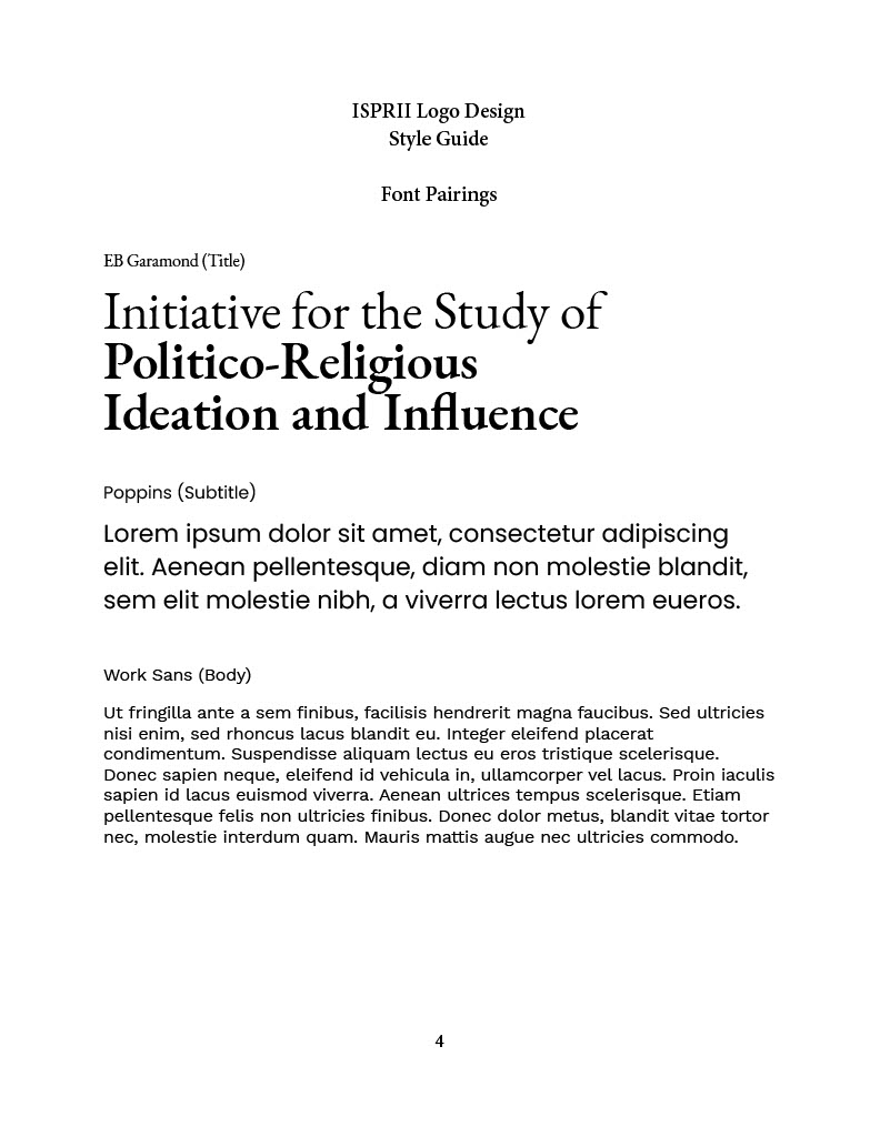
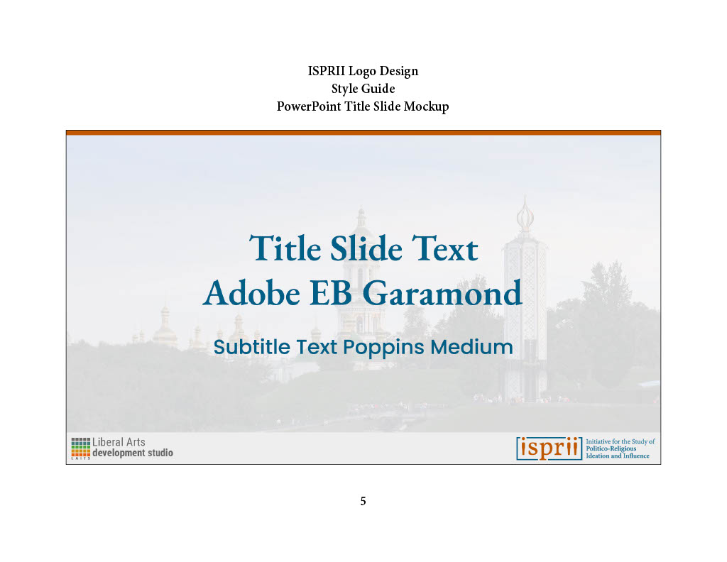
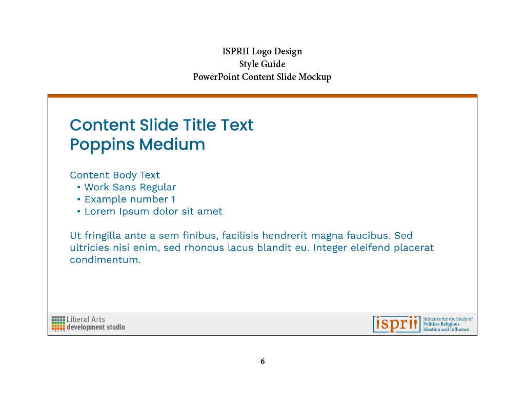
The remaining pages of the style guide include PowerPoint templates and mockups of the logo on different accessories, including a t-shirt, a laptop sticker, a notebook, and a mug.

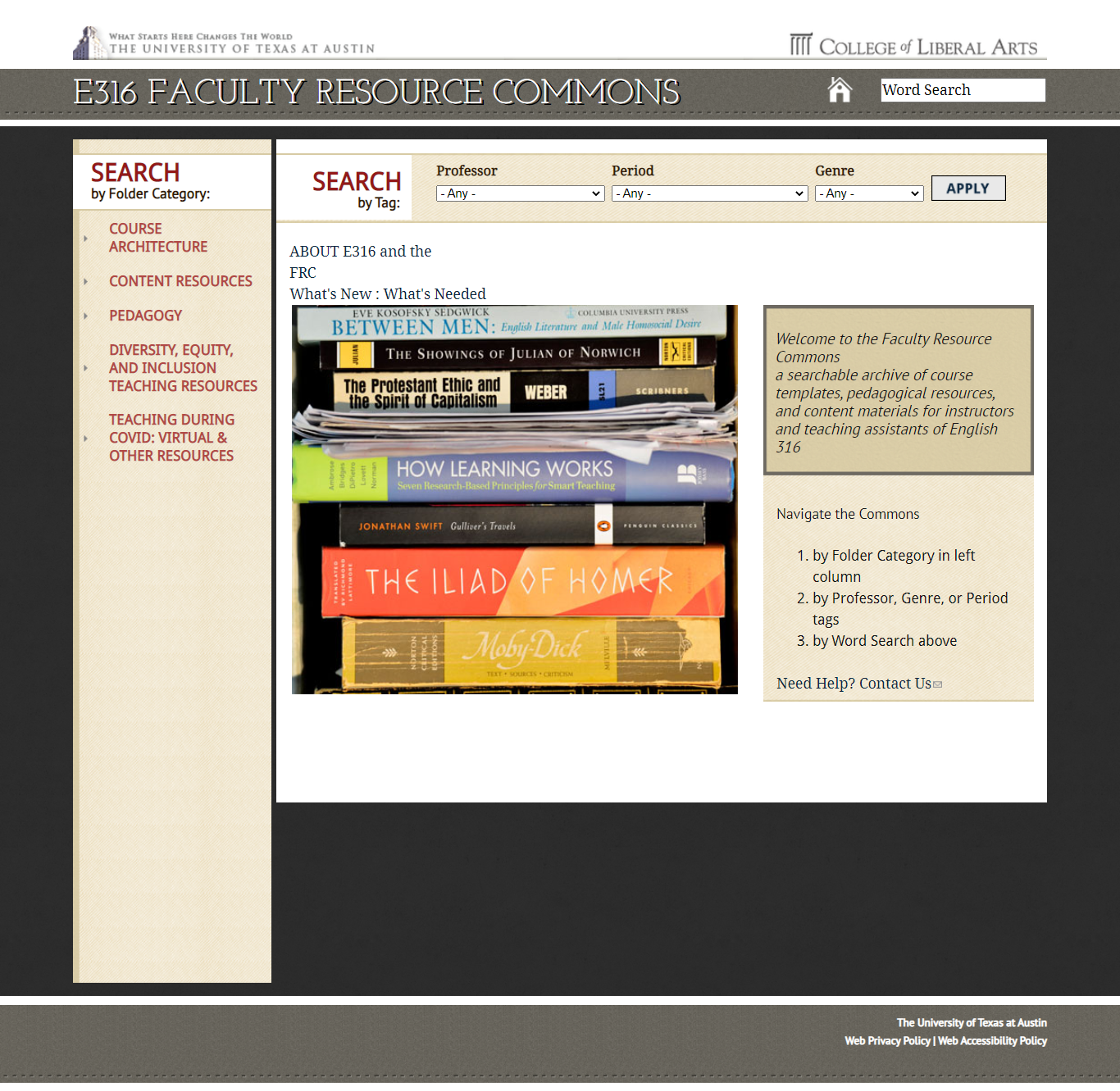
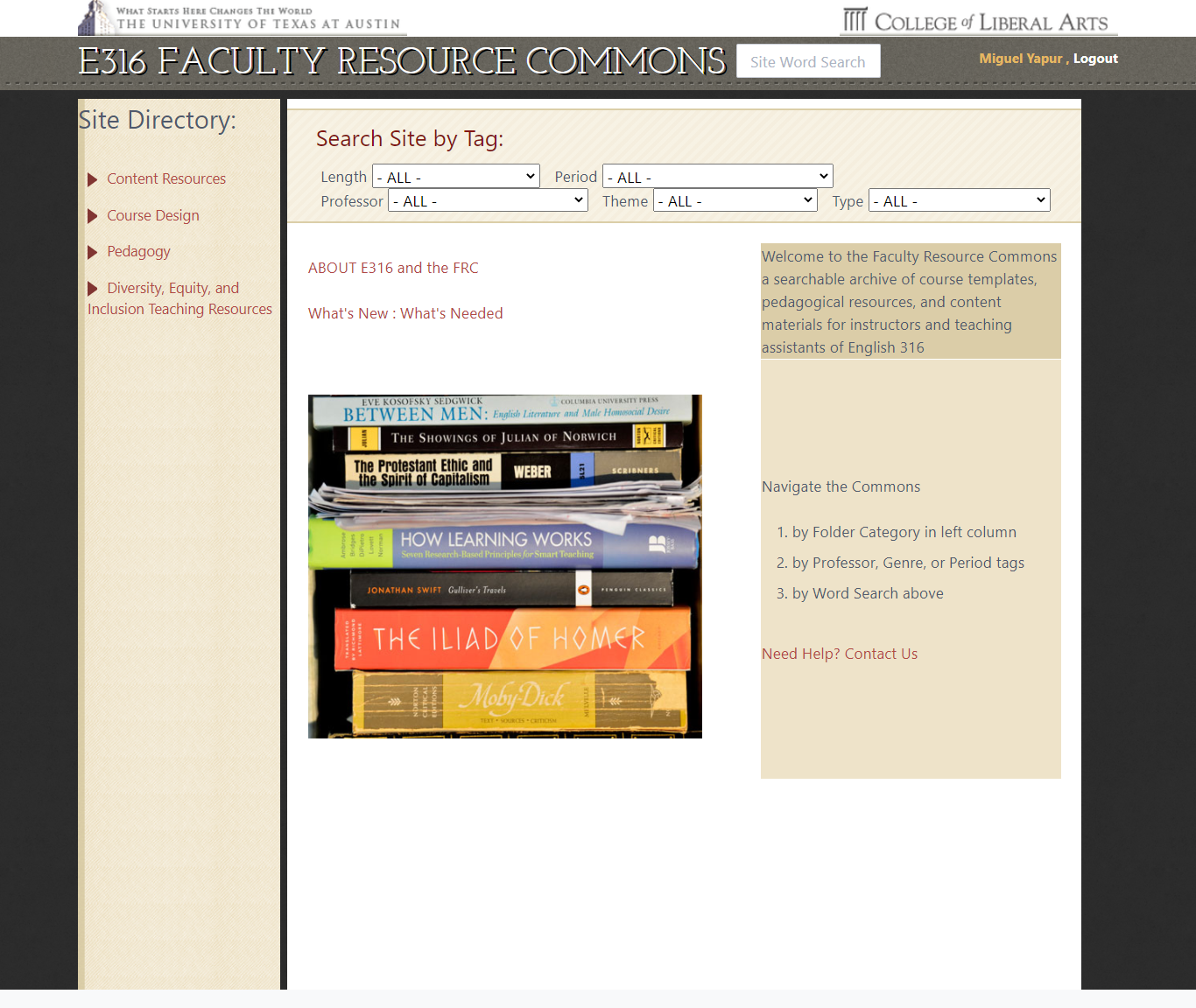
This is a hard project to express visually. Most of the tasks involved making sure that the pages of the English department’s old website were successfully transferred and formatted to fit the new Grav website. However, I ran into an interesting issue in which a plus sign in the slug of one of the pages was creating duplicates that couldn’t be deleted until we asked Ruben to do so by going into the file manager.
Here’s a screenshot of the old and new websites:
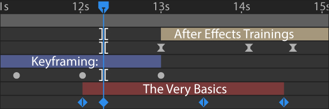
After a couple of weeks, these new intermediate trainings on motion graphics and logo animation (as well as a reference page on Keyframing) are mostly ready to be put to use!
Here are the links to the Logo Animation and Keyframing posts that I authored, along with their respective banners designed on Illustrator and After Effects:

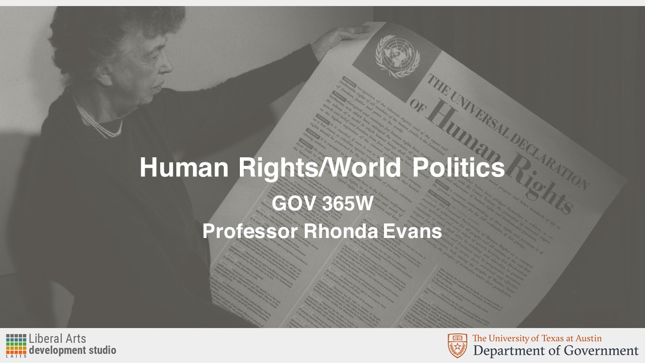
This was a very time-sensitive task on creating a PowerPoint template for the Human Rights/World Politics using the official UT palette and the image background shown below.



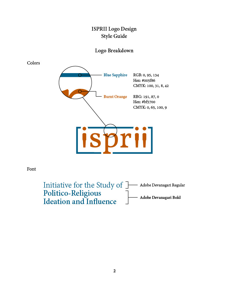
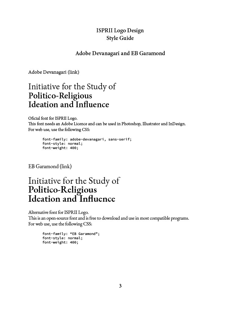
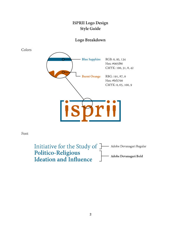
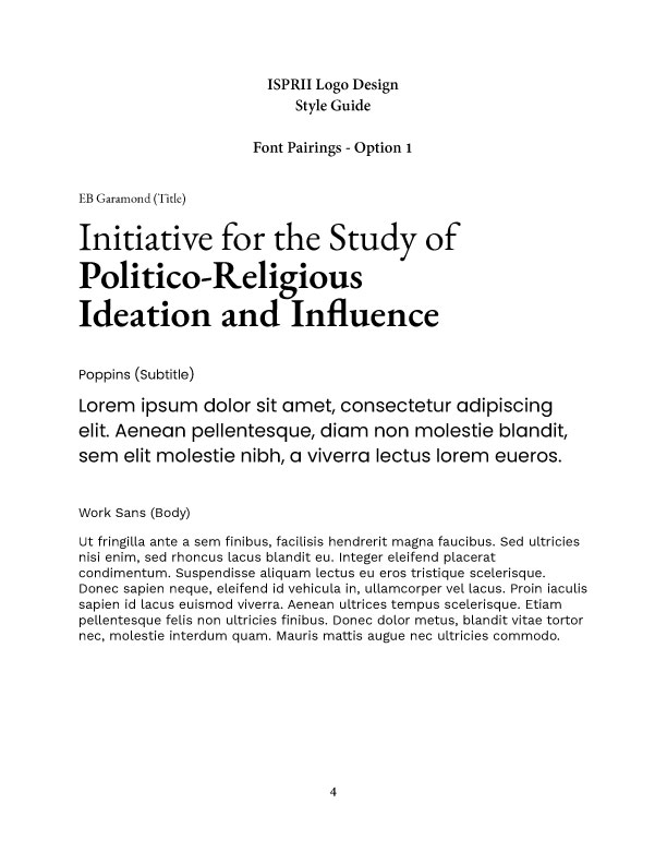
At the final stages of this project, I’ve been putting together a Style Guide to present to the clients, including the different types of logos, the color palette and font selection, pairings and alternatives, and mockups.


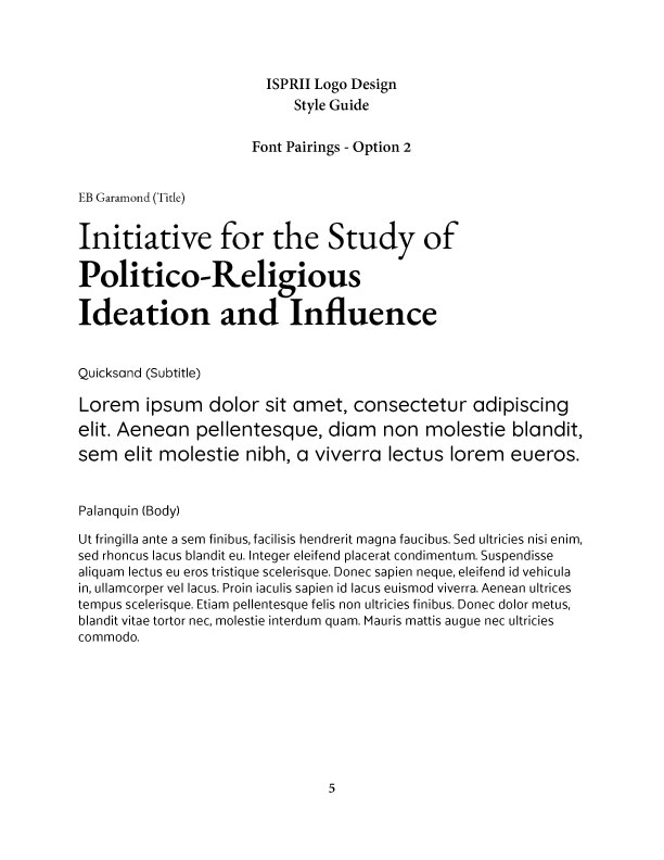












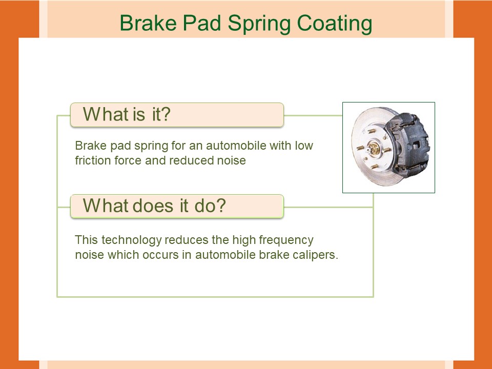
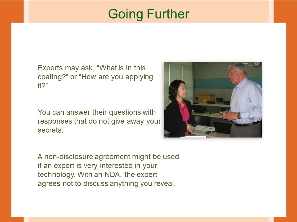
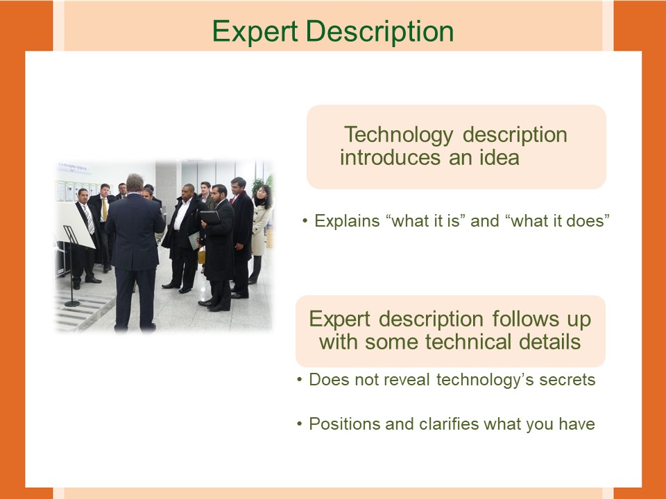
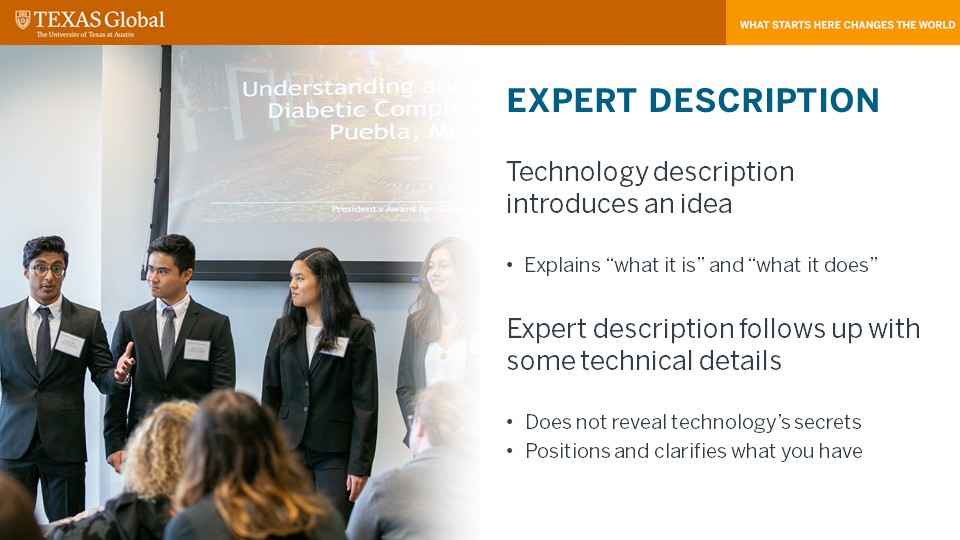
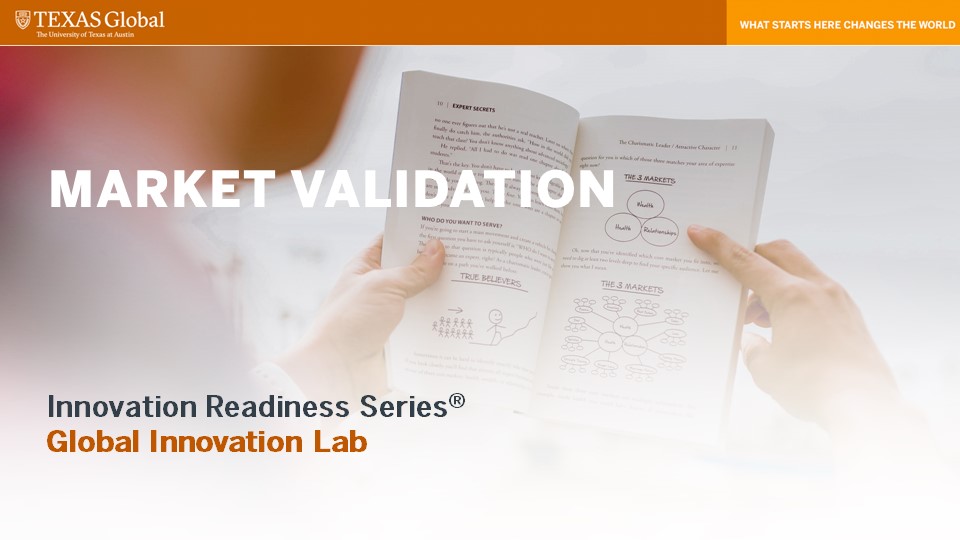
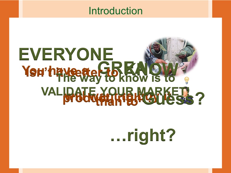
The new styleguide provided by Valerie was a nice way to refresh these outdated designs for the old PPTs. Here are some slides of Technology Description and Market Validation:
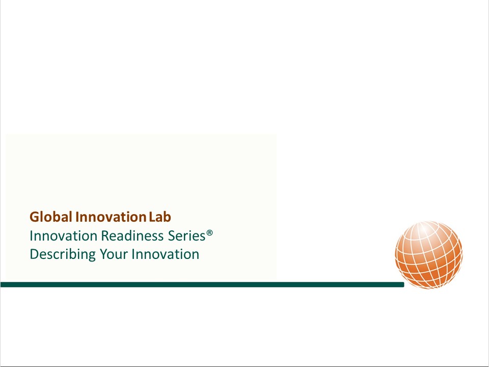
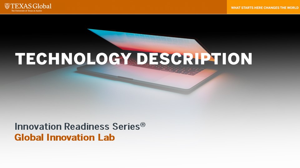

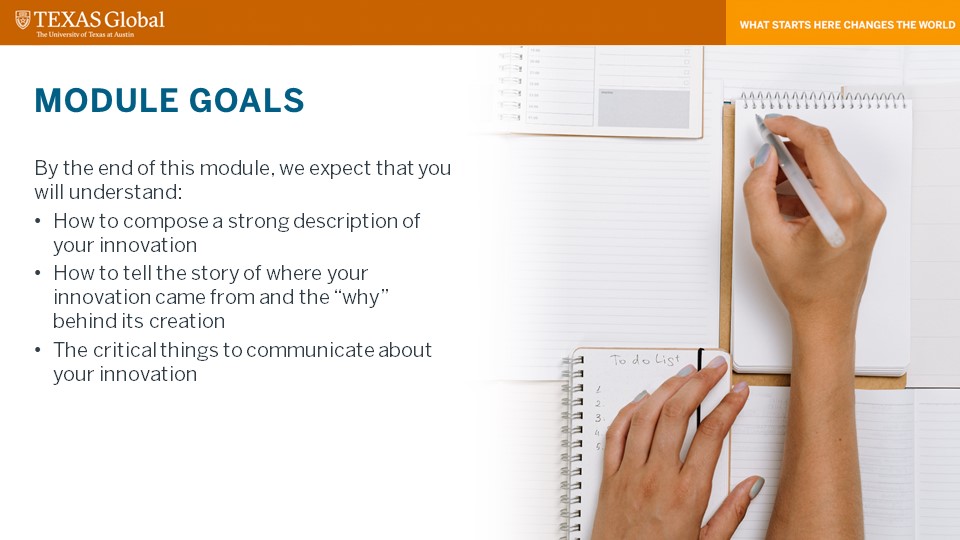



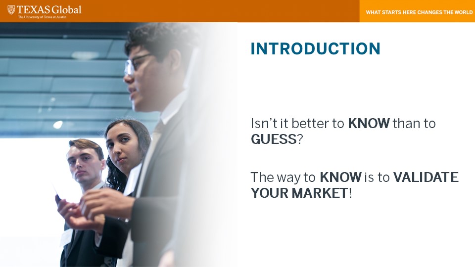

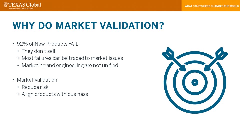

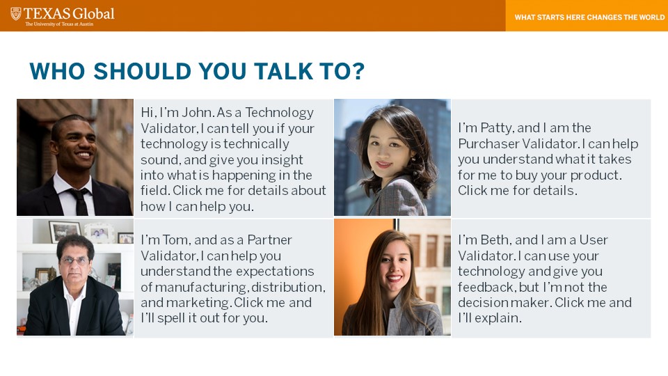


Before we go to commercial, here’s what I’ve been up to this week.
Since Texas Politics wrapped up and I got done with a lot of my KB writing and my Figma training, it’s been pretty ~chill~. I put my typography activity KB article (like InDesign Part II, but only using type) on the KB site and did about six or seven photo IDs. I also edited a few KB articles for writing and grammar — really just deleting bloated phrasing. And last but not least, I helped Miguel and Cristina pick out photos for TX Global from their gigantic folder (not kidding) and began reformatting a PPT for TXG.
In other news, spring break was much-needed after I did three times as many issues than usual for The Daily Texan (you can check out the special coverage here and here). I crocheted myself an ear-warmer for the fall and am currently working on a beanie for a friend of mine (I don’t have the hair for hats). I’ve also had this song on loop during my entire shift today (thanks, Spotify discover weekly).
What makes an effective icon that is both appealing and readable for the brand it is supposed to represent. This was my task that I have been working on for the past couple of weeks. How to create an effective icon.
I began with some research on the foundations of iconography. Icons are supposed to be compact, simplified symbol that represents an object, action or idea. They should be able to be read at first glance. This is important because icons are everywhere and are used for navigation, warning signs, they trigger actions, and the show status for many things. People need icons to be readable beyond language barrier.
This leads to the most important principles of icon design, clarity, readability, alignment, brevity, consistency, and personality.