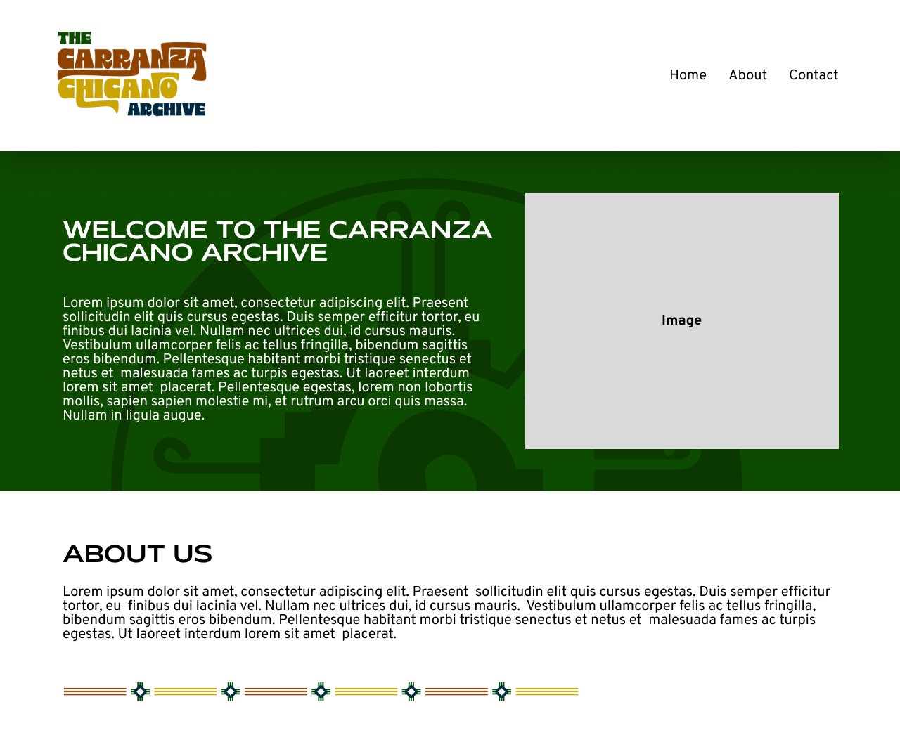
The Carranza Chicano Archive Website
Client: Jonathan Cortez, the Carranzas
Task: Create a website/branding to introduce The Carranza Chicano Archive.
Status: In progress, implementing
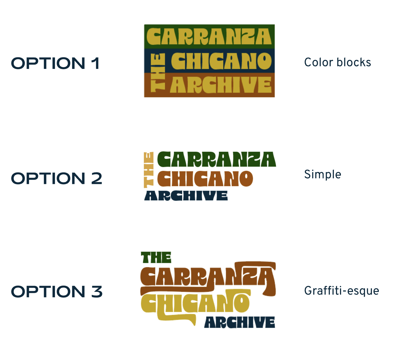
Logo Design
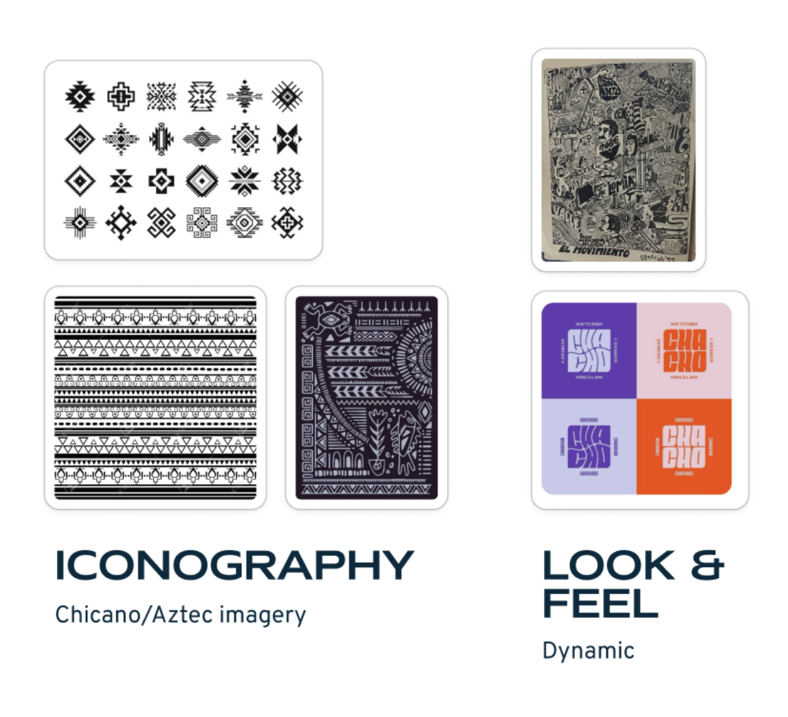
Clean, Iconography of the Chicana/o movement inspired
A moodboard
I started the design process by looking at inspiration. The client wanted the design assets to reference iconography from within the Chicano movement, while keeping a dynamic look. The client also wanted the color palette to be made up of deep burnt orange, mustard yellow, navy blues, and forest greens.
Initial designs
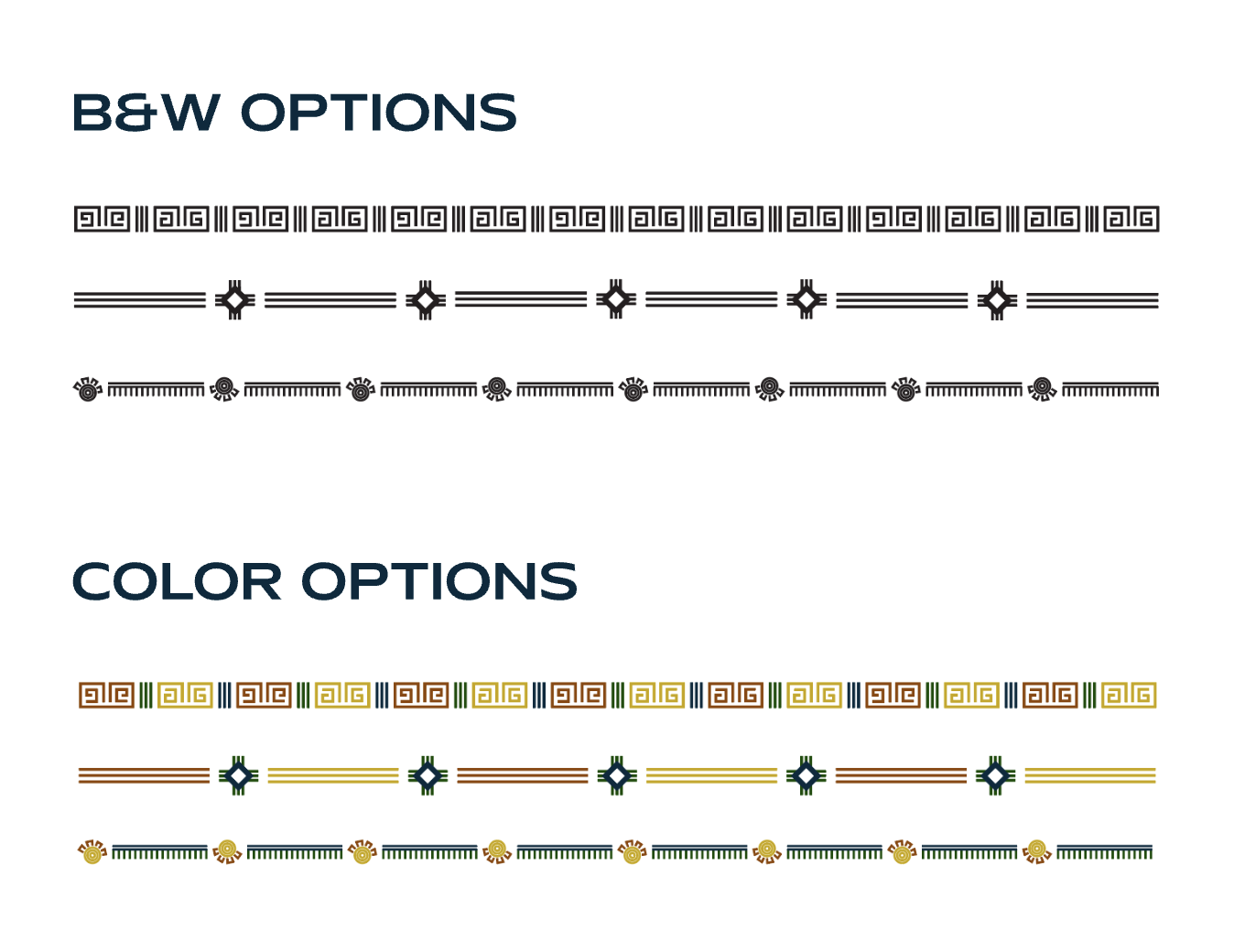
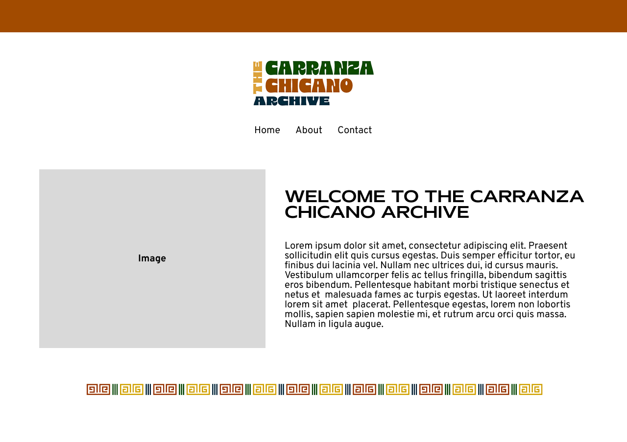
Abstract Banner
Create a repeatable abstract motif/banner graphic for the site. Indigenous iconography (Aztec & Mayan).
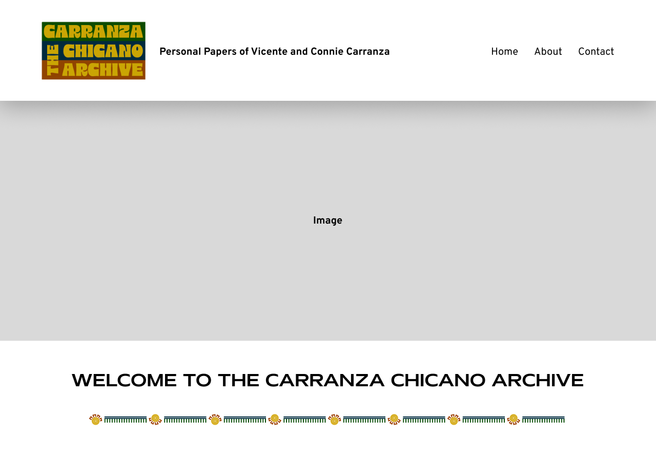
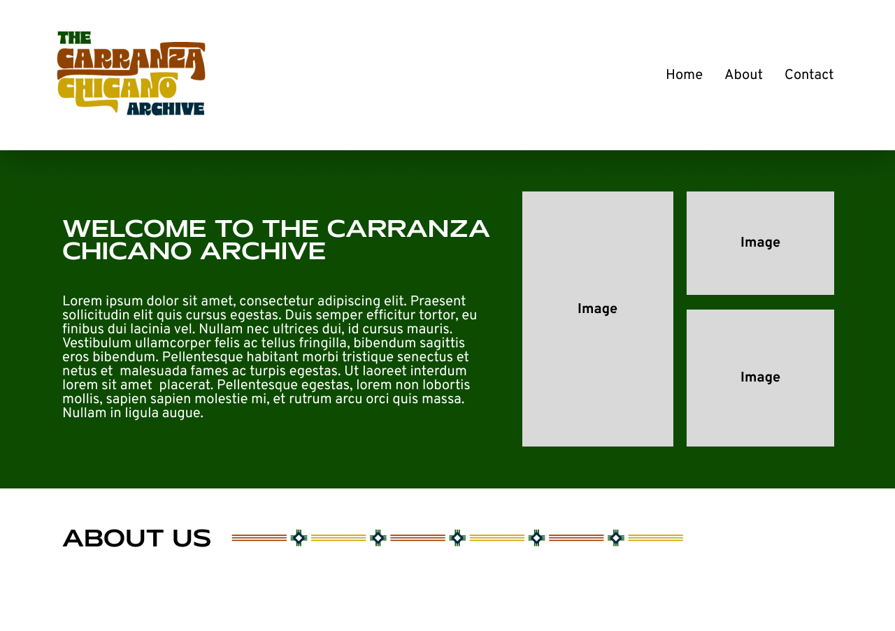
Possible Site Mock-Ups
Several options of implementations of the above assets.
Incorporating a Cultural Symbol
The client wanted to include a Hunab-Ku somewhere on the homepage, so I tried several different variations and placements.
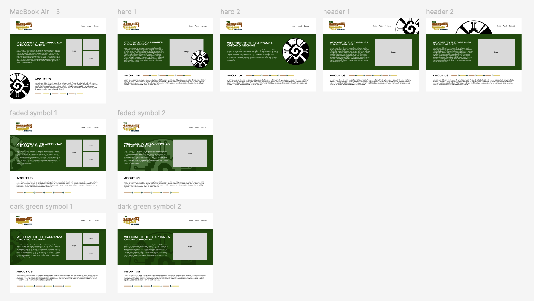
We ended up choosing to going with it being in the hero section, with a transparent background.