• We are STAs
    • Abdurrahmaan Baghdadi
    • Asha Rountree
    • Cindy Truong
    • Haley Ma
    • Isabella Melendez Gonzalez
    • Julie Brandt
    • Kate Shih
    • Kodi Khiraoui
    • Kyra Lee
    • Nicholas Peasley
    • Sasha Kenney
    • Shanda Horm
    • Shriya Atreya
    • Tomas Marulanda-Mesa
    • Trisha Darure
  • We were STAs
  • STA Presentation
    • STA Presentation 2017
    • STA Presentation 2016
  • Testimonials
  • Resources
  • Home

STA Blog

First Class Day (Fall Term) | Post – [264017] 2027 Summer Marketing

October 30, 2026 By Asha Rountree

First Class Day (Fall Term) | Social Media Marketing


★ Overview: Following the Summer 2026 countdown, we wanted to create a new post to celebrate the first day of school for longhorns! We wanted to keep the same style of Bevo from the previous post, but change the background, activity, etc to create a unique post (as the previous graphic has already been used quite a few times). Previous post from 2025:
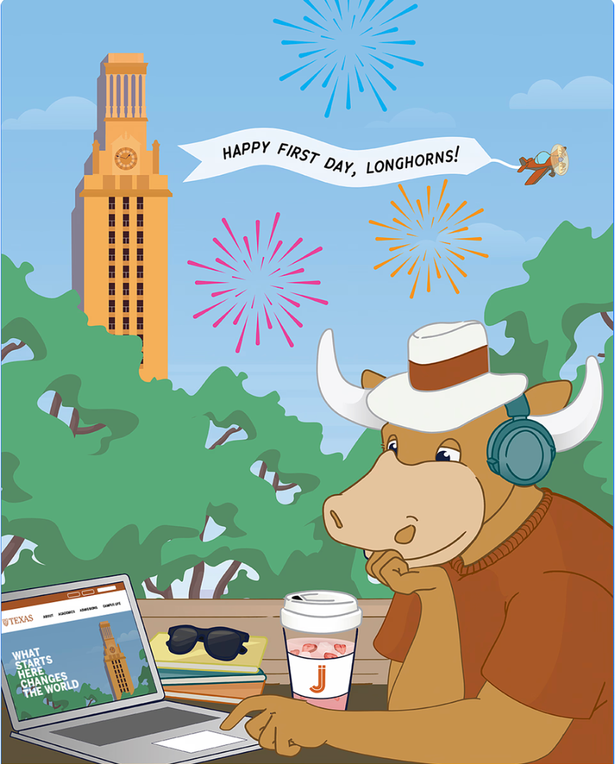
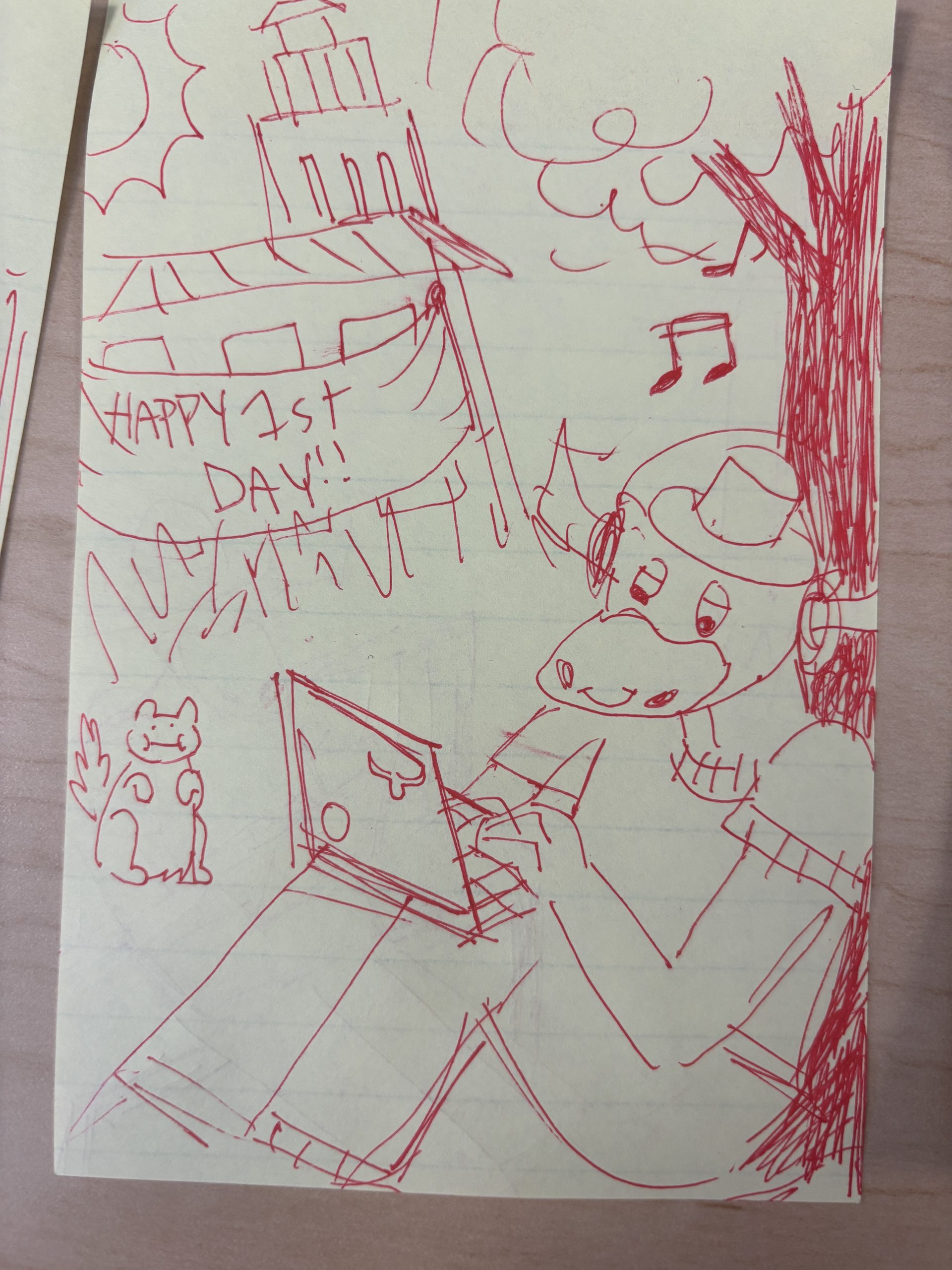
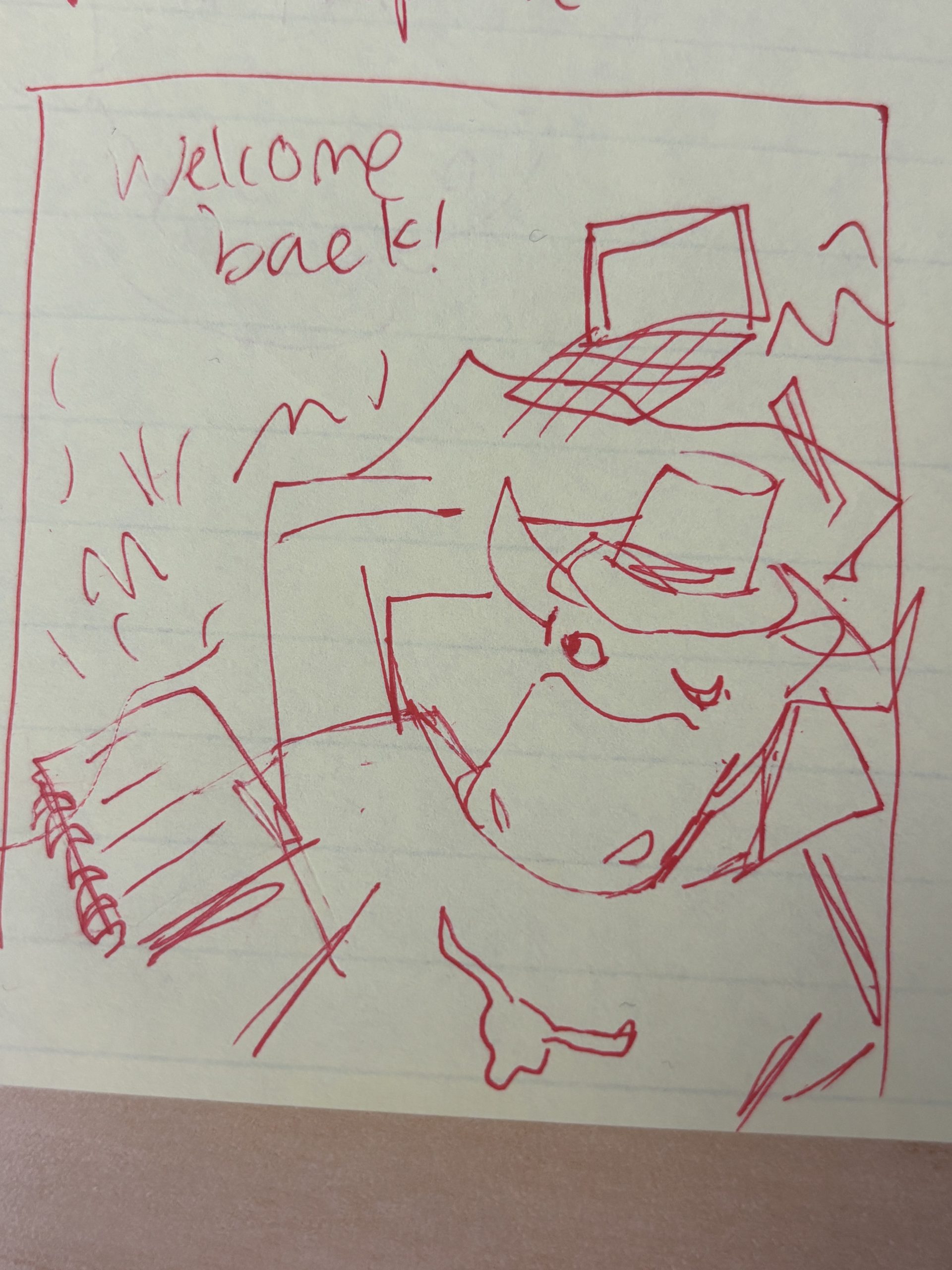
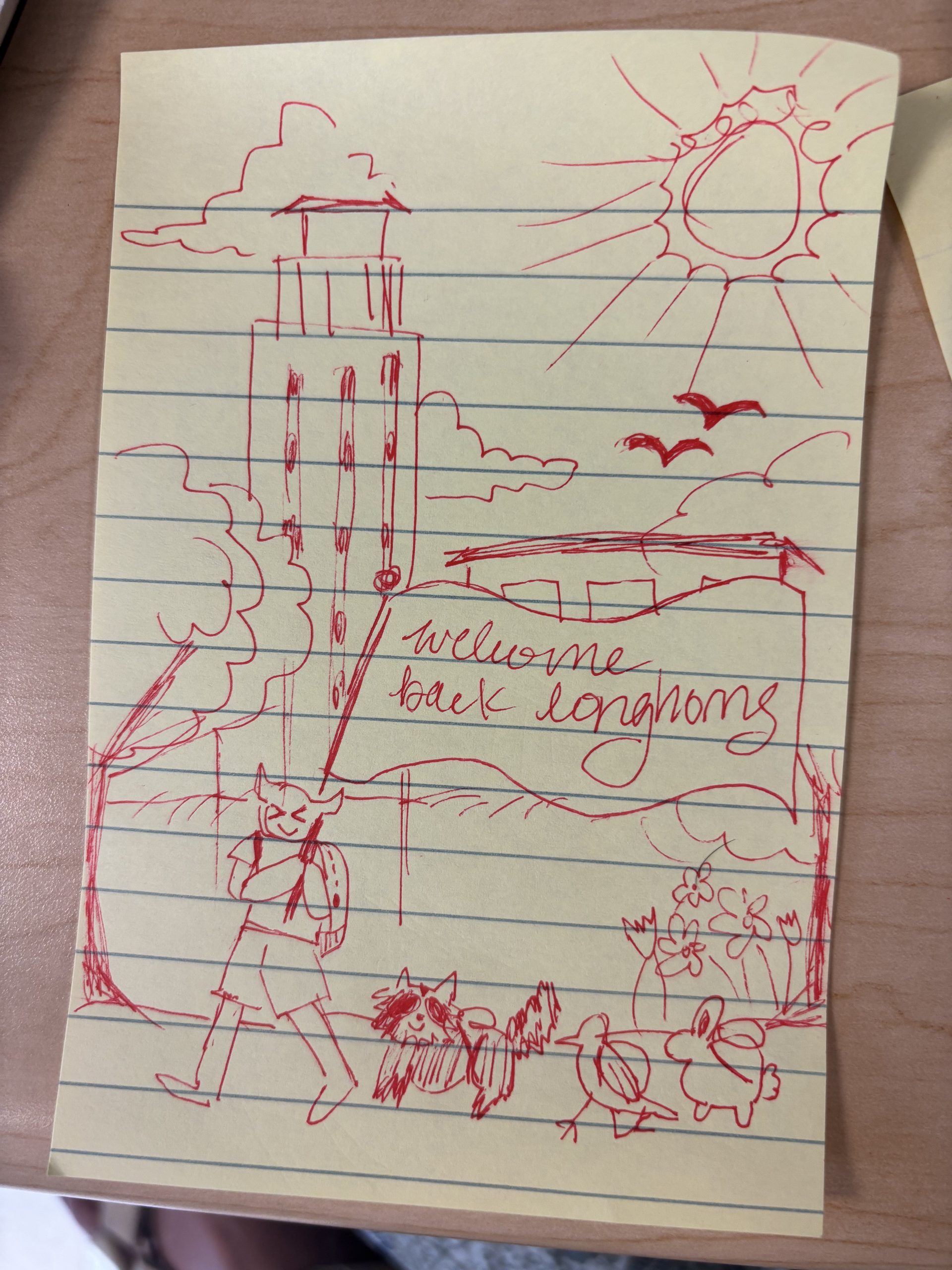
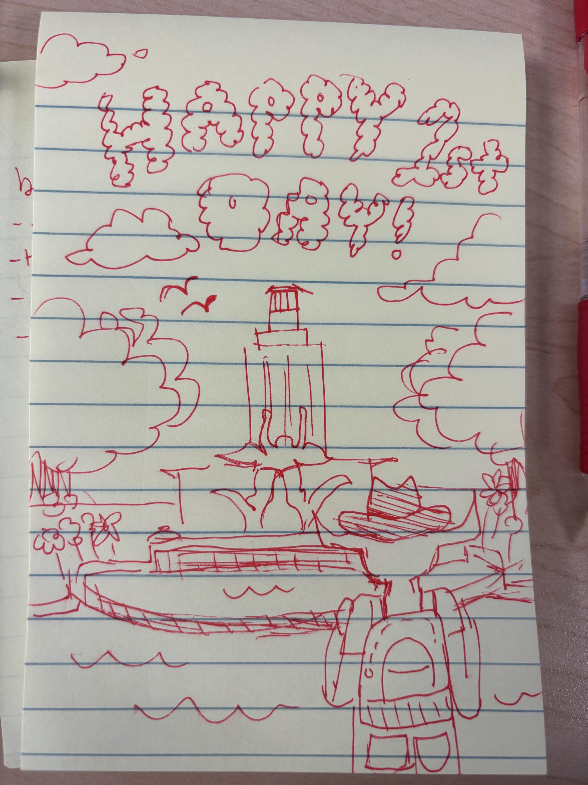
★ Brainstorming: I created quite a few different iterations of Bevo interacting with campus scenery to scope out options for the the new post:
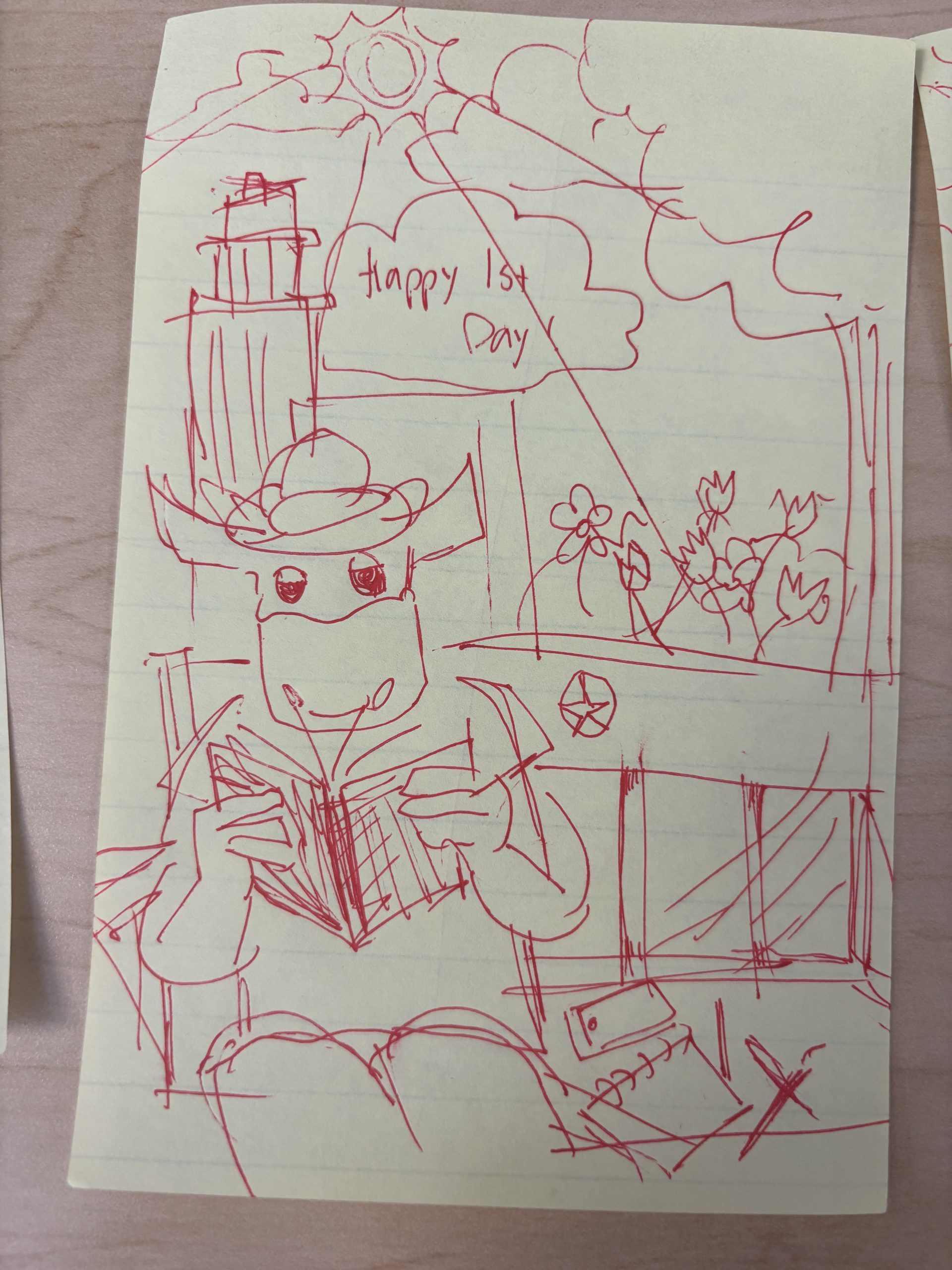
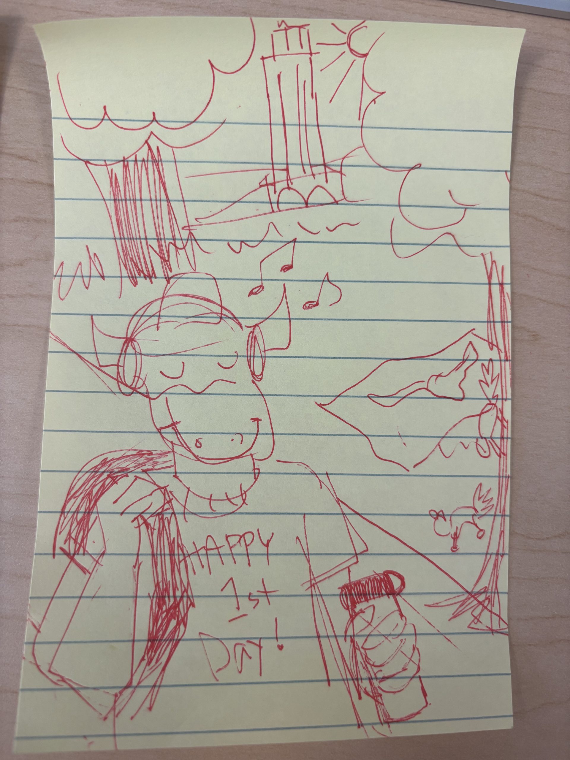
After reviewing the iterations, we decided not to go with the bottom right, as it felt isolating towards Bevo, but the rest of my ideas were fair game. I decided to choose the top right (Bevo leaning against tree) because it felt friendly, relaxing, and welcoming, and still involved Bevo engaging in academics. I also like how visible the UT tower was in this iteration.

★ Iterations:

I decided to go with more saturated colors to create a bright, celebratory atmosphere. Some small edits I made between these two versions were lengthening Bevo’s neck and adding text to welcome our longhorns! I also re-interpreted the fireworks in the original 2025 post to be confetti in the current version

★ Final Design: drumroll please…

Filed Under: Fall 2026 – Spring 2027, We are STAs

Summer 2026 Countdown

October 28, 2026 By Asha Rountree

Fall 2026 Countdown Series | Social Media Marketing


★ Overview: My first assignment as the social media manager was to create a series of three countdown posts for the LAITS Instagram to get students excited about the upcoming fall semester

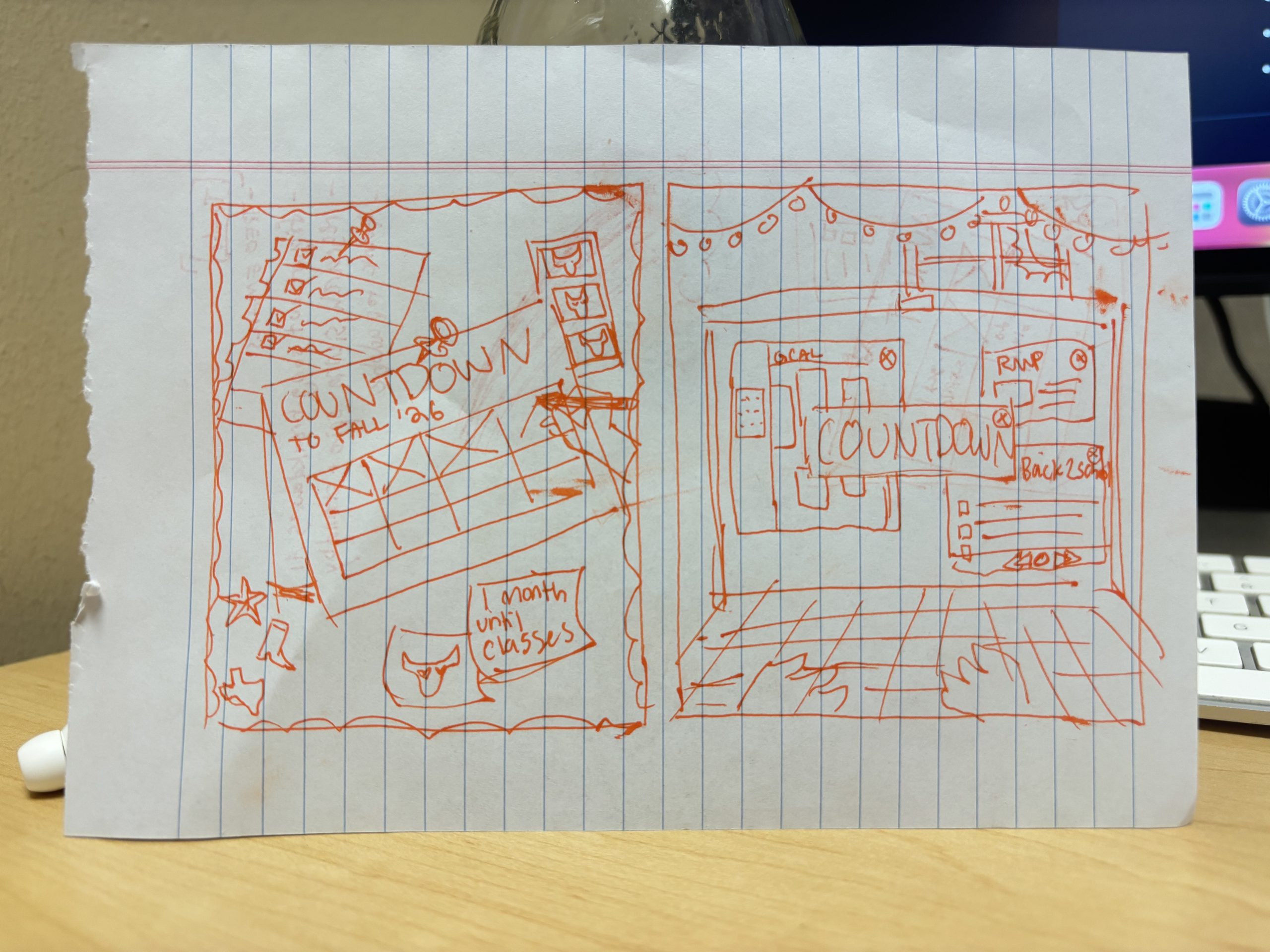
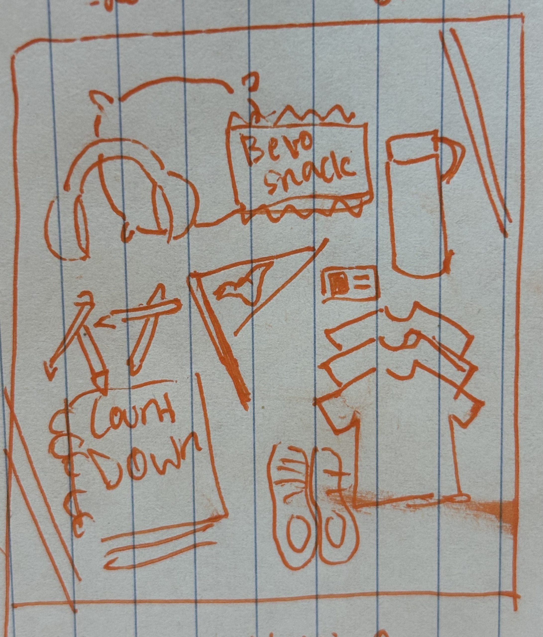
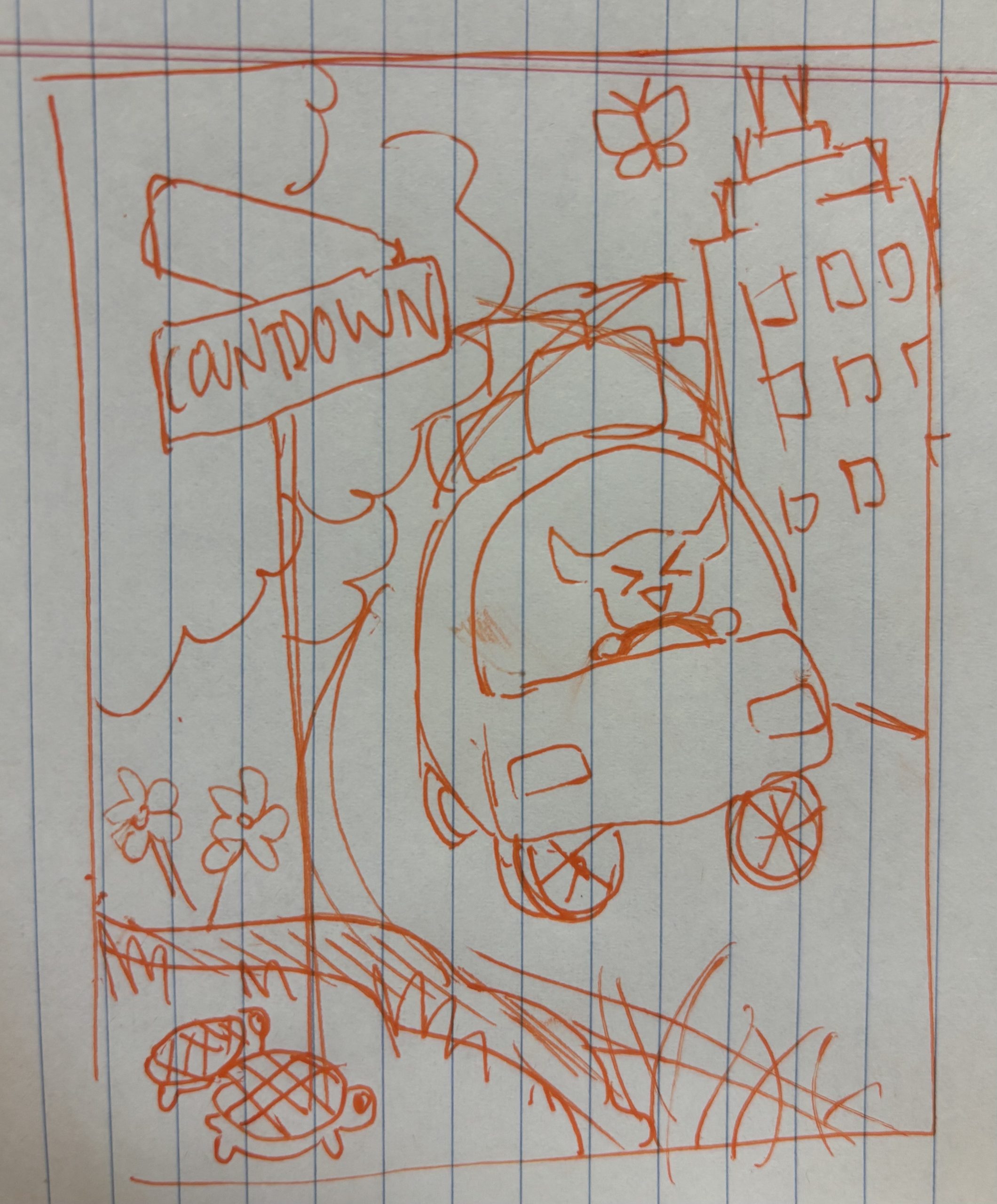
★ Brainstorming: I started out by sketching a few ideas for the post. I wanted the post to appeal to a modern UT student, and tried to lean into online trends (such as a flat layout of personal belongings), and included fun decor and imagery in the backgrounds of the post ideas to increase appeal and engagement to young adults.

I also wanted to keep the idea of Bevo getting ready for school as a common theme throughout the images (the same as last year’s fall countdown posts),

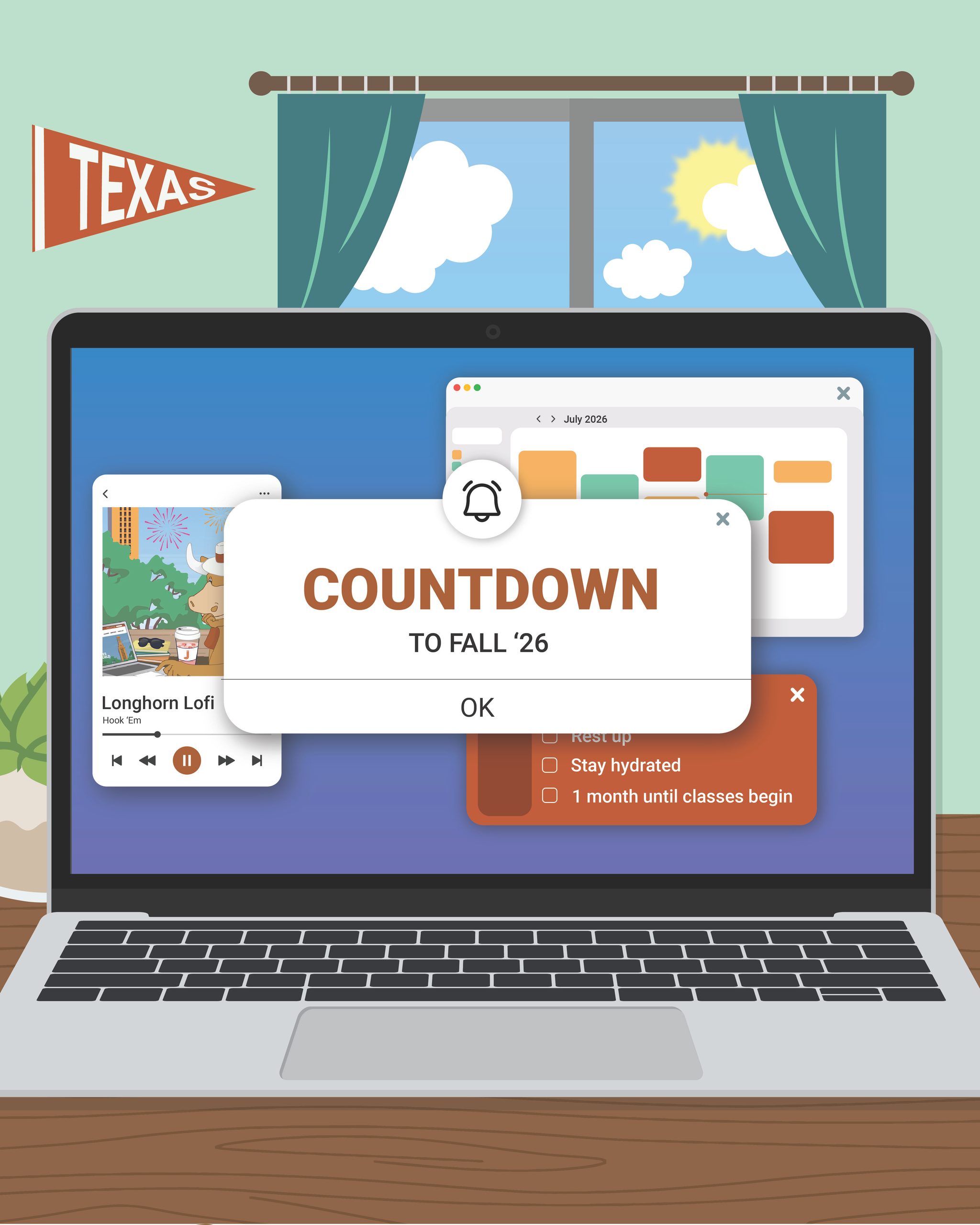
The first idea is a bulletin board set in Bevo’s room, including a calendar, checklist, sticky notes, photo strip, and pins.

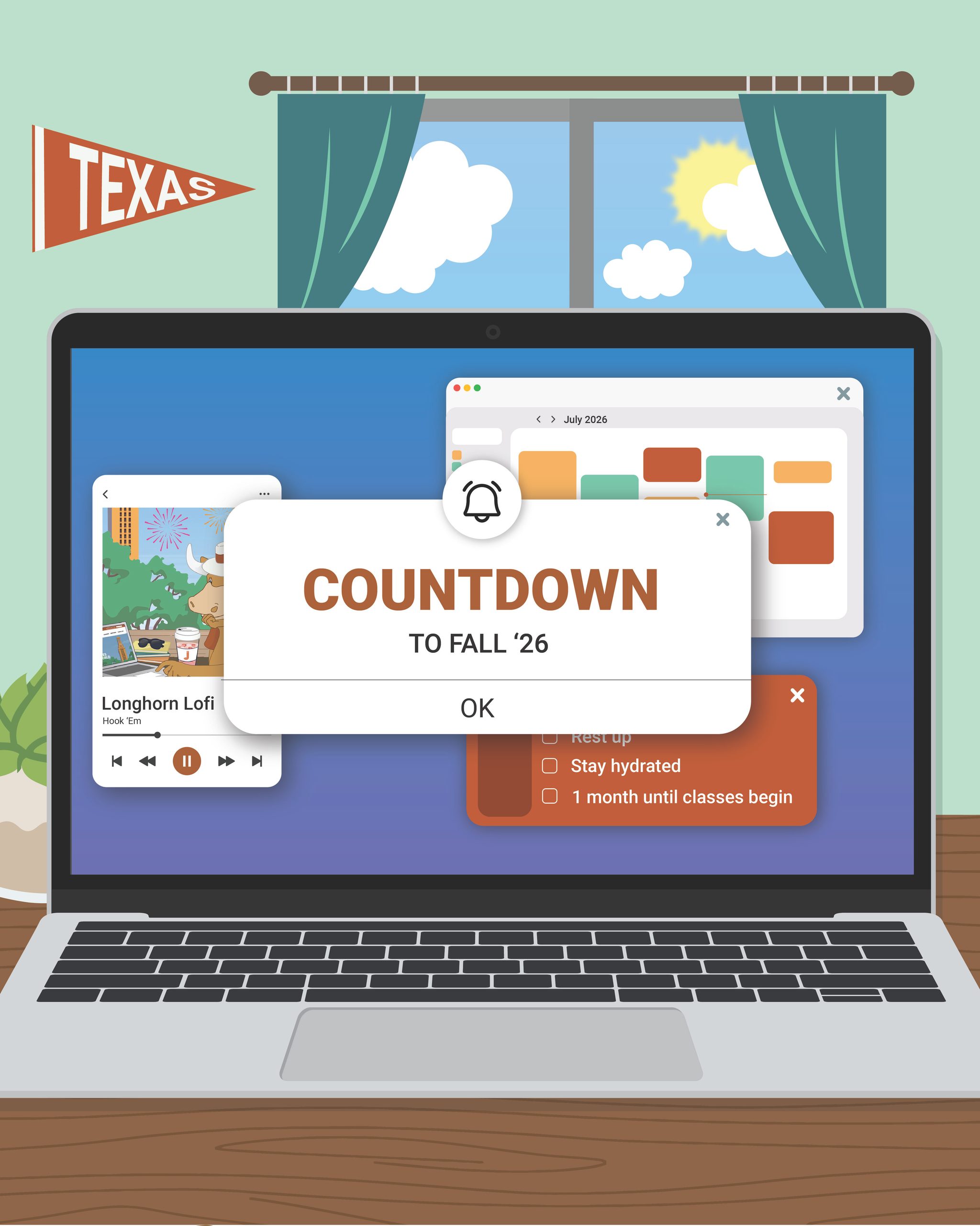
The second is a computer displaying pop up reminders, google calendar, and maybe a back to school playlist. This is a fun perspective because Bevo is behind the laptop.

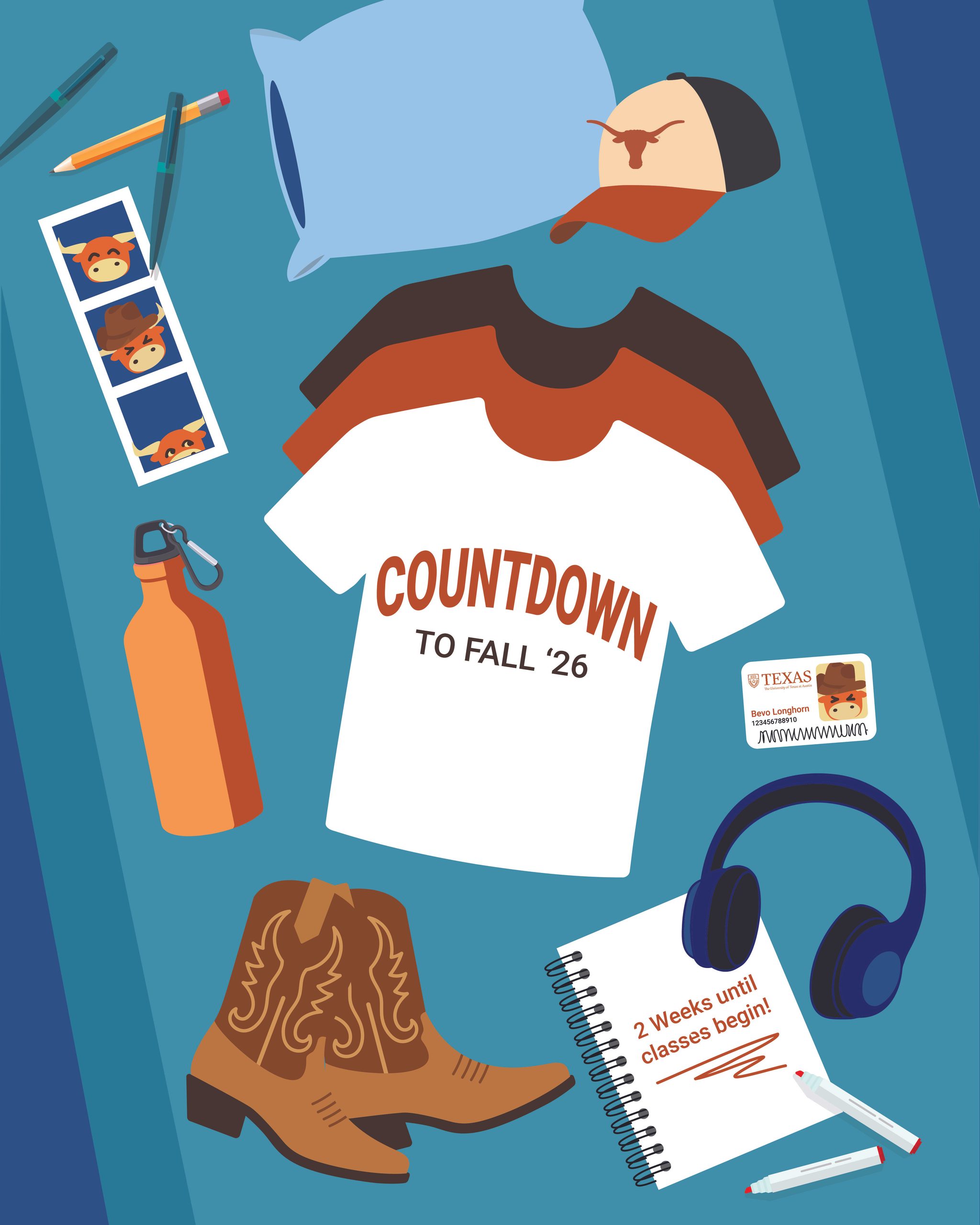
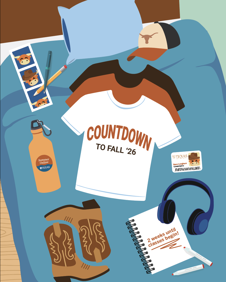
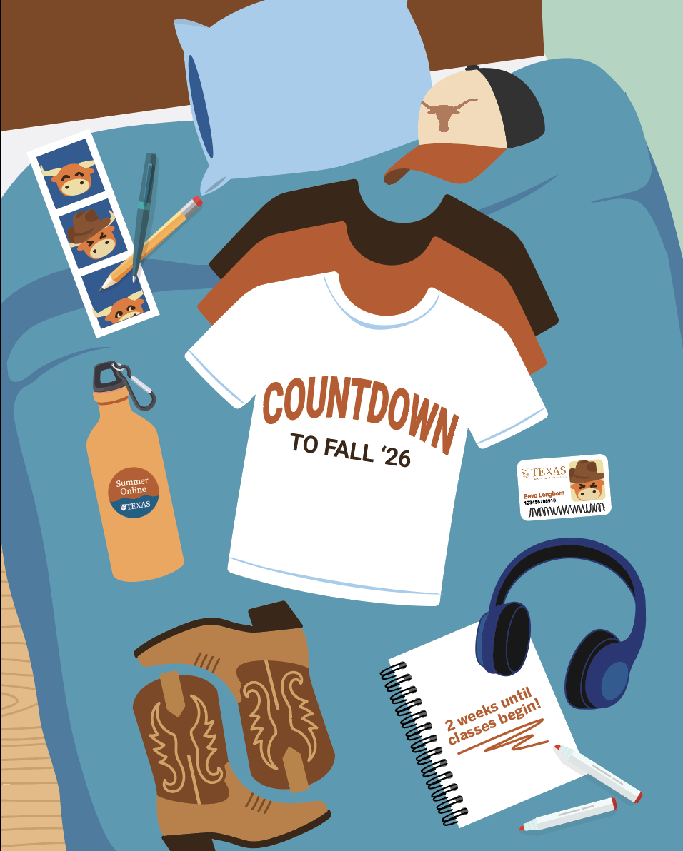
I had the idea to do a flat layout of back to school items for the next post as Bevo is packing up to return to UT. This is also a common method to display packing in an aesthetic way online.

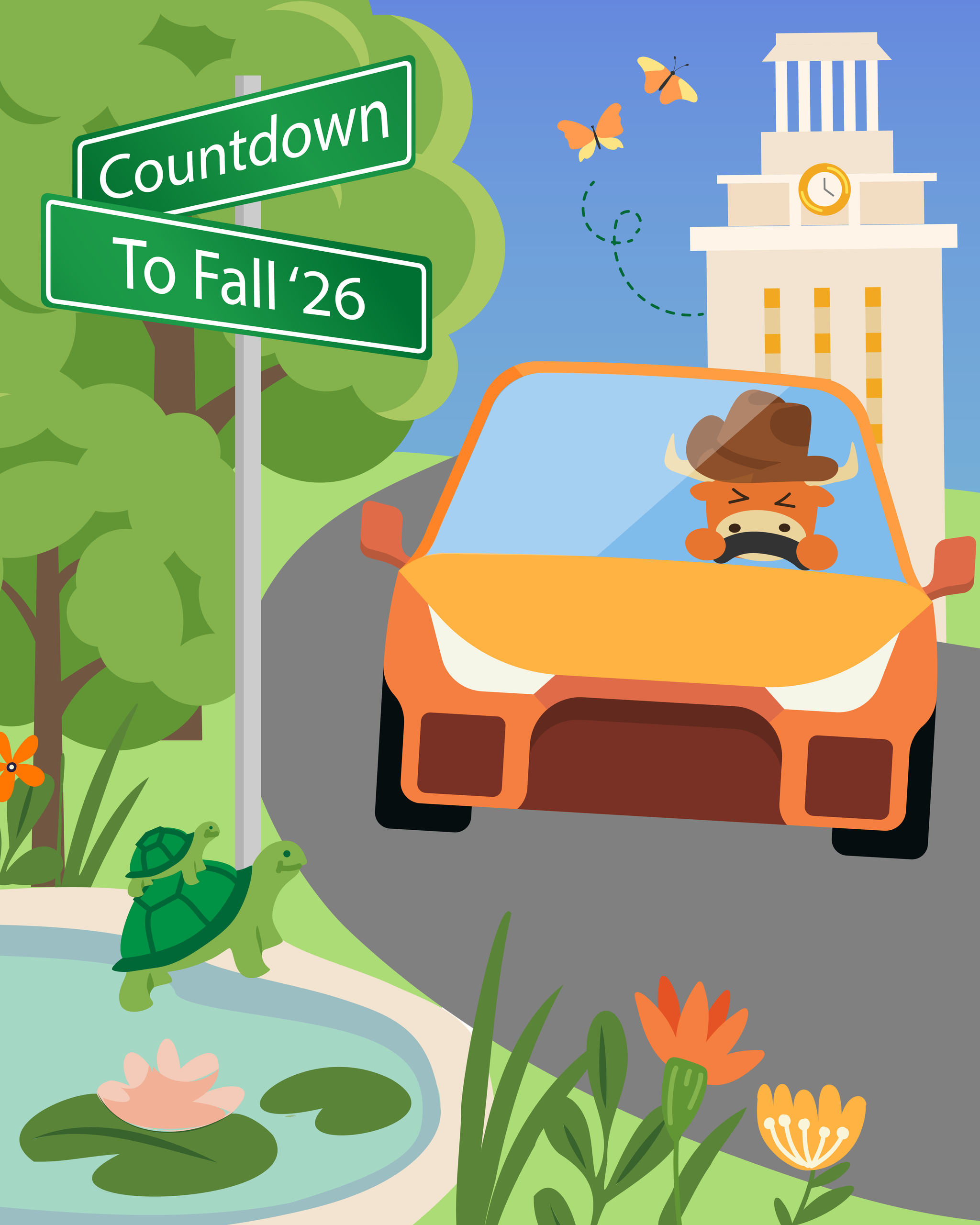
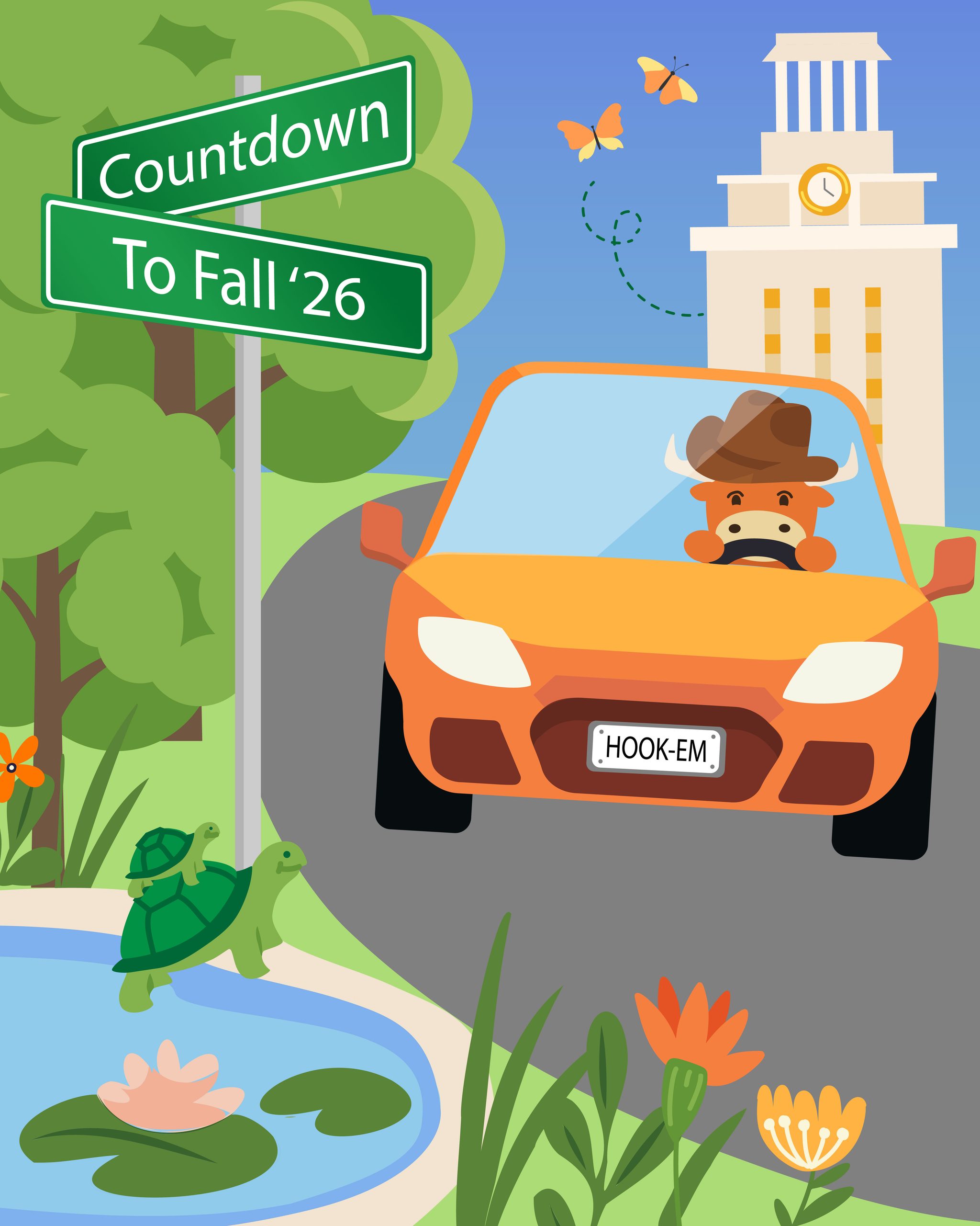
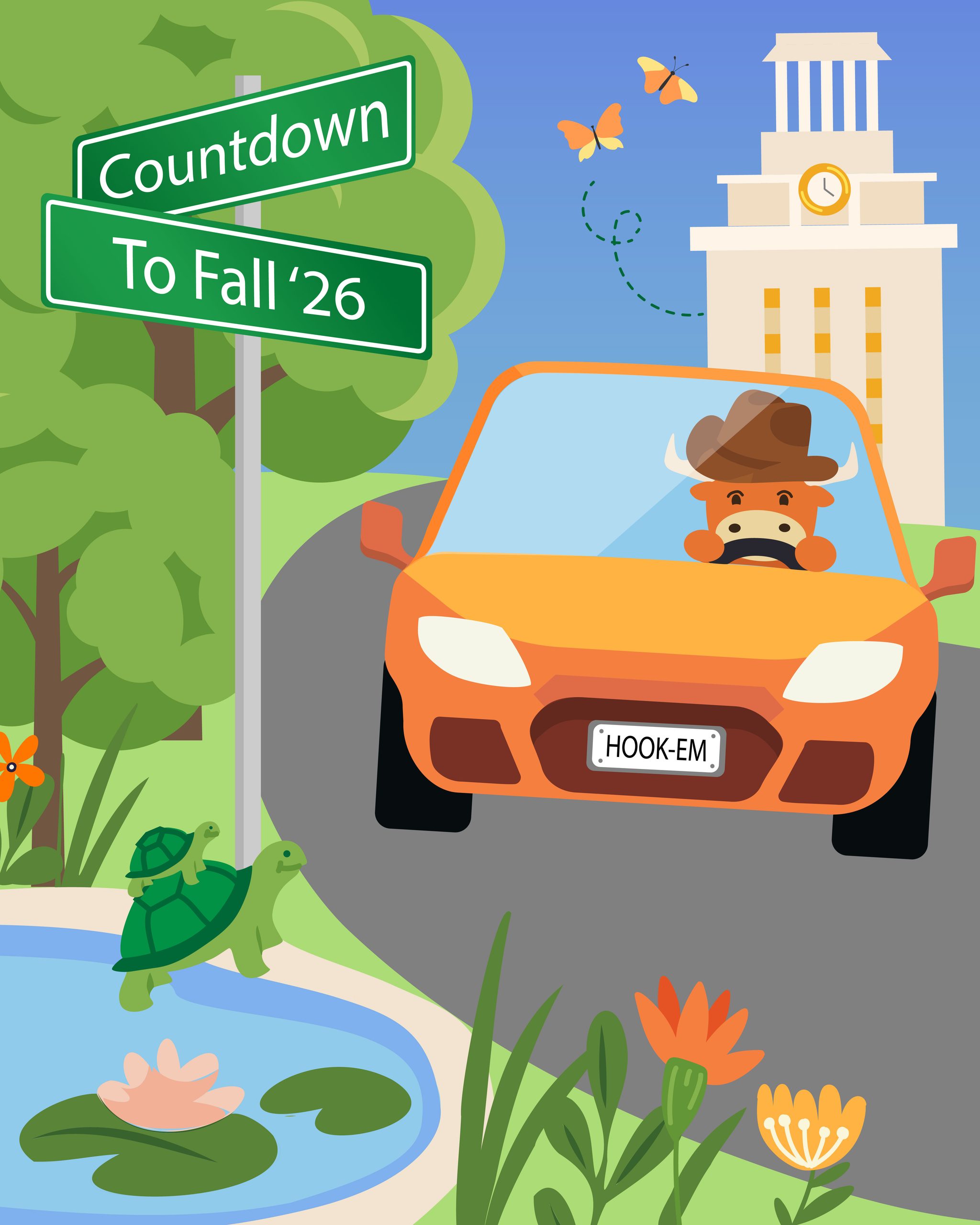
The last idea follows the original move-in theme, but from a different angle. I wanted to include the “countdown” title on a street sign, and incorporate campus nature (turtles, butterfly, trees, etc).

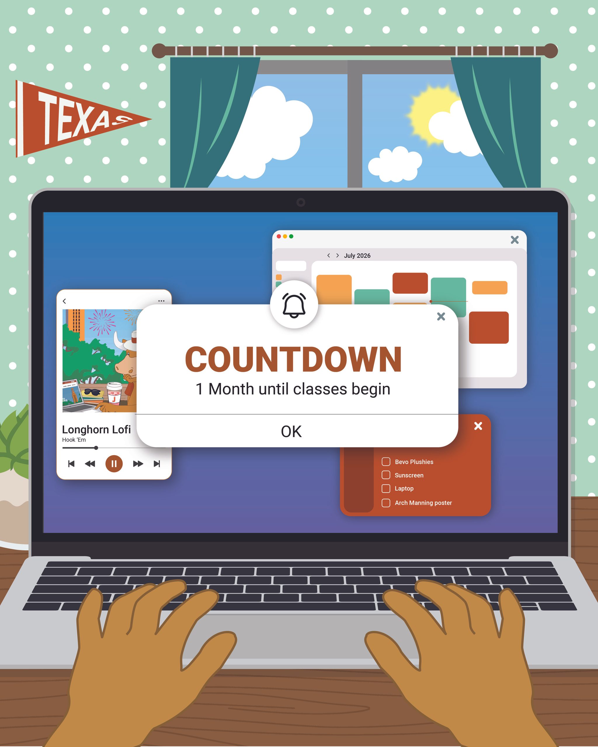
★ 1st Post: After my sketches were reviewed, I got the green light to begin working on the first social media post. Using my sketch as a reference, I created the first draft below. I also color dropped from the previous year’s posts to keep a consistent color scheme.

First Iteration
Final Post

Between these two posts, I got feedback to make a few changes to the background (making the background a solid color to reduce busyness and enhancing readability of the “Texas” flag). I also changed the main popup text to “Fall ’26″instead of “1 month until classes begin” to maintain text consistency throughout all posts

The main change I made after design review was removing Bevo’s hands. I realized after discussing with admin that it was not apparent that the human hands in the post would be Bevo’s. I originally designed human hands to emulate a humanized Bevo in a different post, but this interpretation became lost when I displayed just Bevo’s hand in the countdown post. I decided to just omit the hands entirely for clarity.

★ 2nd Post: Similarly to the first post, I referenced my original sketch to create the first draft of the next post. I wanted to include fun references to student life, like the Bevo student ID, photo strip, and cowboy boots:

First Iteration
Final Post

After the first iteration I received feedback to make the background more apparent as a bed, to add the Summer Marketing sticker to the water bottle, and to change the contrast of the water bottle. For the bed, I tried to make the blankets and bed frame more recognizable while still keeping the background of the post simplistic, allowing the items on the bed to pop.

★ 3rd Post: Finally, I created a post inspired by fun campus landmarks to welcome students on their journey returning to or discovering campus! Here was my first draft:

First Iteration
Final Post

The main feedback I received had to do with altering the car to be less “menacing” and UT themed. The main edits I made to address this were:

1) Rounding out the blocky shapes on the car

2) Adjusting the headlight shape to be less slanted, and a little more rounded. The headlights often read like eyes, so we wanted to make sure we were sending a positive message with this graphic.

3) Opening Bevo’s eyes (so he is not driving blindly)

4) Adding a license plate with a UT slogan!

★ Final Countdown Post Series:

★ Reflection: I loved working on this set of posts, and it was a great introduction to working on leading design ideation for the social media. A few takeaways were:

1) Narrative Structure: Choosing a consistent narrative for a set of graphics helps connect with the audience through storytelling. Throughout the process of making these posts, I was adding/removing things (such as Bevo’s strangely human hands), and including tidbits of Bevo’s student life (ID card, etc), to ensure the narrative of the posts aligned with the process of Bevo getting ready for school.

2) Non-human Emotional Impact: Non human items still invoke an emotional reaction. I learned this by realizing how much of an emotional message the car in the third post conveyed; even though the car is an inanimate object, I had to make sure its shape was still friendly towards the audience as it is a central focal point for the post.

Filed Under: Fall 2026 – Spring 2027, We are STAs

Demo and faculty onboarding resources

October 28, 2026 By Asha Rountree

Demo and faculty onboarding resources


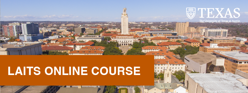
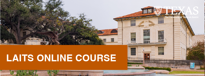
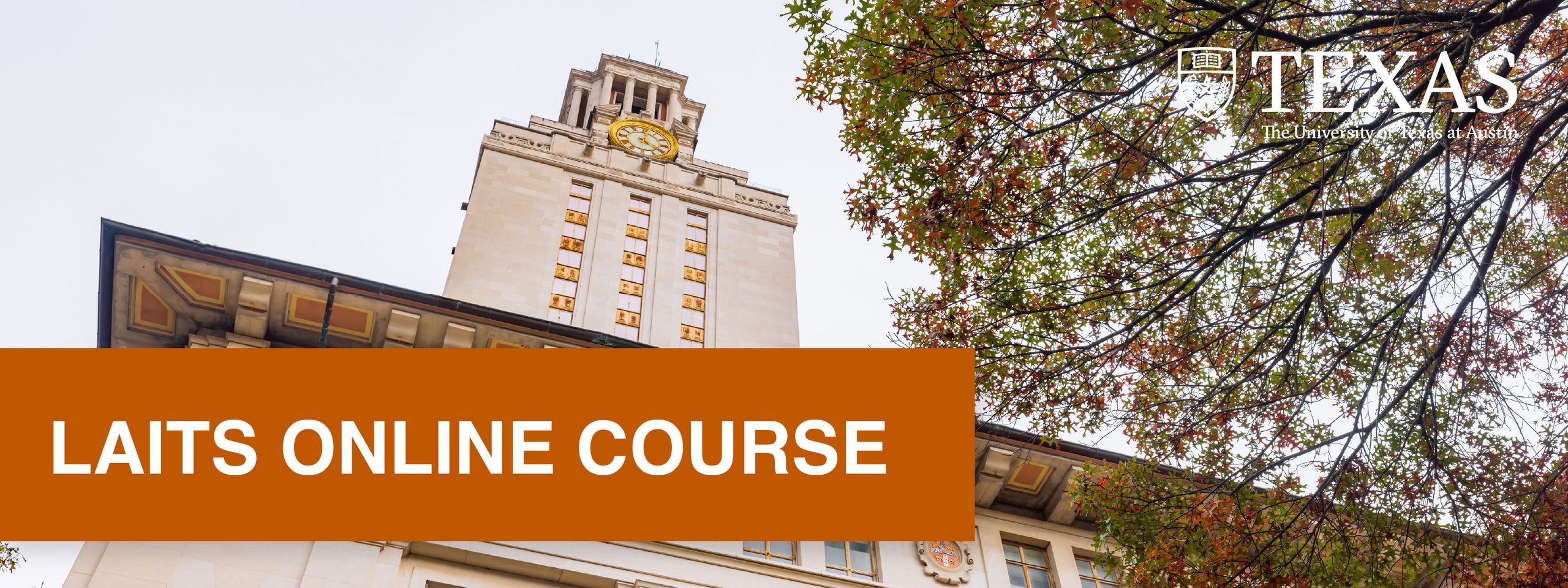
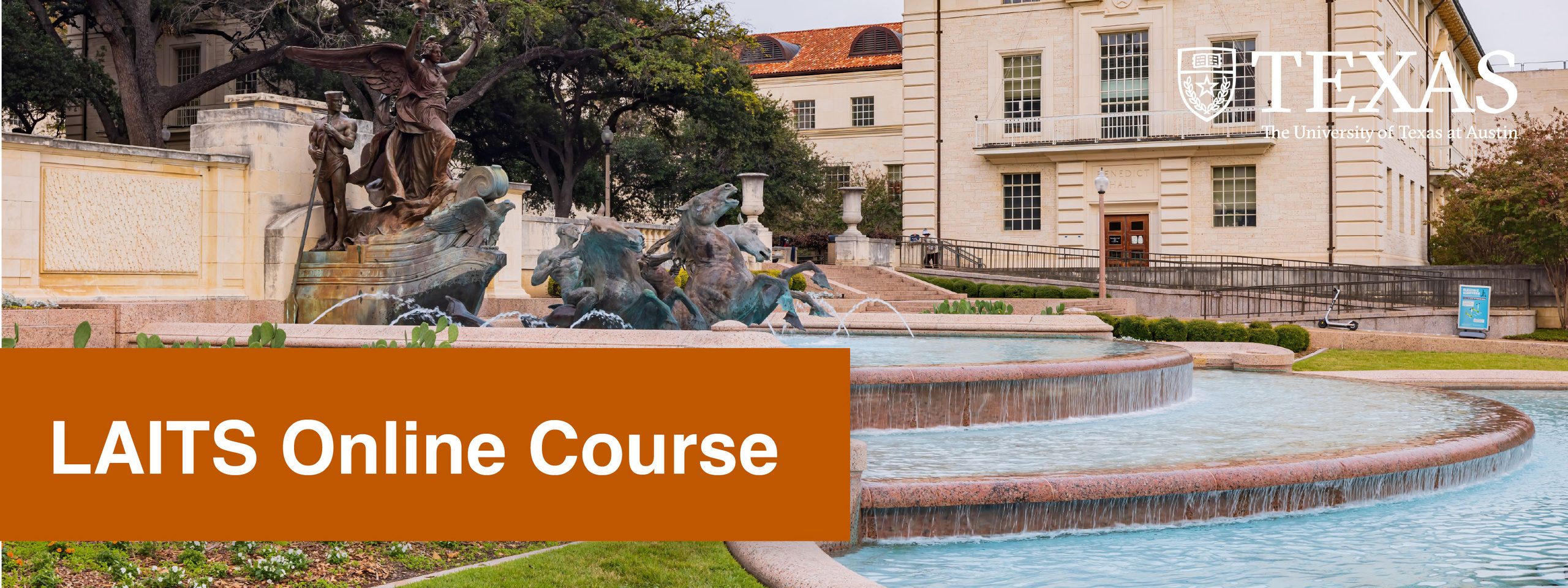
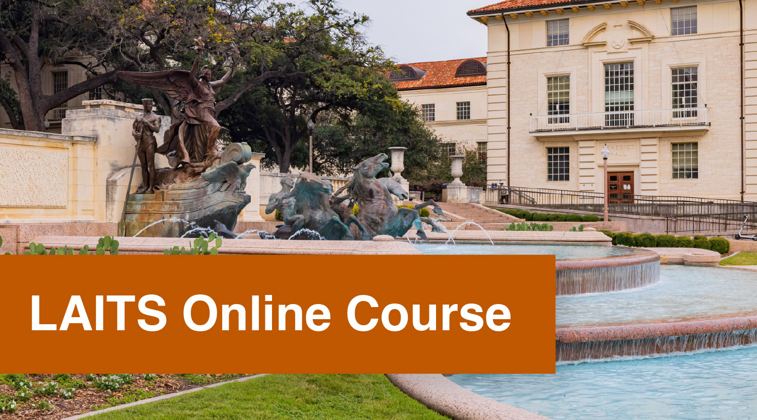
★ Overview: I was tasked with creating course graphics for a LAITS online demo course used for kick-off meetings. The main guideline was to emphasize UT imagery in these graphics

I began by collecting images of UT-related imagery, and created Canvas Homepage mockups for each photo to compare them side-by-side.

LAITS admin ended up liking the idea of including the fountain (the middle option) the most because it felt representative of the location LAITS is on campus (Mezes hall is right next to the fountain). I received some advice to move the photo up slightly to better display the fountain. Taking this into account, I then created the Canvas home page and dashboard banners and matching buttons:

★ Final Design: 

★ Reflection: These graphics were pretty straightforward, but they reminded me that course graphic images should make the people who are using the course feel represented. In this case, that involved choosing photographs that align not only with UT imagery, but with the people working at LAITS.  

Filed Under: Fall 2026 – Spring 2027, We are STAs

October Projects Cont.

October 23, 2026 By Kodi Khiraoui

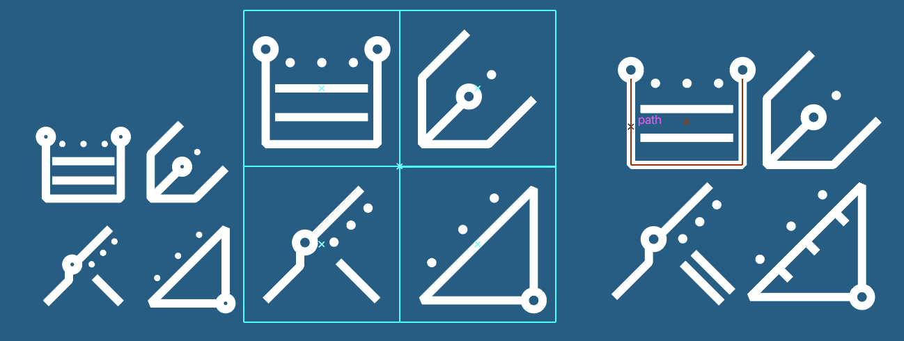
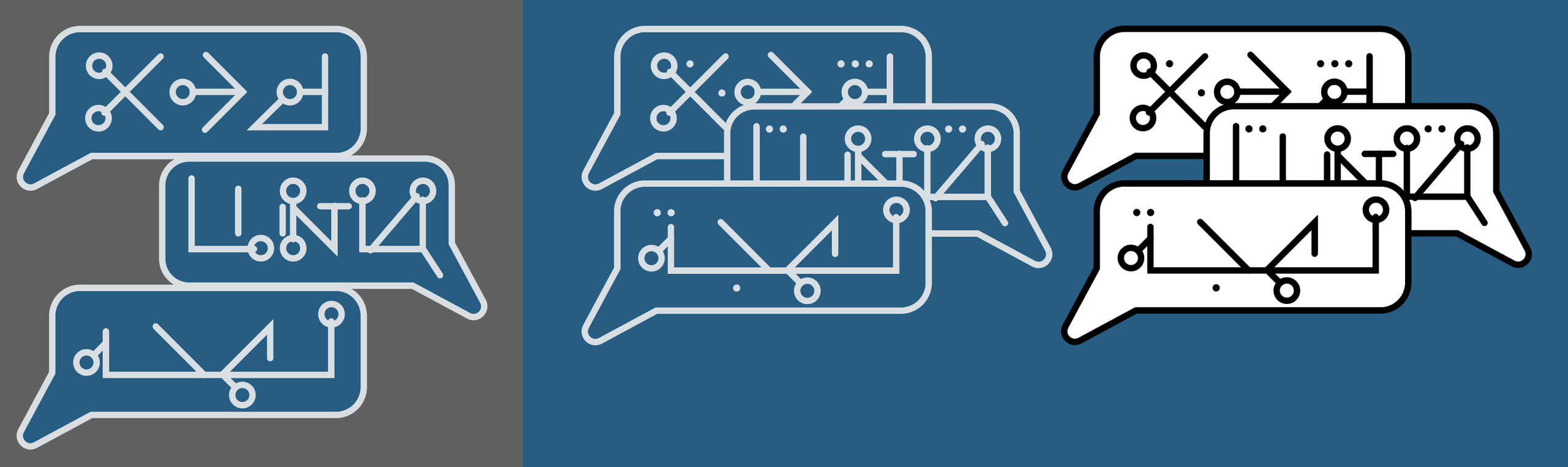
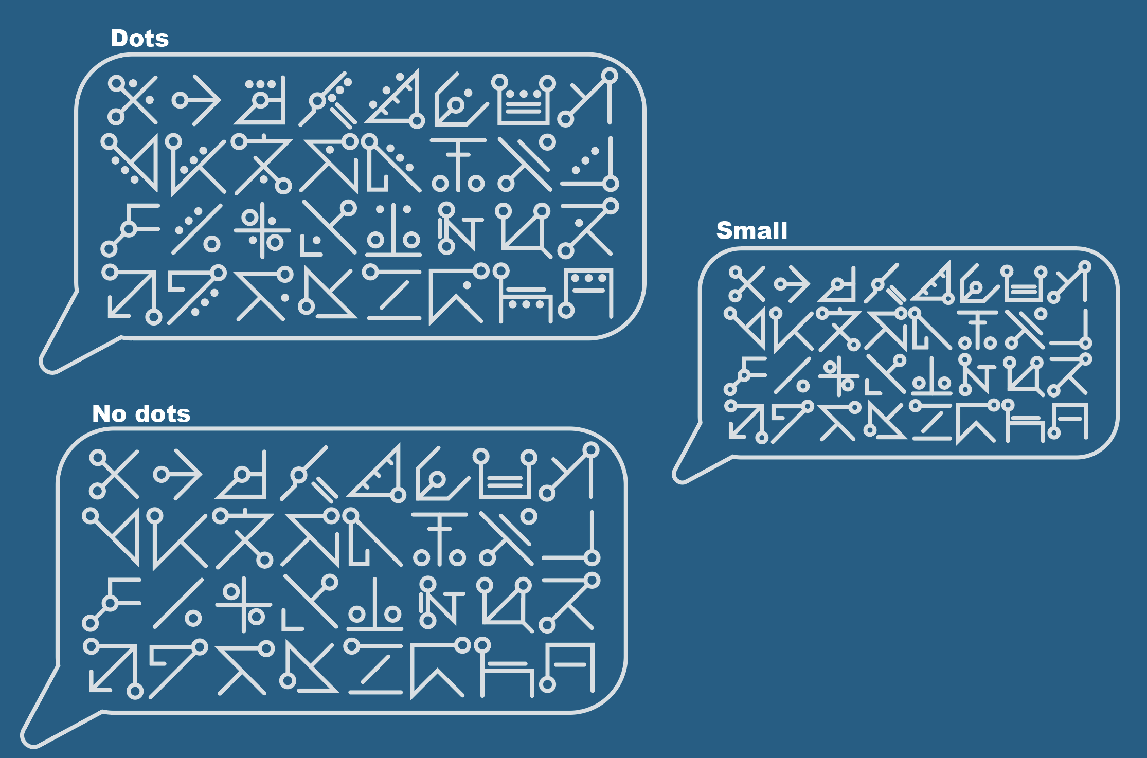
This and last week, I continued designing the logo and course graphics for the spring class Agentic Software Engineering. We’re coming up on the deadline, so I’ve been working on finishing up finalizing the design. I’ve been working on developing several different designs to give the client as many options as possible. Right now, we’re still decided which logo to move forward with, but we should have it finalized by today or Monday.


Initial Concepts

Final concepts

Course Graphics Concepts


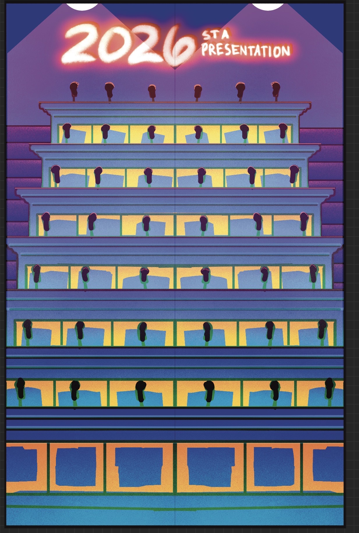
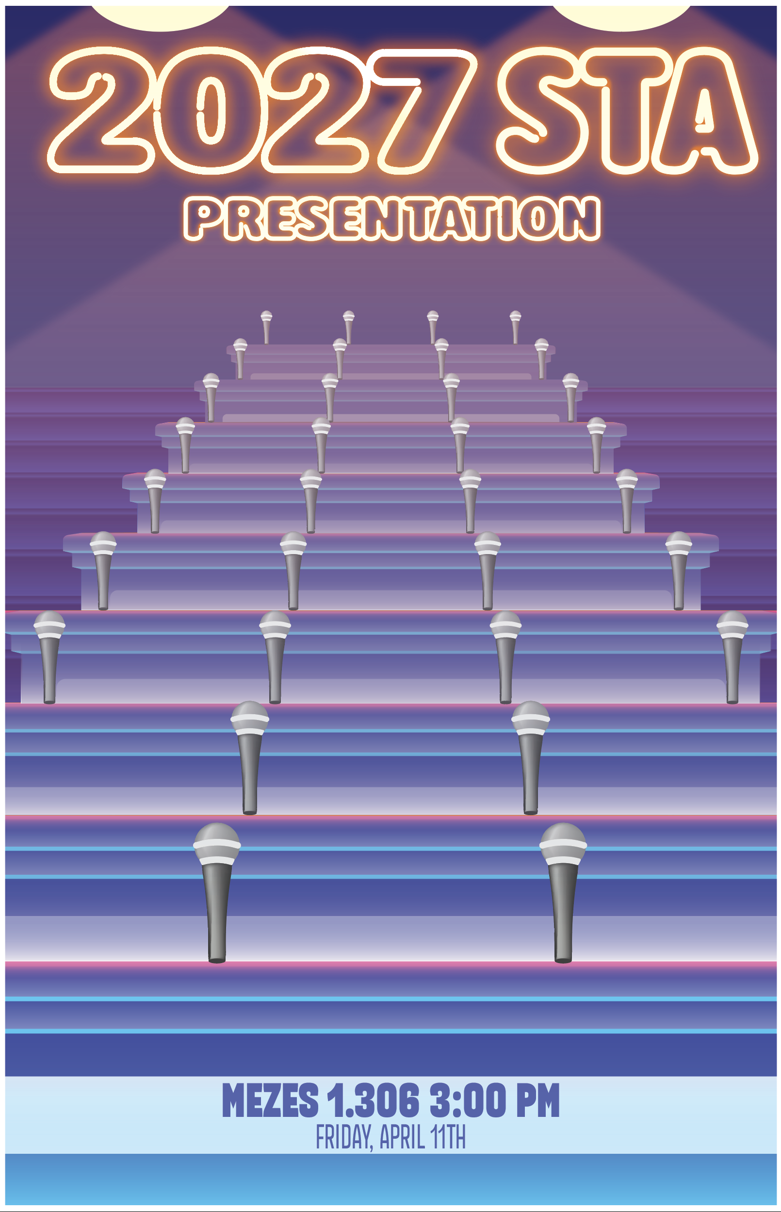
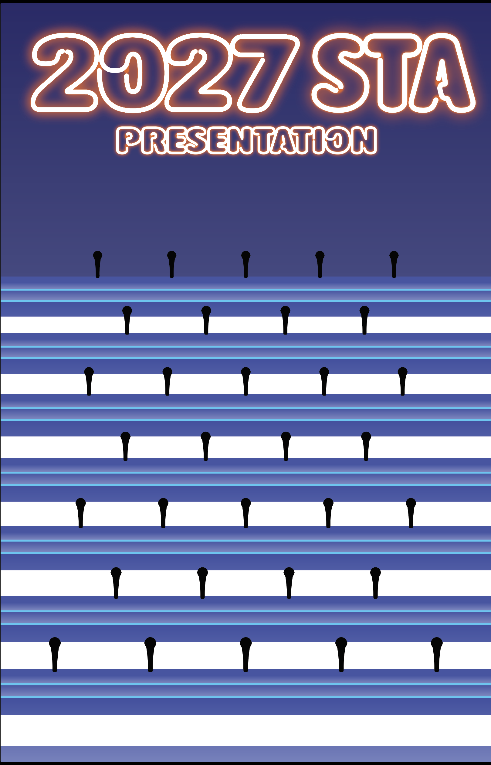
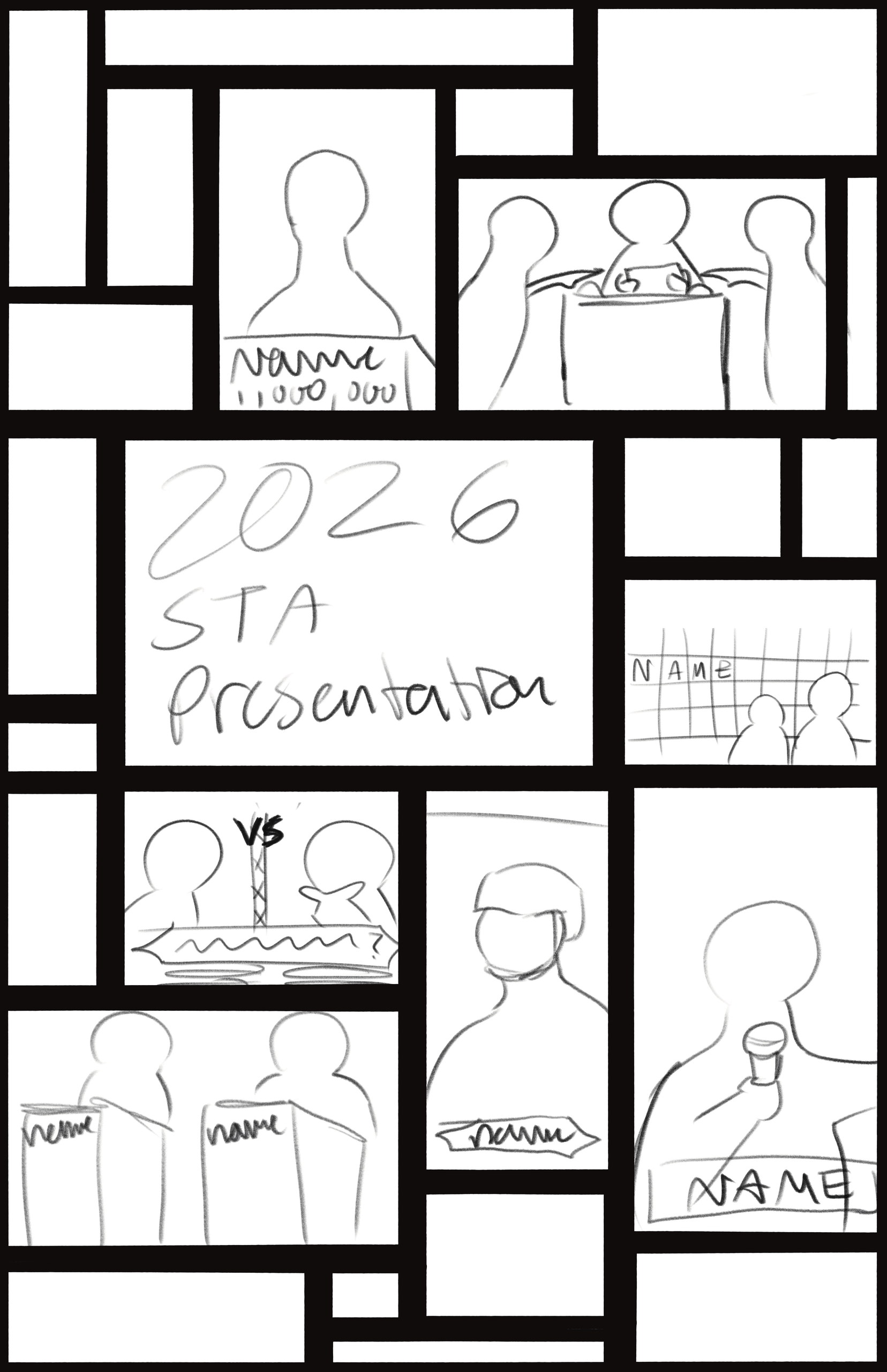
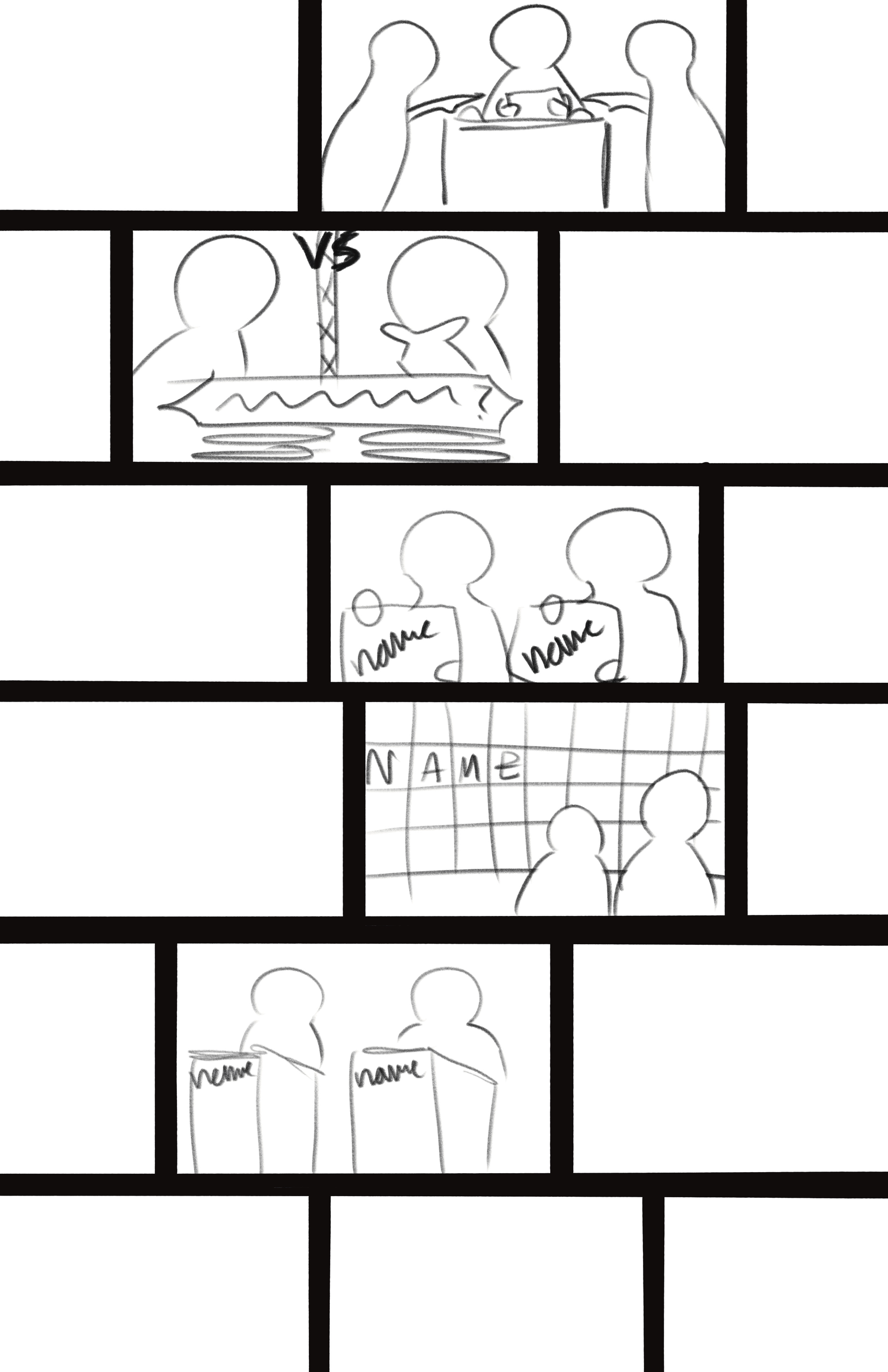
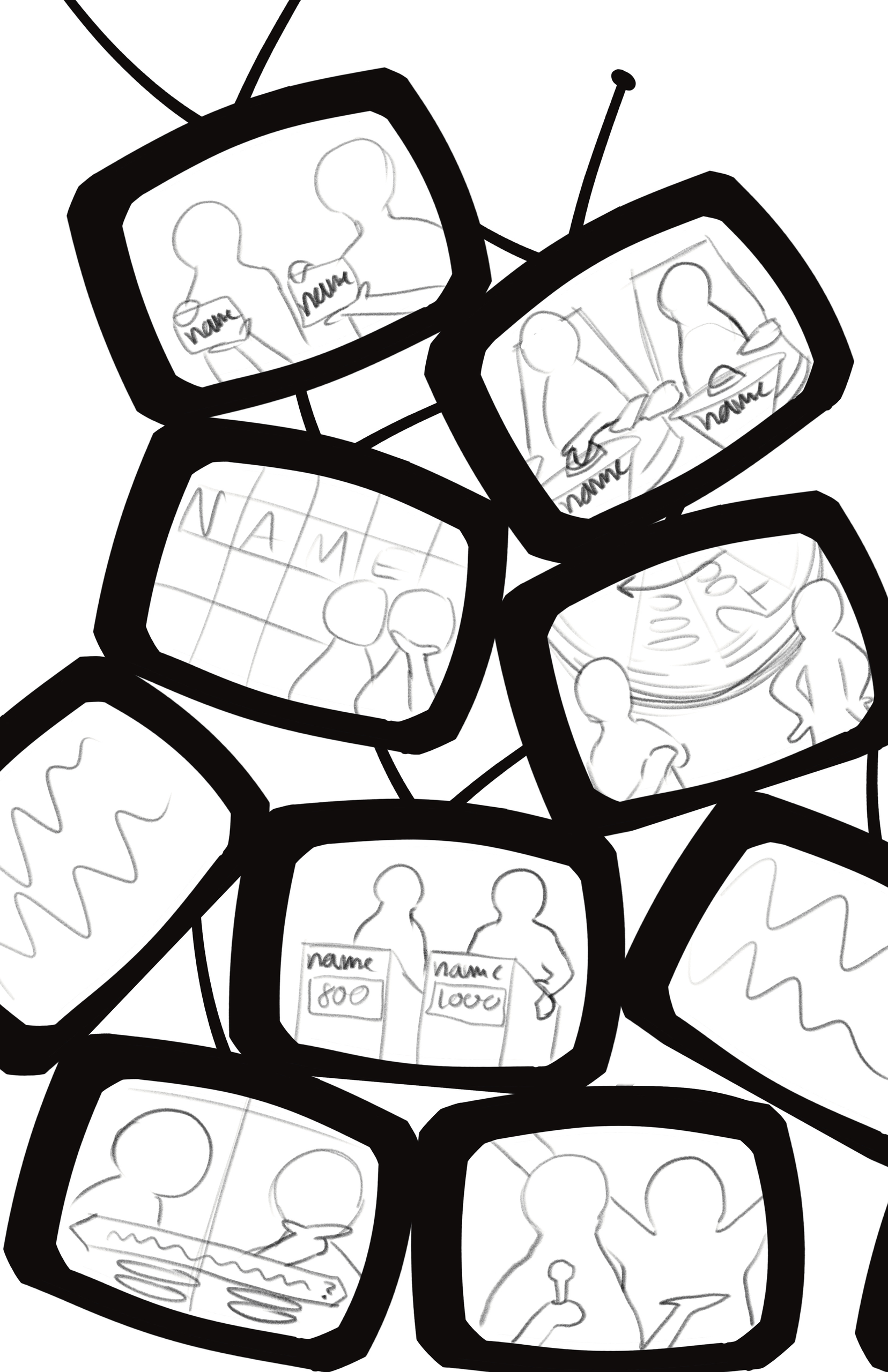
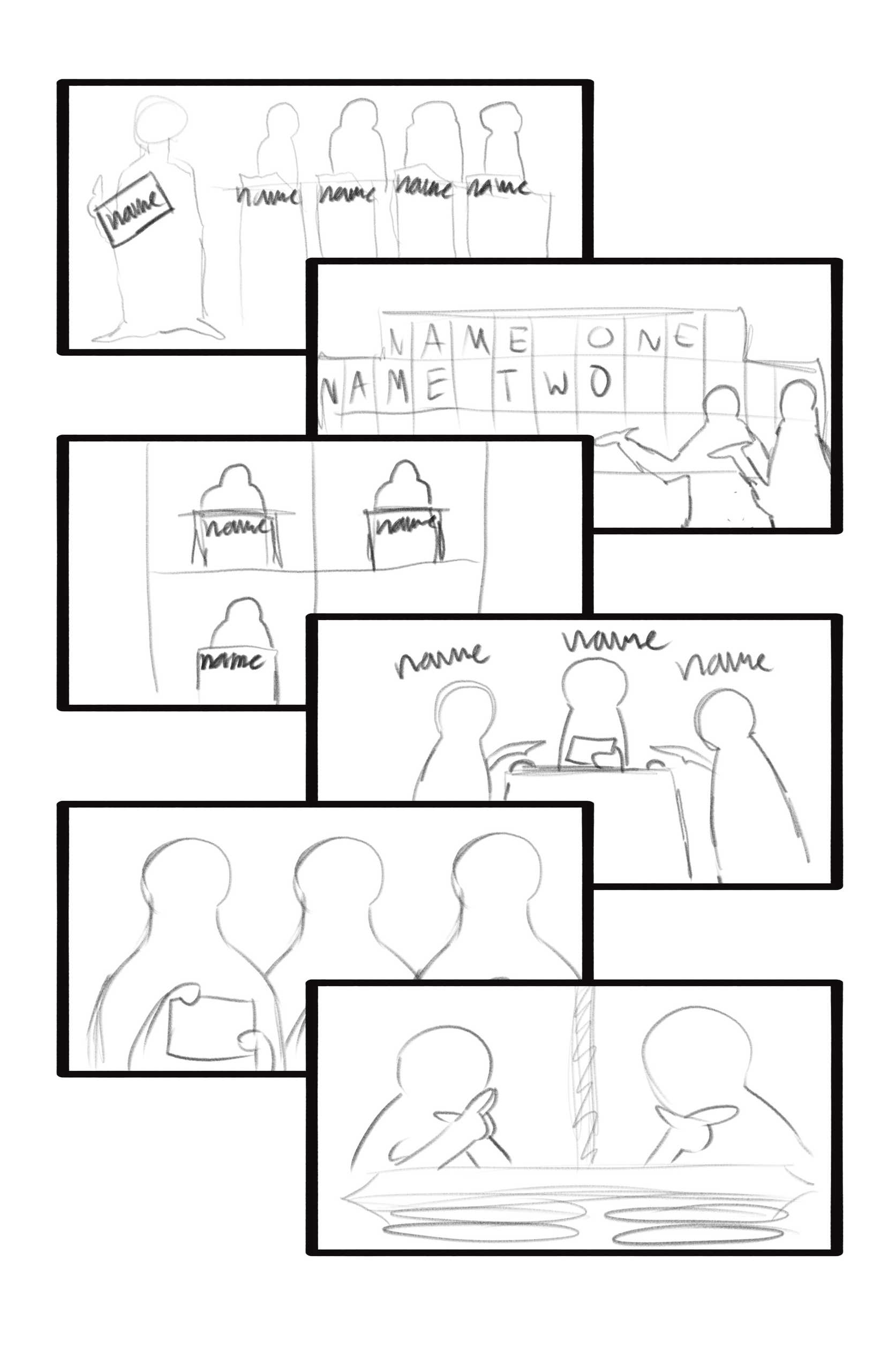
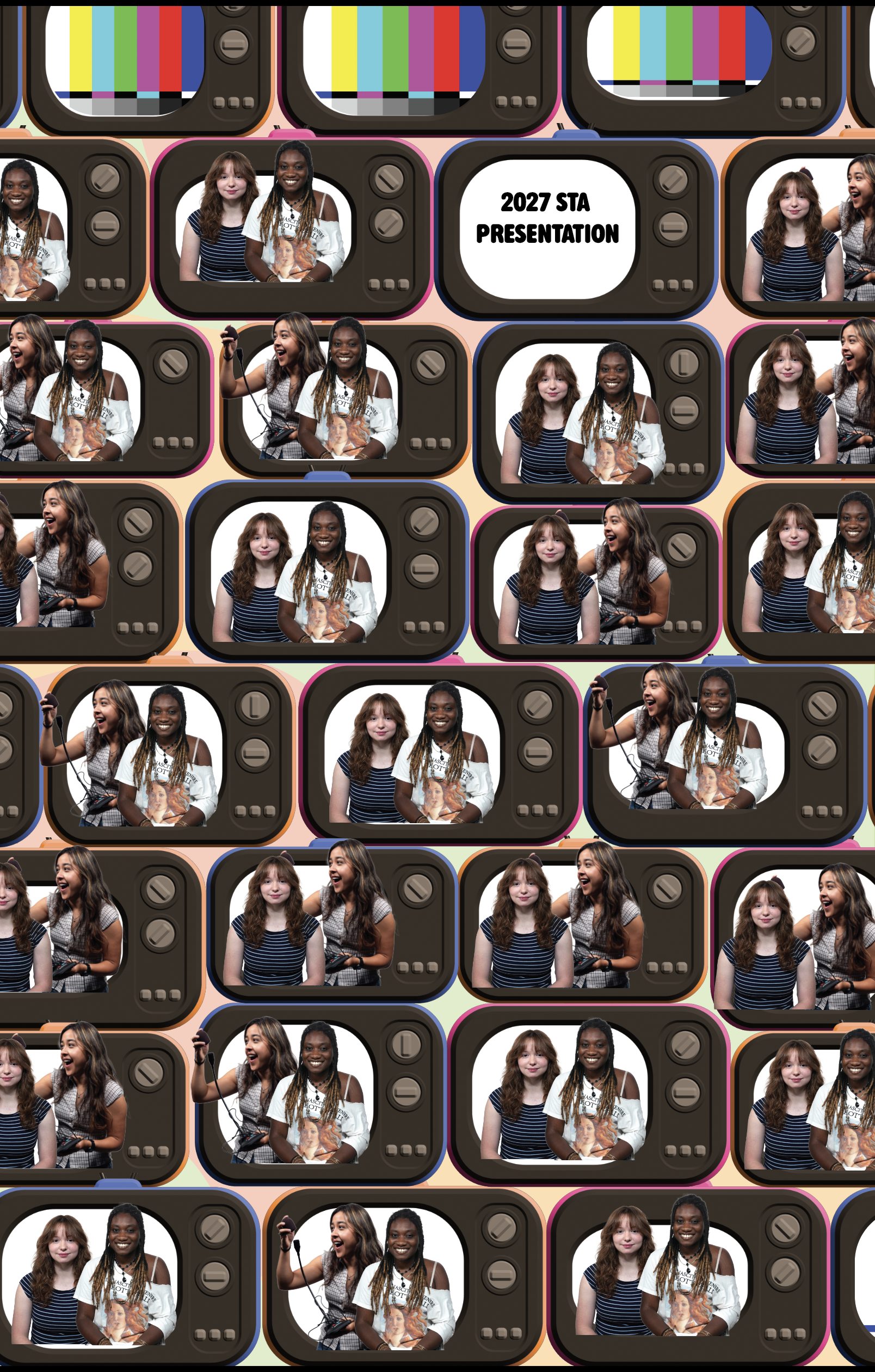
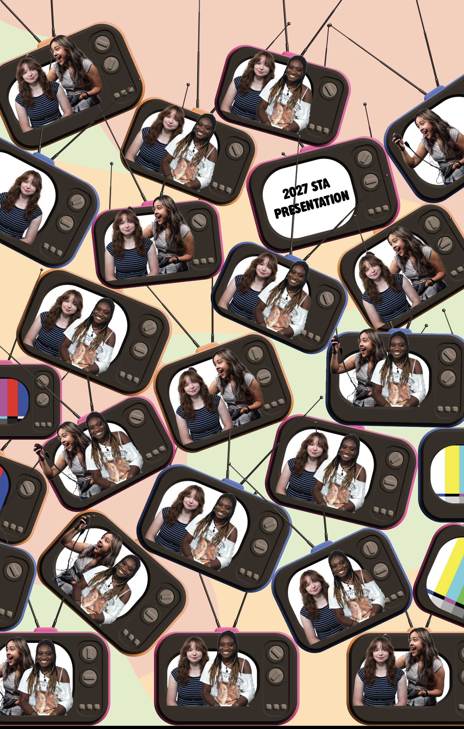
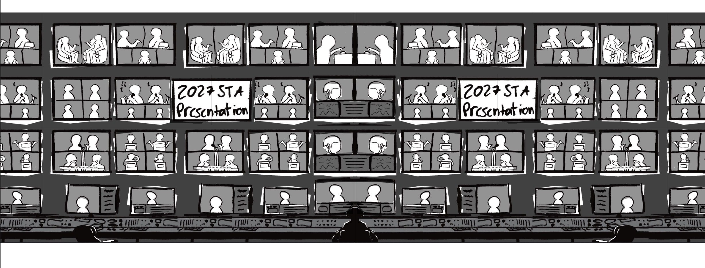
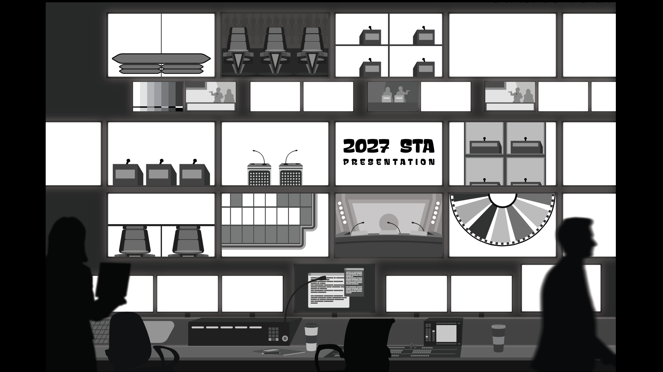
While I waited on feedback from these course graphics, I’d work on designing the 2027 STA presentation poster. We scrapped the original design since we felt it was too similar to a previous design and switched to another idea. I was tasked to portray an environment that was like a “behind-the-scenes” area (or technical room) for game shows, with the shows playing on the screens with our STA’s inside them. After confirmation of the concept, I began working inside illustrator to design all of the assets and designs I will need when I begin inserting the cut-out photos.


Original design. From left to right; Concept, initial Illustrator implementation, edited from constructive feedback

Design version 2. From left to right; 4 versions of concept sketches, 2 versions of Illustrator implementation

Design version 3 (current version), concept sketch

Illustrator implementation, work in progress


I’m glad to be working on these projects and gaining the experience from them. I’ve been enjoying learning many new artistic skills and being able to express my creativity. I look forward to continue working on these and future projects.

Filed Under: Fall 2026 – Spring 2027

UX Training

October 23, 2026 By Julie Brandt

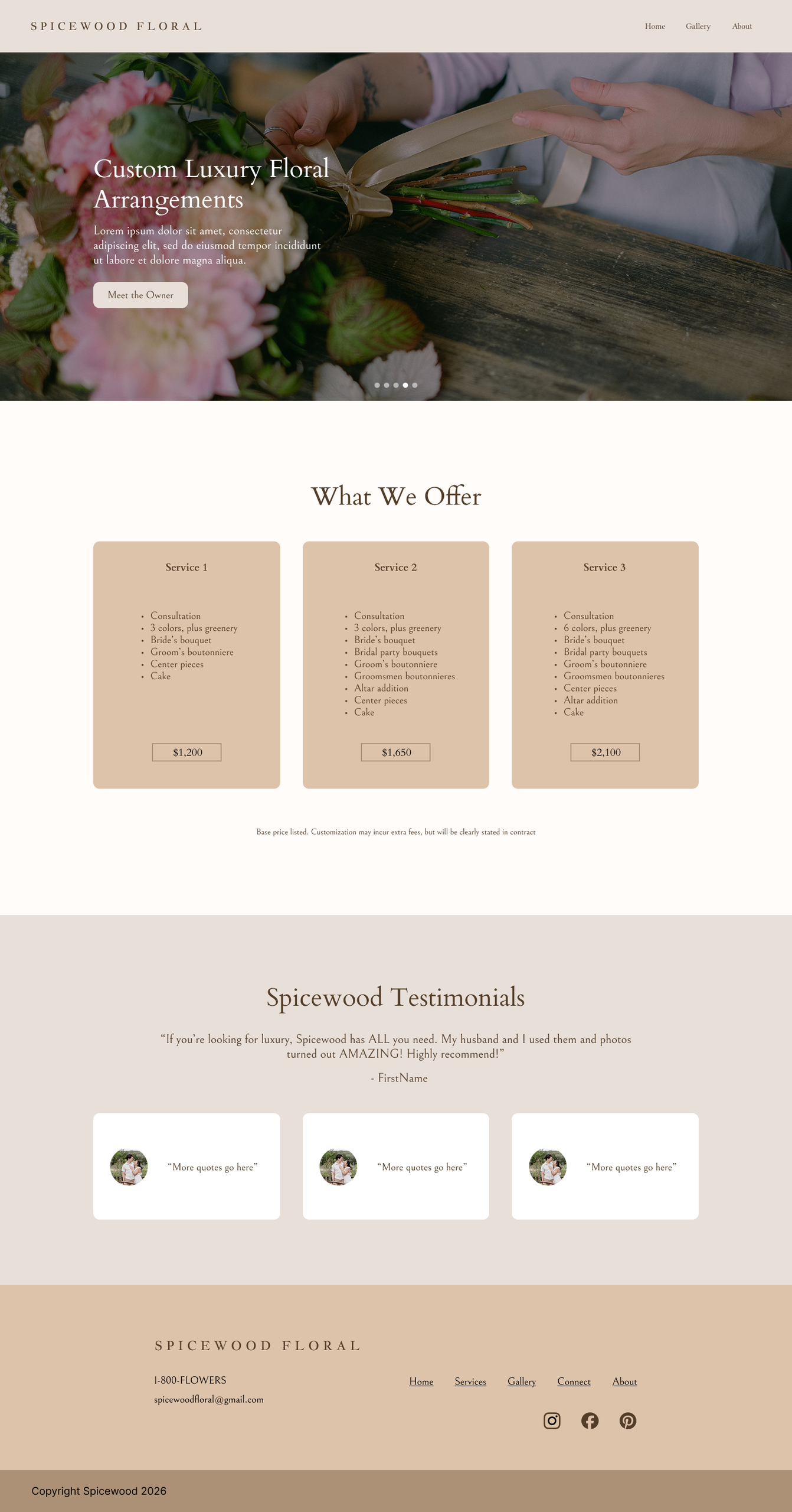
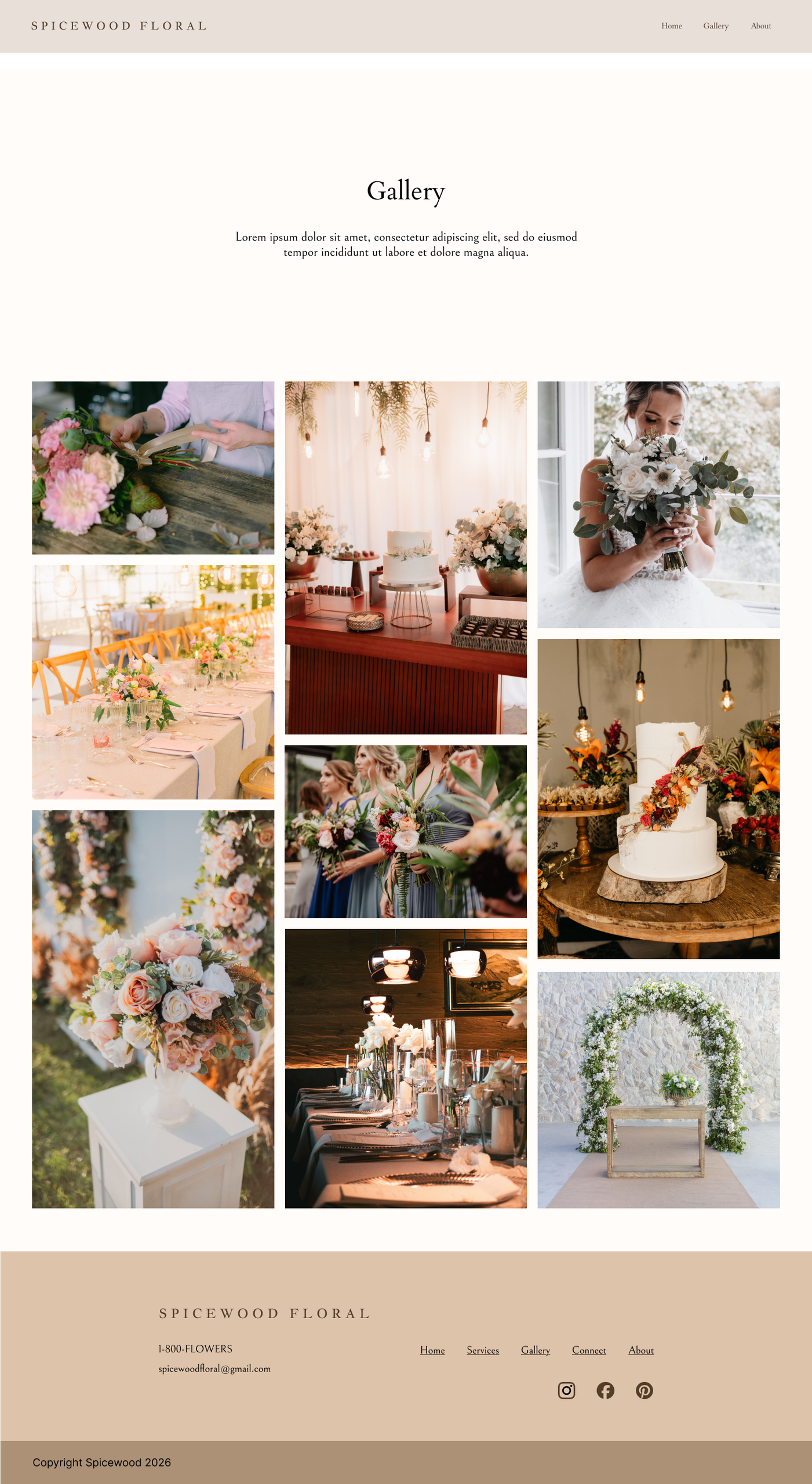
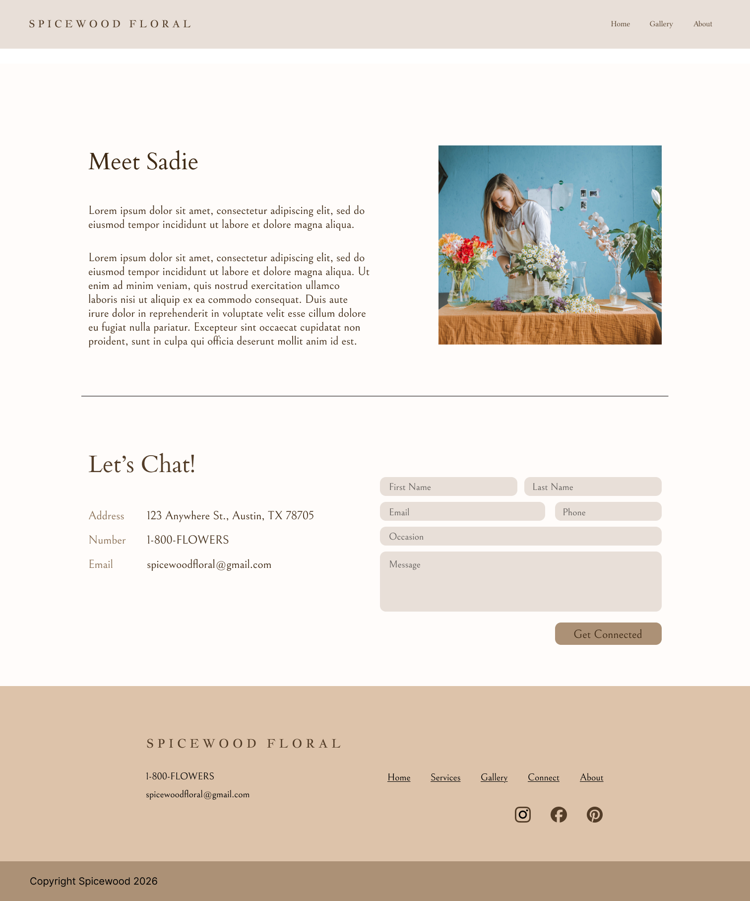
Spicewood Floral

Task: Create a website for Spicewood Floral while maintaining accessible web standards

Status: Complete


Accessibility Research

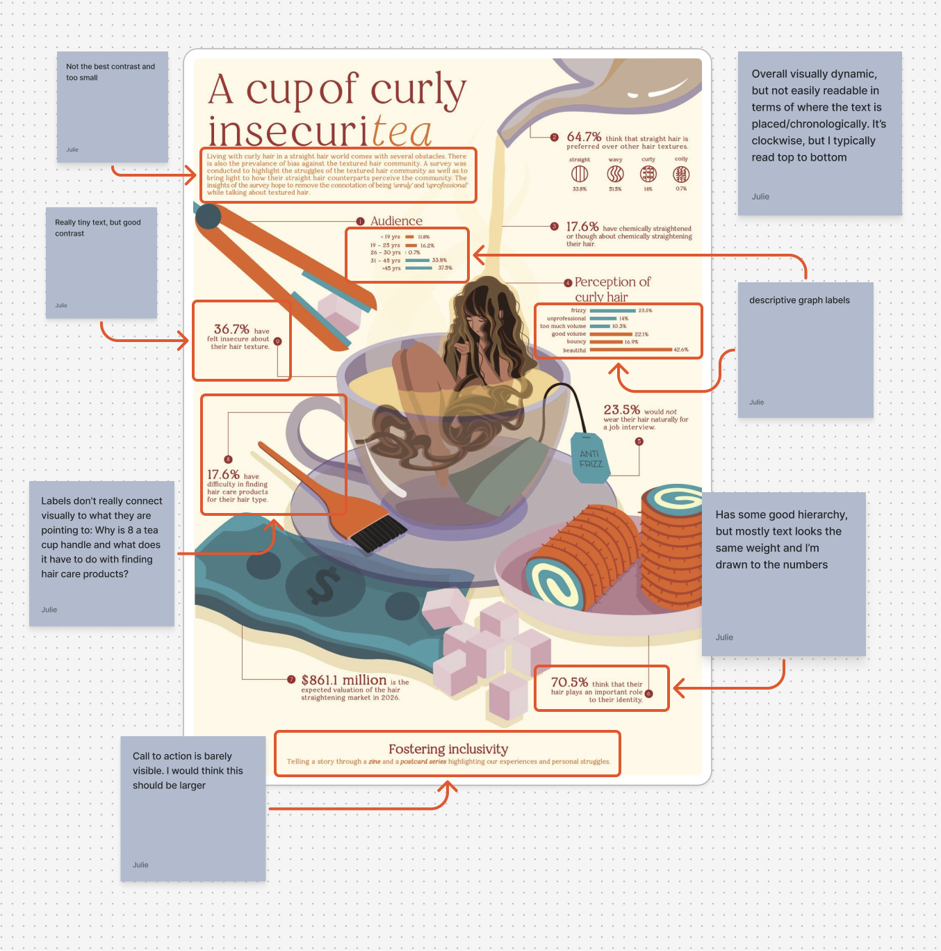
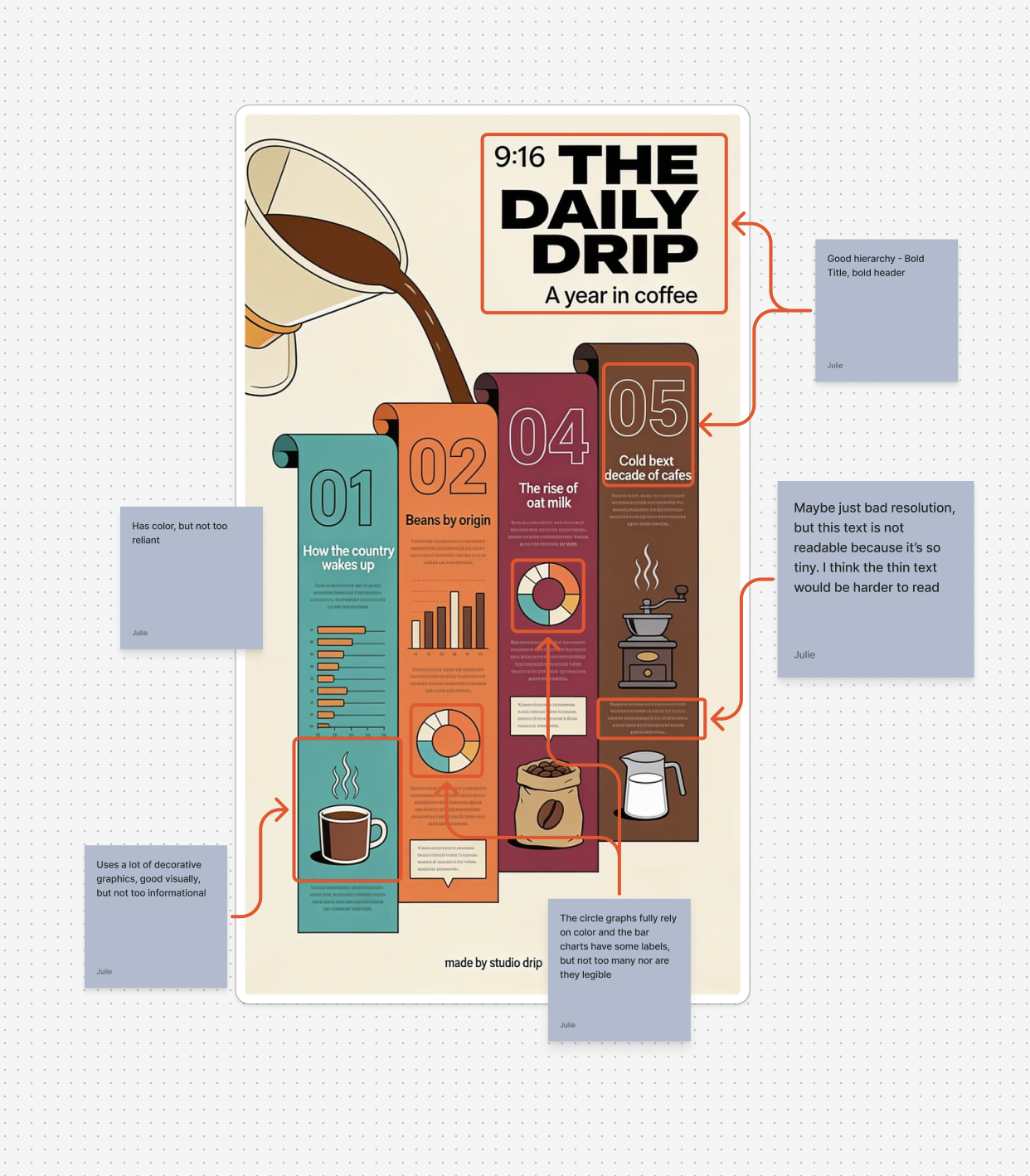
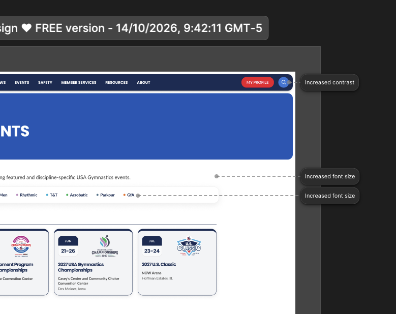
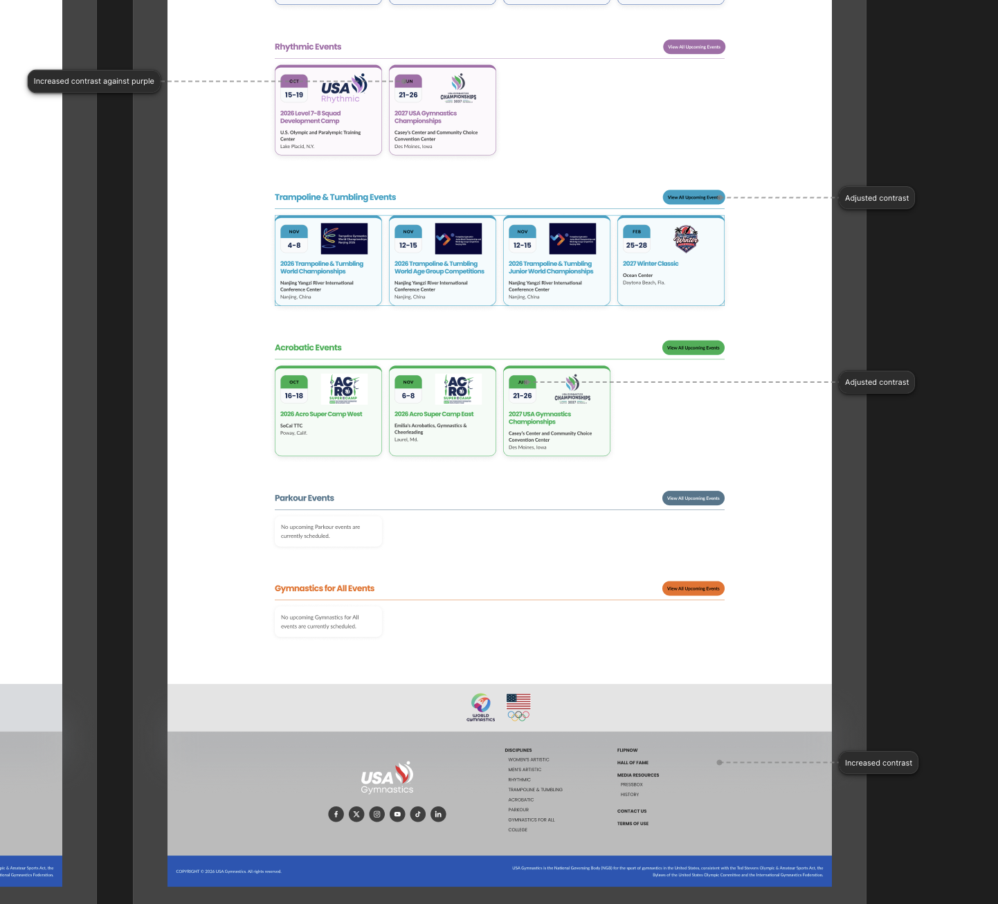
In order to make my website accessible, I started by completing the KB WCAG Training. For that training, I did an analysis on two posters then imported a website into Figma and made adjustments so it complied with WCAG. The website I found was the USA Gymnastic site and it wasn’t too out of compliance. There were a few areas that needed contrast improvements and alt text, but other than that it was pretty good in terms of accessibility.


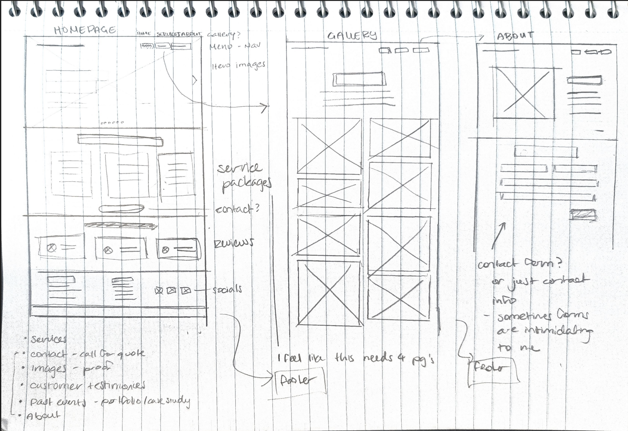
Sketches

Before jumping into Figma, I created some wireframed of the floral website. I tried to keep the “client’s” desire to connect with potential buyers when designing the website’s flow.


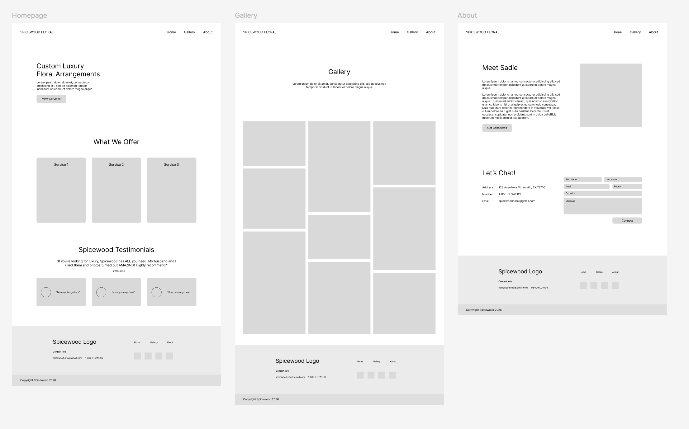
Lo-fi on Figma

Once me sketches were approved, I created the basic layout structure on Figma.


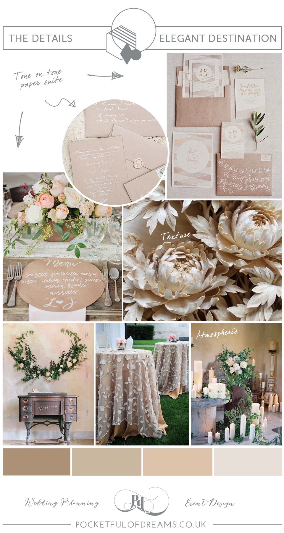
Polishing the Site

Using the brand guide that Lila provided, I began adding colors and fonts to make this website realistic.


Reflection

This training was fun and reminded me that I enjoy working in Figma sometimes. I had to really think about the user’s flow and expectations when designing each page. Since I have done some floral shopping, I tried to put myself in their shoes and provide the information they might seek clearly and upfront.

Filed Under: Fall 2026 – Spring 2027, We are STAs

Edits to Course Graphics

October 22, 2026 By Asha Rountree

Edits to Pre-Existing Course Graphics


★ Overview: Over the summer, I was tasked with updating existing course graphics to reflect the current professors and programs. This set of edits was pretty straightforward – I simply changed the text on existing course graphics.

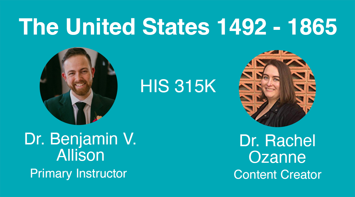
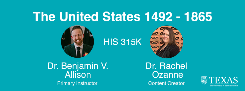
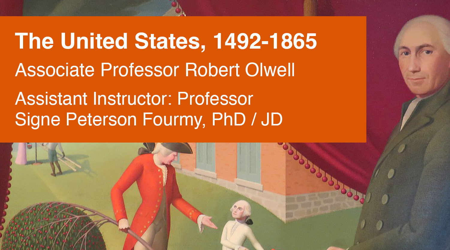
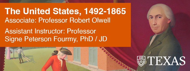
Overall, I completed edits to 10 different courses. The updated versions (most of them solely with updated professor names) are listed below. For each edit, I updated the Canvas dashboard (left) and Canvas home page banner (right) graphics:

★ Reflection: Although this was a very simple assignment, it’s important to realize that sometimes basic, seemingly mundane updates are what keep the wheel turning for all of UT Liberal Arts courses to be properly displayed in a timely manner on Canvas. I’m glad to have helped keep everything up to date.

Filed Under: Fall 2026 – Spring 2027, We are STAs

  • « Previous Page
  • 1
  • 2
  • 3
  • 4
  • 5
  • 6
  • …
  • 8
  • Next Page »

Copyright © 2026 · Cola Theme On Genesis Framework · WordPress · Log in