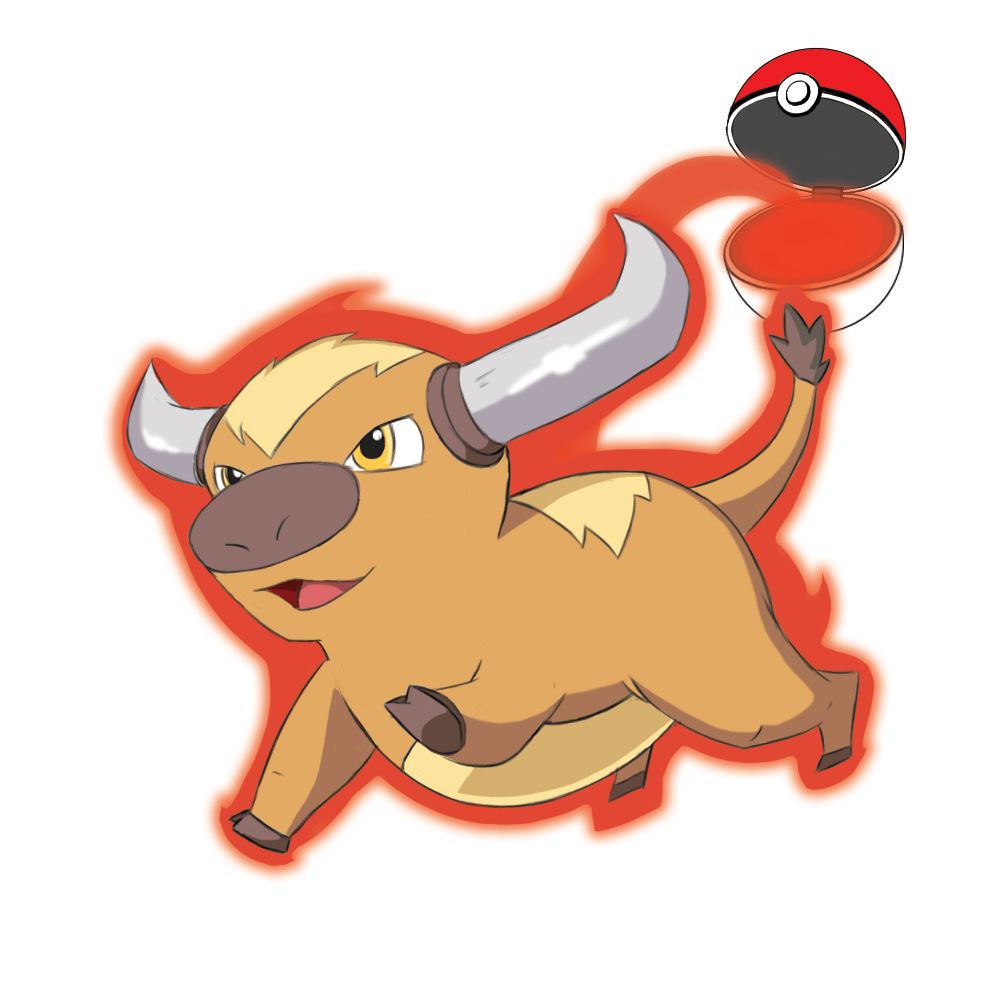
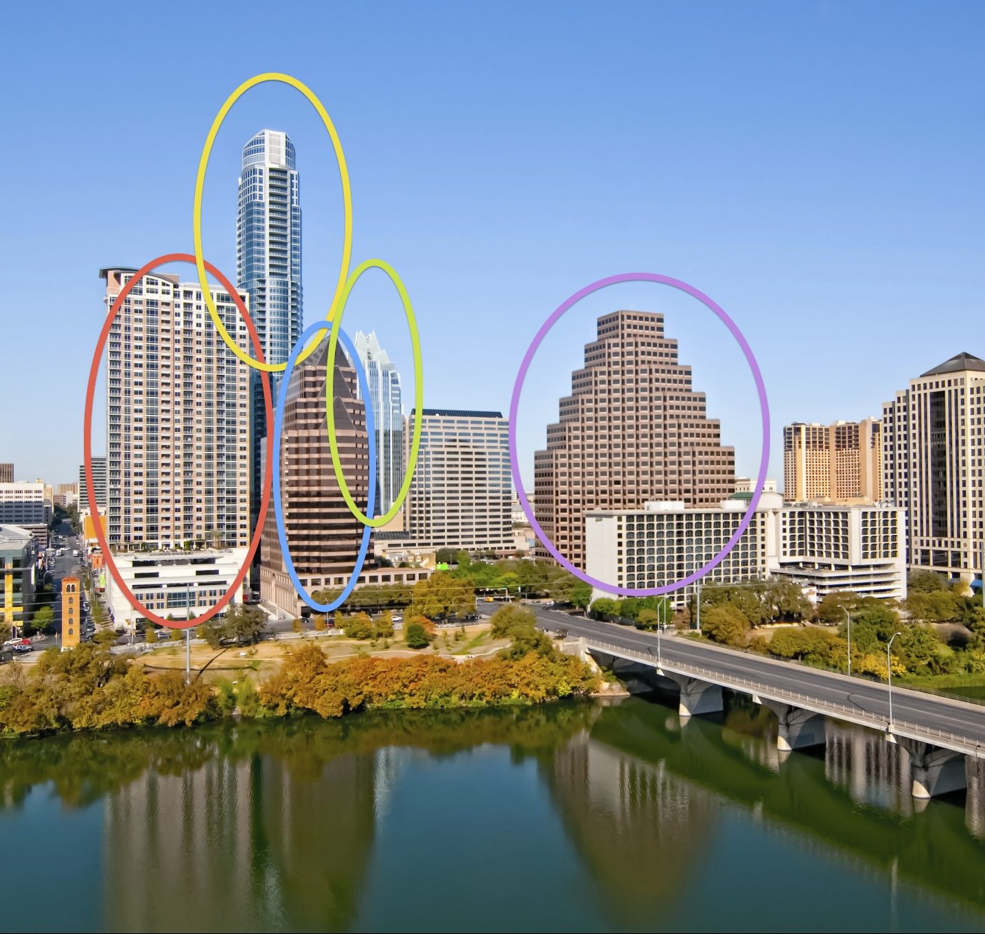
Request: Create a Pokemon inspired illustration that would appear in the magazine that features an interview with the UT alumni who is CEO for the company responsible for the Pokemon App. Create a pikachu-looking creature that is actually a “pokemon-bevo”.
Requested by: Allen Quigley
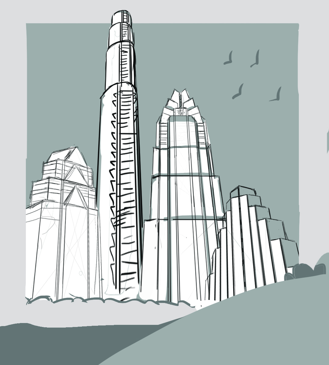
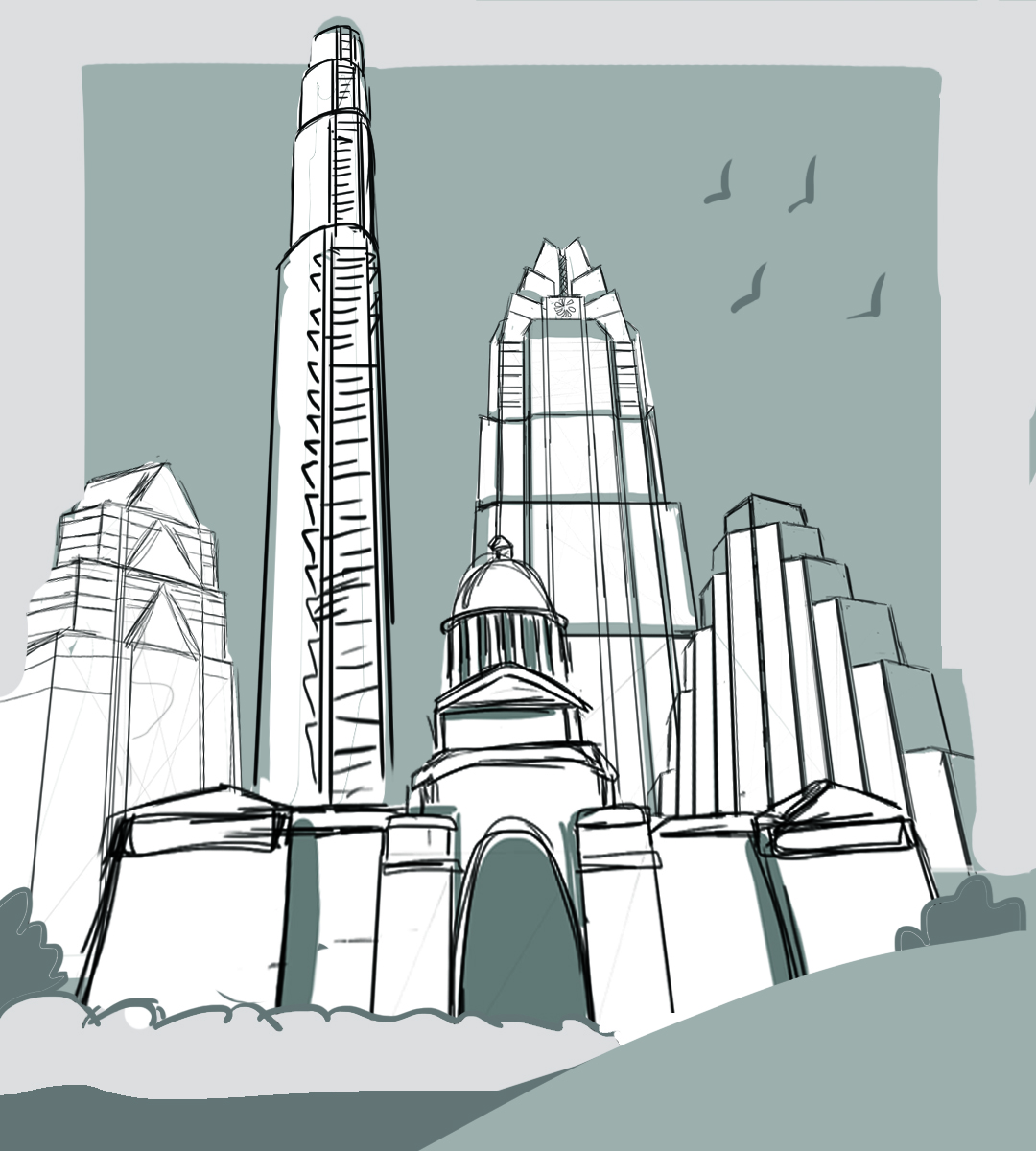
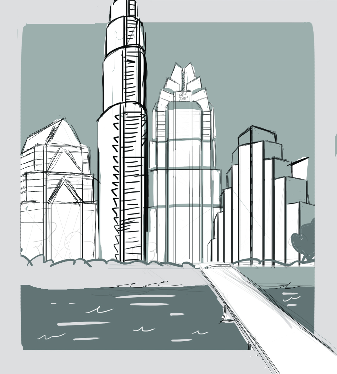
Originally in the email I was sent the request was to make a pikachu looking creature with horns and a snout. Since he mentioned pikachu rather than just saying a bull pokemon I interpreted that he was looking for a cute looking pokemon. So this was the design I decided to use. I colorpicked pokemon from the show for the colors.