• We are STAs
    • Asha Rountree
    • Haley Ma
    • Isabella Melendez Gonzalez
    • Julie Brandt
    • Kate Shih
    • Kyra Lee
    • Nicholas Peasley
    • Sasha Kenney
    • Shanda Horm
    • Shriya Atreya
    • Tomas Marulanda-Mesa
    • Trisha Darure
  • We were STAs
  • STA Presentation
    • STA Presentation 2017
    • STA Presentation 2016
  • Testimonials
  • Resources
  • Home

STA Blog

Shriya Atreya

Shriya Atreya

Shriya AtreyaSTA

Summer in the City

August 27, 2024 By Shriya Atreya

Summer In The City

My Corporate Era

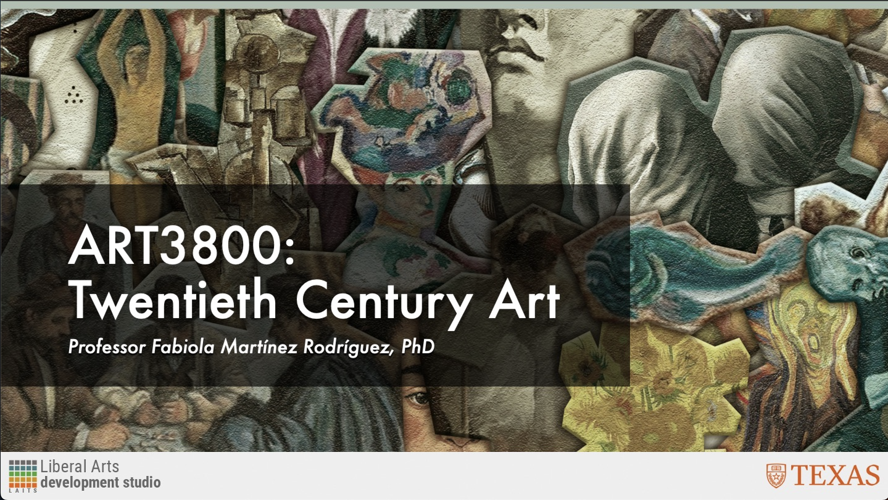
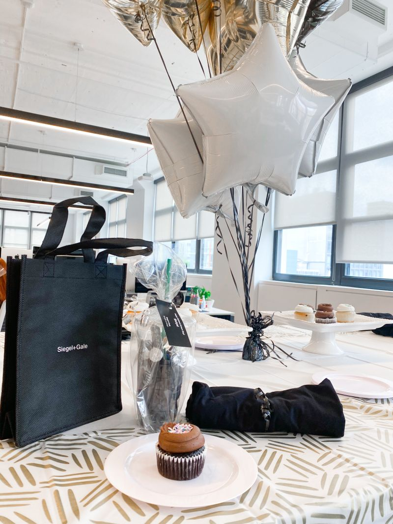
This summer, I had the incredible opportunity to intern at Siegel + Gale’s New York City office as an Experience Intern. It was an extraordinary experience to work in such a big city at one of the top branding agencies in the country. Additionally, the chance to explore my passion for user experience and user interface design in a real work setting was truly invaluable. This experience allowed me to find how much I did actually enjoy UX/UI and how badly I want to keep working hard so post-grad I can return to NYC with a job in this field.

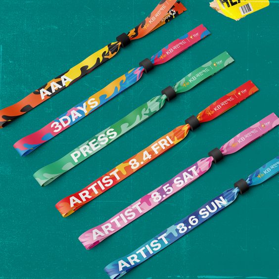
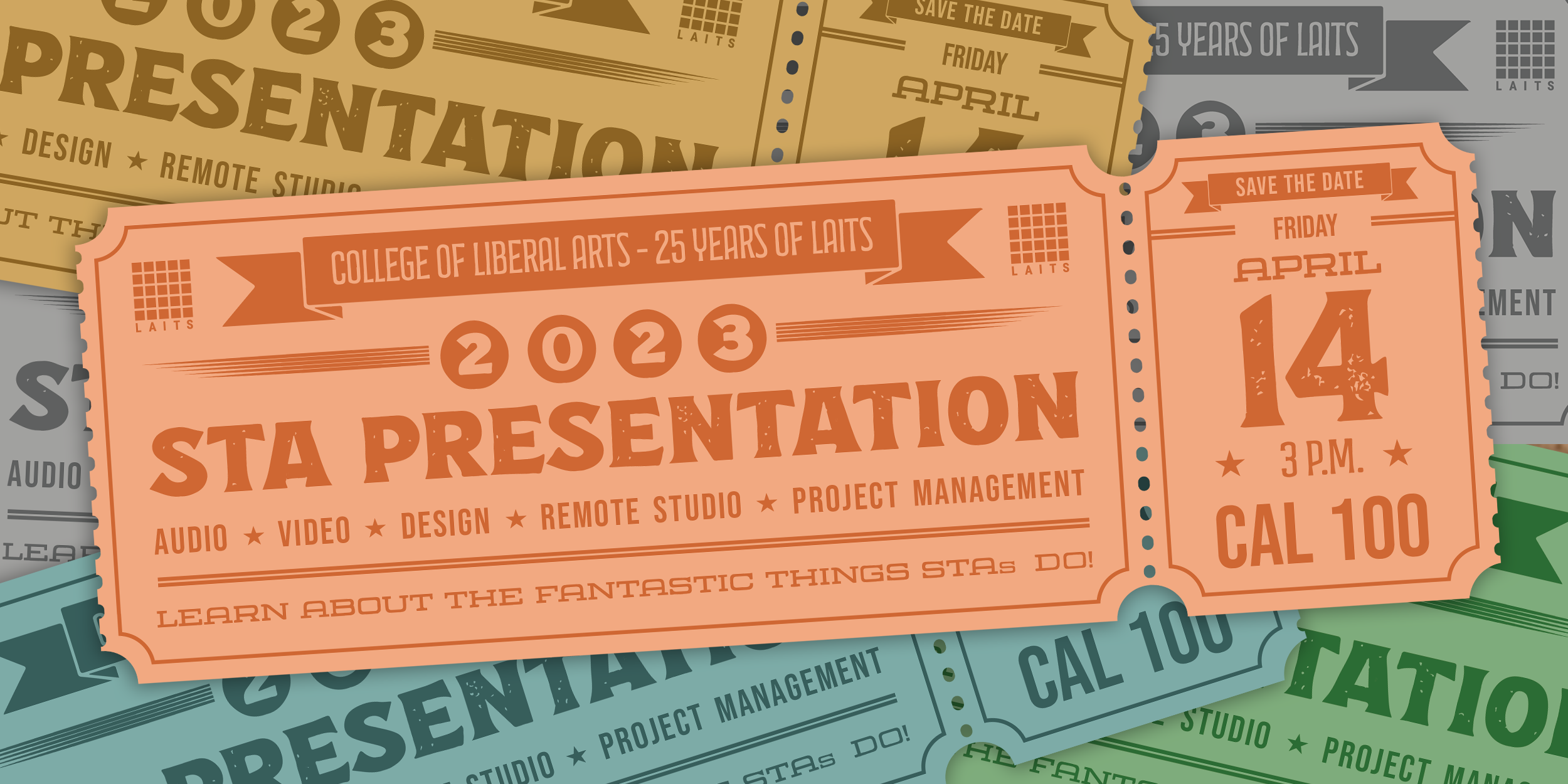
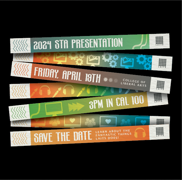
The Internship consisted of two main responsibilities one being the intern project, a prompt given to all the interns to complete as a team, and second being the client work assigned by manager. While both challenged me in different ways these tasks allowed me to grow as a designer and see where I have room to improve as well.

Overall, the friends and connections I made throughout this experience were invaluable. Working alongside talented professionals and fellow interns not only expanded my network but also provided me with a wealth of knowledge and support. The collaborative environment and mentorship I received greatly enriched my understanding of the industry and helped me refine my skills. I am excited to leverage these connections and lessons learned as I continue to pursue my career in UX/UI design, with a clearer vision of my future goals and a passion to contribute to the field of experience design.

The 5-9 After The 9-5

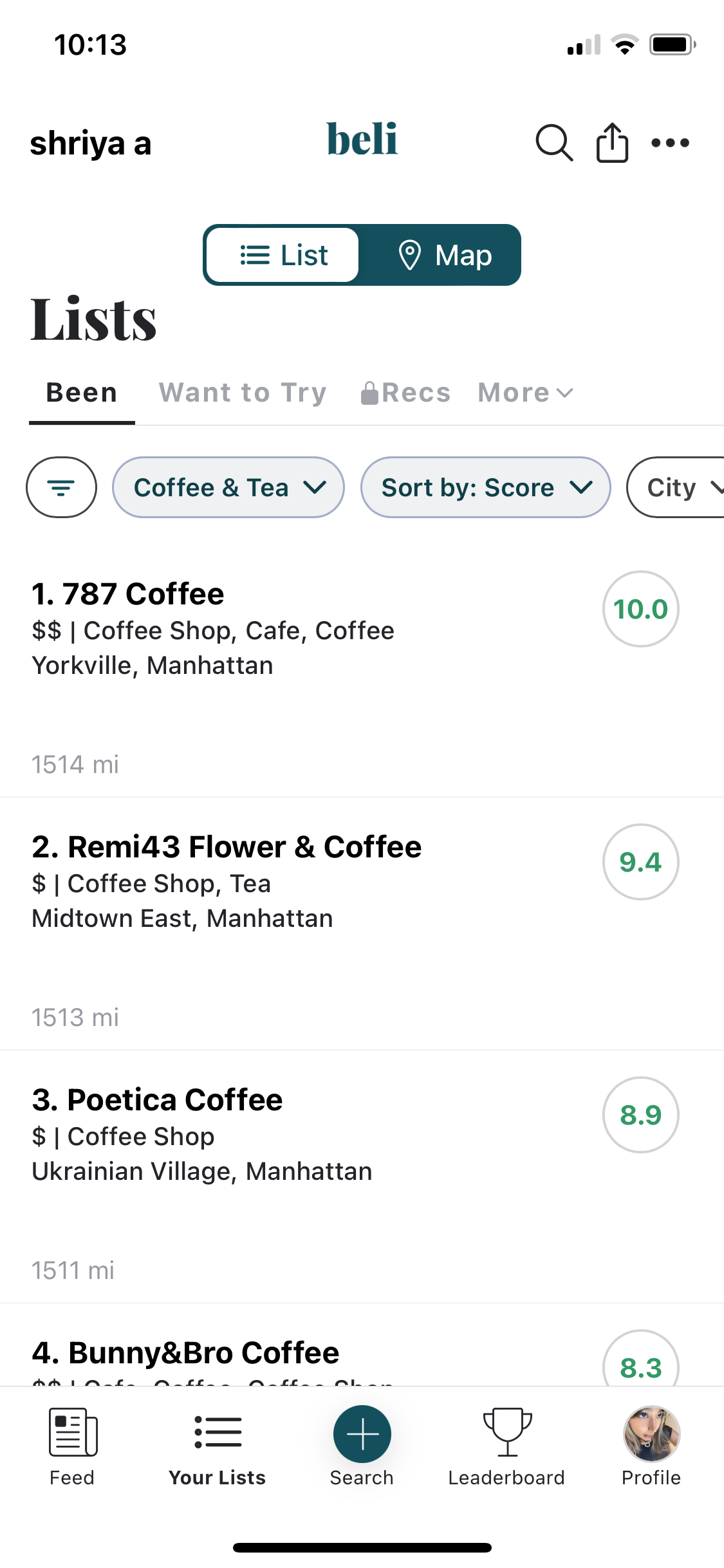
Along with the incredible work experience I gained, I also had the opportunity to live in New York City for three months! Exploring the city’s food scene, hanging out with friends, and soaking in the energy NYC has during the summer made every moment outside of work truly unforgettable. When coming to NYC I had the goal of going to a different coffee shop every chance I got and rating them all so I have a collection of pictures and notes. I am happy to announce that I did complete that goal and have succeeded in making the best list of NYC coffee shops!

Being in New York City for the summer has always been a dream of mine, and I feel incredibly fortunate and grateful to have had the opportunity to experience it. The combination of an enriching internship, city life, and meeting friends made this summer truly the best one ever. This experience has not only reinforced my passion for UX/UI design but also made me more motivated to continue my hard-work this school year. I will cherish these memories forever and I look forward to carrying these experiences with me into the future.

Filed Under: Uncategorized, We are STAs Tagged With: Shriya Atreya, STA

Shriya – Week 3/1 – 3/9

March 22, 2024 By Shriya Atreya

SAVE THE DATE:

2024 STA PRESENTATION EMAIL INVITE FLYER


START: March 7, 2024

COMPLETED BY: March 14th, 2024


BRIEF:

This week I was tasked with creating the email flyer for the 2024 STA Presentation. For this flyer they wanted a concert/festival theme to match with the rest of the graphic assets.

IDEATION:

To start this poster I first wanted to outline my vision for what I wanted this 600px width graphic would look like. For this, I referred to a mix of both Last year’s SAVE THE DATE flyers and other concert festival graphics and posters.

From here I took the direction of a wristband style that would use the idea of concert wristbands to display the required information

Inspiration Picture from the 2023 INCHEON PENTAPORT Rock Festival

LAITS 2023 STA Presentation Email Flyer

DESIGN + ITERATION:

Through this process of design and iteration, I experimented with various elements to capture the essence of a concert/festival theme while drawing inspiration from the festival wristabnds and last year’s SAVE THE DATE flyers. Iterating on this concept, I refined the layout, color scheme, and typography to create a visually striking email flyer that resonates with the spirit of the event along with icons that represent the multiple different sections of LAITS.

FINAL PRODUCT:

WHAT I LEARNED:

This project challenged me to think creatively and adapt design principles to fit a specific theme and audience. By exploring different visual styles and experimenting with layout techniques, I gained valuable insights into effective communication through graphic design. Overall, this experience reinforced the importance of flexibility, iteration, and attention to detail in creating impactful design solutions.


Filed Under: Fall 2023 - Spring 2024, Uncategorized, We are STAs

Shriya – Week 2/12 – 2/16

February 14, 2024 By Shriya Atreya

UTFC Banners: 10.1 Québec & 9.5 Port Villa

START: Feb 7, 2024 

COMPLETED BY: Feb 14th, 2024

DESCRIPTION: This week I was tasked with creating UTFC Banners for two different units. 
 
10.1 Québec 
Step 1. Images Cutout
For this section I started with these three images and used photoshop to erase the background.
  
From here I put the cutout images into Illustrator and used the image trace feature 
to create vectors of each of the images. 
  
Once I had image traced versions of these photos I created a layout that would compliment 
the banner text and center Tex & Tammy.


9.5 Port Villa
I repeated the same process for Port Villa to get this final result:


WHAT I LEARNED:
Through this process I learned a lot about being very attentive to detail. 
Going through multiple rounds of feedback and iteration for these banners, I was able to learn the expectations for these projects and how to apply them properly. 

Filed Under: Fall 2023 - Spring 2024, Uncategorized, We are STAs

Shriya – Week 1/22 – 1/28

January 30, 2024 By Shriya Atreya

ART3800: TWENTIETH CENTURY ART CUSTOM COURSE GRAPHICS

START: January 23rd, 2024

COMPLETED BY: January 26, 2024

DESCRIPTION: This week I was tasked with the training to create a custom graphics package for a LAITS studio course.

BRIEF 
For this course, Dr. Fabiola Martinez Rodriguez, the professor of ART3800: Twentieth Century Art, wanted custom graphics that heavily took inspiration from the content of the course. One of her main requirements for this was incorporating a classic 20th century font and to look into Bauhaus and the International Style for design inspiration.

STARTING STEPS
To meet these outlined goals for Dr. Fabiola Martinez Rodriguez's course I started by creating a mood board of color schemes, mood-boards, and 1920-1930s art and design that I felt would align well with the Professor's and my vision. 
Moodboard for ART3800 Course
After making this mood-board and getting approval from my director, I was able to have a better grasp on how I was going to incorporate the requirements of this assignment into something that also represents the variety of art as a discipline. In addition to this I was able to see the legibility of a handful of 20th century font and which one would be most effective for the main audience of this course, students.

When drafting my first iteration of what the main design of this course would look like I started with designs that were more illustrative, as shown below.

 While inspired by the classic Bauhaus geometric and asymmetric composition, I quickly realized this illustrative style fell flat when it came to In-Studio assets that had to look engaging and clean in order to be transferable into many different graphics. After scrapping this idea, I went back to ideating and referenced my mood-board in order to see how I can convey my vision.

BASE/BACKGROUND DESIGN 
After playing around with more options and getting feedback from my director. I opened up photoshop, inspired to create a collage of some of the most famous works covered in the course content. 
After playing around a bit with placement, color, and texture, I was able to create a puzzle-like collage of some of the most recognizable pieces of twentieth century art. After being happy with the final result of this image I moved to testing it to see if it would comply with the In-Studio Asset guidelines regarding how a professor is framed and how a student is able to view them. 


My initial iteration of this idea, while cohesive with the styling the professor requested, had two main problems

- the saturation of the image
- the placement of certain art pieces  

In the feedback my director gave me, she pointed out the distraction of Frida Kahlo's eye peaking out behind the professor and the image of the cross coming out of their head. These two images along with the high saturation of it all made the collage a bit distracting for students when trying to listen to their professor teach.

After applying her feedback and suggestion I was able to come up with less distracting placement and toned down version of my previous design in order to confirm students have a productive learning experience.   

Final Background Design 

IN-STUDIO ASSETS 
After finalizing this design, I was able to move on to make the rest of the IN-Studio assets for this custom course. For these In-Studio assests I had to tweak this main design slightly to add variation and to fit the various sizes needed. For the custom course I needed to create 3 additional main layouts: the vertical monitor, the desk skirt, and the ipad overlay. 

Vertical Monitor: 

Desk Skirt:
Ipad Overlay:


CANVAS COURSE GRAPHICS
To finalize the course assets I additionally had to make canvas course graphics for the homepage, dashboard, and buttons. Due to the base design being completed this portion of the design process was not too much of struggle. 

Call-Out Buttons:

Canvas Dashboard:

Canvas Homepage:


ADDITIONAL GRAPHICS
Animation:
In addition to these course graphics I was also asked to storyboard a starter animation for this course that would play before the beginning of the lectures. 
My idea for this animation was to make it look as if someone was cutting out the art pieces themselves to make this collage. I wanted to have a realistic almost magazine like feel of cutting out the images from these art pieces and gluing them to the page. At the end it would show the final collage and the camera would slowly zoom in to reveal the finalized background and the text desired.

Powerpoint: 
I was also assigned to make two main example slides for this course. This task was fairly simple and required just slight adjustment to the background (black 50% opacity box) to make the text legible and comfortable for students to take notes on and read.

CONCLUSION + FINAL DESIGN MENU
Overall designing this custom course was such an informative and fun process. It allowed me to be creative but also consider the usability for it target audience of students. The past user research done on what distracts and helps students learn in a digital environment helped me a lot when it came to this product and I will take what I learned designing "Twentieth Century Art" to future graphics and assets I create as a design STA.
 

Filed Under: Fall 2023 - Spring 2024, We are STAs

STA Blog!

January 16, 2024 By Shriya Atreya

★ WELCOME TO MY BLOG! ★

Filed Under: Fall 2023 - Spring 2024

  • « Previous Page
  • 1
  • 2

link to LAITS home page

Video STA Home

© 2026 Liberal Arts Instructional Technology Services | Production Credits