I made some progress with figma.

Project: Texas Beyond History site search mockup
staff guidance: Ruben, Suloni, Estella
description/plans: Create a mockup for the Texas Beyond History site search
Intro to Typography:
font parings:
Merriweather and Verano Sans
Josefin and Verano Sans
I chose Merriweather with Verano Sans because I think the bold serifs od Merriweather pairs well with the humanist sans-serif Verano Sans. Bolded Josefin has a lot of personality and attention catching while Verano Sans is clean and easy to read.
My favorite serif font is Merriweather. I like wedged serifs more than bracketed serifs. It has a bit of a bold vibe because of the thick serifs.

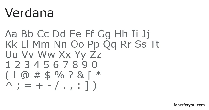
My favorite sans-serif font is Verdana because it has a cross-barred capital I (eye) and differentiates from the lowercase l (ell). I love sans-serif fonts, but most sans-serif fonts don’t differentiate between the capital I and lowercase l.
Script fonts should be used for short phrases to catch attention. My chosen script font is Adine Kirnberg becaue the cursive is readable and fancy.
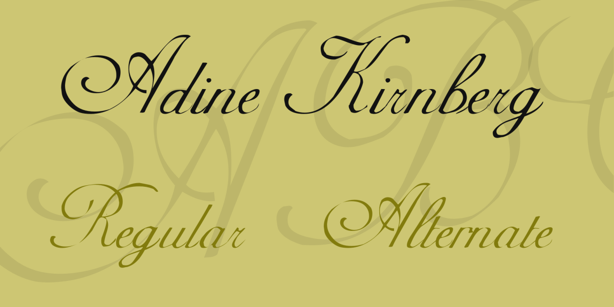
Adine Kirnberg Font Family · 1001 Fonts
I see monospace a lot because I do a lot of coding. My favorite font to use when coding is Fira Code because it has a lot of ligatures.
tonsky/FiraCode: Free monospaced font with programming ligatures (github.com)
My favorite display font is NICESOUR because it has color and strawberries.
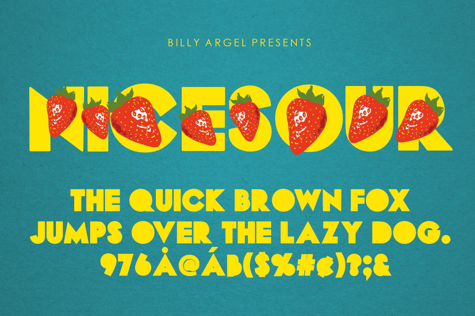
NICESOUR Font | Billy Argel | FontSpace
I like to choose fonts that are clean and readable and have an approachable vibe to them.
Back from a long break and ready to work.
Will be working with Texas Beyond History with Ruben, Estella and Suloni.
This week I finished up my graphic for the History of Design training.
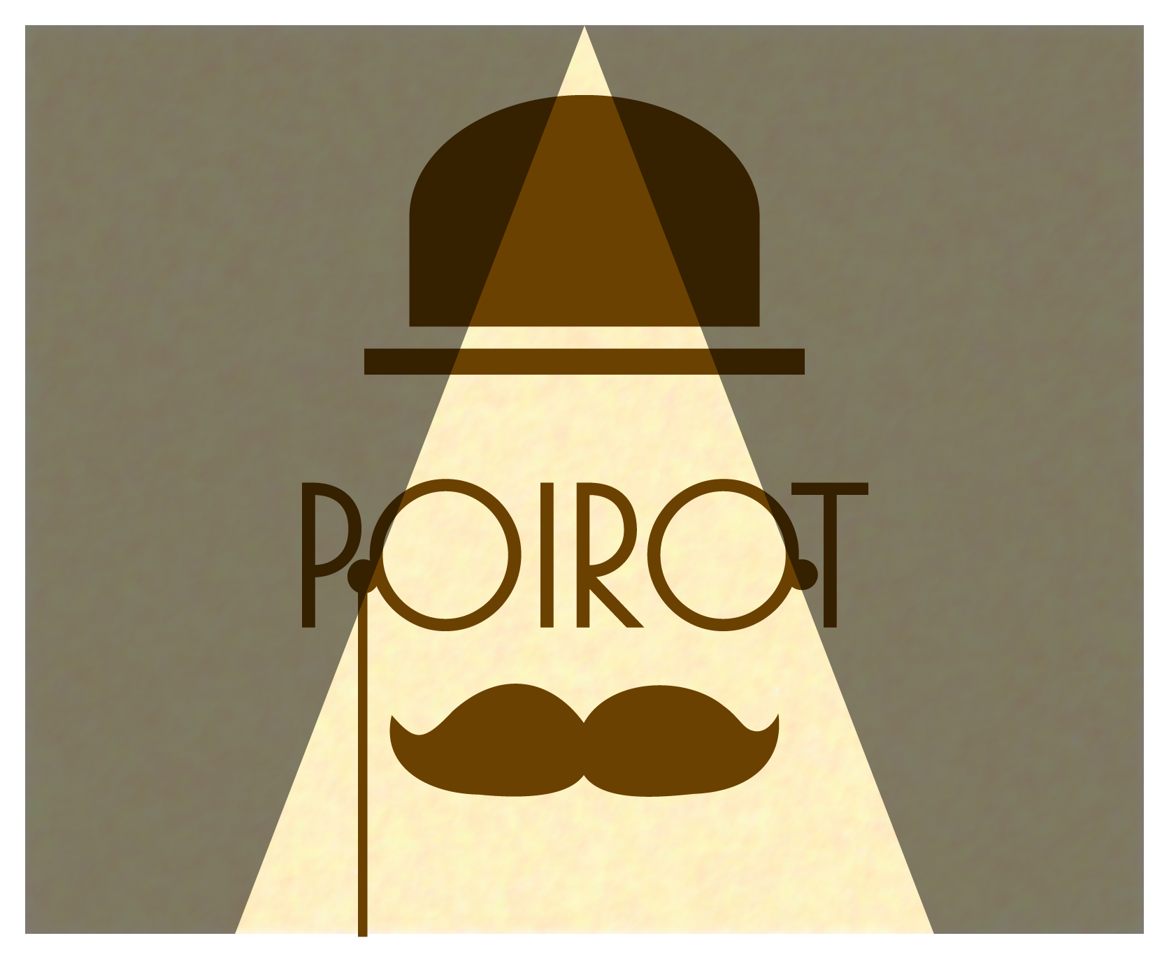
For the paper background, I drew a rectangle, filled it with a beige color, added a grainy texture with Effect -> Texture -> Grain, and then blurred it with Effect -> Blur -> Smart Blur…
I added the hat. I made the spotlight by using two trapezoids filled black and at 50% opacity. Maddy showed me how to make the mustache smoother by going to Object > Path > Simplify.
Maddy suggested I practice the Rule of Thirds.
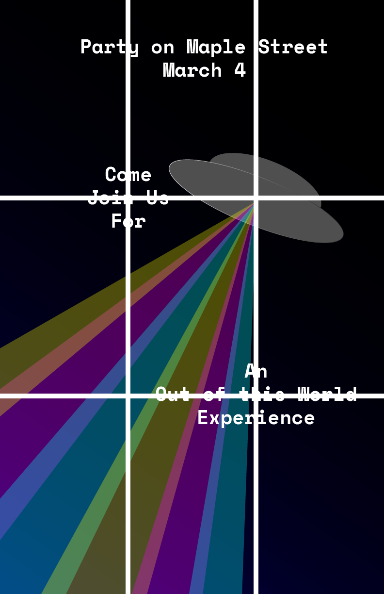
Loosely inspired by The Twilight Zone, “The Monsters Are Due on Maple Street”
There isn’t really an intermediate KB training, so I explored on my own. While working for the Blanton, I didn’t really get many chances to really explore WordPress because I was mostly just migrating content.
I edited the stylesheet to change the colors and added a blurry glass effect to the page. I took a bit of time to find the styles that I needed to change since the stylesheet had 6000+ lines.
I am currently working on the History of Design Training.
I decided to make my graphic using the Art Deco style.
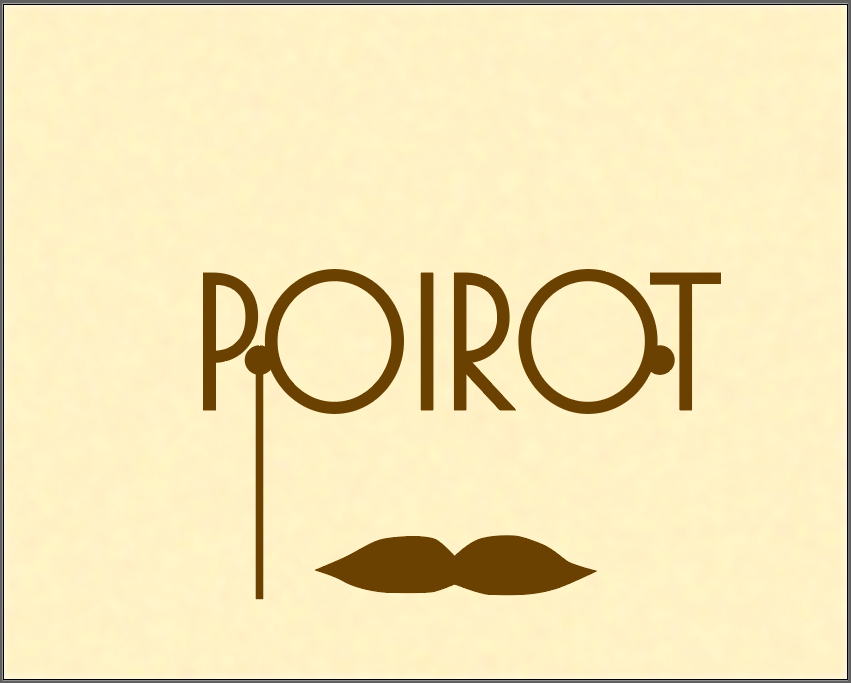
It’s a work in progress. And it’s taking a while because it’s my first time using an Adobe product other than pdf reader.
This week I helped Ruben and Lizabel (a client; works for Blanton) with some small fixes to the Blanton.

Before, I could only add link to individual blocks of texts. Ruben recently added a plugin that allowed us to add links to any kind of block.
I also helped Lizabel debug some things. There was a problem where on mobile some of her pages had some her pages were very wide. The text was contained in the screen, but at the bottom of the page there was a wide blank space that caused a horizontal scrolling. I found the problem to be a large canvas element and quickly fixed that for her.
The rest of the week I did trainings.

I recycled code from my hackathon project for this training.
Had some small technical difficulties because I am new to Grav, but I am getting there.
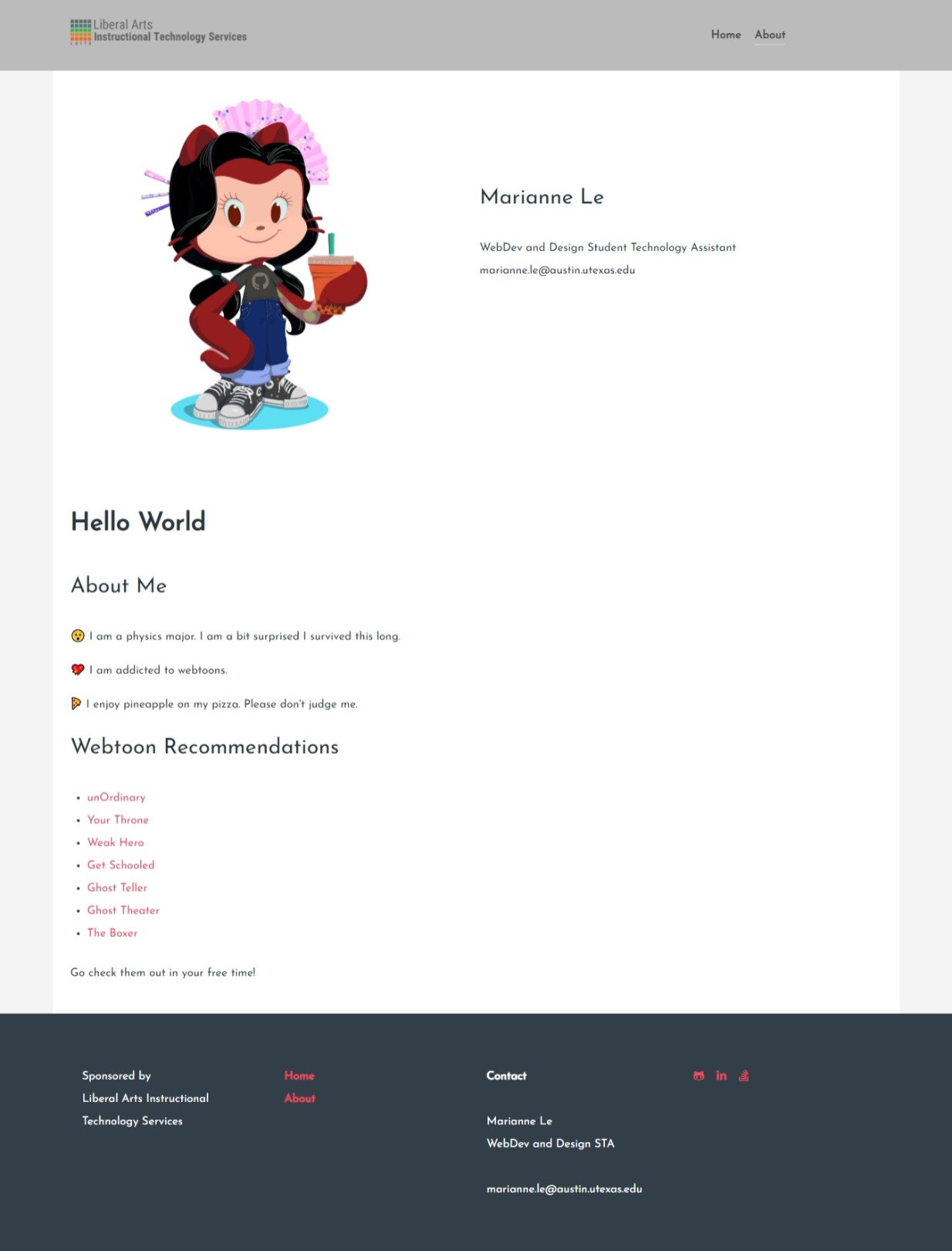
Made my own custom particle for the profile half and half.