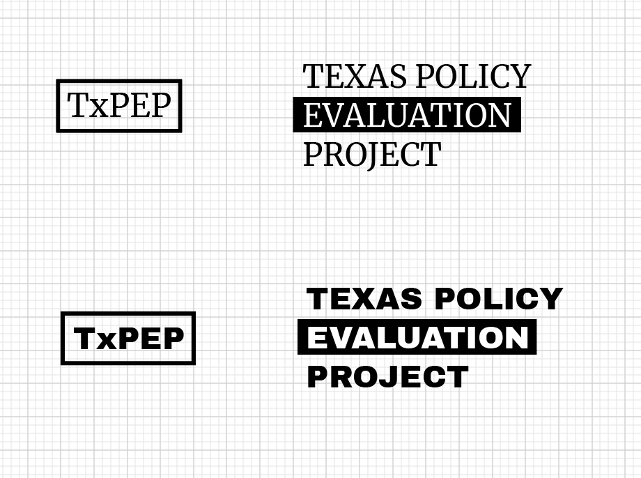
TxPEP Word Logo pt.3
I’m still in the process of trying to figure out how to properly change the color of the capital logo for TxPEP. I was finally able to use the image trace on illustrator to make the PNG into a vector image so that the color could change, but there was still some error with how the logo looked. The lines are no longer clean.

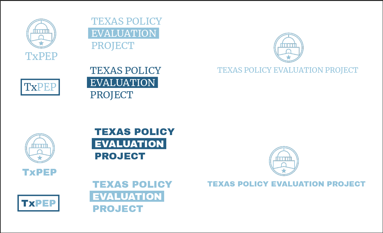
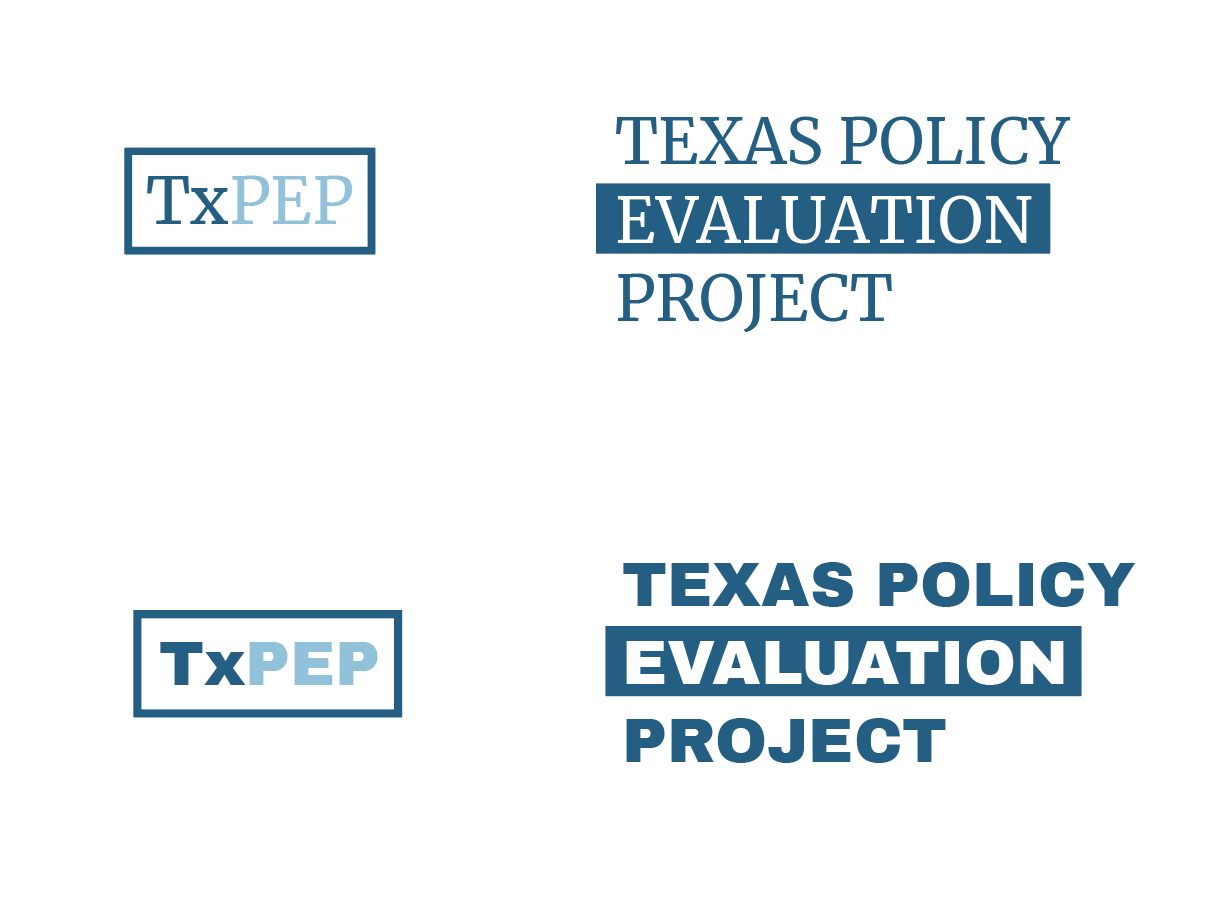
TxPEP Word Logo pt.2
So far, I have continued adding in different versions of the TxPEP logo design. These iterations include the capital logo design.
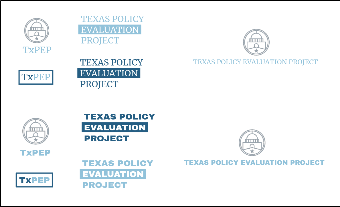
For these first iterations, I was having trouble changing the color of the capital logo to match the new branding colors that were selected. As a result, I ended up recreating the logo in the accurate color to create the other iterations.