Farewell STA Team!

Before coming to this job I was working at Kinsolving dining hall pursuing a degree in art education and just wrapping up my first year of college. It was rough. I hated my job, lacked community, was underpaid, and unsure about what i’ll do after college. My friend Roberto (later an STA as well) who was my student manager at Kins sent me a link to apply for the Design STA position and I went for it. I started in July 2019 working in office with Suloni and sitting along side Maddy and Valerie as my peers. I experienced many people leaving and many joining, some STAs becoming my higher ups after they graduated. I experienced a global pandemic, finished college, worked fall, spring, summer, and winter breaks for three years here in the office and in my living room for about 2 years of the 3. I think I’m the only STA who has reached 560 to-dos and have completed every single design training in the KB! It goes without saying more that I really valued this job and gave a lot of my time and energy to this position and made the most of every moment.
Now leaving this job, I am no longer getting an education degree but starting a career in product design at a firm. I took more design classes at UT my last 3 years and made a portfolio with lots of stuff I worked on during my time here. I learned how to use Photoshop, Indesign, Illustrator, Figma, XD… the list goes on. Accepting this position in retrospect was a huge turning point in what I thought my life was going to look like and it was for the better. This was a safe place to learn and grow and challenge myself.
I’d like to say thank you to all the STAs I worked with. I strongly believe that we are the sum of all the people we have ever met. I was so fortunate to have met only the most amazing people while in this program.
Roberto: Thank you my former Kinsolving manager and fellow video STA. You helped bring this job to me and always believed that I could be great at whatever I wanted to achieve. Your friendship has been so valuable and I hope you are doing great things as well you amazing script writer!
Ean: This clown! Haha my favorite audio STA who is a killer sound cloud artist and DJ. Living it up in New York working in the audio industry. Thanks for being a best friend still and I hope to see you more often and visit NY more frequently.
Jake: Oh jake, your upbeat, positive, warm energy, the light of the office. I will never forget when Valerie was switching computers and transferred your meme folder on your work computer over to the new one. I loved all the profile photos you had on zoom, and yes I did look at your bookmark tabs when you shared screen with great concern haha! Thanks for always finding time to help me via slack with my coding questions. I hope to see you again soon.
Thuy: THUYYYYYY. What do I even say about you? Intelligent, reliable, talented pianist, amazing baker and yogi, hard-worker, great coder! You were my favorite person to work on projects with, we were the ultimate power team! I am going to miss you tremendously and our little out of work hangouts where we eat mochi and takis and paint out nails. Please take care and stay in touch when you’re out in California!
Adrian: eco-king! Tea-drinker! Book-reader! Adrian I hope you go off to do amazing things with your life and I really enjoyed the conversations in the office that we had. Every design you make gets better and better and I hope you fall into a place in work and outside of school that you really love. Keep on being your amazing self.
Marianne: Going to miss your boba tea earrings and your giggles during meetings. Although we haven’t had a project together, by Suloni’s praise I hear you are doing great work and I’m so proud of you to hear that! Keep on always doing your best and follow your passions.
Sheryl: You are such a great friend and co-worker. Your design work is amazing! You’re so reliable and punctual! You really came through for me this past semester when I was going through it and I am endlessly grateful to have worked and been friends with someone like you during my time here. Go do your thing in grad school! Hope I can stop by to visit one of these days while you’re over there.
Cristina and Rodrigo: I have never met a pair of siblings that were SO different. Let me start with you Rodrigo. You were so funny and talkative, always getting me in trouble but nevertheless it was a joy getting to work beside you. Thank you for the coin pouch and the cajeta! Cristina, so sweet and kind and not a trouble maker! I am going to miss talking to you as well and I hope you end up getting a job that you really love after college. I wish both of you guys the absolute best, FAMILIA!
Angie: Angie for some the reason the convos I remember most are about you growing oyster mushrooms in your room and the water damage that happened in your apartment. You are so talented and a great web designer. I believe you went off to do things in biology but nevertheless you were a fantastic artist and designer and it was so nice having someone like you on the team during covid.
Kevin: You were so sweet and kind and I will never forget running into you at HEB. I hope you and Thuy still keep in touch and that you are working at a really cool job getting big checks because you deserve it with all the hard work you did!
Jalissa: I swear you and Jake were complete opposites yet he seemed to get along the best with you in the office it was really funny and sweet to me. You were awesome to work with and I loved the energy you brought to the office every day, It’s been awhile but I hope you’re out there enjoying life.
Emily: You sat behind me when I first started here and you helped me with all my V-Lab Canvasser questions which I am thankful for. I always thought you had a nice sense of style and it was always peaceful sitting next to you, just the two of us some days in the summer.
Ishan: My memories of you are over zoom with just the top-part of your face against a black background. Still, it was always nice hearing from you in meetings and I wish we had the chance to meet in office. You were a great coder and very friendly! (:
Olivia and Jac: I also started off with you two in the offices, I don’t believe I had the chance to work on any projects with either of you yet you both felt like big sisters to me and seemed so calm and experienced at the work you did. Jac I am going to miss your cowgirl energy and Olivia I always loved your curly gorgeous hair!
Miguel: You were so sweet and nice to everyone in the office and SO GOOD AT DESIGN! I don’t know if LAITS has had an architecture student in design before but man those skills transferred nicely! I remember training you over zoom and making jokes with you and poonum during our meetings. I really hope that life gives you nothing but the best and that you design my future house hehe. It was a pleasure working with ya!
Chloe: You sat in front of me my first few days at the program, although we didn’t get to work much together I hope you are enjoying life wherever you are at and thank you for answering my questions that I had my first few days.
Athena: Foodie, Tennis enthusiast, business-woman! My last memory with ya was hanging out at Barton in the cold talking about networking and I actually had a really great time. I’m glad that we still keep tabs on each other via social and I intend to see you again and hang out soon. Stay your cool awesome self Athena I miss you!
Poonum: Poonum! You were probably the funniest person in our zoom calls I wish so so badly that we had gotten the chance to work in person together. You learned the ropes so incredibly fast and were such a talented and smart individual. I hope ones day I cross paths with you again in a work setting because you make a 9-5 feel like a part! <3 stay awesome
De’Sha: Roses, pink, style, cute cute cute. I love your brand and how organized and hardworking you with your side hustles and internships. You are going to do amazing things in life and I am rooting for you. You are such a sweetheart and a great person to work with. Great listener and thoughtful answerer. Don’t ever stop doing what you’re doing. Going to miss you!
Rahul and Asmita: You both were in coding so I didn’t get to work on projects with you all but for the short time that we spent together in the office during our return from Covid was really pleasant and it was nice to meet new people after being at home for so long. I hope you both had a nice time during the program and go off to do great things.
Keshav and Hoa: The freshest coders we have currently. I think I have managed to make my impression on you both for the few weeks we have gotten to work together. You guys are both really cool and funny and a great addition to the office. You all are going to go far in your careers. Take care, learn as much as you can, and always go for the opportunities to show what you can do!
Rachel: Purple purple purple you love purple and so do I! I’m very glad that we got to have a talented animator and illustrator added to our team we were long over-due for a person with your skill sets! I know that having me review your trainings was probably a headache but your designs and growth go from 0-100% in a matter of 2-3 drafts and that’s all you girl! Have fun in grad school. <3
Megan: From the Daily Texan to a Design STA we have stuck through them both. Thanks to you I know how to use InDesign and so do other STAs. Thank you so much for helping me out with networking opportunities and being a friend in the office. I’ve already missed having you around but I know you have big plans in life and you must go forward! Take care Megan, let’s talk again soon.
Ingrid: Ingrid just wanted to say thank you for the books and all the convos we had sitting next to each other this spring semester. You have been a great friend and I loved going to the mall and shopping with you! I’m sad you’re going to be moving so far away but I know the world is for you to conquer so go show them what you got! Love your cute dresses and always gorgeously done nails.
Mounika: You were the first graduate student I had ever worked with at the program I believe. You were so kind, calm, responsible, friendly. I can say you did really important work for us while you were here and I hope that you are at a job that you really like. Take care and I hope to see you one day in the future again.
Bridget: Awww Bridget, I remember so many mornings when it was just us here in the office at 8am on a Monday and I am so thankful for that, it was nice going in and seeing you at your computer and having friendly chit-chat as the day started. You helped me so much with the KB and WordPress and were an amazing writer. I have missed you since you finished the program and I hope that life is treating you well wherever you are at.
Relena and Danielle: My time with you both was very brief and fleeting but Covid was a really weird time for everyone. Of the few words we exchanged over zoom I know that you both were nice people and hardworking. Danielle I know you were in the education program with me but a year ahead, I hope the teaching situation is going great for you! (:
Tate: Thank you for always coming through with the files I needed via slack from your animations. I remember when you use to work in this office the first few months I was hired here next to Suloni. A true veteran of the STA Design program. You’re work, modeling, animation, etc all amazing!
Estella: You have also helped me out with maaanny coding questions Estella and I am endlessly grateful for that. I’m glad that you became a higher up along with Maddy and Valerie for the coding team, I couldn’t imagine anyone better. You are so friendly and radiate positive energy and a positive environment for your employees to ask questions and learn. Hope your DnD games are going well!
Valerie and Maddy: It was been really cool from working along side you guys to you both managing me here at the office, I am SO GLAD that it was you two that were hired for this job. You guys are both so understanding, talented, compassionate, hard-working, motivated, everything a designer needs to be. I really hope that after I leave the program the three of us can get together and hang out some time or go do something fun. I felt very well taken care of by you both and felt like you guys both did everything you can in the interest of the student employees here and that is so amazing. Anybody would be lucky to work with you both.
Suloni: Because of you my whole career choice changed, the classes I took changed, my skills improved. You believed in me and took me under your wing to work here at the program. You have been the absolute best boss I have ever had and I had a few in high school and my first year of college. You are a golden example of what a boss should be: patient, understanding, kind, idea-driven, etc etc etc! Thank you so much Suloni for everything you have taught me, every opportunity you have gave me through projects and tasks, all of it has been so valuable to me. I’ll miss you dearly. The STA design program wouldn’t exist without you.
“We are the sum of all people we have ever met; you change the tribe and the tribe changes you.”― Fierce People
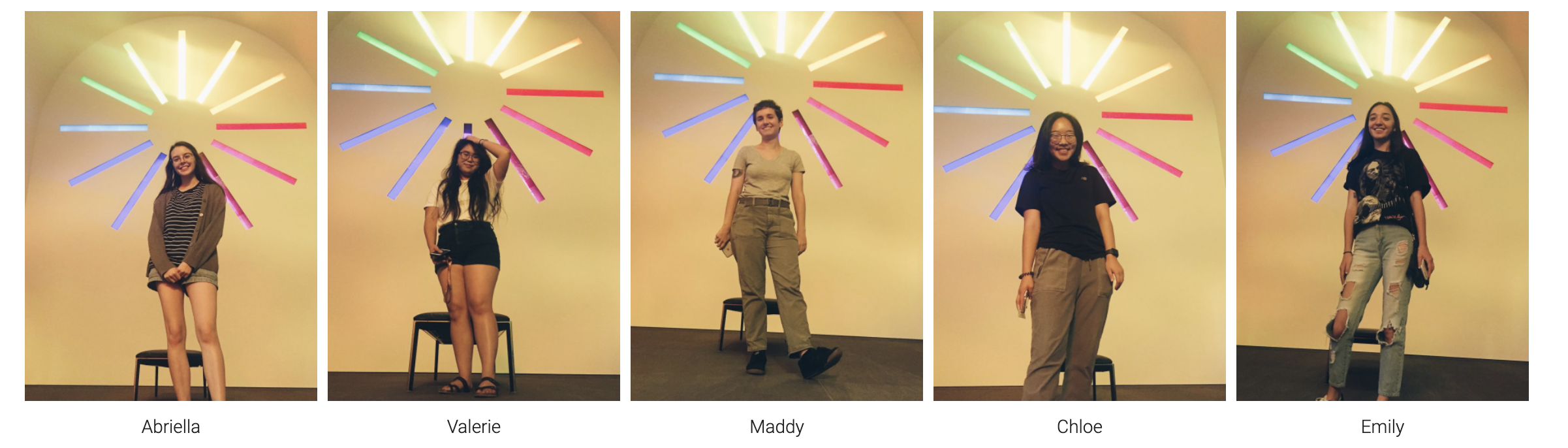
Part of the team when I first started in 2019: