✿˖° ⋆ January 2026 ⋆˚✿˖°
── ⊹ ࣪ ˖♡˖ ࣪ ⊹ ──
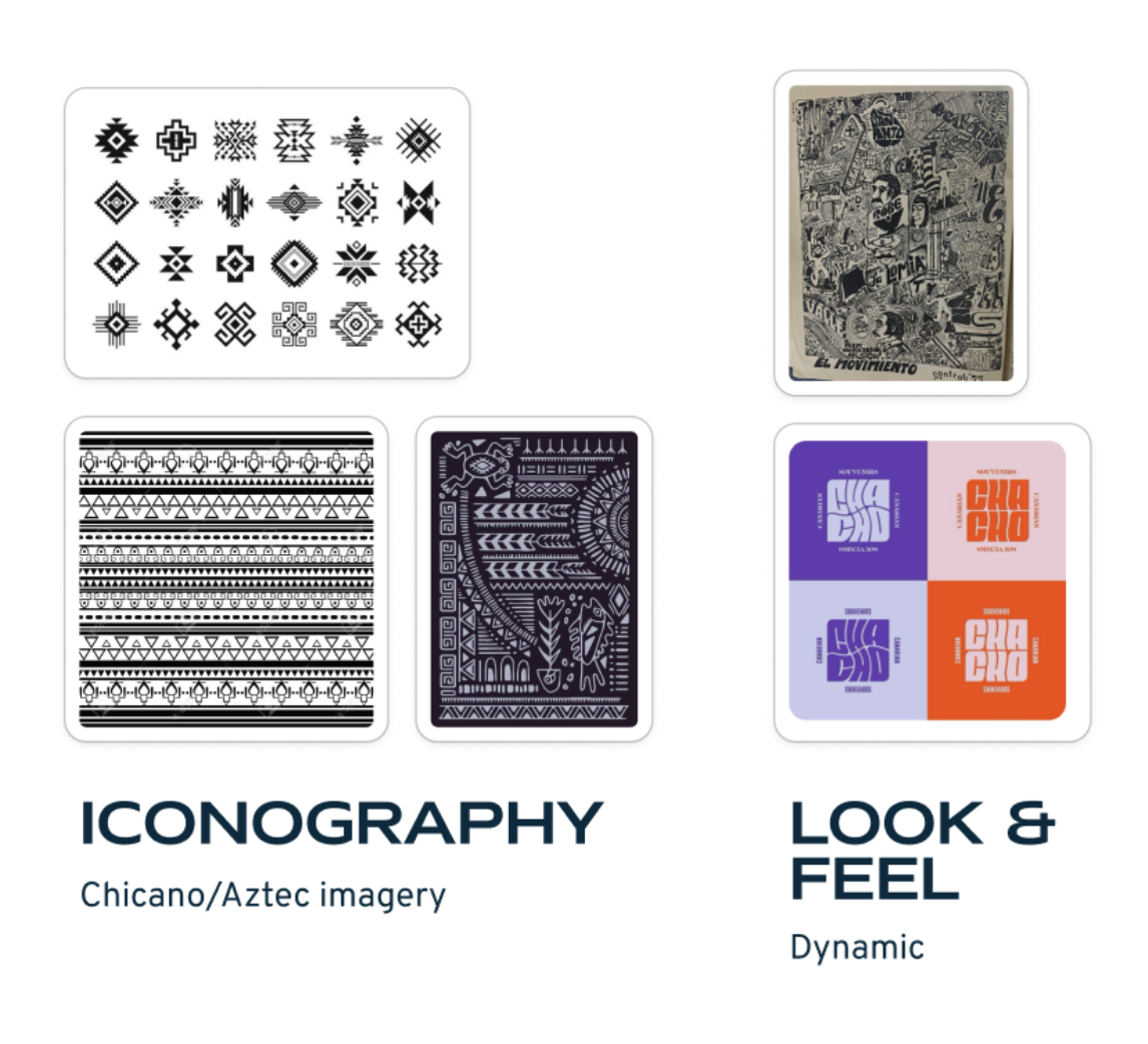
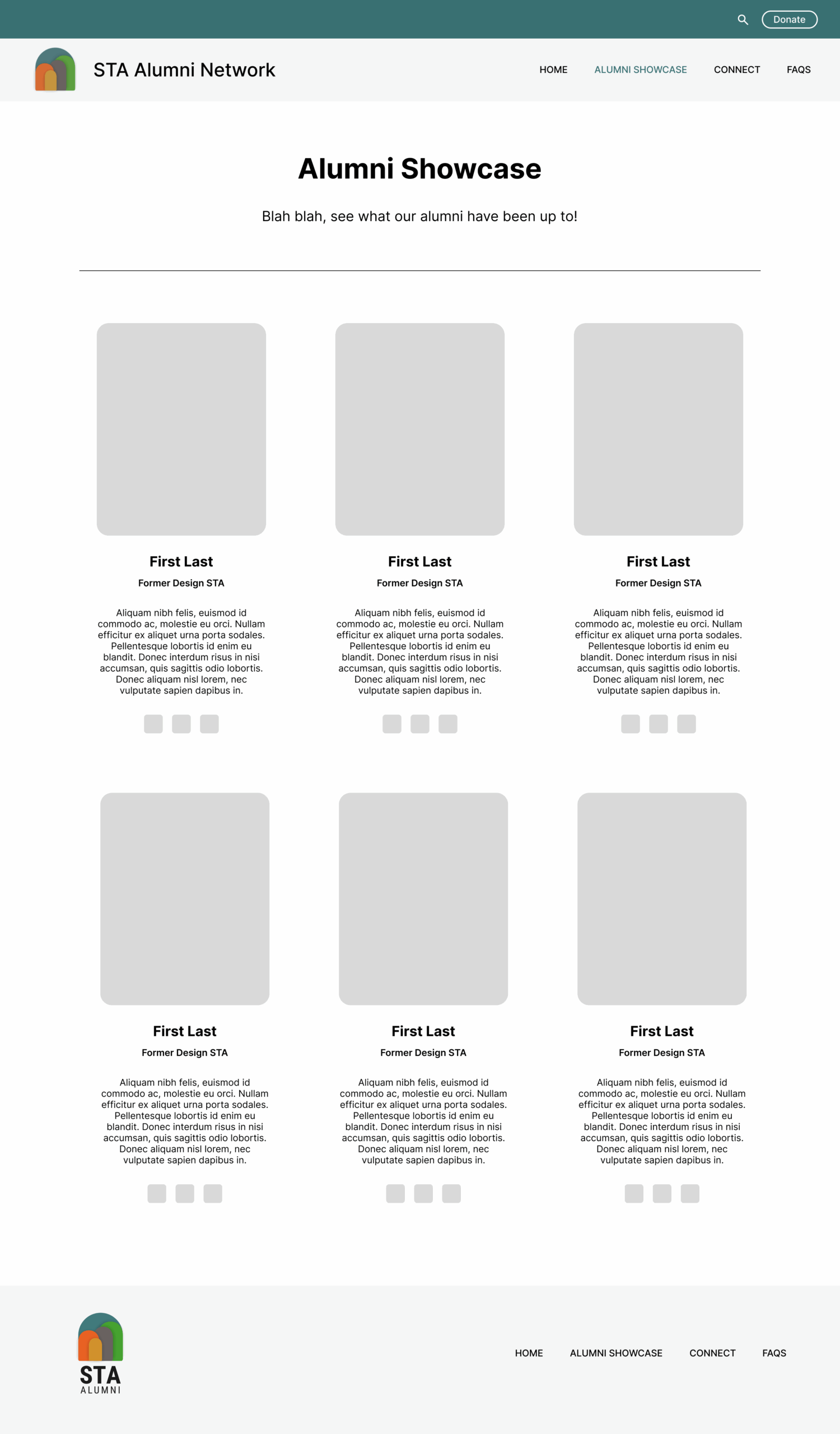
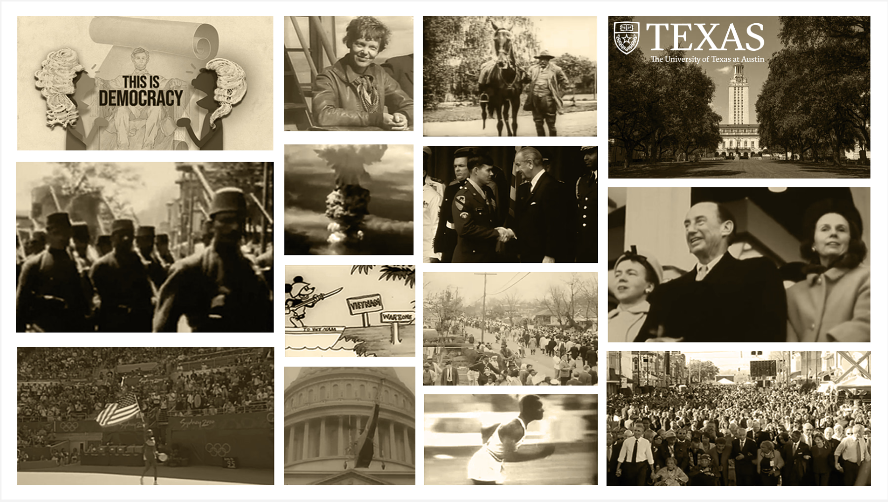
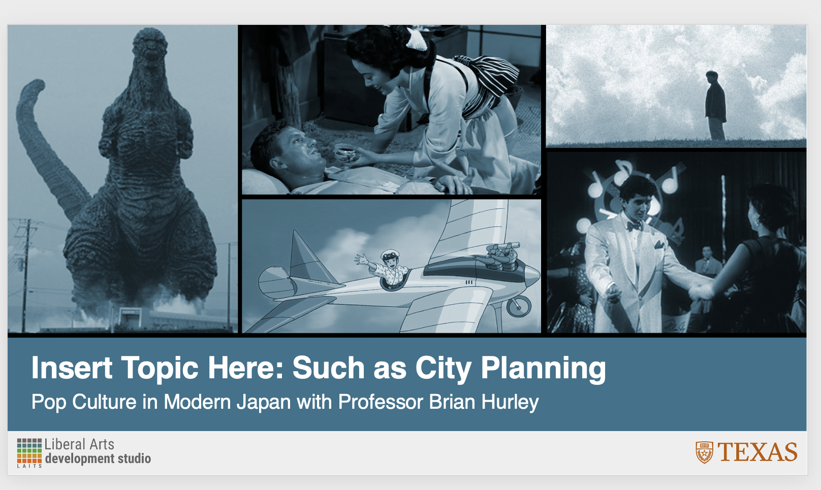
ANS304C (Spring 2026/Hurley) Course Graphic


── ⊹ ࣪ ˖♡˖ ࣪ ⊹ ──
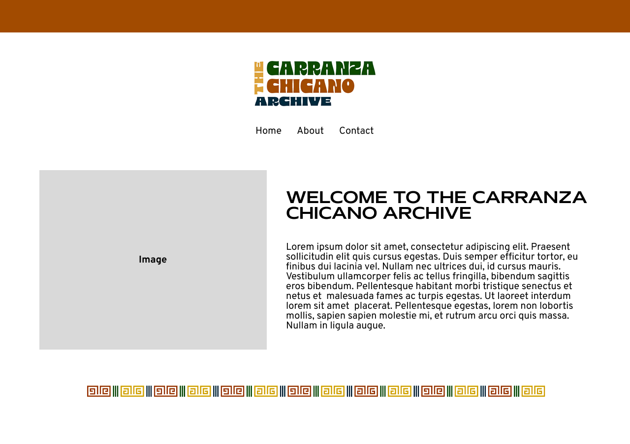
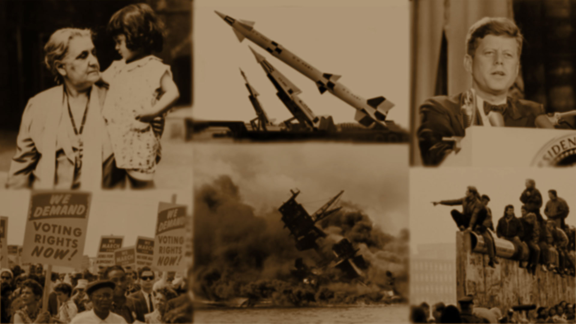
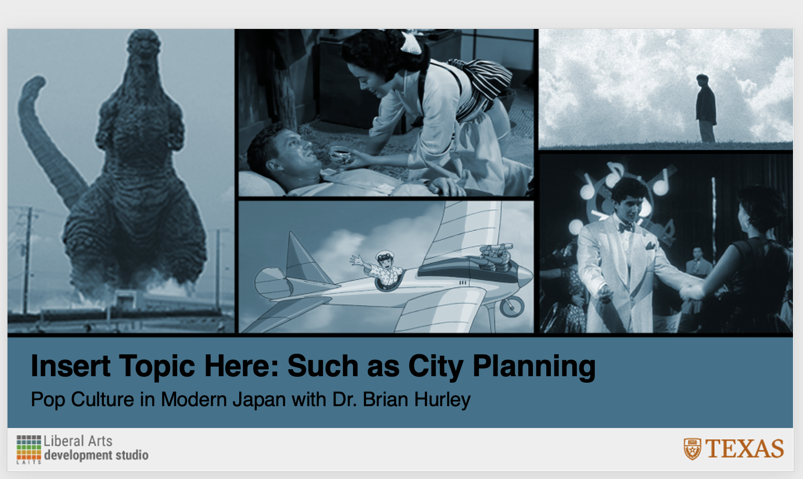
I was tasked to help with designing a canvas homepage and dashboard banner for ANS304C! Lila had established a collage styled design so I then created different iterations with photos moved around!
── ⊹ ࣪ ˖♡˖ ࣪ ⊹ ──

── ⊹ ࣪ ˖♡˖ ࣪ ⊹ ──
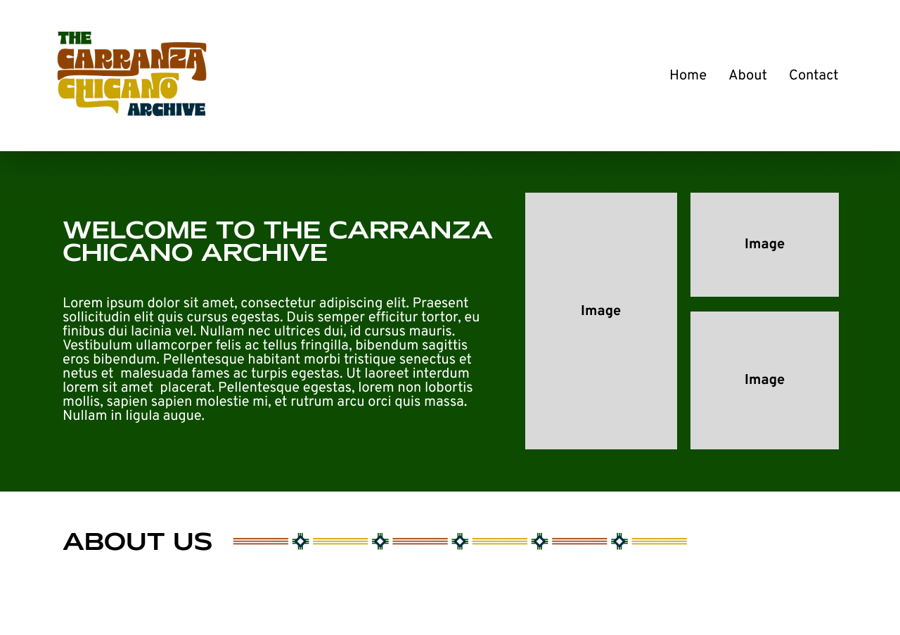
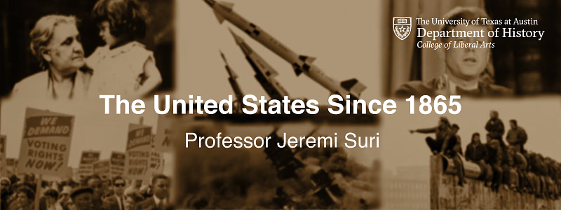
After some feedback from the professor, he preferred the bar at the bottom and asked to switch around the images some more after removing one!
── ⊹ ࣪ ˖♡˖ ࣪ ⊹ ──
── ⊹ ࣪ ˖♡˖ ࣪ ⊹ ──
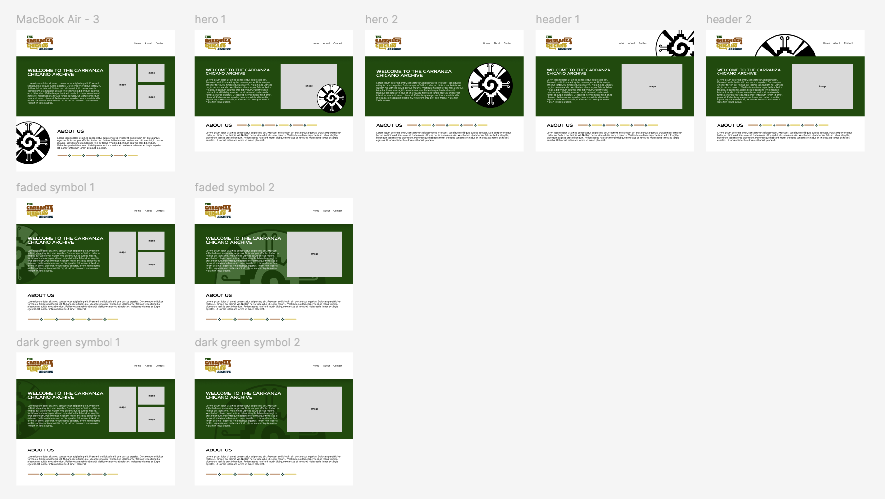
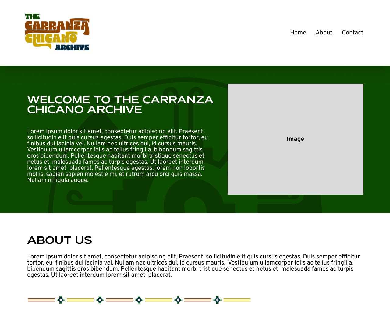
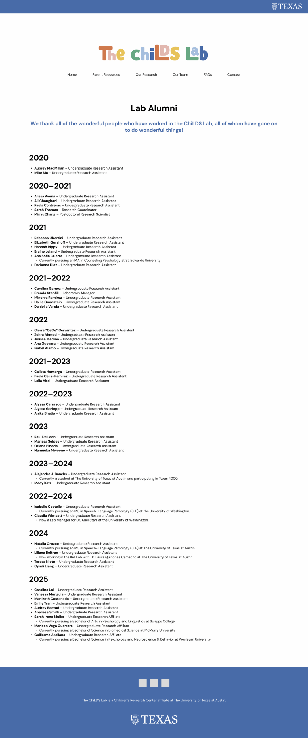
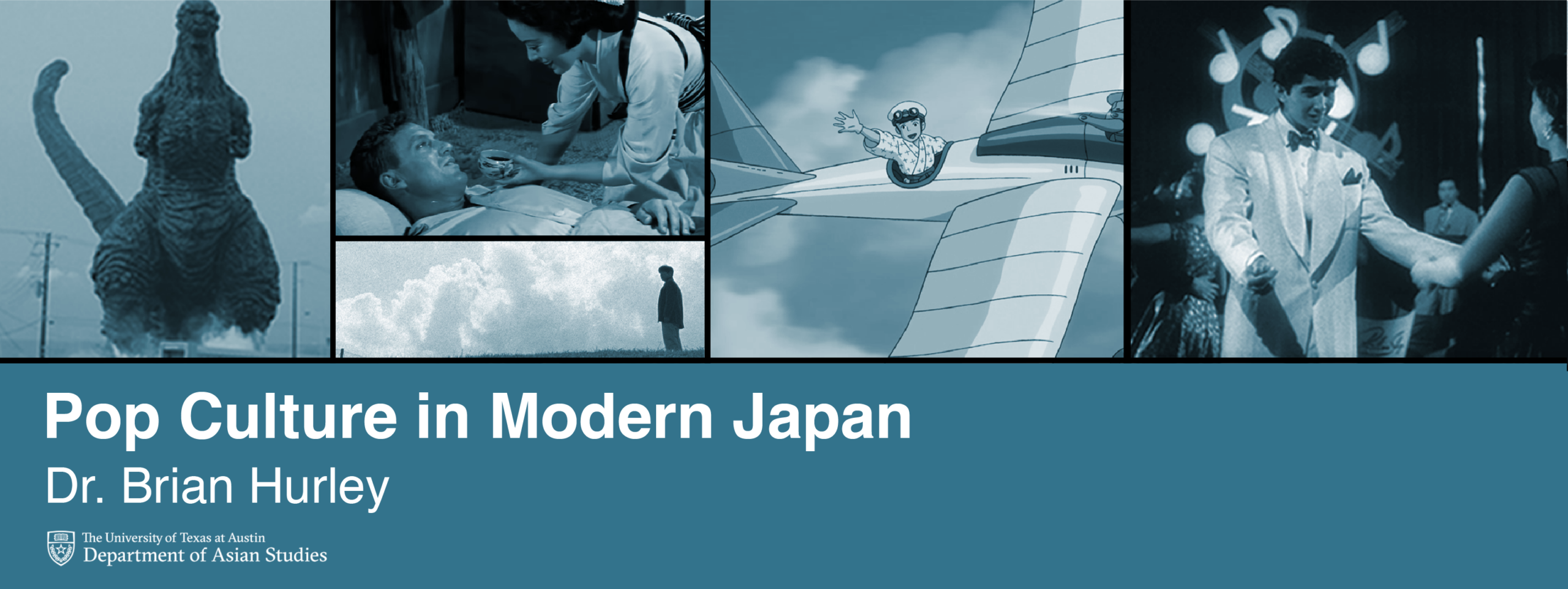
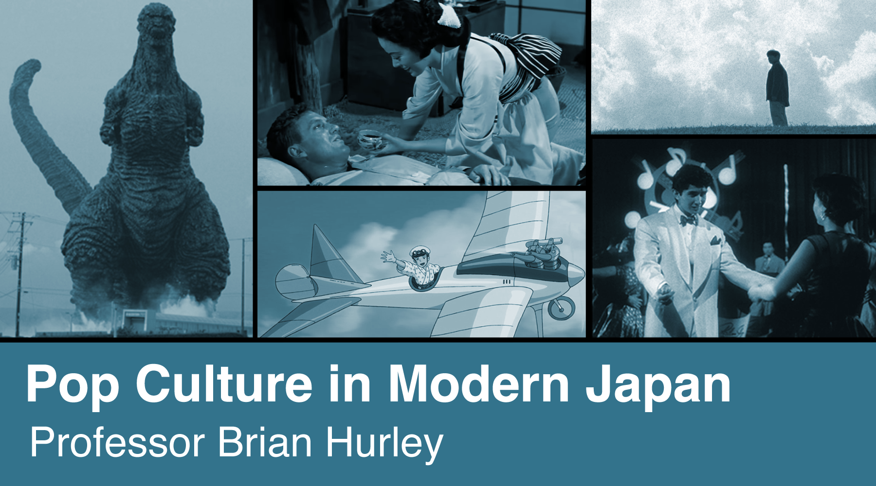
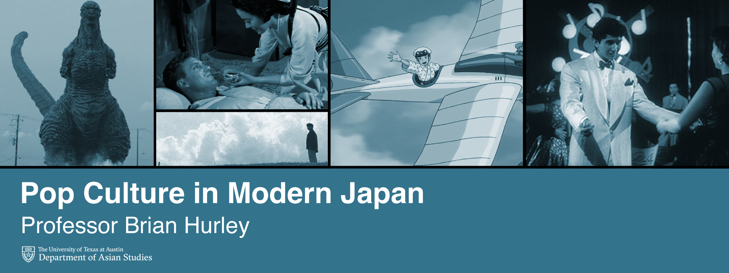
Now the final iterations were completed! I had to change the collage format for the dashboard vs the homepage banner, corrected the text, and added the logo footer for the title slide!
── ⊹ ࣪ ˖♡˖ ࣪ ⊹ ──
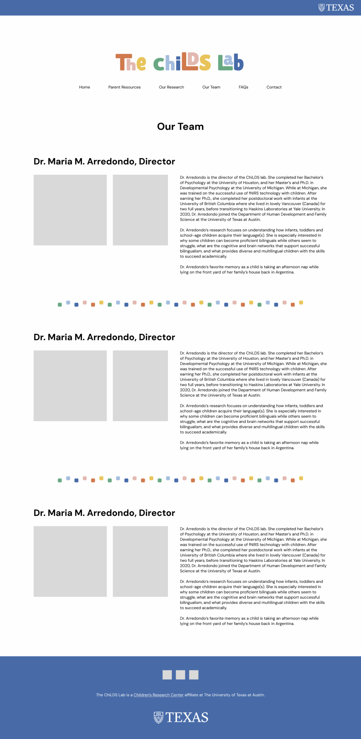
Refining Course Graphics


── ⊹ ࣪ ˖♡˖ ࣪ ⊹ ──
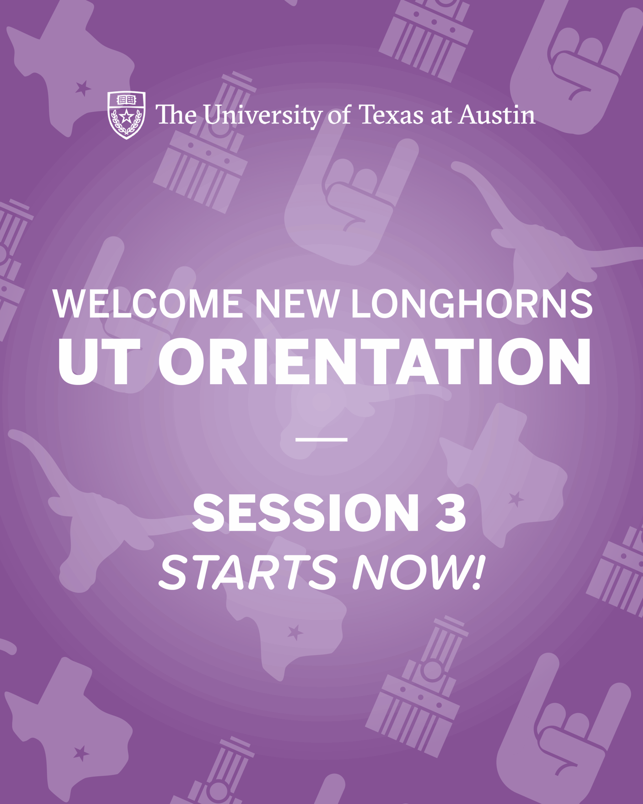
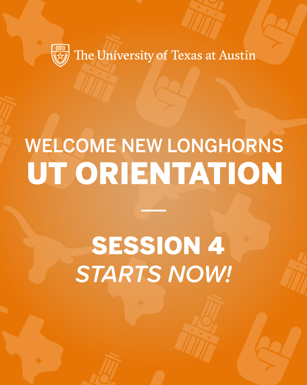
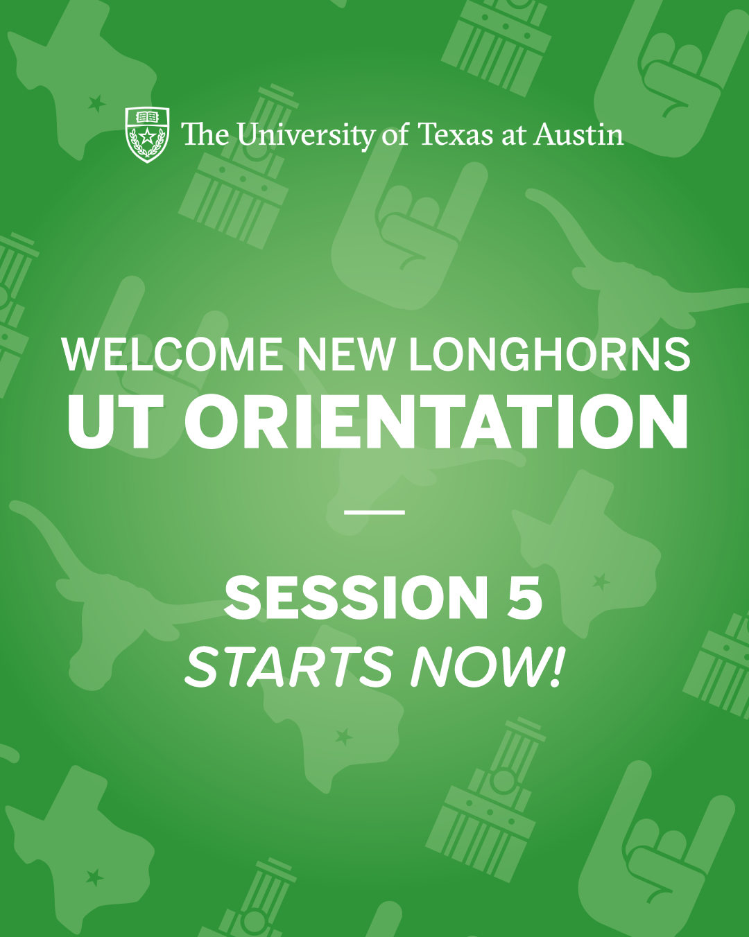
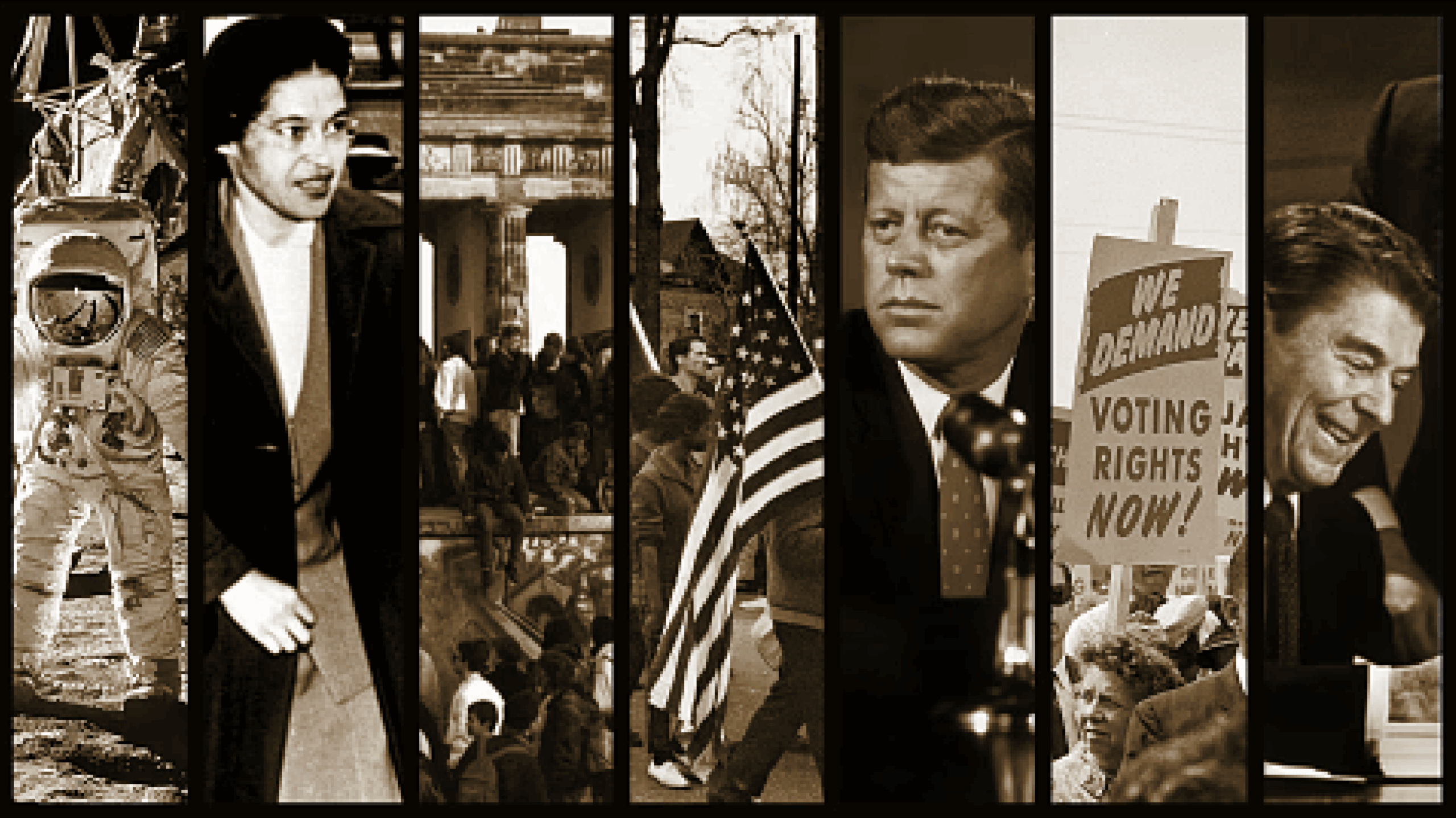
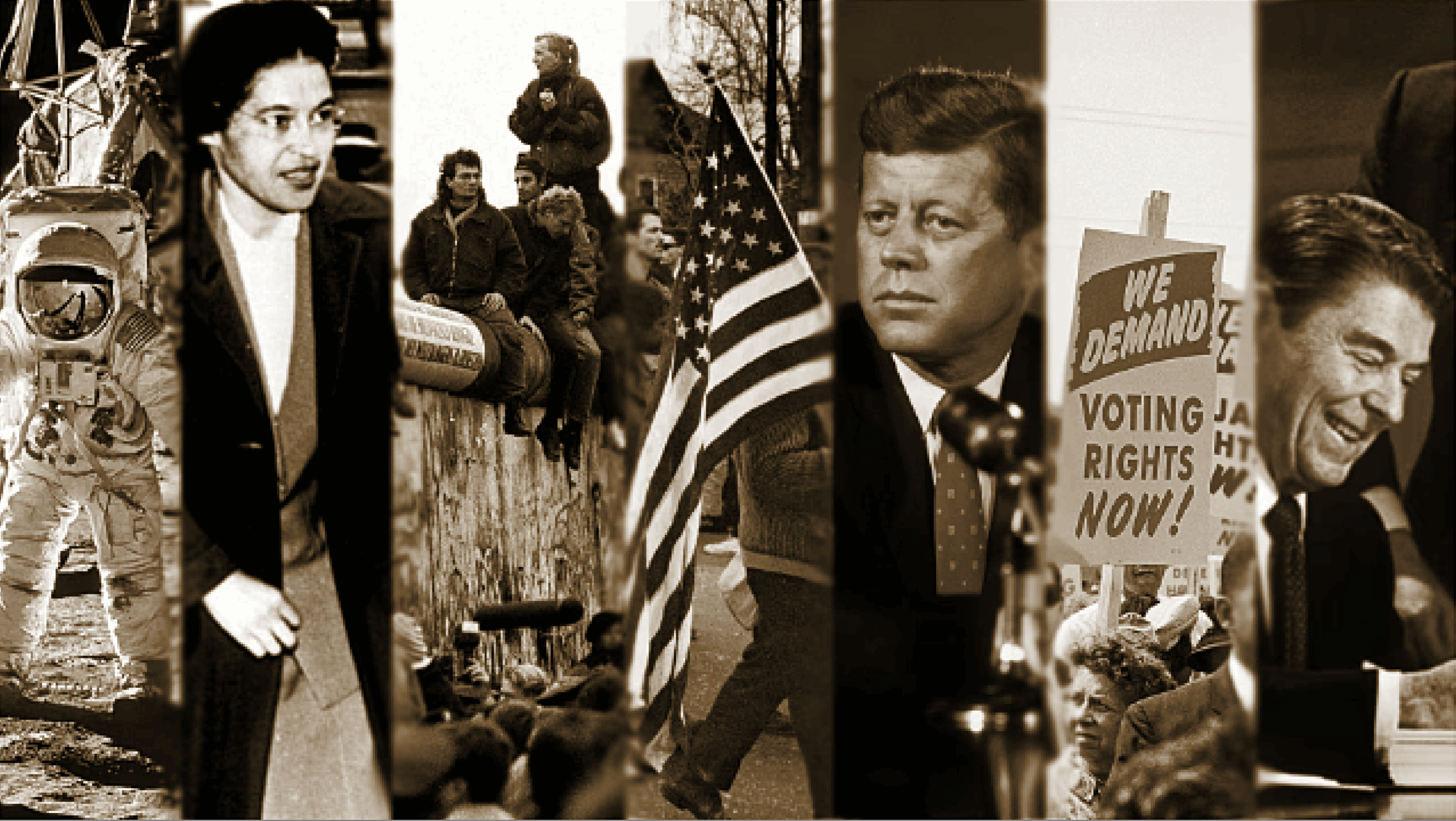
I updated some more backdrops by mostly making the images darker and having more contrast! I also changed the swirl design to a more suitable one and revised the gradients!
── ⊹ ࣪ ˖♡˖ ࣪ ⊹ ──
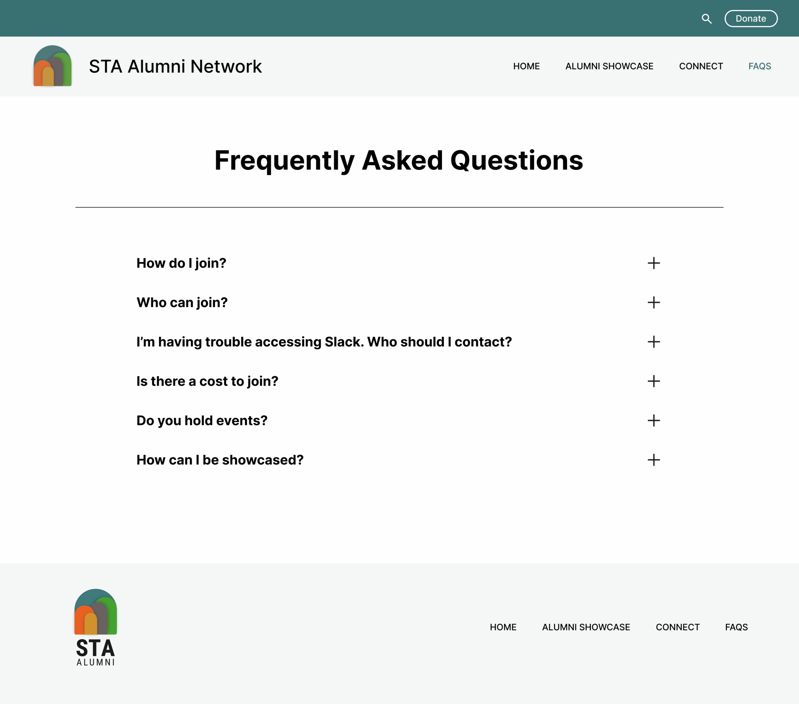
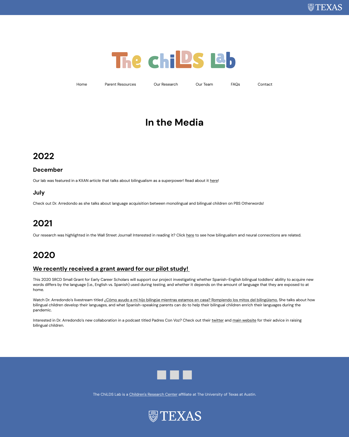
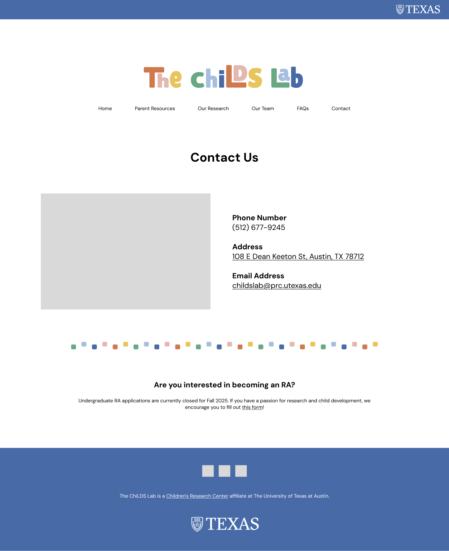
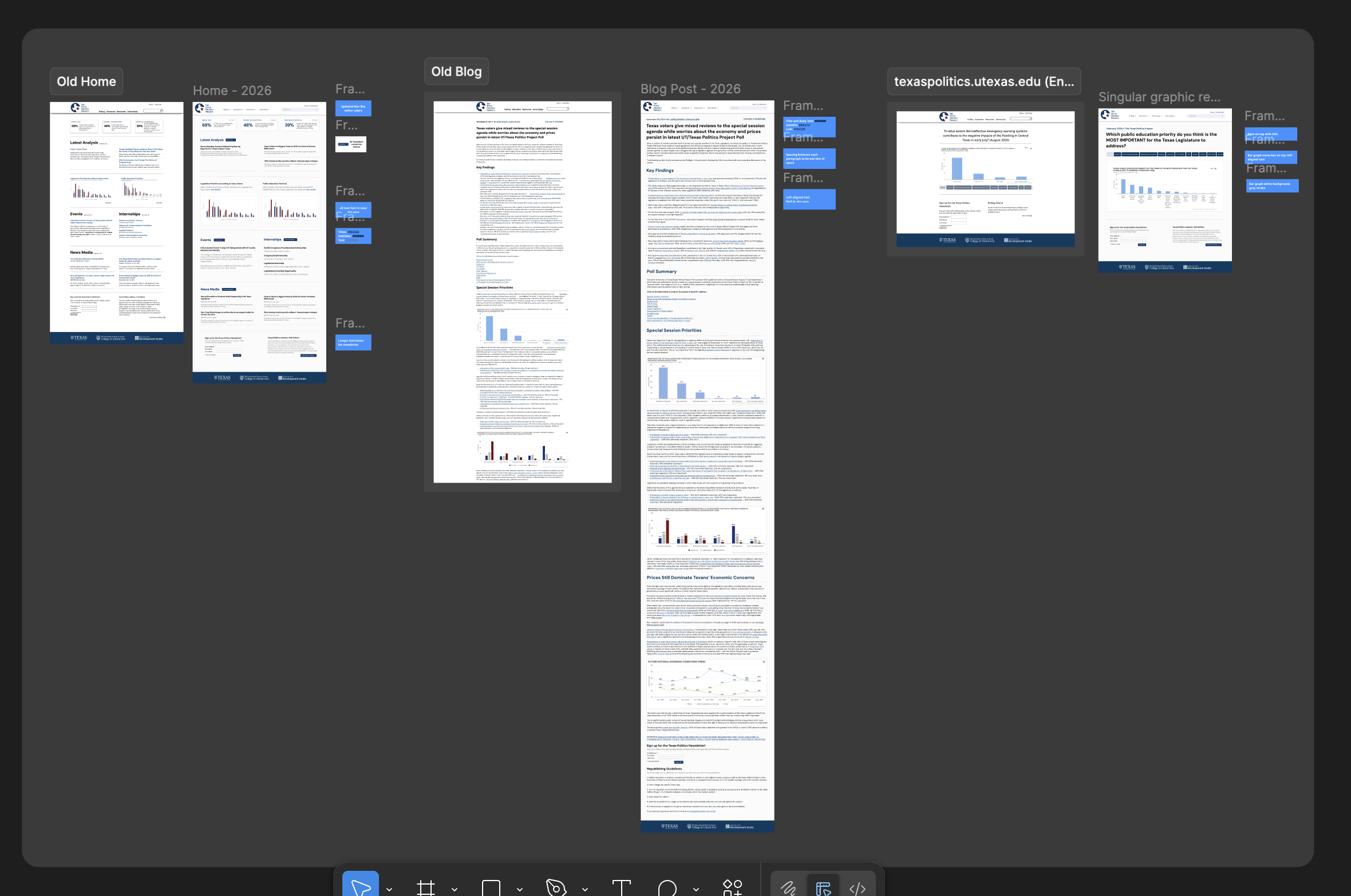
Texas Politics Project
── ⊹ ࣪ ˖♡˖ ࣪ ⊹ ──
── ⊹ ࣪ ˖♡˖ ࣪ ⊹ ──
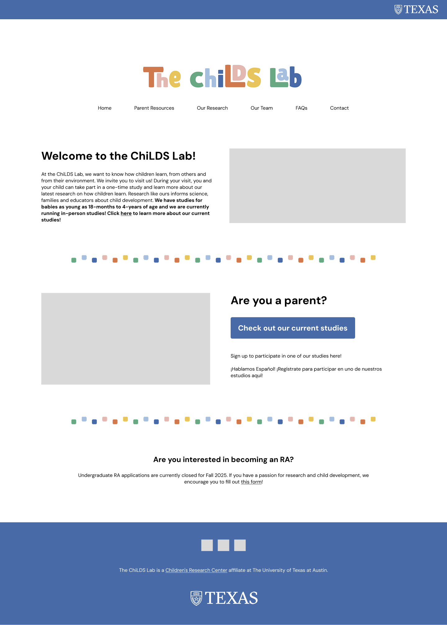
After having a meeting with the developers, I made sure to keep the design simple yet modern but also correspond to what was already on the website!
Most of the revisions included:
- Turning “Read More” text into buttons
- Establishing colors for headings, sub-headings, and body text
- Reformatting spacing in body text
- Adding an area for the authors and dates