Basic Training: Logo Design
My first STA training outside of my new STA training modules! I started on this training after finishing my ART301 Introduction and had a great time going through the whole ideation to finished mock up process.
Activity Description: Creating a Logo
Now that you are more familiar with the 101 of logo design, you will make a brandmark, which is an icon/symbol that represents your brand.
Then, you will work on a wordmark or a lettermark. A wordmark is the design of the brand name (like Google’s logo), whilst a lettermark is the design of the brand’s acronym.
1. Ideation
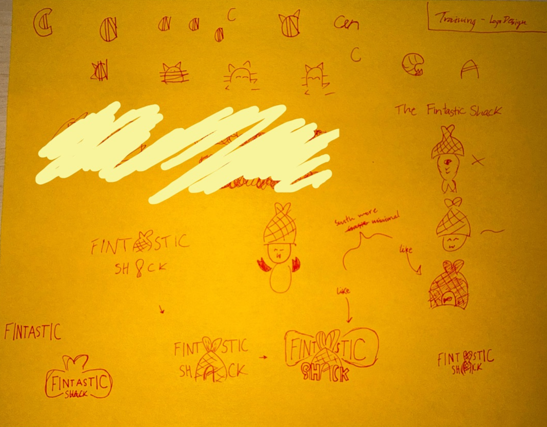
I started off with playing with the “fin” idea and just sketching random related doodles. I eventually followed a similar theme with each doodle I did and started to favor writing out “FINTASTICK SHACK” in my designs. I then realized both words have an odd number of letters and both middle letters of each word were an ‘A’. So I took that realization and ran with it for my final sketches I wanted to do for my logo and icons.
2. Sketch to Illustrator
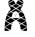

I transferred my sketch ideas into Illustrator and refined the details I couldn’t on the paper.
I played around with the negative spacing that is present with the font I chose for this. I really played with the ‘A’ to make it look like a fish’s body and with the negative space of the fish I thought it looked like a person so I added a face. Then for the “FINTASTIC” lettering I also wanted to make the sizing of the letters be different to have it look like a fish from a side view as well.
3. Iterate and Refine

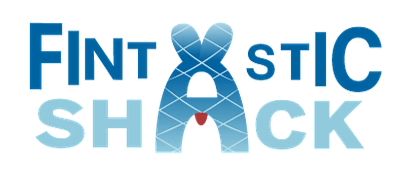
Messing with the color palette for the icon, I chose to go for a more blue tone vibe to connect with the ocean since the restaurant is a seafood restaurant. I also made the lines on the fish thinner to not draw away from the actual fish shape, so the lines were just the scales. The red adds a small contrast to the overall icon and logo since I thought the negative space was a person, I opted away from choosing to add a face to the person and instead gave them a bib that seafood restaurants tend to give to their customers.
4. Finished logo and the mock up
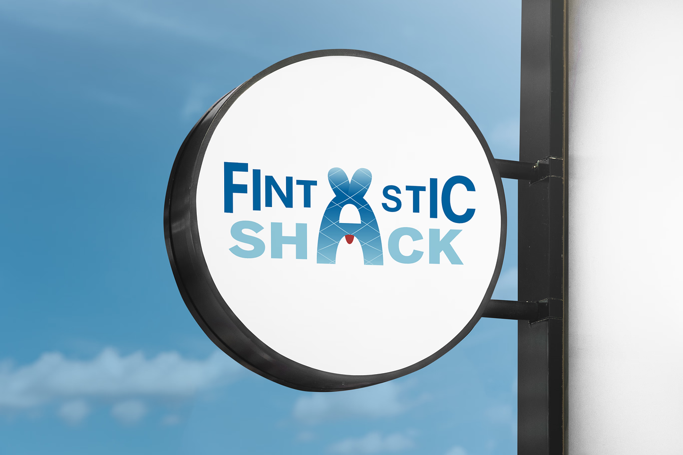
I finished this activity by using Photoshop to edit my logo and lettermark onto a mock up of a sign/marker of where the restaurant is! 😀
────── ෆ˚⋆୨୧⋆˚ෆ ──────