
Woo!
I have officially completed all 33 design trainings that we have along with 7/12 of the web dev trainings!
Current Sta
I have officially completed all 33 design trainings that we have along with 7/12 of the web dev trainings!
Project: COLA Website Refresher
Client /Prof: N/A (College of Liberal Arts)
Completion Status: Started August 25, 2021
Staff guidance: Michelle Vanhoose, Chris Rankin
STA team members: Ingrid, Adrian
description/plans: Points of Contact and Site Evaluation.
To be completed: TBD (long-term)
Hey everyone. This past week I’ve been working on COLA tasks and some few trainings. For COLA I’ve continued to email clients which is a first for me as well as evaluating site sizes and making notes of any interesting features or elements.
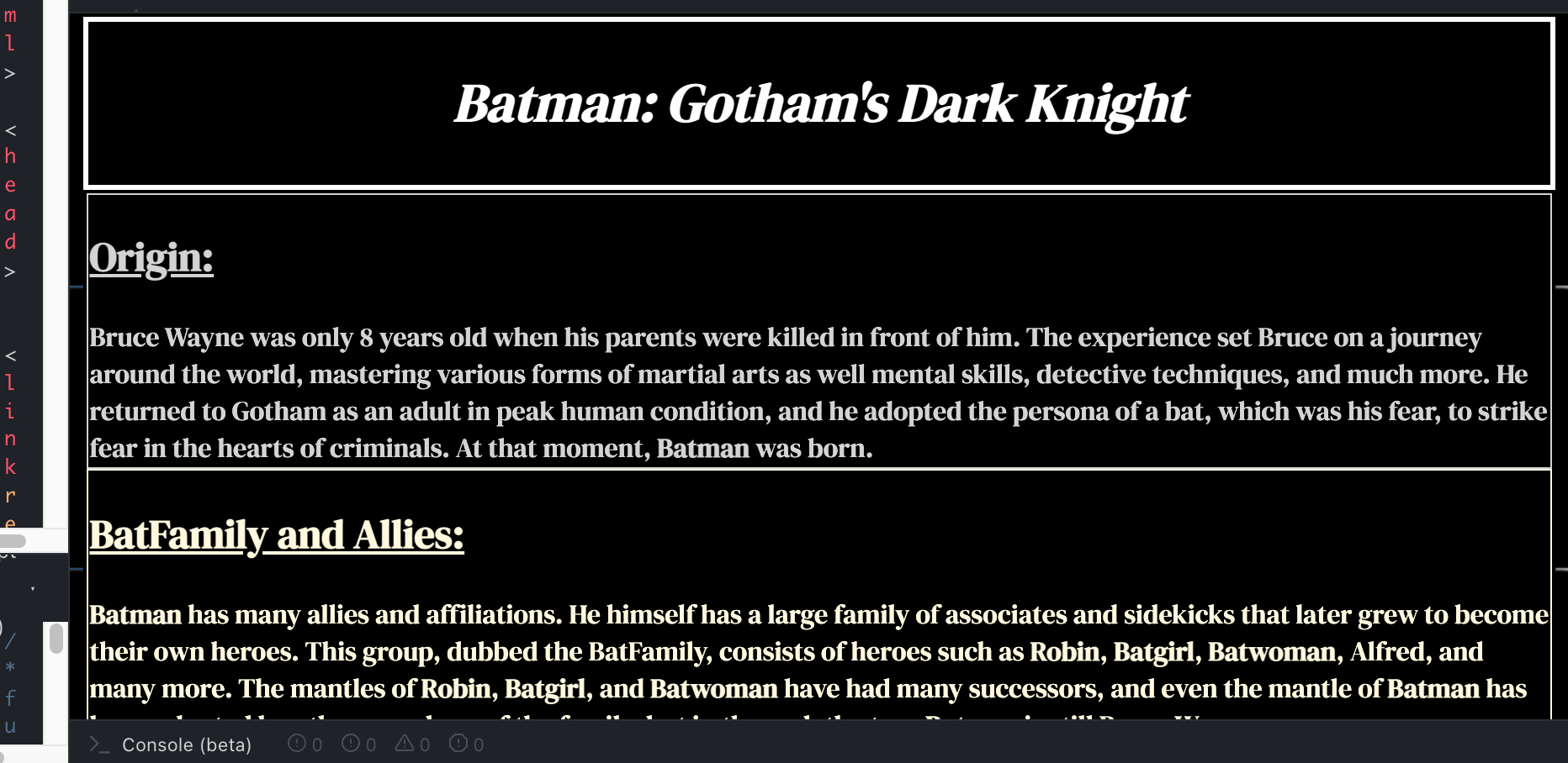
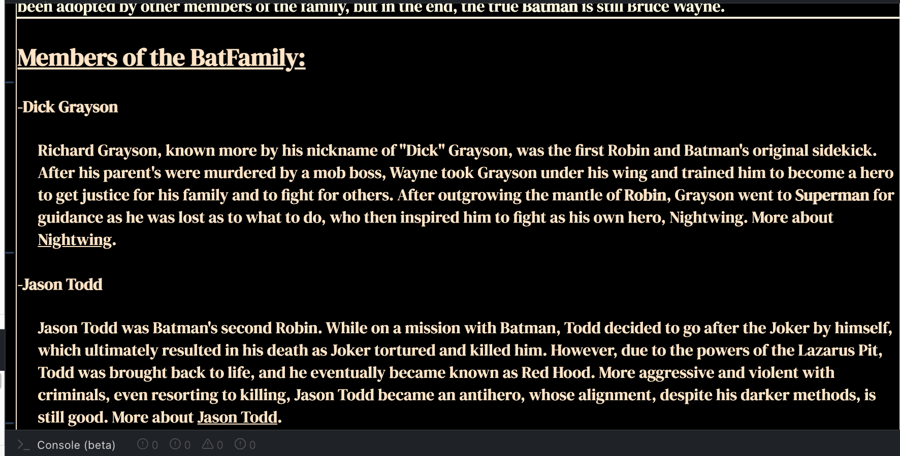
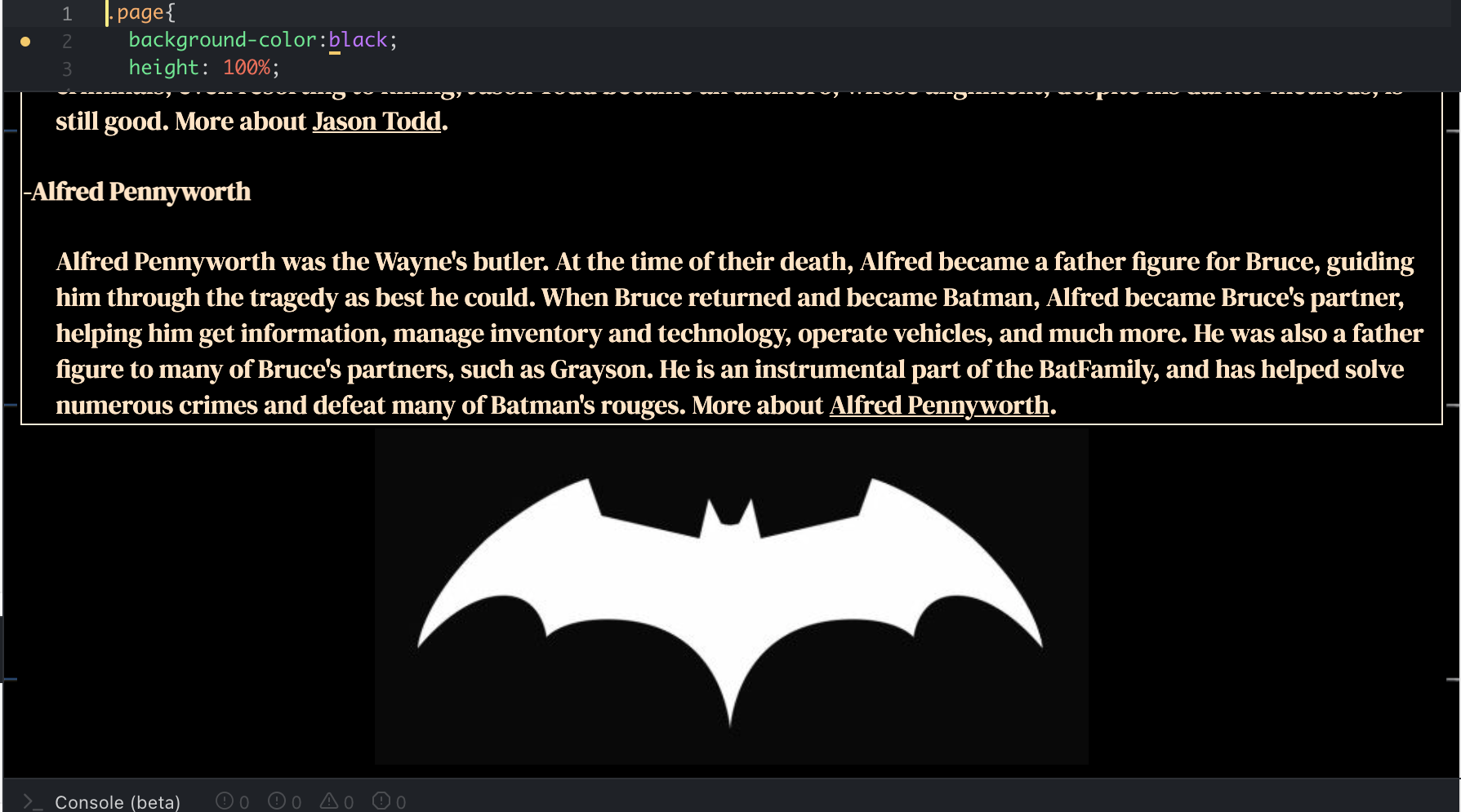
I have also completed the HTML training and have moved onto the git training and am working on that during downtime. Here’s a picture of my finished site.
Project: COLA Website Refresher
Client /Prof: N/A (College of Liberal Arts)
Completion Status: Started August 25, 2021
Staff guidance: Michelle Vanhoose, Chris Rankin
STA team members: Ingrid, Adrian
description/plans: Points of Contact
To be completed: TBD (long-term)
Hey everyone. This past week I’ve been working on COLA tasks and a few trainings. For COLA I’ve been evaluating site sizes and documenting them down as well as emailing clients for points of contact.
For the next section of this training, I will be creating a branding guide for a business. I decided to choose the “Fairy Forest Cafe” because it would allow me to be creative in the design and focus on my typography and color schemes, which are areas I don’t have a lot of experience with.
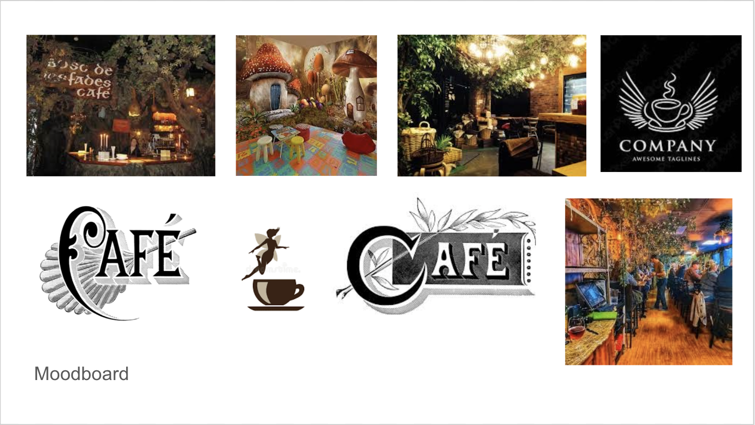
So far, I have been able to mainly focus on getting the logo design ready. Here is the moodboard I created with inspiration for the logo design. I wanted the logo to be cozy, welcoming and magical. I really wanted to express that it is a Fairy Forest Cafe.
Here are the two original designs I created for this client.

After receiving feedback from Maddy, I could tell that the second logo had a lot more potential. The coffee was still the center of attention for the brand but it still incorporated element related to a fairy. The next steps were to make the wings and the coffee cup look like they are a part of the same logo instead of different elements combined.

 With more brainstorming, I was lead to these two design edits. I still incorporated the cup and the wings but I redesigned the complexity if the wings. I also removed the handle on the mug and replaced it with the wings.
With this edit I discovered that it no longer really looked like a coffee cup but instead a bowl of soup. In addition, having the two pair of wings felt more balanced for the design of the logo.
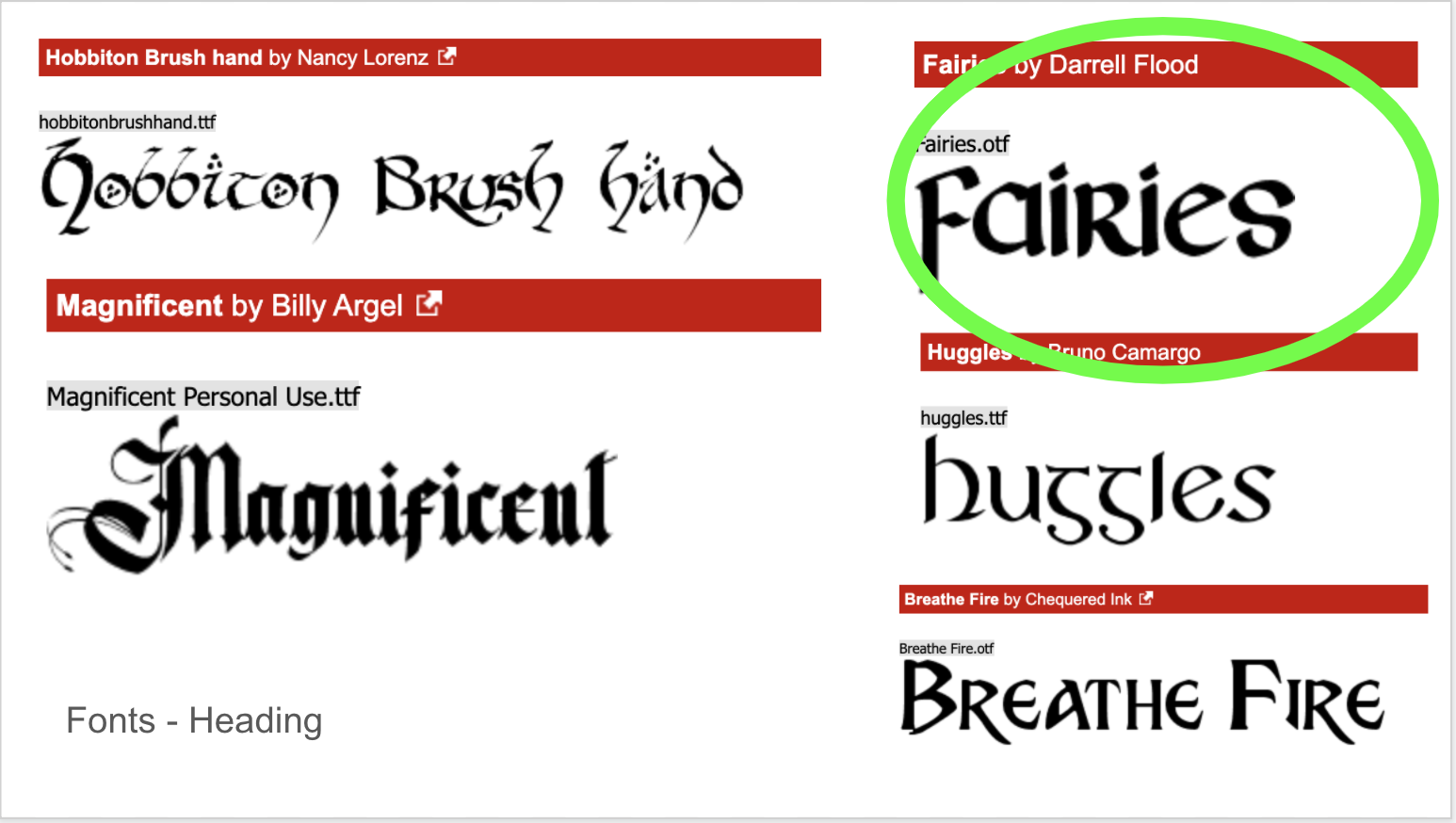
Also, I began looking at different fonts to incorporate into the design. I selected a few off of dafont that I believed matched the aesthetic I was going towards. After adding all of them to the logo, I found… ironically… that the Fairies font worked best for the design.
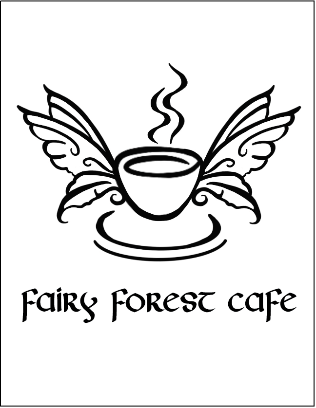
I received some more feedback and It was decided that the logo needs the handle on the cup to truly represent coffee. Here is the mock up of the design.

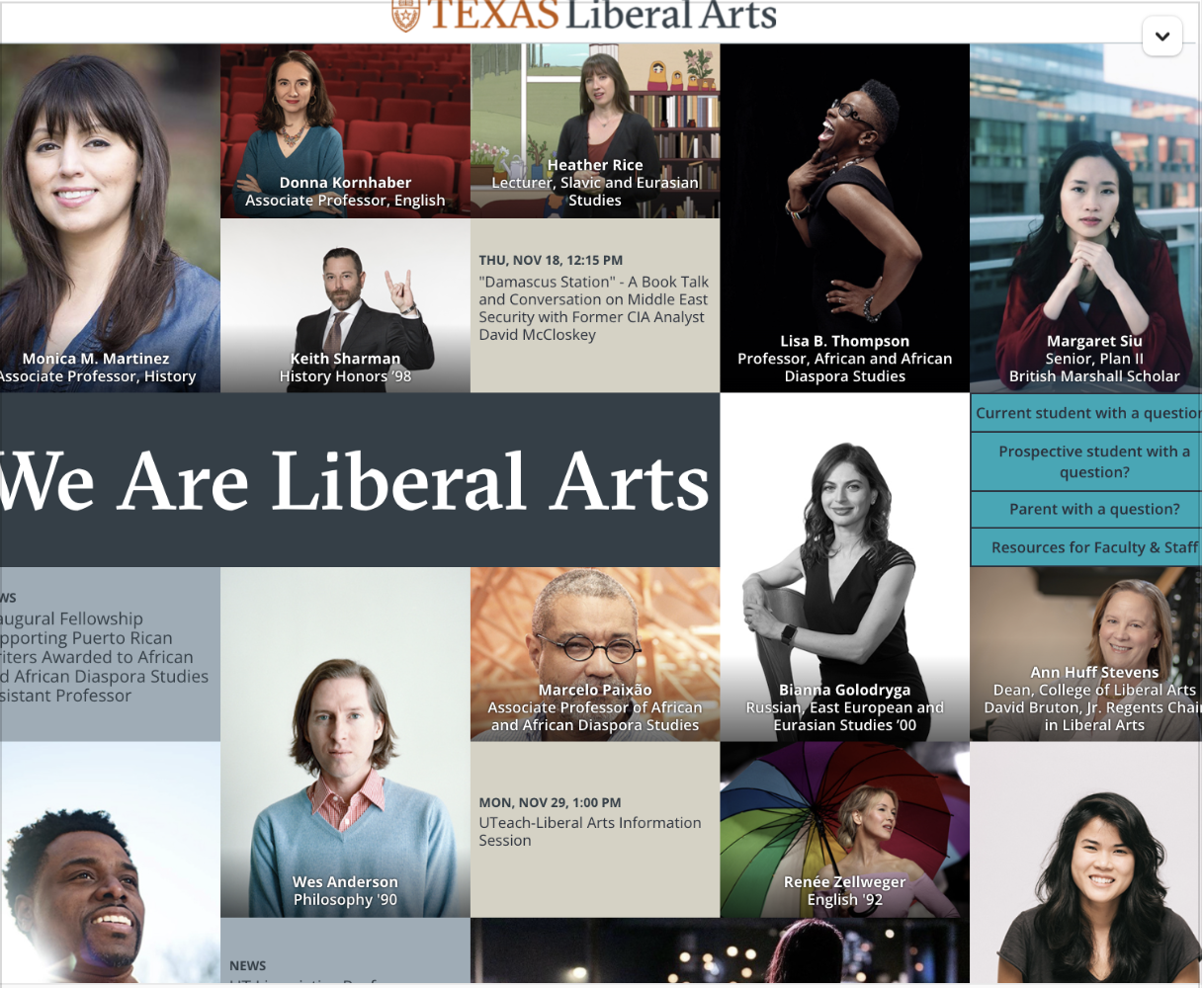
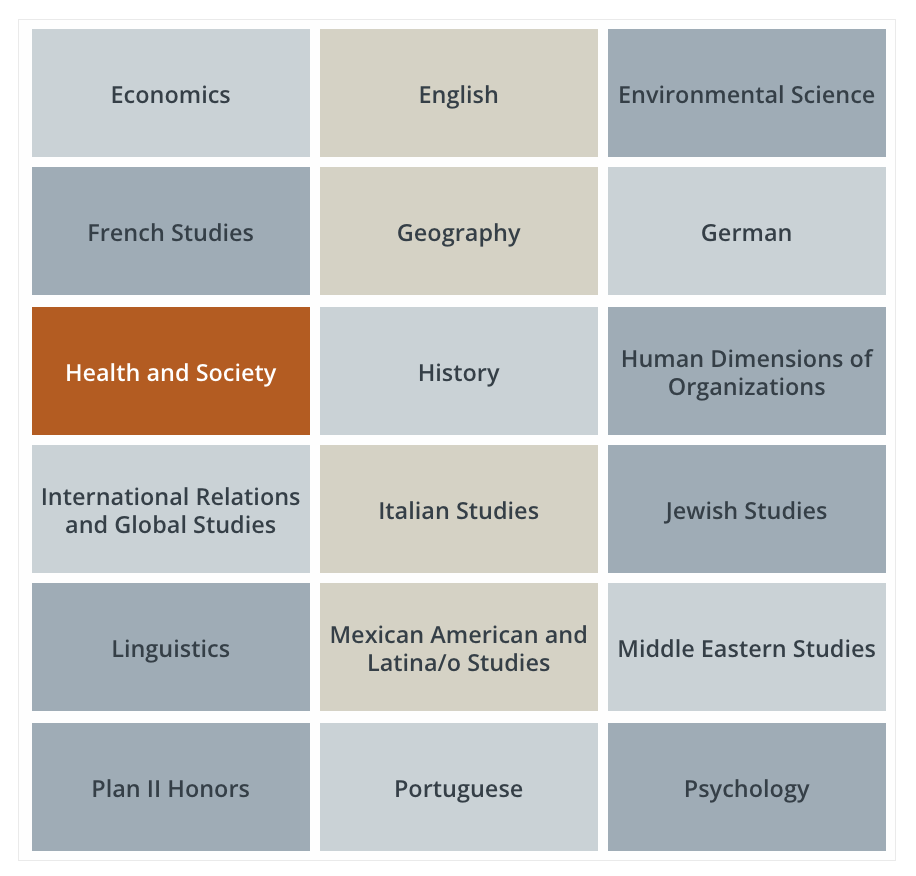
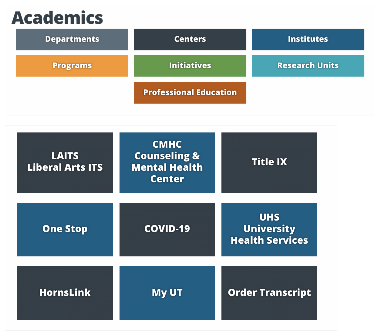
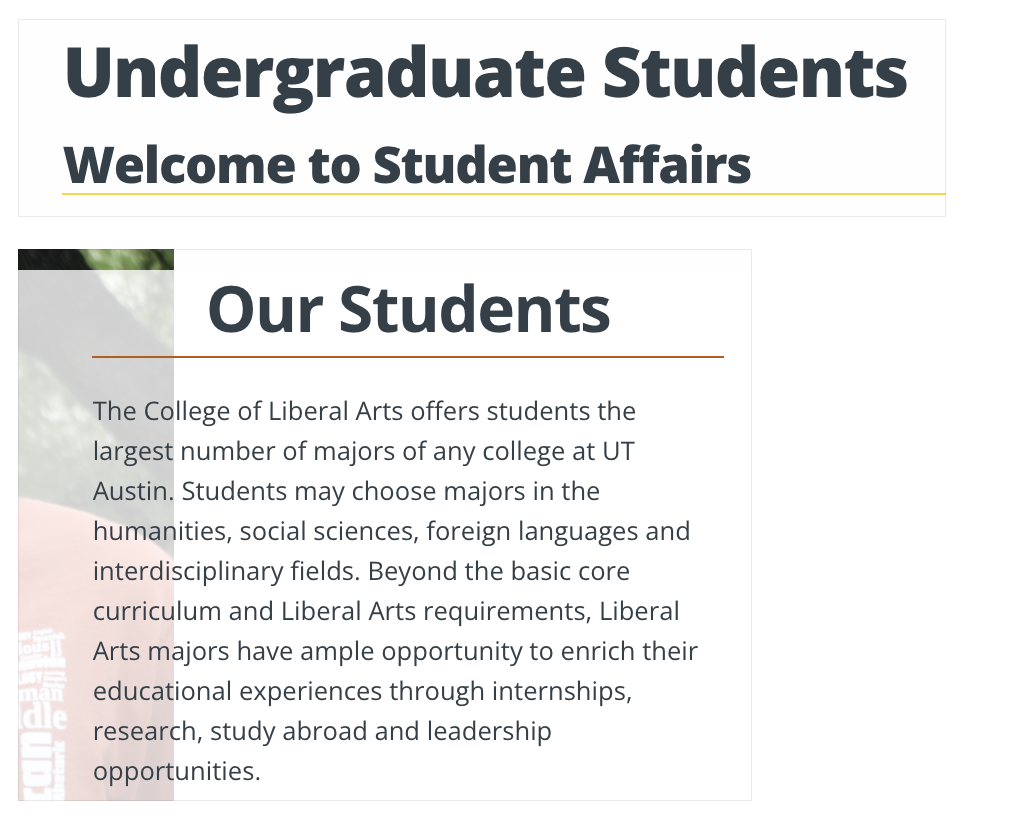
For the first activity in the meaningful brand systems training, I was supposed to conduct research about the College of Liberal Arts’ Website. I found it interesting how their site is strongly influenced by UT’s branding, but they also find ways to be unique in their design. Here are some of the notes I took while researching the site.
College of Liberal Arts at UT
Visual Material:
Assess Findings:
The college of liberal arts stays really close to the branding standards of UT as a whole. They use the same color scheme, typeface and imagery. I believe that liberal arts is a little more creative in how it utilizes UT’s branding, because at first glance it feels different. Therefore, I believe the organization of the sight is quite unique.
This showcases the the college of liberal arts has the same vision for success for their students. Just like in their motto, they talk about creating “world opportunities” which translates to UT’s slogan, “what starts here changes the world”.
In terms of the site, there are a few inconsistencies with the padding on some of their headers but overall, it is a well executed site.
Final Questions and Reflection:
After reviewing UT’s branding Guidelines, it is now easier for me to notice what is in brand with UT. I never knew that even the way the professor’s photos where taken where a part of how UT branded themselves. Overall, it think that has just showcased the subliminal messages UT has been providing to their students. I see UT as a school that thrives for success no matter the obstacle and being in this environment, I have learned to reach in the same way.
With all the resources and opportunities UT provides, it is had not to take risk and go towards your goals.