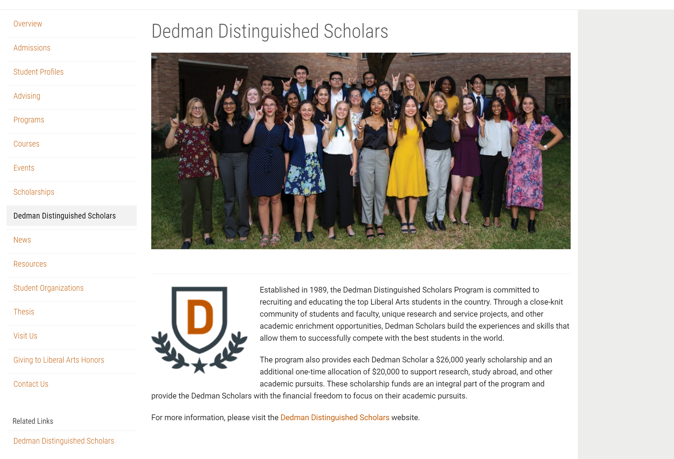
Worked on the draft for the new page in the LAH site with a brief description and a link to the Dedman WordPress site and published the changes after confirmation from the client.
Current Sta
Worked on the draft for the new page in the LAH site with a brief description and a link to the Dedman WordPress site and published the changes after confirmation from the client.
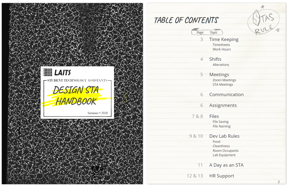
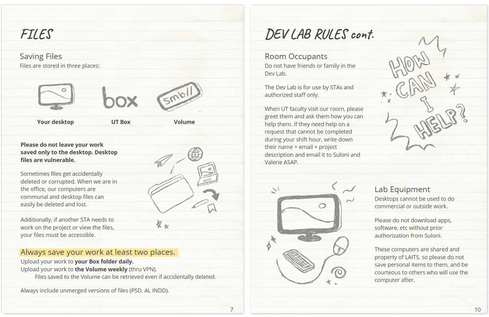
While prepping for summer orientation, I revamped the STA Handbook design. Since it’s one of the first documents a new STA sees, it deserves some love. It is designed to look like a composition book, full of hand-drawn doodles. Since all STAs are students, I thought this would be a cute and relatable theme and maybe make them feel some common ground with new coworkers.
I designed it in Google Slides so it’s extremely easy for team leads to edit in the future.
Since my last post I have started working full time, mostly helping plan orientation for our new summer hires. There is a lot to prep training ~8 new STAs remotely but I’m excited to meet them and get started!
~
Other than that, I have been designing lesson plans for Sexing History, a podcast unearthing facts about sex and sexuality from the past. They want to offer lesson plans for teachers to teach in tandem with the podcast.
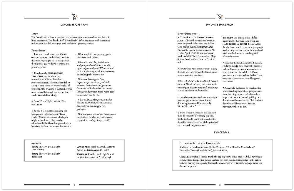
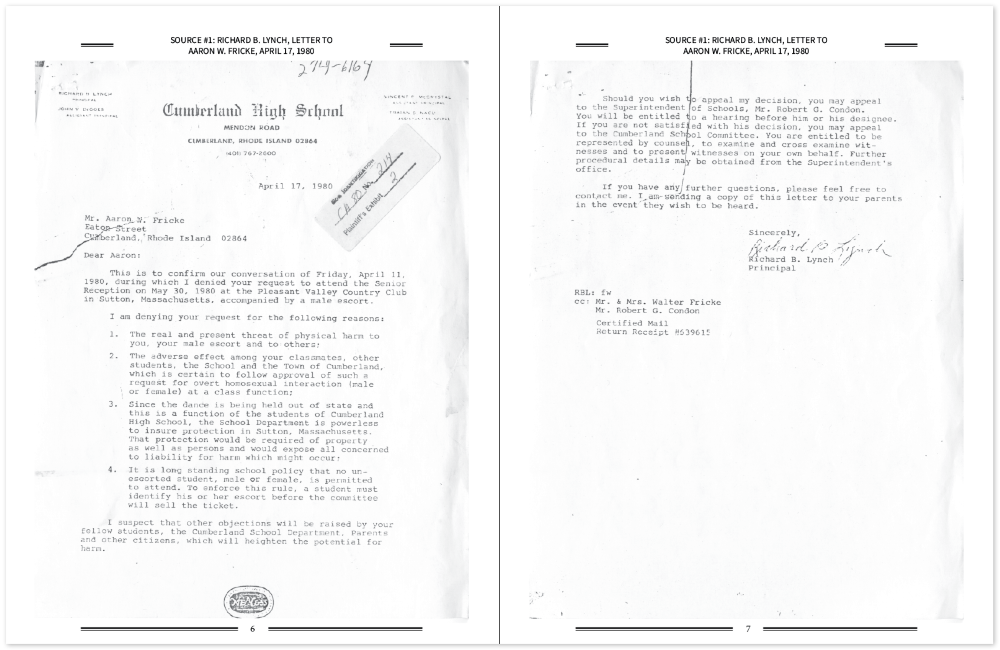
I wanted my design to reflect their brand, which utilizes a lot of vintage imagery. So, I opted for a serif font (Garamond) and some detailed page borders/lines to make it look more “traditional.” Still, it needed to be scannable and easy to read, so I split it into two columns and created a system that bolds sources and tools when they are listed in-text. I could imagine a teacher printing this out and wanting to leave notes to them-self while teaching, so left big blank margins for them to do so. I did this work in InDesign and got a lot use out of its rulers and guides feature.
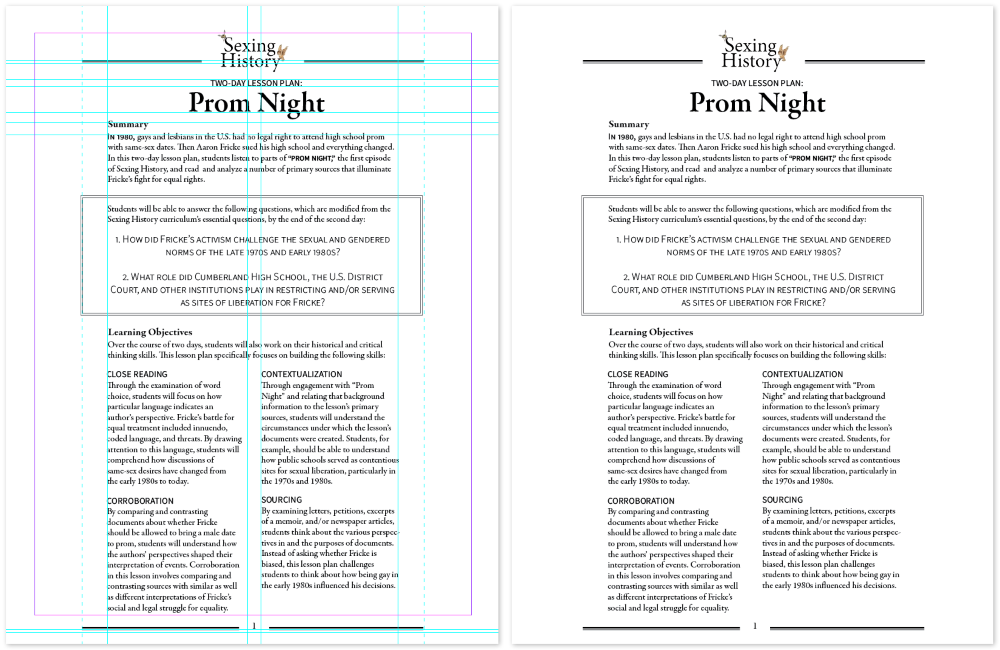
It is always tricky to lay out large blocks of provided text in a cohesive way, which is most evident on pages 4 and 5. When having to make tough cut-off decisions I opted to keep ideas together over visual design since the document is for practical use, and it being nicely designed is a perk, not necessary for teaching.

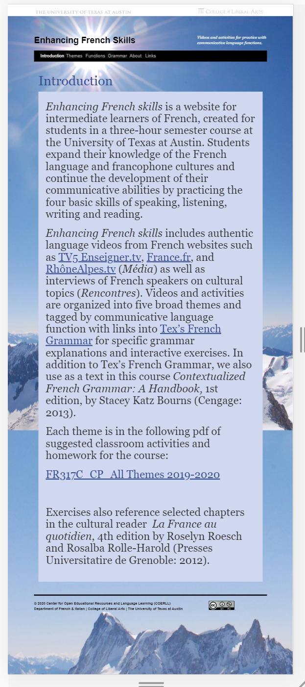
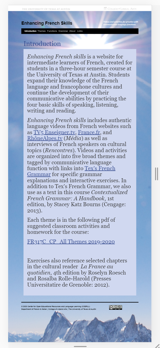
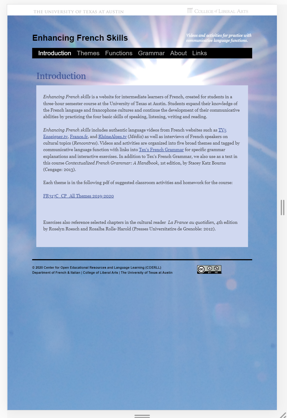
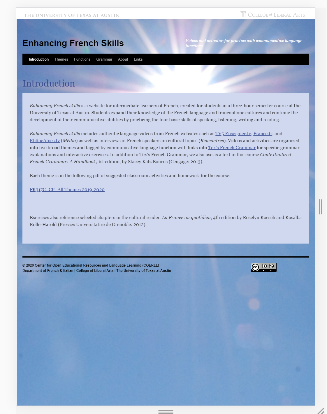
I am currently working on making the Enhancing French Skills website responsive. It is in a better shape compared to the Chinese site and would not require too many design changes. The background is repeating on smaller screen sizes and pages where there is a lot of content. I fixed this issue and I am currently working on an experiment with the margin, padding, and re-aligning a few elements on the page for a better viewing experience on smaller screen resolutions.
I created a Bio as per the specifications given by Maddy. It was fun working on this!

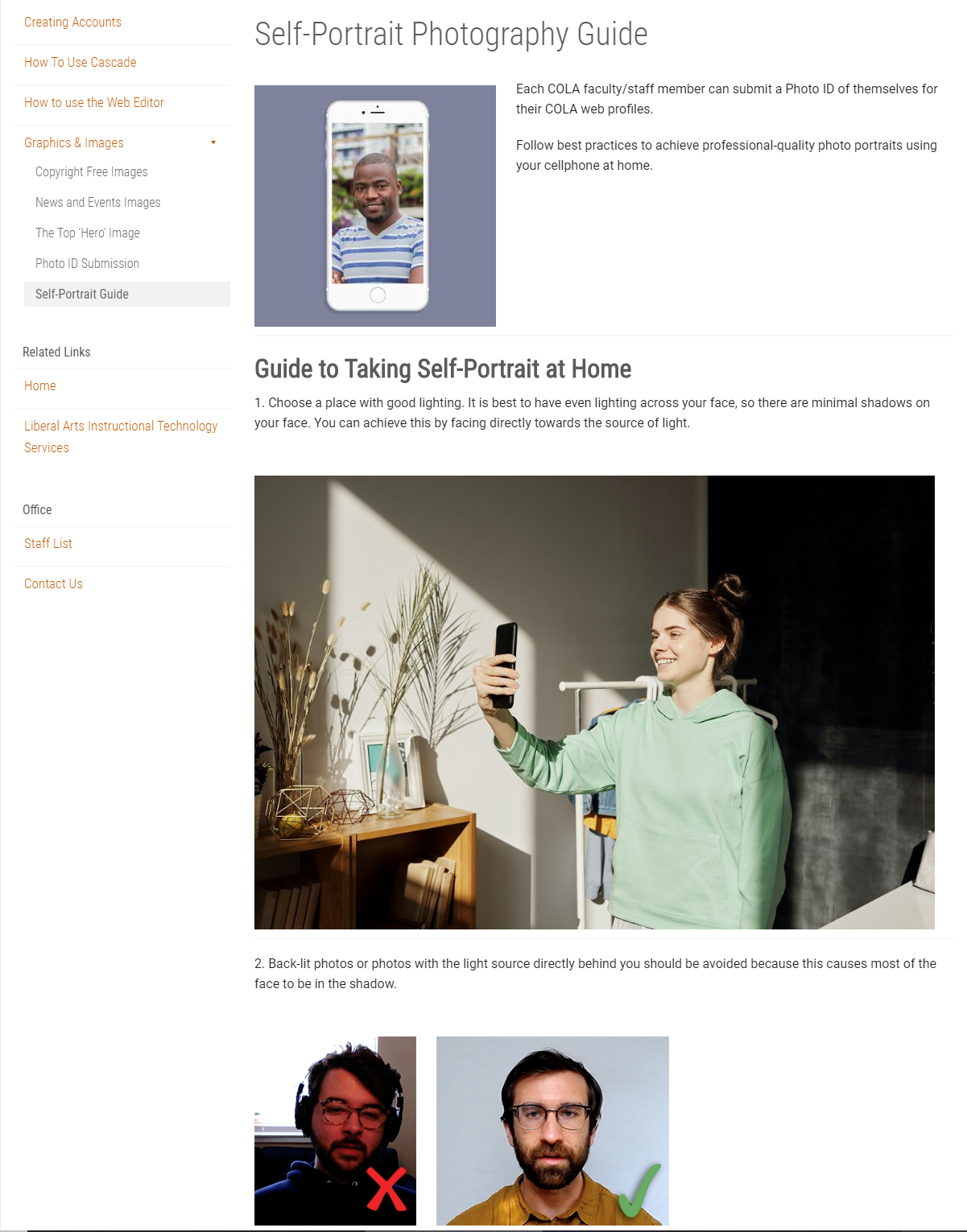
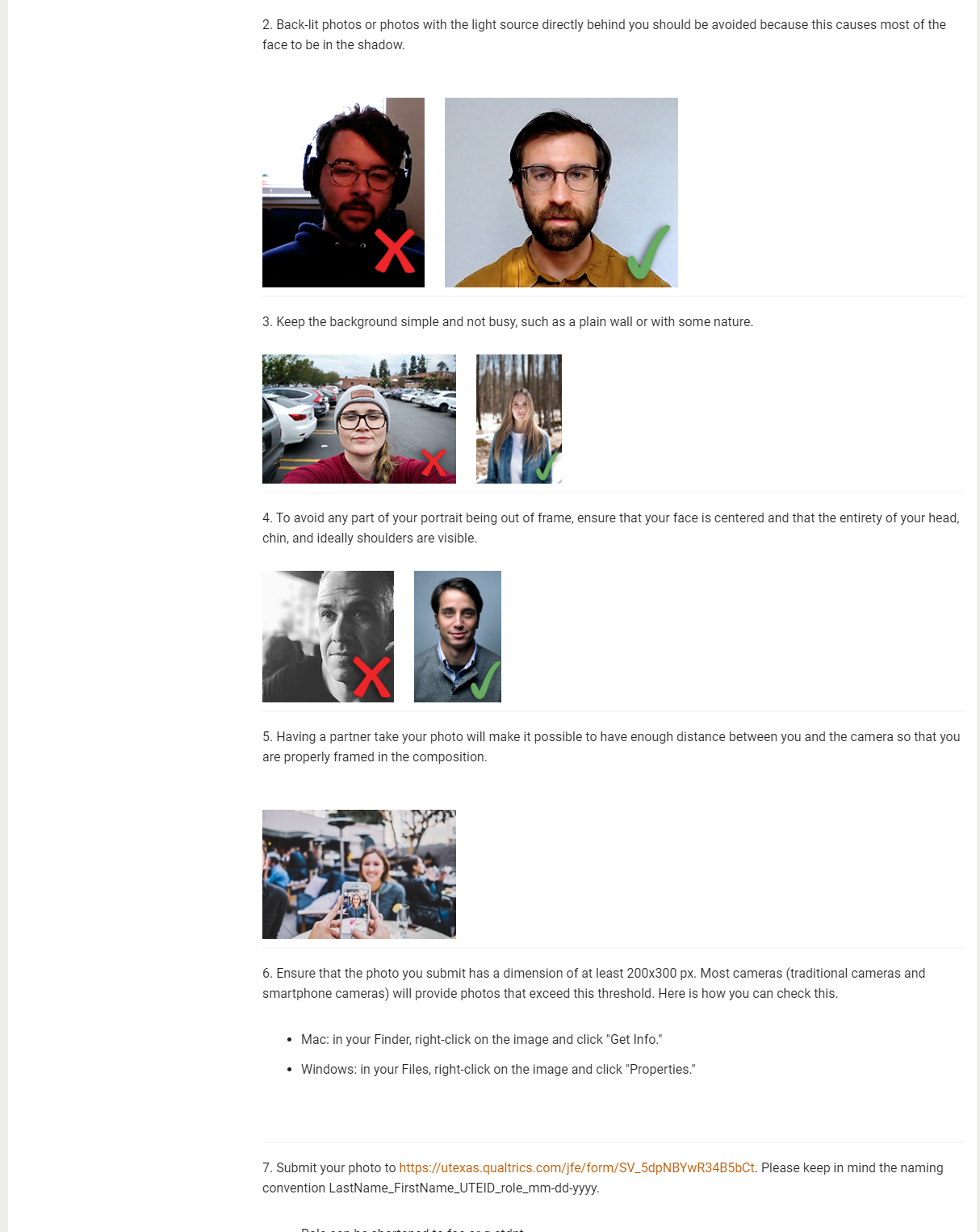
I worked on the photo guide in Cascade and updated the content and images for the page. I have added the Yes and No checkmarks for the example images. This is a Work In Progress and we need to update the page with more relevant images and also add to the content after referring to the updated guidelines.