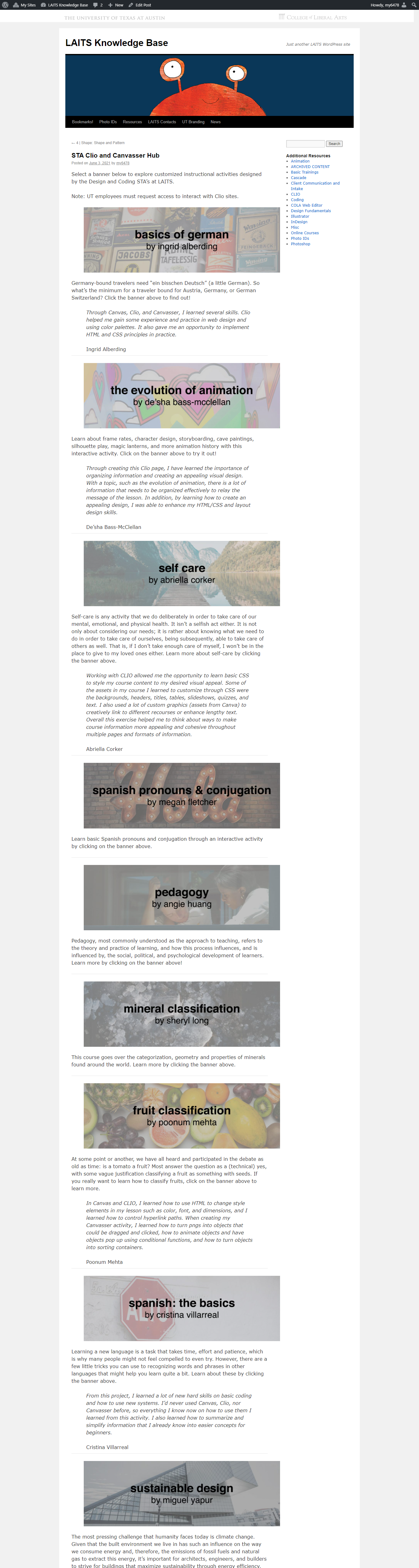
STA Clio and Canvasser Hub
The STA Hub is meant to be a place that hosts all of the STA’s Clio and Canvasser activities. So far, I’ve included a banner, intro paragraph for description, and a paragraph from each STA that outlines what they learned by working with these tools to create an interactive instructional experience. The below screenshot is how it’s looking so far:
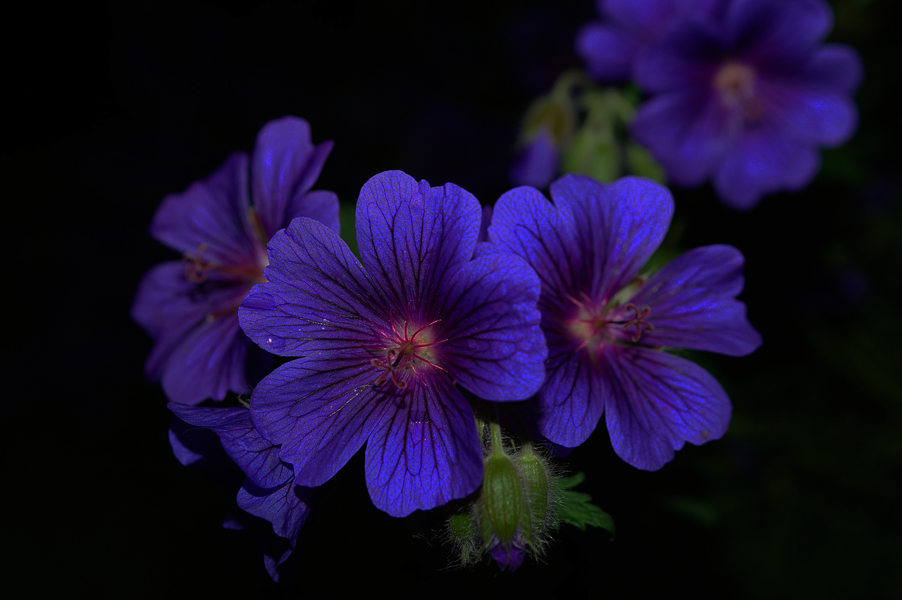
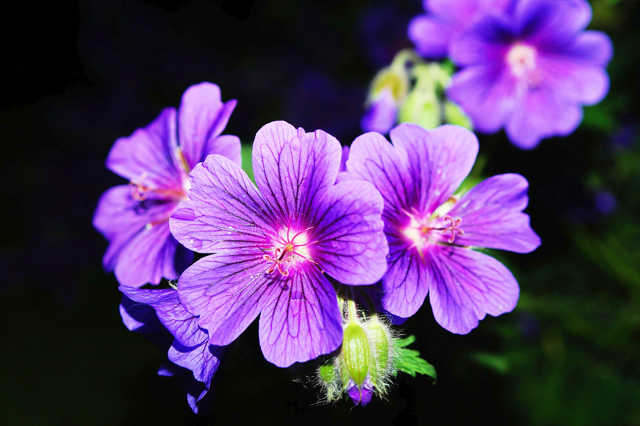
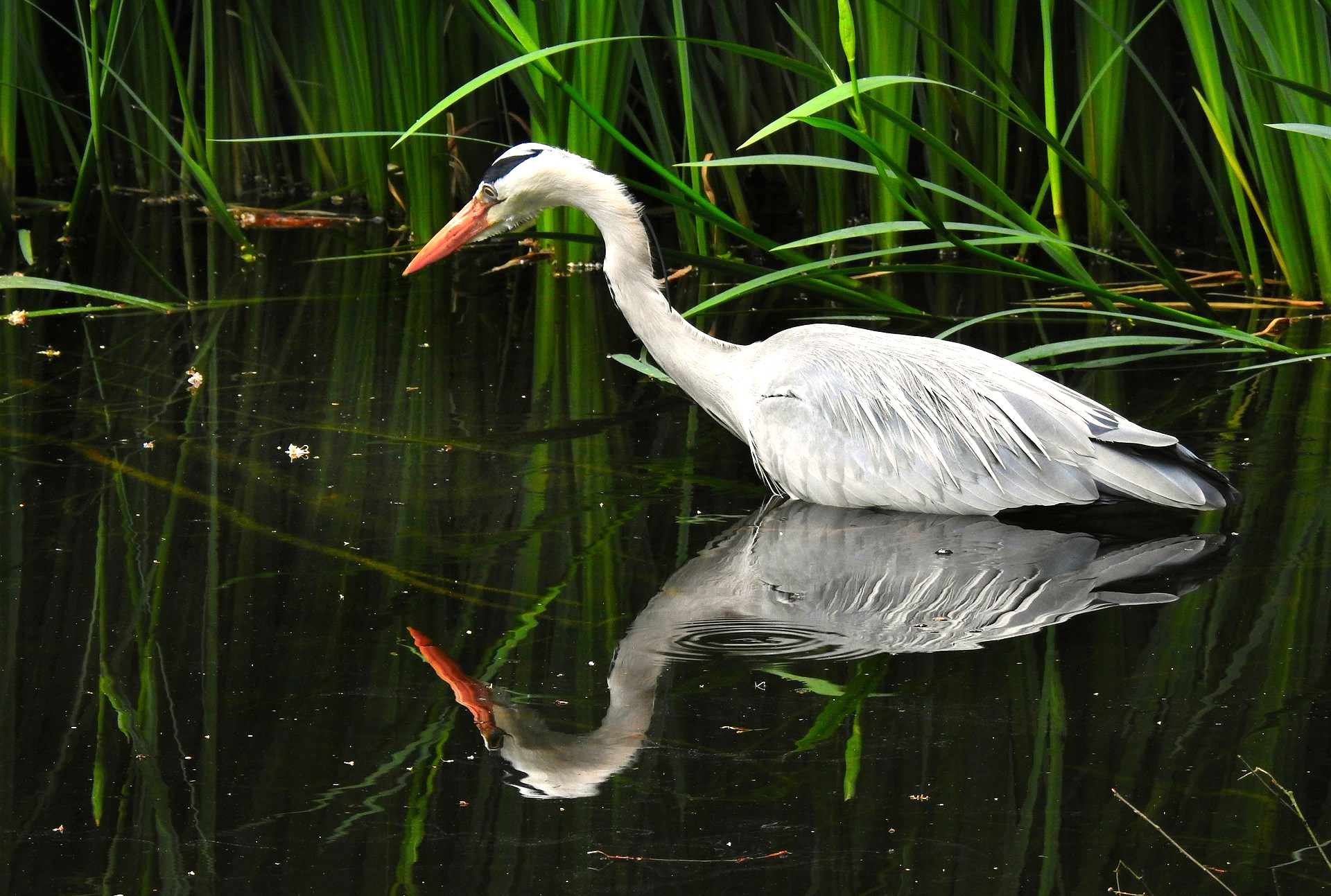
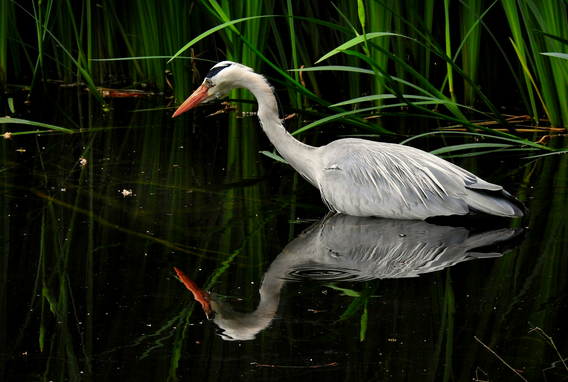
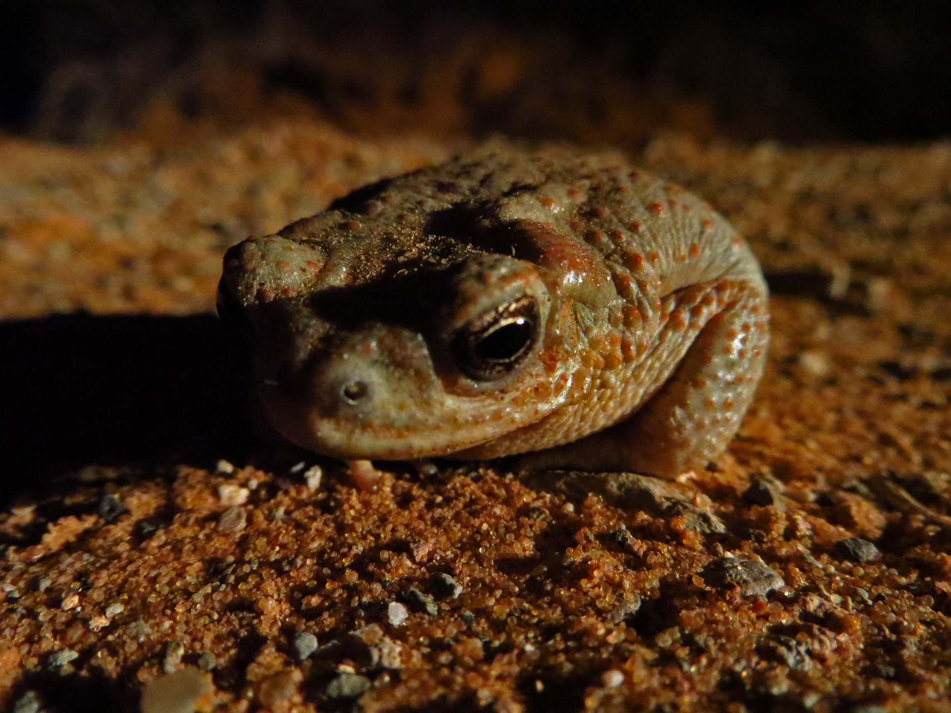
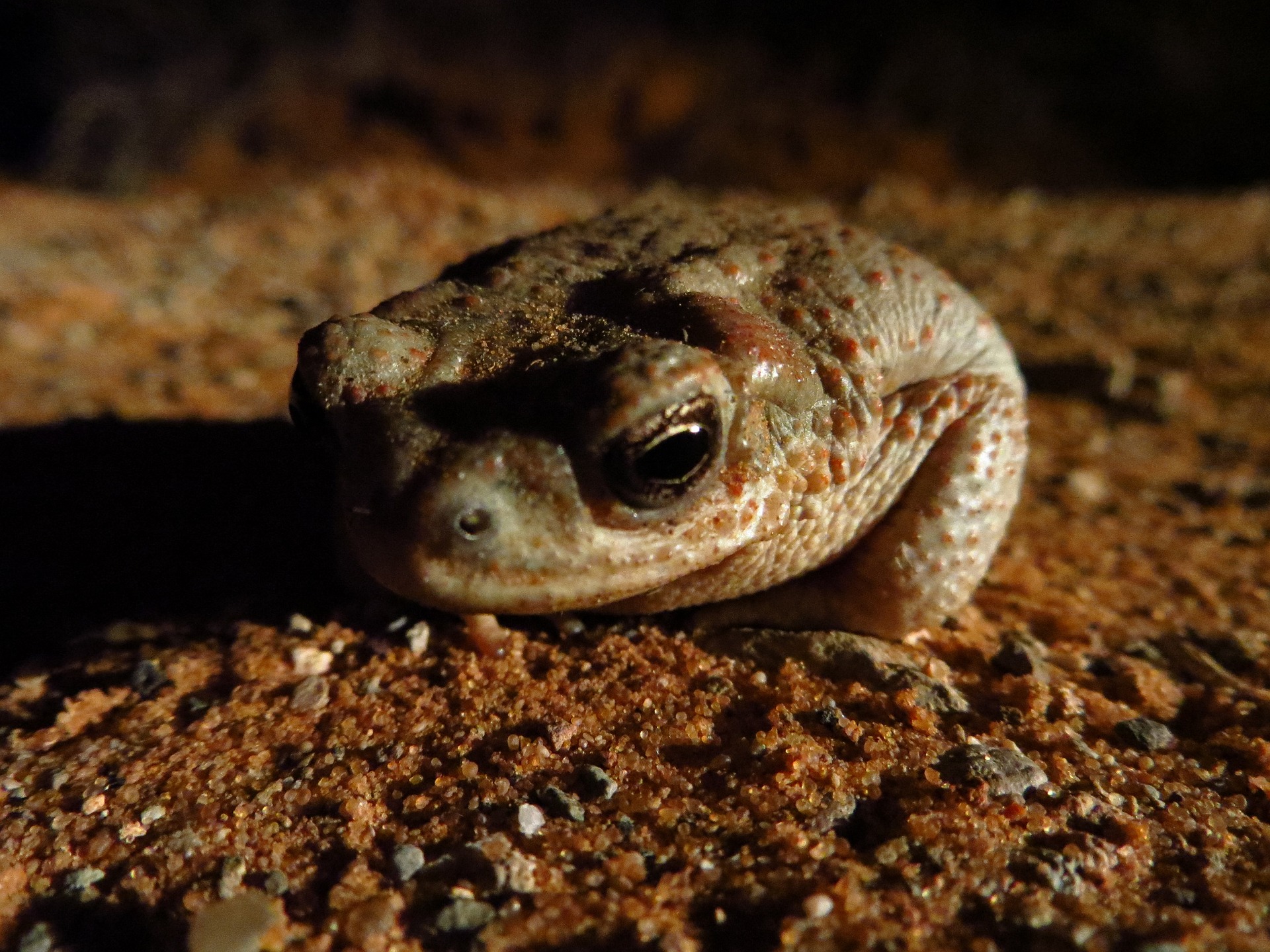
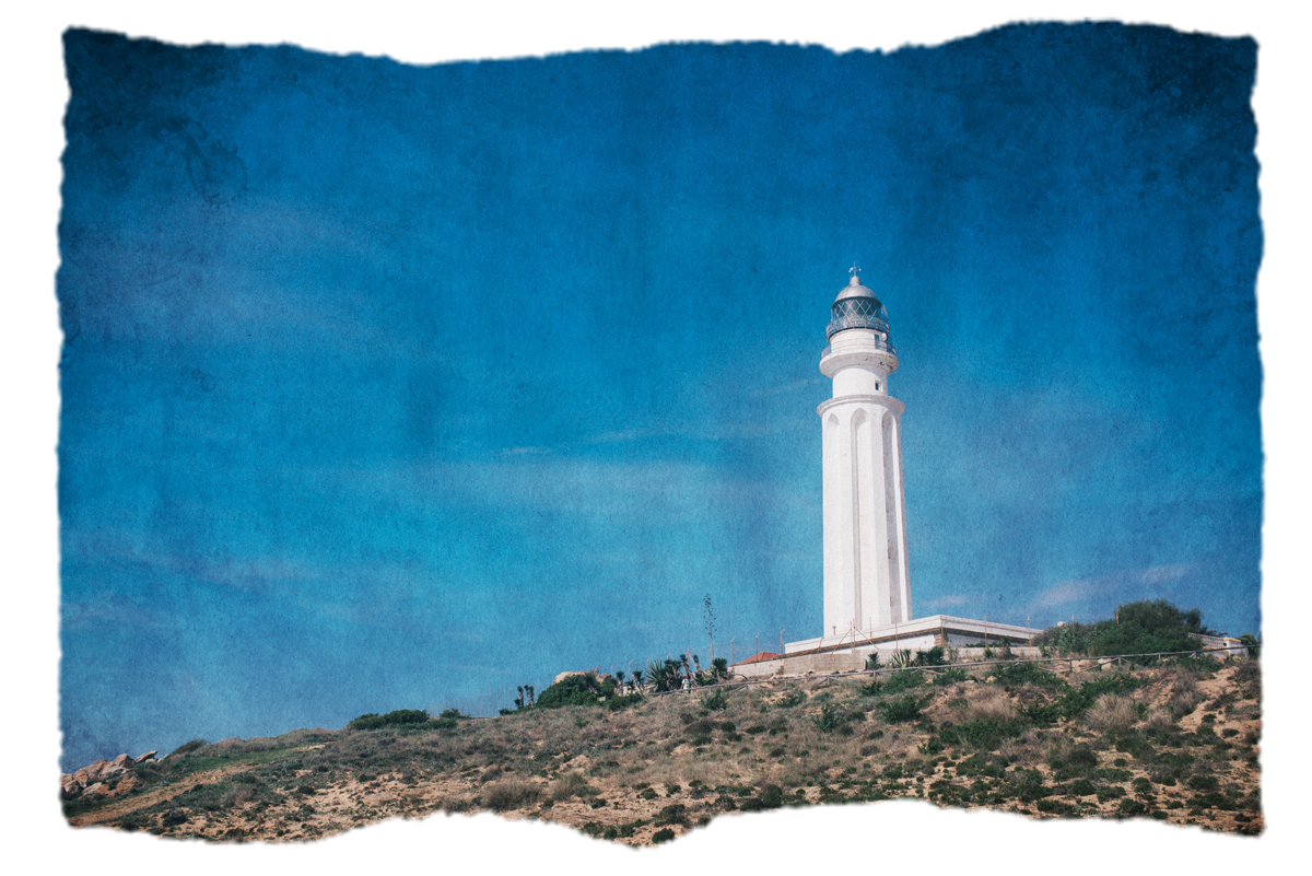
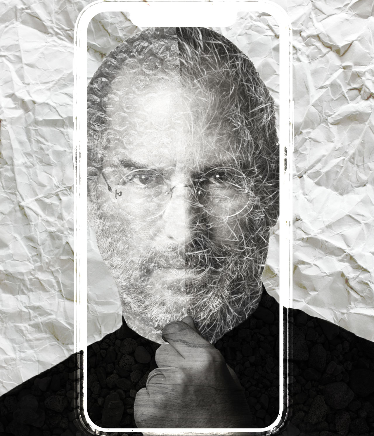
Poonum’s PSD Texture Training
This basic training is meant to teach STAs how to apply texture layers and masks to images. Here are some of the images I made from this training while giving it a test run for feedback:


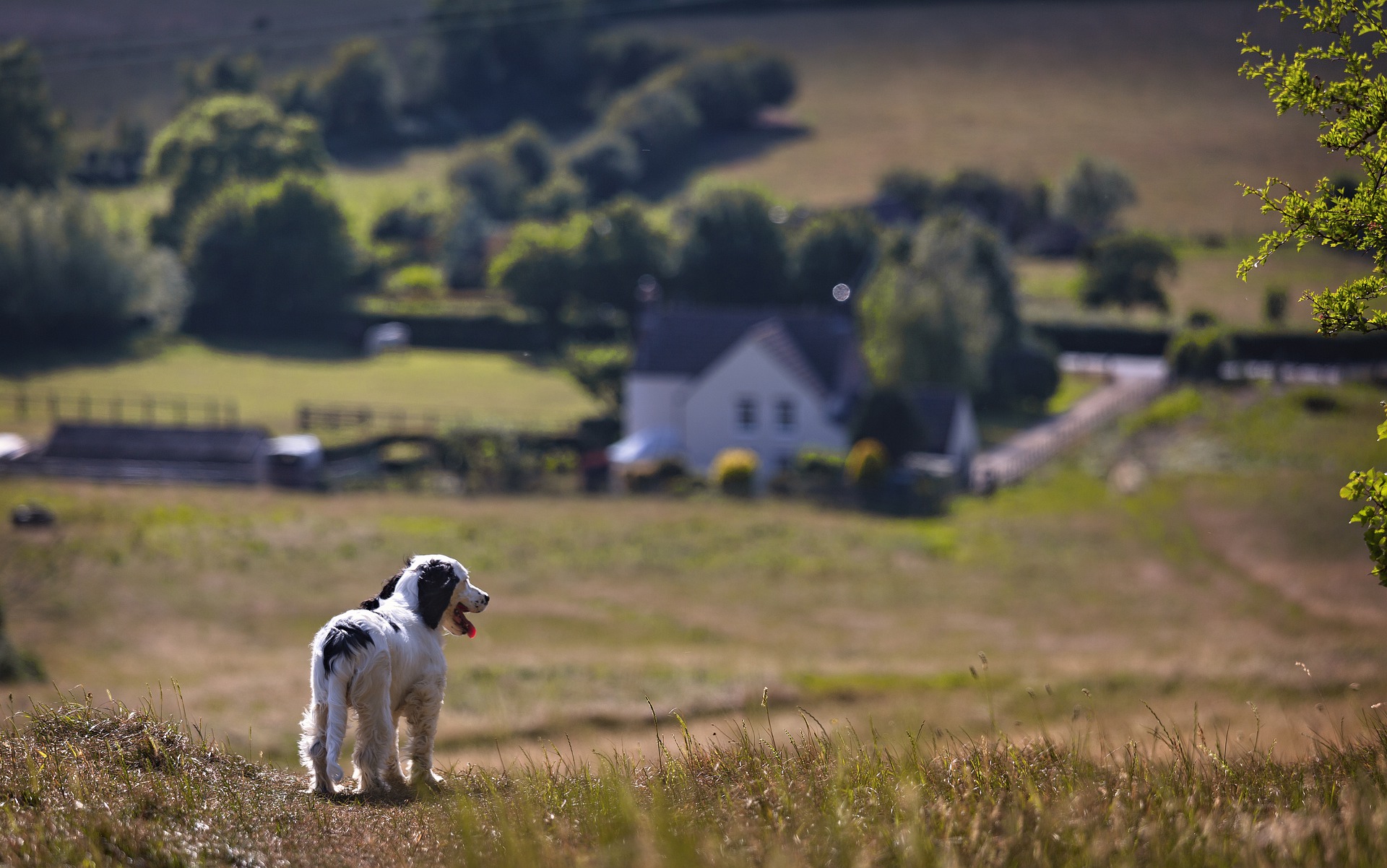
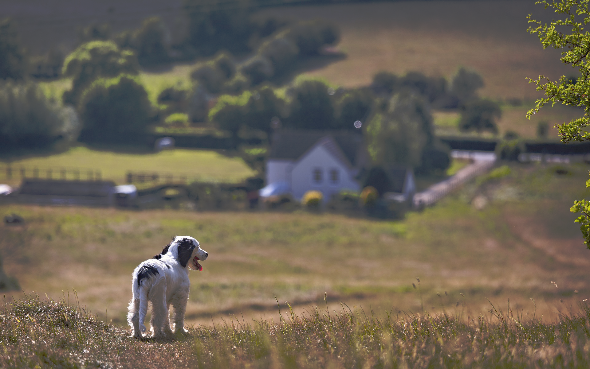
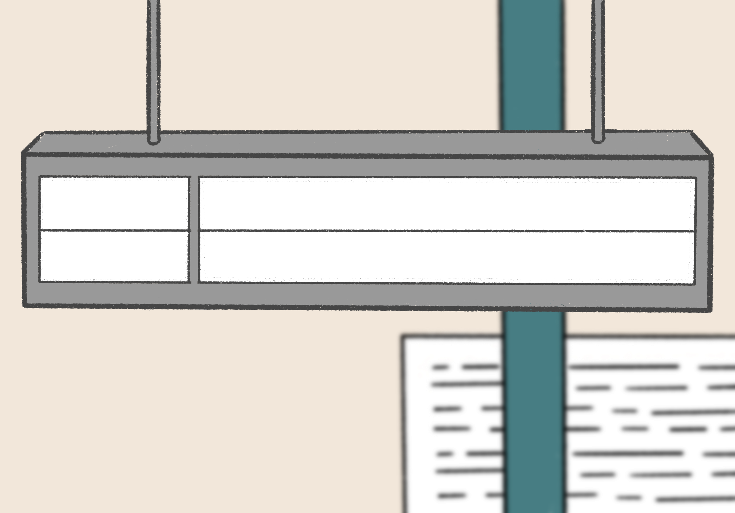
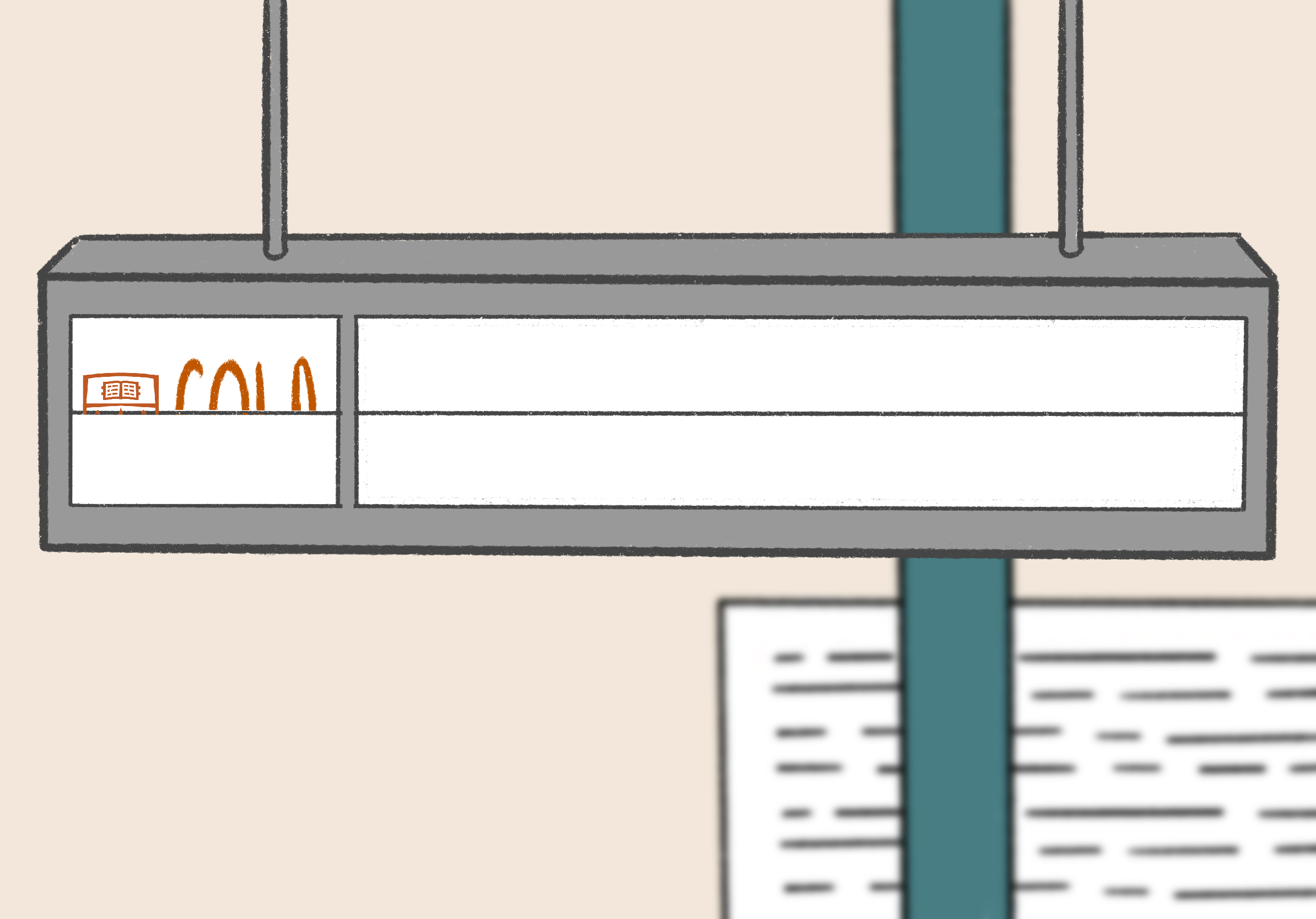
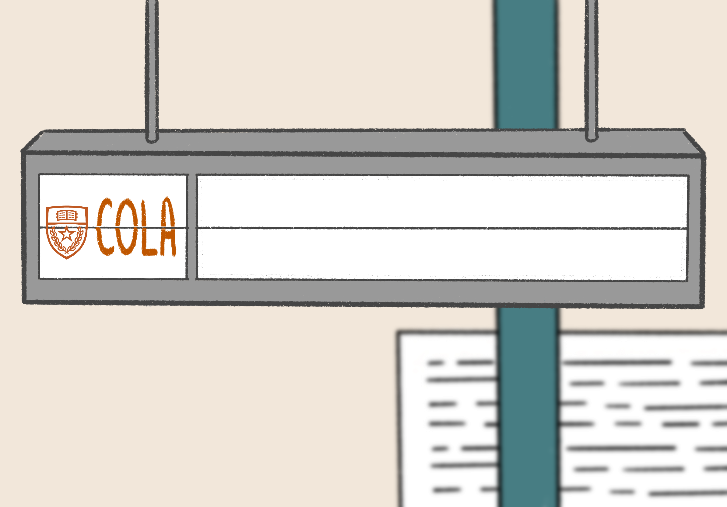
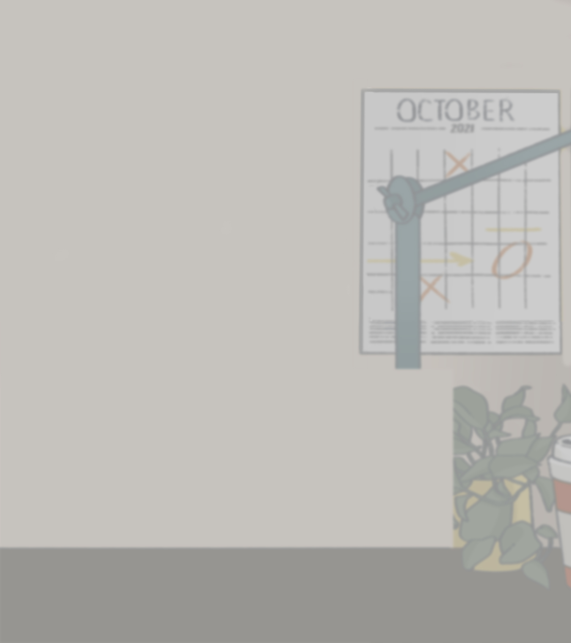
COLA Public Affairs Last Scene
Based on feedback from the video team, we were asked to create assets for a scene at the end of the video that would imitate an airport banner that would change flaps and reveal some text along the lines of “COLA – NOW BOARDING”. The following pics are a storyboard that helped me guide myself in creating the animation:

The scene needed an extended background that would seamlessly move from the laptop up to the banner. Below are the original and extended backgrounds:

Here is a preview of the last scene:

Quantum Computing Animation
Instead of making the preview animation in PSD format, I imported the graphic assets into AfterEffects so I could add more fluidity and complexity to it. Below are both animations for reference: