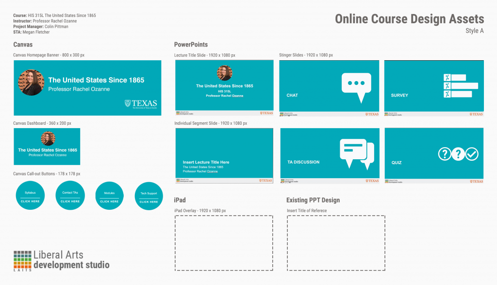
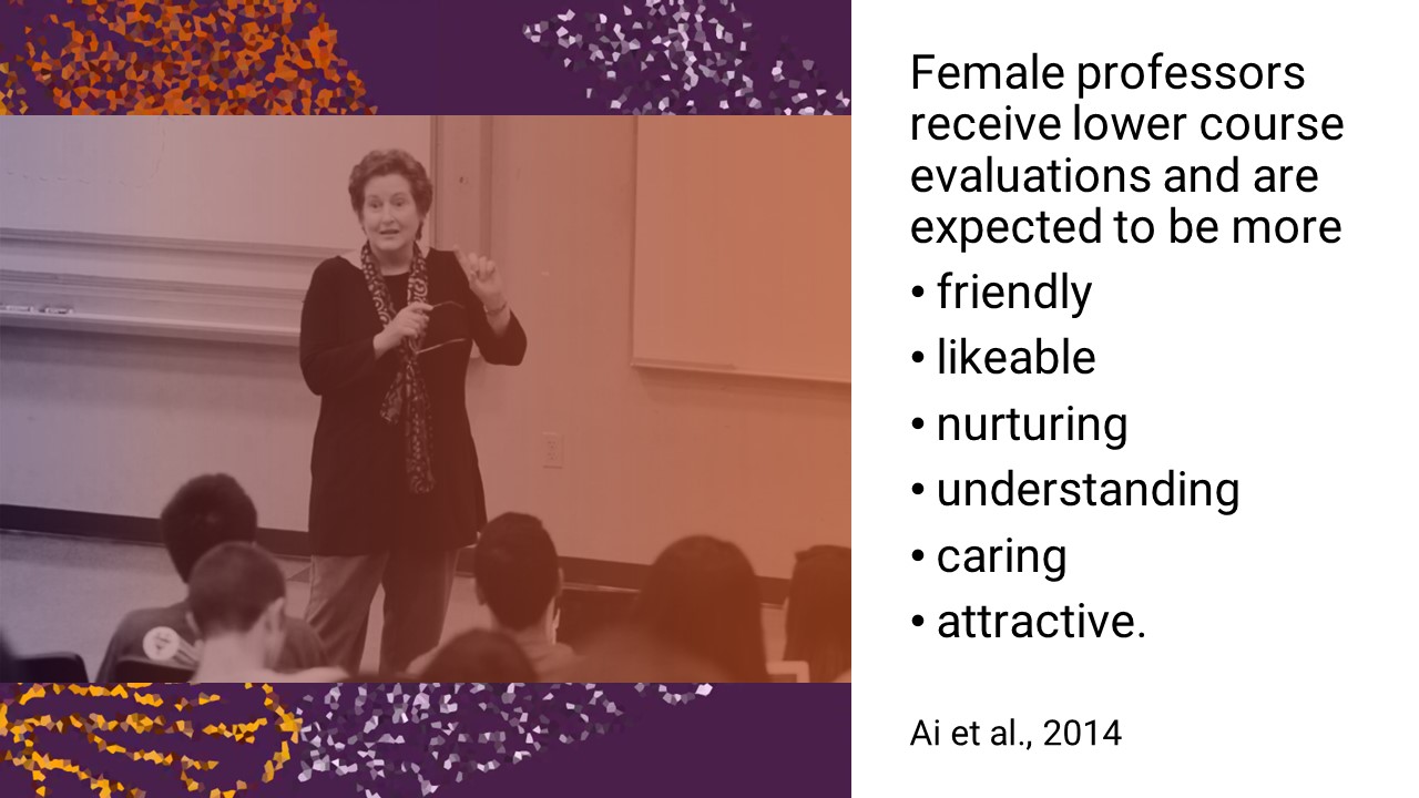
Today I worked on making a universal design language for the content slides, using small figures with color gradients to accent the slides:
I also looked into different font types to establish a hierarchy into the slide. I ended up choosing Gautami.
Current Sta
By Miguel Yapur
This project initially started as a task to create a generic style guide for the clients to refer to while creating content for the UWC WordPress Site. I added a few guidelines under the Publishing Help section in WordPress.
After creating the style guide, I started working on updating the layout for a few pages in the UWC site.
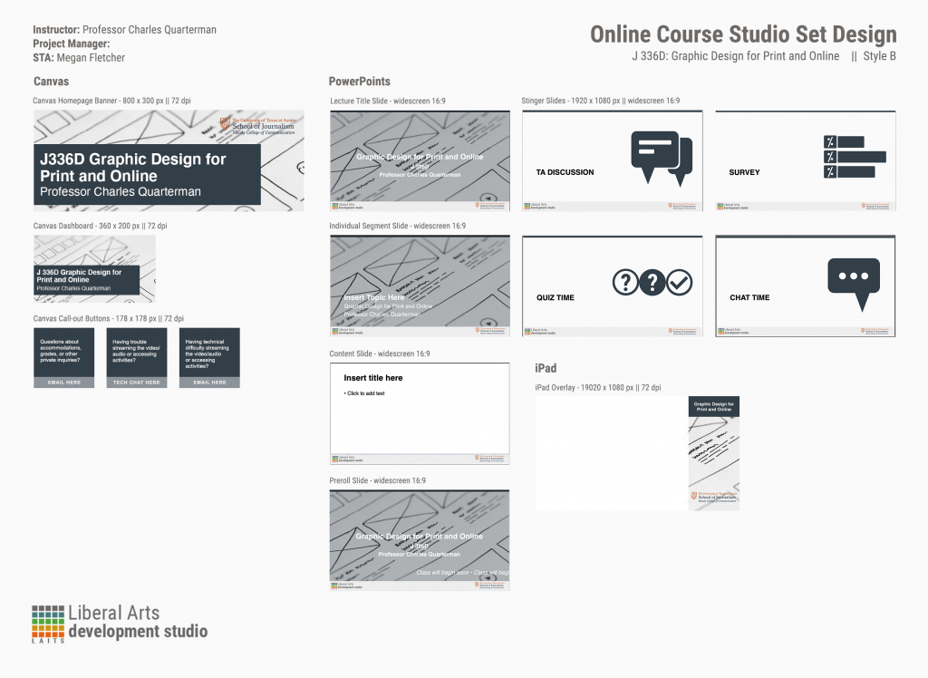
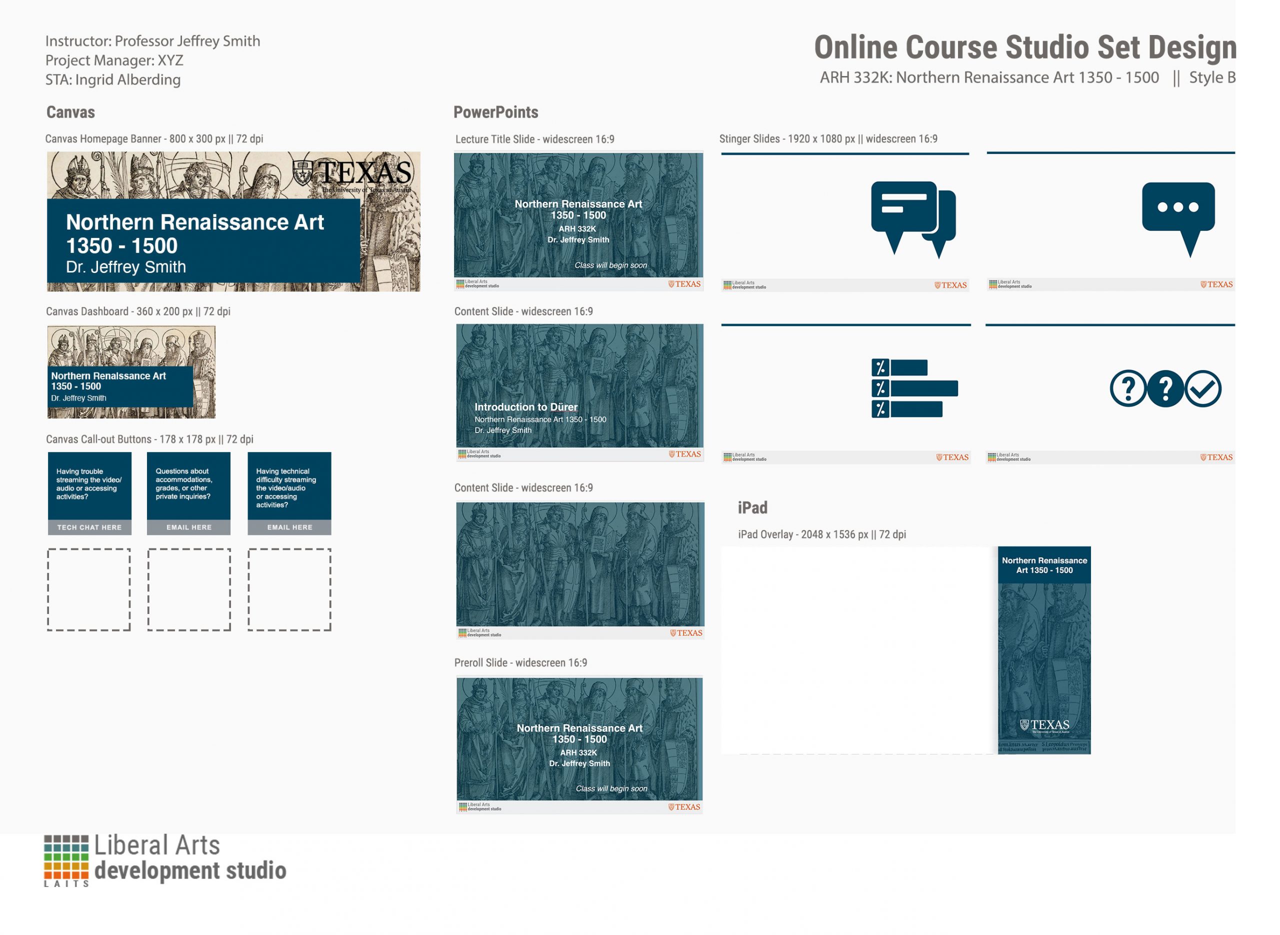
Today, I got an assignment to create some Canvas graphics and a PowerPoint template for the basic English Lit TAs’ orientation. For now, I’m going with the dark blue from the UT secondary palette. Ideally, I would associate English lit with brown, but that’s not a brand color. Blue it is. So far, I’ve done the Canvas callout buttons:
It’s pretty smooth sailing so far. On Monday, I’ll do the rest of the Photoshop work for the Canvas dashboard and home page banner.
UPDATE: I have to redo them on Monday with new text! No problem, though.
The past week has been busy, but very fulfilling! I’ve been working on an assortment of Basic Training modules as well as digital studio backgrounds. Just recently, I finished the basic training for Cascade, and below is a screenshot of my test site:
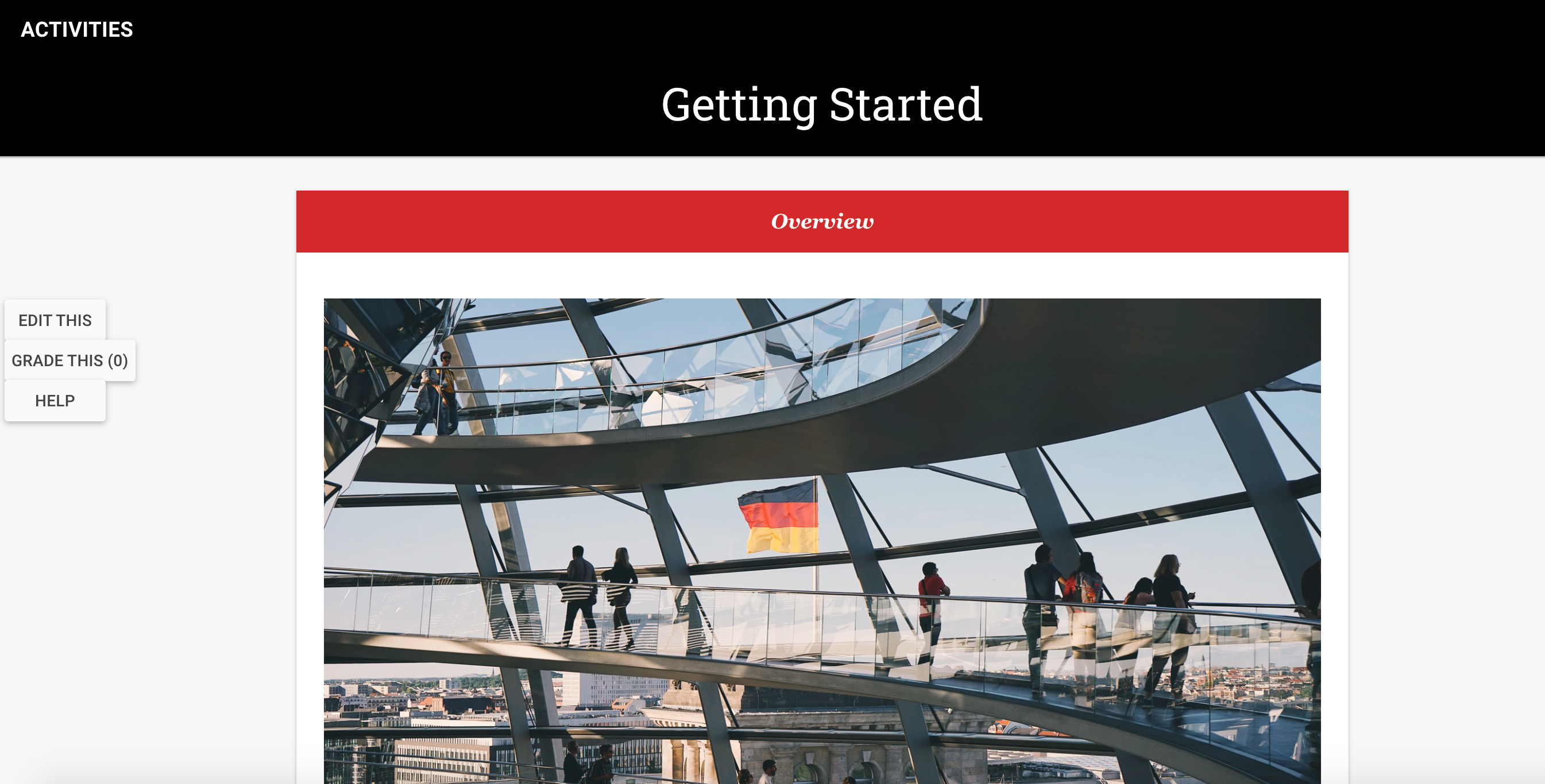
I started working on the intermediate training for Cascade as well. I themed it off Berlin, one of my favorite cities and place I have a lot of opinions about.
By Miguel Yapur
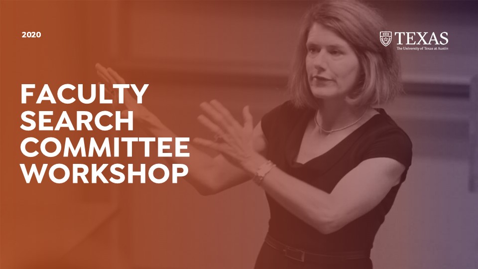
I started my new assignment to redesign the UT Search Committee Workshop.
The original intro slide uses UT’s orange gradient with colonial columns as a background, which the client wants to replace with a picture of the Barbara Jordan Statue or of Barbara Jordan instead.
Here are some pictures that could be used as a background instead:
Since the client is open to the idea of a darker background with lighter font, I made some edits to the above pictures to bring out a cohesive look to the whole document and applied some gradients:
These are my favorite drafts with Isidora Sans Bold, the font that the client wants to use:
The client also wants to go away from UT’s orange bar at the top of the slides:
So that would go away as well, replaced by a darker background with an off-black tone. Maddy made a great suggestion of making some kind of shape that would align with the title and “pop” above the black and greyscale color scheme, so I’m going to look into that.