Reimagining the Video Stream Experience for Tower Tools
Link to Design: https://www.figma.com/design/ki1XLGNEbBCAsqPdebSkKD/TOWER-UX-UI-Revamp?node-id=0-1&t=JWHK67f26uFuscOd-1
The initial request for this project centered on enhancing the Tower Tools experience to better support student clarity, confidence, and engagement. This presented an opportunity to modernize the interface so it aligns with current accessibility expectations, evolving 2026 academic standards, and LAITS branding. By redesigning the UI/UX of the video stream layout, this project aims to deliver a more polished, accessible, and confidence‑building experience, one that strengthens existing workflows while elevating the overall perception and usability of the platform.
The Current State
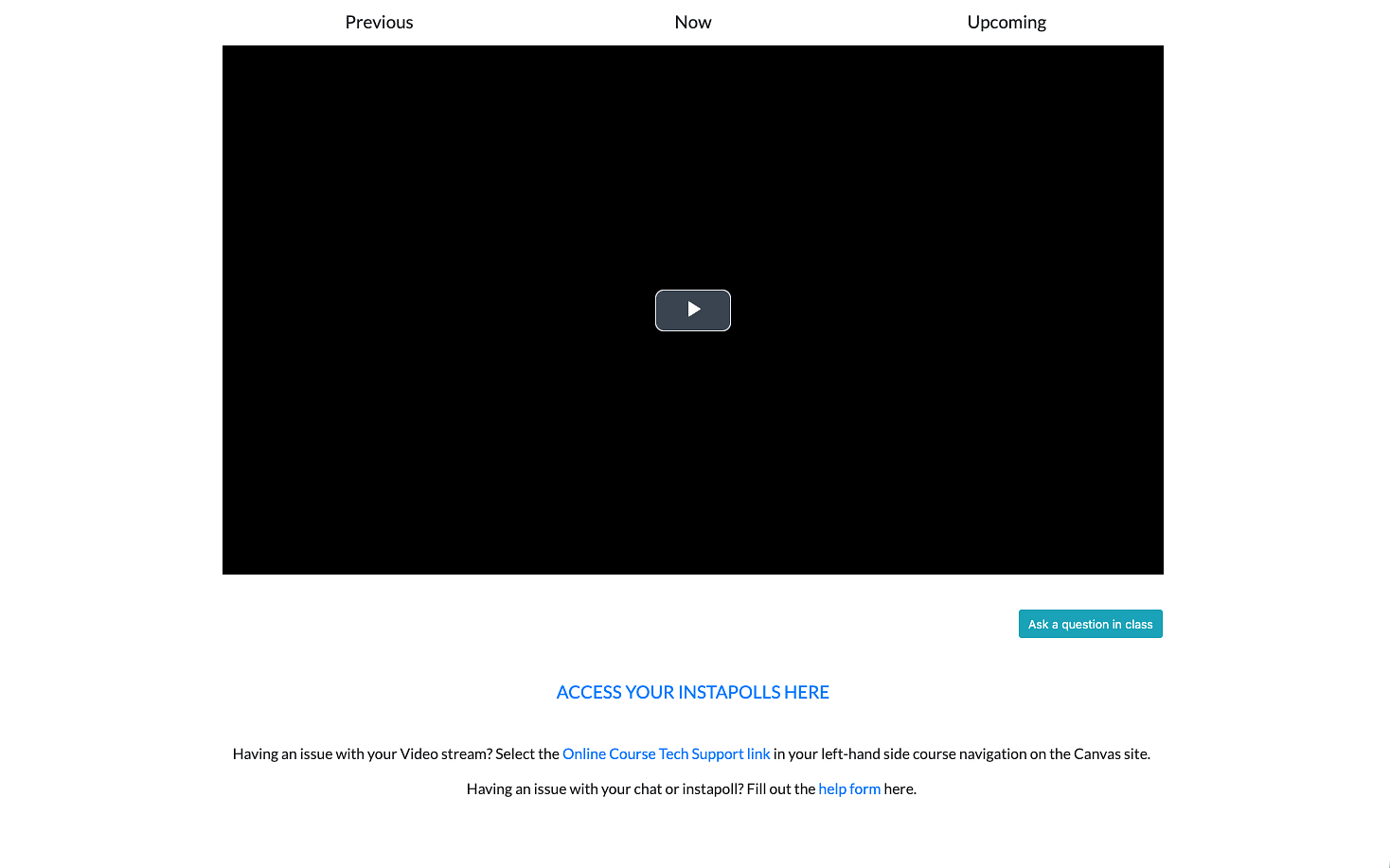
The current platform is highly minimal. While it works, it lacks the visual structure and feedback that help students feel grounded and confident in a digital classroom.
Where It Falls Short
The current experience works but it lacks presence.
The goals for this project were to change that through creating designs that:
- Feel modern and aligned with a 2026 design standard
- Support student workflows without disruption
- Build trust and clarity through thoughtful interface design
- Meet updated accessibility guidelines (WCAG)
- Integrate LAITS branding in a cohesive way
Framing the Problem
How might we redesign the current tower tools interface to increase student engagement & understanding?
In a physical classroom, students receive constant feedback:
- They can see peers reacting
- They can gauge pacing and engagement
- They know where they are in the lecture
In a virtual environment, much of that disappears.
From this, I identified three core design focus areas: