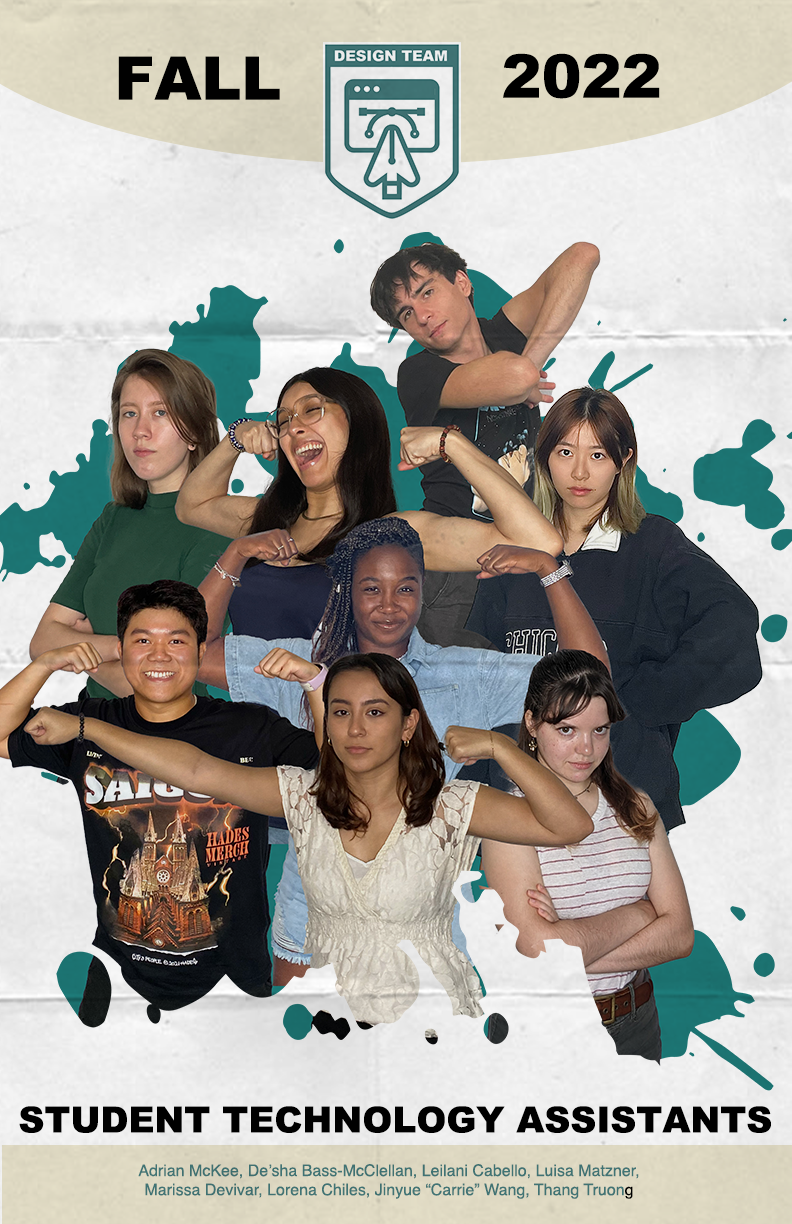
Week 6
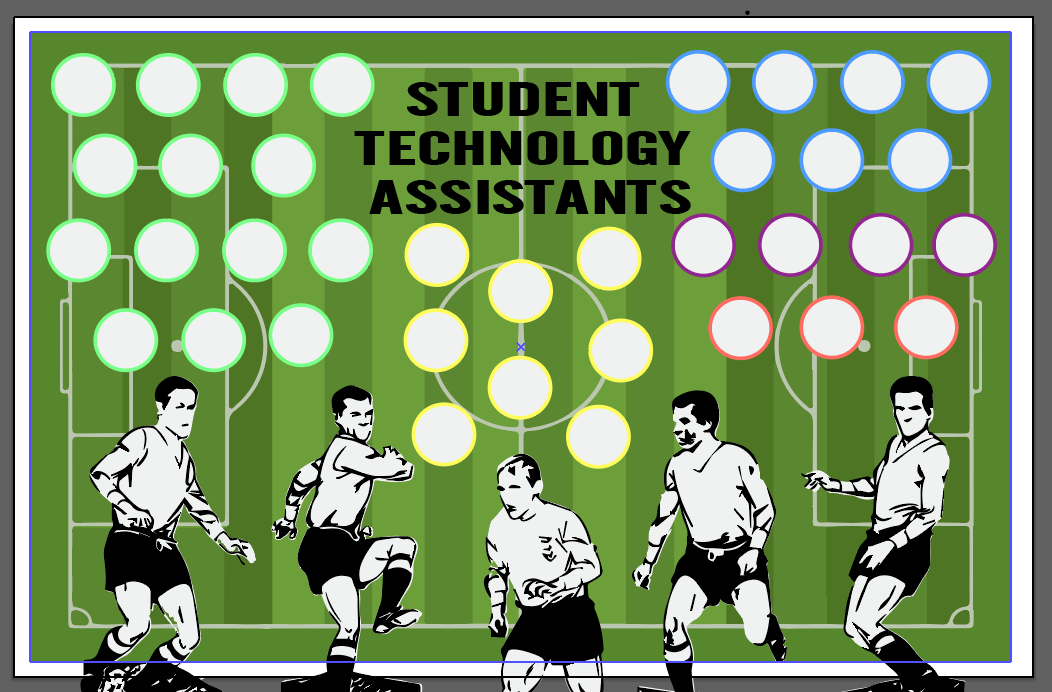
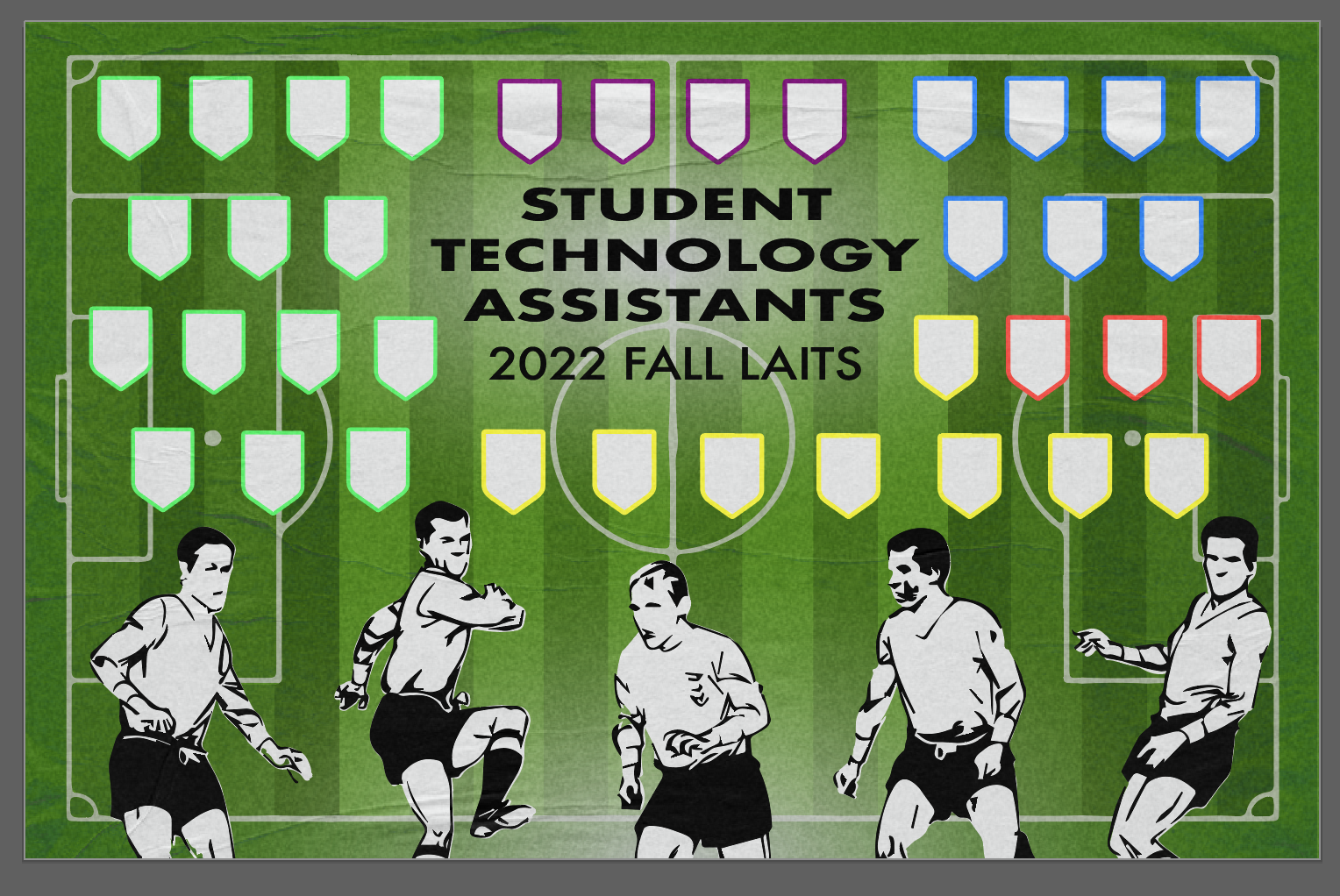
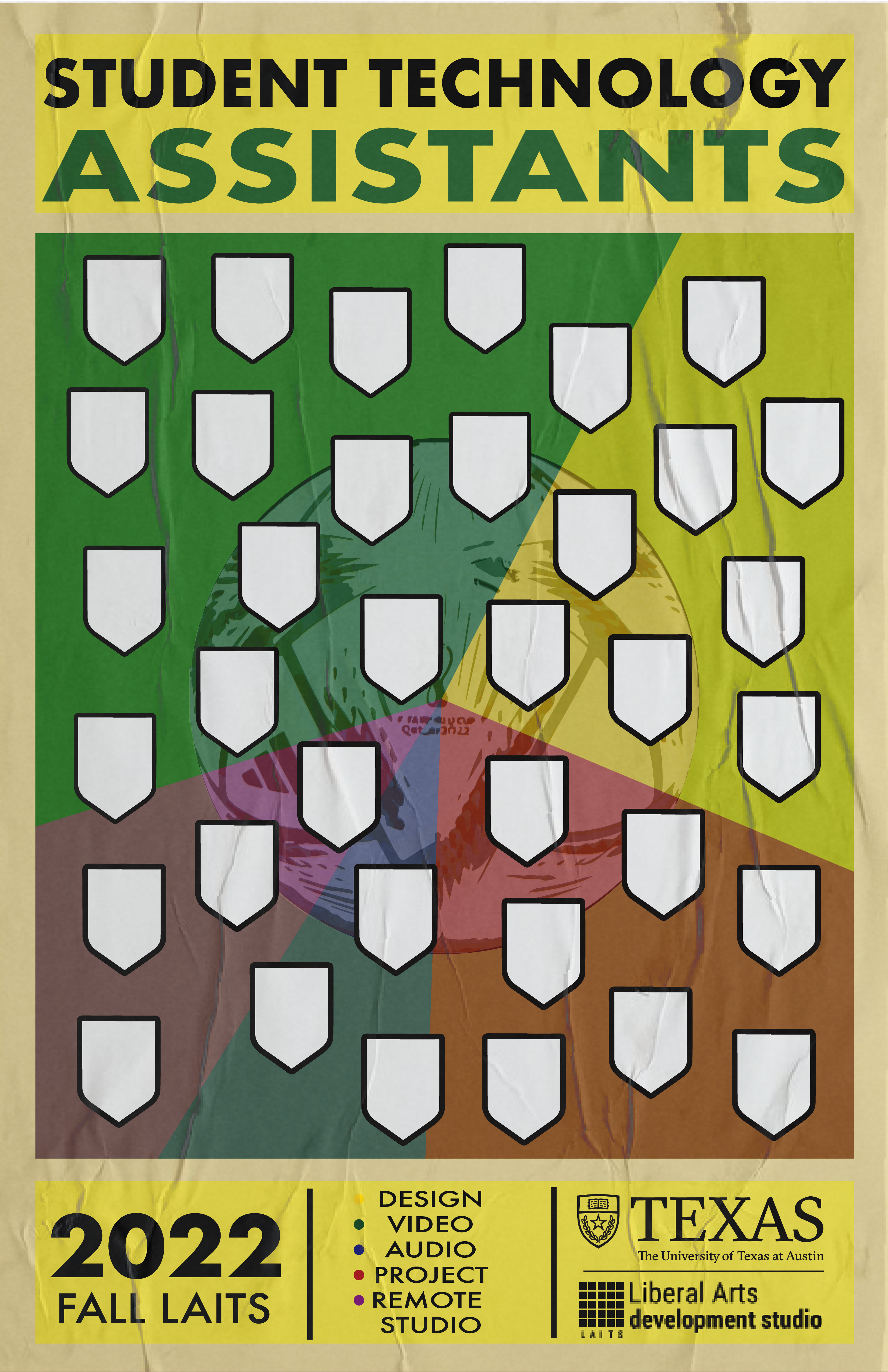
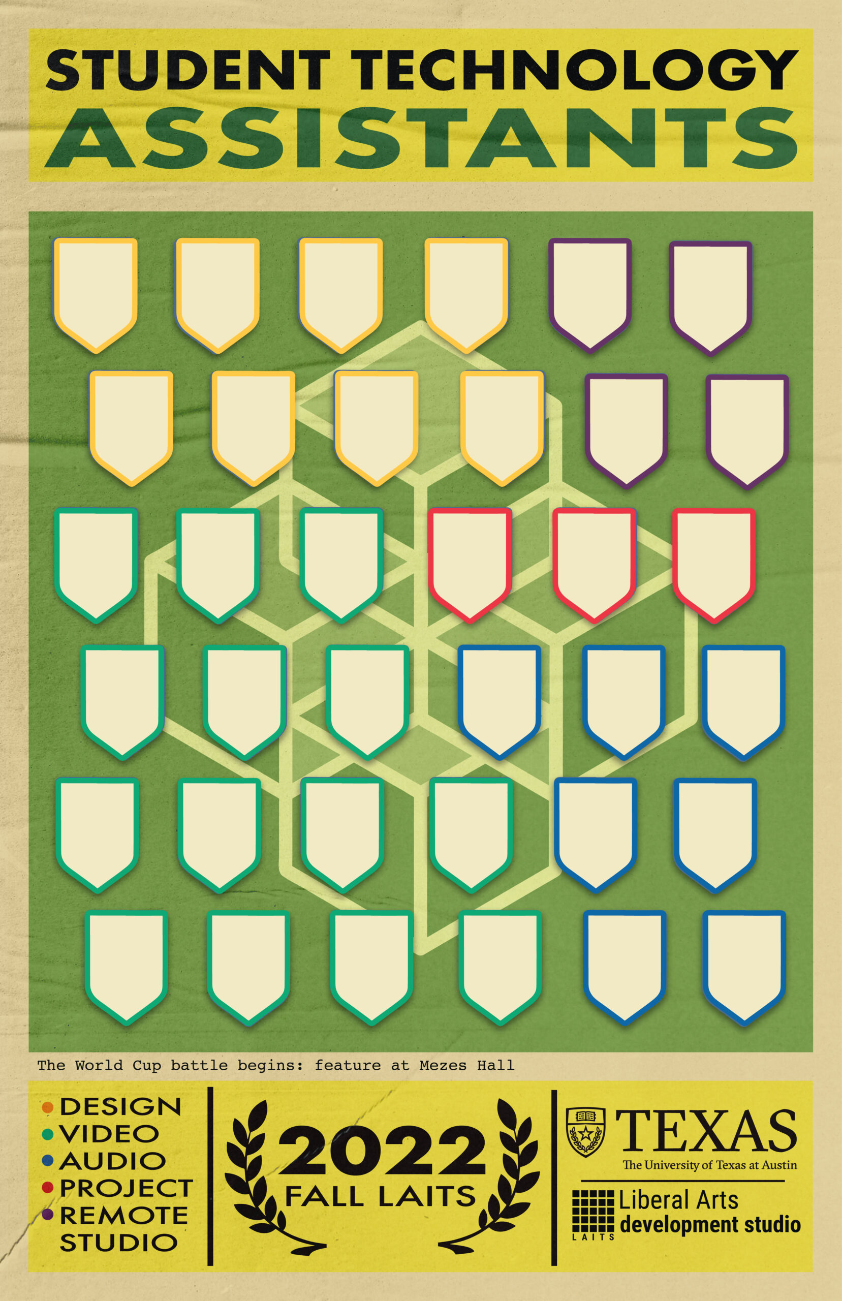
Project: STA Design Team Poster
Start: September 13th 2022
Complete: Oct 13th 2022
Staff Guidance: De’sha and Leilani
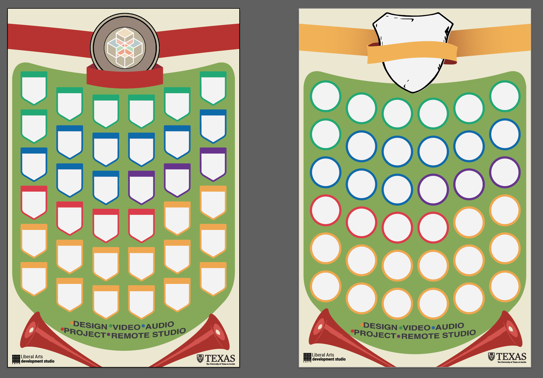
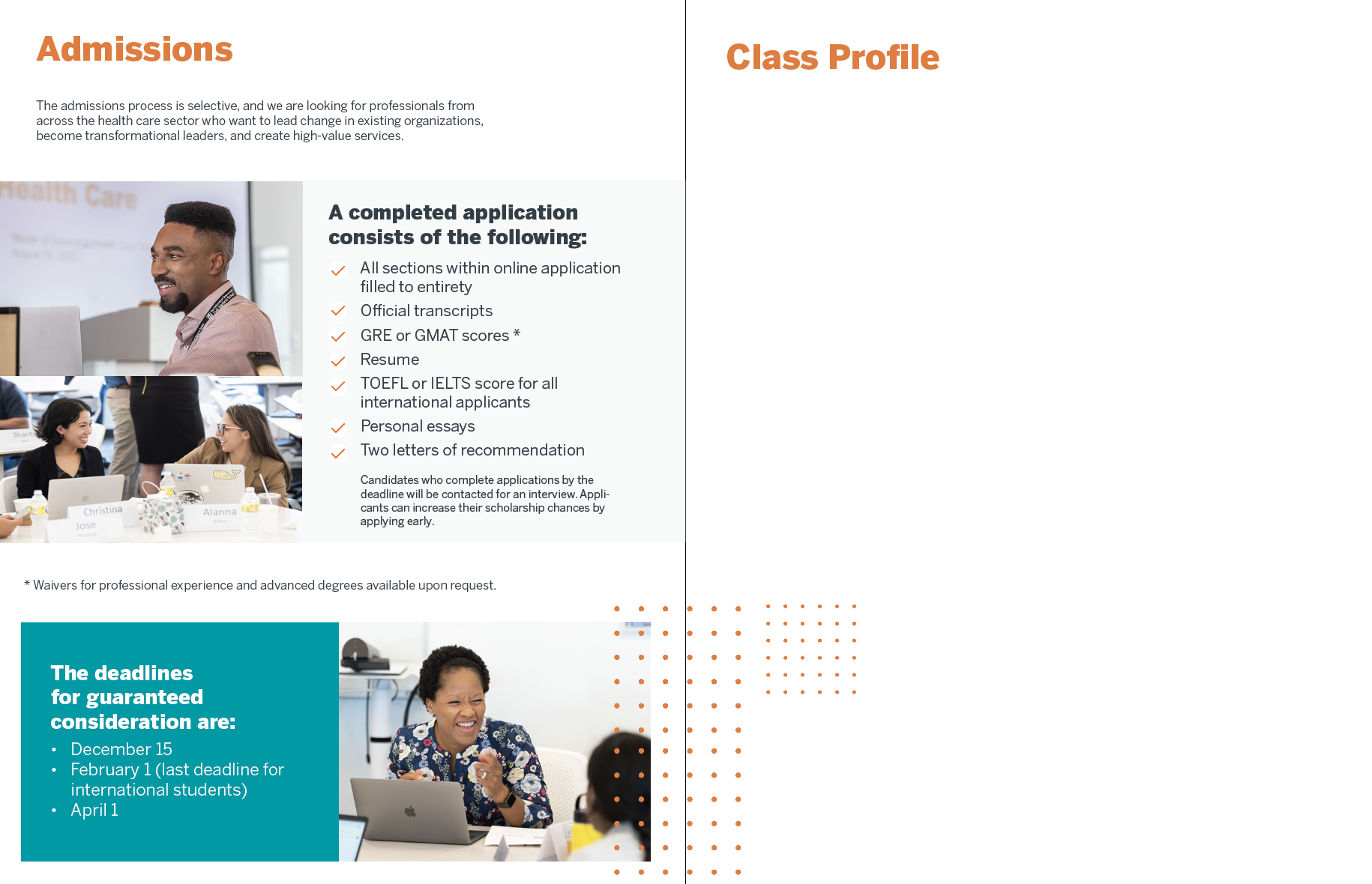
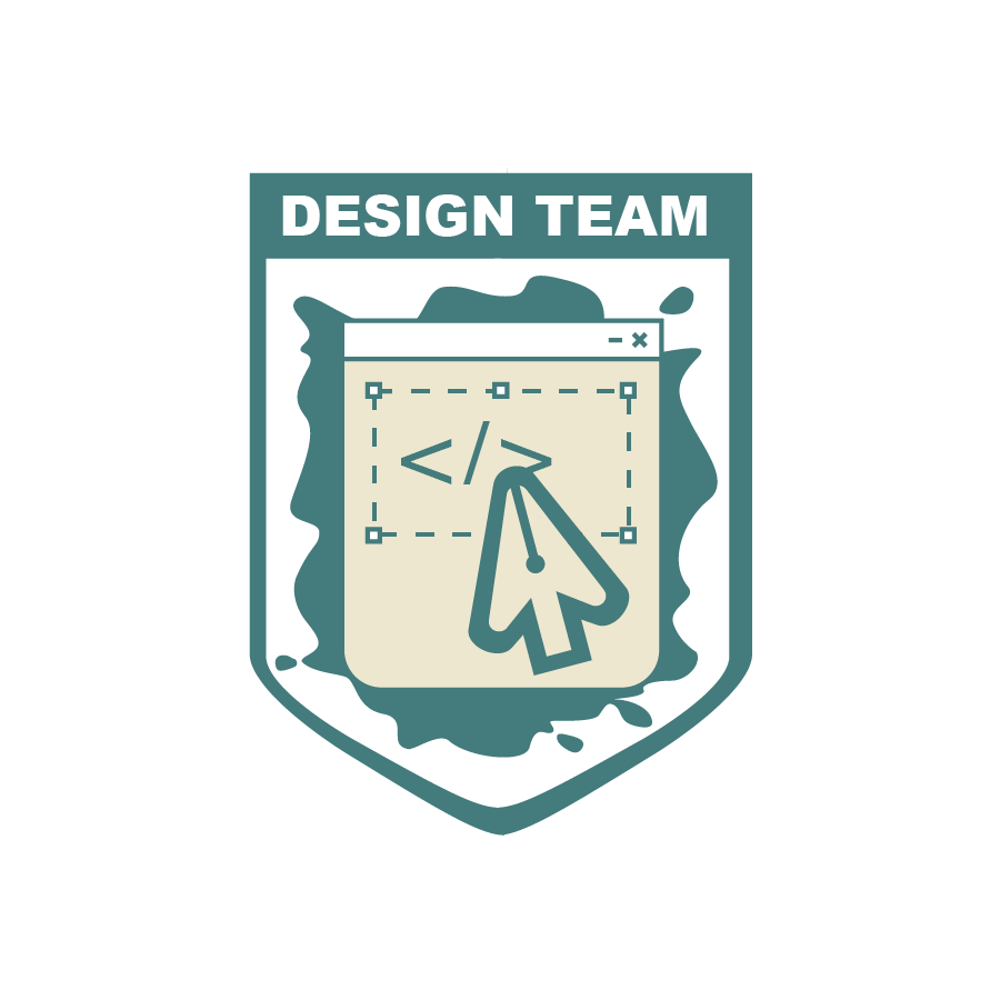
This time I changed the photos of Thang so that his portrait could make symmetry with Lorena and therefore create harmony in the poster. I also remove the paper texture since it may be low-quality after printing it. Regards to the consideration of printed poster, I learned what is dpi (dots per inch) and ppi (pixels per inch). The default dpi for web view is 72 but it’s better to have 300 dpi if we’re going to print it out. Once ensuring the poster is 300dpi and CMYK, I go to File > Save As > Photoshop PDF > “High Quality Print” & Save.
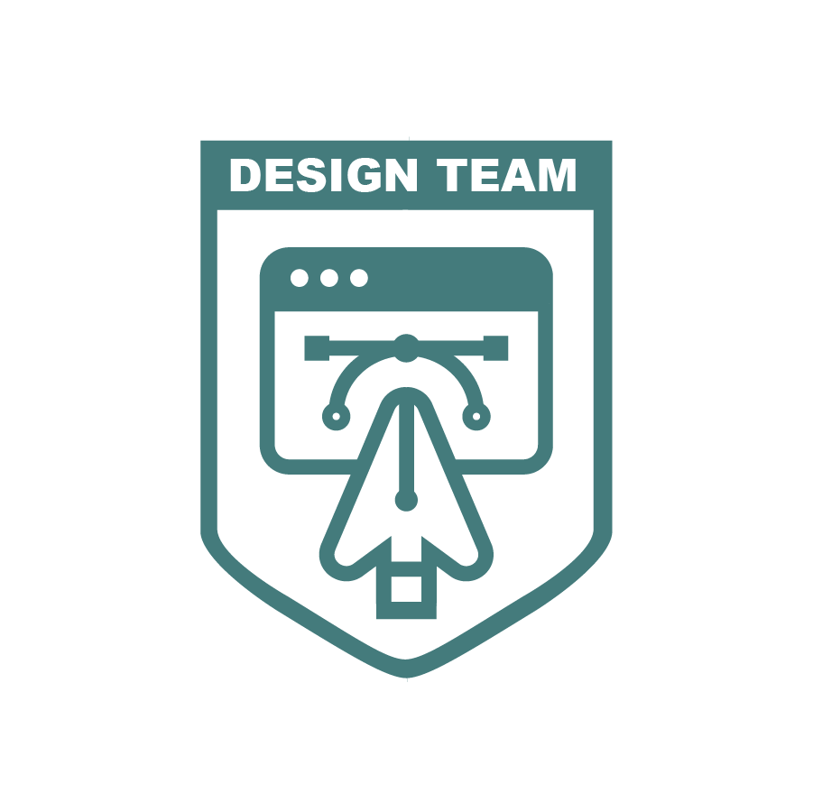
Here is the final version:
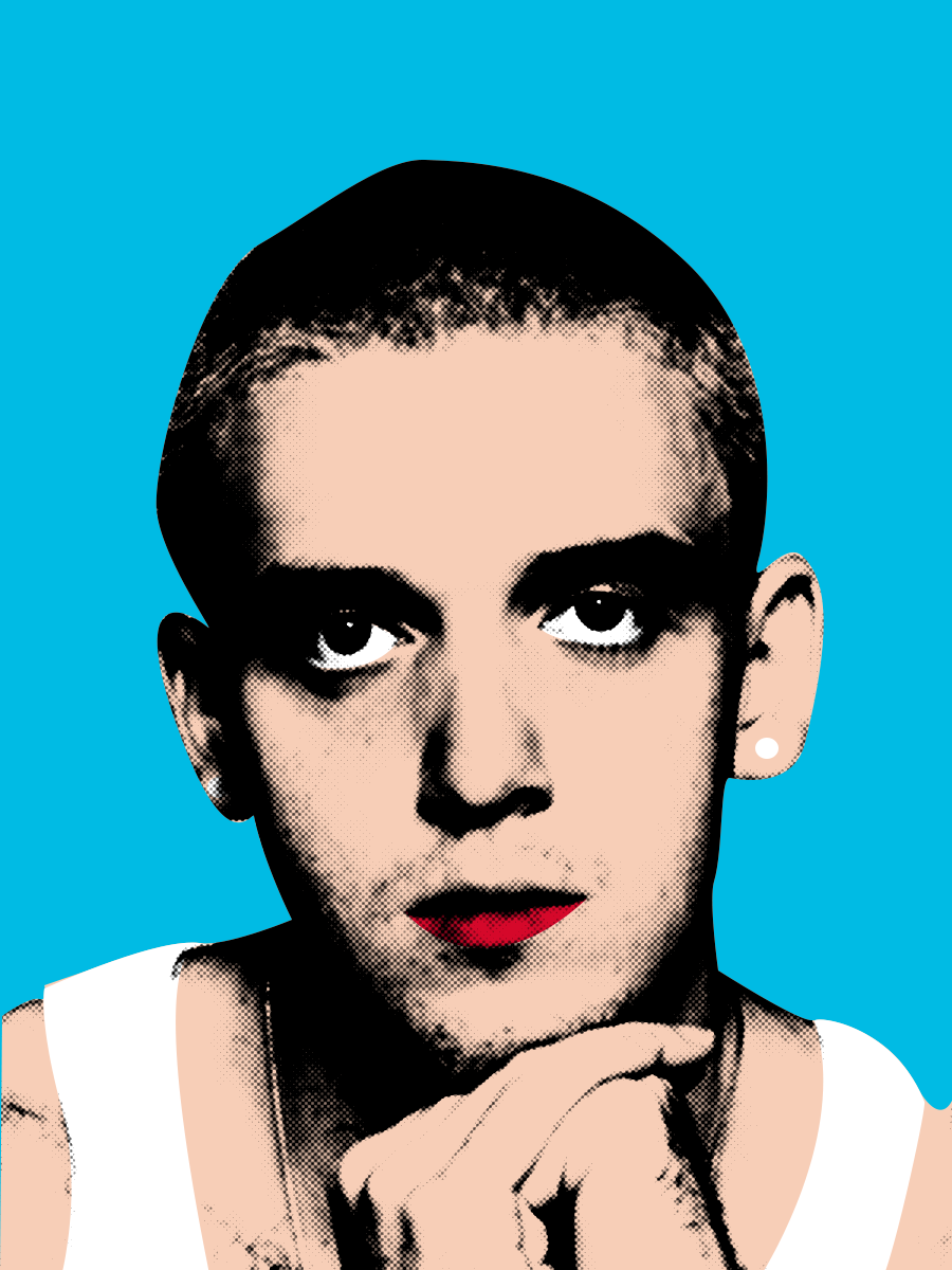
Project: History of Design
Start: Oct 12th 2022
Complete: Oct 12th 2022
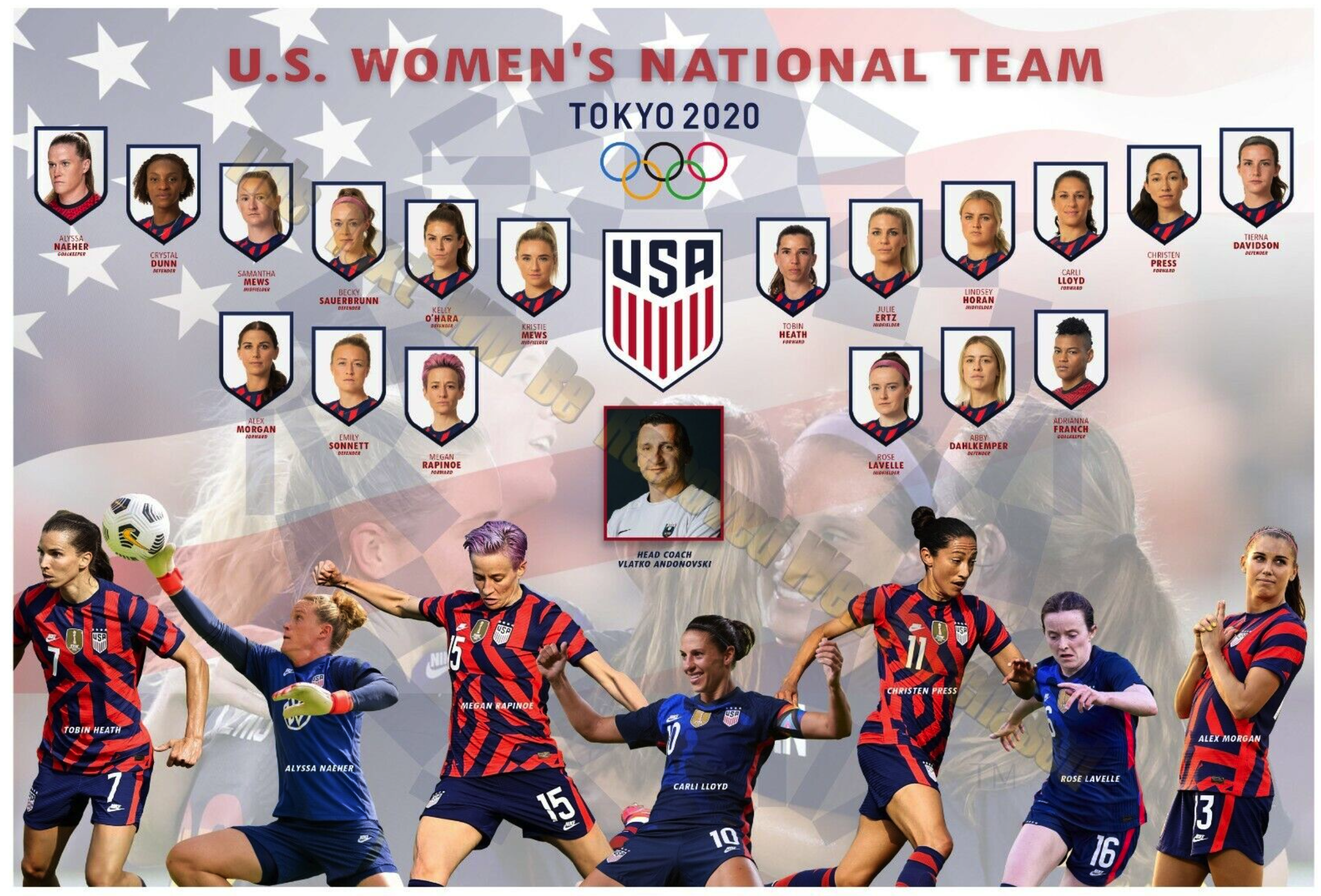
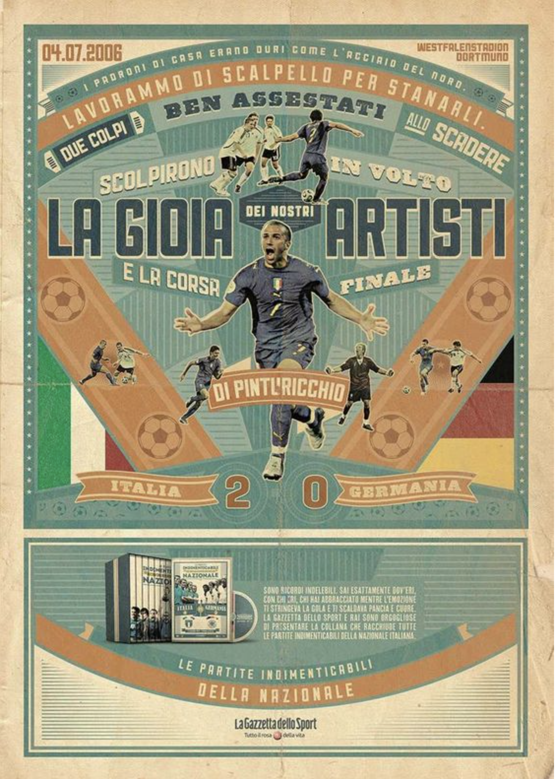
I chose to work on the Pop Art movement and made a celebrity portrait for it. I was attracted by the bright colors and the dots effect applied to it. Meanwhile, the contrasting color forges the irony and satire so the boundaries between art and culture are blurred. All of these elements attract people’s attention so it became an enthusiastic endorsement of the capitalist market!
I stayed with the classical style with it since I’d like to learn how to make the dot effect in photoshop (my most experience is in Illustrator so I’d like to change myself!). I think it’s a quite useful photo-processing tool in the future, especially for vintage style. The only way I know to make the dot effect is the color halftone under the pixelate section inside Filter. Now I explore Filter > Filter Gallery > Sketch > Halftone Pattern, which allows me the chose the dot color inherently instead of masking it later. It also leaves the white place white rather than filling in with small dots.
I also learn several shortcuts in photoshop:
Comd + Shift + U > Desaturate
Comd + Shift + L > Auto Tone (dark darker and white whiter)
Comd + J > Copy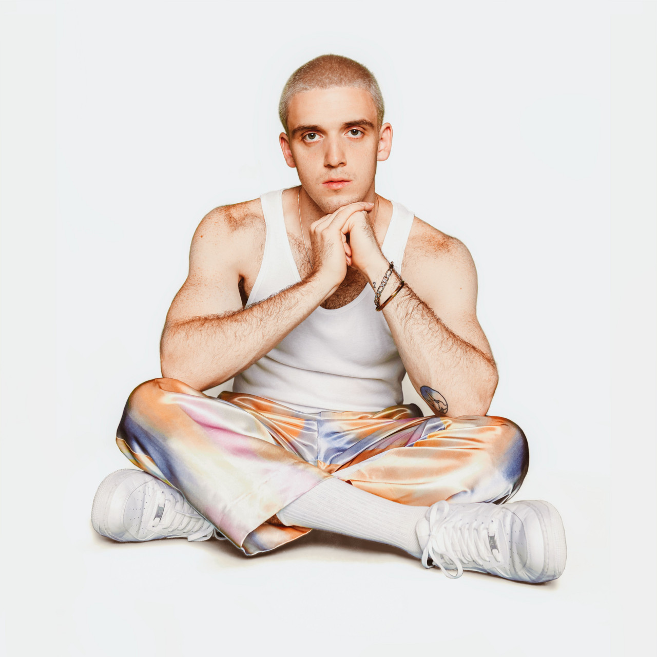
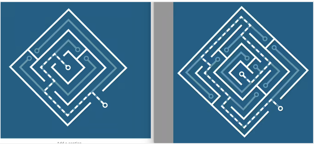
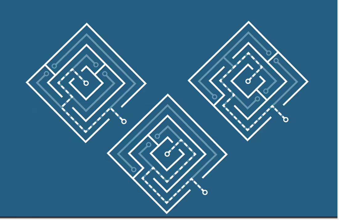
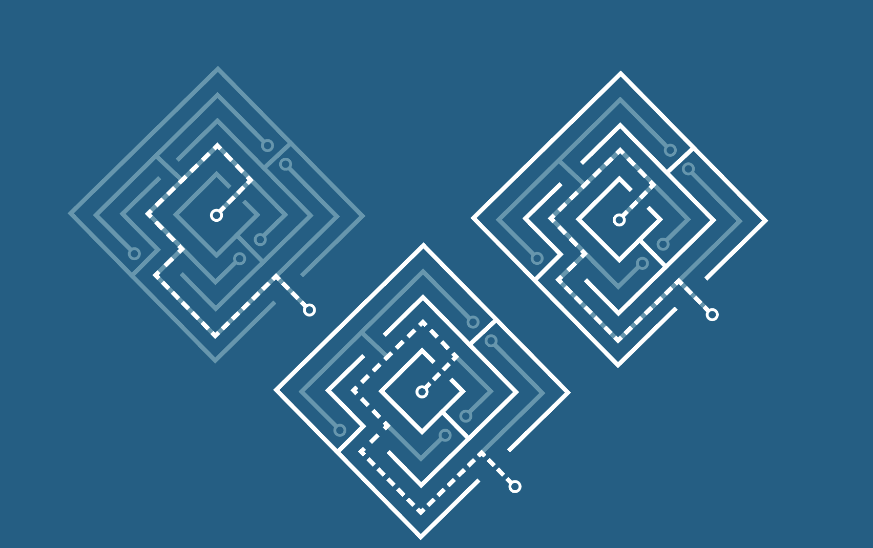
Project: Create Pixel Art in Illustrator
Start: Oct 13th 2022
Complete: Oct 17th 2022
- Customized Color Group. I knew I can save individual colors into the swatches but now I found out it’s pretty effective if I create a new swatch for them so I can switch between by only clicking left and right arrows on the keyboard when I apply “live Paint Bucket”
- If you change the color in the swatch, all colors on the artboard would change automatically
- Recolor Artwork. The function allows me to change the tone, saturation, and other colors to adjust as a whole group. Useful in future design!!

![]()
![]()
Project: 2022 GRG Flyer Promo
Start: Oct 17th 2022
To be Completed: Oct 21th 2022
Staff Guidance: Valerie
This week I started on a new project, which is to promote a class called GRG325 Geography of Texas for Department of Geography & the Environment. I created three versions of flyers in the first round but I’m still struggle with how to display six pictures aesthetically besides the promotion content.