Planning, Search, and Reasoning Under Uncertainty Logo Finalization
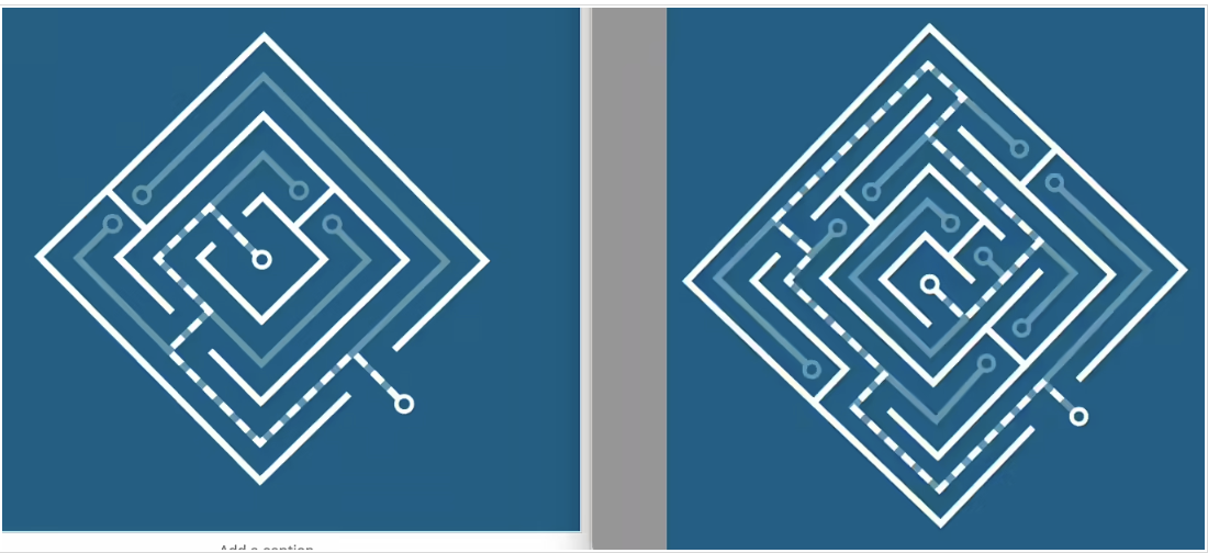
These were the two initial iterations of the logo design. The right one showcases the complexity of the course, but the left one is simpler and easier to read as a design. I felt that it was best to continue with the left logo and find elements that are within the right logo to incorporate to make it more complicated.
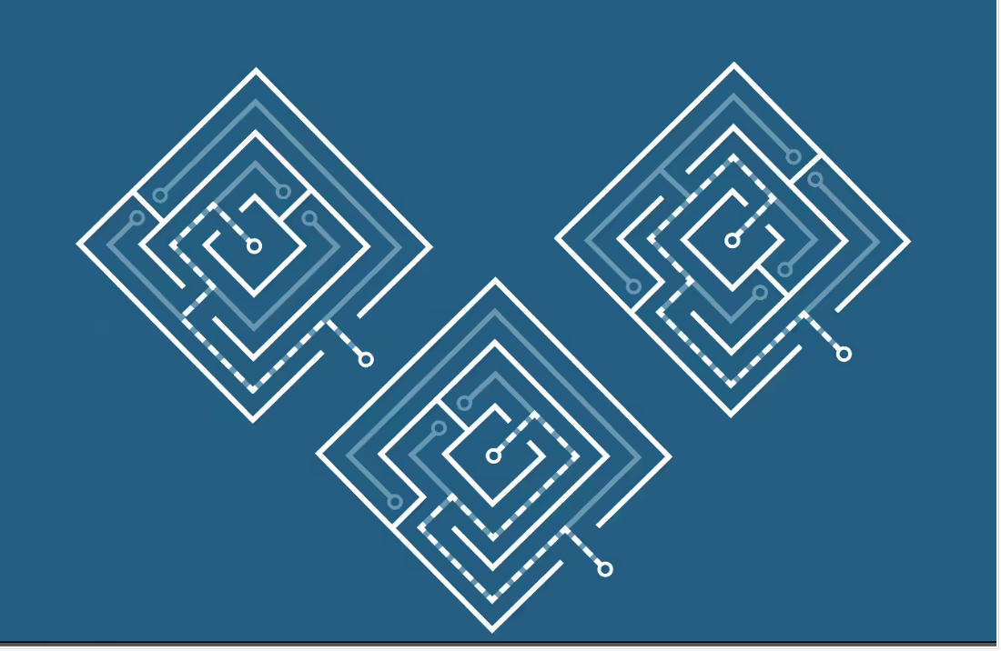
These are the various versions of the simplified logo with different path options to make it a more dynamic design. I personally felt the the top right was the best option.
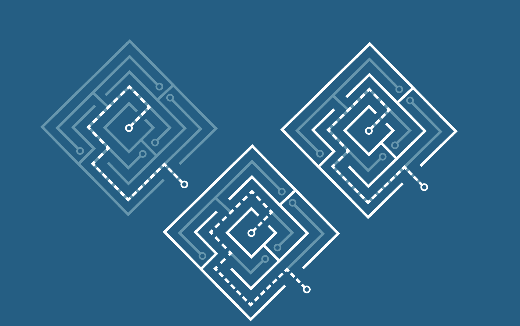
Now, I’m trying to figure out which is the best layout in terms of readability. We want to make sure the viewer can see the path through the maze easily but it’s also a strong logo.


