• We are STAs
    • Diya Nair
    • Haley Ma
    • Kate Shih
    • Kyra Lee
    • Leilani Cabello
    • Lila Mali
    • Marissa Devivar
    • Nicholas Peasley
    • Raaga Srimadh
    • Shanda Horm
    • Shriya Atreya
    • Thang Truong
  • We were STAs
  • STA Presentation
    • STA Presentation 2017
    • STA Presentation 2016
  • Testimonials
  • Resources
  • Home

STA Blog

Leilani Cabello

Leilani Cabello

Project: STA Presentation Poster

March 22, 2024 By Leilani Cabello

STA Presentation Poster

https://3.basecamp.com/4001554/buckets/13723406/todos/7117045933#__recording_7209950051
During the spring break, I took the initiative to guide Raaga through the process of creating a poster for our end-of-the-year STA presentation celebration. The project’s objective was not only to commemorate the year’s achievements but also to bring the team together visually and thematically. The idea was to reflect on what the STAs have accomplished through a design that was both meaningful and visually appealing, incorporating elements that make the STA program unique.
The poster’s design was centered around the theme “We experience or attend the theme,” with stacked polaroids serving as a template to showcase the team’s unity and diversity. The must-have details included the presentation date, time, and location, along with a list of all the groups within our STA program if space allowed.
Guiding Through the Process
My role involved guiding Raaga on how to approach this design task effectively. I recommended starting with a sketch to develop the template, emphasizing the importance of having fun with the creation process and including unique elements reflective of the STA program’s essence. I also pointed her to last year’s presentation poster for inspiration, helping her grasp the project’s scope and expectations.
Overcoming Challenges
One challenge we encountered was fitting all the necessary information and visual elements into the poster without making it look cluttered or overwhelming. This required careful planning and creative problem-solving. We discussed various layout options, experimenting with different arrangements of the polaroids and considering how to incorporate images of STAs into the design.
Collaboration and Feedback
Collaboration and open communication were key throughout this project. I regularly checked in with Raaga to review her progress, providing feedback and suggestions to refine the poster. This iterative process helped us to gradually improve the design, ensuring that it effectively represented the STA program and captured the celebratory spirit of the presentation.
Taking Charge
With the deadline approaching and understanding the importance of this poster in setting the tone for the rest of the presentation graphics, I decided to take charge during the spring break to help complete the project. This involved finalizing the design, selecting and editing images for better cohesion with the overall theme, and making adjustments based on feedback from De’sha and other team members.
Final Touches
In the final stages, we focused on adding decorations and fine-tuning the visual details, such as the background texture and the arrangement of the polaroids. The goal was to create a visually compelling poster that would be memorable and impactful for all attendees of the STA presentation.
Reflection
This project was a testament to the power of teamwork, creativity, and dedication. Guiding Raaga through this process was a rewarding experience, and it was gratifying to see the project come to fruition. The end-of-the-year presentation poster not only celebrated our accomplishments but also symbolized the unity and collaborative spirit of the STA program.
Filed Under: Fall 2023 - Spring 2024, We are STAs

Project: UTCF Project Management

March 22, 2024 By Leilani Cabello

UTCF Project Management

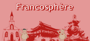
The Project Brief: Managing the Connexions Francophones (UTCF) project for the University of Texas has been both a challenging and rewarding endeavor. The project aimed to create an e-French textbook to provide an immersive learning experience for students. My role as the project manager involved overseeing the creation of digital assets, including banner graphics for chapter breaks, PowerPoint presentations for lessons, and curating appropriate images to complement the textbook content.


The Process: The process of creating these assets requires meticulous planning and execution. One of the first tasks I undertook was to develop a comprehensive tutorial on creating graphic assets, specifically the banner for chapter breaks. This tutorial covered everything from image editing in Photoshop to banner creation in Adobe Illustrator. It was designed to guide my team members, ensuring consistency and quality in our outputs. For instance, the tutorial detailed steps for cutting out images, adjusting their contrast and exposure, and then incorporating these images into banners that align with the textbook’s aesthetic and pedagogical goals.


Simultaneously, I developed a system to keep track of assignments and their progress. I created a detailed spreadsheet that listed each lesson’s specific tasks, such as green screen effects, banner creation, and backdrop development. This spreadsheet included links to Basecamp and Box folders for each task, allowing team members to easily access and upload their work. It also tracked the project status and due dates to ensure we stayed on schedule. This level of organization was crucial in managing the complexity of the project and facilitating effective collaboration among team members.
One of the significant challenges was ensuring that all the digital assets we created—whether banners, images, or presentations—were not only aesthetically pleasing but also pedagogically effective. This meant selecting images that accurately reflected the cultural and linguistic content of each lesson and designing banners that would visually segment the textbook in a way that enhanced students’ learning experience.


Another challenge was the collaborative aspect of the project. Guiding coworkers through these processes required clear communication and patience, especially when introducing them to new software or design principles. I held regular meetings to discuss progress, address challenges, and share feedback. This collaborative environment not only improved the quality of our work but also fostered a sense of community and shared purpose among the team.

The Outcome: The outcome of our efforts is a visually engaging and educationally rich e-French textbook that stands as a testament to our team’s dedication and skill. The textbook’s design, enhanced by custom graphics and carefully curated images, provides an immersive learning experience that we hope will engage students and facilitate their exploration of the French language and francophone cultures.

Overall, managing the UTCF project has been a deeply fulfilling experience. It has challenged me to grow as a leader and a designer, taught me the value of meticulous organization and effective collaboration, and ultimately allowed me to contribute to an innovative educational resource that will impact French learners for years to come.

Filed Under: Fall 2023 - Spring 2024, We are STAs

Project: Visting Students Site

March 22, 2024 By Leilani Cabello

Visting Students Webpage

The Project Brief: The project brief tasked me with creating a webpage dedicated to visiting students interested in summer online courses at UT Austin. The goal was to design a page that not only visually appealed to prospective students but also clearly communicated the opportunities available to them, making navigation intuitive and the enrollment process straightforward. This involved designing custom graphics, including a banner, editing images for cohesion, and structuring the content to ensure a seamless user experience.


The Process: The process was particularly challenging due to the unique structure and requirements of this page compared to other sections of the site. For instance, the banner design underwent several iterations to ensure it was both informative and visually compatible with varying screen sizes, a critical consideration given the diverse devices potential students might use to access the site. Feedback highlighted the need to avoid overly specific imagery, such as the UT tower, which could mislead users about the nature of the online courses.


The final banner design, therefore, leaned towards an abstract representation of studying from anywhere, aligning with the theme of accessibility and flexibility. Adjusting the website’s color scheme and text placement to mitigate the dominance of UT’s traditional orange and to enhance readability across different devices posed additional challenges. Ensuring that the courses were presented in an organized and accessible manner required careful consideration, especially given the directive to sort courses alphabetically while maintaining clarity regarding term offerings. This aspect was further complicated by the pre-existing organizational structure, which differed from other parts of the site, requiring a thoughtful approach to integrate seamlessly.

Collaboration and iteration were key aspects of this project. Feedback from various stakeholders guided adjustments to the visual elements and content presentation, ensuring the page not only met UT Austin’s branding standards but also addressed the needs and expectations of prospective students. The project exemplified the importance of flexibility, creativity, and user-centric design in developing an effective digital communication platform.


The Outcome: The outcome is showcased on the website, reflecting a carefully curated balance of informational clarity and visual appeal. Custom graphics, such as the banner at the top, were crafted to immediately capture the essence of summer learning at UT Austin. Editing existing images and selecting new ones ensured that each visual element contributed to the narrative of flexibility and accessibility that is central to the summer online courses. In conclusion, despite the structural challenges and the need for several iterations, the project was a fulfilling opportunity to contribute to UT Austin’s outreach efforts, providing a welcoming and informative online space for visiting students interested in summer courses. The final webpage stands as a visual for collaborative problem-solving and the effective integration of design and content strategy to enhance user experience.

Filed Under: Fall 2023 - Spring 2024, We are STAs

Project: Alcalde Ad

March 22, 2024 By Leilani Cabello

Visting Students Alcalde Advertisement

The Project Brief: The brief for this project was to create an engaging magazine advertisement for Alcalde magazine, aimed at promoting UT Austin’s summer online courses for visiting students. The goal was to design an ad that not only captured the essence of summer learning at UT Austin but also emphasized the flexibility and accessibility of these courses, allowing students to study from anywhere.

Notable Issues from the Past:


The Process: The process involved several stages of iteration and feedback. Starting with inspirations and initial design concepts, we explored different themes to capture the summer vibe and UT Austin’s brand. We experimented with various layouts, including simplistic designs with color backgrounds and more complex scenes that transported viewers to ideal study locations. Through collaborative feedback, we refined the ad to include elements like sunglasses and a cold drink to emphasize the leisure aspect of summer learning, alongside academic pursuits.
Significant attention was given to the ad’s textual content, ensuring clarity and engagement. This involved careful placement of the main message, adjusting font sizes for emphasis, and integrating the UT logo to strengthen brand identity. We also optimized the QR code for easy access to more information, ensuring a seamless user experience.

Feedback: Feedback from the team led to further refinements, such as adjusting the call to action and ensuring the UT Austin courses’ value proposition was clear. The final design balanced the ad’s visual and textual elements, resulting in an advertisement that was both aesthetically pleasing and informative. The project was a testament to the power of teamwork, creativity, and attention to detail, culminating in an advertisement that successfully marketed UT Austin’s summer online courses to prospective visiting students.

The Outcome: The outcome was a visually appealing advertisement that effectively communicated the ease and enjoyment of summer learning. Featuring a serene background that suggested a summer setting, the ad combined imagery of a laptop, sunglasses, and a refreshing drink to convey the idea of studying in a relaxed environment. The final design prominently featured the “UT AUSTIN” branding, along with a clear call to action for visiting students, highlighting the affordable course offerings available.

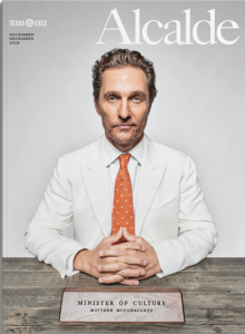
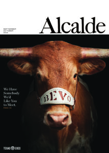
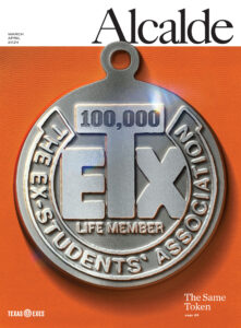
This Month’s Issue Cover + Finished Advertisement


Filed Under: Fall 2023 - Spring 2024, We are STAs

Project: Travel Behavior & Demand Center

March 22, 2024 By Leilani Cabello

Project: Travel Behavior & Demand Center

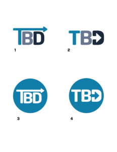
Project brief: The project’s brief was to design and develop a new logo and website for the TBD Center at The University of Texas at Austin, focusing on travel behavior and demand, alongside creating a new logo that encapsulates the center’s identity and mission. My goal was to provide a modern, user-friendly website that effectively communicated the center’s research, projects, and findings, along with a logo that was both compact and reflective of the center’s focus on movement and dynamism, as per the client’s preference for incorporating an arrow element similar to that in the CTR logo.

The Process: The process began with a collaborative effort between the design and development teams. My role primarily revolved around curating the website’s design and style, ensuring it aligned with the newly developed logo and the center’s branding requirements. This involved close coordination with the web development team, which focused on the technical aspects, including backend functionalities and ensuring the website’s performance and accessibility.


The Logo: My design process for the logo involved initial research and sketching, discussing different iterations, and making adjustments based on feedback. This iterative process, which included client consultations and refinements, resulted in a logo that was both representative of the TBD Center’s identity and visually aligned with the website’s overall design. The final logo was selected after several rounds of revisions, ensuring it met the client’s vision of being strong, compact, and dynamic, with the inclusion of an arrow within the letters to symbolize movement.

The Outcome: The outcome was a visually cohesive and functional website that not only met but exceeded the client’s expectations. The website, showcased at https://tbd.ctr.utexas.edu, effectively serves as a platform for the TBD Center to highlight its work and engage with its audience. The project was a testament to the power of collaborative teamwork and the importance of a client-centered design approach.

Filed Under: Fall 2023 - Spring 2024, We are STAs

November 13, 2023

November 13, 2023 By Leilani Cabello

Project Updates

Project: TBD Logo Update
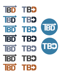
Notes: Building a logo within a couple of hours, particularly with minimal design direction and reliance on a reference for direct inspiration, demanded a unique approach that balanced creativity with efficiency with this specific project. Luckily, I had a reference that served as a blueprint, offering a clear visual guide for structure and style. I experimented with different color schemes that were in relation to the site I was also building for this project. The client mentioned wanting to have color in the logo so I stuck with a color scheme that revolved around a blue color. Ultimately, I ended up choosing a logo that utilized one color, yet I believe this choice shows professionalism and something modern without appearing too convoluted.

Project: UTFC Green Screen
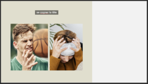
Notes: I worked on a UTCF green screen assignment I created myself. This sheet focused on anatomy and health vocabulary terms in French.


Project: UTFC Banner Redesign
Notes: I used some extra time in my shift to develop a redesign for the UTCF Banner. I discussed with a fellow STA, Princeton Tran, that the current banner appears outdated and difficult to read. How will students register what the city landmarks are if they are just introduced to the city? Another focus of this direction was to create a more efficient way to develop these deliverables. Using one image instead of three seems to be more cost and time effective as well. Below I made some iterations of some possible redesigns.


Project: Giving Feedback as a Project Manager/Art Director in Training
Notes: 

Filed Under: Fall 2023 - Spring 2024, We are STAs

  • 1
  • 2
  • 3
  • …
  • 10
  • Next Page »

link to LAITS home page

Video STA Home

© 2025 Liberal Arts Instructional Technology Services | Production Credits