Project: UT Instapoll
Started on: Mar 26, 2024
Staff Guidance: Chris Pittman
Description:
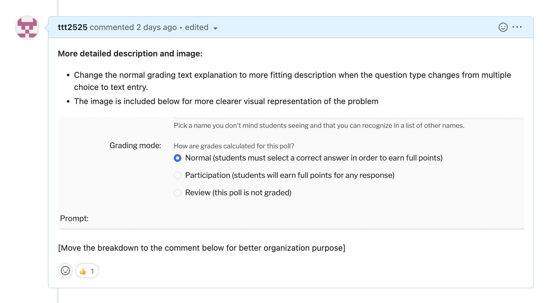
- Task: Change ‘Normal’ grading explanation for non-MC polls #110: The explanation for ‘Normal’ grading reads “Students must select a correct answer”. This makes sense for MC polls, but not for text entry or attendance polls. Change the wording here when the poll type changes.
- Visual Description:
Breakdown of the task:
Update:
Phase 1: Operation Finding Where To Change
- Identify in the codebase the explanation of normal (resources/js/components/PageTeacherPollSetDefaults.vue) -> Actually, this vue file is for the poll defaults. Might need to consider: Should we also change the explanation in the poll defaults? ✅
- The actual location of the file is PageTeacherPollEdit instead of PageTeacherPollSetDefaults ✅
- After changing the file, need to do npm run build to update the vue file -> The PageTeacherPollEdit works ✅
- Change the explanation to some other text and test it out ✅
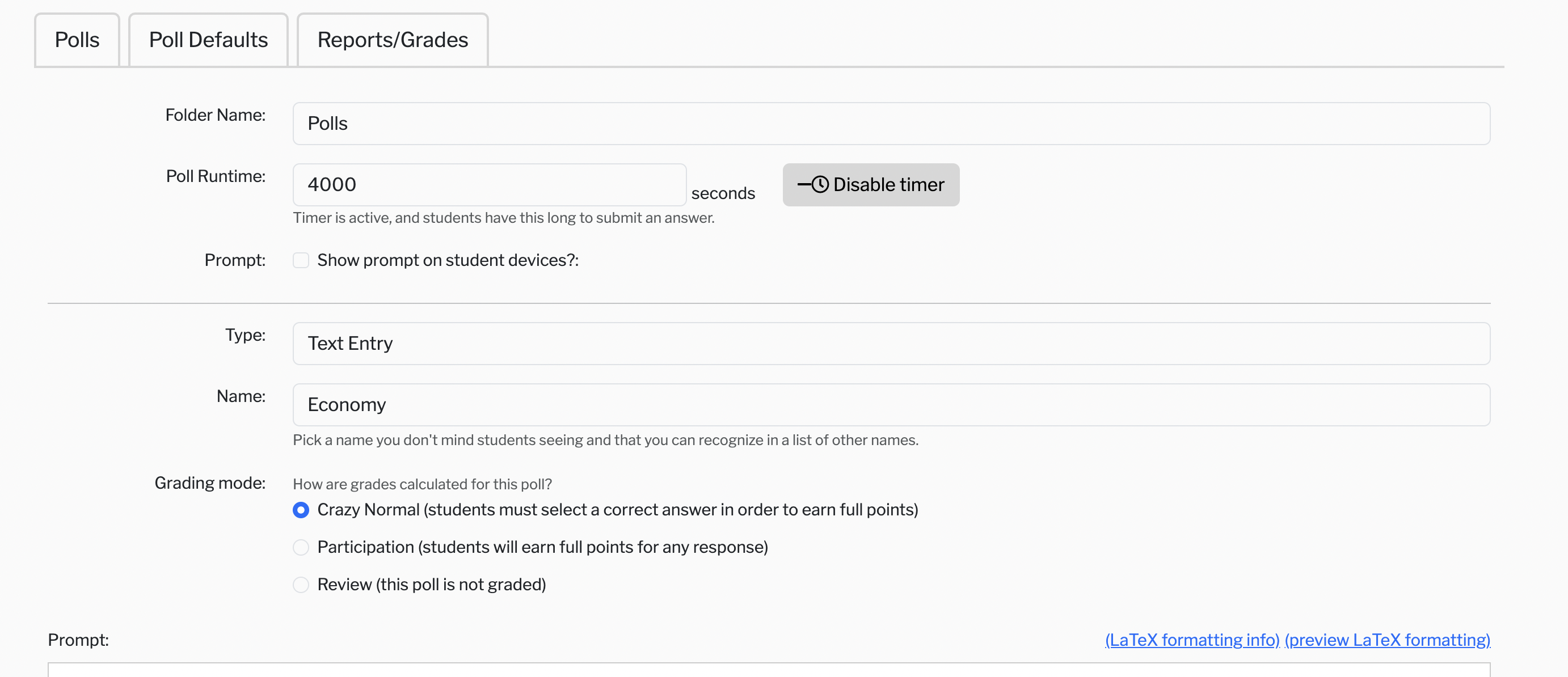
In this screenshot, the normal becomes crazy normal (works) ✅
Phase 2: Experiment with if/else statement
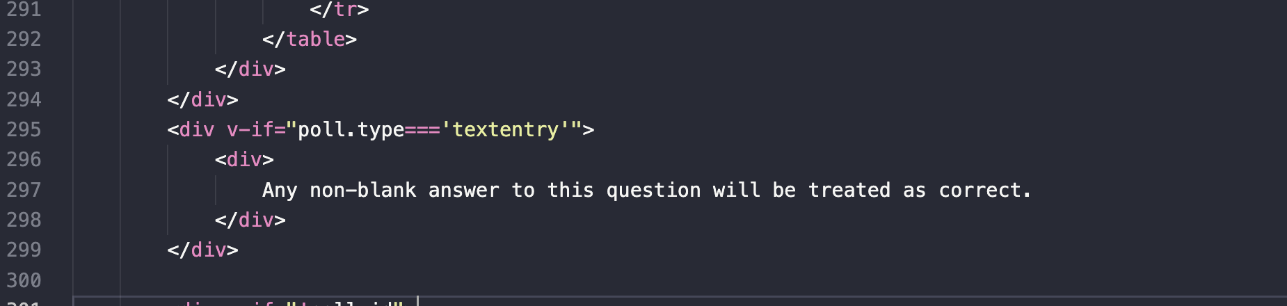
- Include if/else statement to change the explanation when the question type changes (include v-if for that label)
Might do something like this so that whenever it detects the question type to “text entry”, the explanation changes to something else. ✅
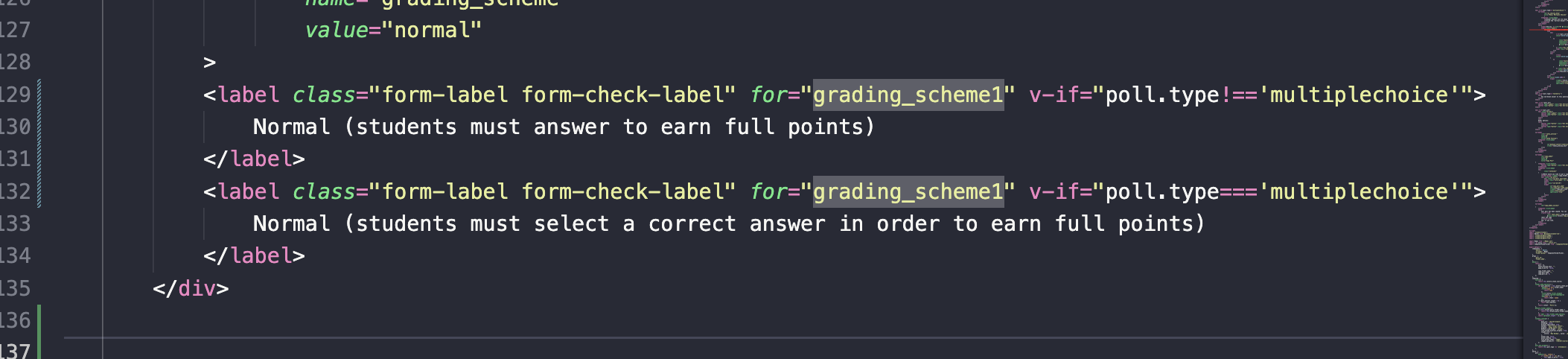
- The third steps include the knowledge of how to retrieve the question type and when to trigger the change in the question type (only use if/else statement is sufficient) ✅
Might look something like this:
– Test it fully with UT Instapoll
Some considerations:
- The text: What should the explanation for multiple choice be?
- Is this the optimal solutions
- Are there any cases where it breaks? (Think about edge cases?)
Something to take in mind when changing:
- Whenever the vue.js file gets updated, always npm run build
- Always use === instead of only == for stronger comparisons.
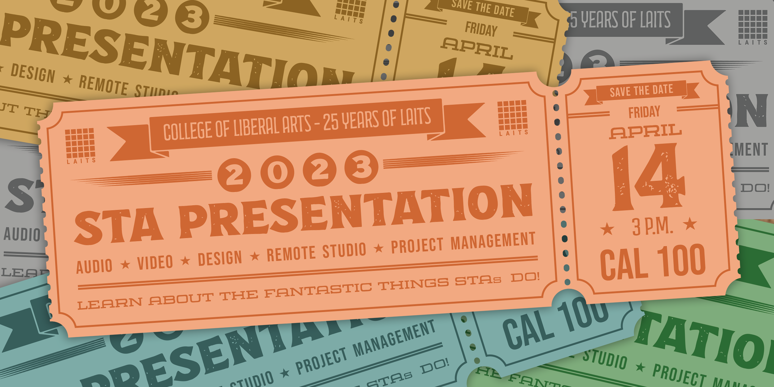
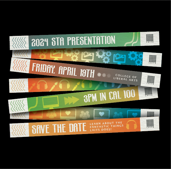
Project: STA Presentation
Started on: Mar 27, 2024
Staff Guidance: Mike, De’sha
Description:
- Plan out the STA presentation outline
https://docs.google.com/document/d/1j4EJSDJxxyTbDPehnLjNEdy0JwYLmTp3yKytZXwnaOo/edit?usp=sharing