Summer Marketing
Email graphics: Similar to the Spring Digital Displays, we wanted to simplify the layout of the email graphics but also give notice to students on how much time was left to register for our summer online courses. ( “Last chance…”, “Registration opens soon”, “… open now”, etc.)
Digital Displays

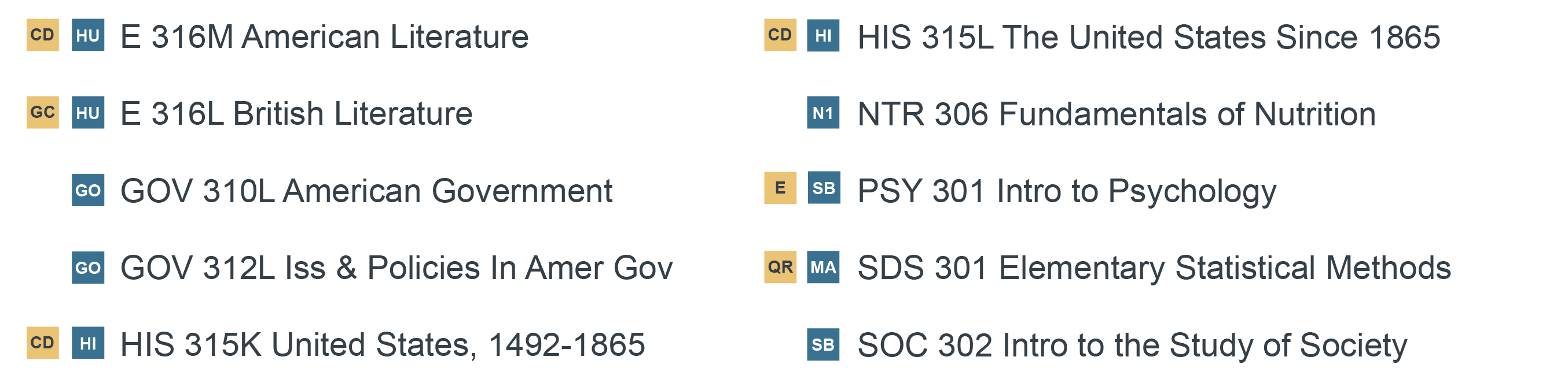
Before


After


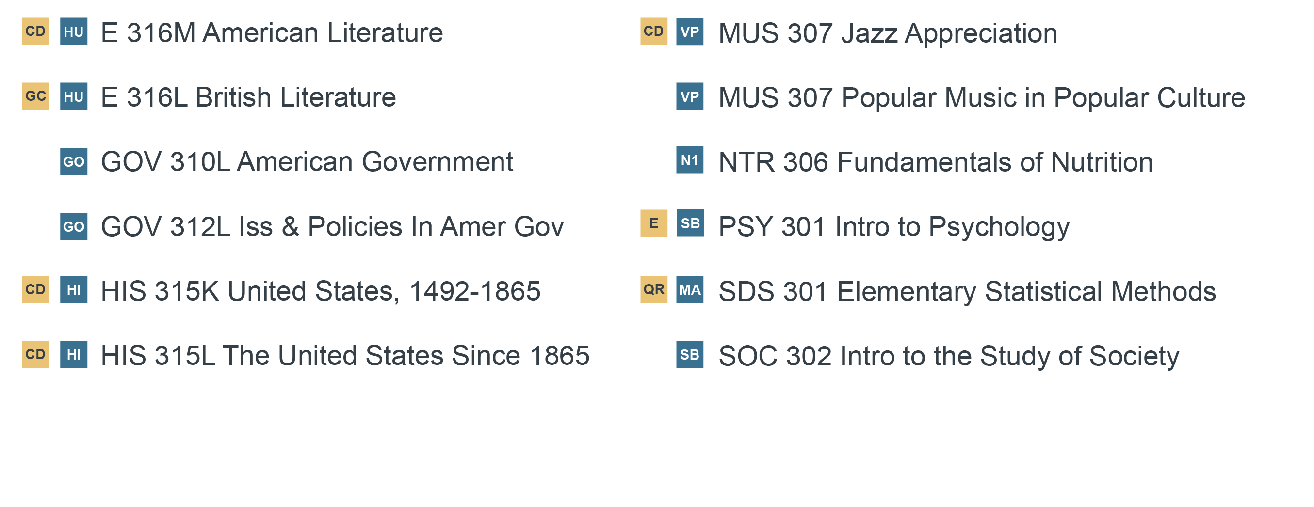
I was also asked to edit/prepare a $500 courses graphic without the MUS 307 courses since they have lower enrollment caps and are already filled. Keeping the same course order, I shifted the courses to have 5 in the left column and 5 in the right column instead of 6 and 6.
Before
After