2025 STA Presentation
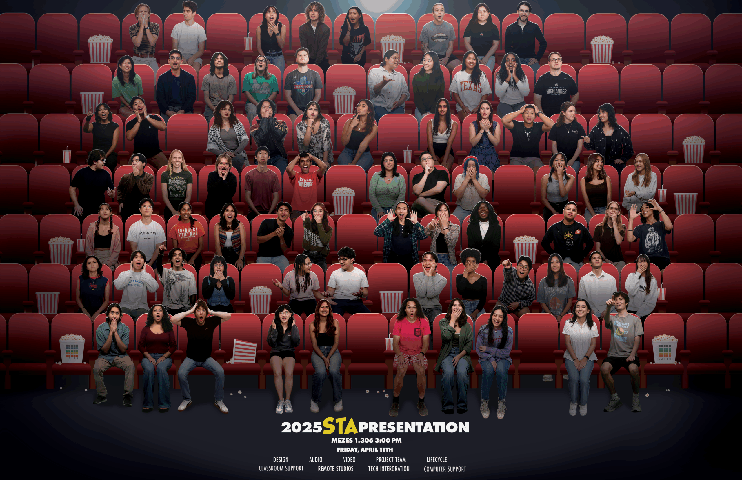
STA Photo Cut Outs


Made photo cut outs for all new STAs! Like myself ฅ^•⩊•^ ฅ
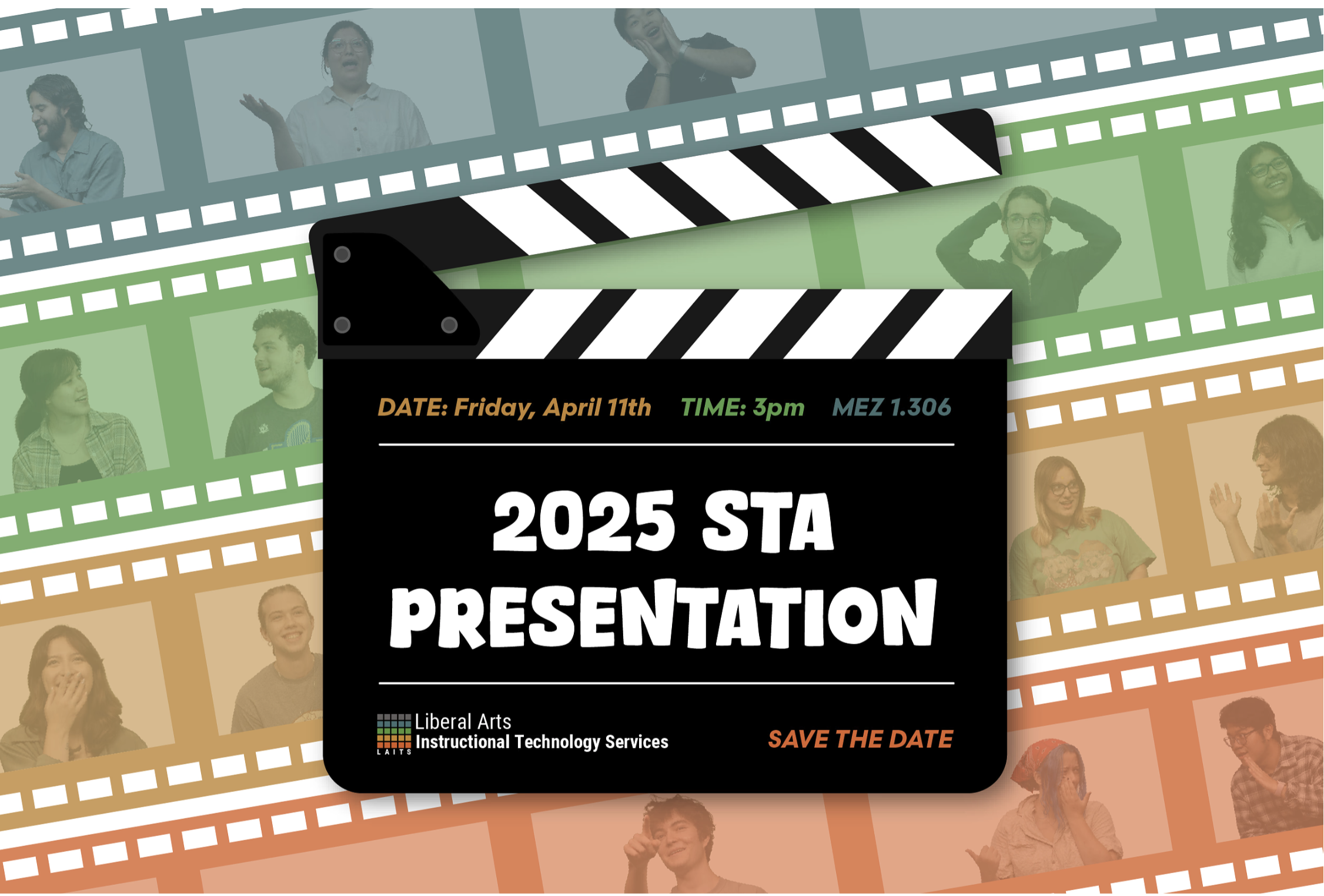
Lower-Thirds Graphic
For this next project I was tasked with designing a Lower Thirds graphic for the STA presentation.
Considerations
⋆。°✩ Keep the design simple and subtle, ensuring it does not distract from the video content.
⋆。°✩ Use LAITS colors or colors from pre-existing graphics for the STA Presentation
⋆。°✩ Find a graphic and font fitting for the theme: Movies, specifically drawing inspo from the The Peanuts Movie poster
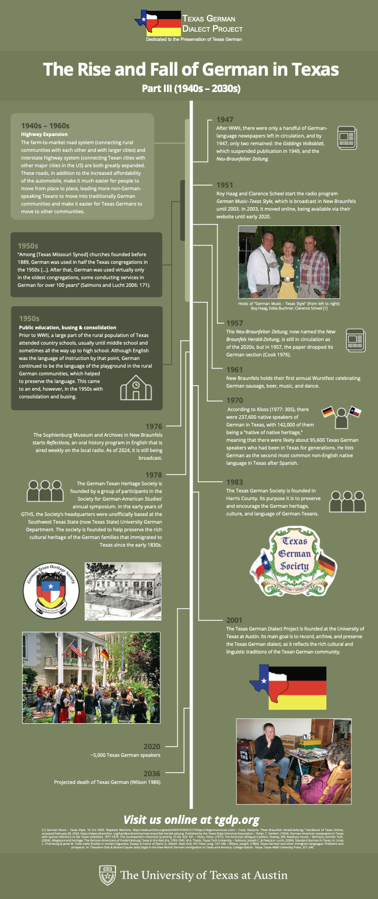
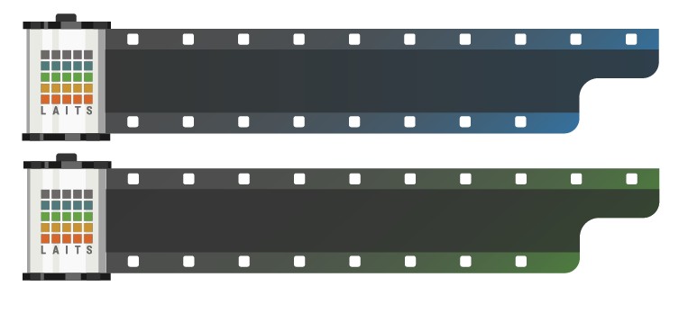
Early Versions
After landing on the idea of a film roll, I started mocking up different versions. Playing with:
• Color
• Logo
• Canister Style
• Film Style
After evaluation, we decided to move forward with the last iteration!


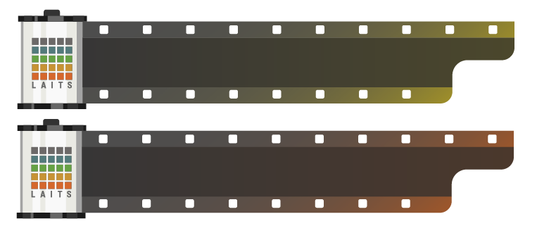
Final Version

STA Presentation Webpage
My next project was to design the STA Presentation webpage!