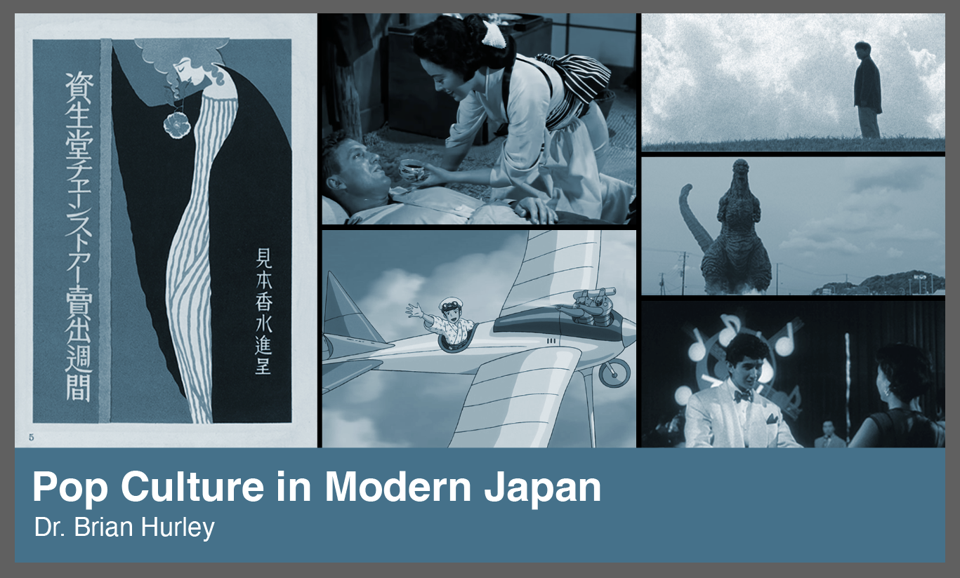
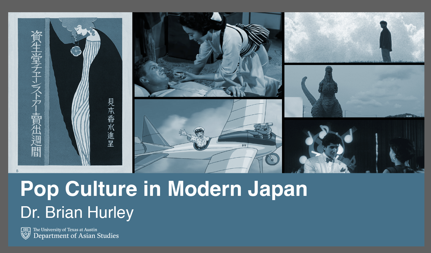
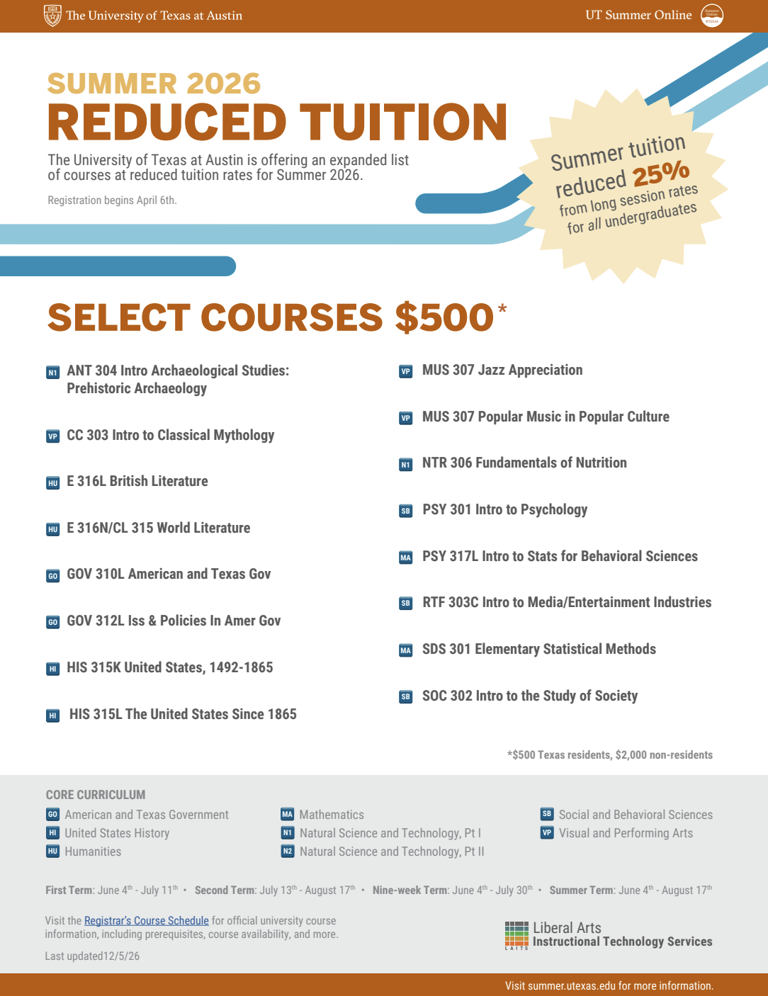
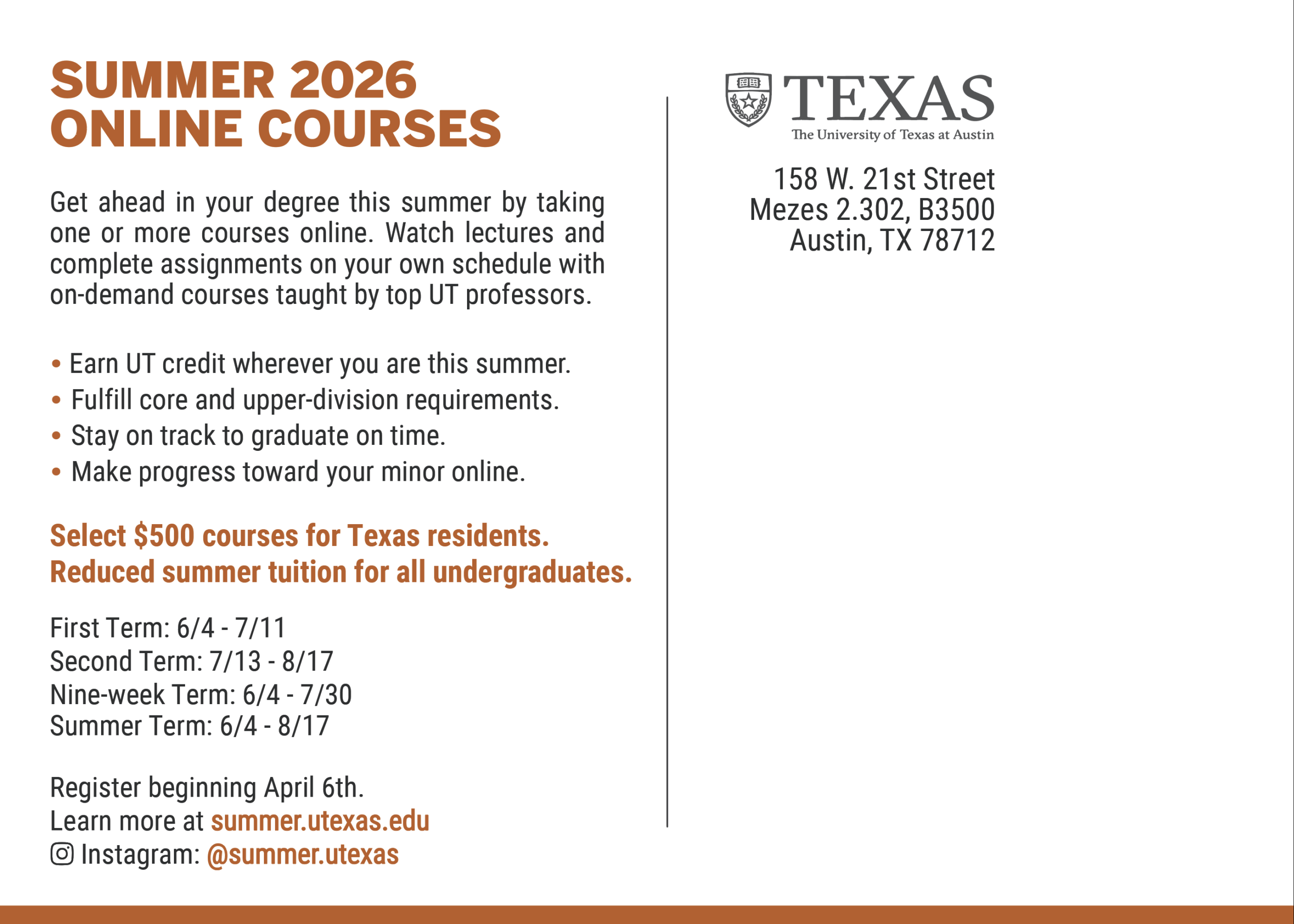
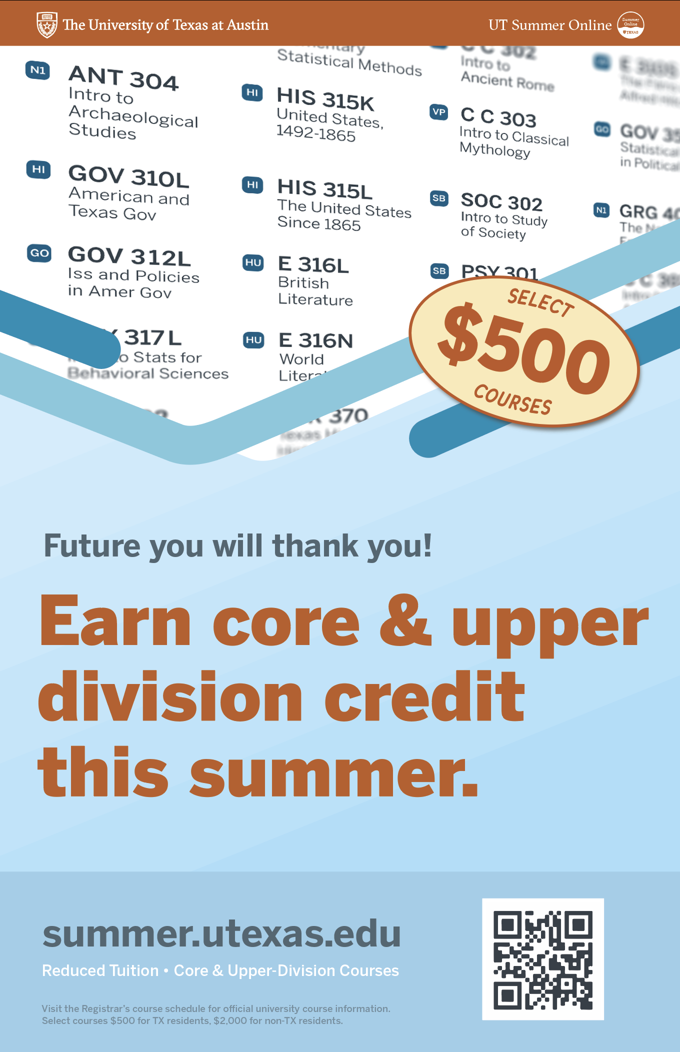
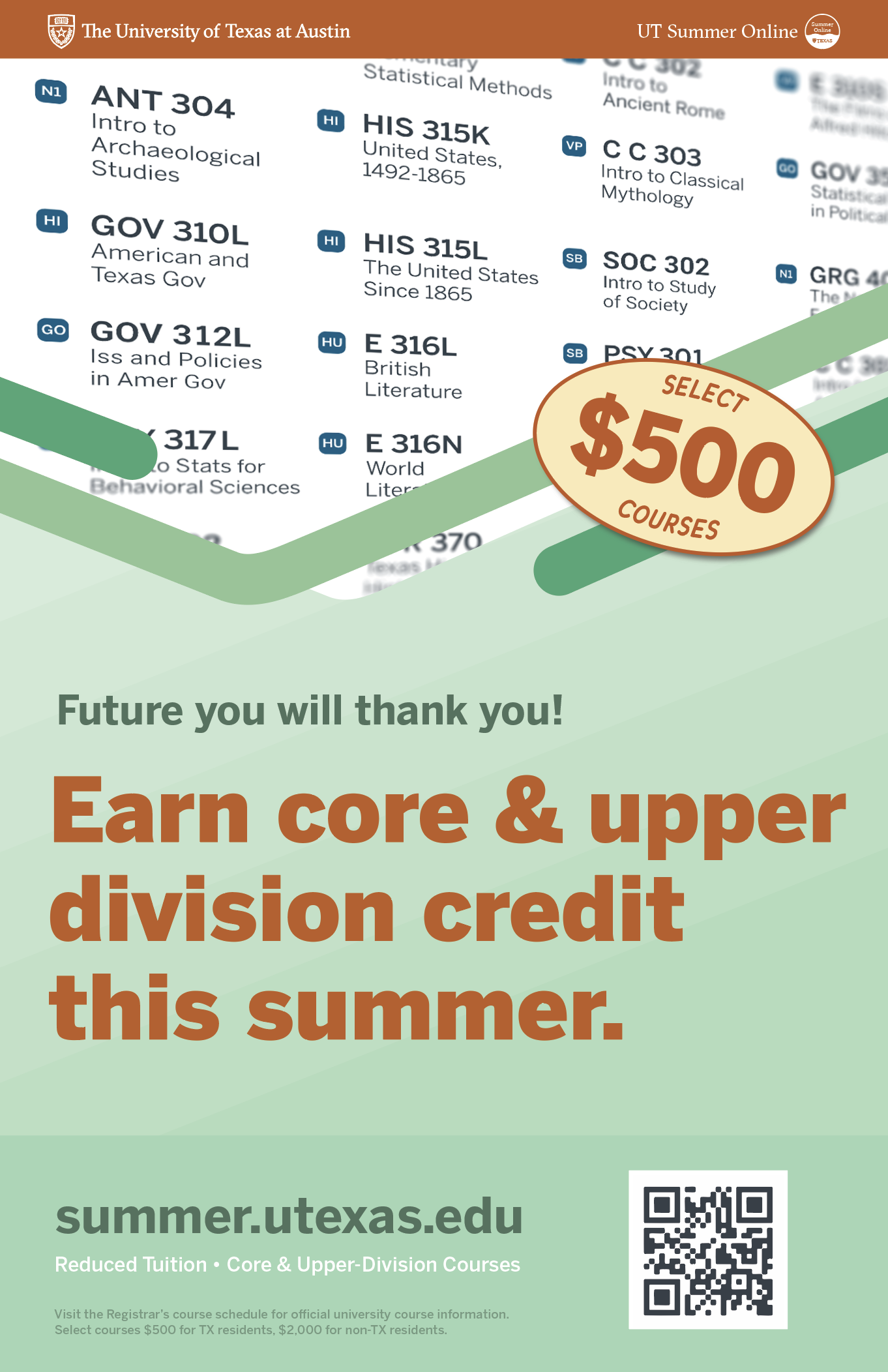
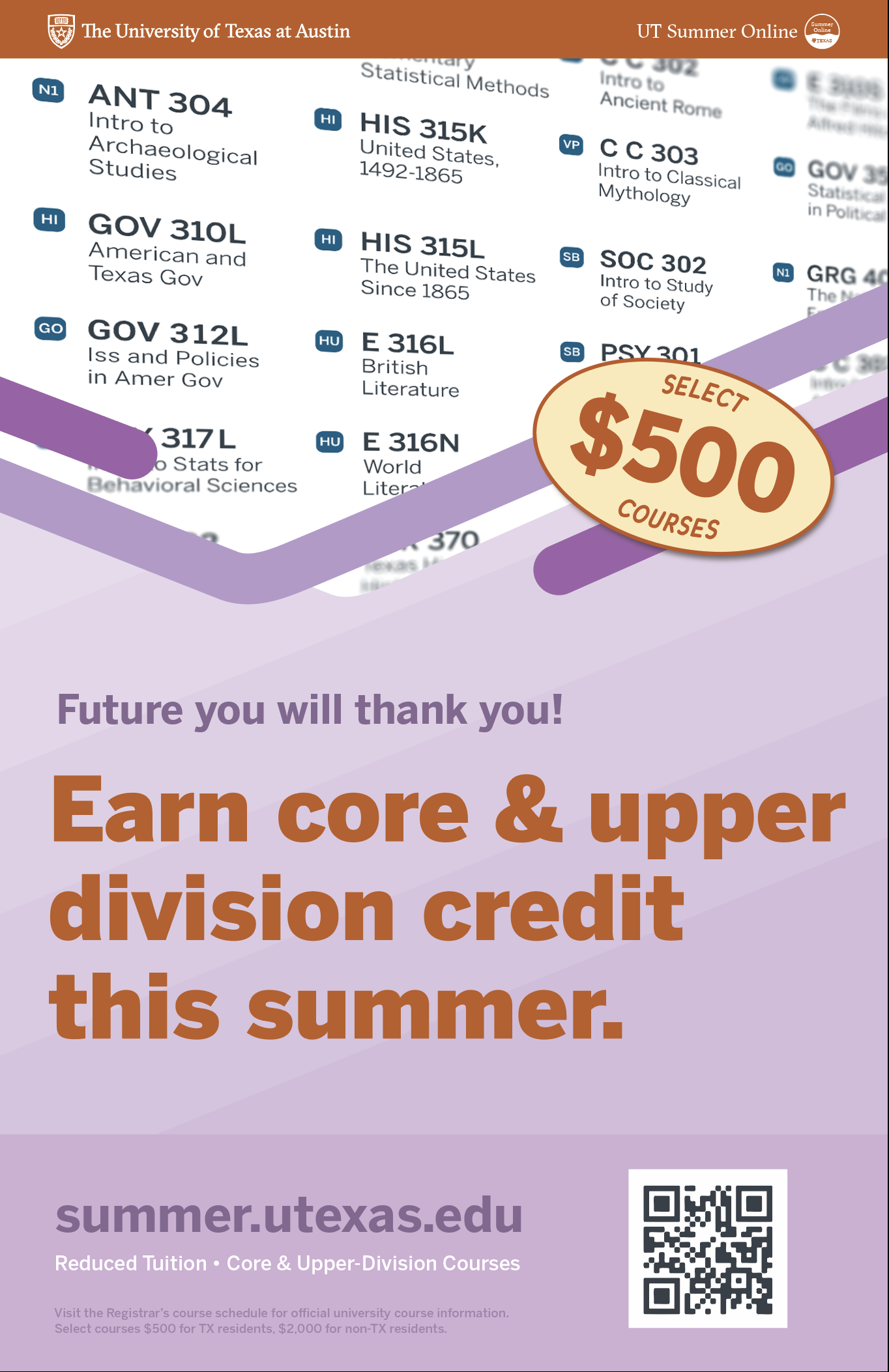
Summer 2026
Summer Marketing

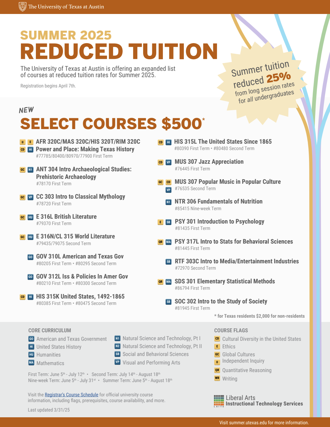
Tuition Guide
2025
2026
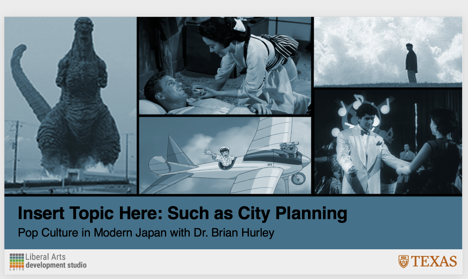
- Added current design motifs
- Removed flags form all course listings
- Fixed course list spacing
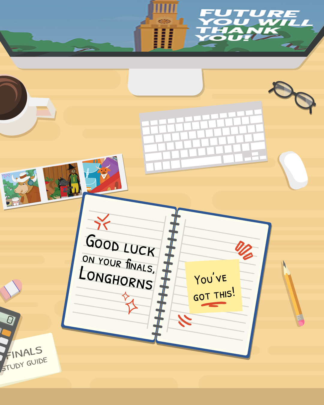
FINAL POSTCARD

Before assets
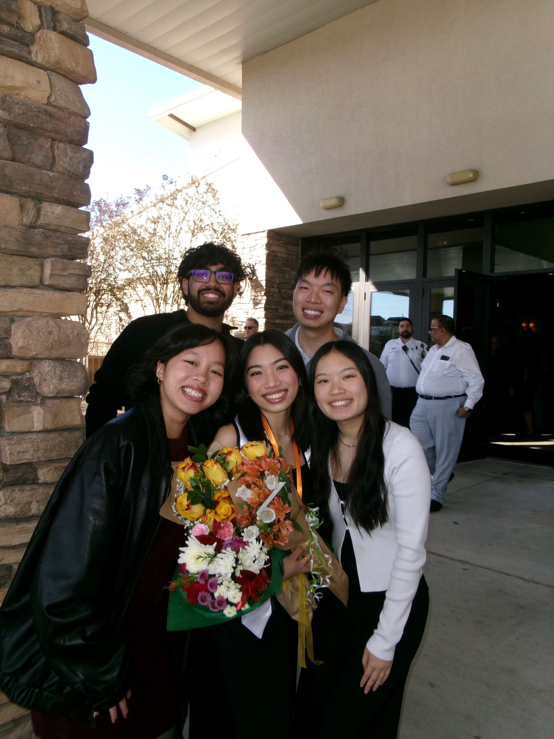
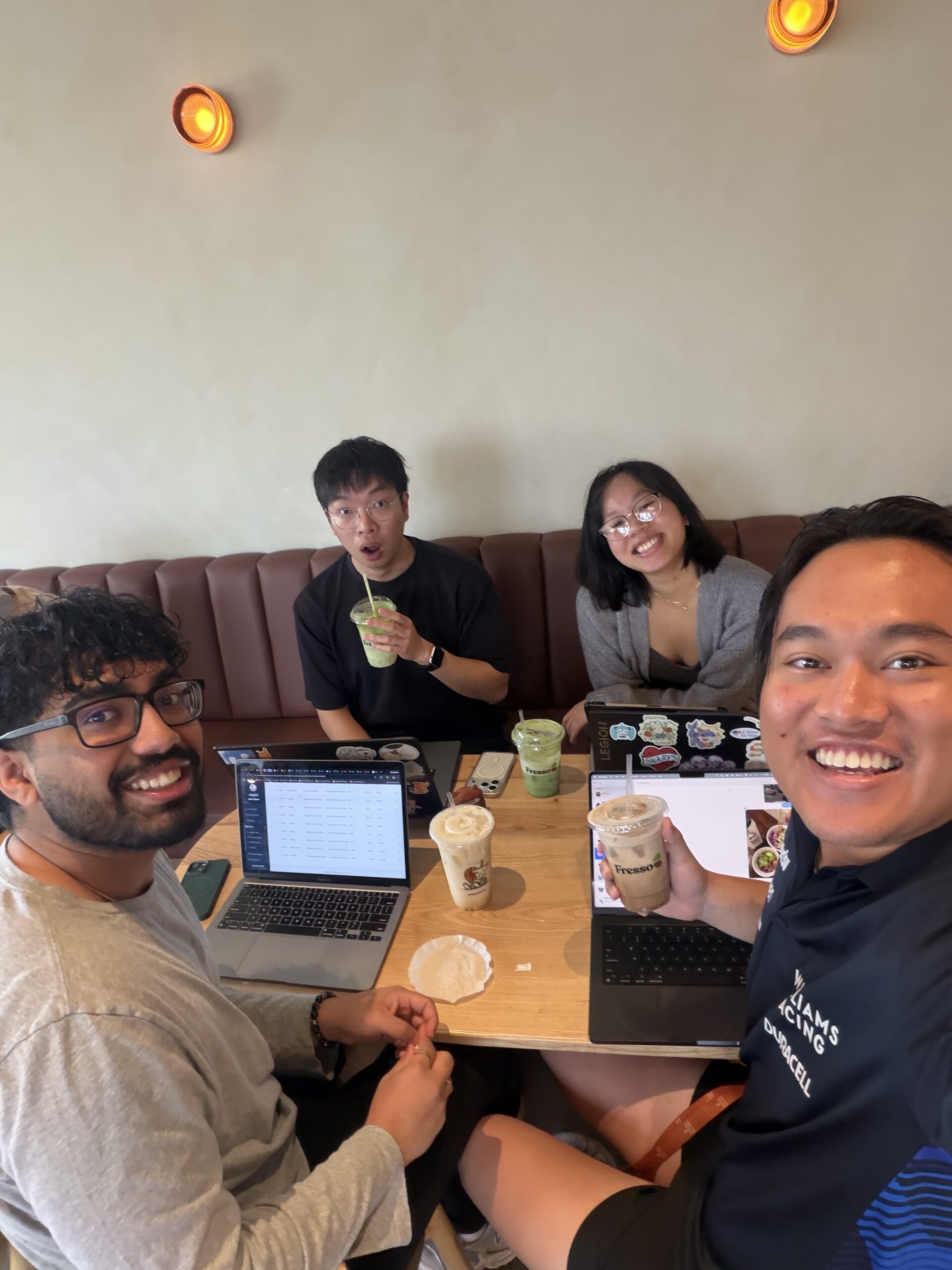
- 4 photo collage
- Showcasing different summer activities
- Studying
- Traveling
- Hanging with friends
- Interning/Working
Iterations


- Photos didn’t align with expectations/direction
- Lack of diversity in actions and people
- Some didn’t work within the context of a postcard
- On-Campus backgrounds
–> Revert back to original layout = ASHA ON EVERY ASSET ☆
FINAL FINAL

Spring Digital Display


FINAL 11×17


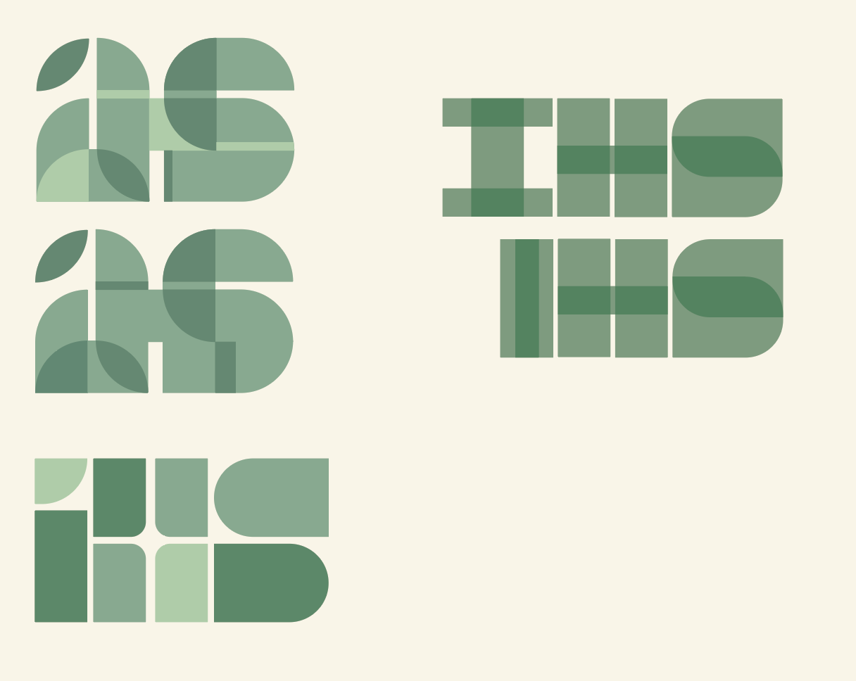
IHS Logo Design
Client had strong sense of direction!
- Something sophisticated and modern
- Played around with different opacity and geometric lettering styles! All letters are vectored shapes