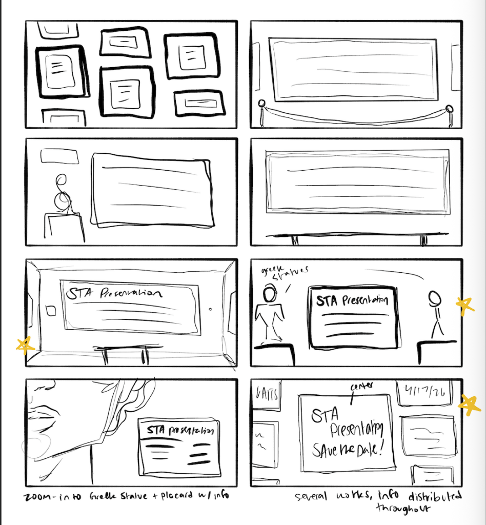
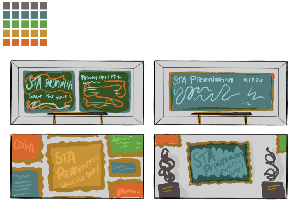
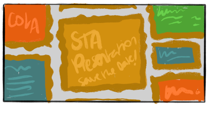
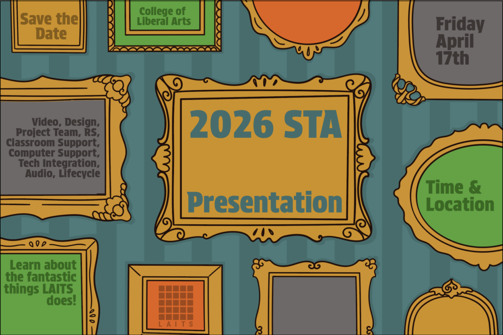
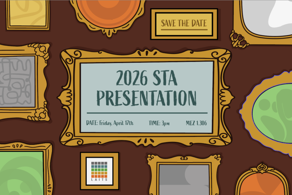
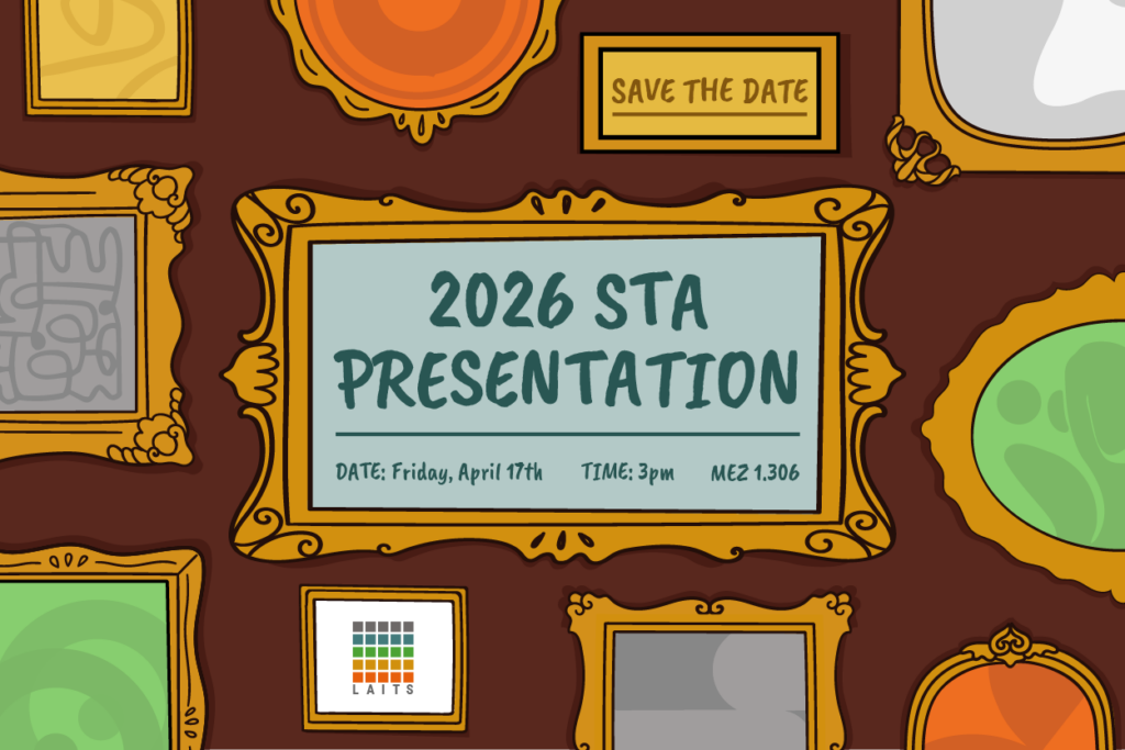
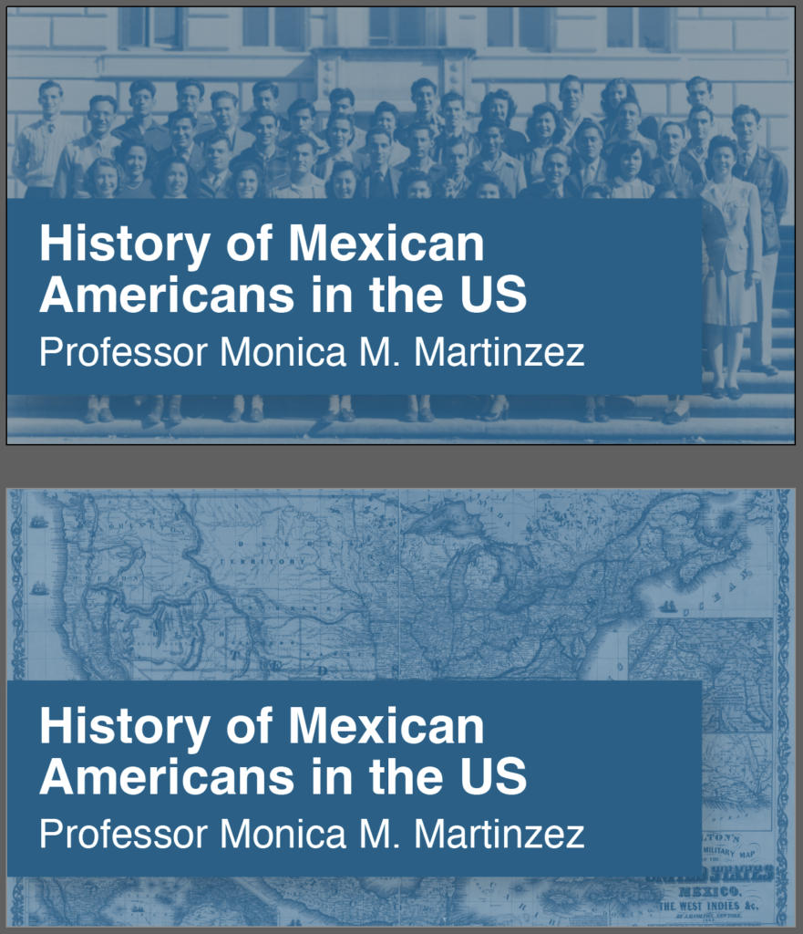
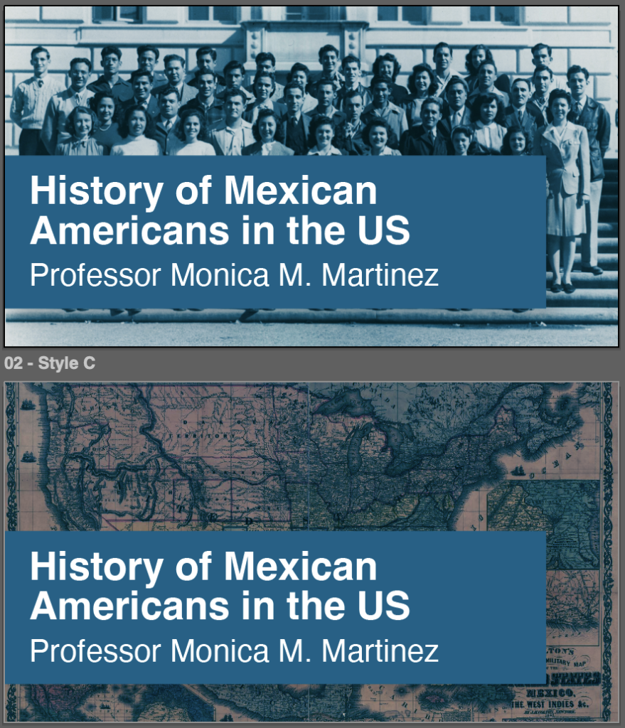
-Continuing Spring 2026 STA Roster Poster-
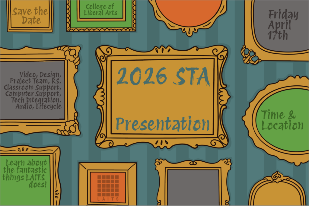
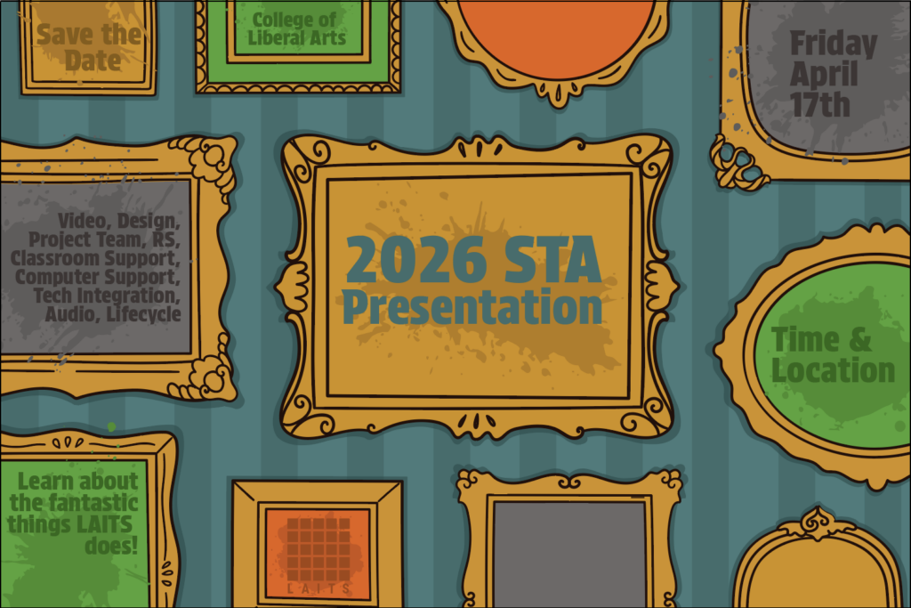
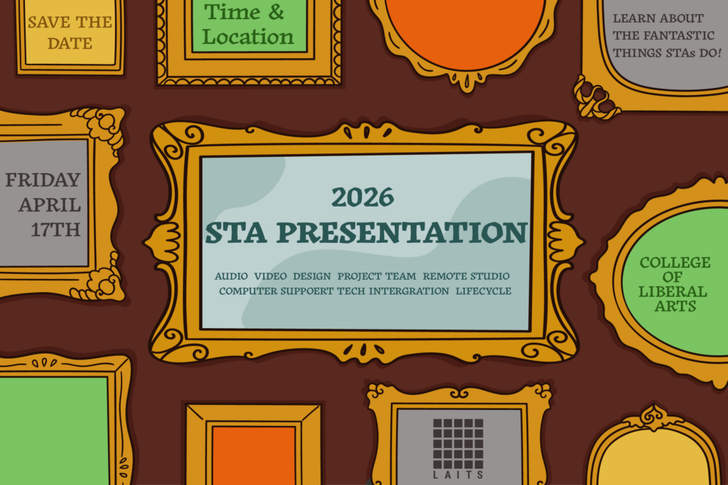
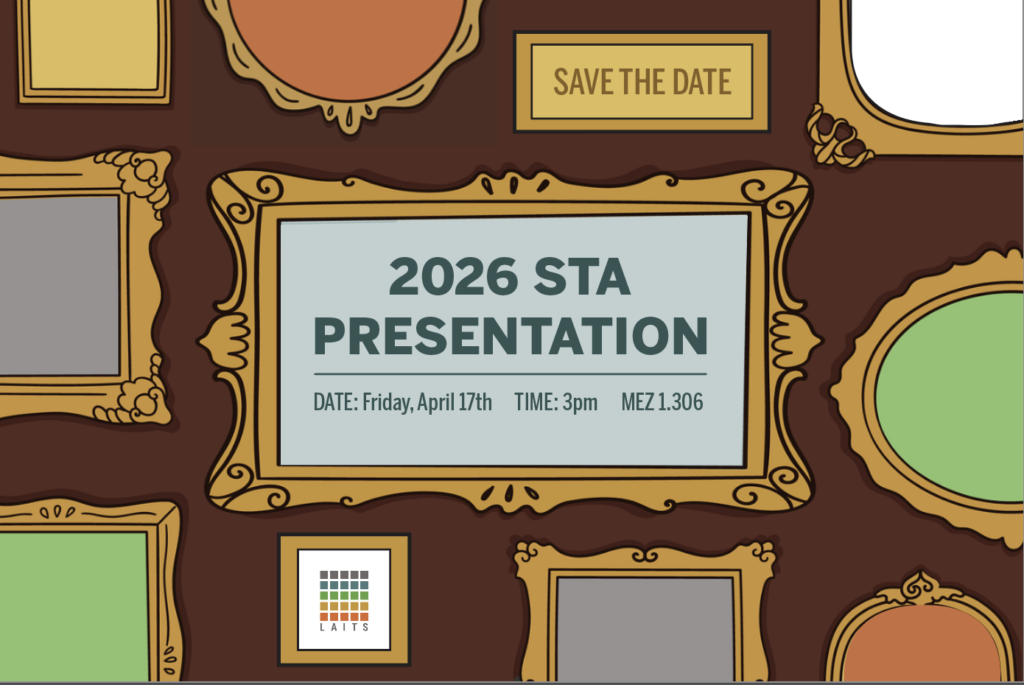
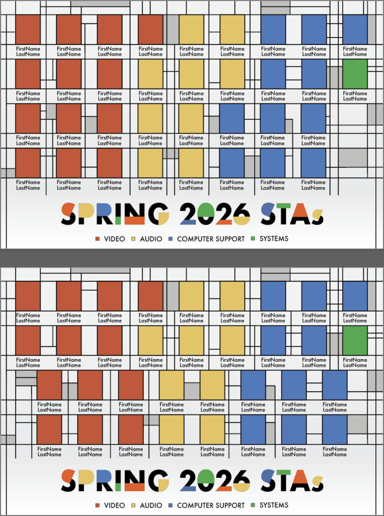
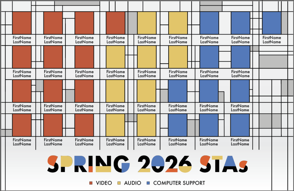
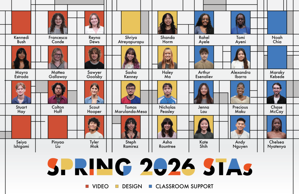
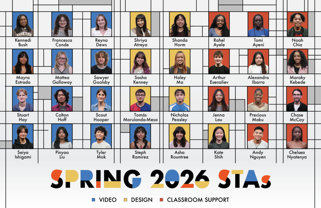
This past week I was able to make significant progress on the style of the Roster Poster, and am now experimenting with how do include various graffiti assets alongside the STA frames.

Summer 2025
Summer Marketing
Fall Digital Display
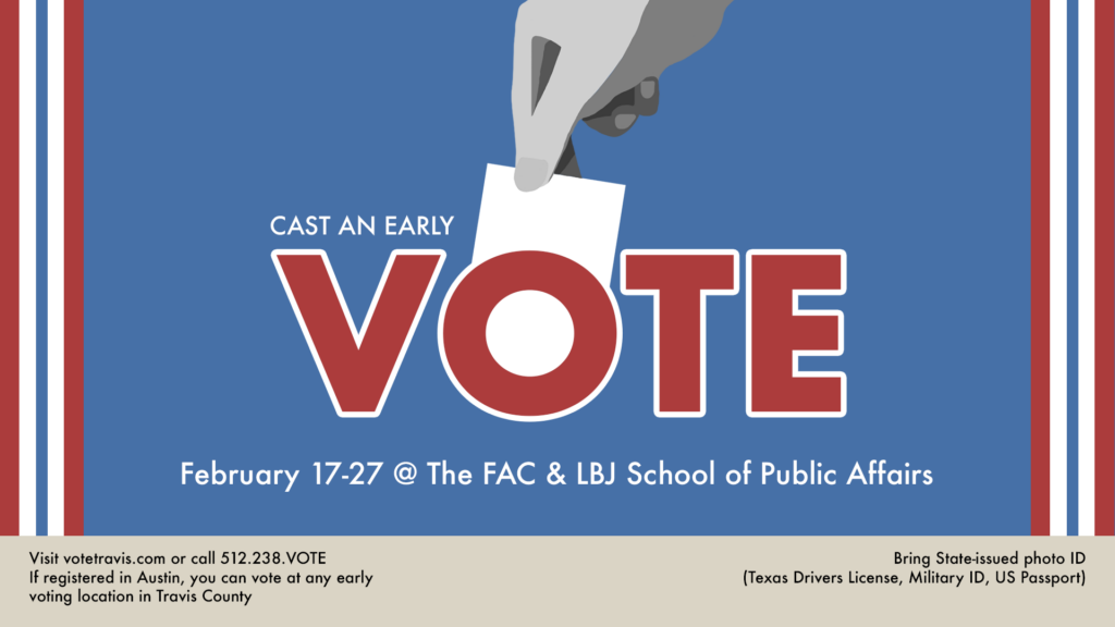
v.1
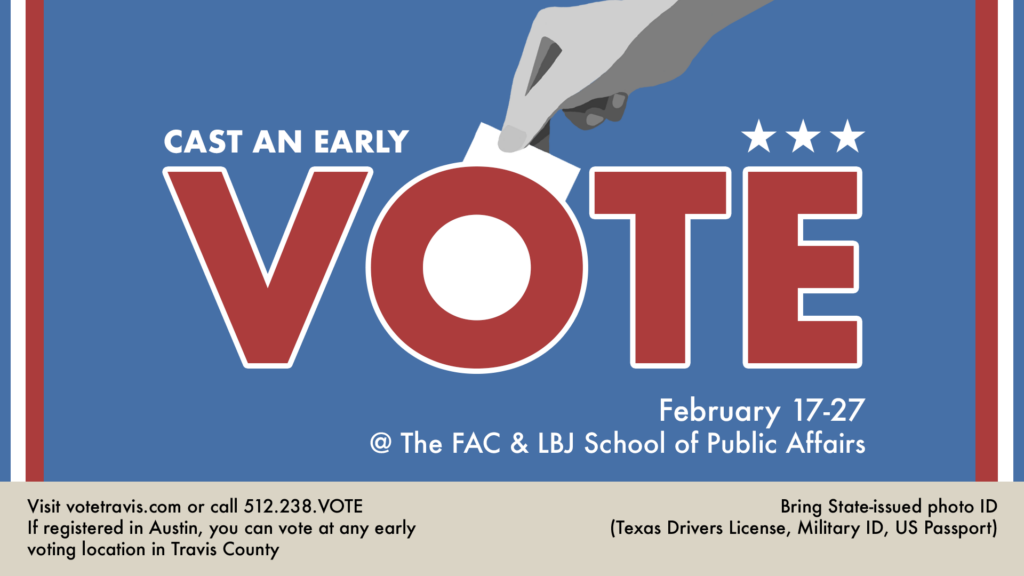
v.2
v.3
11 x 17 Posters (WIP)
v.1
v.2
v.105,784
FINAL POSTERS
Changes
Overall I’m very happy with the poster! It was a struggle knowing what elements needed to be on the poster and in what order. I think this project really helped with my hierarchy skills and just developing as an intentional designer.
Fall A-Frames

Changes
Spring Digital Display
v.1

For this project the objective was to mimic the visual elements of the 11×17 poster, but oriented for a TV screen.
Components
v.2
v.3

I’ve been continuing to create posters for the UT Department of Germanic Studies, and the most recent one I’ve worked on is Banner #18, which covers the topic of Donor Dialects and Language Variation.
➜ Draft 1
➜ Draft 2
➜ Project Status: In Progress
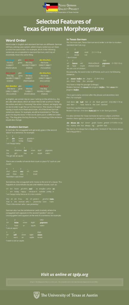
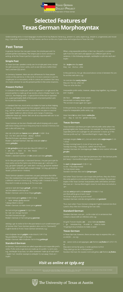
The past few weeks, I’ve been iterating on layouts of the Texas German Morphosyntax Banner (Banner #17) for the UT Department of Germanic Studies. This involves translating written text to a visually appealing poster using Adobe Indesign. I’ve been tweaking the layout of the text blocks and images based on I’ve gotten from my project admin. My fellow STA Kate has also been guiding me throughout the process, so shoutout to her!
➜ Text Clarity/Organization: An important piece of feedback I received was to align the “word-for-word” translations evenly, so that it’s intuitive for a reader to understand which words belong together. To fix this, I made the “word-for-word” spacings more standardized using a transparent table, with a word or number in each cell block. On the images below, the left image is before I added the tables, and the right table is after.
Before I added transparent tables
After I added transparent tables
➜ Draft 1: After two rounds of feedback, I rearranged several headers and adjusted text content:
➜ Draft 2: I ended up condensing the poster to make it much shorter, as I had accidentally elongated the original version. After rearranging some text, here is the most current draft:
➜ Project Status: In Progress
➜ Reflection: I’ve been enjoying my first project working with an actual client, and I’ve learned a lot about designing with a specific audience in mind (in this case, individuals wanting a clear way to learn about Texas German Morphosyntax). I’m also enjoying expanding my skills within InDesign.
These past few weeks with the help of Shanda I worked on a book cover for COERLL, which involved making a text logo and map graphic. using mainly Illustrator for this project, I was able to figure out many more small and useful tips for my workflow, especially when it comes to working with vectors and customizing fonts.
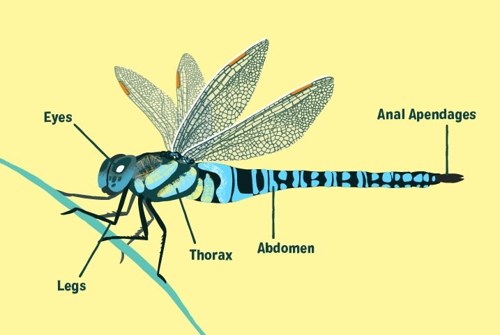
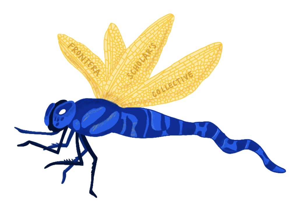
At the same time, I have been working on the Spring 2026 Roster Poster, and have been experimenting with various styles for a main title graphic:
So far, I have chose to continue with concept #1, but I will also try and see how concept #2 could work out. This is also my first time using a Wacom tablet, so I am slowly learning many new things that you can do in photoshop which I hadn’t known previously. Furthermore, this project has also forced me to get back into my illustrative mindset, which I haven’t tapped into in years. (I stopped drawing in like middle school or earlier)
https://sta.laits.utexas.edu/blog/2025/10/16/blog-review-oct-17/
By Kyra Lee
This course is about how AI applications can be used to generate astro-physics data, with students who are not expected to have a background in astronomy. Typically, classes work with pre-curated data, so this class aims to teach students to compile data themselves using AI algorithms. The professors want to keep the focus for the course graphics on astronomy, however, and have emphasized that they would ideally like the typical nodes and lines to be replaced with icons of stars, planets, and galaxies, similar to the things that you can get in Mac Keynote’s shapes. In terms of animation, perhaps some sort of cosmic explosion would work well too.


By Kate Shih
Client: Maria Arredondo, The ChiLDS Lab
Task: Complete a site redesign for The ChiLDS Lab. The client wanted to keep most of the content, but wanted a refreshed and “cuter” design overall.
Status: In progress, low fidelity mock-ups created
What we’re working with.
An updated look.
For separating content.
Several options of implementations of the above assets.
Receiving edits and revising.
The client ended up choosing the “lego block” logo design, with some minor edits. After revising to meet her requests, the logo ended up looking like this:
A more complete plan for the layouts.