2026 STA Presentation: PPT Template & Up Next Slides
Currently working on these projects for this semester’s STA Presentation!!
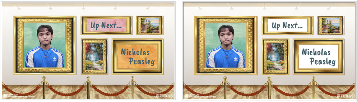
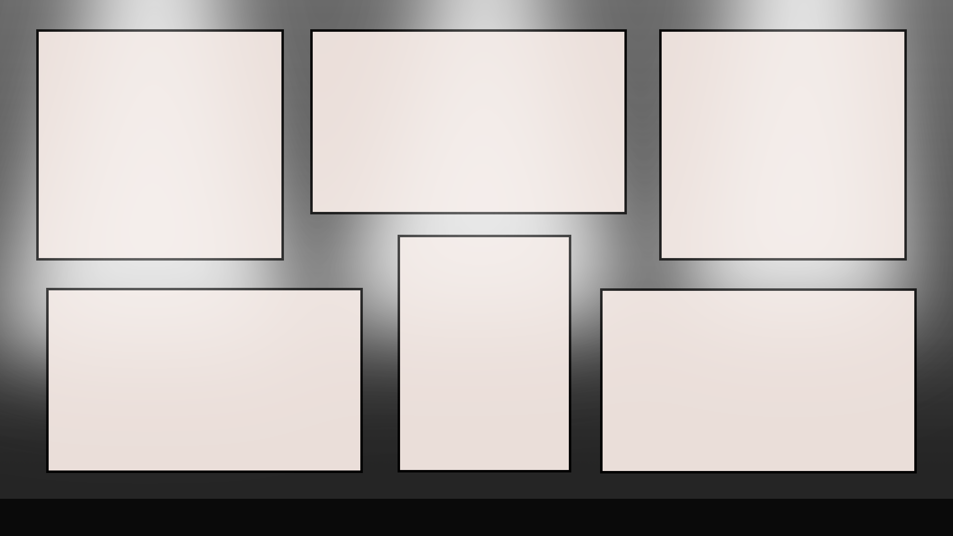
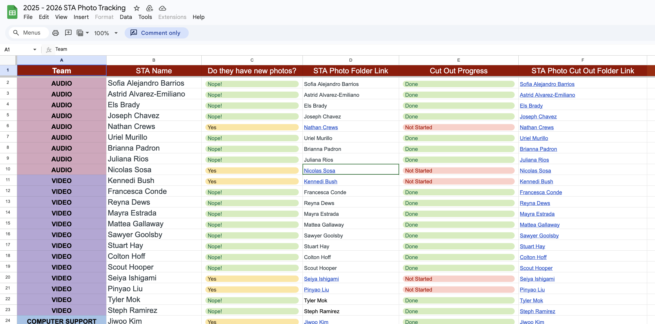
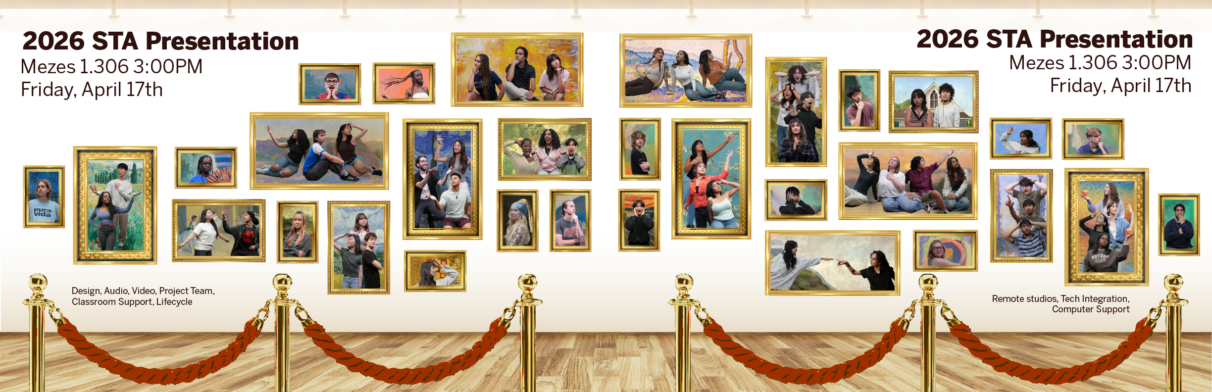
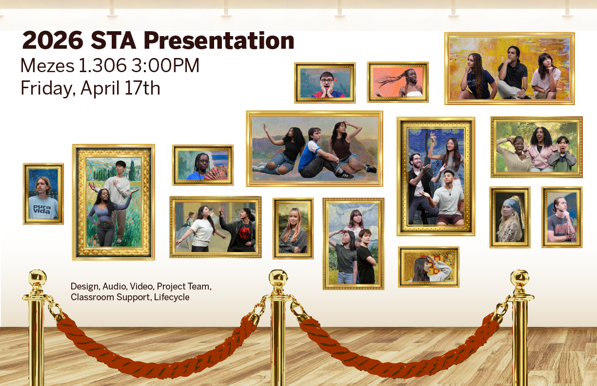
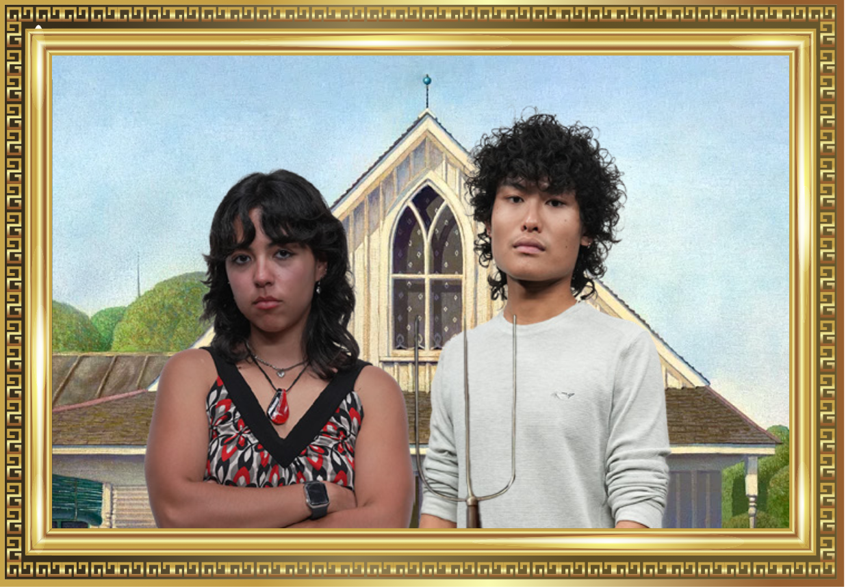
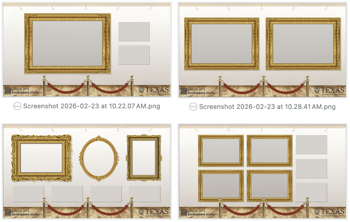
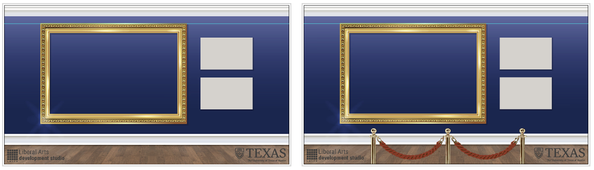
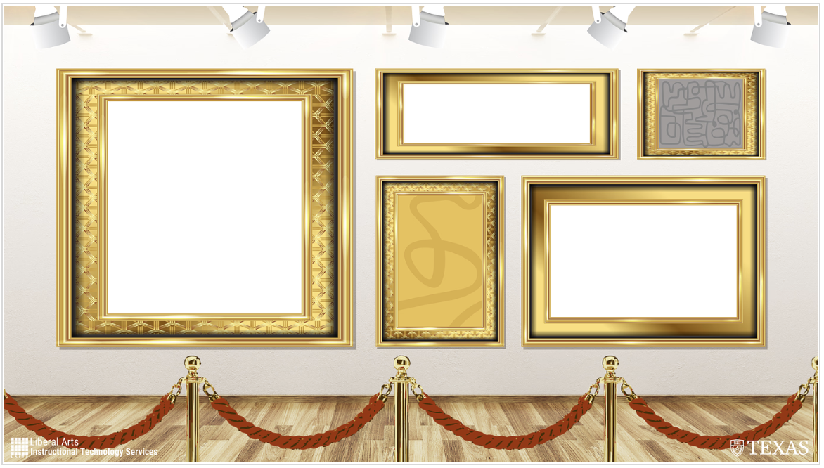
PPT TEMPLATE
Drafting
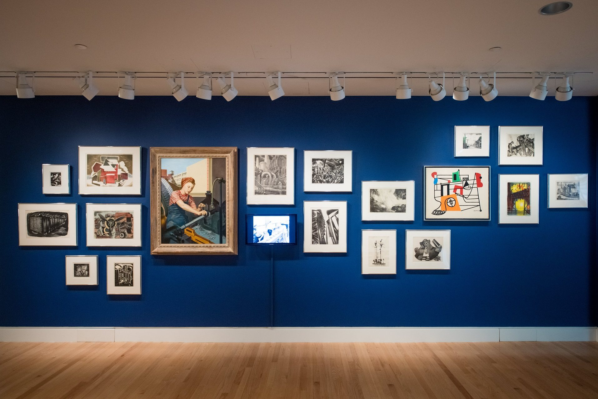
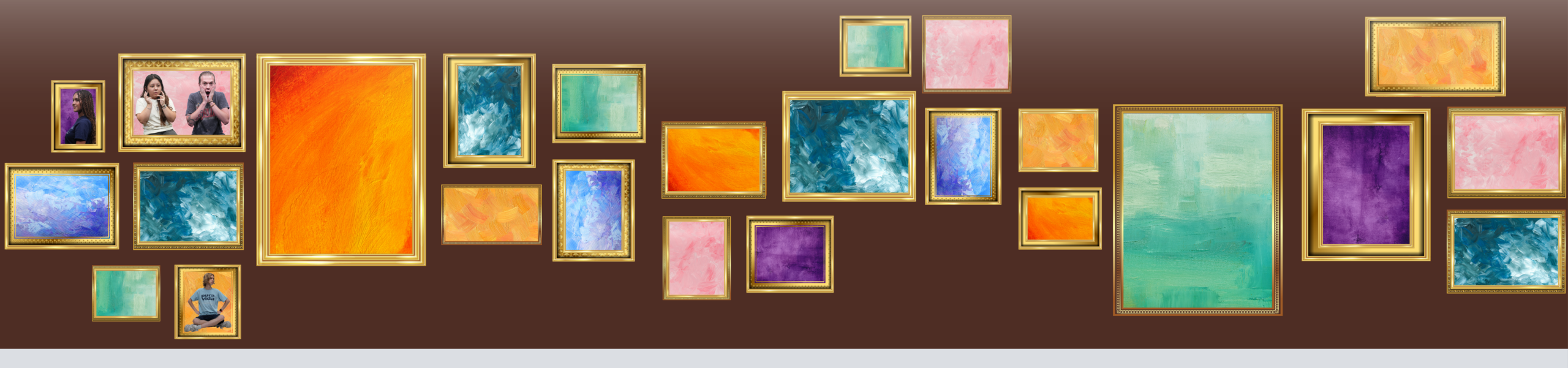
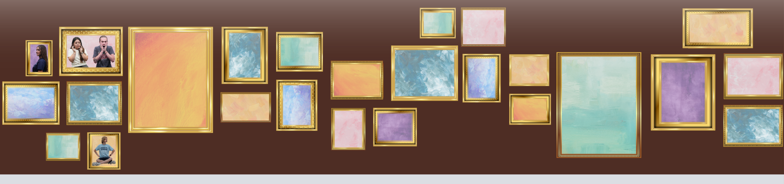
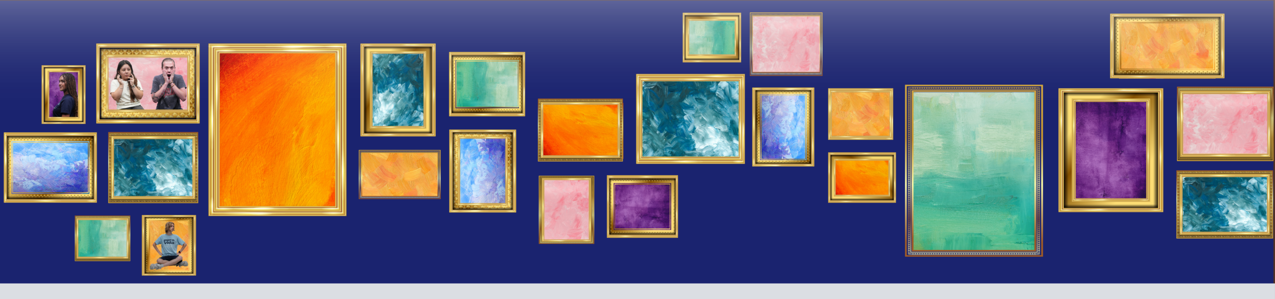
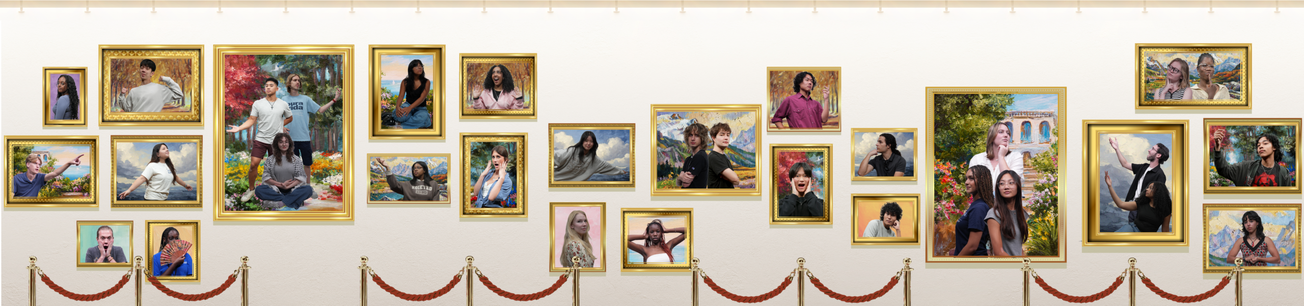
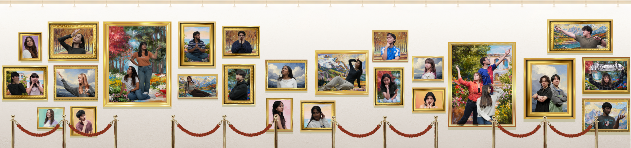
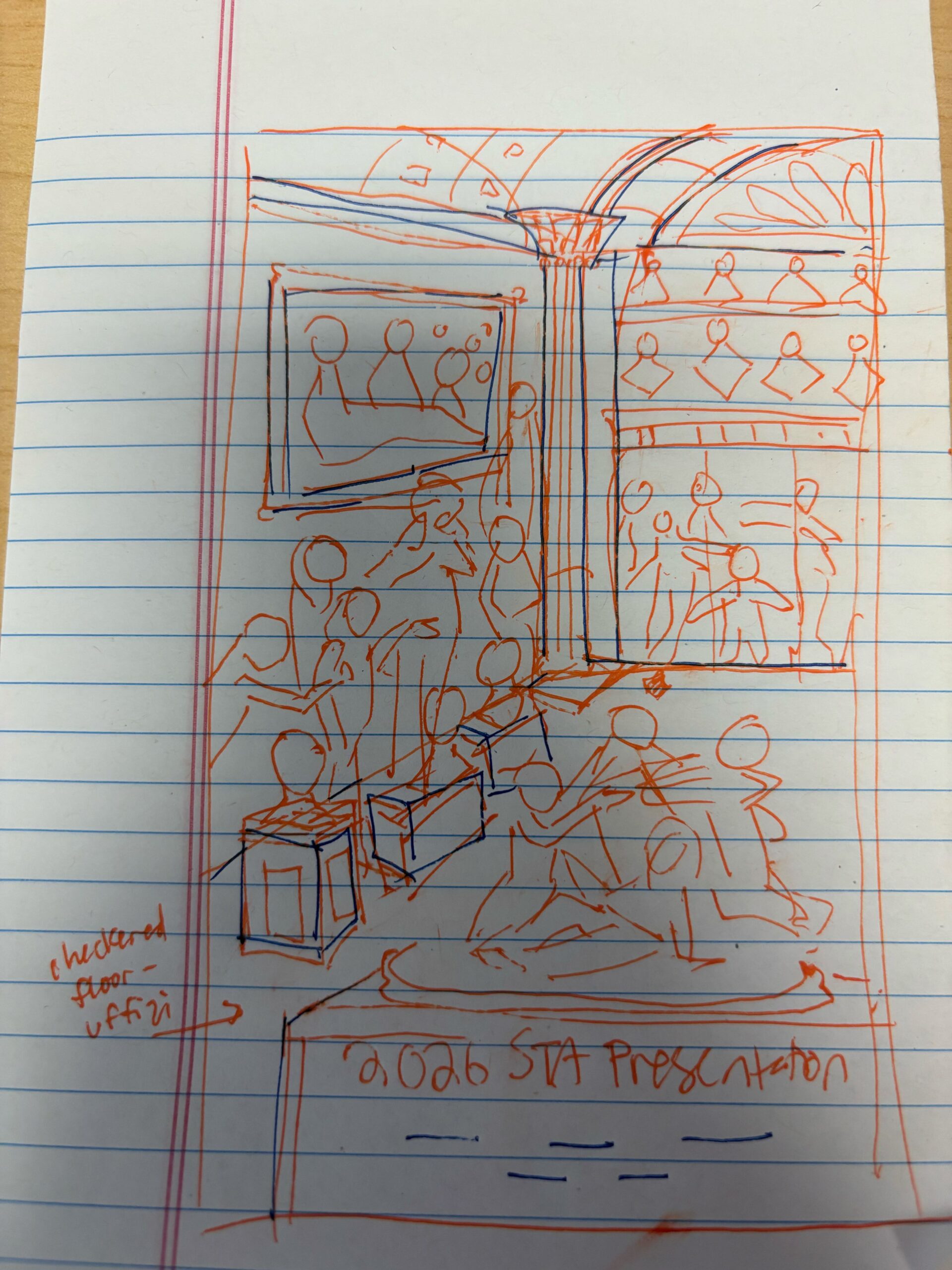
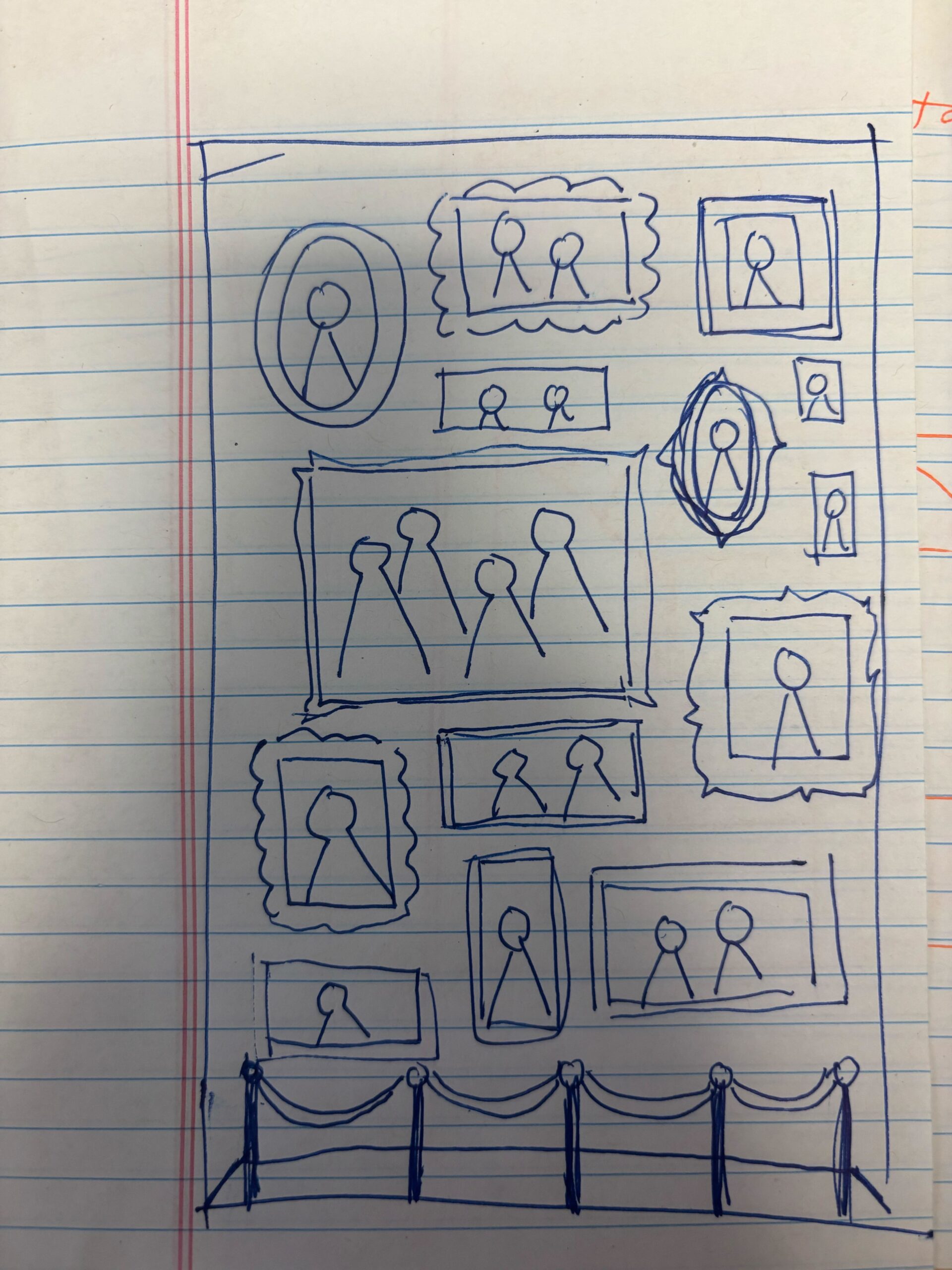
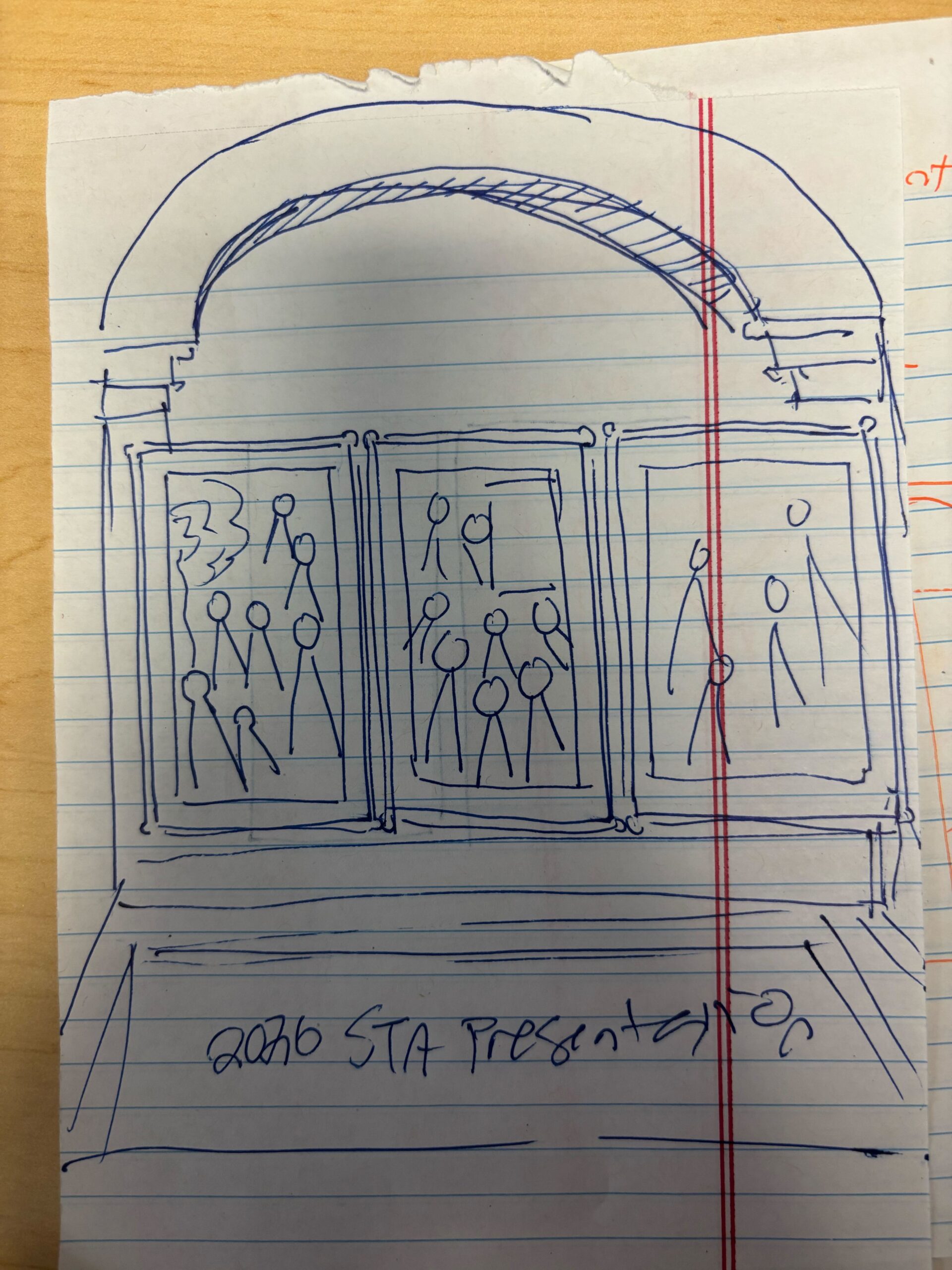
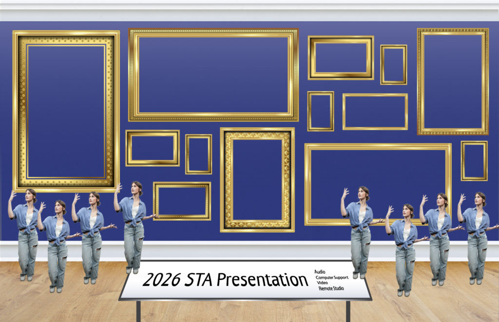
- I began drafting the PPT template, channeling the art gallery theme.
Edits
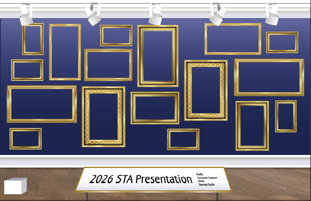
- We went back and forth a few times in order to make the template cohesive with the presentation poster.
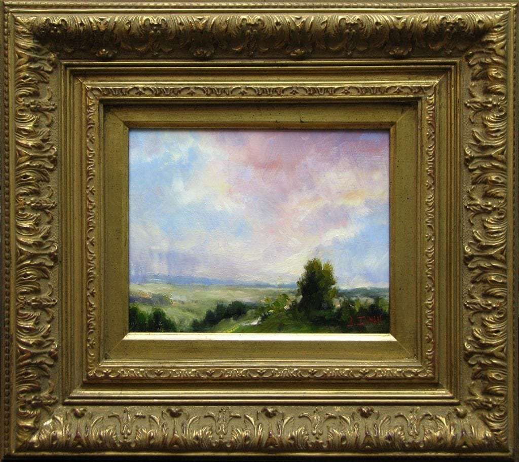
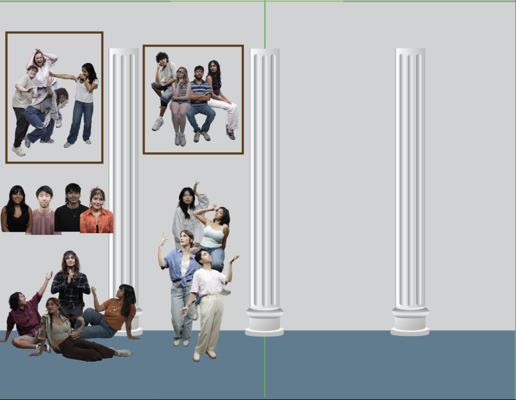
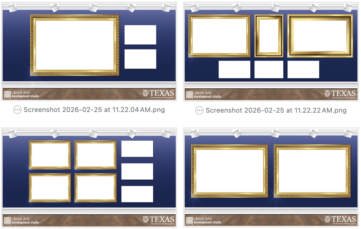
- I added white backgrounds in order to allow the images that will be placed in the frames later to pop.
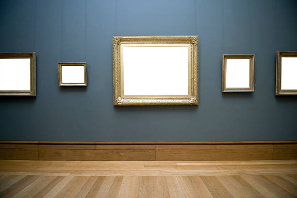
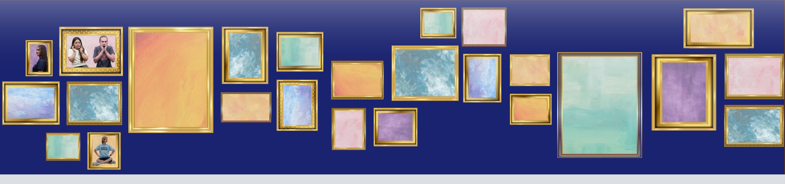
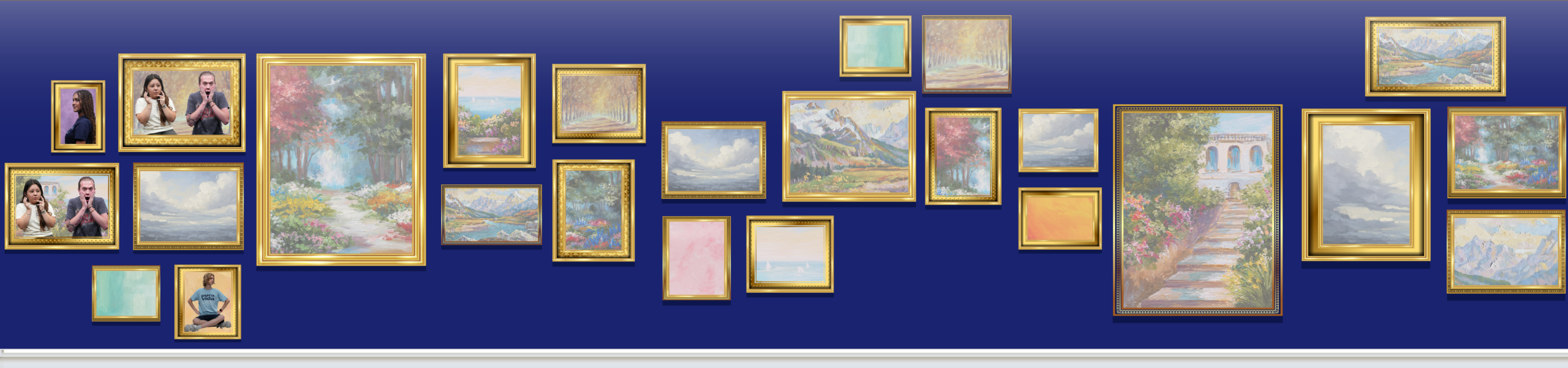
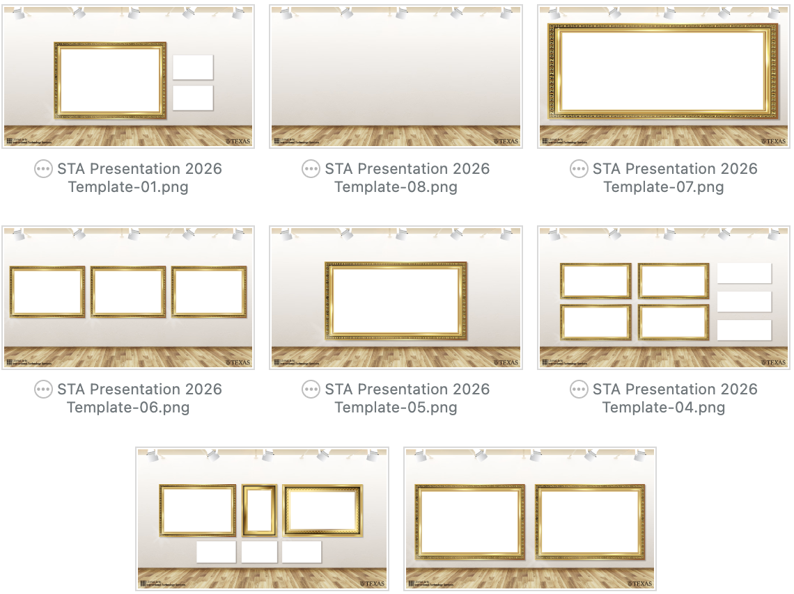
- We decided to return to the background used in the original draft, as well as make the branding smaller.
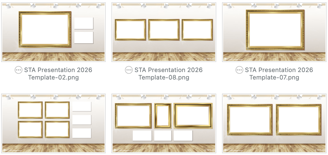
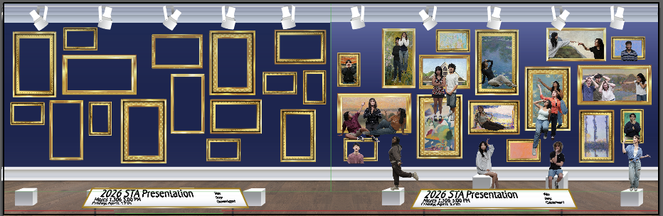
- Changed the branding to dark brown so it doesn’t get lost, moved the frames down in order to leave space for titles, and added a few more variations.
STATUS: IN PROGRESS
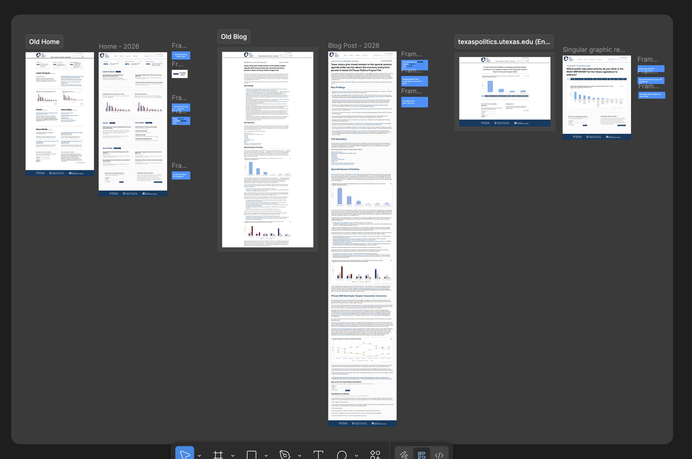
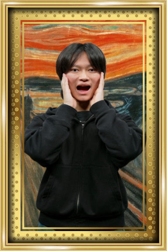
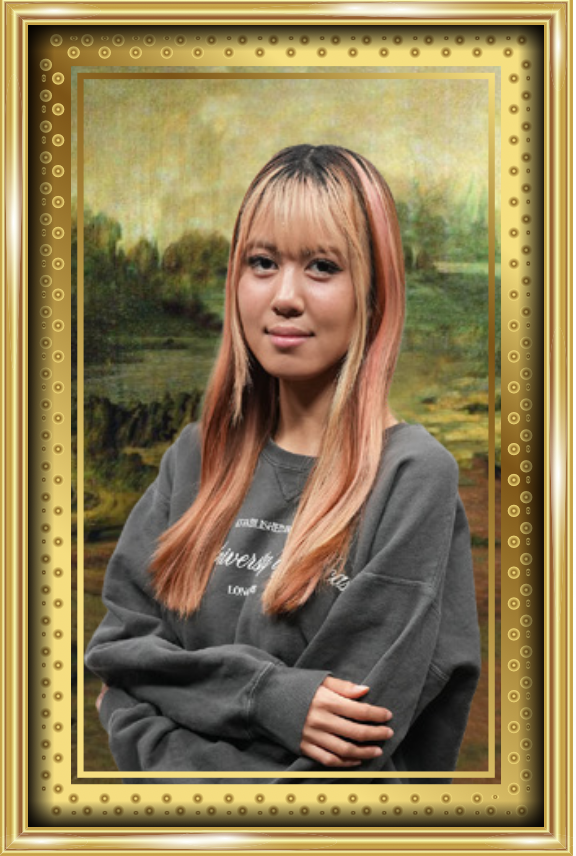
UP NEXT SLIDES
Drafting
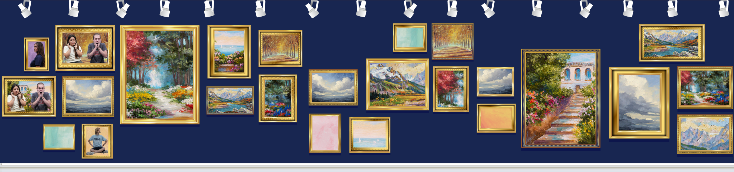
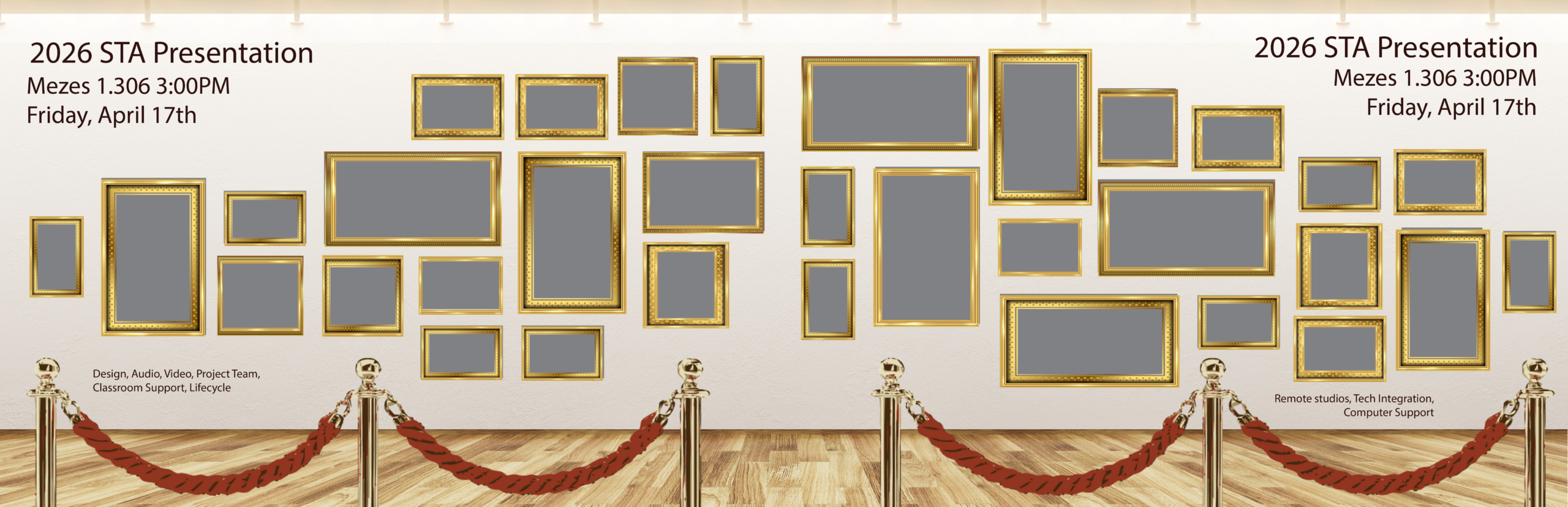
- Keeping cohesive with the rest of the PPT Template.
Edits
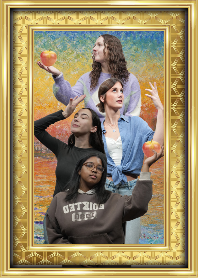
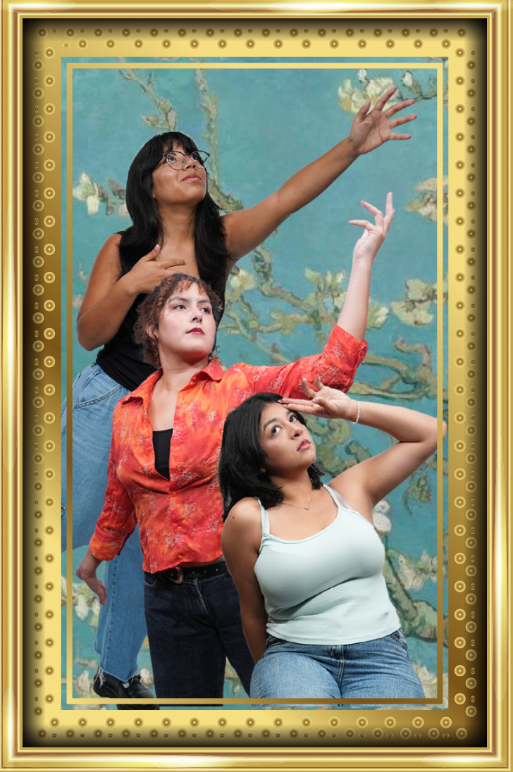
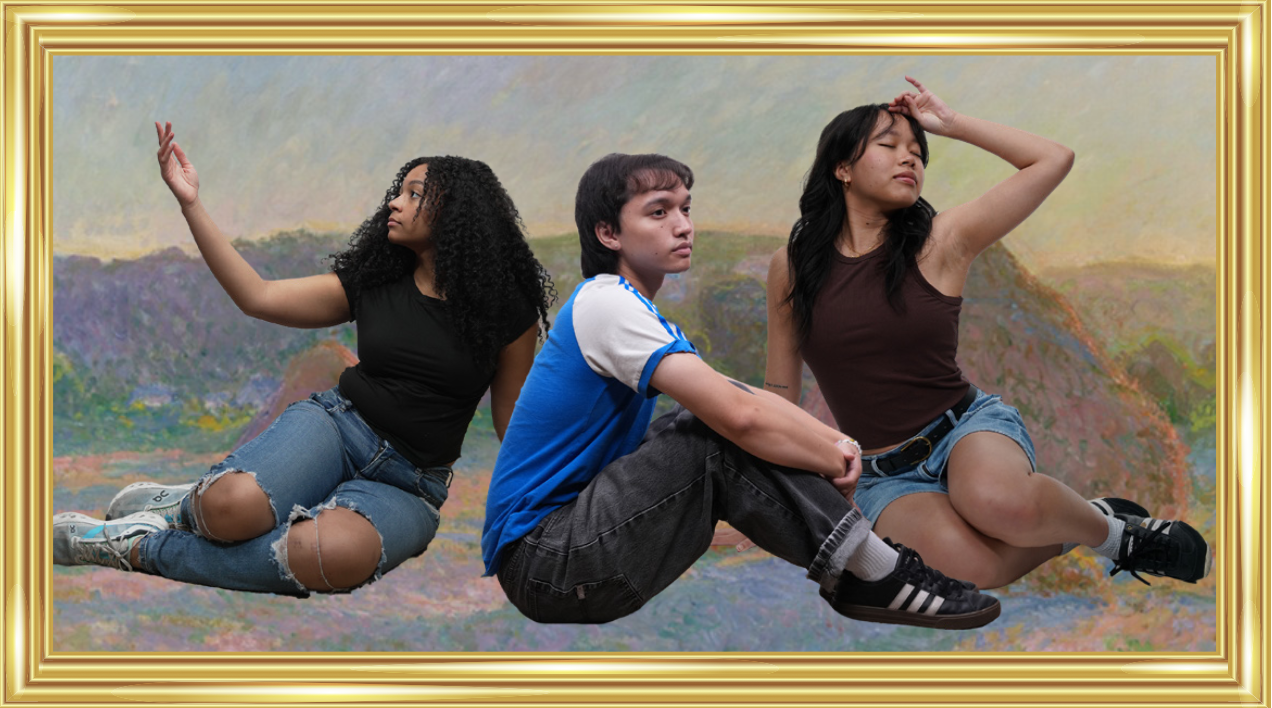
- Adding test headshot and text, as well as painting assets used in the poster to remain cohesive.