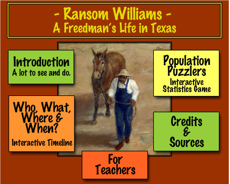
Ransom Williams main menu page:

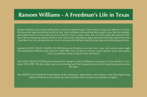
Intro page:

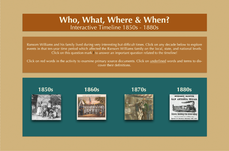
Timeline main page:
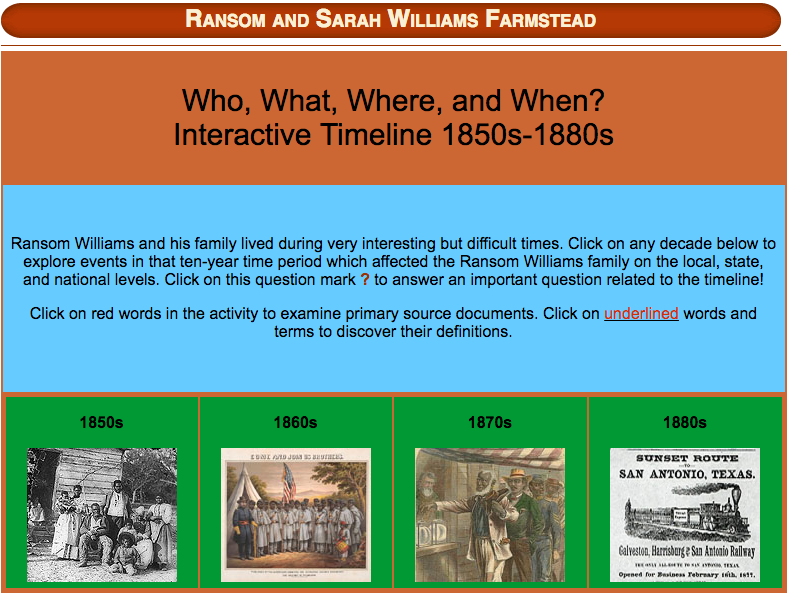
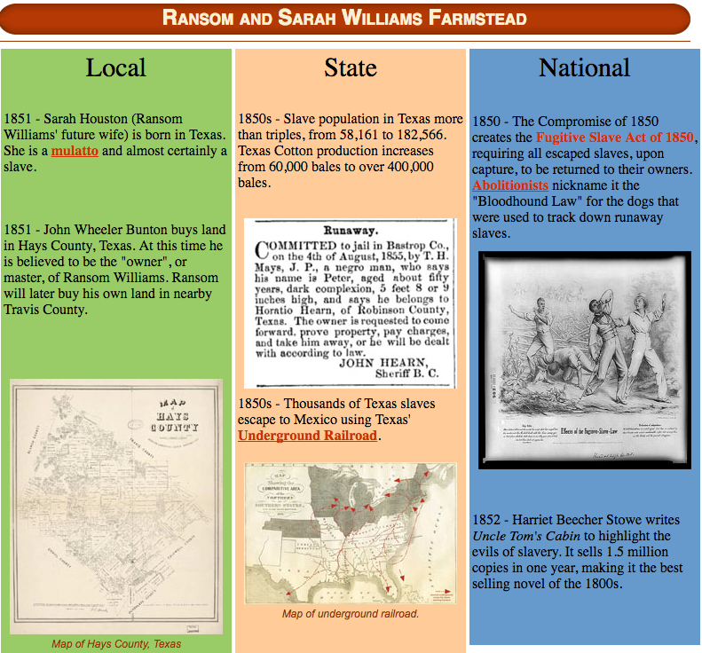
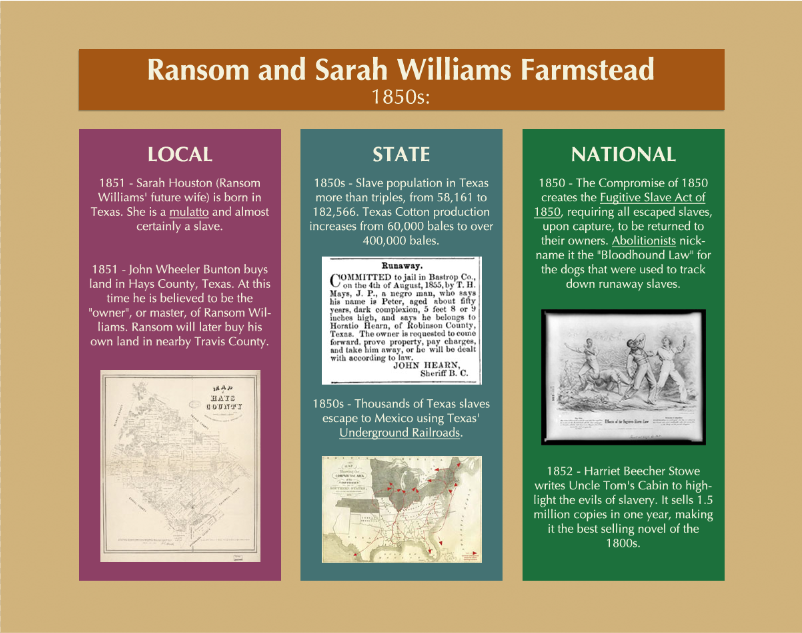
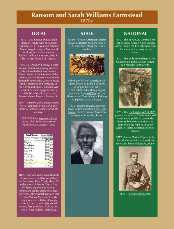
Timelines:

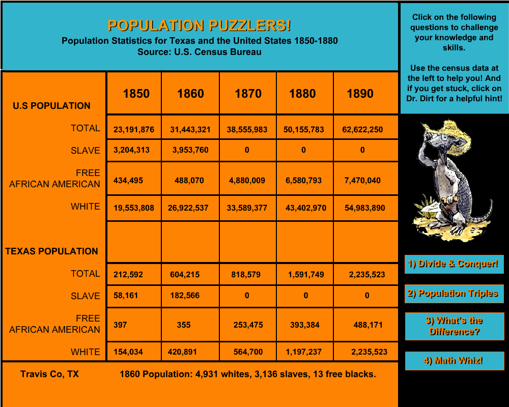
Population Puzzlers:
Credits and Sources page:
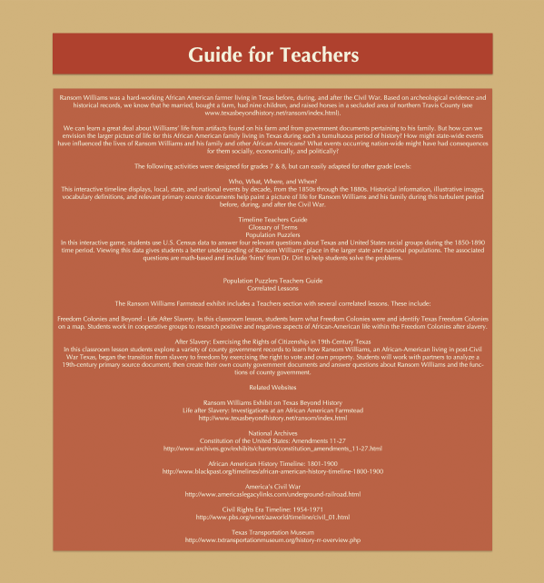
Guide for Teachers page:
Ransom Williams main menu page:
Intro page:
Timeline main page:
Timelines:
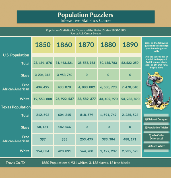
Population Puzzlers:
Credits and Sources page:
Guide for Teachers page:
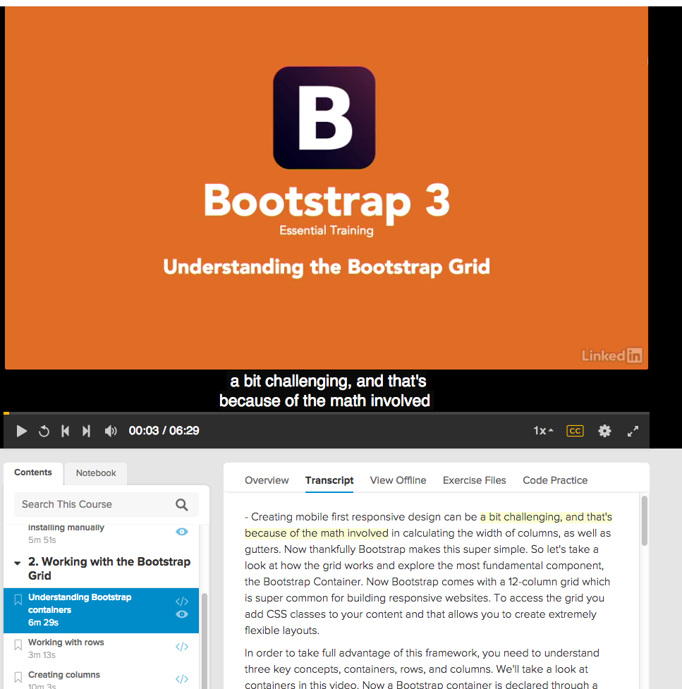
Started Lynda.com training on how to use Bootstrap development framework.
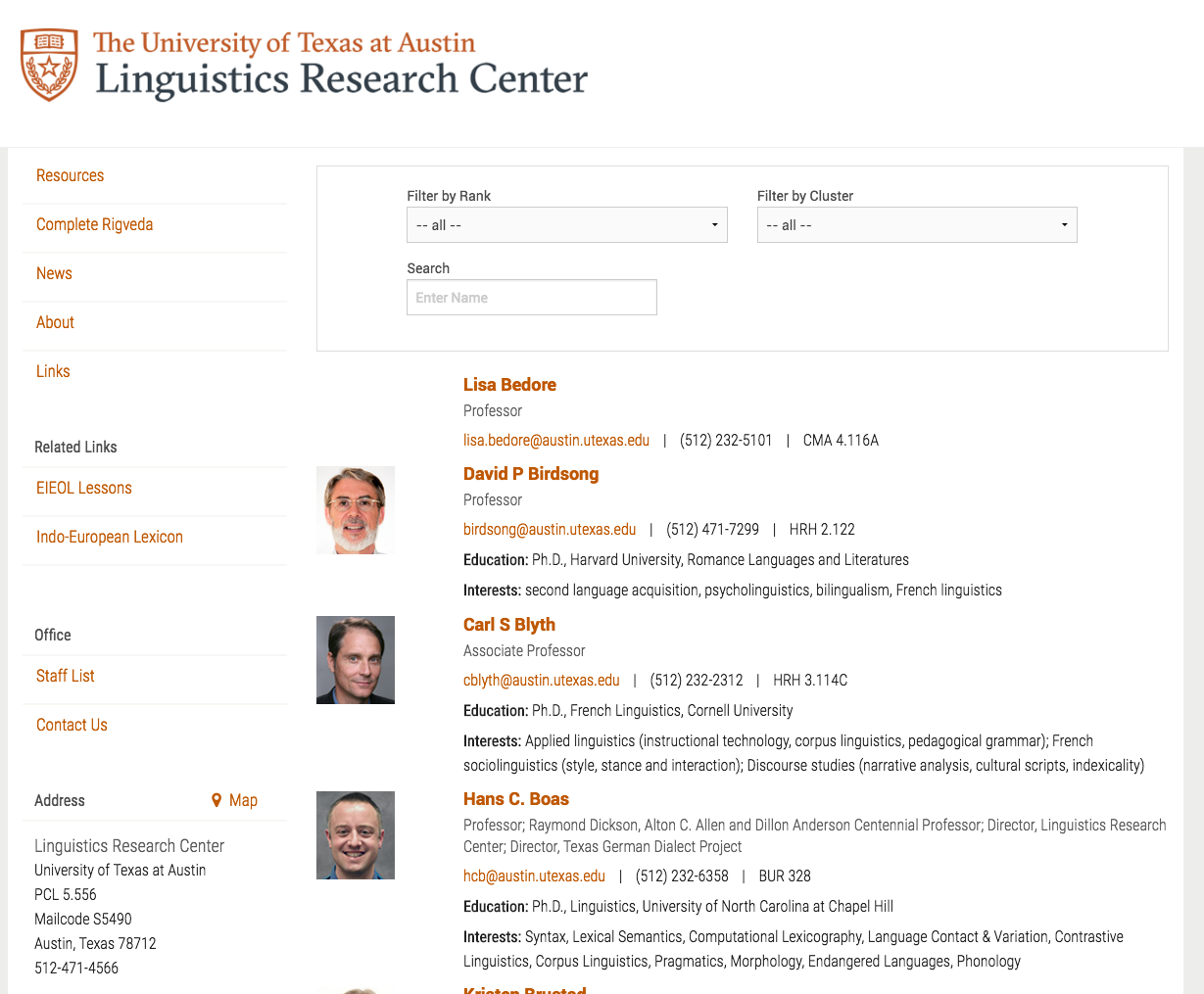
I updated the page for the Linguistic Research Center adding faculty and profile pages.
Request: Create a Pokemon inspired illustration that would appear in the magazine that features an interview with the UT alumni who is CEO for the company responsible for the Pokemon App. Create a pikachu-looking creature that is actually a “pokemon-bevo”.
Requested by: Allen Quigley
Originally in the email I was sent the request was to make a pikachu looking creature with horns and a snout. Since he mentioned pikachu rather than just saying a bull pokemon I interpreted that he was looking for a cute looking pokemon. So this was the design I decided to use. I colorpicked pokemon from the show for the colors.

I was assigned to make 3 different icons for:
the Developmental Cognitive Neuroscience Lab, Imagination and Cognition, and the Social Development Lab. Right now, we are still in the first phase of this project which is to create rough sketches and wait for approval from the Art director in charge, Allen Quigley. The following are the sketches I made as suggested by Allen for each lab.
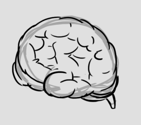
1. Developmental Cognitive Neuroscience Lab = Brain (left)
-I had one drawn a brain illustration in a previous ESL online class I worked on before. I did something similar to that and used it as a reference for this brain.
2.Imagination & Cognition= Unicorn (middle)
-I drew horses for a chinese class I worked on in the past. I used that experience to work on this unicorn icon. It is still a bit rough for my taste but once we get approval, I’ll make sure to make a more refined version like the ones i did for the Chinese class.
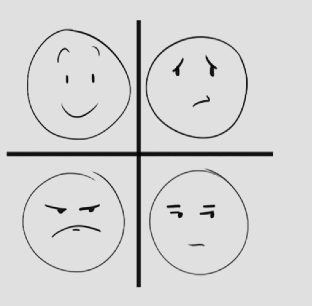
3. Social Development Lab = Schematic face (right)
-Schematic faces are meant to be simple line drawings that make up the basic features of the face and show how a person can interpret facial language. So I had to resist the urge to draw characters with exaggerated facial expressions and instead kept to simple faces.

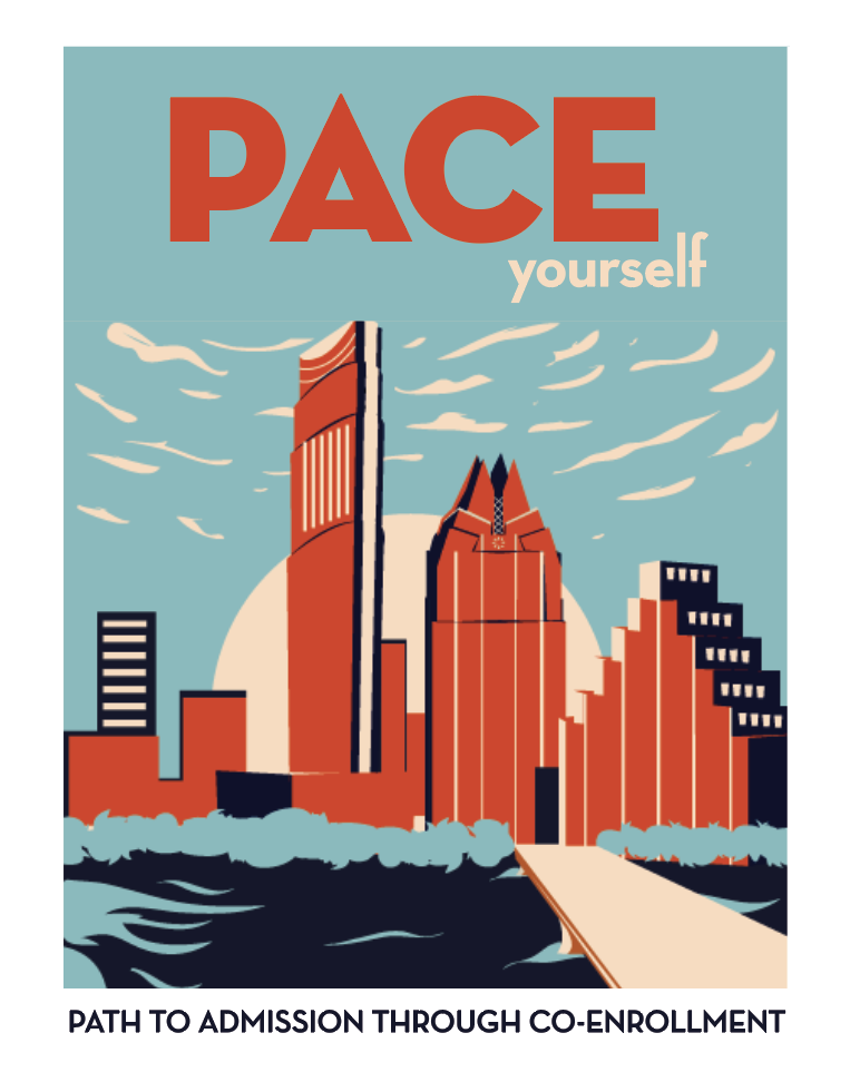
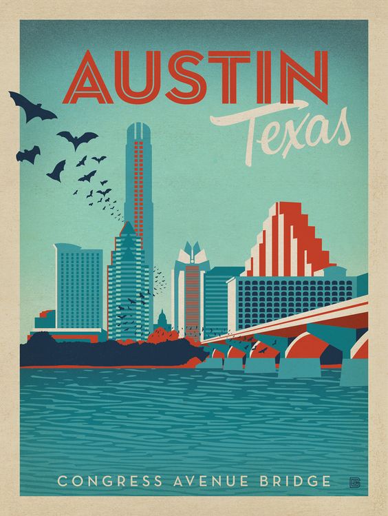
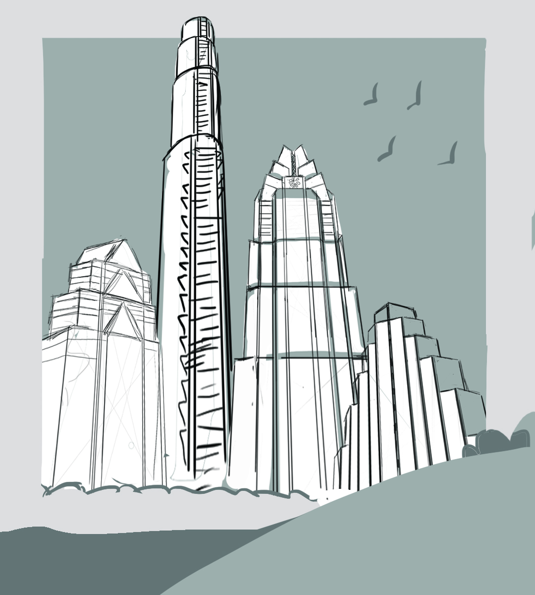
Request: Create a shirt design for a program called PACE ” Path to Admission through CoEnrollment”. Program for students taking class credits between UT and ACC. The client wants an illustrations of the city skyline in the style of a vintage postcard. Keep color count low, between 3 or 4. No recognizable UT landmarks.
Staff: Allen Quigley
Project Managers: Suloni Robertson
Given image and Reference image
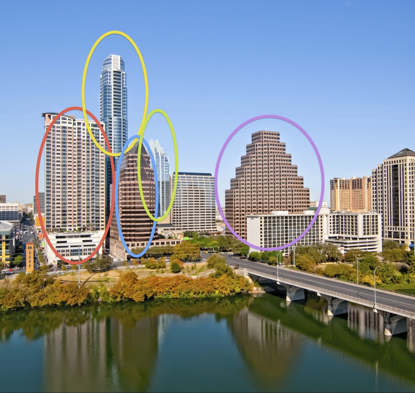
The first two are the same except with and without the capital. But worried it looked too similar to the vintage postcard that was sent. So I made a different alteration:
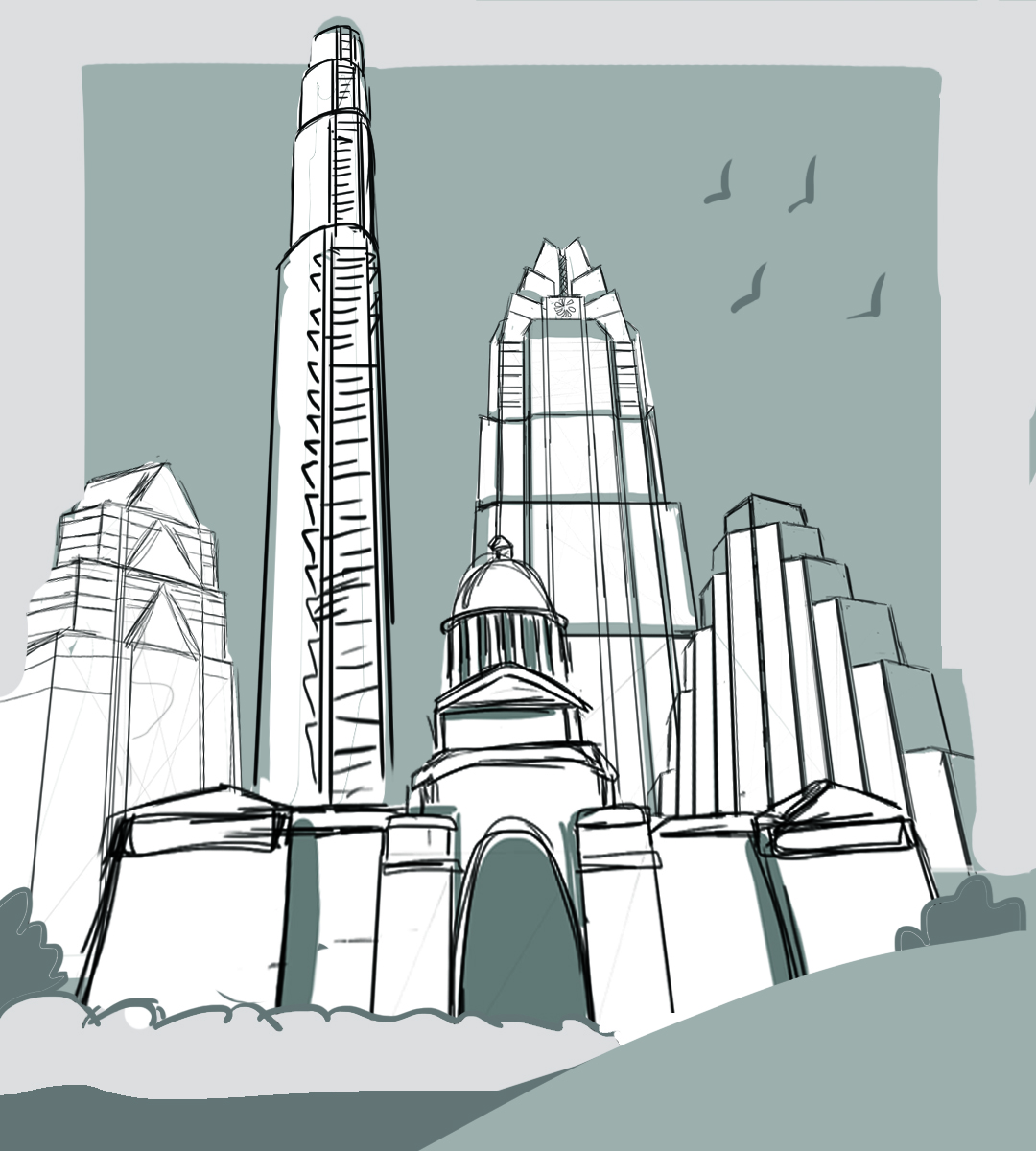
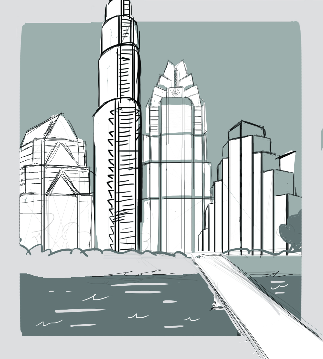

Left image is the draft that was later returned with request to make a couple of changes. The right is the finished version sent to Allen so that he could add the type.