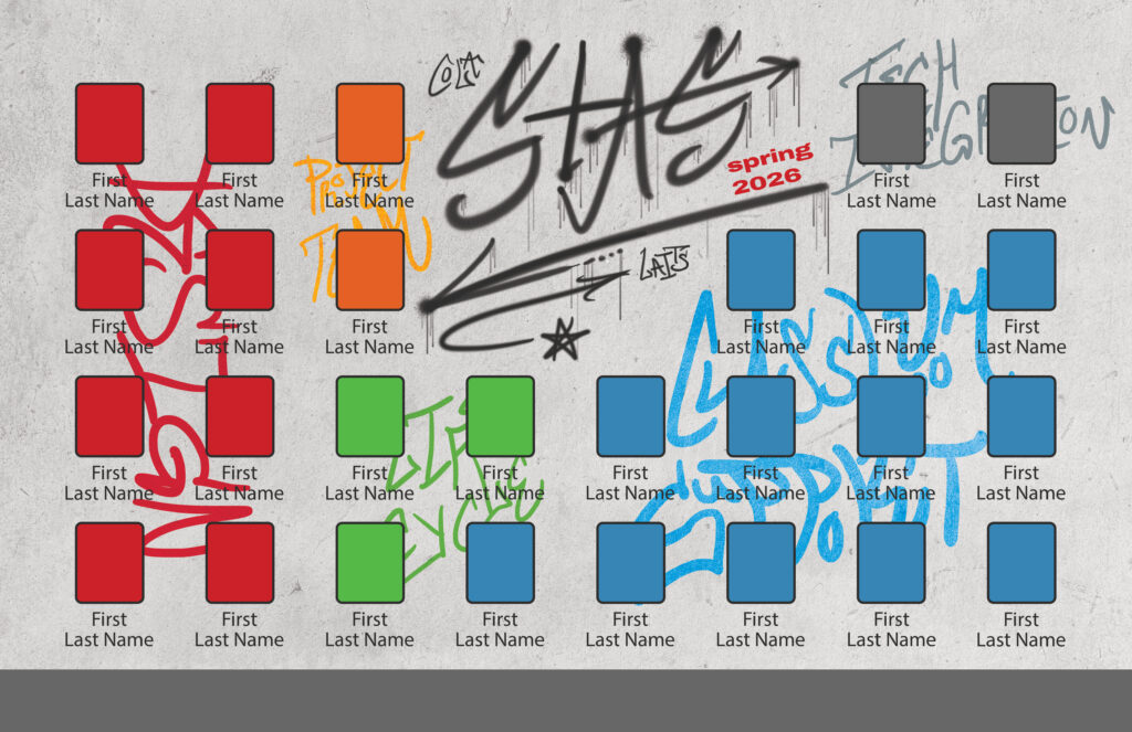
– Spring 2026 STA Presentation –
Lower Thirds
In March and April, I worked on the lower thirds for the Spring 2026 STA Presentation, and since the theme is museum related, my first iteration went in the direction of museum tickets.
However, we noticed that this design was quite similar to a previous lower third design which had a movie theater theme, with the lower thirds being the tickets, so we decided to change directions. We ended up on a paint brush design, where the brush is painting a stroke with the STA names and roles in it:
Final iterations and template creation:
– Tier 3 Course Graphics –
Course Intro
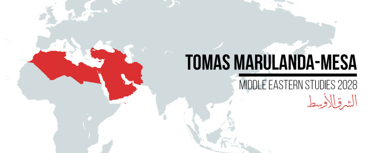
In early April I worked on some leftover Tier 3 trainings. In After Effects, I created a short looping intro for one of the previous Arabic courses I had taken.
