• We are STAs
    • Asha Rountree
    • Haley Ma
    • Kate Shih
    • Kyra Lee
    • Nicholas Peasley
    • Sasha Kenney
    • Shanda Horm
    • Shriya Atreya
    • Tomas Marulanda-Mesa
  • We were STAs
  • STA Presentation
    • STA Presentation 2017
    • STA Presentation 2016
  • Testimonials
  • Resources
  • Home

STA Blog

Carrie Wang

Carrie Wang

Week 7

October 25, 2022 By Carrie Wang

Project: Elements and Principles of Design

Start: Oct 20th 2022

To be Completed: N/A

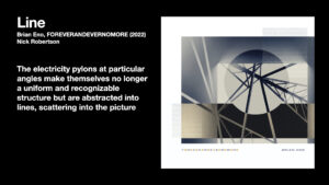
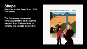
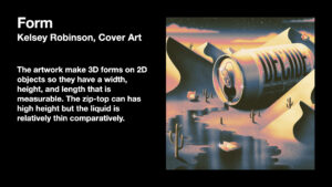
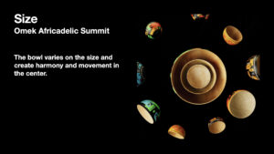
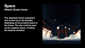
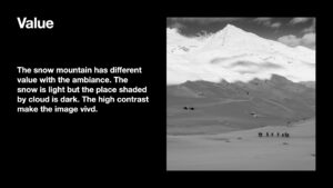
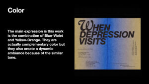
I started a new training this week by identifying what elements and principles of design are and how they function. I’m asked to find an artwork or design work that contains the relationship with one certain element or principles. Through the process, I’m able to learn how to arrange elements in a way that is visually more effective and aesthetically pleasing.


Project: French Connexion

Start: Oct 21th 2022

To be Completed: Oct 30th 2022

Staff Guidance: Maddy

UT French Connexions is a new online French course being developed by LAITS. It will live on the language learning site LingCo. Aside from language learning, the course is placing an emphasis on the culture of French-speaking countries beyond France (Europe, Africa, Carribbean, middle east, Canada, etc). I’m asked to make a website for the project that showcases all information about UT French Connexions, which including lots of action call and the online courses resources.

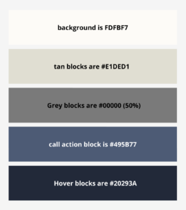
I started this project with building styling of typography, color scheme and interactive elements in Figma. I referred to the French textbook Design Asset and UT brand color & Typography to get inspiration.

However, the dark tan looks a little dated as the background color in this context of a website and dark blue button is dark and listless. So I make three experiments on the site:

  • experiment #1: I tried the family of blue and  go lighter than the A5bDD (the brand color of UTFC) by lowering opacities of it. The more subtle background colors of a website is more modern and better.
  • experiment #2: Stay with tan, but has the lighter shades of tan.
  • experiment #3: Custom Color without considering the UT brand Color and UTFC textbook color.


Finally Maddy and I decided to work on the custom color scheme since the light background works well with the light blue.


Filed Under: Fall 2022 - Spring 2023

Week 6

October 13, 2022 By Carrie Wang

Week 6

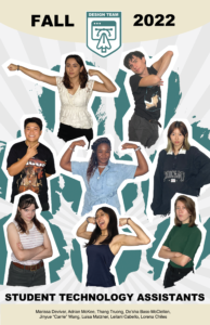
Project: STA Design Team Poster

Start: September 13th 2022

Complete: Oct 13th 2022

Staff Guidance: De’sha and Leilani

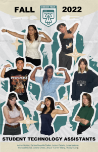
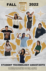
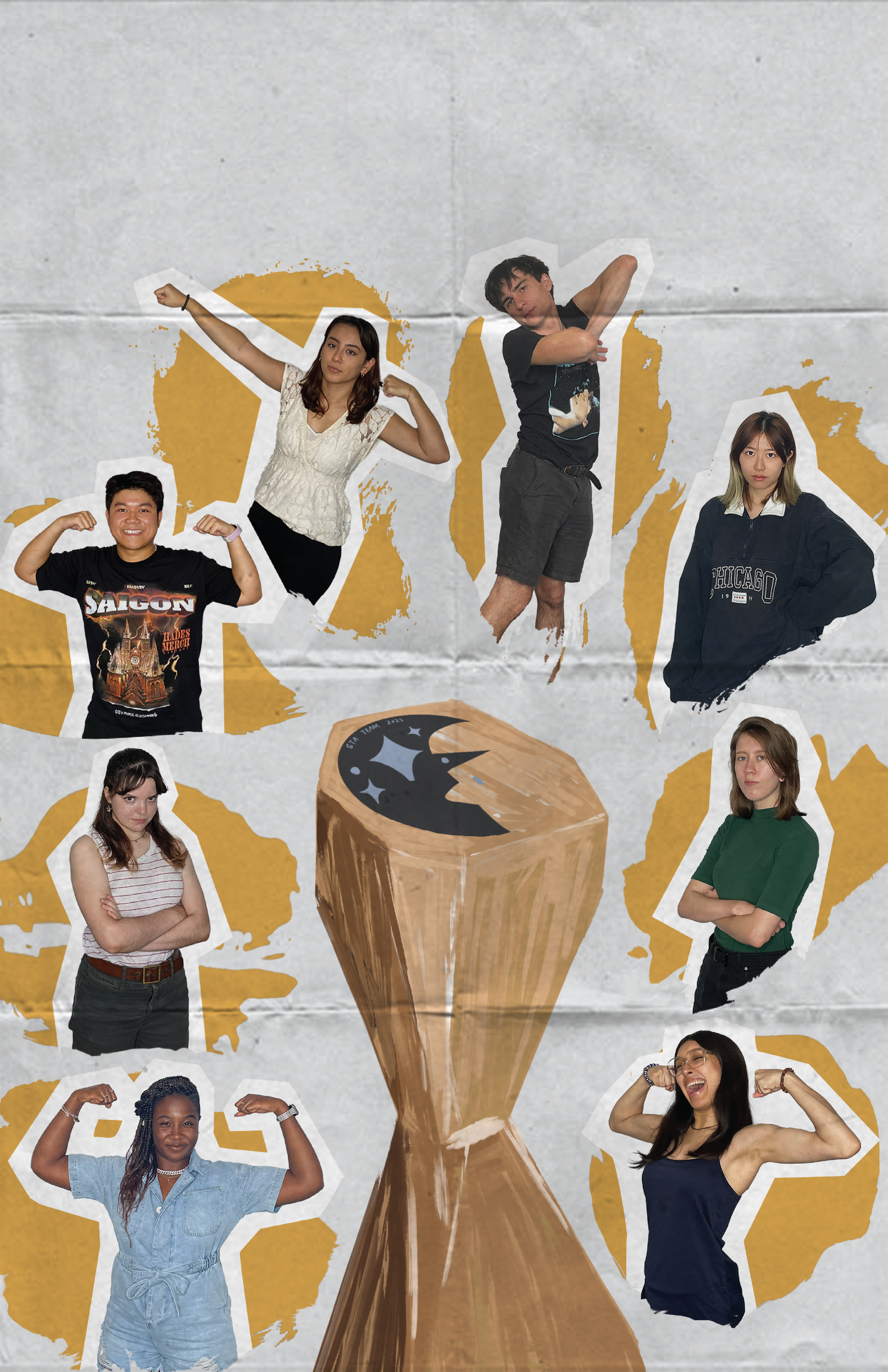
This time I changed the photos of Thang so that his portrait could make symmetry with Lorena and therefore create harmony in the poster. I also remove the paper texture since it may be low-quality after printing it. Regards to the consideration of printed poster, I learned what is dpi (dots per inch) and ppi (pixels per inch). The default dpi for web view is 72 but it’s better to have 300 dpi if we’re going to print it out. Once ensuring the poster is 300dpi and CMYK, I go to File > Save As > Photoshop PDF > “High Quality Print” & Save.
Here is the final version:


Project: History of Design

Start: Oct 12th 2022

Complete: Oct 12th 2022

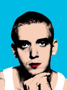
I chose to work on the Pop Art movement and made a celebrity portrait for it. I was attracted by the bright colors and the dots effect applied to it. Meanwhile, the contrasting color forges the irony and satire so the boundaries between art and culture are blurred. All of these elements attract people’s attention so it became an enthusiastic endorsement of the capitalist market!
I stayed with the classical style with it since I’d like to learn how to make the dot effect in photoshop (my most experience is in Illustrator so I’d like to change myself!). I think it’s a quite useful photo-processing tool in the future, especially for vintage style. The only way I know to make the dot effect is the color halftone under the pixelate section inside Filter. Now I explore Filter > Filter Gallery > Sketch > Halftone Pattern, which allows me the chose the dot color inherently instead of masking it later. It also leaves the white place white rather than filling in with small dots.
I also learn several shortcuts in photoshop:
Comd + Shift + U > Desaturate
Comd + Shift + L > Auto Tone (dark darker and white whiter)
Comd + J > Copy


Project: Create Pixel Art in Illustrator

Start: Oct 13th 2022

Complete: Oct 17th 2022

During this training, I learned several new tools in illustrator!
When I first glanced at the title of this training, I thought it was going to pixelate pictures using the low-resolution function in photoshop but I’m surprised to find out it’s actually created in Illustrator. The main tool I used is called “Rectangular Grid Tool” (create grid template for the picture) under the line tool and “live paint Bucket” (paint on each box inside the grid).
These tools may seem exclusive for pixel. There are other tools extremely useful in this training:
  • Customized Color Group. I knew I can save individual colors into the swatches but now I found out it’s pretty effective if I create a new swatch for them so I can switch between by only clicking left and right arrows on the keyboard when I apply “live Paint Bucket”
  • If you change the color in the swatch, all colors on the artboard would change automatically
  • Recolor Artwork. The function allows me to change the tone, saturation, and other colors to adjust as a whole group. Useful in future design!!


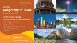
Project: 2022 GRG Flyer Promo

Start: Oct 17th 2022

To be Completed: Oct 21th 2022

Staff Guidance: Valerie

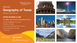
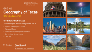
This week I started on a new project, which is to promote a class called GRG325 Geography of Texas for Department of Geography & the Environment. I created three versions of flyers in the first round but I’m still struggle with how to display six pictures aesthetically besides the promotion content.


Filed Under: Fall 2022 - Spring 2023

Week 5

October 10, 2022 By Carrie Wang

Week 5

Project: STA Design Team Poster

Start: September 13th 2022

To be Completed: September 29th 2022

Staff Guidance: De’sha and Leilani

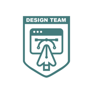
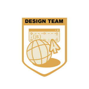
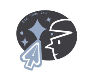
This week I tries my best to simplify the design of the crest. I decided to get rid of the global is the crest is able to be more clean and less crowded.

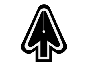
Leilani gave me more suggestions more the crest design and finally we have this crest with all same line weight. From De’sha: “we are highlighting how it is the creation of the websites that we view daily. This is shown with the web window and the cursor. The design element is highlighted with the pen tool and the curve tool. Which is an element graphic designs have to use often. With the cursor and the pen tool combined, it helps simplify the design and it also showcases how our department is a combination of both teams working together.”For the poster design, I tried to expand everyone’s bust and let them overlap with every other to enhance the connection.

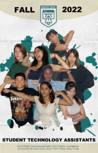
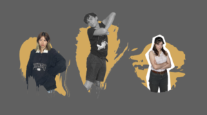
Leilani suggestion me to put everyone is one splash so I did this quick mockup. We’ll find out a way to incorporate everyone well.

Project: CTX Retold

Start: Sep 27th 2022

To be Completed: Mid Oct 2022

Staff Guidance: Maddy

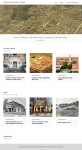
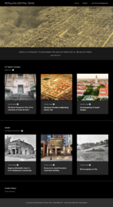
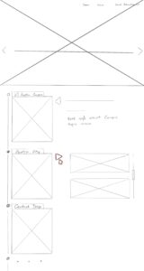
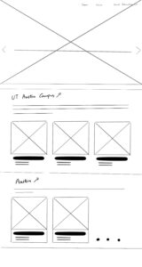
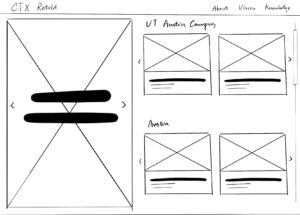
I developed the my wireframe in Figma according to eji.org. Here is the site in light mode and dark mode. I also update the fixed banner into a slider so there are more images can show on one single page. Figma presentation: https://www.figma.com/proto/cCH6gBareq60356Cxbvk6H/CTX-Retold?node-id=2%3A2&scaling=contain&page-id=0%3A1.


Filed Under: Fall 2022 - Spring 2023

Week 4

October 3, 2022 By Carrie Wang

Week 4

Project: STA Design Team Poster

Start: September 13th 2022

To be Completed: September 29th 2022

Staff Guidance: De’sha and Suloni

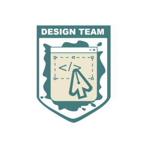
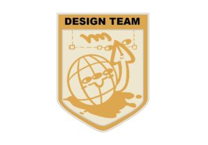
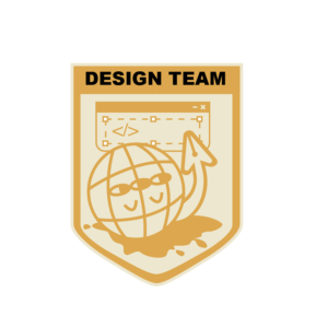
This week I worked on the Crest design for the STA design Team. Starting from the previous sketches, I decided to keep the cursor-pen tool elements and add more direct coding and design icons to the crest. In procreate, I created a figurative web character with its pen arm who try to picture the daily tasks of our designing and coding tasks.

Suloni suggests me to add more coding elements such as {</>}, {…}, and {js}  so I decided to create a window for typing coding language with the text box from design software.

However, when I put the crest into the poster, the tan shield and broader fade into the poster background and the complicated designs are invisible and messy at the top. So I get rid of the eyes and arm of the global to emphasize the pen-cursor and simplify the overall feeling. Here is the final version:

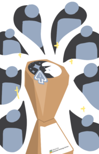
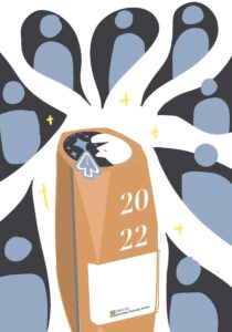
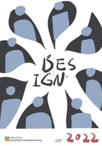
For the poster, since we are no longer being literal with the soccer world cup theme so the trophy in the middle of the poster was moved. Quote from De’sha: “Even though as designers we work on separate projects, collaboration is key. How can you position the poses where we are connected as a team?” I decided to use the shape of the stroke to connect everyone together. The strokes would start from one STA and lead us to another STA.

I add the spark in the background and typed in several coding languages to make the vibe. Regards to design elements, I placed the brush tool icon and eyedropper icon undernead Fall 2022. After cooperating with the crumbled paper effects, here is the latest version!


Project: Online Course Photo edit

Start: Oct 3th 2022

Completed: Oct 3th 2022

Staff Guidance: Maddy

Maddy asked me to edit this photo to reduce the yellow tone on Dr. Rice by preserving the blue board and neutralizing the yellow light on her. I adjusted the temperature, tint, and color mixer, as well as little change in vibration and saturation.


Project: CTX Retold

Start: Sep 27th 2022

To be Completed: Mid Oct 2022

Staff Guidance: Maddy

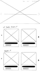
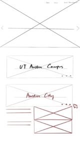
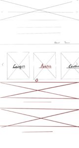
For the CTX Retold project, we decided to organize the homepage by geography in the categories of Campus, Austin, and Central Texas. We also want to preserve the minimalist and modern aesthetic style of Dr. Gordon. After browsing the current CTX Retold website, I found the efficient way is to only show the geographical locations on the main page and hide the sub-cards after one click so it’s clean overall. The red section represented that stimulation is needed to show part of the content.

I also try to develop an iteration where the projects are not hidden behind a click. It helps improve discoverability since users may not realize something is clickable, and it is “one less click”. Regards to the possible future cards, I add the slider arrows on the side for enough flexibility. Also, this way I display text underneath instead of color overlay so readability is enhanced.


Filed Under: Fall 2022 - Spring 2023

Week3

September 21, 2022 By Carrie Wang

WEEK 3

Project: STA Design Team Poster

Start: September 13th 2022

To be Completed: September 29th 2022

Staff Guidance: Valerie

The detailed shadowing of the Design STA Team:

  1. We focus on communication. We care about each other and give feedback on others’ works to boost better design.
  2. We are flexible and chill at balancing our time during working. We don’t have to focus on one assignment or training at a scheduled time but organize our time by ourselves.
  3. We have critical eyes and design thinking which vary from each other.
  4. We’re mainly working with computers (plenty of software!)
  5. We collaborate with each other. Design STA has individual projects and group projects. Collaboration enables our STA  to expand their horizons by simply hearing out other people’s ideas. We can discuss our designs in the weekly STA meeting to examine if there is any point we have missed.

Realizing the classical sports world cup design might not fit for the design, I redesigned the trophy in an abstract way. I decided to use geometric figures to represent the sense of designers. I also attached the STA design team logo, LAITS logo and year to ensure the integrality as a final draft in procreate. Here are the final outcomes:


Then I started the formal draft in Illustrator. I first used the Mask tool in Photoshop to get Everyone’s portrait.

To make the poster have a more designer vibe, I’d like to emphasize the brush stroke as the background for each Design STA bust.  I found brush stroke png online and photoshop them to paste under each STA.

However, it’s a little bit messy when the colorful bust is attached on a bright yellow so I tried the black&white and add broader, Eventually, to ensure the overall layout looks super clean, I sketched out the white silhouette as the broader for such STA. As I have used the textualized brush stroke as a main object in the center, I decided to make it more vintage and papery style in its background (folded paper) and the (hand-drawing) trophy design. However, I try to figure out if there is anything to include more coding and web elements into the layout. So I might insert the mouse-arrow icon into the poster somewhere.

What I developed in Illustrator for the mouse-arrow icon:


Project: CTX Refold

Start: September 21th 2022

To be Completed: N/A

Staff Guidance: Maddy, Suloni, and Marianne

On Wednesday, I attended the first meeting of CTX Refold for Dr. Gordo with Maddy, Suloni and Marianne. This is my first time attending the client meeting as a note-taker. It’s a Refine-Web-Design project for Retelling Central Austin History. During the meeting, we summarize several goals such as organizing the content orderly, resetting the color palette, and defining its aesthetic-driven style to appeal to the engaged audience. I’m assigned to create a light mode design fro CTX Retold in Figma. I browsed on Figma Tutorial in KB and started to wireframe the site.

Filed Under: Fall 2022 - Spring 2023

Week 2

September 19, 2022 By Carrie Wang

WEEK 2

Project: STA Blog Portrait

Start: September 7th 2022

Complete: September 13th 2022

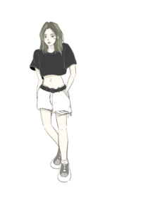
Here is my STA Blog self-portrait. To make the persona consistent, I choose the same color palette as my banner for my portrait :).

Project: StyleA/B Course Graphics

Start: September 13th 2022

Complete: September 15th 2022

Staff Guidance: Adrain

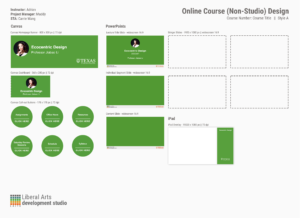
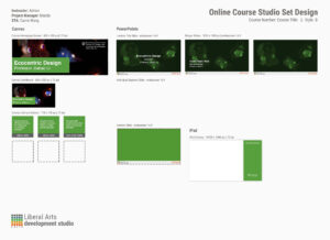
Since eco-centric design could be described as “design for nonhuman-center design” or”design for the ecosystem”, I choose dark green from the approved color palette of UT to fit the theme.

http://sta.laits.utexas.edu/wp-content/uploads/2022/09/DES330T-StyleAB-AnimatedStinger-Quiz.mp4
http://sta.laits.utexas.edu/wp-content/uploads/2022/09/DES330T-StyleA-B-AnimatedStinger.mp4


For style B, I found the cuttlefish pictures in the portfolio website from professor Jiabao Li’s project and it really fits in the context.


Project: STA Design Team Poster

Start: September 13th 2022

To be Completed: September 29th 2022

Staff Guidance: Valerie

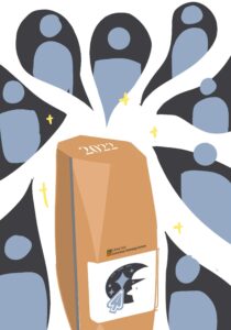
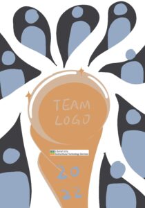
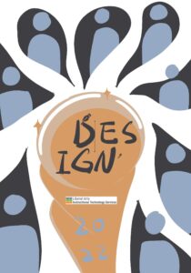
I drew several simple sketches for the Design team. The central world cup icon is the representation of our design team spirit with the design of its details (I haven’t worked on this part yet). I’ll also place the team logo in the center once I finish designing it. The eight drops around are analogous to the paint trails (when they develop well in Photoshop later). STA busts are placed inside the drops. There are just rough prototypes that show my idea.


Filed Under: Fall 2022 - Spring 2023

  • « Previous Page
  • 1
  • …
  • 5
  • 6
  • 7
  • 8
  • Next Page »

link to LAITS home page

Video STA Home

© 2025 Liberal Arts Instructional Technology Services | Production Credits