Week 4
Project: STA Design Team Poster
Start: September 13th 2022
To be Completed: September 29th 2022
Staff Guidance: De’sha and Suloni
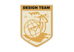
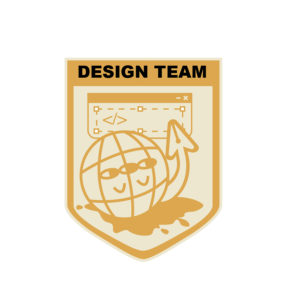
This week I worked on the Crest design for the STA design Team. Starting from the previous sketches, I decided to keep the cursor-pen tool elements and add more direct coding and design icons to the crest. In procreate, I created a figurative web character with its pen arm who try to picture the daily tasks of our designing and coding tasks.
Suloni suggests me to add more coding elements such as {</>}, {…}, and {js} so I decided to create a window for typing coding language with the text box from design software.
However, when I put the crest into the poster, the tan shield and broader fade into the poster background and the complicated designs are invisible and messy at the top. So I get rid of the eyes and arm of the global to emphasize the pen-cursor and simplify the overall feeling. Here is the final version: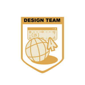
For the poster, since we are no longer being literal with the soccer world cup theme so the trophy in the middle of the poster was moved. Quote from De’sha: “Even though as designers we work on separate projects, collaboration is key. How can you position the poses where we are connected as a team?” I decided to use the shape of the stroke to connect everyone together. The strokes would start from one STA and lead us to another STA.
I add the spark in the background and typed in several coding languages to make the vibe. Regards to design elements, I placed the brush tool icon and eyedropper icon undernead Fall 2022. After cooperating with the crumbled paper effects, here is the latest version!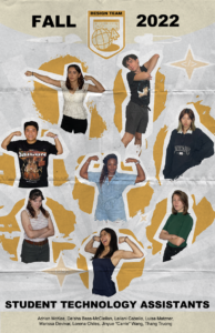
Project: Online Course Photo edit
Start: Oct 3th 2022
Completed: Oct 3th 2022
Staff Guidance: Maddy
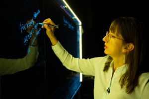
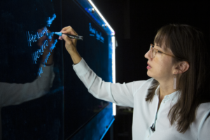
Maddy asked me to edit this photo to reduce the yellow tone on Dr. Rice by preserving the blue board and neutralizing the yellow light on her. I adjusted the temperature, tint, and color mixer, as well as little change in vibration and saturation.
Project: CTX Retold
Start: Sep 27th 2022
To be Completed: Mid Oct 2022
Staff Guidance: Maddy
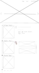
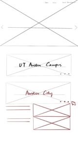
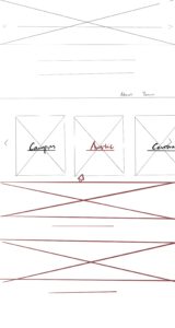
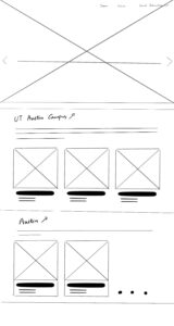
For the CTX Retold project, we decided to organize the homepage by geography in the categories of Campus, Austin, and Central Texas. We also want to preserve the minimalist and modern aesthetic style of Dr. Gordon. After browsing the current CTX Retold website, I found the efficient way is to only show the geographical locations on the main page and hide the sub-cards after one click so it’s clean overall. The red section represented that stimulation is needed to show part of the content.
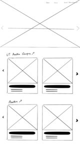
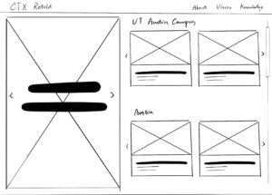
I also try to develop an iteration where the projects are not hidden behind a click. It helps improve discoverability since users may not realize something is clickable, and it is “one less click”. Regards to the possible future cards, I add the slider arrows on the side for enough flexibility. Also, this way I display text underneath instead of color overlay so readability is enhanced.
