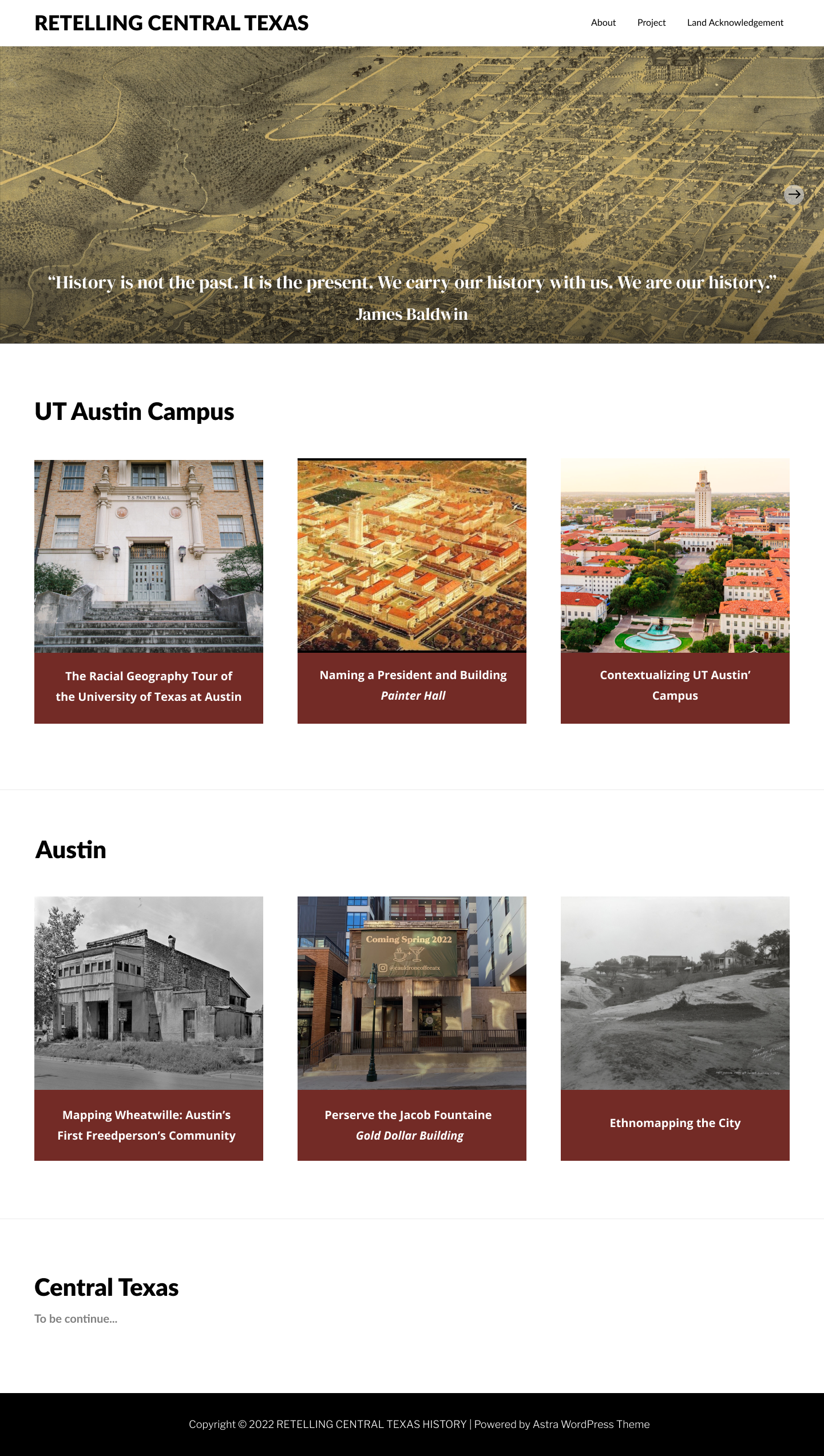
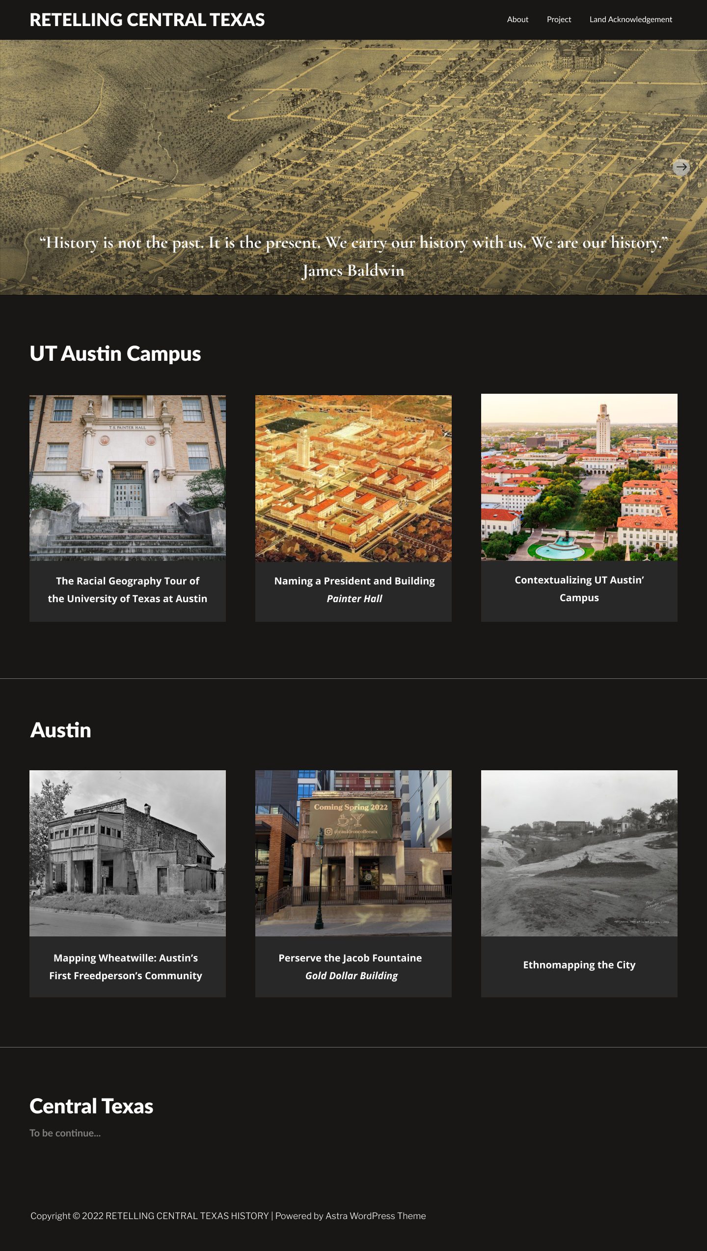
• We are STAs
    • Asha Rountree
    • Haley Ma
    • Kate Shih
    • Kyra Lee
    • Nicholas Peasley
    • Sasha Kenney
    • Shanda Horm
    • Shriya Atreya
    • Tomas Marulanda-Mesa
  • We were STAs
  • STA Presentation
    • STA Presentation 2017
    • STA Presentation 2016
  • Testimonials
  • Resources
  • Home

STA Blog

Carrie Wang

Carrie Wang

Save the days

January 18, 2023 By Carrie Wang

Save the Date

Start: Jan 18th 2023

To be Completed: Jan 25th 2023

Client: LAITS

Staff Guidance: Maddy

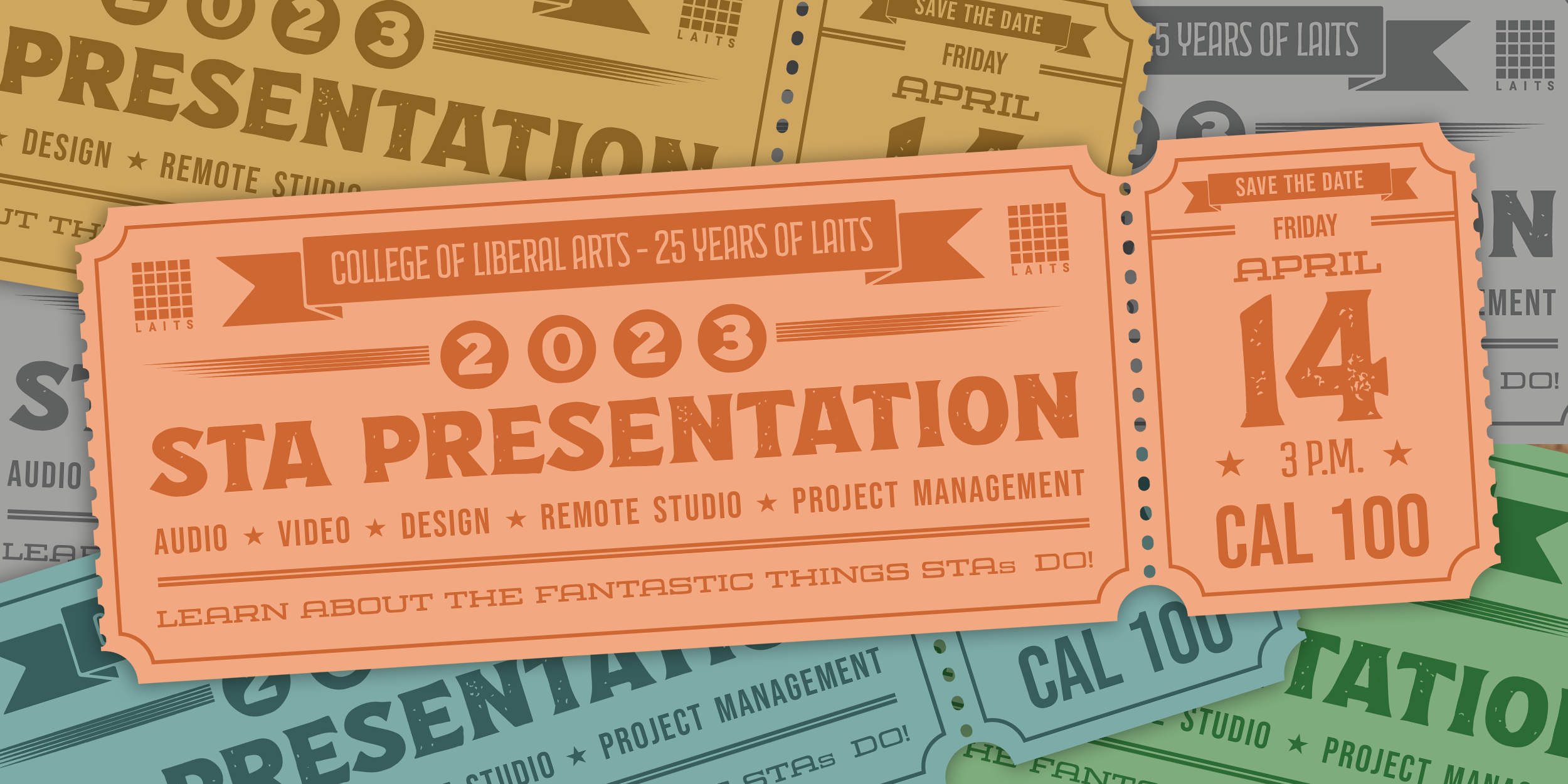
Description: This project aims to create a design in the form of sports tickets and invite people to watch the event via e-mail for 2023 STA presentation. The necessary information on the tickets includes:

  • Title: 2023 STA Presentation
  • Date and Time: Friday, April 14th, 3pm
  • Location: CAL 100

Maddy also includes some additional text to be add on or as decoration elements with low hierarchy:

  • Save the Date
  • Learn about the fantastic things LAITS does!
  • Audio Video Design Web Development
  • College of Liberal Arts
  • Student Technology Assistants
  • 25 years of LAITS (confirm)

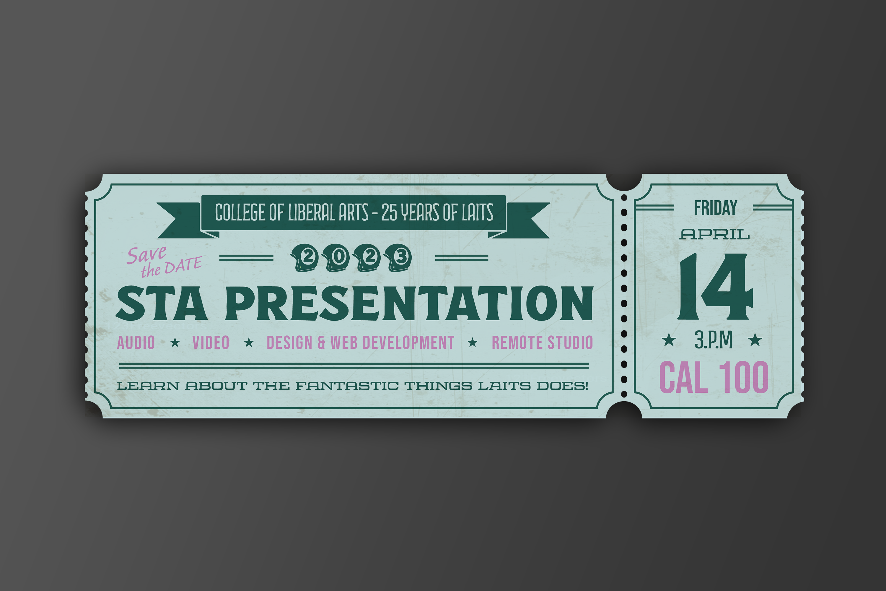
For the first draft, I utilize the color code from the LAITS logo as the background and play with black and white to limit my color palette. Since there is no image to place on the ticket, I’d like to use typography to evoke the expression and emphasize the important information. In terms of the title, I used an extra bold font with black color to create contrast between other line decorative lines and other low-hierarchy info on the green background. I also divide the tickets into two sections with its form of stub and main ticket. On the left ticket, I explain on the content and context of the event whereas the right part only showcase the time ad location. I also enlarge the date and location to capture the attention from the first glance.

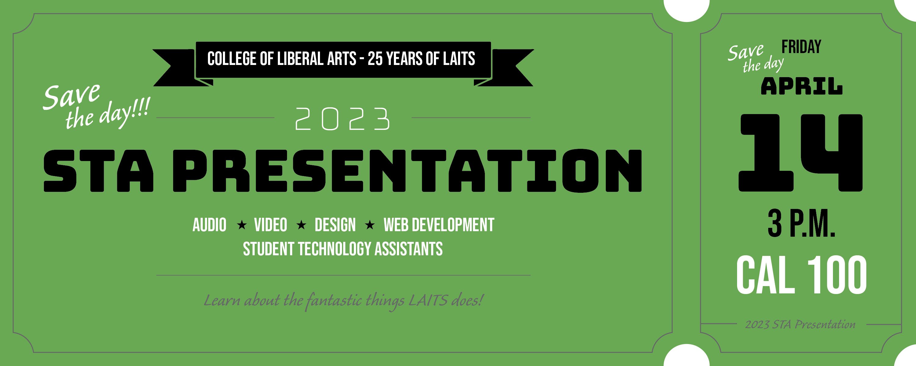
The use of font and use of color, black and white, has high contrast between each element and therefore creates the sense of illustrated/graphic look in the first draft. However, The STA presentation has a sports theme and therefore needs a more photo-realistic/collage/textured look.

  • One to approach the vintage style is to add more flowing ribbon or plaque-type elements from the 19th or 20th centuries.
  • At the same time, utilizing art-deco fonts and complimenting color with the background color (as well as avoiding the use of black and white) portrays the sense of the age and times.
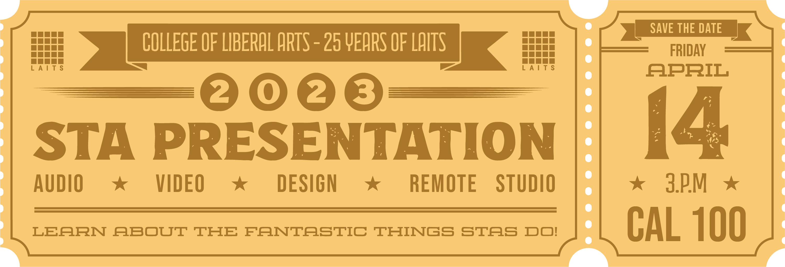
  • This time I replied with the typeface called Espiritu from Adobe fonts. The type family has three different styles with heavier strokes as headlines, condensed type for the main content, and dingbats as decorative fonts (data point). I also use orange to distract the flow of black and make the picture full.
  • After research on other vintage tickets, I found out the ponderous line weight is more suitable for art deco fonts and therefore used a 2px line weight for decoration. 

When I took a deeper look at the second draft, I realized that the use of black and white is too serious and differentiate from the antique tickets with poor printing quality and yellowing paper. For the new draft, I chose the lighter tone of blue from LAITS logo and play with dark shade color and complimentary color. 

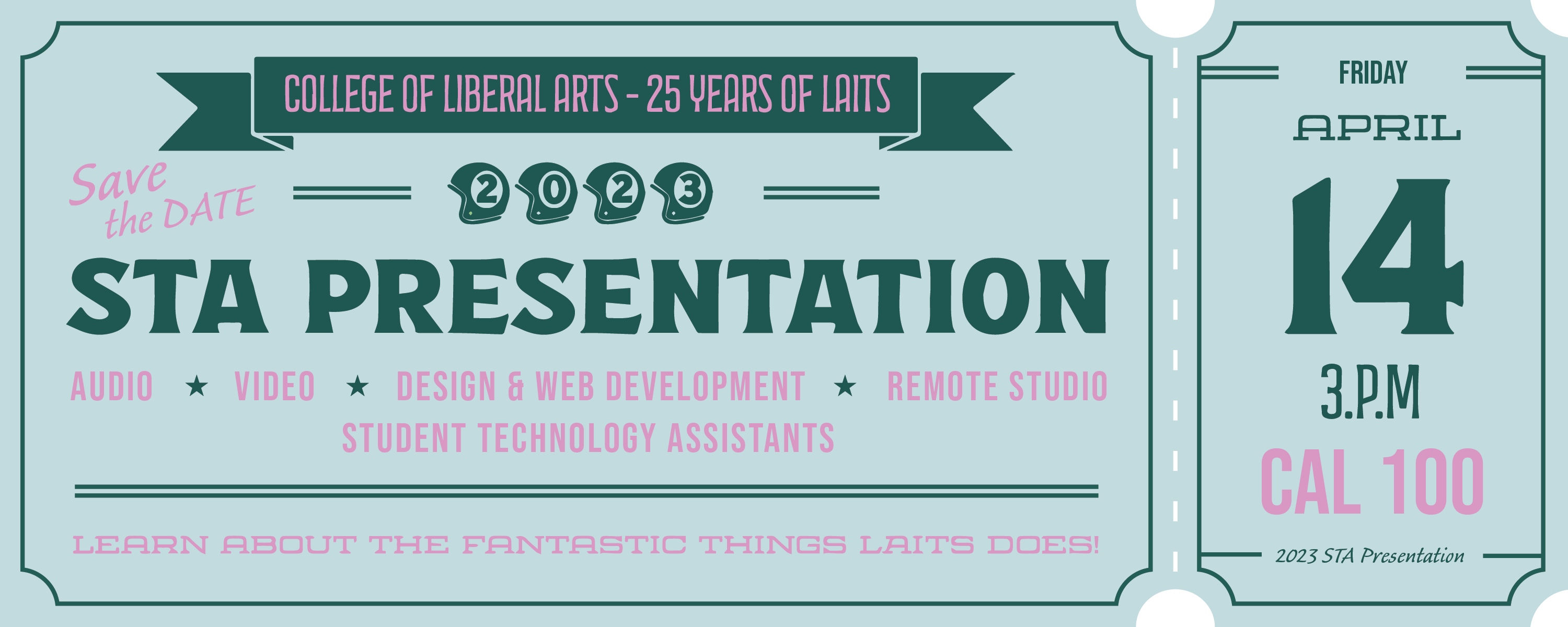
The last change I made to the design is to make it more rectangular and blocky as a whole. I get rid of some additional texts but kept with the event title, date, time, location, associated department, and the teams engaged in the LAITS team. I also prioritize the text in terms of importance by color, font weight and focal point of the tickets. I also made a simple mockup and added the antique texture to the tickets as the final outcome.

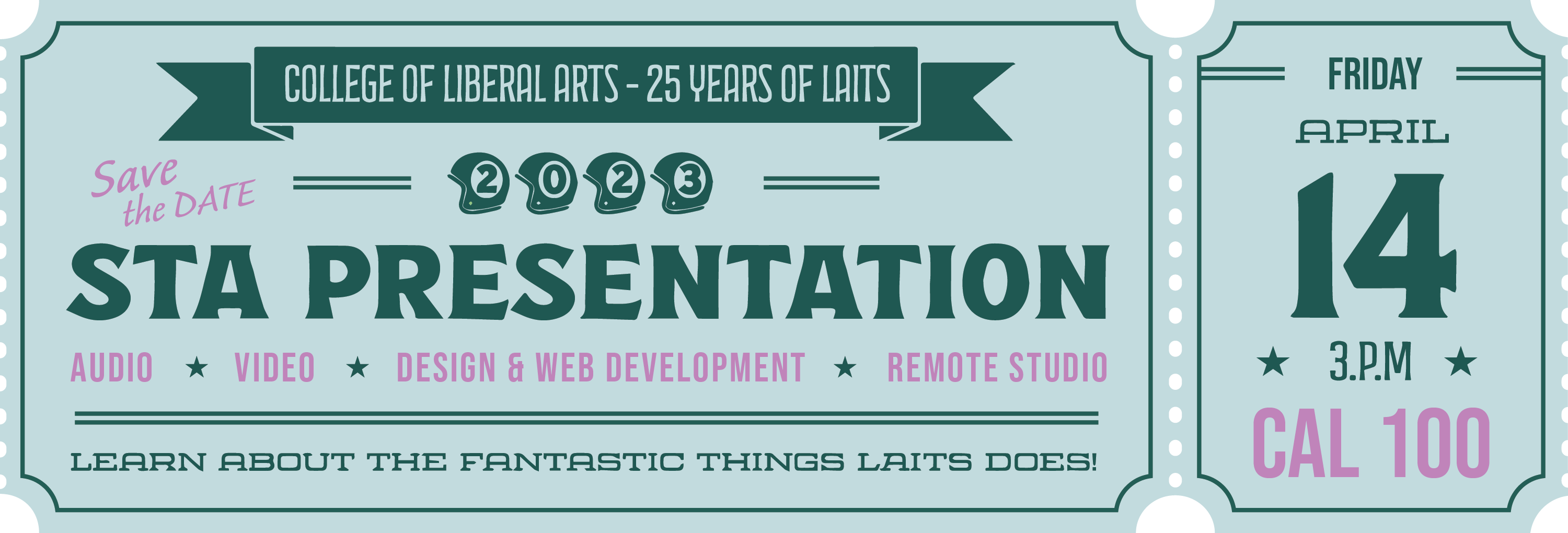
To fit for LAITS color scheme and emphasize the role of LAITS, I created five version with different team color and add LAITS logo on the side of the banner.
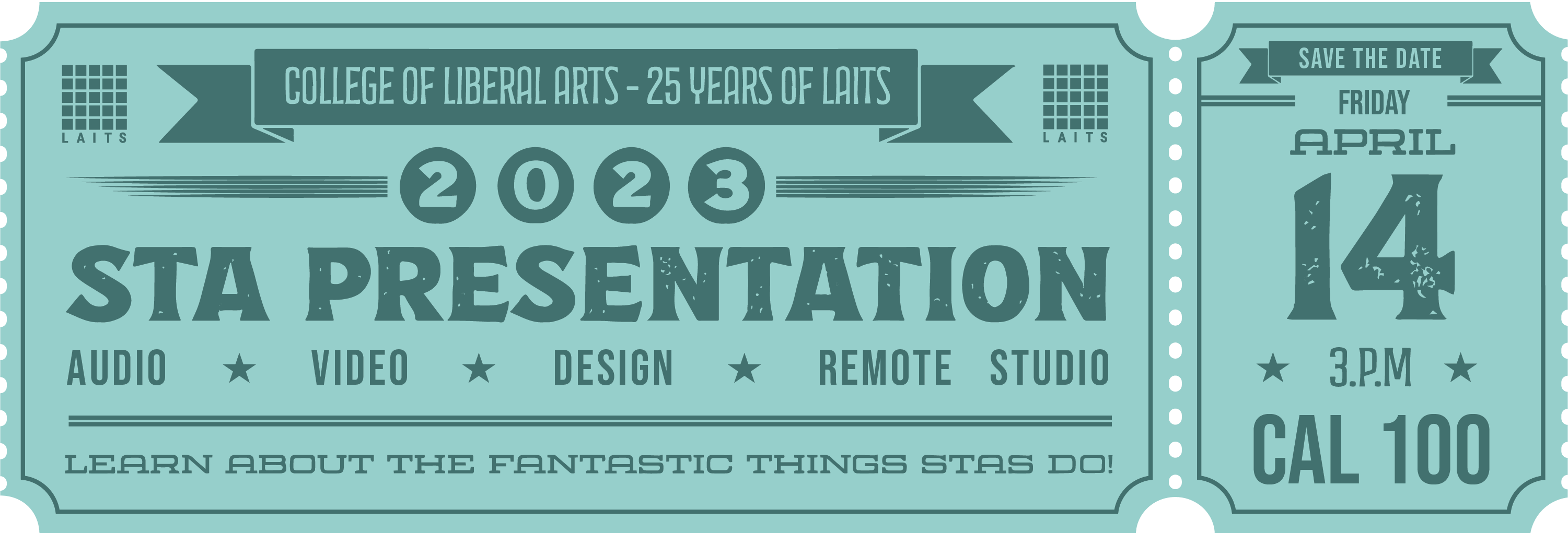
Final:

Filed Under: Fall 2022 - Spring 2023, Uncategorized

Week 12

January 11, 2023 By Carrie Wang

Week 12

First week for Spring Semester 2023 :). So excited!!!

I’m setting up everything for the new semester and doing some correction tasks. I also decorated the white board with all STA schedules on it under the theme of “growth”. I put it in the context of garden and draw the vein as the broader and butterflies as the representation of us. I helped to recolor the CCI logo from Maroon to UT blue #005f86. Marianne updated the website with the new blue logo and changed the color palette for that site.


PSY365D’s new course button:


Changing the number into Roman numeral in the following file: (1) a title card; 2) a vertically oriented digital asset for in-studio use; 3)  a banner for the Canvas homepage. I’m aware of how important it is to keep editable file in the shareable box file so now I can edit on it : 3


Project: Intro to Typography

Start: Jan 11th 2023

To be Completed: Jan 11th 2023

I have learned a lot in this typography intro training. I’m able to label each part of a letter and identify them due to distinct parts and aware of details and differences between each typeface. For example, I used to recognize all extensions at the end of a letter as brackets. However, there is actually an unbracketed serif since there is no curve or tapered block but only with a line extended. Typography is the visual component of written words so it has the magic to convey feeling and make the design memorable. I’ll be more careful with the font choice by noticing the details involved to match the most suitable one with the content.

I also find two font pairing that looks amazing for me.

  • The first font sharing I’d like to share is DM serif display and DM sans. The typefaces belong to two categories: display and sans serif. The display typefaces contain brackets and designed to be bold and decorative. The sans serifs is clean and modern, have strong readability. Although they feature at different style, they have similar kerning and relatively same proportion on X height and Type Size, making them matching. It can to be used as any formal expression of documents with the feeling of modernity.

  • The second example comes from a branding project. This brand emphasize on the utilization of typography without any use of image or illustration. The choice of two typography (display for title and sans serif for content) both showcase the feeling of elegant through the thin stroke. The extended vertical space of character in the content is clean and readable but still stylized. 


Filed Under: Fall 2022 - Spring 2023

Week11

November 29, 2022 By Carrie Wang

Week 11

Project: CTX Retold

Start: September 21th 2022

To be Completed: Dec 1st 2022

Staff Guidance: Maddy

Link to Prototype

This week Celeste pointed out Dr.Gordon and her loves picture-driven narrative and wonder a more-designed website.

Improvement:

  • bigger cards with smaller margin between
  • noticeable font choice
  • more design elements on the banner


Project: Color Theory

Start: Nov 29th 2022

To be Completed: Dec 1st 2022

I started a new training on Color Theory, which asks me to illustrate tint, shade, and tone to the pure RGB primary color: yellow, blue and red.

  • Tint: add white to a pure hue
  • Shade: add black to a pure hue
  • Tone: add grey to a pure hue.

I use the layers of waves to represent the altered value that added to the pure hue gradually, creating a slow transition.


Filed Under: Fall 2022 - Spring 2023

Week 10

November 10, 2022 By Carrie Wang

Week 10

Project: French Connexion

Start: Oct 21th 2022

To be Completed: N/A

Staff Guidance: Maddy

Link to UTFC Website: https://frenchconnexions.net/

This week I schedule meeting with Marianne to talk about how to implement my design better into the web development.


Project: CTX Retold

Start: September 21th 2022

To be Completed: N/A

Staff Guidance: Maddy

Link to Prototype

I continue to update the design due to the new feedback from Celeste.

Changes:

  • Body Font: Lato, Extra Bold
  • Quote Font: DM Serif Display
  • New Maroon Color: #881A1D
  • Black Background Color: #313131 + #000000 banner color


Project: Beyond Sweatt v Painter Presentation

Start: Oct 21th 2022

To be Completed: N/A

Staff Guidance: Maddy

This project is to redesign the powerpoint for Beyond Sweatt v Painter Presentation for Olivia Muna with the consistent typography and color palette choice. Since there are lots of historical documents insert into the powerpoint, we decided to highlight on the important texts and create a clearer and bigger typed-text block for better understanding. We also minimized the number of the documents that showed on one page so the audience are able to focus better. At the same time, we insert the photos of either author or related figures for the documents to ensure the storytelling.


Project: Green Screen 8.3B

Start: Nov 14th 2022

To be Completed: Dec 1st 2022

Staff Guidance: Yazz and De’sha

I was asked to find pictures of foods and drinks for the UTFC projects, prioritizing pictures from Antananarivo and Madagascar.

UTFC Green Screen 8.3B Food and Drink


Project: Elements and Principles of Design

Start: Oct 20th 2022

To be Completed: Nov 15th

Elements and Principles of Design

I learned several design principles from this training:

  • Repetition
  • Rhythm (similar visual elements but the different distance and frequencies create joy)
  • Movement (arranging the composition in such a way that the objects lead the viewer’s eye along a path)
  • Balance
  • Proportion/Scale
  • Negative Space
  • Contrast
  • Emphasis
  • Variety
  • Unity/Harmony (taking different elements in a composition and creating visual similarity by the way one arranges them)
  • Hierarchy

When I design, I should be careful with the rhythm, balance, proportion and unity.  In order to emphasize one visual element, I can utilize contrast, emphasis, hierarchy by changing color, size and volume. Movement and negative space can lead the viewer’s eye and create excitement. One design work should consist of several design principles so the image would balanced and noticeable.


Filed Under: Fall 2022 - Spring 2023

Week 9

November 7, 2022 By Carrie Wang

Week 9

Project: French Connexion

Start: Oct 21th 2022

To be Completed: N/A

Staff Guidance: Maddy

This week I was mainly working with Marianne, our developer for this new site, about how to implement the design into the real site.

Here is what it looks like right now: https://frenchconnexions.net/

I also designed another page for a new added-section:  Culture and Language.

Project: CTX Retold

Start: September 21th 2022

To be Completed: N/A

Staff Guidance: Maddy

Changes:

  • Fonts: Dr. Gordon likes the CTX title in bigger title and the subtitles.
  • The quote placement: No darken color on top of the image but try to find a way to ensure the readability
  • Site color: The black background instead provide enough contrast or energy.

Previous Version:

New Version:


Link for prototype


Project: UTFC Green Screen

Start: Oct 31th 2022

To be Completed: Nov 2nd 2022

Staff Guidance: De’sha and Yazz

For this project, I was assigned to find pictures of fabrics and materials images from from N’Djamena, Chad or Central Africa.

7.2B Fabrics and Material-Final Version


Filed Under: Fall 2022 - Spring 2023, We are STAs

Week 8

October 28, 2022 By Carrie Wang

Project: French Connexion

Start: Oct 21th 2022

To be Completed: Oct 30th 2022

Staff Guidance: Maddy

This week I started to design the pages for French Connexions. The final color palette I chose is the blue family with UT slate gray since it looks rational and clean.

Issues on Homepage:

  • The white bar on the side of pictures seems awkward when I expand the windows
  • better way to place the text on slider
  • Text is too big and hard to read
  • There is no hierarchy in texts
  • How to place the parallel text

Ways to tackle issues on homepage:

  • expand the banner for full screen (the width can expand when users stretch the window but the height will be fixed
  • use icons to list out parallel text and emphasize the different definition of connexions
  • use font weight, size, color, and leading to hierarchy.

Issues on Program Suite:

  • Different padding for titles
  • when users minimize the window, text and maps cannot be read on the same page
  • uneven padding in left and right
  • break between each part

Ways to tackle issues on Program Suite:

  • Align text along the map
  • Use color block to differentiate each part
  • Use boxes to emphasize each module and balance with the block of map (align perfectly)


Issues on Pedagogies + Technologies:

  • Big leading
  • white bar along with the banner


Ways to tackle Pedagogies + Technologies:

  • Full width for the banner
  • Usr block to make division
  • Decrease the leading between text
  • Increase the padding of block

Issues on About

  • Mission and Team are mixed together
  • long sentences in each paragraph makes users hard to read (50-70 character is the best)
  • Hierarchy
  • Text block is not align with the pictures


Ways to tackle About:

  • Emphasize the mission since it’s the main goal of the site
  • Use color block to represent each members of the team
  • Use colored text differentiate name, role, contribution on the project and other description
  • Full width of the banner (add color overlay to ensure the readability)


Issues on Contact

  • Not consistency color use
  • Blurred image at the top
  • The caption of the image looks like a part of the contact page
  • Text about Contact Us is not aligned to any other part of the page
  • The bottom padding is to narrow
  • Missing the purpose of contact?

Ways to tackle Contact:

  • Find new copyright picture
  • Full width for the banner
  • add the purpose align with the title
  • Use the same color of block from other pages as the enter box

Finally I make the developer note for them to code CSS more easily, including text style, color palette and padding.

Filed Under: Fall 2022 - Spring 2023

  • « Previous Page
  • 1
  • …
  • 4
  • 5
  • 6
  • 7
  • 8
  • Next Page »

link to LAITS home page

Video STA Home

© 2025 Liberal Arts Instructional Technology Services | Production Credits