Week 3: Training Progress
Tier 2 Studio Graphics
Last week I spent a lot of time making the Digital Wall monitor for this tier, once I had that set in stone, the rest of the graphics came quickly!
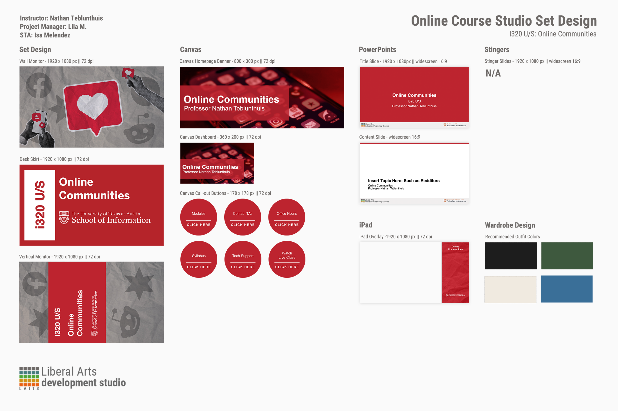
I was a lot more focused on simplicity this time around. I made sure to stick to a single primary color, that being the red, and made sure that was consistently shown throughout all the graphics. It was interesting to have to think about the wardrobe the professor would have to keep in mind. I never thought about it before, but it’s true that they could clash with the background with certain colors. For example, wearing red for this studio set would surely clash, but a green or blue would help the professor stand out.
Helpdesk Place Card Redesign
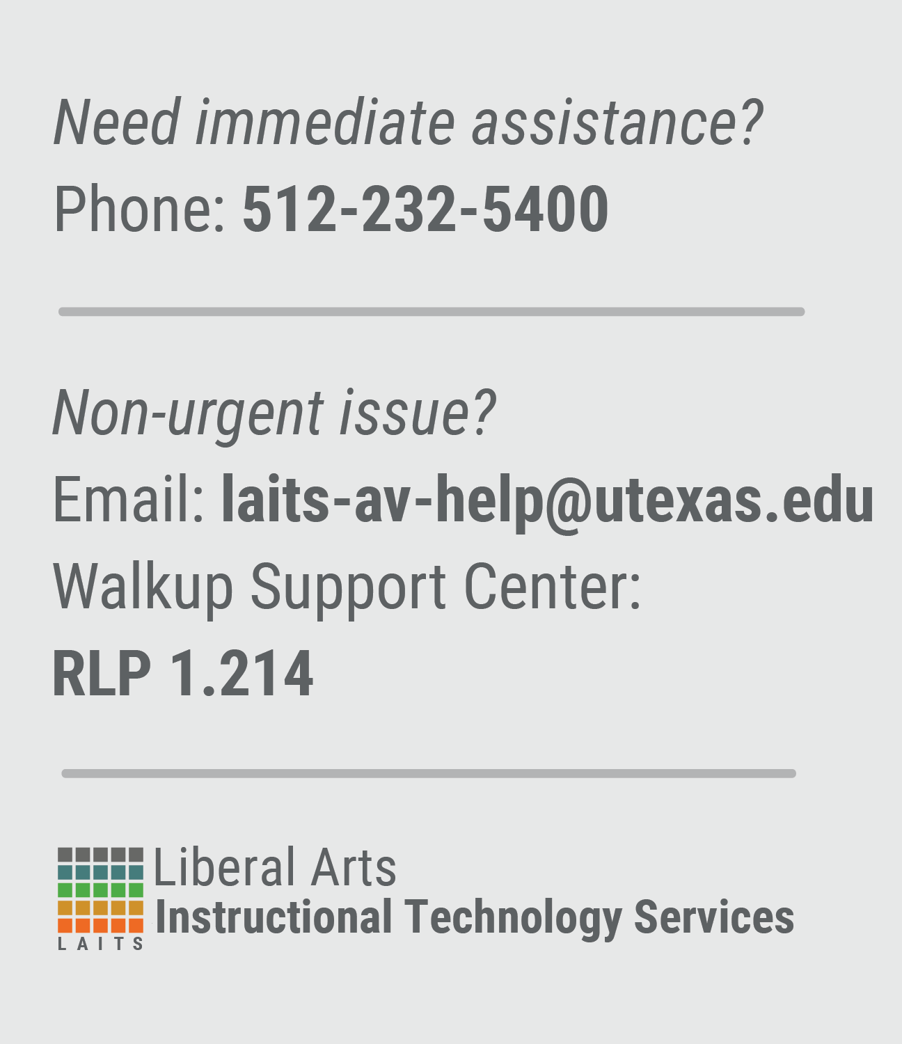
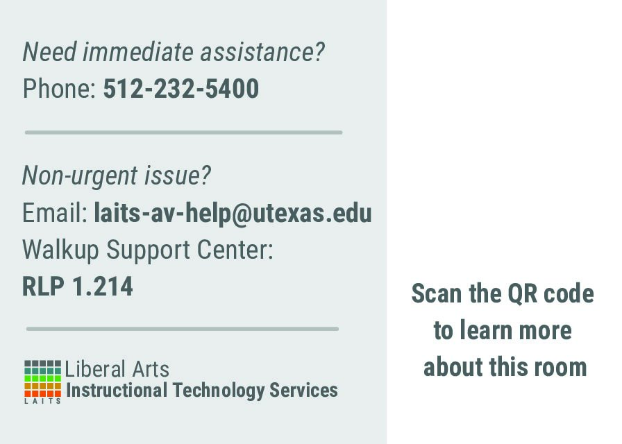
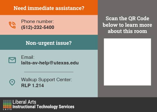
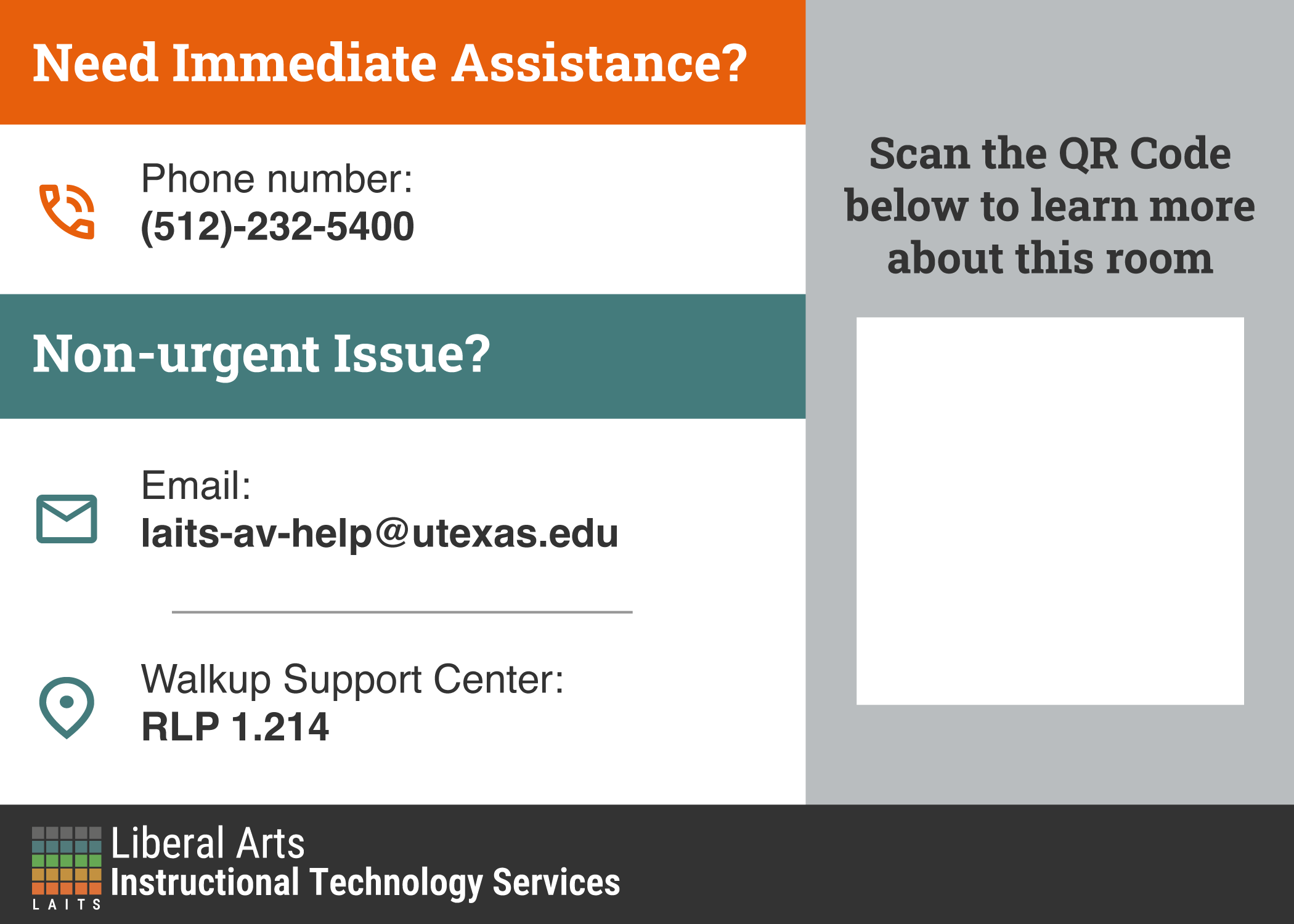
This is my first project where I’m working with real clients! I was tasked with redesigning the current Helpdesk Place Card. This is the current design:
They are usually on grey desks, and the current design makes them blend in, so I needed to make them stand out whilst still adhering to the LAITS Style Guide. This would mean sticking to their color palette, using the right fonts, and the right logo.
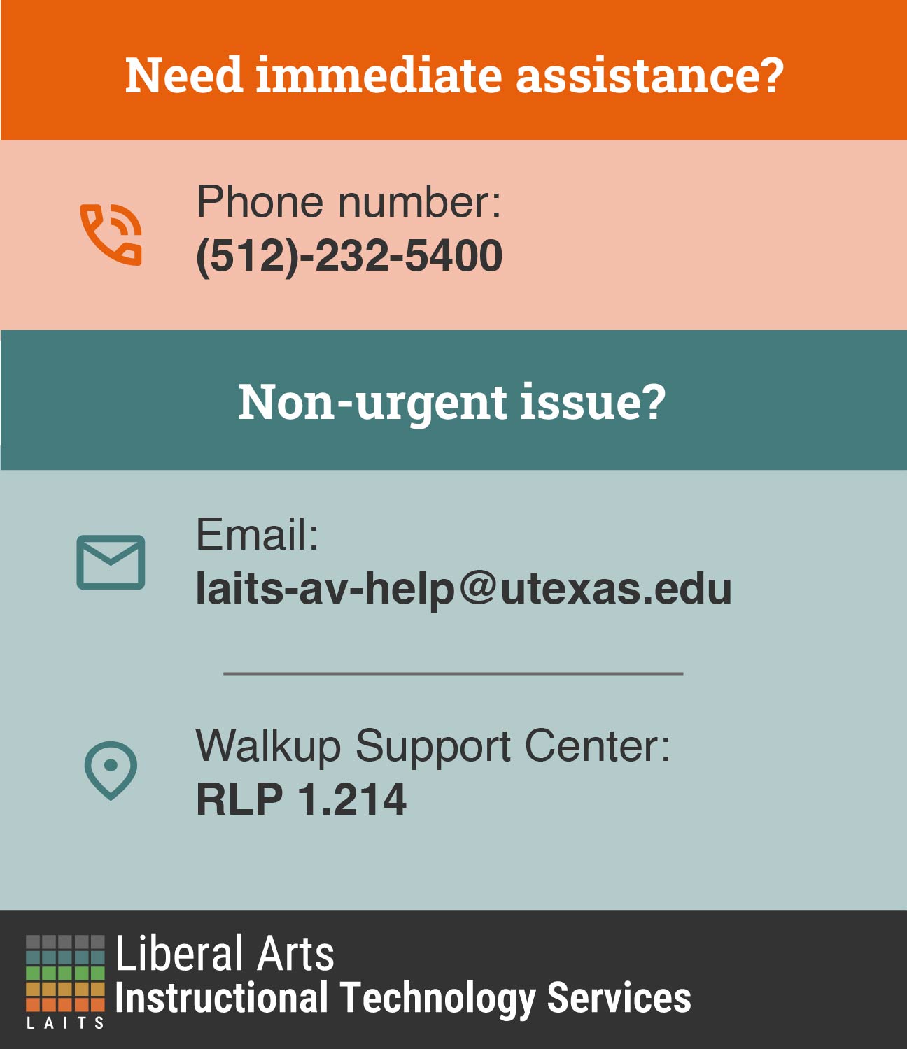
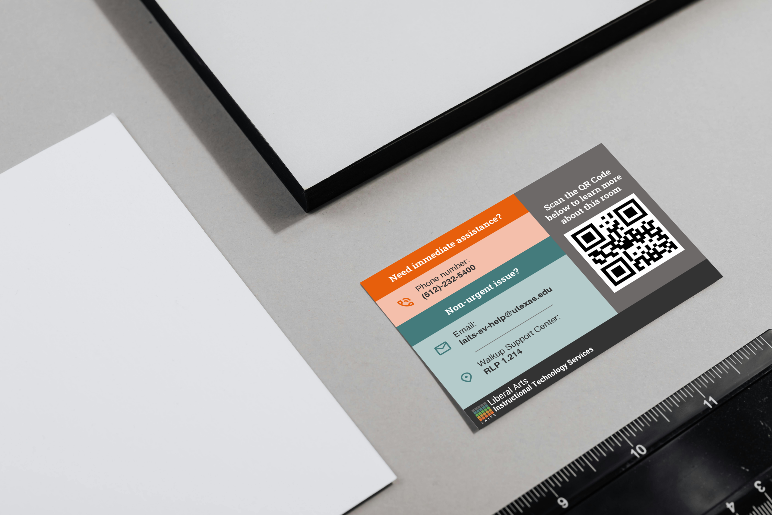
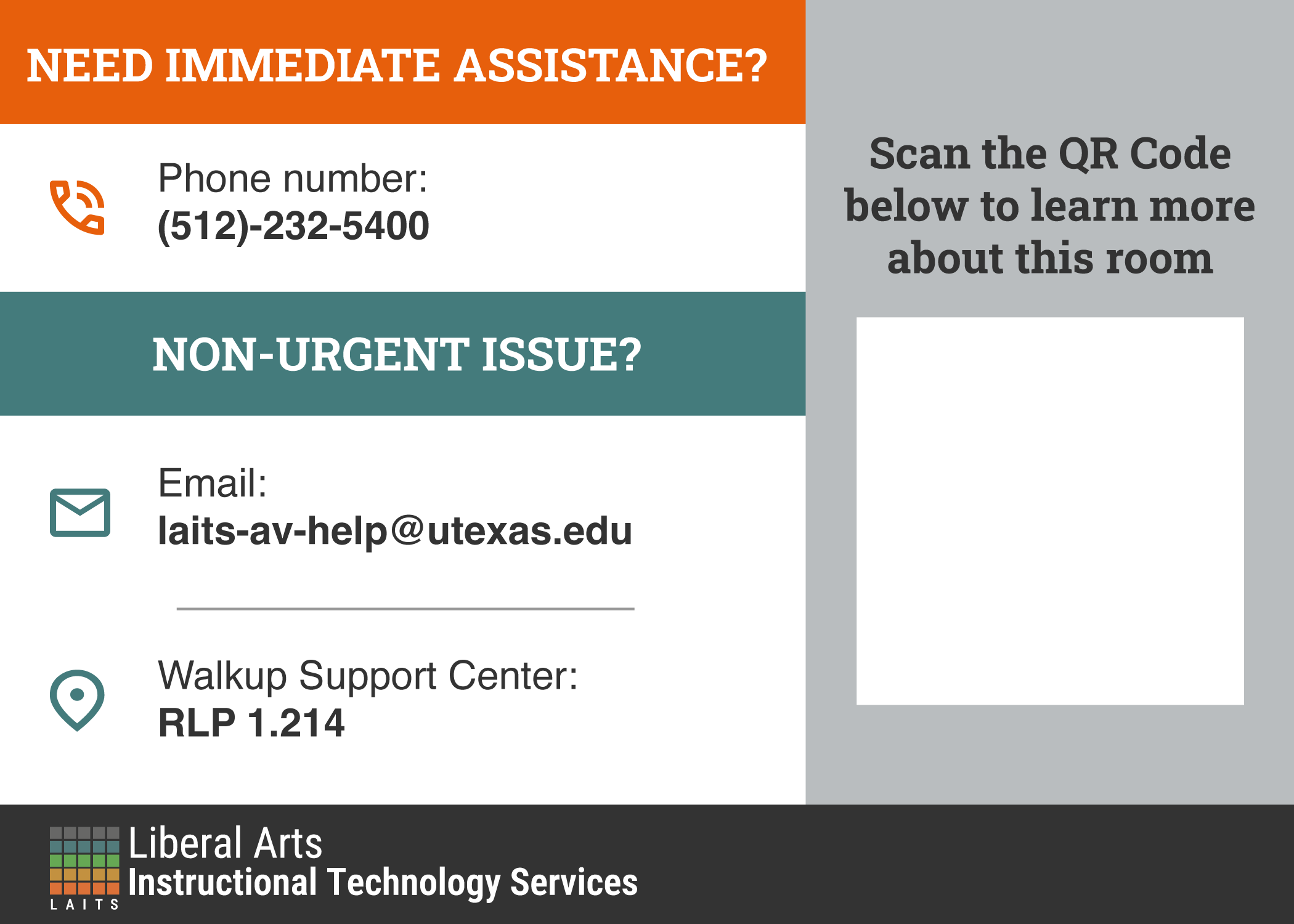
My first iteration:
This was a nice direction and I was told to make a mockup of them, so I put them on a gray desk much like how it would be in real life. Here are the initial mockups:
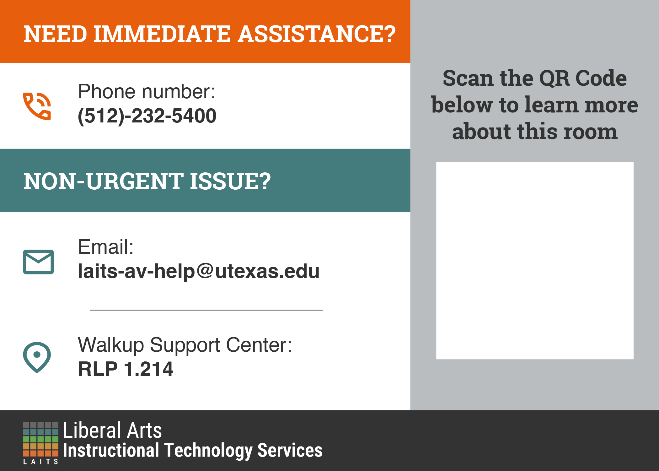
I received the following feedback:
- Align LAITS logo with the icons
- Try capitalizing titles and increasing the size
- Change the light orange and light blue to white
- Make gray lighter in QR area
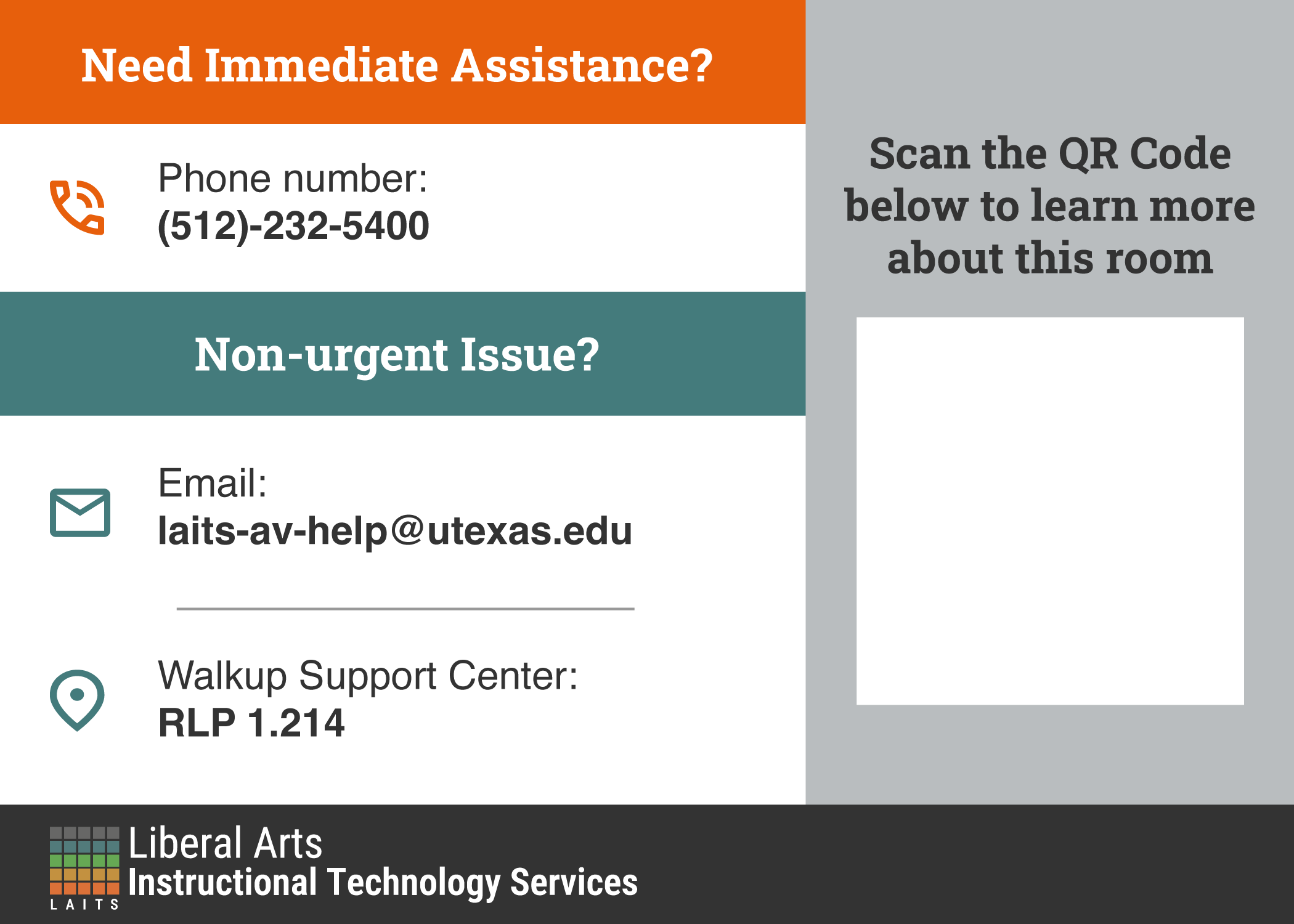
The alignment of the text/icons and whether the titles should be all caps or not were the main question. Keeping all this in mind, these were my next few iterations:
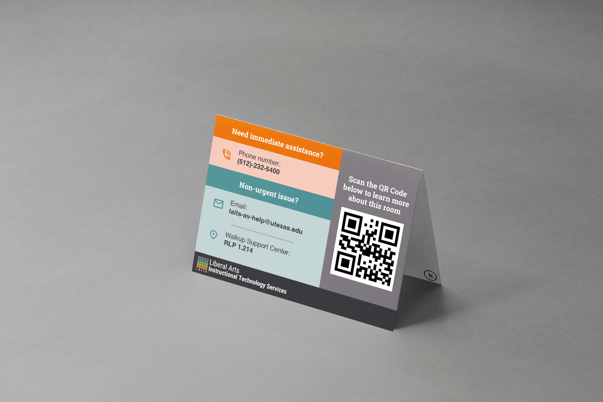
The favorite of all the iterations was this one:
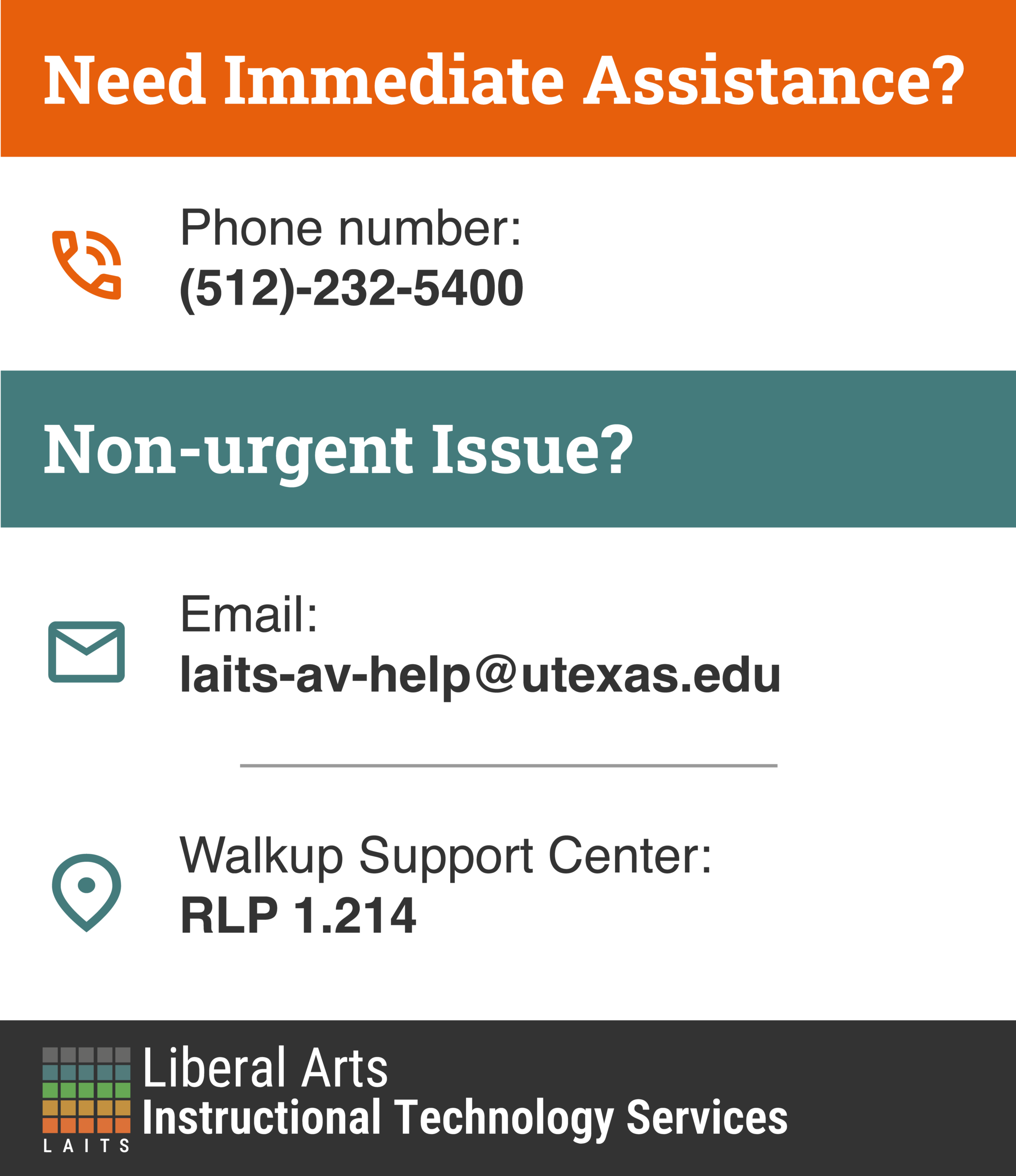
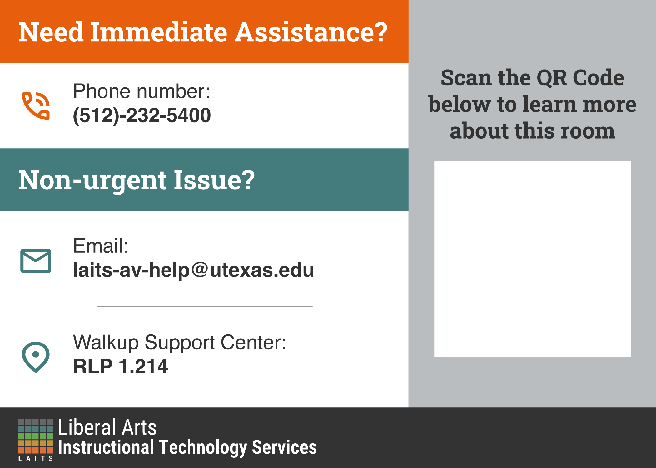
I’m still waiting for more feedback, but I’m pretty sure this may be the final version we end up going with!
Overall
It’s so interesting to see how many iterations you have to go through before you end up landing on the one that everyone is happy with. Design is an iterative process and rarely is ever linear, so it’s been a really cool journey to see how a design can develop!