Studio Backdrops Redesign (July Update)
────────────────────⊹ ࣪ ˖♡˖ ࣪ ⊹ ────────────────────
.

.
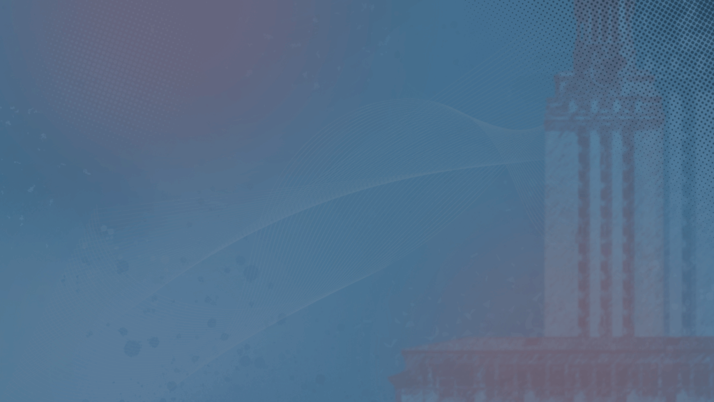
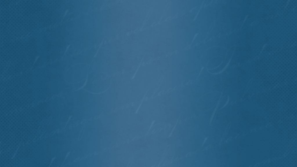
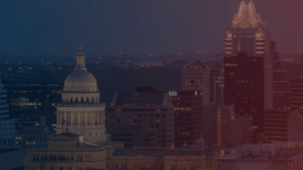
Last time I talked about the studio backdrops redesign, I had created and edited these four designs as well as selecting stock photos that fit the news anchor style! Now it was time to studio test!
After studio testing with De’sha, the main revisions we thought of were:
.
– narrowing down stock images selection
– repositioning the designs to fit the screen better
– either blurring or making more designs visible depending on the backdrops
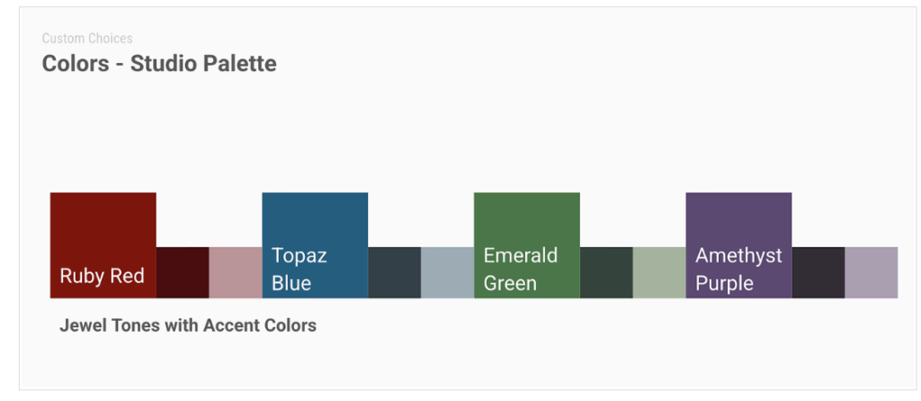
– incorporating more of the jewel tone colors
.
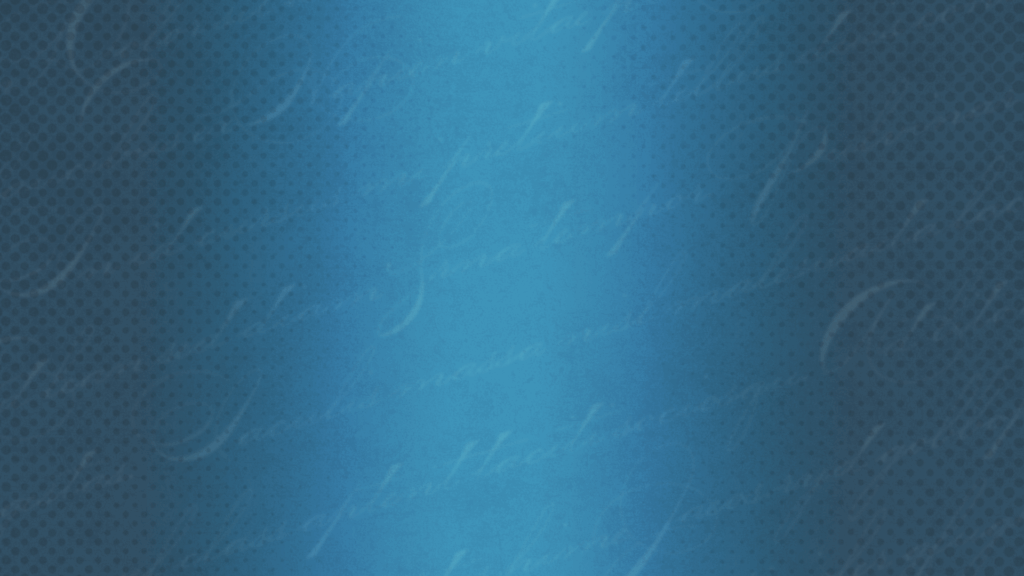
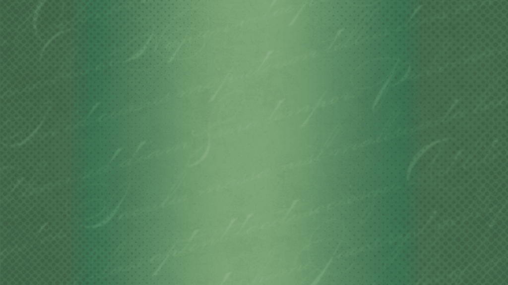
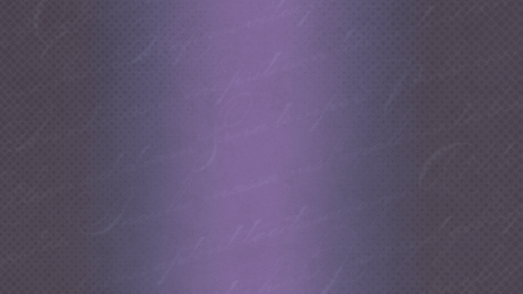
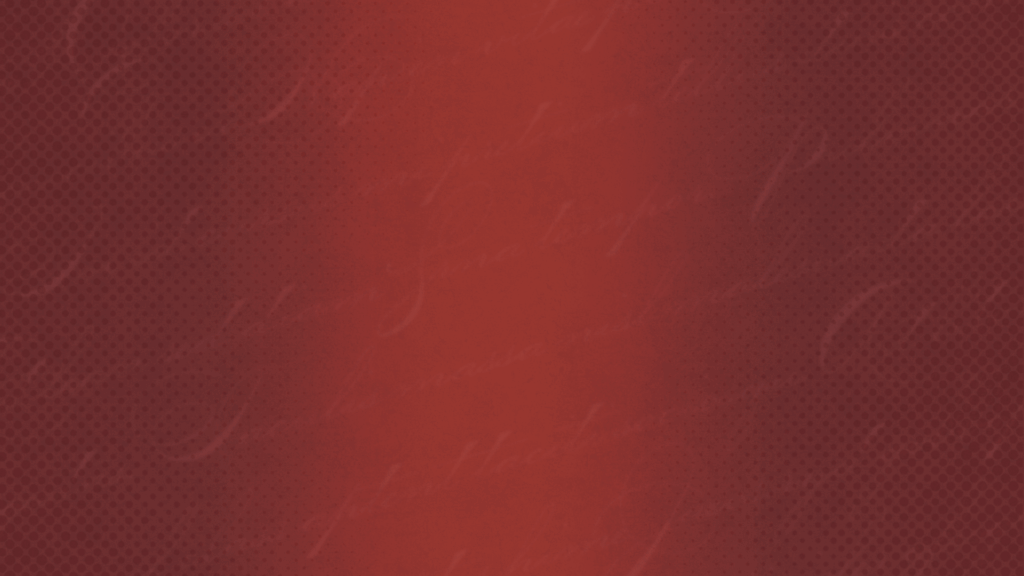
For the next revision, I was intrigued about how the current designs would look in different colors! I gravitated a lot towards topaz blue at first, but maybe some other colors might suit other designs better!
.



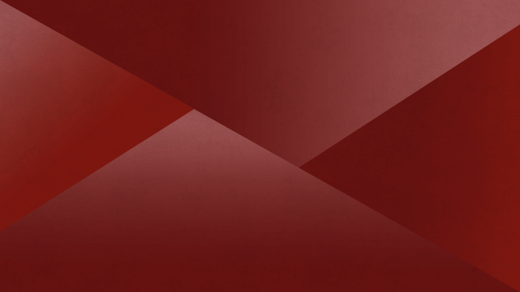
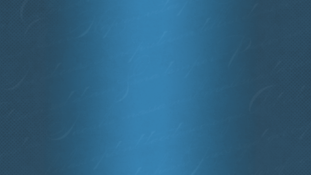
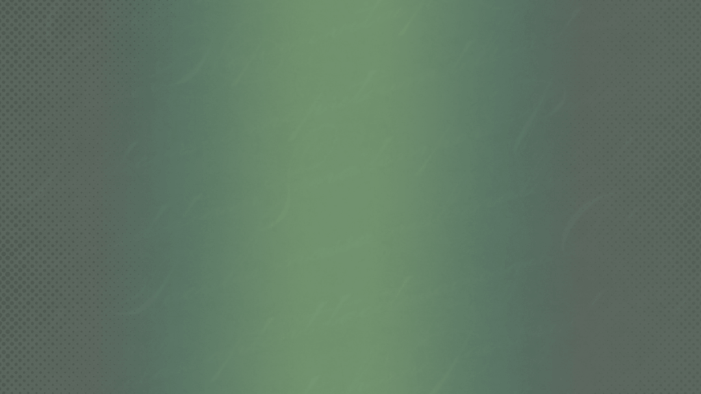




.
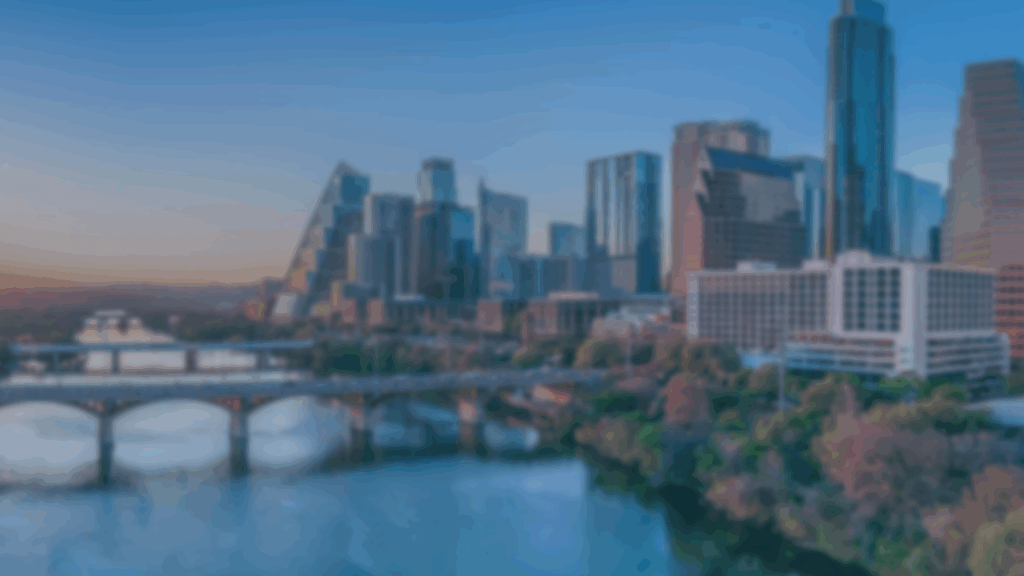
On July 1st, De’sha and I tested the revised backdrops! The variety of colors was a great addition to the testing as well! Again, we did feel like we can make some more changes for next time which were:
.
– some colors needed to be more saturated
– replace or remove textures
– bring up the opacity and blurriness on some designs
– photo edit some stock images
– gather more stock images
.










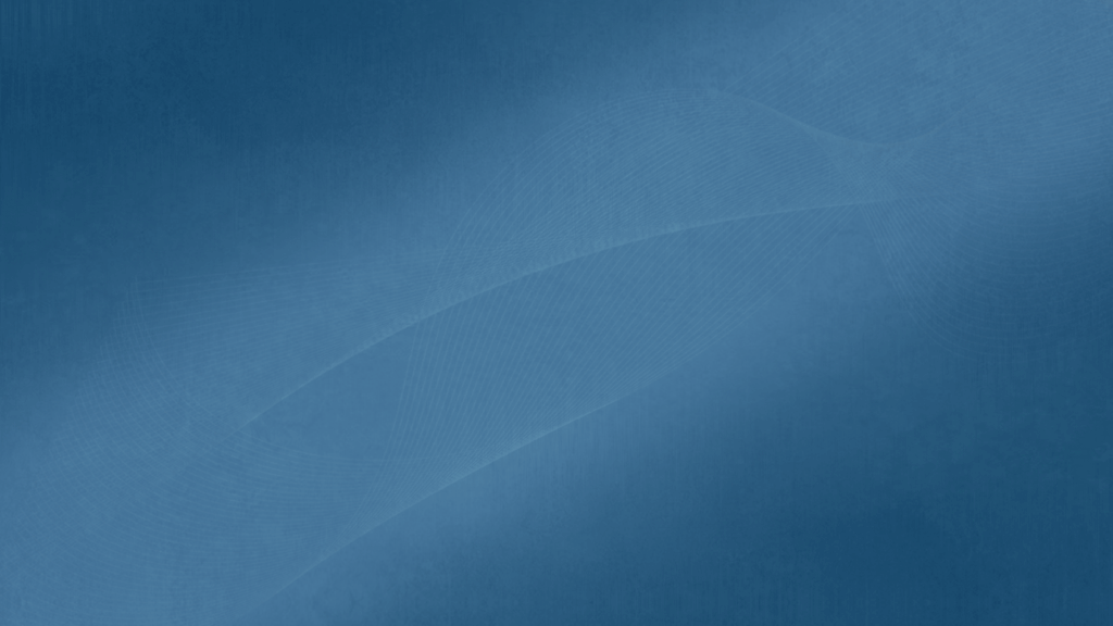
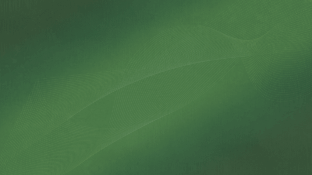
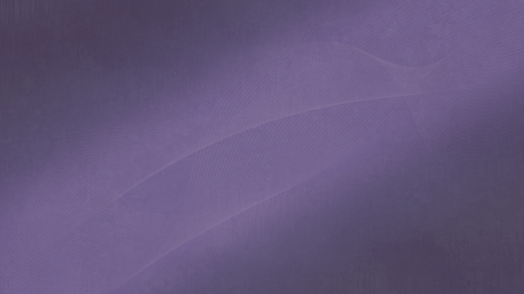
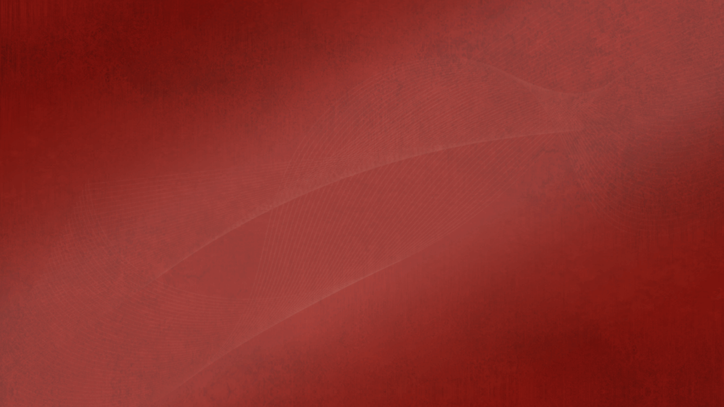
.
On July 9th, De’sha and I went back to studio testing with the updated designs! I found some more stock images that captured the news anchor style but we decided to narrow the selection more for the next studio testing date! However some designs still needed some updates like:
.
– bringing up the opacity of texts
– revising tints of stock images
– reformatting the display of designs
.




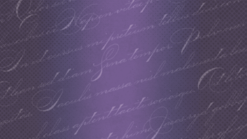
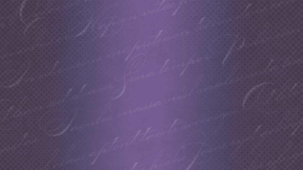
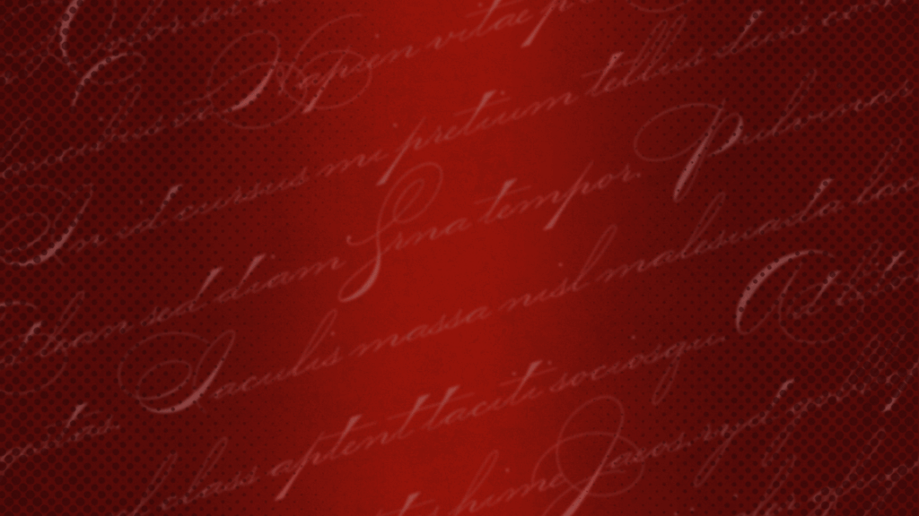
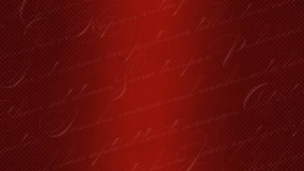


.
Before my summer shift ended, I updated the background based on our revisions! Until we go studio testing again, this is where we left off! Overall, this project really let me practice my graphic skills and was such a fun project to end summer with!
