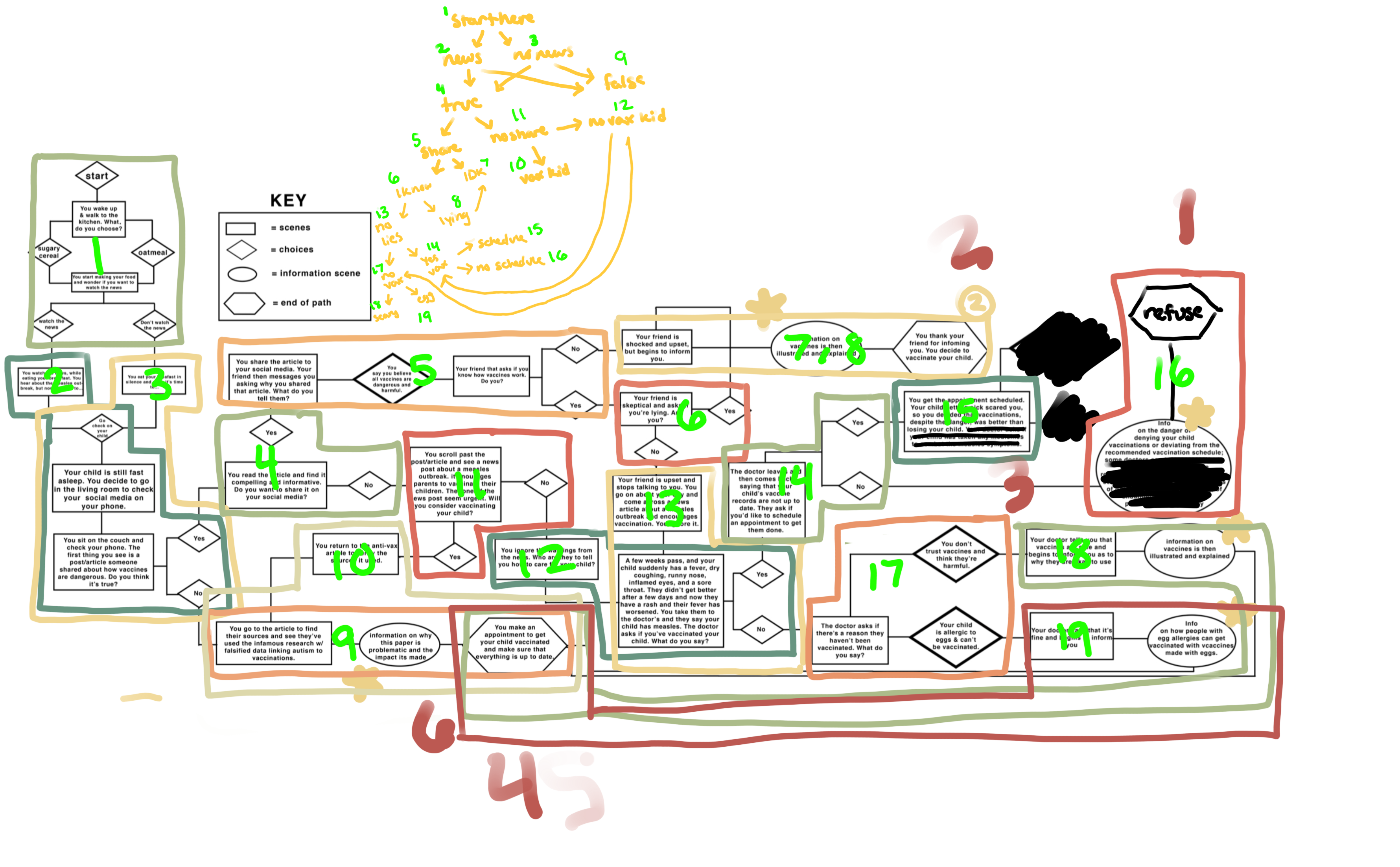


Since our last meeting in May I’ve made many changes to the podcasting sites with the help of Suloni, Stacy, Jaclyn and feedback from Jacob.
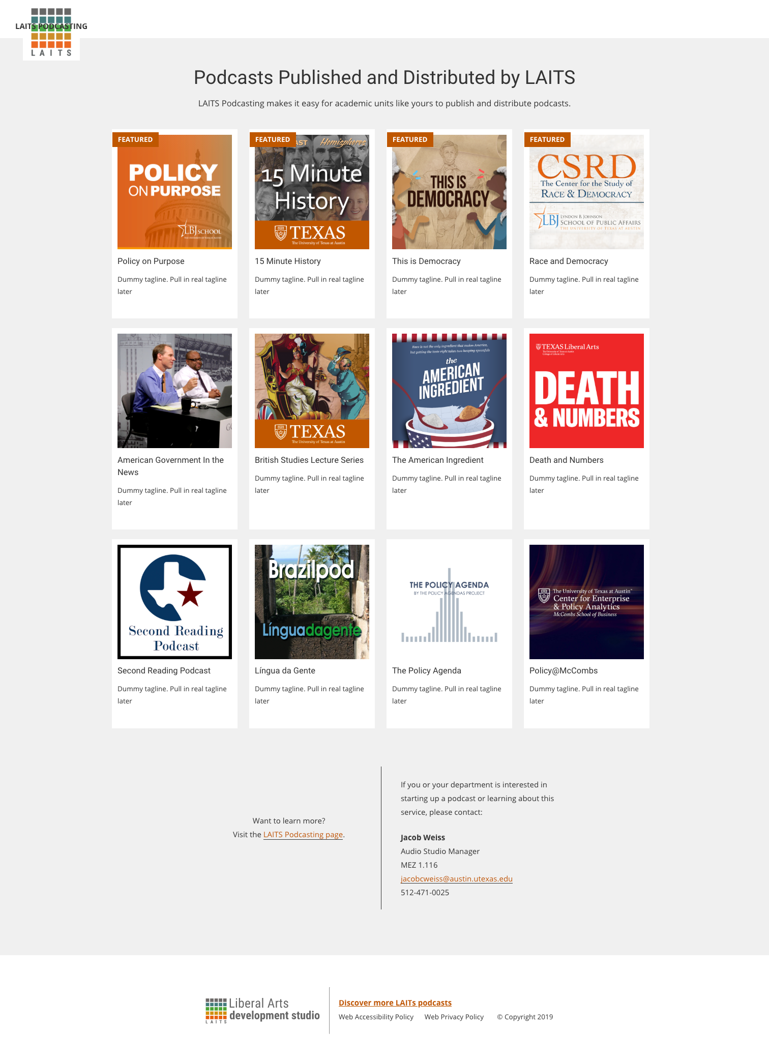
The biggest update is the new homepage for all LAITS produced podcasts – https://podcasts.la.utexas.edu .
I used Jaclyn’s mockup to create cards similar to the style of our podcasting search pages. Jacob requested an option to feature certain podcasts so we added the orange tag and commanded posts with the featured tag to appear first in the queue.
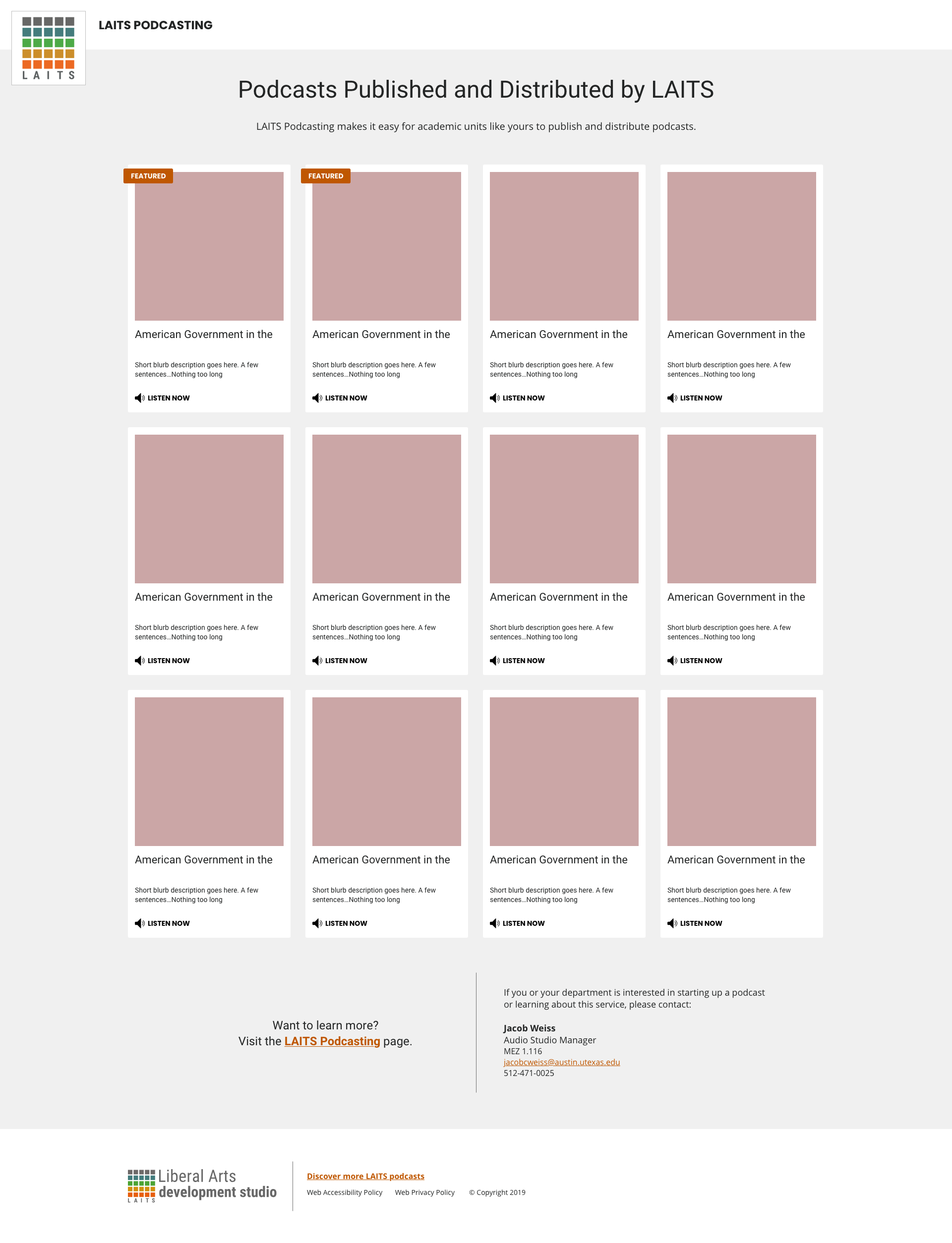
Along with creating adequate media queries I’m still struggling to properly align the header elements and need to decide which audio player to place in the cards but for now I’m waiting on Stacy’s feedback and guidance. Still much work to be done!
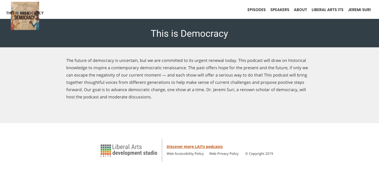
We also added a footer to the site with LAITS branding and necessary links as well as a homepage for each podcast. Again, still having trouble with placing the podcast logo and site title, especially moving into tablet and mobile view.
![]()

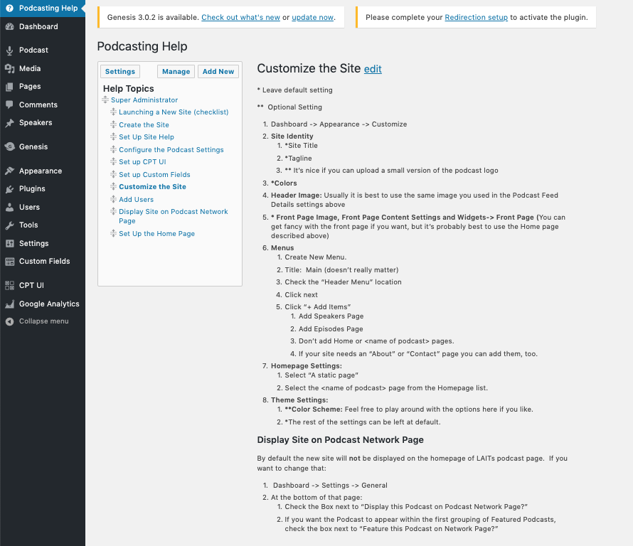
A lot of additional work happened on the backend of the WordPress site. Stacy and I created a “Podcasting Help” section to help Jacob and other site administrators set up their podcast pages with our decided preferences and show them their options for customization.
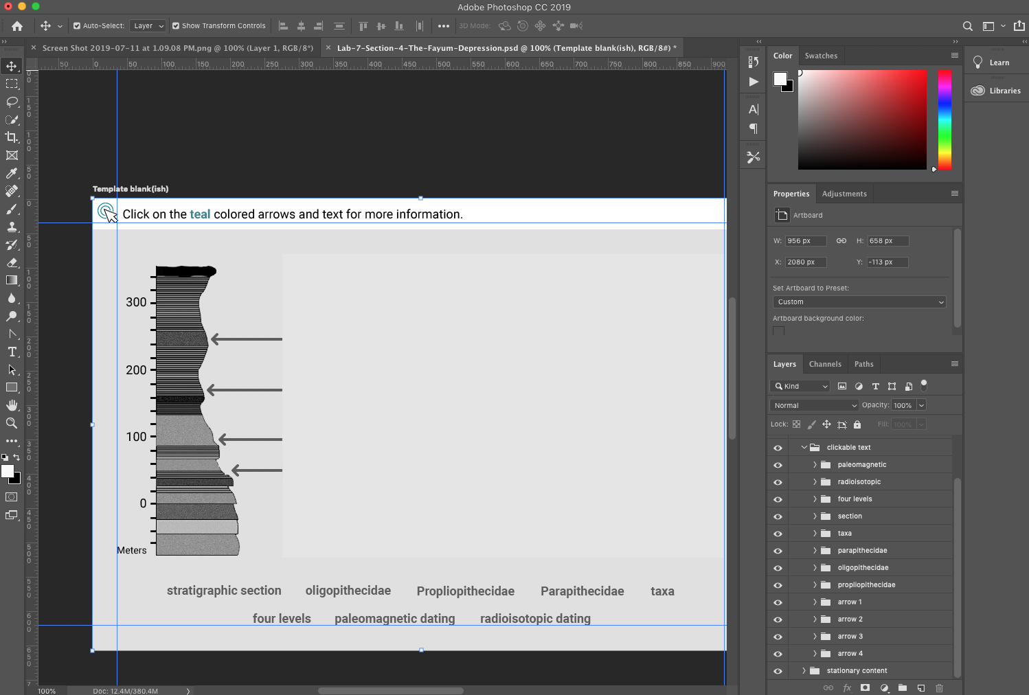
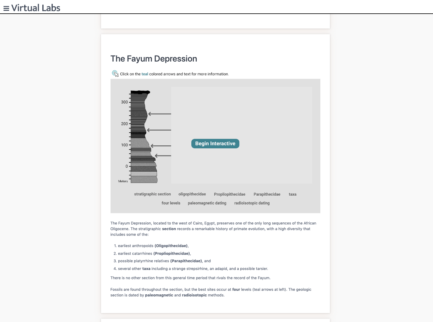
Starting in June I took a much needed break from WordPress to assist with canvasser interactives and asset creation for Vlabs. I’ve definitely become very familiar with canvasser at this point and through working on asset creation I’ve become much more comfortable with Photoshop.
Now I’m beginning to perform “last looks” on the GRAV site which involves reformating our html for consistency and making sure all interactives are present and functional!Here’s the current checklist to follow when performing the final looks:
As you perform your LAST LOOKS, assignments, COMPARE the FLASH pages with the GRAV pages, while using the checklist below. ……………………………………………………………………………………………………………………..
1. For content accuracy: -We want to ensure that the Anthropology students have all that they need per lab, per-section, so that they can study and learn the complete and accurate information they need to pass their exams.
2. Interactives though the lens of pedagogy (SORT OF!)
“how knowledge and skills are imparted in an educational context, and it considers the interactions that take place during learning”
*** Make sure that the redesigned interactives have enough content to be able to stand stand alone, and deliver the lesson the students need to learn. Interactives should not to depend on the html page text content to make sense.
3. For consistent visual style: We want to ensure that Anthropology students have a consistent experience as far a visual and conventions go, from page to page, from interactive to interactive.
……………………………………………………………………………………………………………………..
LAST LOOKS CHECK LIST
CONTENT CHECK – IS IT ALL THERE?
1. All of the Content needs to be in the section HTML TEXT VIDEOS INTERACTIVES
HTML TEXT – COPY EDITOR
2. all of the HTML text has to be correct – ex: words like “Click Here” need to be edited out of the HTML – spelling needs to be corrected -if words runtogether/spacing , correct the spacing -if words need to be bolded, bold them
CONTENT FLOW
3. All of the content needs to flow and be laid out as best as possible – “group” text & other content from separate cards into one card if it helps content flow better
& indent sub headings as needed to show sub-content in the flow of one card. – Center video as needed, or if it’s a list of videos right align?
DOES IT ALL MAKE SENSE?
INTERACTIVES & HTML
3a. All of the Interactives need to be sensibly laid out and pair sensibly with the HTML text, but not depend on the html text.
3b. This step is mostly necessary for the older Interactives & the ones that are not “teal”: Is there enough context (text and images) in the interactive for the interactive to make sense? if the text was edited & re-worded does the resulting text support the content of the interactive? ** It is ok if there is some redundancy between the interactive content & HTML content.
3c. When you see that visual conventions are not following the style guide for Interactives make a note on basecamp and on the spread sheet. ***ALSO let us know that this needs to be re-worked for the content in the interactive to make sense for the student trying to learn the points. – ……………………………………………………………………………………………………………………..
(TEAL DEAL)
4. Valerie will keep track of the teal replacement Interactives on the spread sheet and will make corresponding new to-dos on bc for these


I’ve been working on creating a workbook for the Russian online course RUS406. I have finished transferring Unit 2 into workbook form and am currently working to define some stylistic choices more clearly as well as identify areas where templates can be created to help when creating more content for this workbook.
An ongoing project that I’ve been working on are the logos for the edX Computer Science masters program. The logos revolve around encapsulating a main theme of a specific class in an animated logo comprised of circuit imagery (circles and lines). Here are many of the logos I’ve created for the program thusfar:
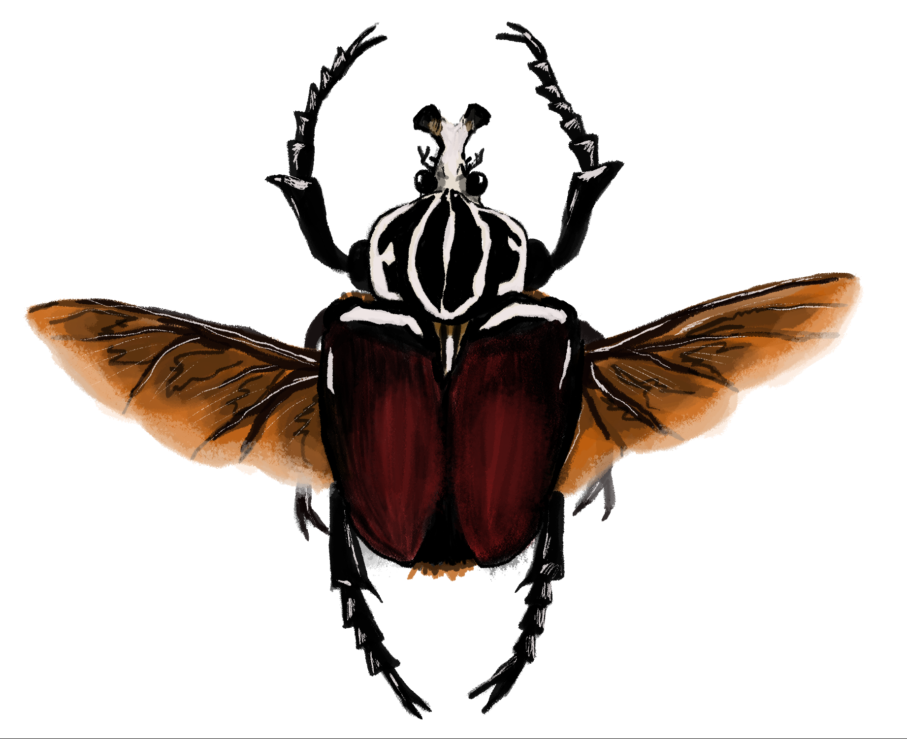
This is a painting done on Adobe Photoshop with the Wacom tablet of the beetle Goliathus goliatus, one of my favorite insects. I used dry brush painting tools to create this image starting with a trace layer, adding on base colors, and then shadows and highlights. I think this training by far has been my most favorite because I enjoy drawing a lot and feel like there’s more versatility in drawing with pen. However, there is still a lot for me to try out so there may be something that is even better or as equally fun to do. Hopefully in the future the opportunity to create more illustrations will be handed to me in an assignment. For now this is what I came up with and am pleased with how it turned out.