• We are STAs
    • Asha Rountree
    • Haley Ma
    • Kate Shih
    • Kyra Lee
    • Nicholas Peasley
    • Sasha Kenney
    • Shanda Horm
    • Shriya Atreya
    • Tomas Marulanda-Mesa
  • We were STAs
  • STA Presentation
    • STA Presentation 2017
    • STA Presentation 2016
  • Testimonials
  • Resources
  • Home

STA Blog

HS 301 Course Graphics and STA Presentation

May 3, 2021 By Athena Zeng

HS 301 Course Graphics and STA Presentation

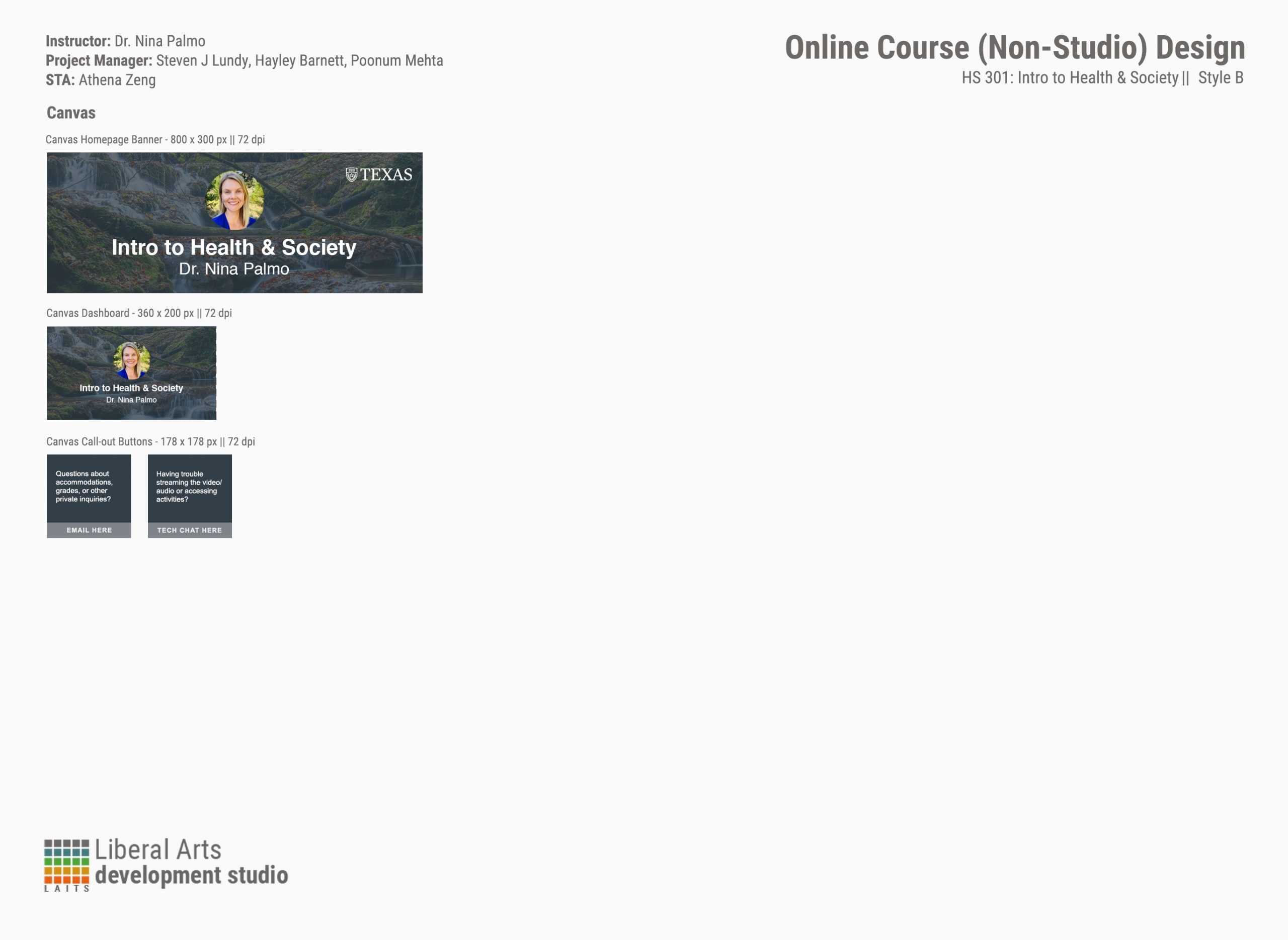
I took some time off of work last week to focus on some of my final projects! But while I was at work, I worked on a couple things like fine-tuning the formatting of the Cascade Page Layout Design Guide and this course graphics package for HS 301: Intro to Health & Society. This was an interesting request because the professor wanted her picture on the slide. It also took a while to reach the concept of a downstream river as a representation of the course. Initially, I was going for some more health and hospital type appearances, but the professor stated that she wanted something more representative of society instead. Abriella provided guidance for the final layout, suggesting a color overlay and adjustments to the standard course graphics appearance.


I have also been finalizing what I want to say during my STA presentation! It’s a little tricky because the project is still in process, but that shouldn’t be a big deal. I will be presenting on the UT Oxford Project, which is a government response tracker of COVID-19- related policies.

Filed Under: 2021 Spring - 2021 Summer

Student Success Tool Logo Update Pt.2

April 30, 2021 By Cristina Villarreal Núñez

Student Success Tool Logo Update Pt.2

Welcome back to the thrilling saga of designing the upcoming Student Success Tool app logo! You may remember from my last post that I concluded last week with a few new drafts (the Shape-Style Approach Drafts). You might also remember that I some more feedback on those that I didn’t get to work on before the end of my shift.


Well, I started this week working on said feedback. Basically, I was tasked with:

– Reducing the size of the ribbon

– Decreasing the padding between the closed thumb the rest of the hand (for the design with a closed thumb)

– Pushing the knuckles closer together

– Fixing the angle of the thumb (for the designs with an open thumb)


So I worked on that feedback (and posted some of the corrections on Basecamp). But before I was able to finish up all of the new drafts, we got comments from the client asking about the color scheme, requesting new additions to the drafts (like a wrist) and other details. So, I got to work on it. We still didn’t have a consensus for color palette so I started working on the other needs for this batch of drafts and this is how some of them came out…


After that, I started working on a few color combos to see how they would look like. The most successful one being a combo of a burnt orange hand with a dark gray ribbon. So the next few drafts for that design were done in that color palette. (At this point I also noticed that I made a mistake with the previous Hook ‘Em version since I left the thumb extended, when that gesture is done with the thumb closed shut. I fixed that mistake in the next batch of drafts.)


After this batch, Valerie and I agreed that these were all very solid designs and that the first one (top left) was the strongest of these. Then, I was tasked to revisit the calendar logo and work out a new color palette for that design that would match the schemes from the other apps available at the UT app store. So, naturally, I made 24 different color variations to test out and figure out a new color palette. I won’t bore you with all the details, but the following drafts were my top 3 favorite drafts.


Now we are waiting for the client to get back to us with their comments. But you know the routine. I’ll keep you posted on what happens. For now that’s it. Thanks for tuning in!

Filed Under: 2021 Spring - 2021 Summer

Update 04.30.2021

April 30, 2021 By Miguel Yapur

Data Exploration and Visualization

Below are some graphics I’ve been brainstorming to show Aidan on this CSMS course. The professor wants to stay away from conventional bar graphs and pie charts, and instead display information in key ways. I came up with radar charts, bubble charts, stacked graphs, and others seen below:

MSISP LinkedIn Profile Pic

I’m waiting for a client’s approval to start designing an icon similar to the one below, replacing “Moody” with “MSISP”:

New Curriculum Feedback

Throughout the week, we began giving feedback to each other on our new basic trainings.

Abriella has been working on the After Effects: Logo Animation Training, and she pointed out there was some specific instructions that weren’t correct for importing files into AE that would result in having all her layers show up at the center of the composition.

After some research on this issue, I corrected the instructions to specify that STA’s need to change the import mode to retain Layer Size:

Additionally, I went through the Color Theory KB, written by Cristina, and gave her some comments on what could be improved. I went through both activities listed in this post, creating color wheels and color palettes:

Photo ID’s

I worked on three of these on Tuesday and Thursday:

Filed Under: 2021 Spring - 2021 Summer, We are STAs

Gov banners and more

April 29, 2021 By Megan Fletcher

Gov banners and more

I finished up course graphics for both microeconomics and rhetoric! I got a new assignment last week to make retractable print banners (big ones) for the government department. They want two — one generic, with logos, and one for graduation (“congratulations, class of 2021”). I’ve made a ton of drafts (read: 15) and am waiting on feedback from the client.

In other news, I hear we’re starting a new training curriculum for web dev STAs, which is neat. I’ll be helping with it even though I’m not a web dev person: I’m writing up lessons on certain elements in CLIO — google forms and CSS flip cards, specifically, which loyal readers will recall I used in the D&I CLIO course we worked on over winter break.

Filed Under: 2021 Spring - 2021 Summer, We are STAs

More IFML

April 28, 2021 By Angie Huang

Endless Animations

More drafts for IFML as aspected, but also an update on exporting and final assets. Today I looked into plugin extensions for AE. I landed on two plugins, BodyMovin and Lottiefiles, which both can create .JSON files for the final IFML website. JSON files (and .LOTTIE files, a lightweight version of a JSON file, favored for app graphics) will be ideal for this project for their file size, quality, and transparency. Animation has really been the bread and butter of my work lately.

The Export Plugins

BodyMovin and Lottie Files In AE

JSON and LOTTIE files!

Filed Under: 2021 Spring - 2021 Summer

Update 4/23/2021

April 23, 2021 By Miguel Yapur

Computer Science Course Graphics

This week, I mostly worked on tweaking and improving on the graphics with feedback from Maddy and Aidan. Here are some examples:

SIMPL:

Regression:

Design Principles and Causal Inference:

Reduced Course Graphics Design Menu

I also created a reduced menu template and used it for the GOV 365W graphics:

Filed Under: 2021 Spring - 2021 Summer, We are STAs

  • « Previous Page
  • 1
  • …
  • 14
  • 15
  • 16
  • 17
  • 18
  • …
  • 39
  • Next Page »

link to LAITS home page

Video STA Home

© 2026 Liberal Arts Instructional Technology Services | Production Credits